CP

Room Colors · Red Powder Room

8 Best Red Powder Room Paint Colors for 2026
ideas, combinations, and real rooms

8 curated picks from real red powder rooms — with the exact colors, honest reasons why, and the combinations that hold the room together.

Jessica Williams
Jessica Williams· Color Stylist & Interior Editor

Former interior stylist who can spot a green undertone from across a room. Jessica writes the color and mood pieces — what to choose, what pairs, and why your "white" looks pink.

The Fast Answer

Don't want to read 8 picks? These four are the safe answers.

Benjamin Moore · Lacquered Burgundy Elegance · LRV 4
Gleaming ruby-red lacquered walls meet polished brass fixtures and cool marble for a cozy, jewel-box escape.
Valspar · Dramatic Wine Powder Room · LRV 2
Immerse yourself in deep wine walls and matte black details that make this intimate powder room feel like a luxurious sanctuary.
Behr · Velvet Wine Powder Room · LRV 4
Rich wine-toned walls wrap this powder room in dramatic luxury alongside striking veined marble and glowing brass lighting.
Valspar · Crimson Geometric Powder Room · LRV 5
Deep crimson walls pair with striking monochrome geometric tiles to create a moody, high-style jewel box.
Room painted in Brick Red
Brick Red
Try it in your room →
Top picks · see them in a room

Top Picks for the Red Powder Room

Tap a shade to see the red powder room in it, then try it on your own room.

Brick Red
#7C2F2A

Saturated cult dark red for powder rooms with brass and creamy white trim.

SEE IT IN YOUR ROOM →

Red Powder Room Color Trends 2026 — What's In, What's Out

On the Way Out
  • Bright Primary Apple RedThe hard, primary-red apple tone popular a decade ago now reads harsh next to 2026's warmer terracotta and berry reds.
  • Red Kept To The Front Door OnlyTreating red as strictly an exterior door accent is giving way to bringing warm reds inside onto powder-room walls.
  • Red Paired With Black TrimDeep red walls set against black-painted trim and mirror frames is a moodier 2026 pairing replacing the softer white-trim look in small powder rooms.

The 8 Best Red Powder Room Paint Colors

Every pick below is a real rendered red powder room, not a chip. The lead color first; the swatches are the full scheme in the photo — walls, furniture, textiles, accent.

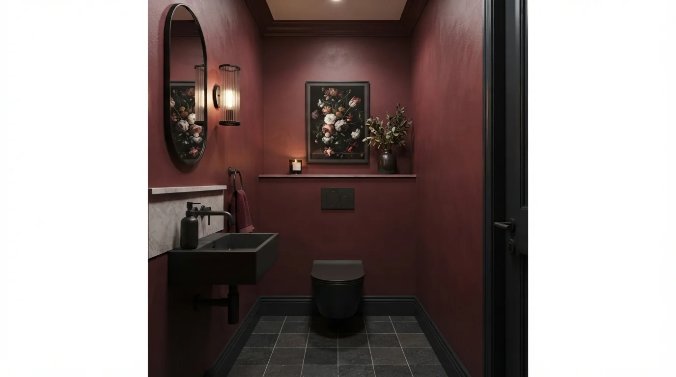
Dramatic Wine Powder Room — red powder room painted in Ancient Burgundy
1Ancient BurgundyValspar · Dramatic Wine Powder Room

Immerse yourself in deep wine walls and matte black details that make this intimate powder room feel like a luxurious sanctuary.

Deep wine is a rich, velvety dark burgundy red. In this room, the deep wine paint covers all the walls, paired with matte black on the trim, floating sink, and minimalist toilet. The space feels moody, luxurious, and wonderfully intimate. The combination works because the warm berry tones soften the stark black fixtures, turning a compact room into a cozy jewel box. It is perfect for anyone who wants to create a bold, high-drama powder room that wows every guest.

Walls · Valspar
Trim · Backdrop
Accent · Behr
Ceiling · Valspar
Plant · Glidden
SEE IT ON YOUR WALLS →
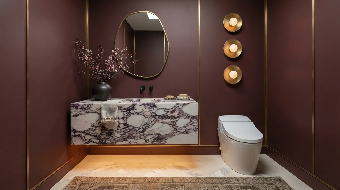
Velvet Wine Powder Room — red powder room painted in Hawaiian Cinder
2Hawaiian CinderBehr · Velvet Wine Powder Room

Rich wine-toned walls wrap this powder room in dramatic luxury alongside striking veined marble and glowing brass lighting.

Burgundy is a deep, velvety wine-red with rich purple notes. In this room, that bold plum shade covers all the walls, pairing seamlessly with a floating purple-veined marble vanity and a crisp white toilet. The space feels intimate, snug, and delightfully dramatic. The combination works because the bold veins in the stone tie directly into the dark wall shade while warm brass sconces keep everything from feeling too dark. It is perfect for anyone wanting an unforgettable, jewel-box guest bath.

Walls · Behr
Trim · Benjamin Moore
Cabinet · Benjamin Moore
Rug · PPG / Glidden
Accent · Behr
SEE IT ON YOUR WALLS →
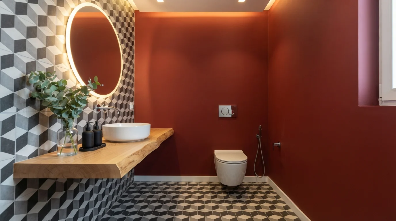
Crimson Geometric Powder Room — red powder room painted in Heirloom Red
3Heirloom RedValspar · Crimson Geometric Powder Room

Deep crimson walls pair with striking monochrome geometric tiles to create a moody, high-style jewel box.

Crimson is a deep, velvety red packed with bold personality. In this powder room, that rich red blankets the main walls and door, framed by sharp black, white, and gray geometric tiles on the floor and side wall. The space feels incredibly moody, intimate, and upscale. The combo works because the crisp monochrome tiles and warm live-edge wood keep the dark walls from feeling heavy. It is perfect for design lovers who want to make a big, dramatic statement in a small space.

Walls · Valspar
Table · Kompozit
Ceiling · Benjamin Moore
Plant · Sherwin-Williams
SEE HEIRLOOM RED ON YOUR WALLS →
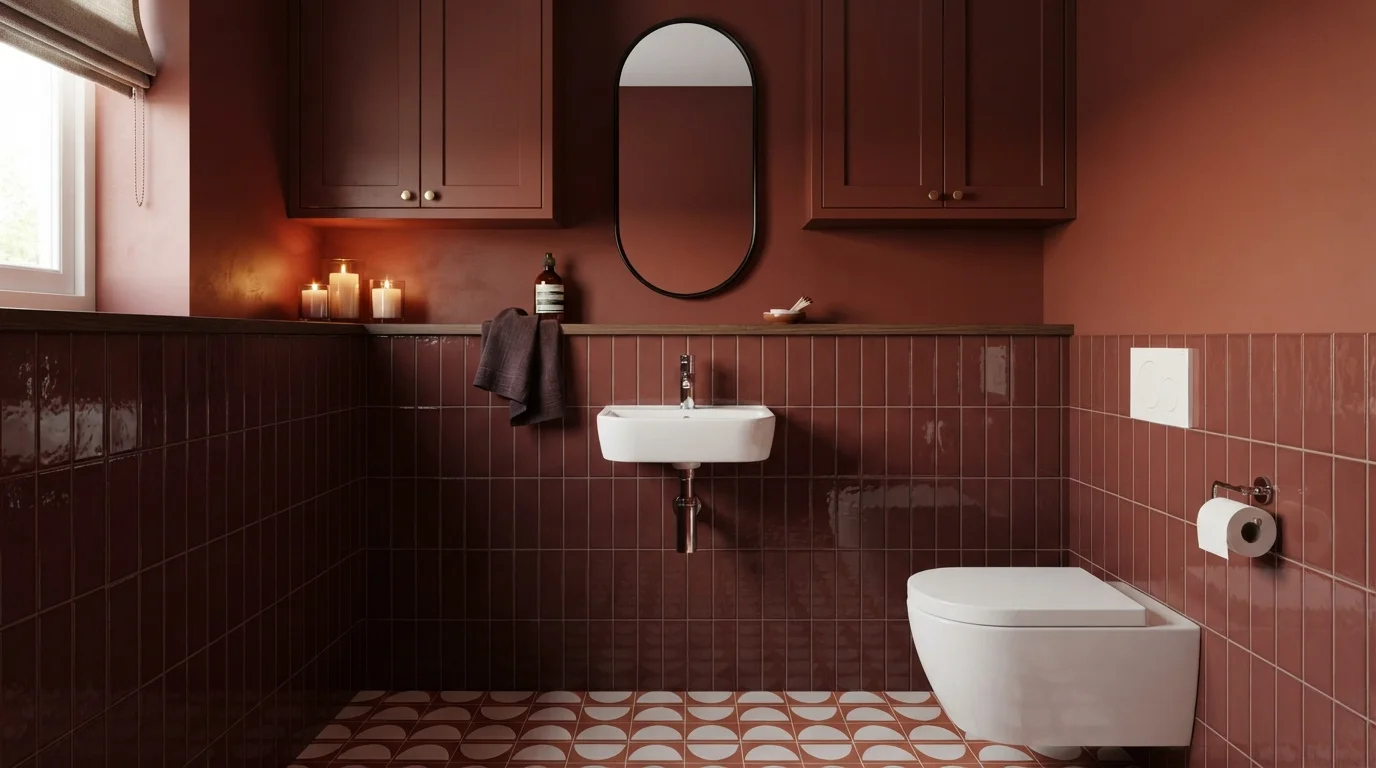
Burnt Terracotta Powder Room — red powder room painted in Palace Arms Red
4Palace Arms RedBenjamin Moore · Burnt Terracotta Powder Room

Rich wine tones and glossy vertical tiles create an intimate, cocoon-like powder room full of dramatic charm.

Burnt terracotta is a deep, earthy red with cozy brown depth. In this powder room, that rich shade coats the upper walls and built-in upper cabinets, seamlessly echoing the glossy wine tiles below. The space feels incredibly snug, polished, and intimate. Wrapping a single deep color family around the entire room makes a tiny layout feel deliberate and high-end rather than cramped. It is a stunning choice for anyone who loves bold powder rooms that make a memorable impression.

Walls · Benjamin Moore
Cabinets · Sherwin-Williams
Cabinet · Sherwin-Williams
Accent · Dunn-Edwards
SEE IT ON YOUR WALLS →
Crimson Powder Room — red powder room painted in Cardinal
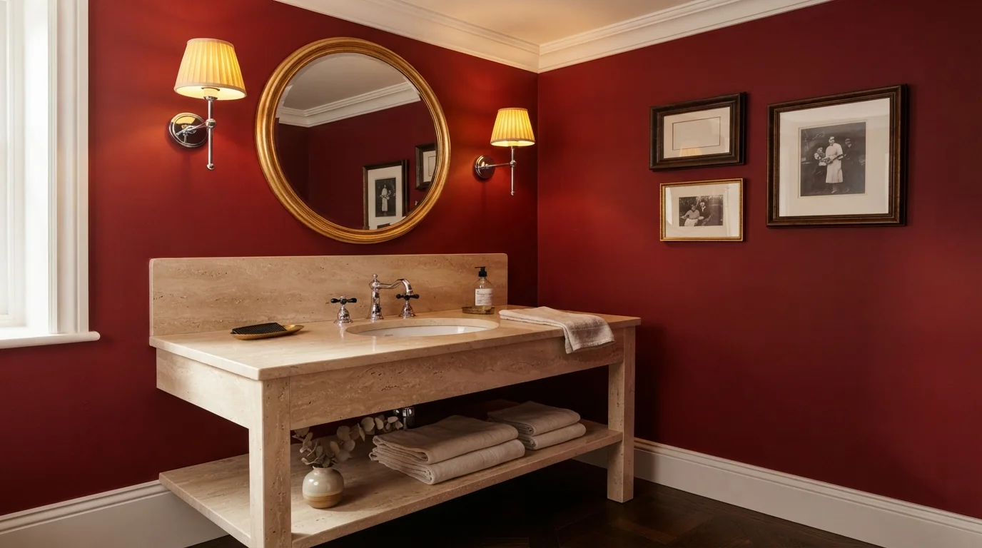
5CardinalSherwin-Williams · Crimson Powder Room

Rich crimson walls and warm travertine stone turn a compact powder room into an intimate, glowing jewel box.

Crimson is a deep, velvety red with timeless charm. In this powder room, bold red covers the walls from edge to edge, set against a creamy beige travertine vanity and an off-white ceiling. The room feels dramatic, cozy, and distinctly upscale. This look works because the warm natural stone and soft sconce lighting keep the intense wall color feeling inviting rather than overwhelming. It is perfect for anyone wanting to give a small guest bath an unforgettable, high-end look.

Walls · Sherwin-Williams
Trim · Glidden
Table · C2 Paint
Accent · Diamond Vogel
Artwork · Benjamin Moore
SEE CARDINAL ON YOUR WALLS →
Burgundy Velvet Powder Room — red powder room painted in Florence Red
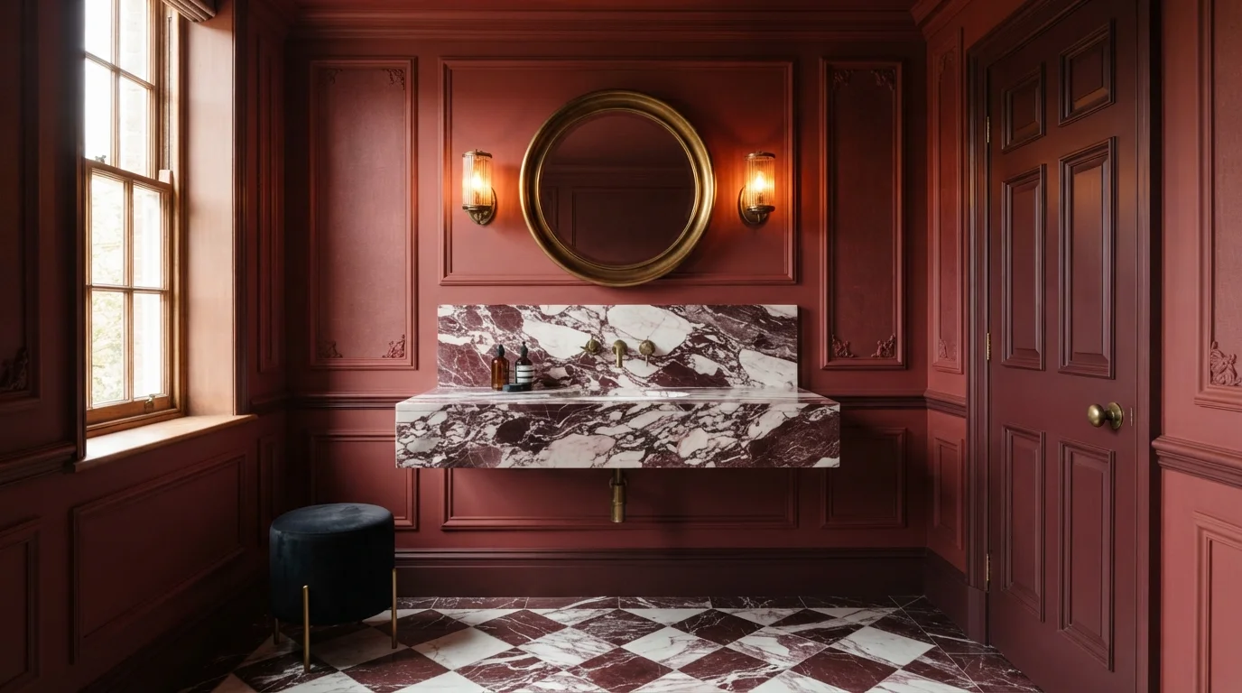
6Florence RedBehr · Burgundy Velvet Powder Room

Rich wine-painted walls meet bold veined marble and warm brass light for an intimate, luxurious retreat.

Deep burgundy is a rich, moody wine red. In this powder room, the deep red covers the walls, high baseboards, and interior door for a full wrap effect. The room feels sultry, intimate, and snug. Tying the paint color directly to the rich veined marble vanity and checkered floor keeps the look grounded and cohesive. This bold combination is for anyone who loves dramatic spaces and wants to make a memorable statement in a small powder bath.

Walls · Behr
Trim · Valspar
Accent · Dunn-Edwards
Table · Behr
Floor · PPG / Glidden
SEE FLORENCE RED ON YOUR WALLS →
Lacquered Burgundy Elegance — red powder room painted in Classic Burgundy
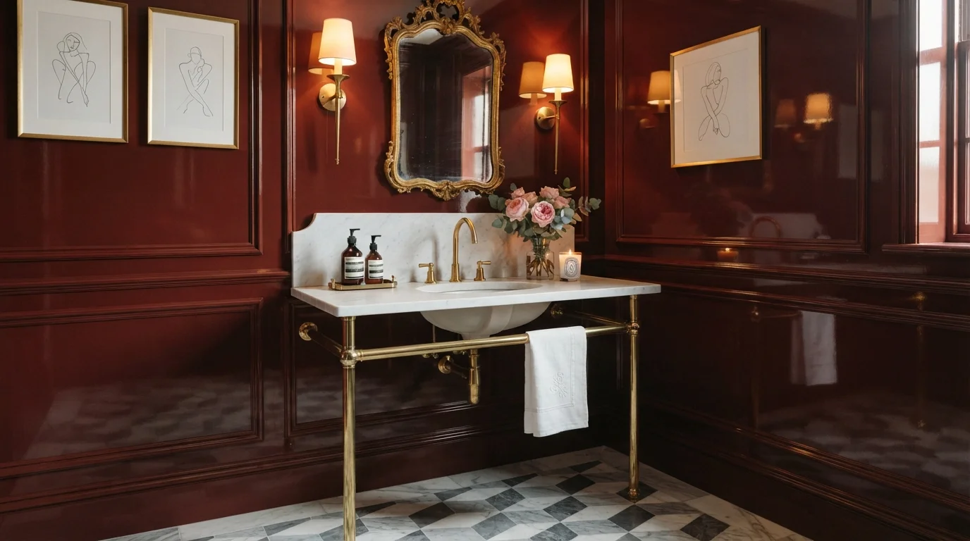
7Classic BurgundyBenjamin Moore · Lacquered Burgundy Elegance

Gleaming ruby-red lacquered walls meet polished brass fixtures and cool marble for a cozy, jewel-box escape.

Burgundy is a rich, intoxicating deep red with hints of wine. In this powder room, high-gloss burgundy coats the traditional wall paneling from floor to ceiling, framing a gleaming white marble vanity and warm brass fixtures. The space feels dramatic, moody, and undeniably luxurious. The combination works because the ultra-glossy finish reflects light across the dark walls while crisp white marble keeps the small space from feeling too heavy. It is perfect for anyone wanting to make an unforgettable statement in a compact powder room.

Walls · Benjamin Moore
Table · Diamond Vogel
Accent · Valspar
Artwork · Behr
SEE IT ON YOUR WALLS →
Moody Crimson Opulence — red powder room painted in Antique Red
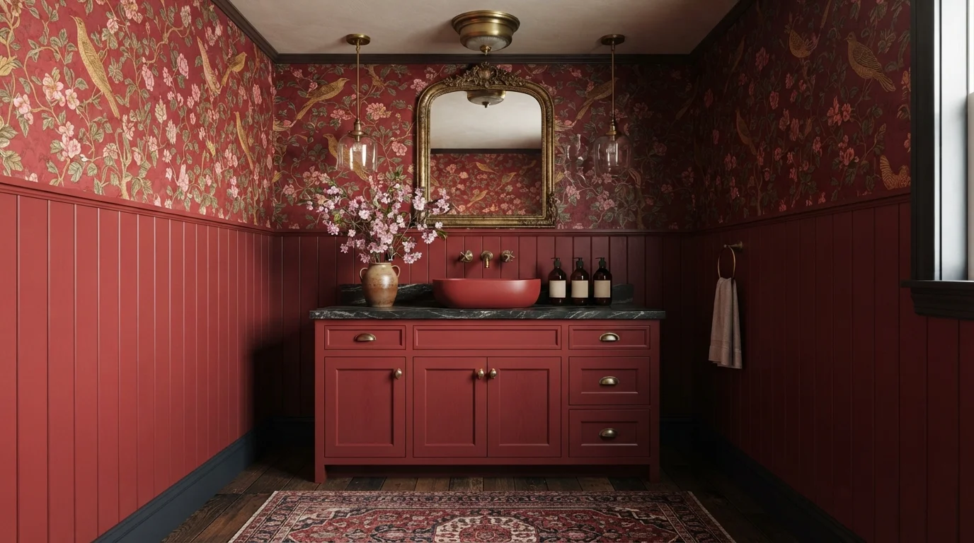
8Antique RedBehr · Moody Crimson Opulence

Deep crimson panelling and vintage gold accents create a rich, dramatic jewel-box powder room full of historic charm.

Crimson is a deep, velvety red with rich wine notes. In this powder room, saturated crimson coats the paneled wainscoting and rustic vanity, perfectly matching the illustrated bird wallpaper above. The space feels moody, luxurious, and wonderfully snug. Layering matching red tones across different textures works because glowing brass hardware and an ornate gold mirror break up the color with warm sparkle. It is the perfect choice for anyone wanting a bold, unforgettable statement in a small guest bath.

Vanity · Behr
Trim · Backdrop
Accent · Benjamin Moore
Ceiling · Benjamin Moore
SEE ANTIQUE RED ON YOUR WALLS →

Red Powder Room Wall Color Combinations

A wall color never works alone. These are the full schemes from the rooms above — the lead color first, then the supporting colors that make the photo work.

Dramatic Wine Powder Room
WallsAncient BurgundyTrimHocus PocusAccentSoft Lilac
Walls
Ancient Burgundy · · LRV 2
Trim
Hocus Pocus · · LRV 1
Accent
Soft Lilac · · LRV 64

Immerse yourself in deep wine walls and matte black details that make this intimate powder room feel like a luxurious sanctuary.

TRY THIS PALETTE →
Velvet Wine Powder Room
WallsHawaiian CinderTrimMassicotCabinetPiano Concerto
Walls
Hawaiian Cinder · · LRV 4
Trim
Massicot · · LRV 34
Cabinet
Piano Concerto · · LRV 52

Rich wine-toned walls wrap this powder room in dramatic luxury alongside striking veined marble and glowing brass lighting.

TRY THIS PALETTE →
Crimson Geometric Powder Room
WallsHeirloom RedTableCinnamon ToastCeilingFrosted Café
Walls
Heirloom Red · · LRV 5
Table
Cinnamon Toast · · LRV 40
Ceiling
Frosted Café · · LRV 77

Deep crimson walls pair with striking monochrome geometric tiles to create a moody, high-style jewel box.

TRY THIS PALETTE →
Burnt Terracotta Powder Room
WallsPalace Arms RedCabinetsRookwood RedCabinetSun Dried Tomato
Walls
Palace Arms Red · · LRV 7
Cabinets
Rookwood Red · · LRV 5
Cabinet
Sun Dried Tomato · · LRV 5

Rich wine tones and glossy vertical tiles create an intimate, cocoon-like powder room full of dramatic charm.

TRY THIS PALETTE →

The two darkest picks, Caliente and Million Dollar Red, both want a hard stop at the trim — soft white or a warm off-white on baseboards and door casing keeps the red from bleeding into a muddy corner, and matte black or unlacquered brass fixtures give the room the jewel-box look people search for when they type in "red powder room." Cottage Red pulls in the opposite direction: because it's a rustic, barn-toned red rather than a glossy true red, it pairs better with a wood vanity or wood-framed mirror than with brass, and oil-rubbed bronze hardware reads more at home with it than polished chrome.

Cinnamon Slate and Sunset Orange, both lighter and less saturated, are the picks to combine with a white or light stone counter rather than a dark one — with LRV already in the high teens, a dark counter drags the whole room down and cancels out the reason you picked the lighter red. Rosy Apple and Red Tomato sit in the middle and are the most forgiving for a full four-wall treatment with plain white trim; save the accent-wall-only approach for Raspberry Truffle or Million Dollar Red, where the remaining three walls in a soft white keep the room from feeling like a closed box.

More Powder Room Color Ideas

Set on a color family already? Each page has its own real rooms and picks.

Light or Dark Red Powder Room Colors?

Go Light (LRV 60+) If…

The room is small, faces north, or has to work at every hour. Light warm colors make it feel bigger and stay calm in evening light — the light you actually live in.

Go Dark (LRV Under 20) If…

You want the cocoon effect and the room has real daylight. Dark works best on one feature wall — or fully color-drenched in a large room with good windows.

In a powder room this small, LRV does more work than in any other room in the house, because there's usually no second light source correcting for a bad call. Cinnamon Slate (LRV 19) and Sunset Orange (LRV 17) are the safer starting point if the room has no window or relies on one vanity sconce — they still read as red-toned and warm, but they bounce enough light back that the room doesn't disappear at night. Rosy Apple (LRV 15) and Red Tomato (LRV 14) are the next step down and still work fine under a bright LED vanity bar; below LRV 14 is where the room starts to feel deliberately moody rather than accidentally dim.

Caliente and Million Dollar Red (both LRV 8) and Raspberry Truffle (LRV 9) are the ones to reserve for a powder room with good artificial lighting already installed — sconces on either side of the mirror, not just a single overhead can. Done right, that darkness is the whole point: guests are in the room for two minutes, so let it feel like a different, more dramatic room than the rest of the house. Done with only a dim ceiling fixture, the same color just looks like a room nobody bothered to light.

VISUALIZE YOUR SPACE

See It. Love It.
Paint It.

Upload one photo of your red powder room and try every color on this page on your own walls — in your own light, before you buy a drop of paint.

Drag the slider to compare
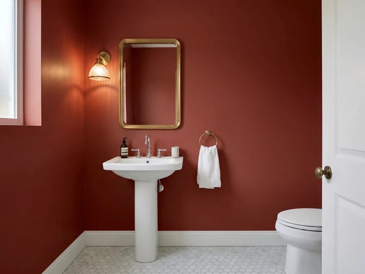
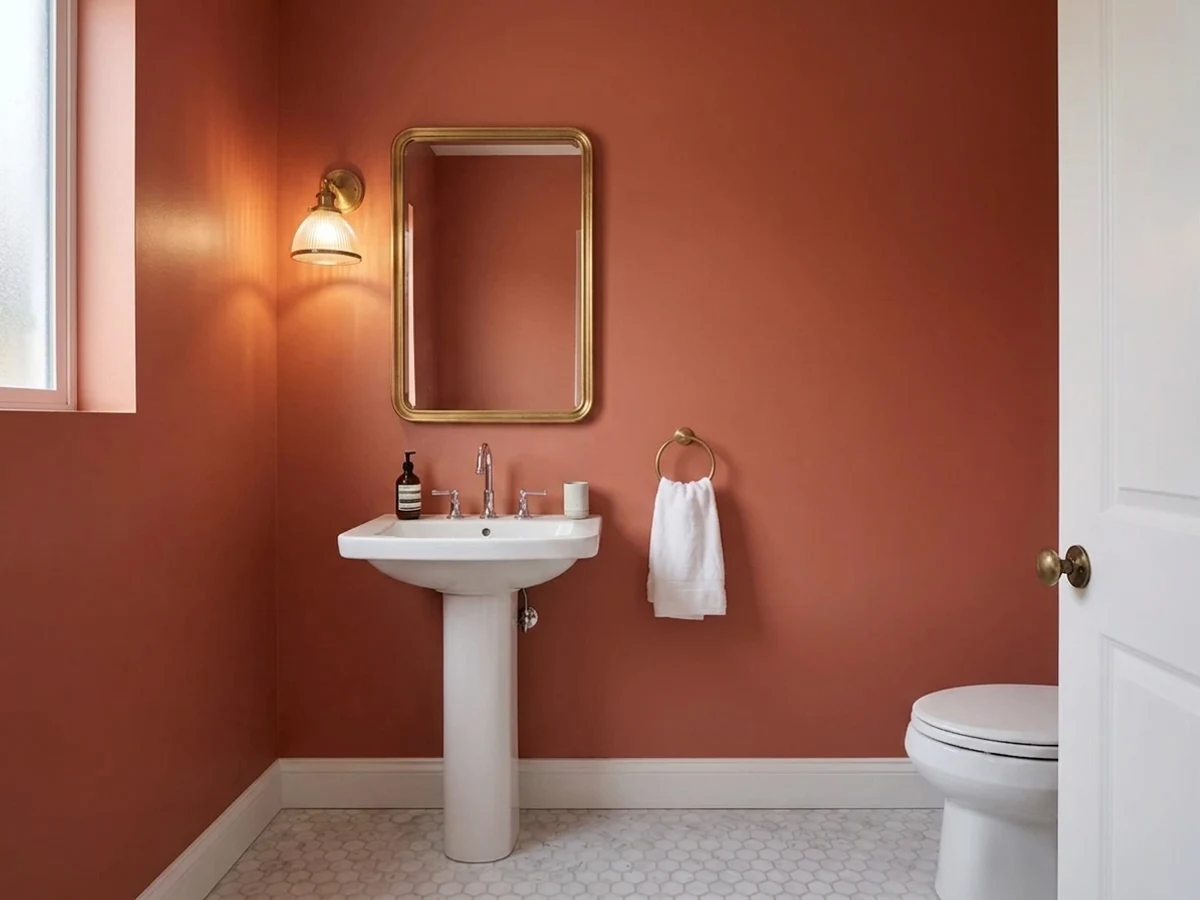
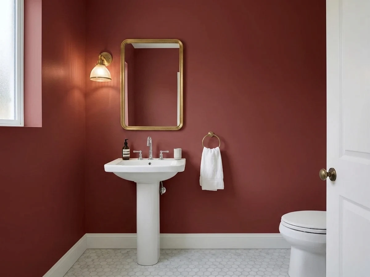
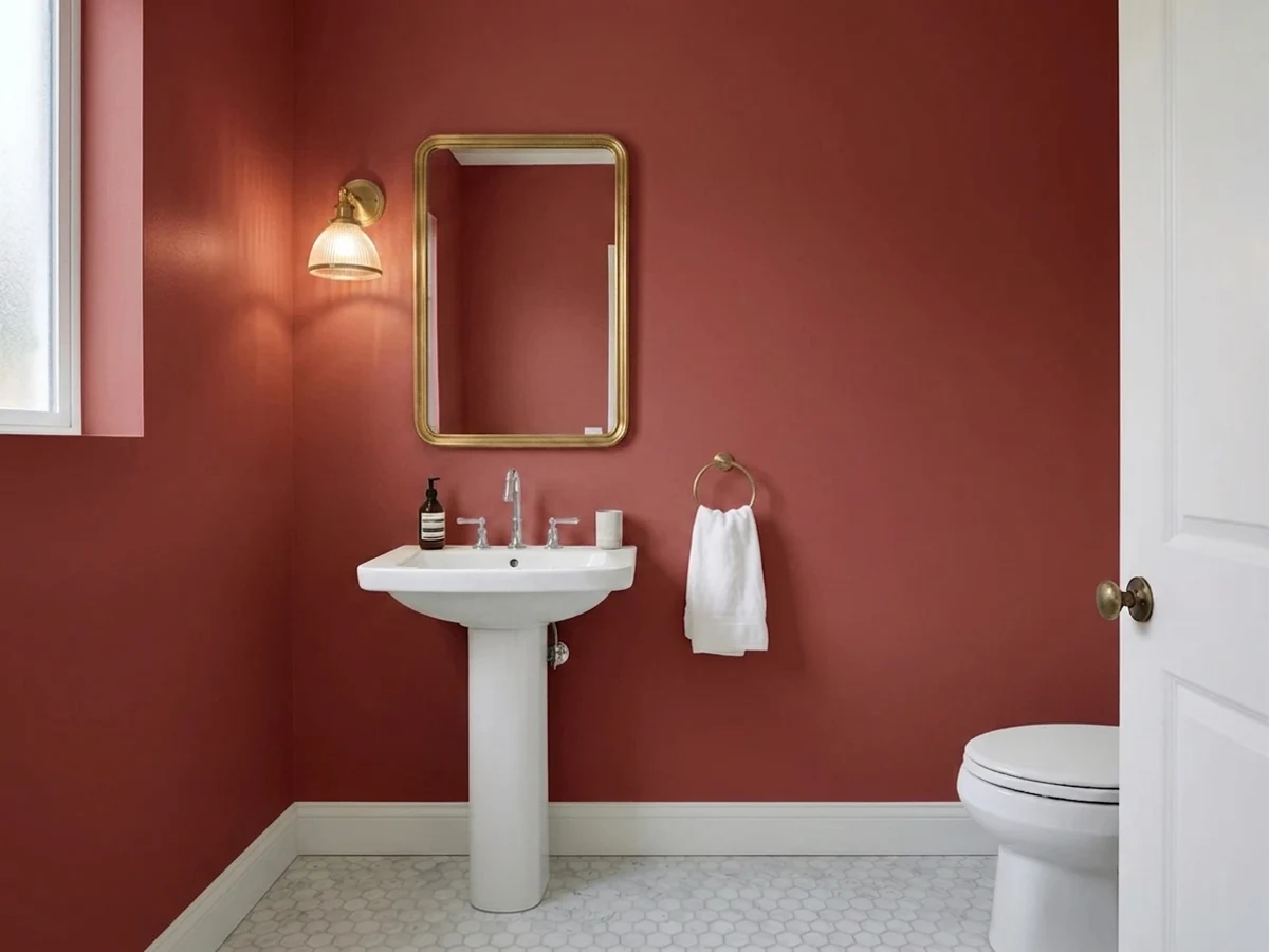
red powder room before paintingred powder room painted in Brick RedBrick RedBefore

Sheen And Finish For A Red Powder Room

Powder room walls take a lot of hand contact and almost no scrubbing, which is why eggshell is the standard call for the wall color itself — Cottage Red, Rosy Apple, and Cinnamon Slate all read cleanest in eggshell, with enough sheen to wipe a fingerprint off the wall near the light switch but not so much that every roller mark shows. Trim is the one place to go up a step: a satin or semi-gloss white trim gives the crisp edge that makes a dark wall color like Caliente or Million Dollar Red look intentional instead of murky.

High gloss on the walls themselves is a real option with the darkest picks — Million Dollar Red or Caliente in high gloss is the look behind most of the dramatic red powder room photos online, because the sheen throws back what little light the room has and reads almost lacquered. It's a harder sheen to apply without showing every wall imperfection first, so it's worth skim-coating minor patches before rolling it on, and it's not the finish to use with a flatter, more muted pick like Sunset Orange, which is meant to read soft rather than shiny.

Where To Stop The Color

A full four-wall red in a true powder room — often 4 by 6 feet or smaller — reads bold but not overwhelming, since there's usually a mirror and a door breaking up two of the four walls anyway. The ceiling is the real decision: leaving it white with Caliente or Million Dollar Red on the walls keeps a low ceiling from feeling lower, while carrying the same red up and over creates the fully wrapped, cocoon effect a lot of the dramatic powder room photos are chasing. There's no wrong answer here, but painting the ceiling the same color only works when the room already has a light fixture doing real work, not just a single dim bulb.

If the room has any awkward angle, half wall, or wainscoting, that's the natural stopping point for a color like Rosy Apple or Cottage Red rather than trying to wrap the whole box — a chair rail or wainscot line gives the eye a place to rest and keeps a small room from feeling like it's closing in.

Mistakes Specific To A Red Powder Room

The biggest one is picking the color under daytime light and never checking it after dark, when a powder room actually gets used most — during dinner parties, holidays, evenings with guests. A red that looks balanced with afternoon sun coming down the hall can turn muddy or brownish under a warm 2700K bulb, which is exactly the light most powder rooms run. Tape up a sample of whichever pick is under consideration and look at it after sunset with the actual vanity light on before committing to a full gallon.

The second mistake is matching the bulb color temperature to the wrong red. Cooler LED bulbs (3500K-4000K) tend to wash out warmer picks like Cottage Red and Sunset Orange, making them look flat instead of rich; warmer 2700K-3000K bulbs are the better match for nearly every pick on this page, since all eight reds here lean warm rather than cool or pink-based. The third is skipping primer on a room that was previously a pale color — true reds, especially Million Dollar Red and Caliente, are notorious for needing a tinted primer or an extra coat to stop the old color from ghosting through.

About Red Powder Room Paint Colors

A powder room is the one room in the house where a red you'd never risk in a living room suddenly makes sense. Nobody lingers there, there's rarely a window fighting the color, and the whole job is a few gallons and an afternoon. That's why designers keep reaching for reds here that they'd hesitate to use anywhere else — Benjamin Moore's Caliente (AF-290) and Million Dollar Red (2003-10) both sit at LRV 8, dark and saturated enough to feel like a jewel box the second a guest opens the door.

Not every red powder room needs to go that dark. Benjamin Moore's Cinnamon Slate (2113-40) at LRV 19 and Behr's Sunset Orange (BXC-39) at LRV 17 read more like warmed-up neutrals than true red — they give a small windowless room a cozy glow without turning it into a cave, which matters if the room also handles daytime guest traffic. In between, Rosy Apple (2006-30, LRV 15) and Red Tomato (SW 6607, LRV 14) split the difference: cheerful and clearly red, but still forgiving under a single overhead light.

Cottage Red (HC-184, LRV 11) and Raspberry Truffle (2080-10, LRV 9) round out the middle-to-dark end — one rustic and barn-toned, one a deeper berry that leans more sophisticated than fiery. Across all eight picks, the range runs LRV 8 to 19, which is really the whole decision: how much of the room's small footprint do you want the color to visually absorb, and how much light does the vanity fixture actually put out.

The Questions Everyone Asks

What color should I paint my red powder room?

If you want one answer, start with the safe picks above — Classic Burgundy, Ancient Burgundy, Hawaiian Cinder, Heirloom Red. They read well in any light and survive furniture changes. Then check the light: strong afternoon sun wants a step cooler, a north-facing room wants a step warmer.

is red a good color for a small powder room?

Yes, and it's one of the few rooms in the house where a bold red actually makes sense. A powder room is used for minutes at a time, often has no window to fight, and repainting it is a small job if you change your mind. Caliente and Million Dollar Red, both LRV 8, are the two most common picks for exactly this reason — they turn a small utilitarian room into a deliberate design moment instead of trying to make it feel bigger.

what trim color goes with a red powder room?

Soft white or warm off-white trim is the standard pairing for any of these reds, from Cinnamon Slate down to Caliente. A stark, cool white trim can make a warm red look slightly off, while a true white with a hint of warmth keeps the wall color and trim reading as one intentional palette. Satin or semi-gloss on the trim gives it enough sheen to stand apart from an eggshell or matte wall.

should the ceiling match the walls in a red powder room?

It depends on the ceiling height and the fixture. A white ceiling with a dark pick like Million Dollar Red or Caliente keeps a low ceiling from feeling lower and is the safer default. Carrying the same red up and over the ceiling creates a fully wrapped, cocoon-like effect that reads dramatic in photos, but it only works well if the room has real light — sconces, not a single dim overhead bulb.

what paint sheen is best for red powder room walls?

Eggshell is the standard choice for the wall color itself — enough sheen to wipe clean near the light switch, without showing every roller mark. High gloss is a real option with the darkest picks, Caliente or Million Dollar Red, since it throws back light in a room that often has little of it and gives that lacquered look. Save gloss for a wall that's been properly patched first, since it shows imperfections.

is it a mistake to paint a powder room too dark?

It's only a mistake if the room doesn't have the light to back it up. Raspberry Truffle and Caliente, both under LRV 10, look intentional and rich next to a working vanity sconce, but the same color under one weak overhead bulb just reads dim. If the room's lighting is already good, dark is a safe, popular choice for a powder room specifically because guests only spend a couple of minutes in it.

What two-color combination works best in a red powder room?

The reliable pattern is a quiet main color plus one deep accent on a single wall. Keep trim and ceiling in one warm white so the two colors are the only event in the room — the combination cards above show complete schemes from real rooms.

What colors make a red powder room look bigger?

High-LRV, slightly warm colors — LRV 60–75 is the sweet spot. Paint the walls and trim close to the same light color so the corners blur, and keep the ceiling white. Stark cool white actually works against you; it creates hard shadows that show the room's edges.

Ask a Question

Jessica Williams

Not sure what's right for your red powder room?

Ask Jessica below — every question gets a real reply, usually within a day.