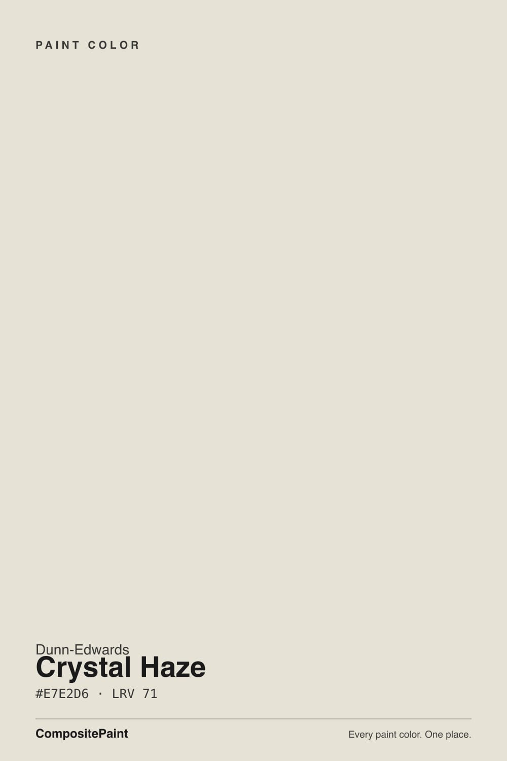
Crystal Haze
Dunn-Edwards' light greige workhorse, reviewed honestly: the rooms where it stays airy, the north light that turns it drab, and why it is not a white.

Jessica has spec'd whites and neutrals for more than 300 rooms and keeps a sample wall of painted drawdowns in her studio. Every color review is checked against real reader rooms in the comments and re-tested when a formula changes. About the testing process →
- 1Agreeable Gray60
- 2Balboa Mist66
- 3Crystal Haze71
- 4Pearly White77
- 5Dover White83
The Fast Verdict
Crystal Haze is the light greige Dunn-Edwards painters actually run through a whole house. At LRV 71 it reads almost like a soft white — until you park it next to a real white and the creamy-gray body shows. Western designers treat it as a chameleon main-floor color: Robin Strickler of Design Works calls it her studio's number-one go-to for the body of a home because it warms a gray and cools a tan. It is not a Color of the Year and it is not White Dove. Give it daylight and a brighter trim white and it behaves. Give it a dim north room, or buy it hoping for a true white, and the chip will feel like a different paint.
Whole-house walls in decent daylight · open living rooms and hallways · kitchens that want greige, not white · anyone who wants light without going stark
You wanted a true white · the room faces north and stays dim · floors are cool gray LVP · you need a deeper greige with more body
- Light enough (LRV 71) to run a whole house without going empty
- Chameleon greige — warms a gray, cools a tan, stays in the middle
- Official Warm White trim pairing is a clean, reliable snap
- Western designer default for main-floor walls, not a trend color
- Hides more scuffs and patches than a true white
- Goes drab gray in dim north rooms
- Not a white — looks dusty next to Whisper or Milk Glass if you expected one
- Cool gray floors and stone pull the yellow-cream into the open
- Too light if you wanted Agreeable Gray depth
What Color Is Crystal Haze, Really?
A whitened warm greige with the chroma turned almost all the way down. Dunn-Edwards files DE6219 in the Perfect Palette Cool Neutrals set and still describes it as a warm greige with a creamy lean — that contradiction is the color. The official Munsell is 4.79Y at chroma 0.7: yellow hue, barely any pigment, which is why Sara McLean, Dunn-Edwards' own color expert, called it a soft, whitened greige that only hints at color so the furniture can talk. Robin Strickler puts it more usefully: it is a chameleon. Next to a gray it reads warmer; next to a tan it reads cooler. Rebecca Ward still recommended it in 2026 for living rooms that need to work traditional and modern, because it feels light and airy, almost white, with just enough pigment not to drain the room.
At LRV 71 it sits a full step above the greiges Instagram trained everyone on — Agreeable Gray is 60, Edgecomb Gray 63, Revere Pewter 56 — and right next to Pale Oak (LRV 69) and Drift of Mist (LRV 69). Foggy Day, the quiet Dunn-Edwards neighbor, shares the same 71. That number is the useful part. There is enough bounce to carry a hallway and an open main floor without the empty glare of Warm White (LRV 93). There is enough body that the wall is clearly not white once a brighter trim is on the casing. Dunn-Edwards has sold this formula as a 2006 Perfect Palette color for two decades. It has never been a Color of the Year — Midnight Garden, Caramelized, and Skipping Stones took those slots — and it does not need to be. Painters already know the can.
Undertone in one line: grayed-out yellow-cream — never pink, never green. In south sun it reads as a finished light greige, almost a dirty white in the kindest sense. In cool north light the cream drops out and the gray is what you live with. If your sample looks beige, that is west sun or oak floors bouncing; if it looks flat gray, the room is dim or the bulbs are cool. Both reads are the same gallon being honest about the light.
Where It Shines
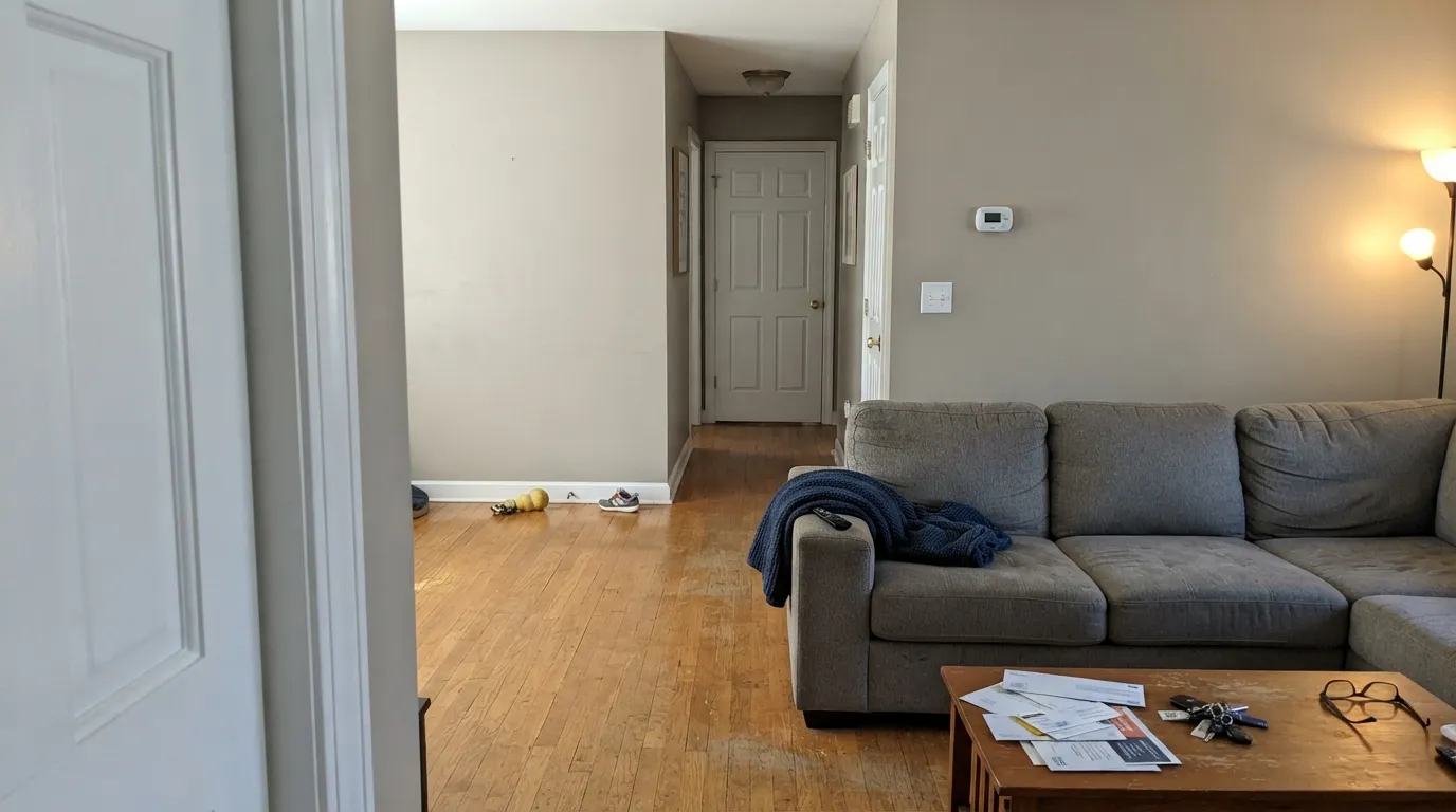
Give it real daylight, a brighter trim white, and rooms that connect, and Crystal Haze does the rare light-greige job: it stays airy without going empty. Open living rooms are its home turf — Strickler runs it as the main body of the house, Ward as a living-room default — and hallways are where the LRV 71 earns the gallon. Dunn-Edwards' own pairing is the one that works: Warm White on the woodwork. A 2015 Los Angeles den ran it with Chantilly Lace trim and the same snap showed up. Keep the stone and wood on the warm side and the creamy gray just sits there, which is the point.
Where It Fails
Almost every unhappy Crystal Haze story is a light-greige story in a Western can. The cream is real, it is small, and three situations make it loud or take it away. None of them are a bad mix — but if your room matches one, this is not your color, and another coat will not hide it.
North light is cool and grey, and Crystal Haze has almost no chroma to push back with. The cream drops out and the wall goes drab — not cozy greige, not clean white, a flat putty people describe as dingy. Warm lamps help after dark and do nothing at 2 p.m. Step to a cream that still glows (Dunn-Edwards Swiss Coffee) or a greige with more body (Agreeable Gray, LRV 60), or keep this color for rooms with real sun.
On the chip it can pass for an off-white. On four walls next to Warm White or Chantilly Lace the greige is unmistakable — LRV 71 is not 90. Shoppers who wanted Whisper, Milk Glass, or White Dove end up with a tinted wall that reads dusty by comparison. That contrast is the intended look if you wanted greige. If you wanted white, this is the wrong can.
Gray LVP, gray-washed oak, and Carrara-look quartz sit at the opposite temperature and shove the yellow-cream into the open. Walls that looked quietly greige on the chip read beige, even faintly dirty, against a cool floor. Warm oak, walnut, and creamy stone are its company. With gray plank already down, sample a big board above the actual floor at 4 p.m. before you commit the house.
Room by Room
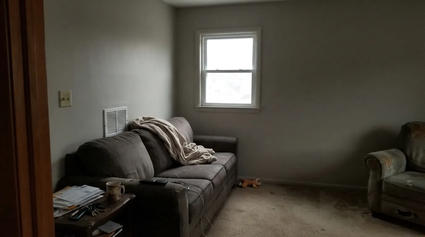
South- and west-facing living rooms are the light this greige was mixed for: airy, finished, not empty. Eggshell walls, Warm White or Chantilly Lace on trim in semi-gloss. A closed, dim living room is the skip — that is where it goes drab.
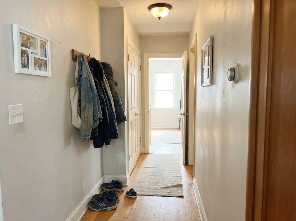
This is why Strickler keeps a can on the truck. At LRV 71 it carries room to room without clashing and without the tunnel of a mid-tone greige. Open halls that borrow daylight from both ends are safe. A windowless interior hall still wants a lamp; the color will not invent light.
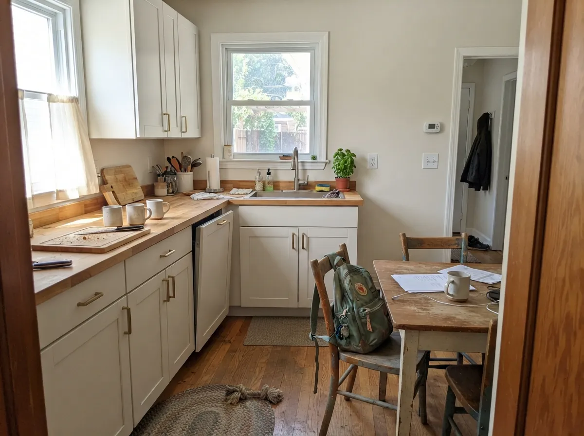
A light greige kitchen wall is the reason people leave white. It flatters brass, oak, and butcher block, and it lets white or Alabaster cabinets snap. Satin only if the boxes themselves are Crystal Haze — most kitchens look better with the greige on the field and a real white on the doors. Cool gray quartz is the sample-first surface.
A sunlit bedroom stays soft and restful; under 2700K bulbs it turns a step creamier at night, which is the point. A north cave will go drab. Matte or eggshell; keep a lamp on each side of the bed so corners do not sink to putty.
Warm marble, wood vanities, brass: it looks settled. Gray porcelain, blue-grey subway, chrome-and-Carrara: it argues, and the wall goes beige. Satin or a bath-rated eggshell for wipe-down either way.
An open dining room that borrows living-room light is a natural fit. A closed, lamp-only dining room needs 2700K bulbs or dinner goes gray. Home offices with a real window are fine; windowless dens are where the drab reviews come from.
Your Light Is the Risk
The cream stays quiet and the greige reads finished, not empty. Whole-house walls are only this safe here.
Cool grey daylight strips the cream and leaves a flat putty-gray. The dingy read. Do not use it as a four-wall color here.
Morning east light is the coolest, grayest read. Midday is the honest greige. Late west sun flushes a creamier beige for an hour; it is bounce, not a new color.
2700K bulbs pull the yellow-cream forward and the walls go softly warm. Cool 4000K–5000K LEDs gray it out and make it look unfinished. Swap the bulbs before you repaint.
Most complaints about Crystal Haze are a light mismatch. Upload a photo of your actual room and see it on your walls — then ask for the same wall in north light or evening lamps before you buy a single sample.
Need It From Another Brand?
Any paint counter can custom-tint Dunn-Edwards DE6219 directly. If you would rather stay in one brand's own deck, these are the closest stock matches, measured as ΔE2000. Under 2 is a difference you will not see on the wall.
| Brand | Closest color | ΔE | LRV | |
|---|---|---|---|---|
| Sherwin-Williams | NacreSW 6154 · Sherwin-Williams | 0.8 | 76 | Color page → |
| Behr | Echo ValleyECC-25-2 · Behr | 0.5 | 76 | Color page → |
| Benjamin Moore | French Canvas1514 · Benjamin Moore | 2.2 | 76 | Color page → |
| Valspar | Quail Egg7002-12 · Valspar | 1.4 | 76.7 | Color page → |
| PPG / Glidden | OatmealPPG1023-1 · PPG / Glidden | 0.4 | 76 | Color page → |
| Glidden | OatmealPPG1023-1 · Glidden | 0.8 | 77 | Color page → |
Similar Dunn-Edwards Colors
The nearest shades to Crystal Haze within Dunn-Edwards's own range, ranked by perceptual color distance — useful when you want the same look a touch lighter, darker, or warmer.
WCAG 2.1: AA is 4.5 : 1 for normal text, 3 : 1 for large text, AAA is 7 : 1.
Crystal Haze vs the Colors You're Also Considering
Every Crystal Haze sample board has the same rivals on it. The numbers show the real lightness gap — then it comes down to which risk you would rather live with.
Pick this when you want the greige to be visible, not a white that almost is.
Dunn-Edwards DE6226 · LRV 71Foggy DayPick this if you want the quieter, nearer-white version at the same LRV — it is the hush in Dunn-Edwards' near-white trio.
Pick this when you are already at a Dunn-Edwards counter and want the slightly airier, creamier Western read.
Benjamin Moore OC-20 · LRV 69Pale OakPick this if your painter works in Benjamin Moore — same light-greige job, a touch moodier when the light goes bad.
Crystal Haze Coordinating Colors
The rule is a brighter true white on the woodwork, then stay on the warm-to-neutral side of the fence. Dunn-Edwards prints Warm White as the trim partner for a reason: Crystal Haze has enough body to take that snap. It likes oak, brass, dusty sage, and one dark door. It argues with cool gray stone and with any cream you try to use as trim. These are the partners that keep showing up in rooms that work:
A 2006 Workhorse, Not a Color of the Year
Crystal Haze has sat in the Dunn-Edwards Perfect Palette since 2006. It is not a Color of the Year — Midnight Garden took 2026, Caramelized 2025, Skipping Stones 2024 — and it has never had a national campaign. What it has is a job. Dunn-Edwards files it in Cool Neutrals and still sells it as a warm greige, which is the honest version of a chameleon: low-chroma enough to sit with the cools, yellow-cream enough to warm a tan. Sara McLean put it on Bob Vila's gray list as a whitened greige that lets other colors talk. That is a backdrop, not a headline.
The rooms that made it into print are specific and Western. Robin Strickler of Design Works has called it her number-one go-to for the main body of a home because it works with both cool and warm hues. Rebecca Ward was still naming it for living rooms in 2026 — light and airy, almost white, with enough pigment not to drain the space. A Los Angeles den in 2015 ran it with Chantilly Lace trim. A desert painter posted a bedroom in Everest velvet. Facebook groups keep asking whether it will carry a whole house. That is the pattern: a quiet main-floor greige, used by people who already shop Dunn-Edwards, not a viral paint.
Crystal Haze With Wood Tones and Floors
Warm wood loves it. Oak — red, white, honey — walnut, butcher block, and cedar all sit comfortably because the grayed yellow-cream meets theirs halfway. Honey oak is kinder here than it is against a true white: Crystal Haze is not contrasty enough to make the orange louder. Brass and unlacquered hardware look clean rather than dated, which is why it works as a kitchen wall behind mixed metals.
The flooring that needs a sample first is cool gray LVP or gray-washed wood. Gray plank pulls the cream into relief, and the wall can read beige, even slightly dirty, against it. It is not always a dealbreaker — a large rug and 2700K lamps fix it in most rooms — but tape a big sample above the actual floor in afternoon light before you paint the whole house. Medium maple and warm tile are safe. Chrome is the only metal that leans cold against it; the rest can stay.
Three Ready Palettes Built on Crystal Haze
A color is never alone on the wall. These are complete combinations in the 60-30-10 pattern, with the reason each one holds together. Every one opens in the visualizer.
This is the pairing Dunn-Edwards prints on the color page: Crystal Haze on the field, Warm White snapping the woodwork. The navy door is the single dark note a light-greige house needs so the whole thing does not read unfinished.
Try this palette in your roomAlabaster is the cabinet white that still has a little cream, so the handoff from Crystal Haze walls does not look like a dirty-white mistake. Evergreen Fog on the island gives one muted green note that sits in the same quiet family.
Try this palette in your roomWhisper is Dunn-Edwards' White Dove — a softer trim snap than Warm White if the bedroom should stay hush. Light Sage on a door or bench adds one dusty green without leaving the Western deck; it needs a window to read green, which a bedroom should have anyway.
Try this palette in your roomCrystal Haze FAQ
Is Crystal Haze gray or beige?
Neither, on purpose. It is a light greige — grayed-out yellow-cream — and which side you see depends on the light. South sun and 2700K lamps pull the cream; north light and cool LEDs leave the gray. If you actually want gray, or actually want beige, this is the wrong can.
What trim white goes with Crystal Haze walls?
A brighter true white. Dunn-Edwards prints Warm White (DEW380) on the color page, and that snap is the one that works. Chantilly Lace does the same job if your painter is Benjamin Moore. A creamier trim white — Whisper, Milk Glass, Swiss Coffee — sits too close and the walls look dirty instead of greige. Semi-gloss on the trim, eggshell on the walls.
Is it good for a whole house?
That is the job it has. Robin Strickler of Design Works has called it her studio's number-one go-to for the main body of a home, and Facebook threads keep asking the same whole-house question. It works when the house has real daylight. A north wing or a basement will not get the airy read — sample those rooms separately.
Will Crystal Haze look yellow?
Only when something warm is bouncing — west sun, honey oak, a terracotta overhang. The yellow is grayed down to chroma 0.7, so it does not flash butter the way a cream does. If your sample looks yellow, look at the floor and the hour before you blame the gallon. If it looks gray, the light is cool.
Does it work with oak floors?
Warm oak, walnut, and butcher block are its natural company — the cream meets theirs halfway. Honey oak is usually fine; Crystal Haze is not contrasty enough to turn the floor orange. Cool gray LVP and gray-washed oak are the sample-first floors: they pull the yellow-cream into relief and the wall can read beige.
Crystal Haze or Agreeable Gray?
Crystal Haze if the house should stay light and airy — it sits at LRV 71 against Agreeable Gray's 60. Agreeable Gray if you want the famous greige with more body and more gray. They fail in the same light (cool, dim, north). Sample both on the darkest wall you have before you pick.
Have you painted with Crystal Haze?
Rate it — one tap helps the next reader decide.
Ask a Question