Foggy Day
Dunn-Edwards' quietest near-white greige, reviewed honestly: the light that erases its gray, the Southwest sun that flattens it to plain white, and what to pick instead.

Jessica has spec'd whites and neutrals for more than 300 rooms and keeps a sample wall of painted drawdowns in her studio. Every color review is checked against real reader rooms in the comments and re-tested when a formula changes. About the testing process →
- 1Superwhite0
- 2Heirloom Shade63
- 3Foggy Day71
- 4Alabaster82
- 5Chantilly Lace91
The Fast Verdict
Foggy Day is about as close to a true neutral as Dunn-Edwards sells — a light, low-chroma greige with a whisper of warmth and almost no visible color to argue about. Give it soft, indirect daylight and it reads exactly like the name: a misty, quiet gray-cream that makes limestone, pale oak and linen look considered. Give it the hard, direct sun the brand's home Southwest market is known for, and that same lack of chroma washes it toward plain white. It is less a color than a very well-behaved background — which is either exactly what you want or a letdown, depending on why you picked it.
Whole-house walls + trim in a house that gets real but indirect daylight · kitchens that want a whisper of gray instead of full greige · bedrooms and hallways that should stay quiet · stucco exteriors that want warmth without reading cream
You want a neutral with real visible depth · your rooms run mostly on cool white LEDs · your climate is mostly flat overcast light with no midday sun contrast · you are chasing the literal misty-gray the name pictures — full sun will not give you that
- About as close to a true, low-drama neutral as Dunn-Edwards sells
- Flatters pale oak, limestone, linen and unlacquered brass without adding its own color noise
- Whole-house safe — runs from room to room without clashing
- Reads as a soft, warmer alternative to a stark exterior white on Southwest stucco
- Deep enough (LRV 71) to avoid looking sterile, light enough to stay bright
- Direct, hard Southwest sun bleaches its already-low chroma toward plain white
- Cool LED bulbs in a dim room leave it flat and slightly cold
- Reads dingy next to a noticeably brighter separate trim white
- Buyers chasing a visibly 'misty gray' wall may find it too quiet to register as a color at all
What Color Is Foggy Day, Really?
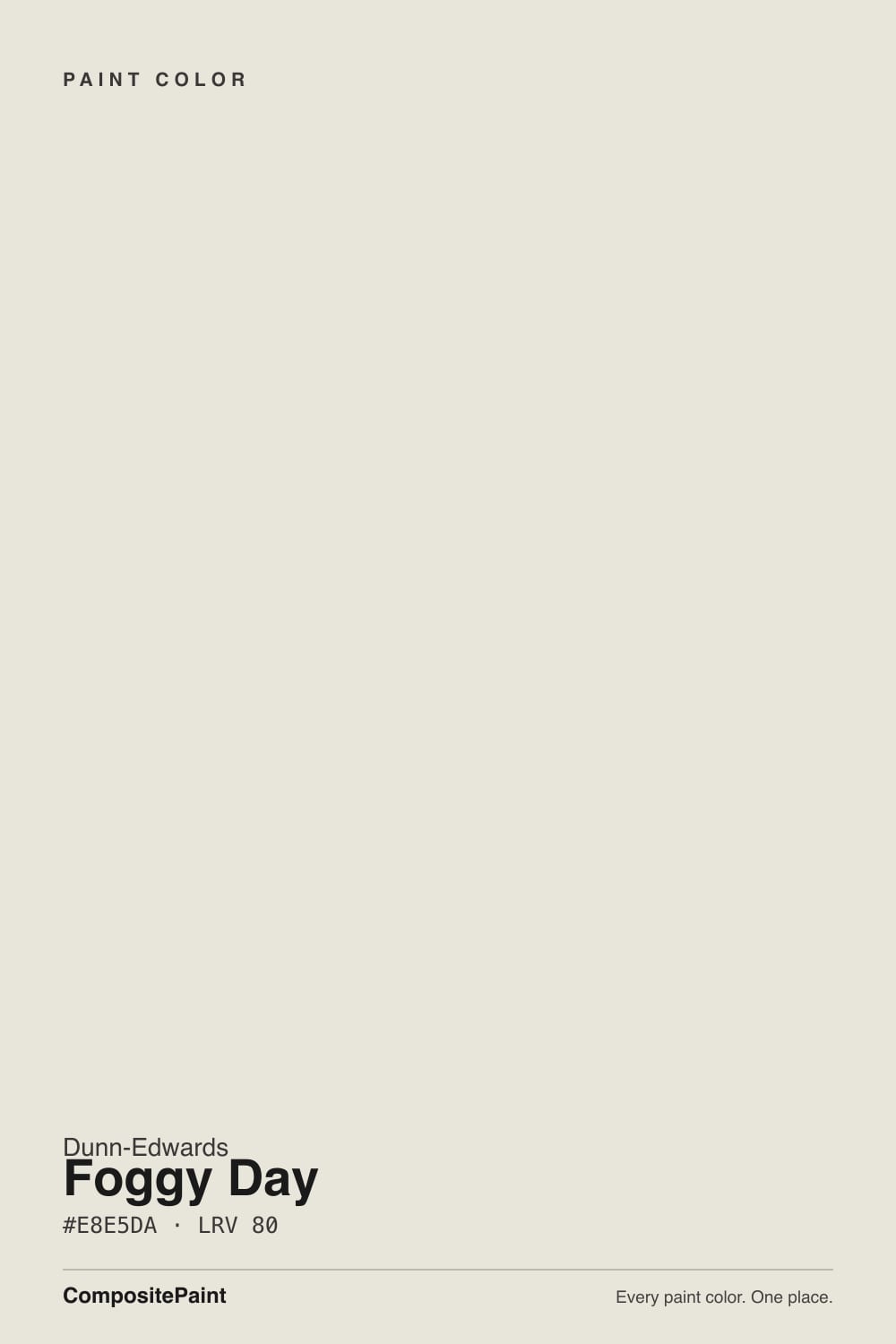
Dunn-Edwards' own line describes Foggy Day as a light, misty greige with subtle warm undertones, and files it under Cool Neutrals in the Perfect Palette collection — a small contradiction that tells you exactly what this color is doing. Officially it carries warmth (a base a shade toward yellow), but there is so little of it that the color reads cool and quiet on the wall. Its Munsell chroma is 0.4 — essentially the floor of the scale, close to a true neutral gray with almost no measurable saturation. Very few colors in any deck are this quiet.
In our deck it sits at LRV 71: not stark white, but close enough that it needs a real neighbor to show its body. Next to Dunn-Edwards' own Swiss Coffee (LRV 83, warmer and creamier) or a flat colorless white like Benjamin Moore White (LRV 84), Foggy Day reads visibly grayer and cooler — the depth is there, it's just subtle. The color sits at the gray end of Dunn-Edwards' numbered near-white trio, alongside Whisper and Swiss Coffee, positioned as the quietest, least-cream option of the three.
Undertone in one line: a warm base filed as a cool neutral, and in practice it splits the difference — not blue-gray, not yellow-cream, just a very quiet, low-saturation greige. If your sample looks almost colorless, that isn't a flaw; that is the whole design of this paint. If you wanted it to visibly read gray or misty, you need soft, indirect light to see it — direct sun erases the effect.
Where It Shines
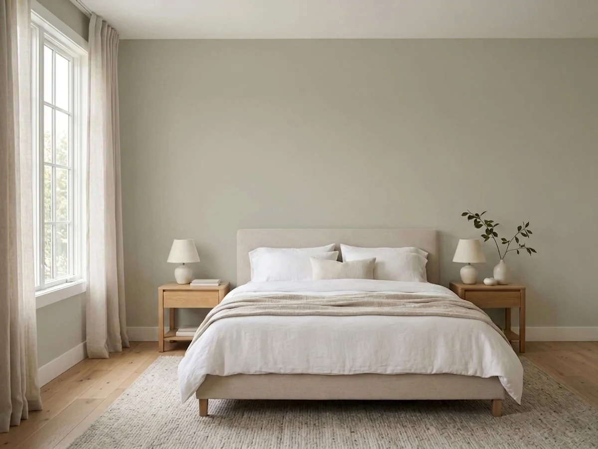
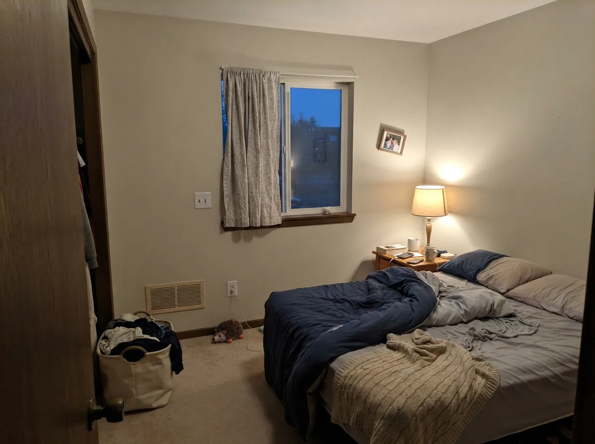
Give it soft, indirect or overcast daylight and it does exactly what its name promises: a quiet, misty gray-cream that never competes with the room. It flatters pale materials — limestone, whitewashed and pale oak, linen, unlacquered brass — without adding any color noise of its own. It is built to be a background, and in a room with real but filtered light, that restraint is the whole appeal: furniture, art and wood tones read as the decision, not the wall.
Where It Fails
Almost every disappointed review of Foggy Day comes down to one of three scripts, and all three trace back to the same root cause: this color has almost no chroma to spend, so it depends entirely on its light and its neighbors to show up at all.
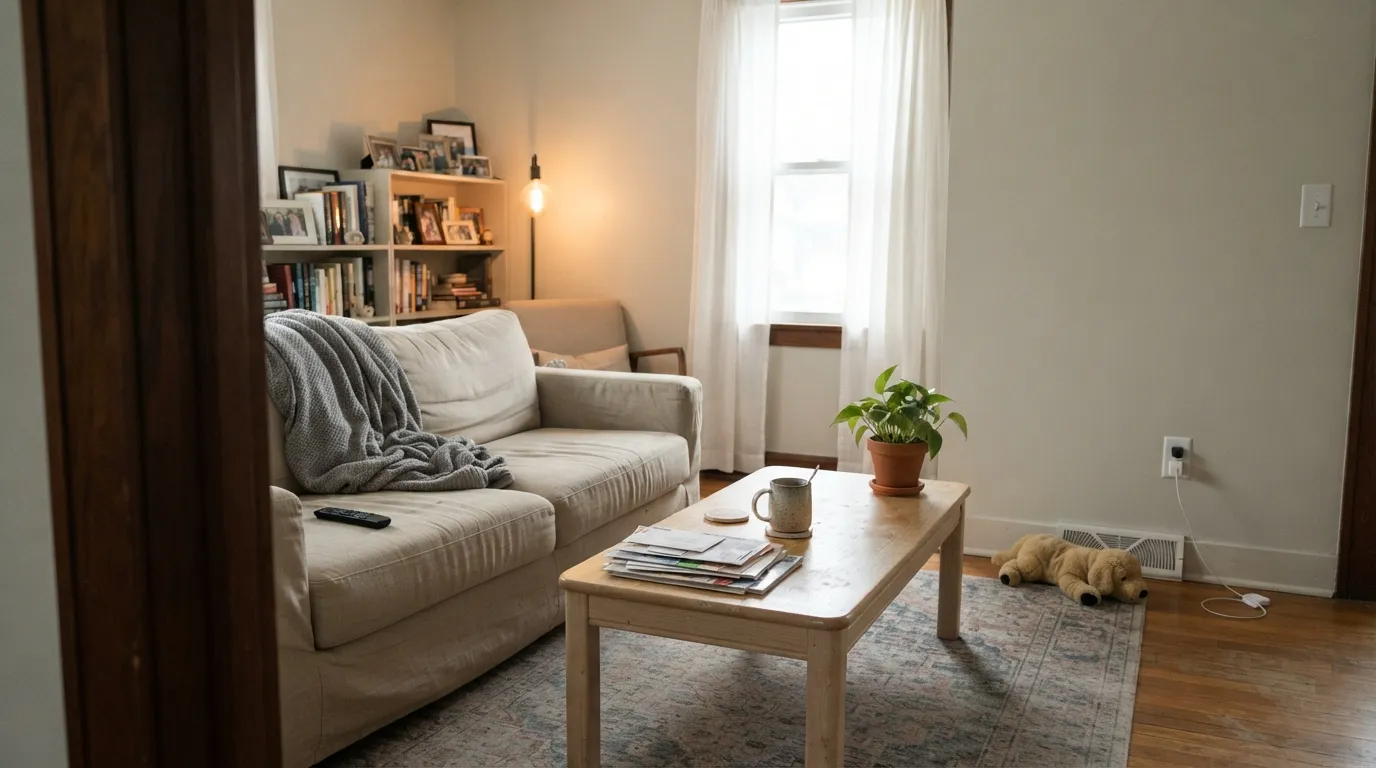
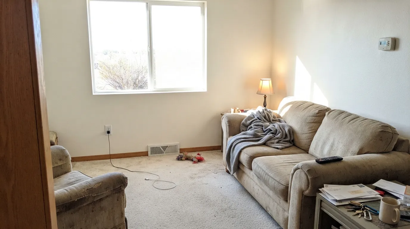
Dunn-Edwards' home market is Southern California and the Southwest — strong, direct, high-UV sun. A color with Munsell chroma of 0.4 has almost no color to hold onto, and hard direct sun bleaches what little is there. The result: a wall that photographs as plain white, not the misty greige on the fan deck. The paint didn't fail — full sun is simply the one light this particular color can't survive with its personality intact.
Put a stark, high-LRV trim white beside Foggy Day's grayer body and the walls read dingy by comparison — a very common off-white mismatch. The fix is the one-color rule: run Foggy Day on the trim too, in a higher sheen, or step down to a genuinely warmer trim white instead of a brighter one.
With so little inherent saturation, this color has nothing to fall back on when the light works against it. Cool 4000K+ bulbs strip the small amount of warmth it has and leave a flat, slightly cold gray that feels closer to primer than to the 'misty' color on the sample chip. Swap to 2700K bulbs before blaming the paint.
Room by Room
A calm backdrop for wood furniture and art in any room that gets filtered, indirect light through the day. In a south-facing room with hard sun, expect it to look closer to plain white than gray.
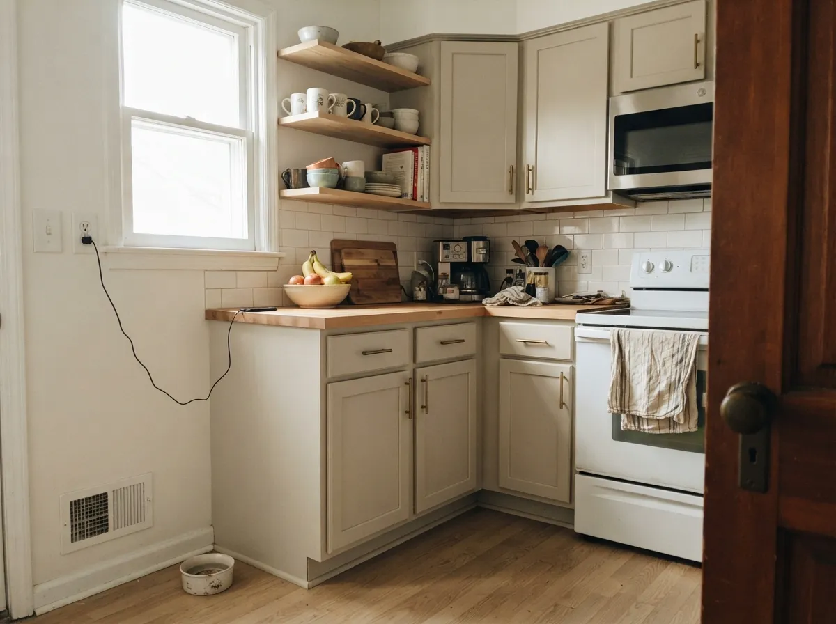
On cabinets it reads as a whisper of gray sophistication rather than a full greige commitment — pairs cleanly with pale oak and unlacquered brass. Satin, urethane-fortified cabinet enamel; two coats minimum since it's a light color going over primer.
Low, filtered daylight and warm lamps at night are exactly the conditions this color wants. It stays quiet rather than going flat, which is the point in a room meant to be restful.
This is a whole-house neutral by design: quiet enough to run wall-to-wall without picking a fight with any room's furniture or flooring. Keep sheen consistent room to room so the color doesn't appear to shift with the light change alone.
Semi-gloss Foggy Day trim under a slightly deeper wall color reads soft, not stark. Pairing it with a much brighter separate trim white is the single most common regret with this color — see the fails section.
On stucco it reads warmer and less clinical than a stark exterior white, which is why Dunn-Edwards' own market leans on colors like this. Just expect full, unfiltered Southwest sun to read it noticeably brighter and flatter than the shaded north elevation of the same house — walk the whole exterior with a sample before committing.
Your Light Is the Risk
Filtered or overcast light is where the misty greige actually shows — enough gray to register, enough warmth to stay soft.
Hard, unfiltered sun washes the low-chroma color toward plain white. The gray the name promises can disappear entirely.
Warmer and slightly cream-tinted at the sun hours, quieter gray-neutral the rest of the day. The shift is subtle, not dramatic.
2700K lamps keep the small amount of warmth it has. Cool LEDs flatten it further — there's very little color reserve to lose.
Most complaints about Foggy Day are a light mismatch. Upload a photo of your actual room and see it on your walls — then ask for the same wall in north light or evening lamps before you buy a single sample.
Need It From Another Brand?
Any paint counter can custom-tint Dunn-Edwards DE6226 directly. If you would rather stay in one brand's own deck, these are the closest stock matches, measured as ΔE2000. Under 2 is a difference you will not see on the wall.
| Brand | Closest color | ΔE | LRV | |
|---|---|---|---|---|
| Sherwin-Williams | Toque WhiteSW 7003 · Sherwin-Williams | 0.5 | 76 | Color page → |
| Behr | Weathered WhiteHDC-NT-21 · Behr | 0.6 | 77 | Color page → |
| Benjamin Moore | Seapearl961 · Benjamin Moore | 1.6 | 76 | Color page → |
| Valspar | Barley8007-12F · Valspar | 0.5 | 77 | Color page → |
| PPG / Glidden | Mountain GrayPPG1021-1 · PPG / Glidden | 0.5 | 76 | Color page → |
| Glidden | Mountain GrayPPG1021-1 · Glidden | 0.5 | 77 | Color page → |
Similar Dunn-Edwards Colors
The nearest shades to Foggy Day within Dunn-Edwards's own range, ranked by perceptual color distance — useful when you want the same look a touch lighter, darker, or warmer.
WCAG 2.1: AA is 4.5 : 1 for normal text, 3 : 1 for large text, AAA is 7 : 1.
Foggy Day vs the Colors You're Also Considering
Every Foggy Day sample board has the same rivals on it. The numbers show the real lightness gap — then it comes down to which risk you would rather live with.
Pick this when you want the quieter, grayer version with less visible cream.
Dunn-Edwards DEW341 · LRV 83Swiss CoffeePick this if you want the warmer, creamier member of Dunn-Edwards' own near-white trio — the Southwest's default off-white.
Pick this when you want a hair more warmth and body than a flat mirror-white gives you.
Benjamin Moore OC-151 · LRV 84WhitePick this for the truly colorless, no-opinion white that mirrors whatever sits next to it.
Pick this if you're already buying Dunn-Edwards and want to stay in-brand for touch-ups and matching.
Sherwin-Williams SW 7008 · LRV 82AlabasterPick this if your painter doesn't stock Dunn-Edwards — a near-identical warm-quiet neutral from a brand with wider reach.
Pick this for the lighter, quieter version that stays closer to white even when the light is generous.
Benjamin Moore OC-23 · LRV 74Classic GrayPick this for a neutral with actual visible gray weight — Classic Gray holds its color where Foggy Day nearly disappears in bright rooms.
Foggy Day (DEW343) sits at an LRV of 80, near the top of the usable white range. Historic White (DET653, LRV 79) is almost as light but reads a touch more traditional and slightly deeper in warmth, making it a good swap when Foggy Day feels too clean for an older home.
Whisper Gray (DEC785, LRV 73) is noticeably darker and, as the name suggests, leans grayer and cooler. Choose it when you want more of a greige than a warm white, or when a bright room needs something with a bit more color on the wall.
Trade Winds (DET647, LRV 76) falls between them, a soft warm neutral that shows more depth than Foggy Day without going gray. If you love Foggy Day's warmth but want the walls to feel slightly more grounded, Trade Winds is the closer, calmer step down.
Foggy Day Coordinating Colors
The rule for coordinating with Foggy Day is simple: it does almost none of the work itself, so let the pairing carry the character. It flatters pale wood, warm whites, and near-black accents, and it stays out of the way of almost anything you put next to it — that's both its strength and the reason it needs a confident partner somewhere in the room.
Foggy Day's Story: A Near-White Family Built for Southwest Sun
Foggy Day isn't a Color of the Year or a viral internet color — it's a working member of Dunn-Edwards' own graduated trio of numbered near-whites (Whisper, Swiss Coffee, Foggy Day), each one a small step apart in warmth and depth. That's the honest context: this color was built to be one dependable option in a lineup, not a headline color, and it does exactly what a well-designed member of a lineup should — it fills the quiet, grayer slot so the warmer ones (Swiss Coffee) and the brighter ones don't have to cover every job.
The tension worth knowing before you buy: Dunn-Edwards' own copy calls it a warm-based greige, and its own palette system files it under Cool Neutrals. Both are true at once, because the color has almost no saturation to lean either way — Munsell chroma 0.4, close to the scale's floor. That's unusual restraint for a paint color, and it's the whole reason this review keeps circling back to light. With so little color of its own to hold onto, Foggy Day is more responsive to daylight than almost any other neutral in this deck, for better in a filtered room and for worse in direct Southwest sun.
Foggy Day With Wood Tones and Floors
This is an easy pairing question because the color asks so little of its partner. Pale oak, whitewashed wood, and light limestone all sit comfortably against Foggy Day — the low chroma means the wood does the visual work and the wall simply stays out of the way. Warmer honey oak still reads fine; there isn't enough color in the paint to clash the way a more saturated greige can.
The one flooring that flattens the effect is a very cool, blue-gray-washed floor in a bright room: with so little warmth of its own to offer, Foggy Day can end up reading closer to that same cool gray rather than holding its own quiet, warmer note. If that's your floor, sample a large swatch in the room's actual light before committing to the whole house.
Three Ready Palettes Built on Foggy Day
A color is never alone on the wall. These are complete combinations in the 60-30-10 pattern, with the reason each one holds together. Every one opens in the visualizer.
One color at two sheens keeps a house calm room to room without introducing a second neutral to negotiate with; the near-black door supplies the single deliberate dark note the scheme needs.
Try this palette in your roomSwiss Coffee's warmth keeps the walls glowing while Foggy Day cabinets add a whisper of gray sophistication without the room going full greige; Kendall Charcoal on the island grounds it in one dark, confident move.
Try this palette in your roomFoggy Day's quiet warmth is calm enough to let a genuinely moody accent do the talking; Alabaster on the ceiling keeps the plane bright, and Sleepy Hollow gives the one point of personality the room actually needs.
Try this palette in your roomFoggy Day FAQ
Is Foggy Day warm or cool?
Both, in a small way — Dunn-Edwards describes it as a warm-based greige but files it under Cool Neutrals in its own palette system. In practice there is so little saturation (Munsell chroma 0.4) that it reads as a very quiet, close-to-neutral gray-cream rather than clearly warm or clearly cool.
Foggy Day or Dunn-Edwards Swiss Coffee?
They're siblings in the same near-white family. Swiss Coffee (LRV 83) is warmer and more visibly creamy; Foggy Day (LRV 71) is the quieter, grayer one. If your room already has warm wood and brass, Swiss Coffee will glow more; if you want something closer to a true neutral, Foggy Day is the pick.
Does it work on exteriors?
Yes, and it's a genuine strength — on Southwest stucco it reads warmer and softer than a stark white. Expect the sunny side of the house to look noticeably flatter and brighter than a shaded elevation; walk the whole exterior with a sample before ordering paint.
Is it good for kitchen cabinets?
Yes, especially if you want a whisper of gray rather than a full greige commitment. It pairs cleanly with pale oak and unlacquered brass. Use a satin, urethane-fortified cabinet enamel and two coats — it's a light color that needs even coverage over primer.
What trim white goes with Foggy Day walls?
Foggy Day itself in a higher sheen is the safest choice — it avoids the dingy-wall effect a much brighter separate trim white can cause. If you want visible contrast, go for a warmer trim white rather than a starker, brighter one.
Will it actually look 'foggy' or gray on my walls?
Only in the right light. In soft, indirect or overcast daylight, yes — that's when the low-chroma greige is most visible. In direct, strong sun (Dunn-Edwards' own Southwest market), the color's minimal saturation washes toward plain white, and the misty gray effect can disappear almost entirely.
Have you painted with Foggy Day?
Rate it — one tap helps the next reader decide.
Ask a Question