Room Colors · Blue Shutters
8 Best Blue Shutters Paint Colors for 2026
ideas, combinations, and real rooms
8 curated picks from real blue shutterss — with the exact colors, honest reasons why, and the combinations that hold the room together.

Former interior stylist who can spot a green undertone from across a room. Jessica writes the color and mood pieces — what to choose, what pairs, and why your "white" looks pink.
The Fast Answer
Don't want to read 8 picks? These four are the safe answers.

Top Picks for the Blue Shutters
Tap a shade to see the blue shutters in it, then try it on your own room.
Blue Shutters Color Trends 2026 — What's In, What's Out


- Pale Coastal Blue Shutters — Light, chalky coastal blues are cooling off as homeowners lean into darker, more saturated blues with real depth and contrast.
- Blue Shutters, White Siding Only — The all-white-house-plus-blue-shutter formula is giving way to warmer siding pairings that let the blue read richer.
- Matchy Blue Door And Shutters — Making the front door and shutters the exact same blue is losing ground to intentional near-matches that add layering instead.
The 8 Best Blue Shutters Paint Colors
Every pick below is a real rendered blue shutters, not a chip. The lead color first; the swatches are the full scheme in the photo — walls, furniture, textiles, accent.

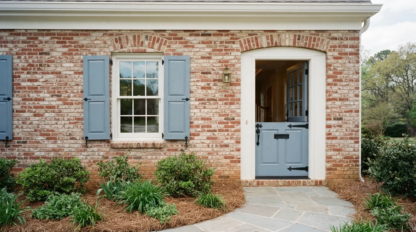
Soft slate blue paint brings a breezy, storybook feel to timeless red brick and crisp white window trim.
Slate blue is a dusty, calming blue with a hint of gray. In this exterior look, soft blue coats the raised-panel window shutters and the charming split Dutch front door. White paint keeps the window casing and upper molding crisp and clean. The entire space feels friendly, welcoming, and relaxed. The combo works because the cool blue effortlessly tempers the warm, earthy tones in the textured brick wall. It is perfect for anyone wanting classic curb appeal with a touch of countryside character.
SEE SEABROOK ON YOUR WALLS →
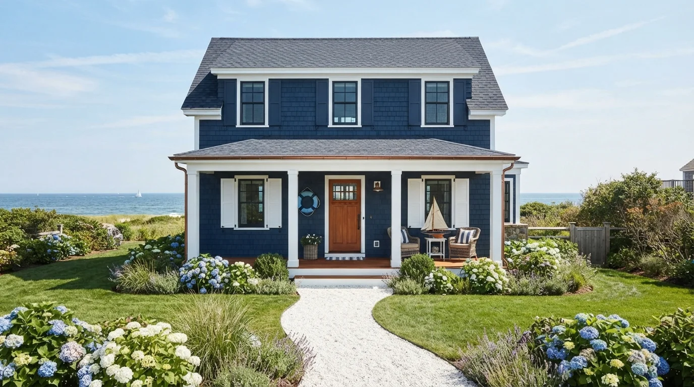
Rich navy shingles paired with bright white trim bring classic seaside charm and timeless, breezy curb appeal.
Deep navy is a bold, maritime dark blue. In this photo, the textured shake siding wears deep navy, framed by bright white trim, window shutters, and front porch railings, with warm wood on the front door and porch decking. The whole house feels crisp, cheerful, and unmistakably coastal. This combination works because bright white creates a sharp, clean outline against deep blue, while warm wood prevents the look from feeling too stark. It is perfect for anyone dreaming of classic Cape Cod cottage style.
SEE SYMPHONY BLUE ON YOUR WALLS →
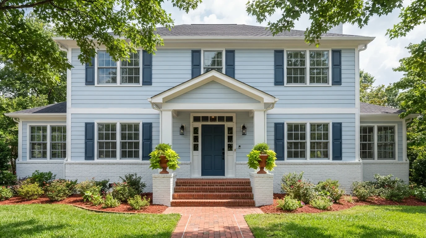
Soft sky blue siding paired with deep navy shutters brings a cheerful, classic coastal feel to this sunny front porch.
Sky blue is a soft, airy pastel blue with a light and breezy charm. In this photo, the fresh blue coats the horizontal siding, while crisp white brightens the brick foundation, columns, and window trim, anchored by rich navy blue on the front door and window shutters. The exterior feels bright, tidy, and incredibly cheerful. The combination works because the deep navy accents add sharp contrast to ground the breezy pastel walls. It is perfect for anyone wanting classic curb appeal with a friendly, coastal personality.
SEE IT ON YOUR WALLS →
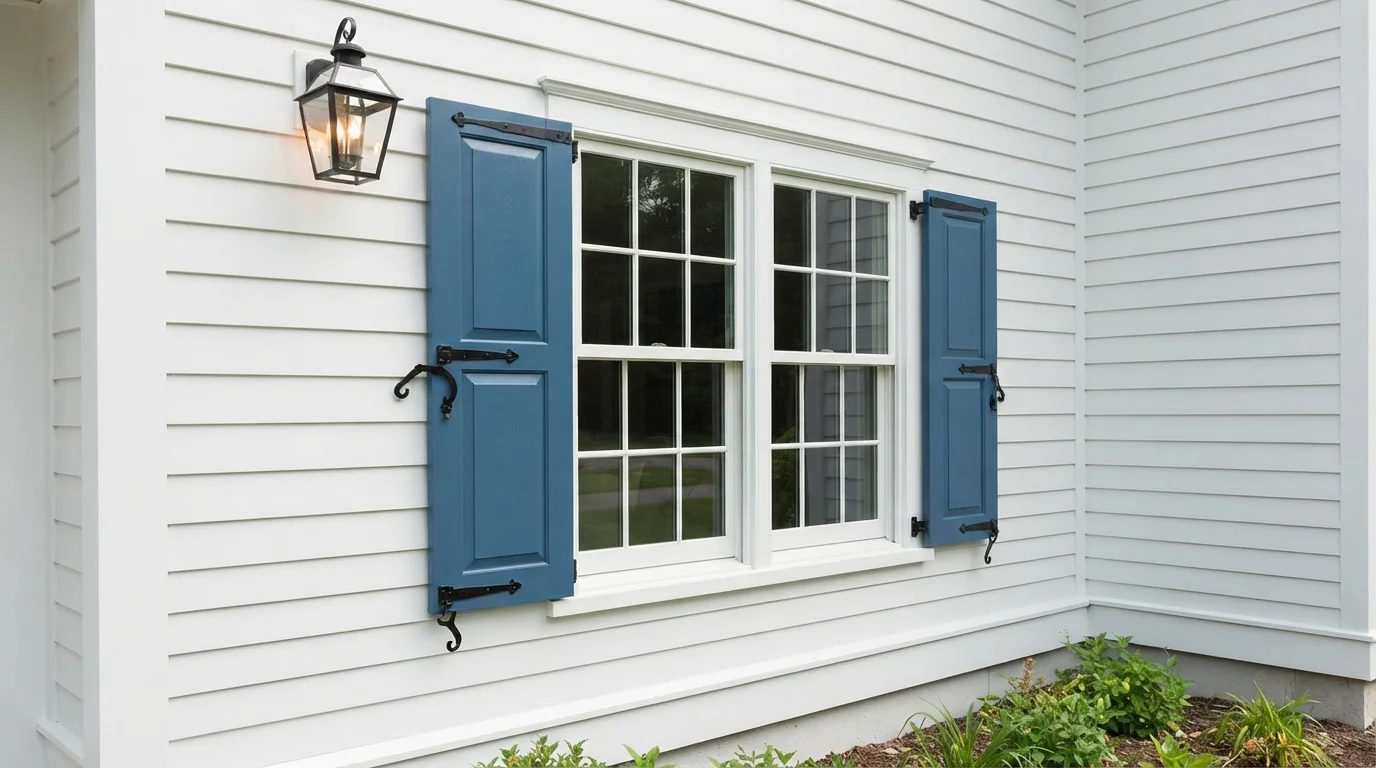
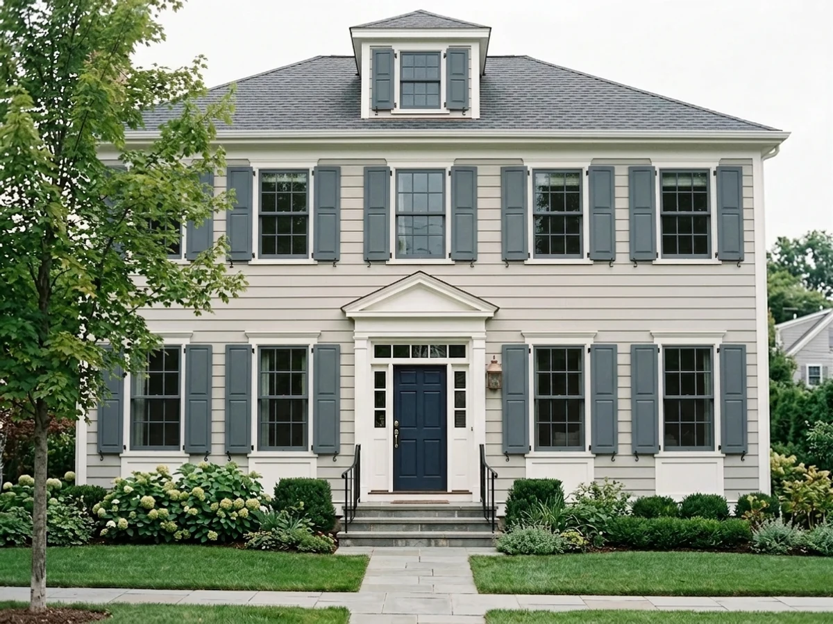
Crisp slate-blue shutters bring breezy coastal energy and bold contrast to bright white horizontal lap siding.
Slate blue is a deep, nautical tone with rich seaside character. In this photo, bold blue covers the exterior shutters, framing a multi-pane glass window against crisp white horizontal lap siding and matte black hardware. The house feels fresh, bright, and wonderfully welcoming from the curb. The pairing works because deep blue creates a sharp, graphic pop against clean white walls. It is a fantastic choice for anyone who loves timeless cottage curb appeal.
SEE SHASTA LAKE ON YOUR WALLS →
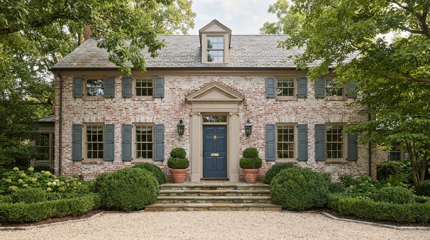
A deep heritage navy door anchors weathered brickwork, slate-gray shutters, and warm creamy stone accents.
Deep navy is a classic, grounded coastal blue. In this exterior, the rich navy door creates a handsome centerpiece against whitewashed red brick walls, creamy taupe window frames, and muted gray-blue shutters. The entire home feels stately, welcoming, and rooted in history. This combination works because the cool blues balance the warm, earthy tones of the weathered brick. It is perfect for anyone wanting traditional curb appeal with timeless, elevated charm.
SEE IT ON YOUR WALLS →
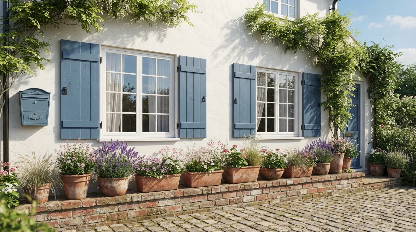
Crisp white plaster and sun-kissed blue shutters pair with rustic terracotta pots to bring effortless European cottage warmth outside.
French blue is a soft, sun-washed cornflower blue with a classic rustic feel. In this photo, clean white stucco walls set the stage for charming blue board-and-batten shutters, painted window ledges, and a vintage mailbox. Weathered terracotta pots filled with purple blooms line the brick ledge below. The whole scene feels breezy, peaceful, and full of easy garden charm. The pairing works because the cool blue stands out crisply against the bright white backdrop and earthy clay pots. It is perfect for anyone dreaming of a romantic countryside garden.
SEE GLASS SAPPHIRE ON YOUR WALLS →
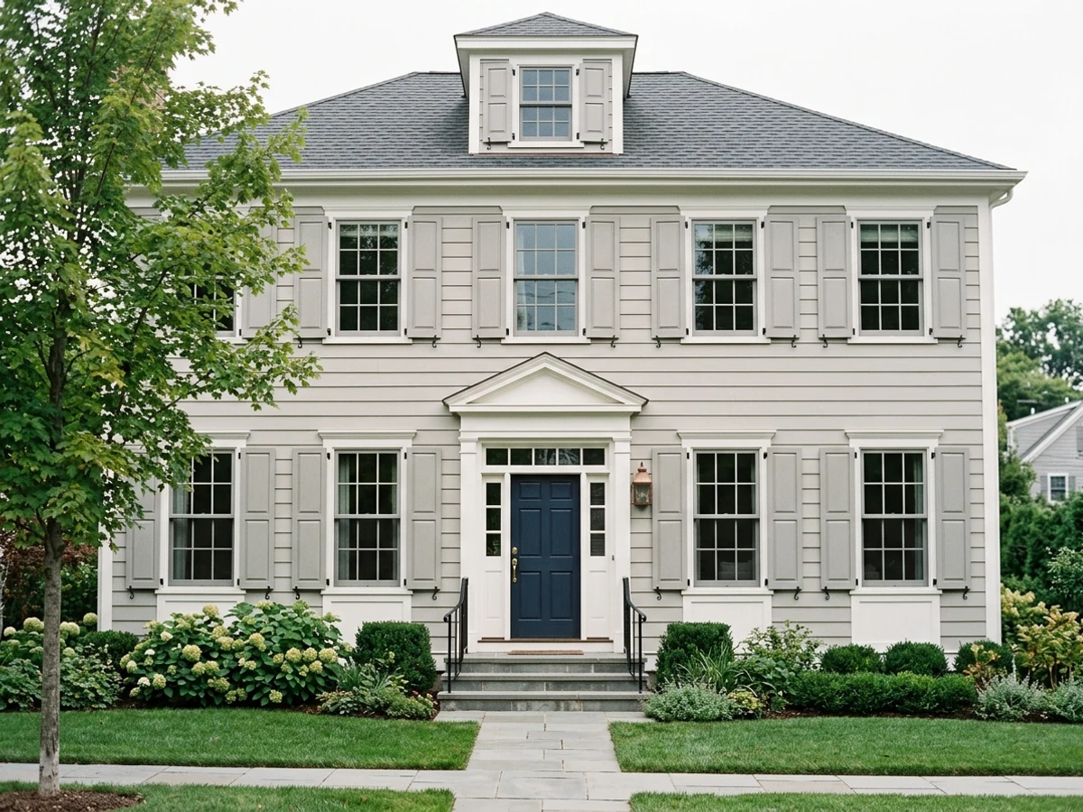
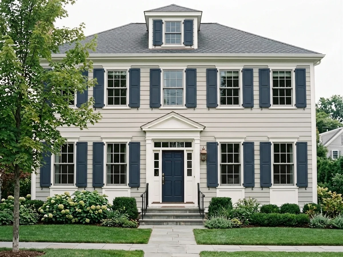
Rich navy shutters give your entryway crisp, classic New England charm.
SEE NAVAL ON YOUR WALLS →
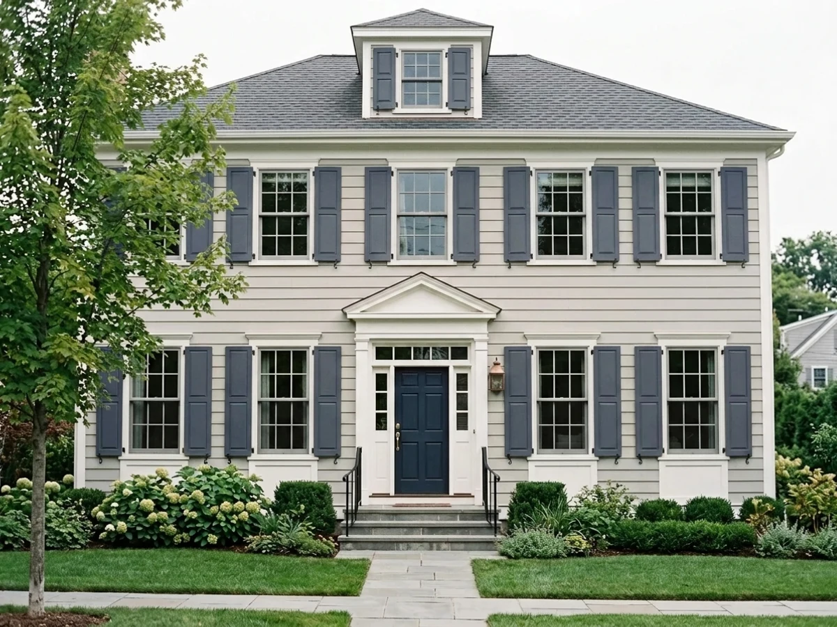
You'll love how this smoky blue adds sophisticated curb appeal to your exterior.
SEE WATERLOO ON YOUR WALLS →Blue Shutters Wall Color Combinations
A wall color never works alone. These are the full schemes from the rooms above — the lead color first, then the supporting colors that make the photo work.
Soft slate blue paint brings a breezy, storybook feel to timeless red brick and crisp white window trim.
TRY THIS PALETTE →Rich navy shingles paired with bright white trim bring classic seaside charm and timeless, breezy curb appeal.
TRY THIS PALETTE →Soft sky blue siding paired with deep navy shutters brings a cheerful, classic coastal feel to this sunny front porch.
TRY THIS PALETTE →Crisp slate-blue shutters bring breezy coastal energy and bold contrast to bright white horizontal lap siding.
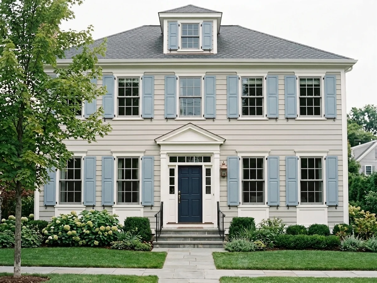
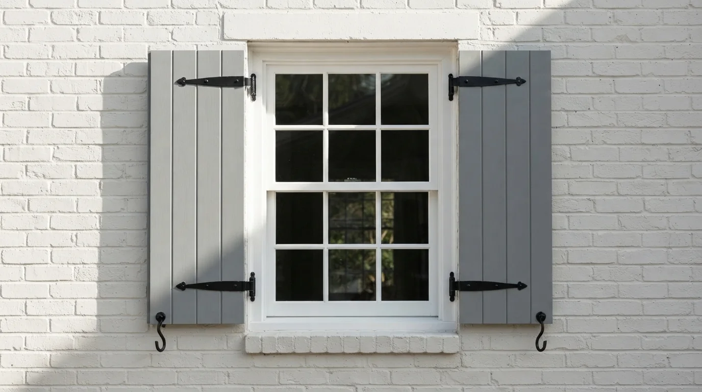
TRY THIS PALETTE →The classic pairing is white or light-gray siding with a dark navy shutter and a black or white door - Naval is built for that look, and it's the same combination that reads as New England from across the street. Slate Tile does a softer, more gray-leaning version of the same idea on a house with warm-gray or greige siding. On beige, tan, or light-yellow siding, skip the near-black options; Provence or Yarmouth Blue keep enough warmth in the blue to sit comfortably next to a warm siding color instead of fighting it, with a white or cream trim keeping the shutters from looking too saturated against the wall.
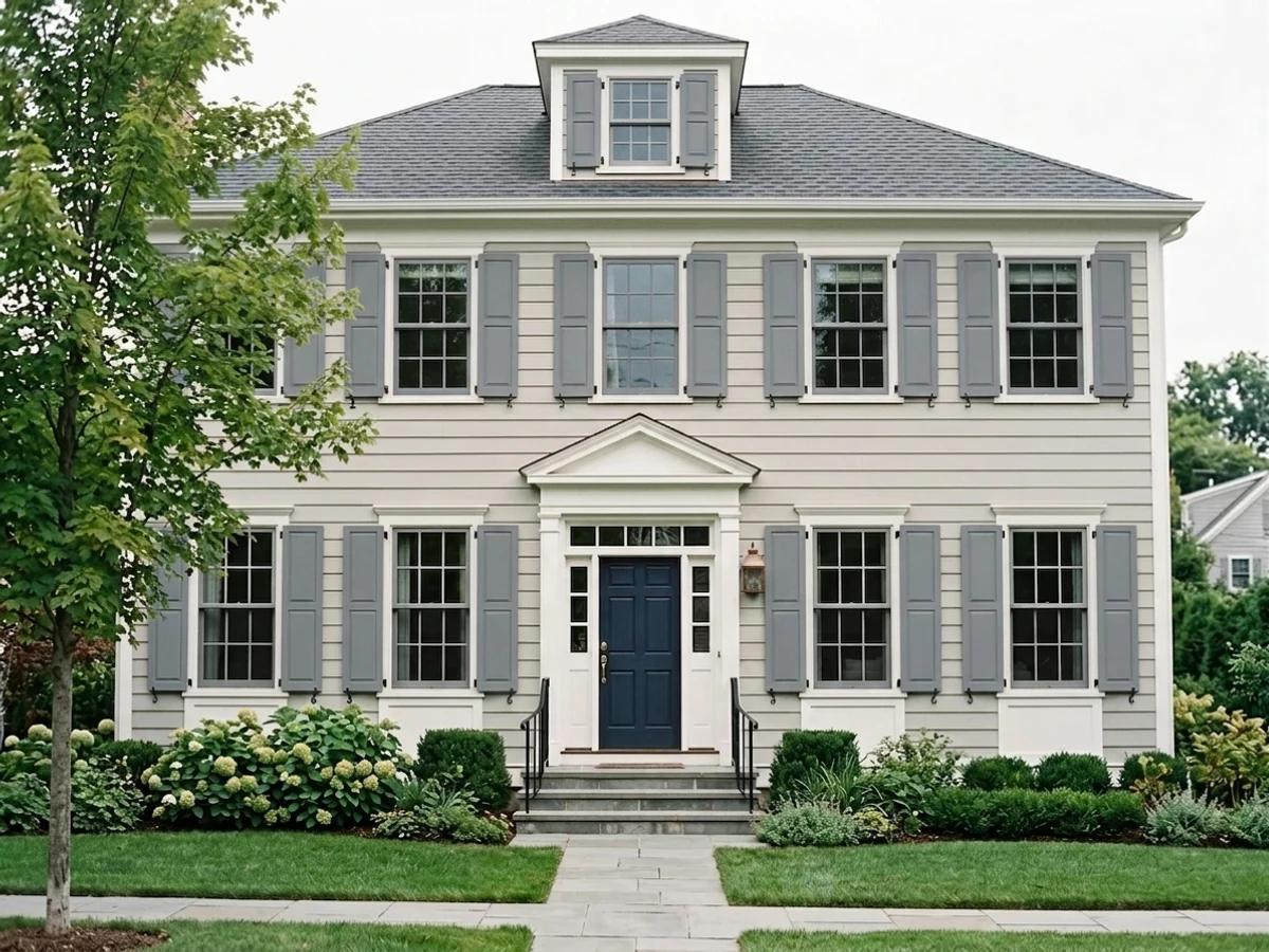
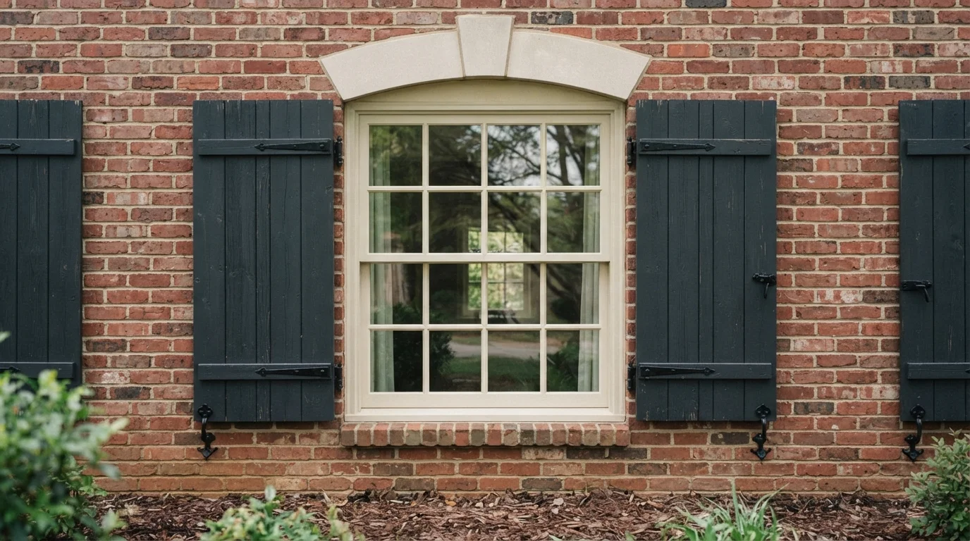
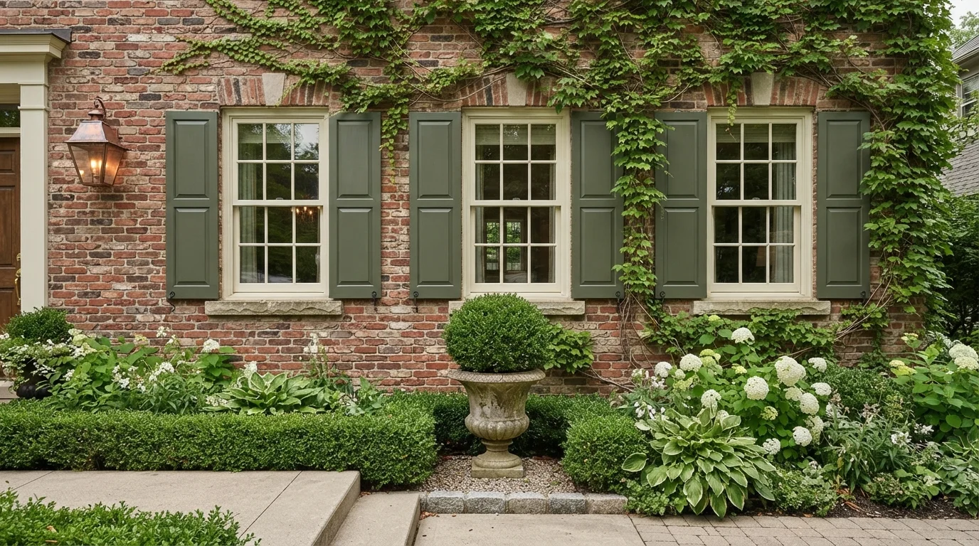
For a brick house, the safer pairing is a dark, slightly muted blue rather than a bright one - Wolf Gray or Slate Tile sit close enough to charcoal that they read as a deliberate choice against red or orange-toned brick, where a brighter blue like Honolulu Blue can clash with the brick's warmth. If the siding itself is already gray or blue-gray, Gothic Purple's dusty undertone gives the shutters a slightly different note than the wall so they don't disappear - lean on a crisp white trim to separate the two rather than letting shutters and siding blend into one gray mass.
More Shutters Color Ideas
Set on a color family already? Each page has its own real rooms and picks.
Light or Dark Blue Shutters Colors?
Go Light (LRV 60+) If…
The room is small, faces north, or has to work at every hour. Light warm colors make it feel bigger and stay calm in evening light — the light you actually live in.
Go Dark (LRV Under 20) If…
You want the cocoon effect and the room has real daylight. Dark works best on one feature wall — or fully color-drenched in a large room with good windows.
Shutters sit close to the wall, so light and dark behave differently here than on a whole facade. A dark pick like Naval (LRV 4) or Slate Tile (LRV 14) reads as a strong graphic line against light siding - white, light gray, beige - and is the choice when you want the shutters to frame the windows rather than blend with them. On darker or busier siding, like brick, stone, or deep gray, the same dark shutters can disappear into the background at a distance, so a mid-tone pick like Upward or Yarmouth Blue (both LRV 39) usually reads better because it keeps enough contrast to still register as blue from the street.
A light pick like Honolulu Blue (LRV 62) is the outlier in this set and it's worth treating as one. At LRV 62 it's closer to a pastel than a traditional shutter navy, so it only works with light siding - white, cream, pale gray - where a soft, low-contrast look is the point. On a darker house it washes out and reads gray instead of blue. If the goal is quiet, classic contrast rather than a beach-house pastel, Wolf Gray or Provence (both LRV 21) sit in the same mid-dark range as most of the other picks and hold their color at a distance the way Honolulu Blue can't.
See It. Love It.
Paint It.
Upload one photo of your blue shutters and try every color on this page on your own walls — in your own light, before you buy a drop of paint.

Hale NavyBeforeChoosing the Right Sheen and Paint for Shutters
Satin is the most commonly recommended sheen for exterior shutters, holding up well across wood, vinyl, and composite materials without showing every surface flaw the way gloss can. Some painters go semi-gloss instead, since a shinier finish adds contrast and makes the shutter's louvers or panel detail more visible from the street. Either way, skip flat or matte finishes outdoors - they don't clean well and won't stand up to weather the way a wood or composite shutter needs.
Material matters as much as sheen. Wood and composite shutters take standard exterior acrylic paint the same way trim does, so a dark pick like Naval or Slate Tile goes on without issue. Vinyl shutters need paint labeled specifically as vinyl-safe. Standard dark paint absorbs more heat than vinyl siding was engineered to handle, and enough heat can warp or bow the shutter. Vinyl-safe formulas use reflective pigment technology that lets you go as dark as Naval's LRV 4 without that risk - check the can before assuming any exterior paint will work.
Common Mistakes with Blue Shutters
The most common mistake is picking a blue in isolation, on a swatch or a screen, without checking it against the actual siding. A blue that looks great next to white paper can turn muddy against a warm beige wall or fight a red-brick facade - Wolf Gray and Slate Tile were built for exactly that brick pairing because their gray undertone keeps them from clashing, while a brighter option like Honolulu Blue usually doesn't work there.
The second mistake is choosing a dark shutter color for vinyl without checking whether it's a vinyl-safe formulation - a navy that's fine on wood can warp vinyl shutters in direct summer sun. The third is matching the shutters too closely to the siding value, so they disappear instead of framing the window; if the house is already a mid-tone gray or blue, going a shade or two darker (Slate Tile over Upward, for example) keeps the shutters doing their job as a visual frame rather than blending into the wall.
Matching Shutters to Your Front Door and Trim
Shutters and the front door don't need to match - they need to coordinate. A dark navy shutter like Naval reads well with a black, white, or even a bright red door, since the strong contrast is doing the work either way. A softer, mid-tone shutter like Yarmouth Blue or Provence pairs more naturally with a door in a warm neutral or a muted complementary color, since two saturated colors that close in value can compete rather than support each other.
Trim is usually the piece that ties everything together. White or cream trim gives any of these blues, from the near-black Naval to the pastel Honolulu Blue, a clean edge to sit against, which is why it's the default recommendation regardless of which blue you pick. If the siding is already a warm off-white or cream, keep the trim in that same family rather than switching to a stark white, so the shutters read as the intentional pop of color rather than one more mismatched element.
About Blue Shutters Paint Colors
Shutters are the smallest color decision on a house, but the one people notice first pulling into the driveway. Blue reads classic against nearly every siding color, from crisp Sherwin-Williams Naval (SW 6244, LRV 4) doing a deep, ink-navy version of the New England look, to Benjamin Moore Honolulu Blue (2066-60, LRV 62) turning a plain white or gray facade into something closer to a beach cottage. Because shutters cover only a few square feet each, they can hold intensity a whole wall never could - that's why the LRVs across this list swing from 4 to 62 and still all read clearly as blue.
The right paint also depends on what the shutters are made of and what sits next to them. Wood shutters take full-strength pigment the same way trim does, so Naval or Sherwin-Williams Slate Tile (SW 7624, LRV 14) go on dark and stay dark. Vinyl shutters are pickier - the material itself limits how dark you can go without a vinyl-safe formulation, which is part of why a mid-tone option like Sherwin-Williams Upward (SW 6239, LRV 39) or Benjamin Moore Yarmouth Blue (HC-150, LRV 39) shows up on so many vinyl-shuttered houses. The color still reads as blue without pushing into the heat-absorption problem pure navy can cause on vinyl.
A few of the picks lean away from a "pure" blue on purpose. Behr Gothic Purple (N110-4, LRV 25) is a dusty blue with enough gray-violet in it to look almost slate in overcast light and more purple in direct sun - a pick for anyone who wants blue shutters that don't look like every other house on the street. Benjamin Moore Wolf Gray (2127-40, LRV 21) sits right at the blue-gray boundary, a safe choice that still reads as color rather than neutral. Behr Provence (ICC-74, LRV 21) is the warmest of the group, a French-countryside blue leaning toward periwinkle rather than navy or slate.
The Questions Everyone Asks
What color should I paint my blue shutters?
If you want one answer, start with the safe picks above — Naval, Waterloo, Shasta Lake, Seabrook. They read well in any light and survive furniture changes. Then check the light: strong afternoon sun wants a step cooler, a north-facing room wants a step warmer.
what color house goes with blue shutters?
Blue shutters work with almost any siding, but the shade of blue should match the siding's warmth. White, light gray, and beige houses pair well with a dark navy like Sherwin-Williams Naval or a softer mid-tone like Sherwin-Williams Upward. Brick and other warm-toned siding do better with a muted, gray-leaning blue such as Benjamin Moore Wolf Gray, since a bright blue can clash with brick's orange undertone. A bright, coastal-style blue like Benjamin Moore Honolulu Blue is best kept to light siding.
do shutters have to match the front door?
No. Shutters and the front door don't need to be the same color - they just need to coordinate. A common approach pairs a dark navy shutter like Naval with a black or white door, or a softer blue like Yarmouth Blue with a door in a complementary neutral. What matters more than matching is that the shutter color, door color, and trim don't all compete at the same intensity.
what sheen should I use to paint exterior shutters?
Satin is the most common recommendation for shutters, balancing durability with a clean look across wood, vinyl, and composite materials. Some painters use semi-gloss instead, since the extra shine adds contrast and shows off louvers or panel detail from the street. Skip flat or matte finishes outdoors - they won't hold up to weather and cleaning the way an exterior-rated satin or semi-gloss will.
can you paint vinyl shutters a dark color like navy?
Yes, but only with paint labeled vinyl-safe or formulated specifically for vinyl. Standard dark paint absorbs more heat than vinyl was engineered to handle, and enough heat can warp or bow the shutter in direct sun. Vinyl-safe formulas use reflective pigment technology that lets you go as dark as Naval (LRV 4) without that risk, so check the can before assuming any exterior paint will work on vinyl.
should shutters be lighter or darker than the house?
Usually darker. Shutters read best as a frame around the windows, and that only works with enough contrast against the siding - a dark pick like Slate Tile or Naval against white or light-gray siding is the classic look. The exception is a light-colored house paired with an even lighter, pastel blue like Honolulu Blue, which trades contrast for a softer, coastal feel instead.
What two-color combination works best in a blue shutters?
The reliable pattern is a quiet main color plus one deep accent on a single wall. Keep trim and ceiling in one warm white so the two colors are the only event in the room — the combination cards above show complete schemes from real rooms.
What colors make a blue shutters look bigger?
High-LRV, slightly warm colors — LRV 60–75 is the sweet spot. Paint the walls and trim close to the same light color so the corners blur, and keep the ceiling white. Stark cool white actually works against you; it creates hard shadows that show the room's edges.

Ask a Question