Room Colors · Green Shutters
8 Best Green Shutters Paint Colors for 2026
ideas, combinations, and real rooms
8 curated picks from real green shutterss — with the exact colors, honest reasons why, and the combinations that hold the room together.

Former interior stylist who can spot a green undertone from across a room. Jessica writes the color and mood pieces — what to choose, what pairs, and why your "white" looks pink.
The Fast Answer
Don't want to read 8 picks? These four are the safe answers.

Top Picks for the Green Shutters
Tap a shade to see the green shutters in it, then try it on your own room.
Green Shutters Color Trends 2026 — What's In, What's Out


- Classic Hunter Green Shutters — Crisp, cool hunter green is fading next to warmer, earthier sage and olive greens that feel less like a stock builder color.
- Green Shutters With Cool Gray Siding — Pairing green shutters with cool blue-gray siding is reading dated as warm neutral siding takes over in 2026.
- Bright Kelly Green Shutters — Saturated, primary-leaning greens are losing out to the muted, grayed-down greens borrowed from the current interior color trend.
The 8 Best Green Shutters Paint Colors
Every pick below is a real rendered green shutters, not a chip. The lead color first; the swatches are the full scheme in the photo — walls, furniture, textiles, accent.

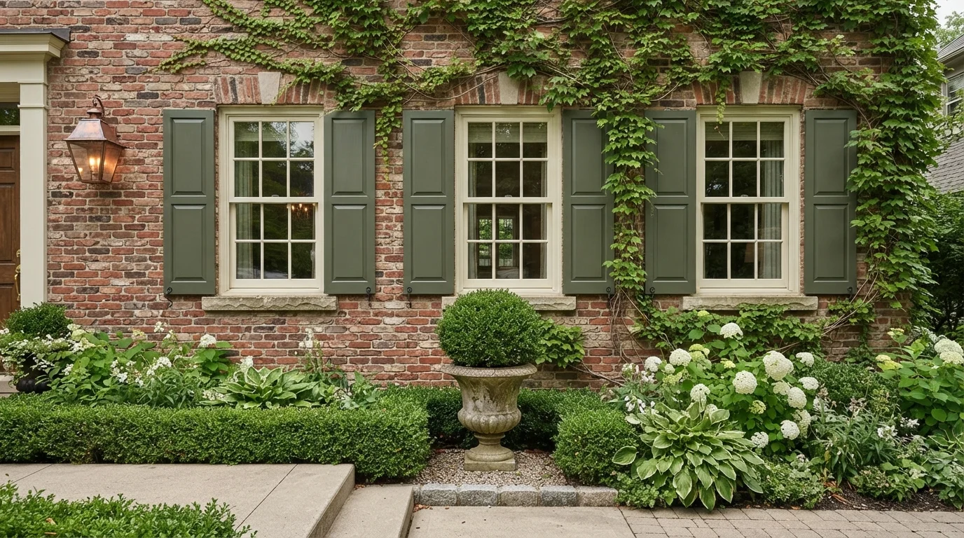
Soft sage brick and rich mossy shutters blend effortlessly with lush garden greenery and romantic climbing ivy.
Sage green is a soft, muted grey-green with a grounded, earthy look. In this photo, sage green covers the exterior brick siding, paired with deeper olive green on the paneled shutters and soft cream on the window frames. The exterior feels calm, timeless, and welcoming. Layering tones of green works naturally because they blend right into the garden plants and soften the masonry lines. It is perfect for anyone who loves an understated, classic cottage style.
SEE BIG FISH ON YOUR WALLS →
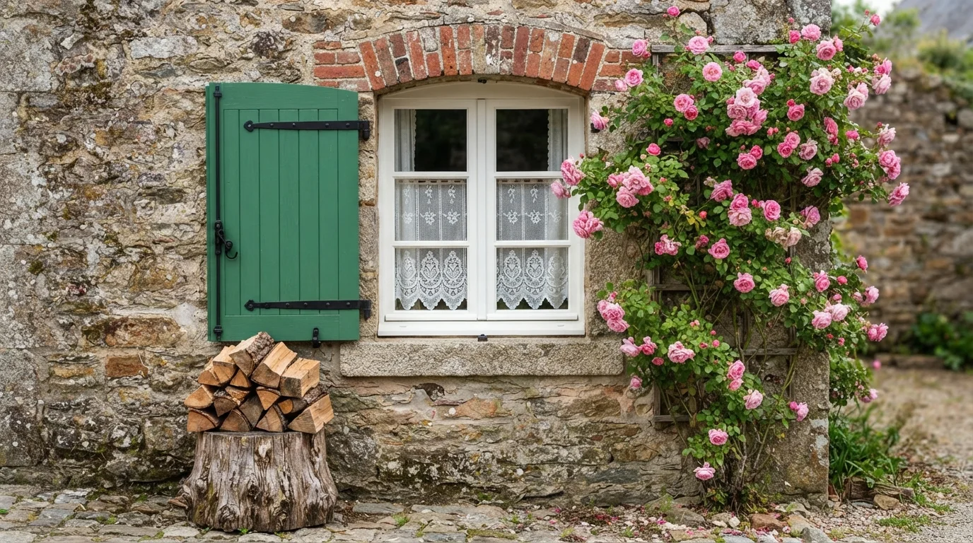
Vibrant green shutters pop against weathered stone and delicate pink roses, capturing timeless countryside warmth.
Kelly green is a lively, botanical shade full of crisp energy. Here, the cheerful green covers the exterior window shutters, paired with bright white window trim and aged stone walls. The setting feels romantic, welcoming, and relaxed like an afternoon in a cottage garden. The combo works because the leafy green color naturally connects the rustic stone architecture to the climbing pink roses beside it. It is a fantastic choice for anyone looking to add storybook personality to their home exterior.
SEE NILE GREEN ON YOUR WALLS →
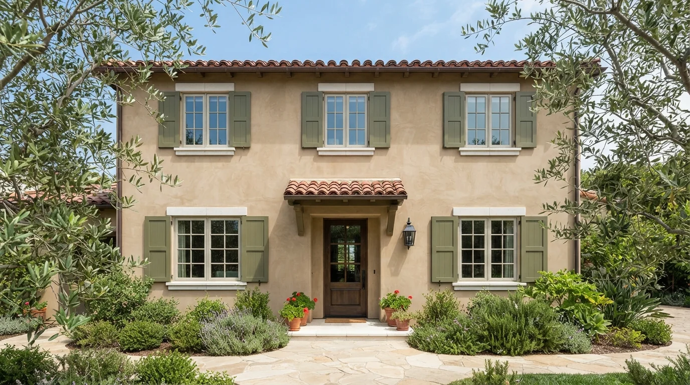
Sun-drenched stucco and deep olive shutters create an inviting, countryside warmth under classic terracotta tile roofs.
Olive green is a deep, earthy leaf color. In this photo, rich olive covers the window shutters and matching window sashes against warm sand stucco walls. The facade feels calm, grounded, and sun-kissed. This combination works because naturals always go together, blending seamlessly with the surrounding olive trees and red clay roof tiles. It is perfect for homeowners who want timeless Mediterranean curb appeal that feels right at home in nature.
SEE BABY VEGETABLE ON YOUR WALLS →
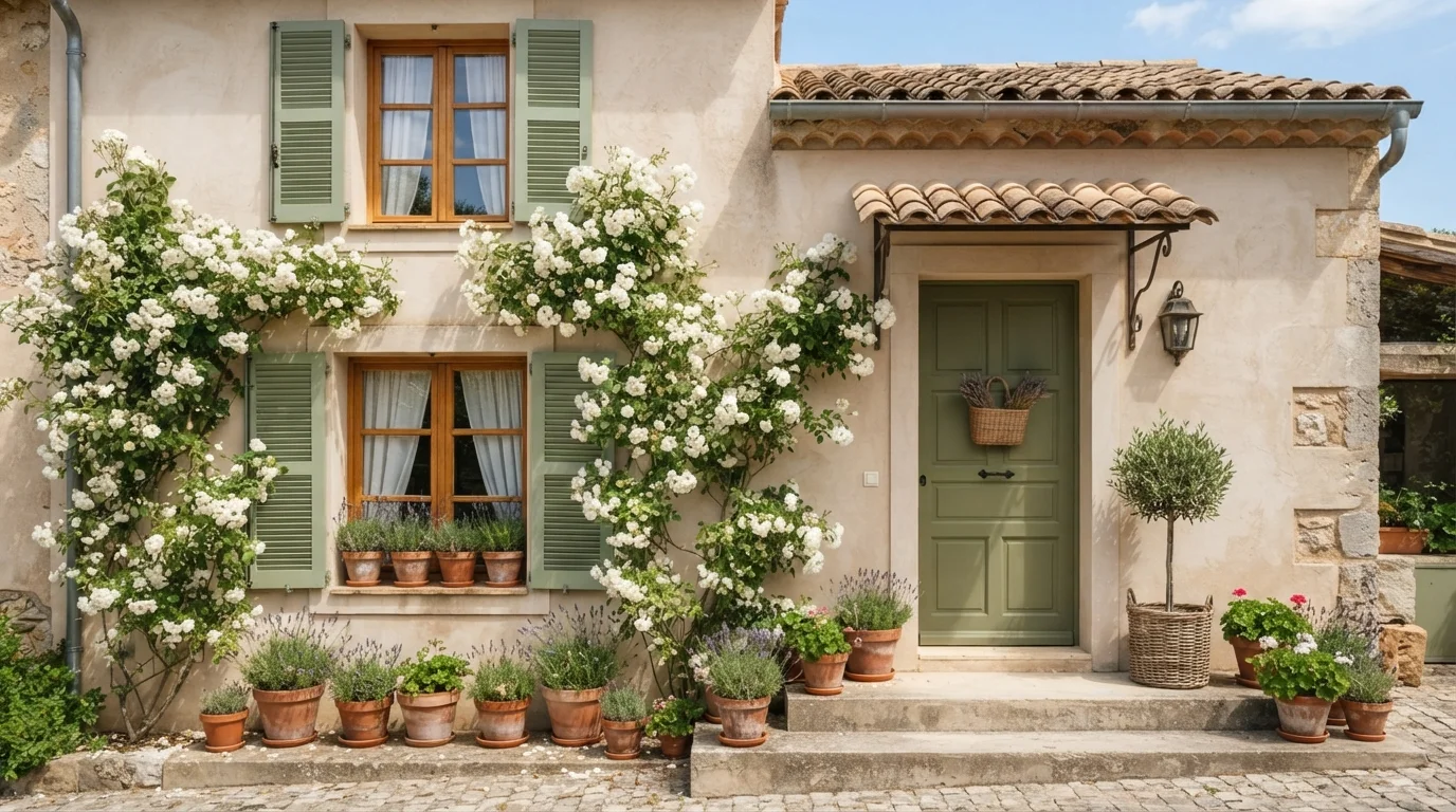
Warm sandy stucco meets soft sage shutters and fragrant lavender for an instantly relaxing French country cottage feel.
Sage green is an earthy, muted herbal green with a gentle gray cast. In this exterior, it coats the slatted window shutters, while a deeper olive green accents the front door against warm sand-colored stucco walls. The entry feels peaceful, welcoming, and bathed in sunshine. This combination works because earthy greens naturally complement warm terracotta pots and sandy stone. It is perfect for anyone wanting a relaxed Mediterranean or European country look for their home exterior.
SEE LOUNGE GREEN ON YOUR WALLS →
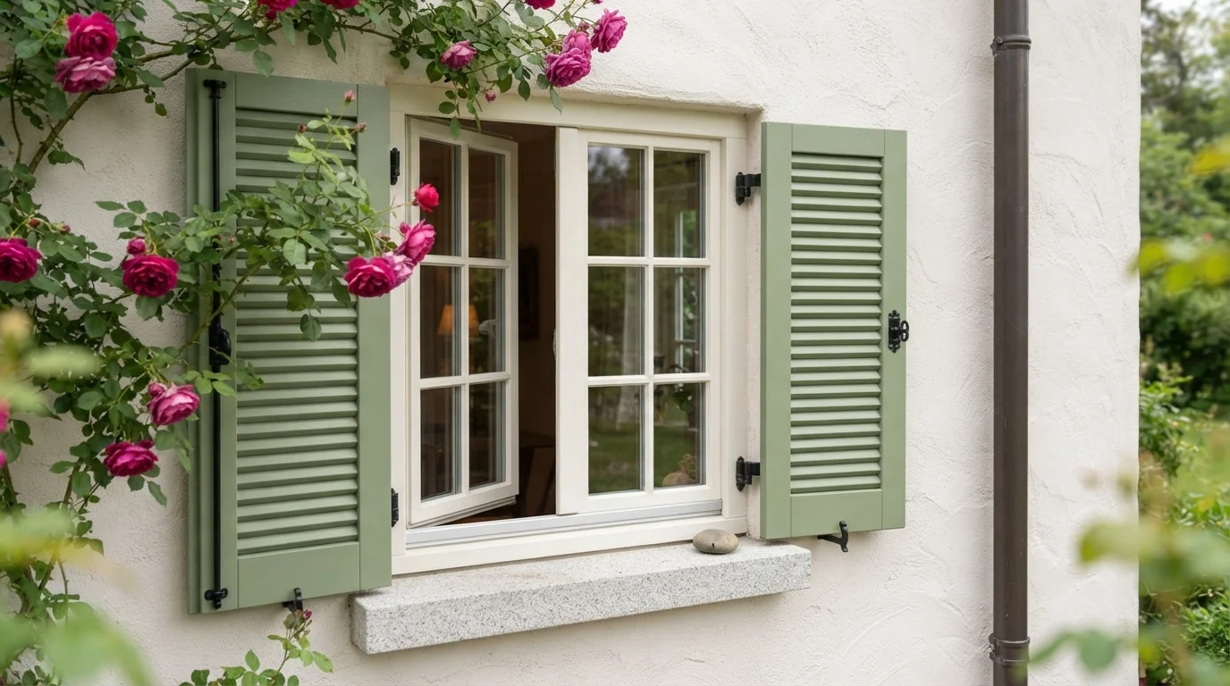
Fresh sage green shutters and romantic climbing pink roses create a serene, timeless European cottage exterior.
Sage is a gentle, earthy green with soft gray notes. In this exterior look, cheerful sage green graces the louvered window shutters against clean white stucco walls, paired with warm off-white trim around the glass. The space feels charming, peaceful, and wonderfully inviting. This classic combination works because the muted green mirrors natural garden foliage while letting the vibrant pink roses pop beautifully. It is perfect for anyone wanting a storybook cottage look with timeless, relaxed curb appeal.
SEE IT ON YOUR WALLS →
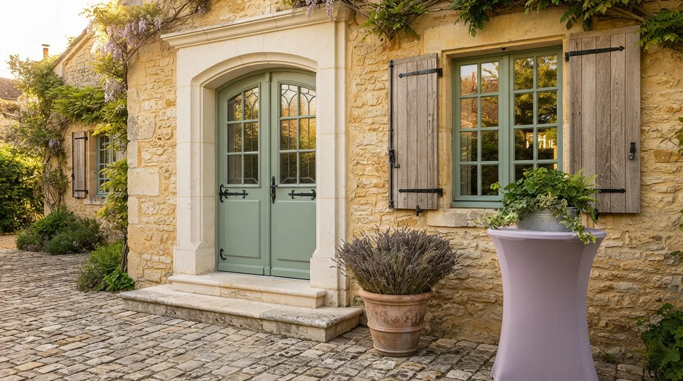
Sun-baked honey stone and gentle sage woodwork mingle with potted lavender for an effortlessly breezy European countryside look.
Sage green is a soft, earthy herb green with gentle gray notes. Here, breezy sage coats the paneled double front doors and rustic wooden shutters against textured honey limestone walls. The whole entrance feels relaxed, peaceful, and sun-warmed. This combination works because cool botanical greens create an effortless natural contrast with warm golden stone and terracotta pottery. It is ideal for anyone looking to bring timeless European village charm to their front porch or garden entrance.
SEE IT ON YOUR WALLS →
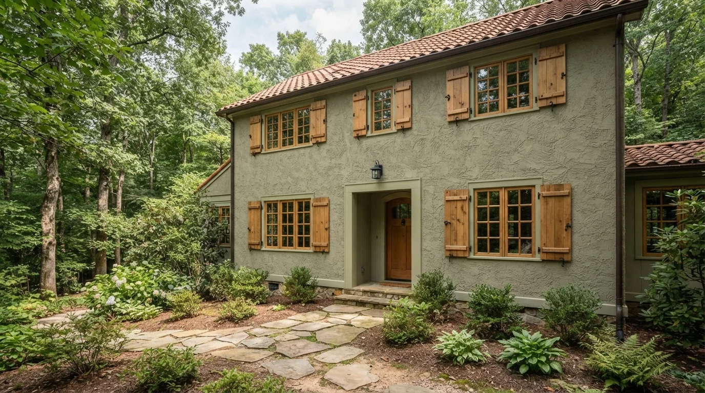
Textured sage green stucco pairs with warm wood shutters for a tranquil, European countryside retreat feel.
Sage is a soft, muted green inspired by nature. In this exterior, gentle sage coats the heavily textured stucco walls while a slightly lighter green accents the window and door surrounds, set off by warm honey wood shutters. The home feels remarkably peaceful, cozy, and grounded. This combo works because soft greens naturally harmonize with untreated wood tones and forest greenery. It's perfect for anyone wanting a storybook cottage look that blends into the landscape.
SEE RUSSELL GREEN ON YOUR WALLS →
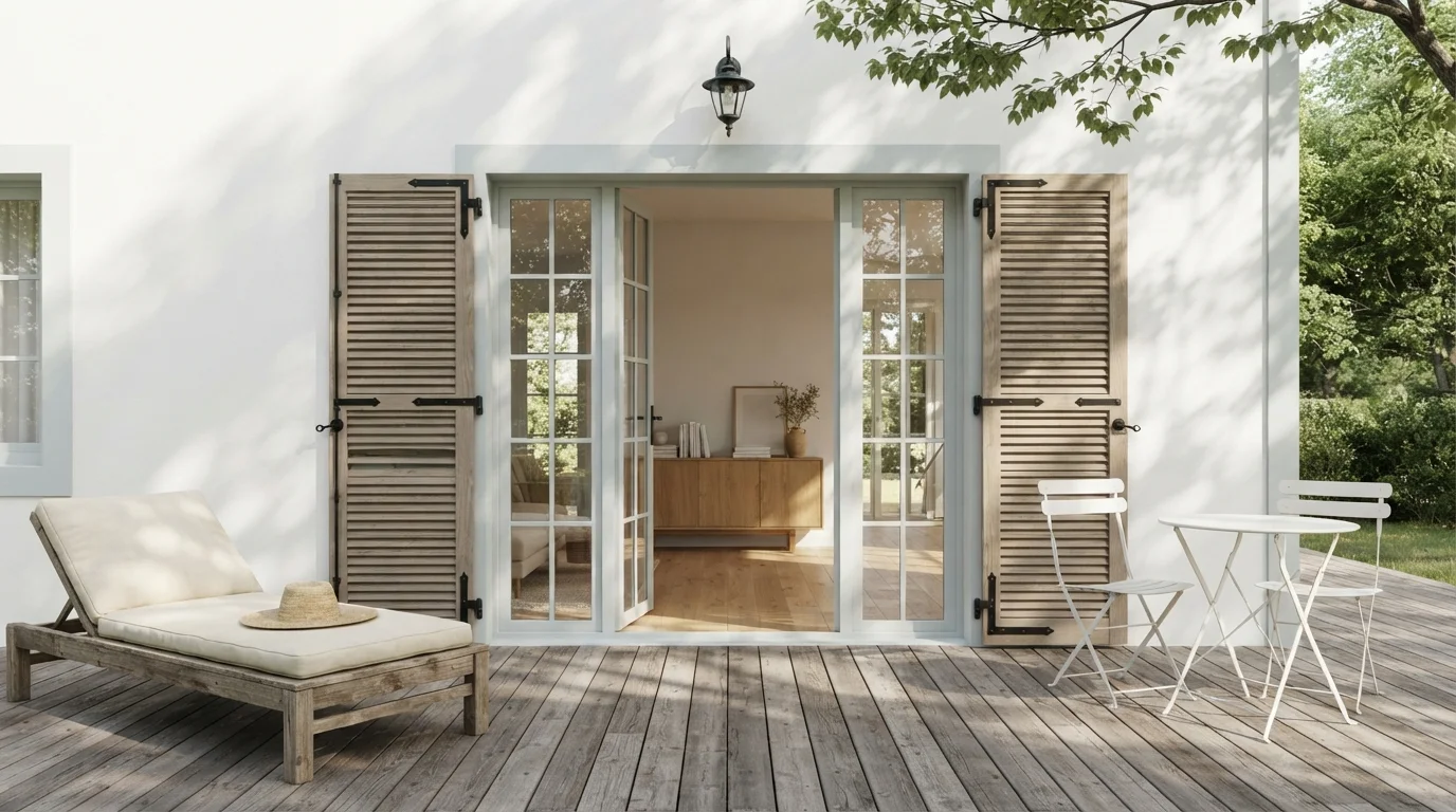
Gentle sage shutters against sunlit white stucco create a peaceful, European-inspired garden terrace with effortless charm.
Sage is a soft, earthy green with quiet grey notes. In this outdoor haven, muted sage paint covers the classic louvered shutters, framing bright white stucco walls and pale off-white French door trim. The whole setting feels calm, breezy, and deeply relaxing. This look works because the organic greens naturally echo surrounding garden leaves while contrasting cleanly with the sun-drenched facade. It is perfect for anyone dreaming of a timeless, romantic European courtyard.
SEE INCOGNITO ON YOUR WALLS →Green Shutters Wall Color Combinations
A wall color never works alone. These are the full schemes from the rooms above — the lead color first, then the supporting colors that make the photo work.
Soft sage brick and rich mossy shutters blend effortlessly with lush garden greenery and romantic climbing ivy.
TRY THIS PALETTE →Vibrant green shutters pop against weathered stone and delicate pink roses, capturing timeless countryside warmth.
TRY THIS PALETTE →Sun-drenched stucco and deep olive shutters create an inviting, countryside warmth under classic terracotta tile roofs.
TRY THIS PALETTE →Warm sandy stucco meets soft sage shutters and fragrant lavender for an instantly relaxing French country cottage feel.
TRY THIS PALETTE →White or cream siding with black or dark bronze door hardware pairs cleanly with Louisburg Green shutters — it's the classic craftsman combination, and the warm undertone in HC-113 keeps it from feeling cold next to a brick or stone foundation. On red or orange-toned brick specifically, skip the cooler greens and stick with Louisburg Green or Laurel Tree; a blue-leaning green like Vale Mist can fight with warm brick instead of complementing it.
For a cottage look, pair Coastal Plain or Sage Brush shutters with white trim and a natural wood front door — the wood tone becomes the accent and the green stays supporting. On gray or greige siding, Escape Gray shutters create a tonal, low-contrast look that reads sophisticated rather than matchy; if you want more separation between siding and shutter, move to Coastal Plain or Laurel Tree instead so the shutters don't disappear into the body color.
More Shutters Color Ideas
Set on a color family already? Each page has its own real rooms and picks.
Light or Dark Green Shutters Colors?
Go Light (LRV 60+) If…
The room is small, faces north, or has to work at every hour. Light warm colors make it feel bigger and stay calm in evening light — the light you actually live in.
Go Dark (LRV Under 20) If…
You want the cocoon effect and the room has real daylight. Dark works best on one feature wall — or fully color-drenched in a large room with good windows.
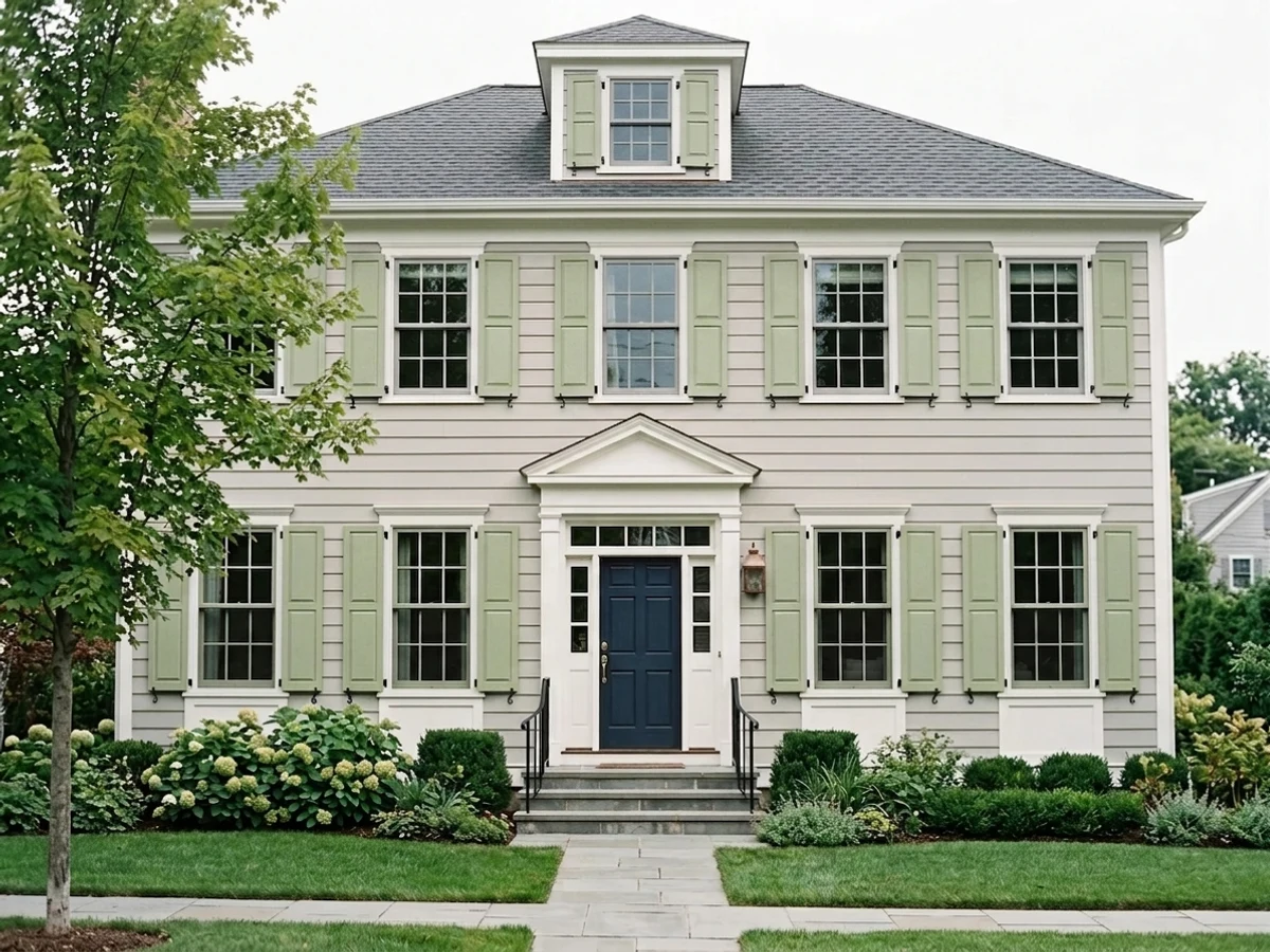
Go lighter — Sage Brush, Soft Fern, Vale Mist, or Jojoba, all in the LRV 56-60 range — when your siding is already dark, when the house sits under heavy tree shade most of the day, or when the shutters are vinyl. Vinyl shutter manufacturers specifically warn against dark colors because they absorb more heat and can warp in direct sun; the light greens in this group are close enough to the manufacturer's factory tint range that a vinyl-safe paint holds up without that risk.
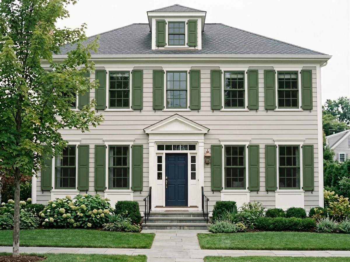
Go darker — Louisburg Green, Laurel Tree, Coastal Plain, or Escape Gray — when the siding is white, cream, or light beige and the shutters need to actually read as a color from the street instead of blending in. Dark green shutters also do more visual work on two-story houses, where a pale green can wash out by the time it's twenty feet up; the deeper picks hold their saturation at a distance in a way the pastels don't.
See It. Love It.
Paint It.
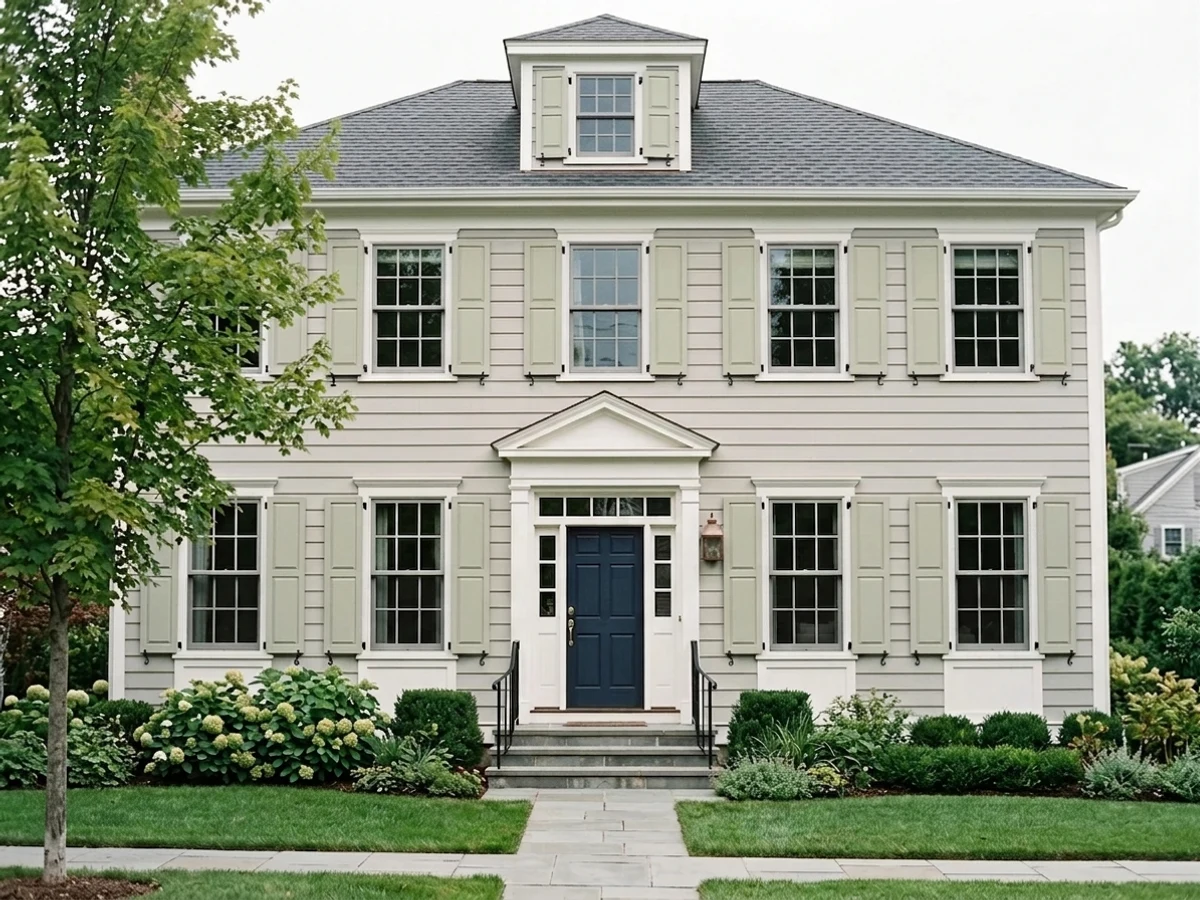
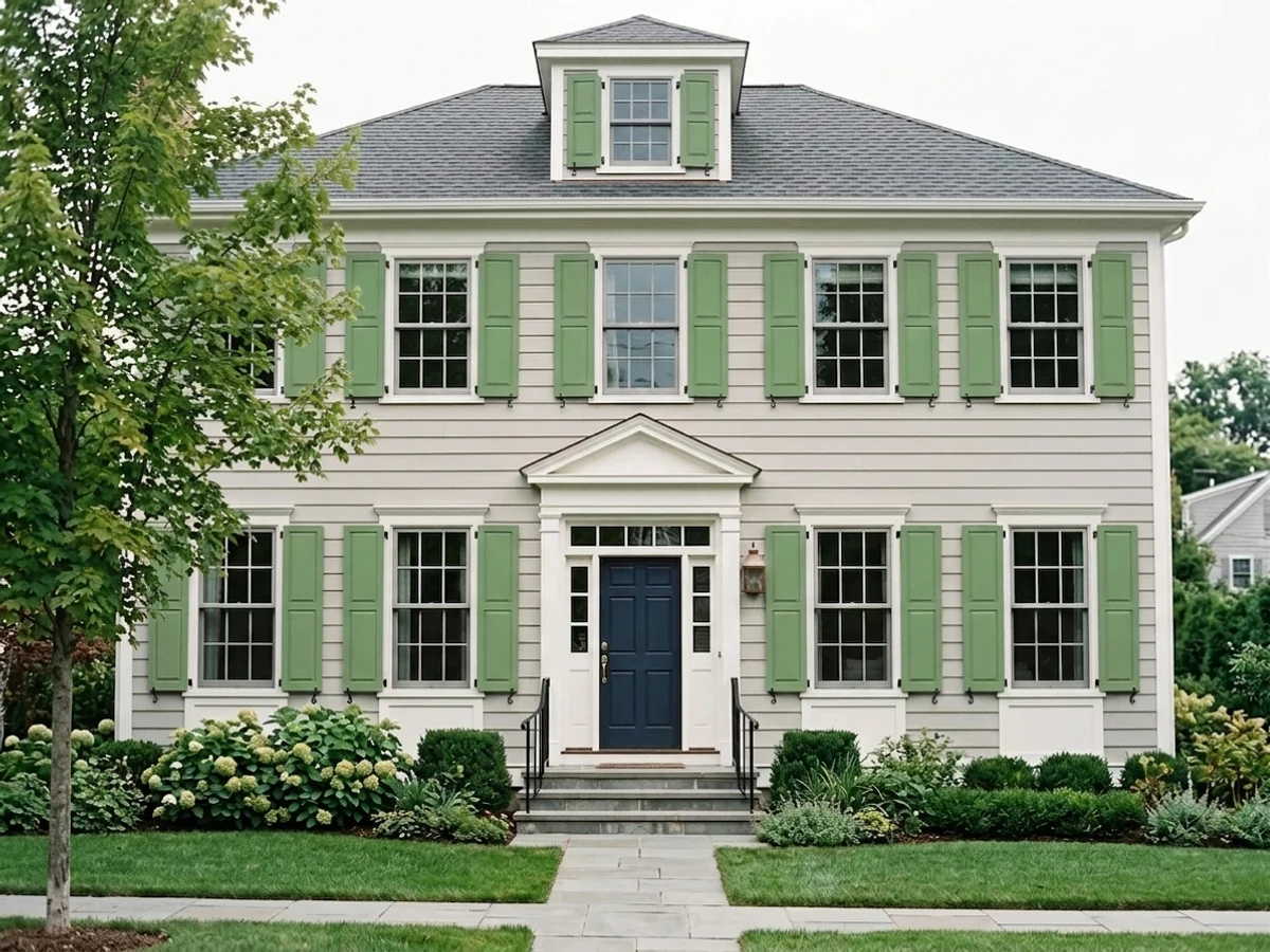
Upload one photo of your green shutters and try every color on this page on your own walls — in your own light, before you buy a drop of paint.

Royal OrchardBeforeSheen And Material Matter More Than The Color
Shutters get more direct sun and weather than almost any other painted surface on the house, and the finish you choose affects how the color performs over time. Satin is the most common recommendation because it sheds water and holds up to UV without the glare of full gloss; semi-gloss is the next most popular choice and gives slightly more durability at the cost of showing brush marks more readily.
If your shutters are vinyl, check the can for a "vinyl-safe" label before buying any of these colors — regular acrylic paint on vinyl in a color darker than the shutter's original factory tint can cause the vinyl to absorb heat unevenly and warp. This is the practical reason to lean toward Sage Brush, Soft Fern, or Vale Mist on vinyl shutters and save Louisburg Green or Laurel Tree for wood, composite, or fiber-cement shutters that don't have that heat restriction.
Wood shutters can take any of these eight colors safely, but they need a bonding primer first, especially if they're being repainted over an old oil-based finish. Fiber-cement and composite shutters behave like wood for paint purposes and are the easiest surface to move into the darker end of this list without worrying about warping.
Mistakes To Avoid With Green Shutters
The most common mistake is picking a green that's trying to match the landscaping instead of the house. Foliage already supplies plenty of green in front of most homes; shutters that match the hedges too closely just blend into the yard instead of framing the windows. A green with a different value or undertone than nearby plants — cooler like Escape Gray or warmer like Louisburg Green — actually stands out better against real greenery than a green chosen to match it.
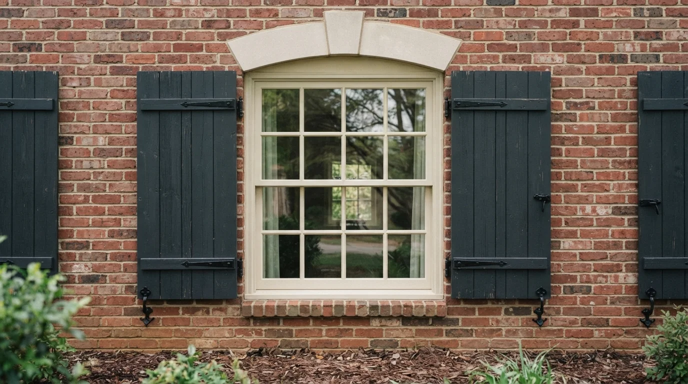
The second mistake is ignoring undertone against brick or stone. A blue-leaning pastel like Vale Mist can look slightly off against warm orange brick, while a warm green like Louisburg Green or Laurel Tree sits more naturally next to red or tan masonry. If you're not sure, hold a large sample against the actual brick or siding in daylight before committing — shutter swatches read very differently in a paint store than they do sixty feet from the street.
About Green Shutters Paint Colors
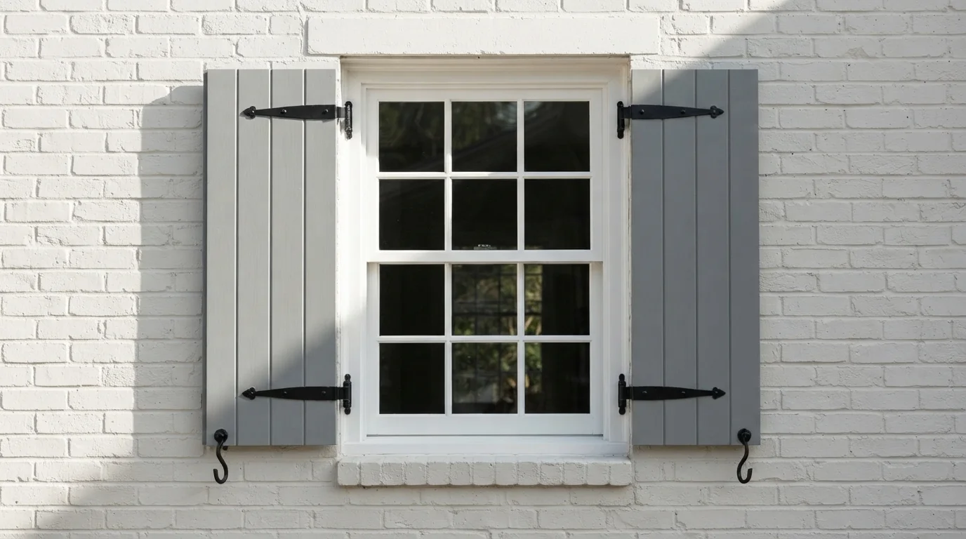
Shutters are a small surface with an outsized job: they frame every window and set the tone for the whole front elevation, so the green you pick reads louder than the square footage suggests. Most of the picks here lean softer than the deep hunter or forest green people picture when they hear "green shutters" — Sage Brush from Behr (S370-3, LRV 60) and Jojoba (N390-3, LRV 56) are closer to a pastel mint than a Colonial green, which is exactly why they work on cottages and bungalows where a saturated dark green would feel heavy against light trim.
On siding that already reads dark or busy — weathered cedar, dark gray fiber cement — Benjamin Moore's Soft Fern (2144-40, LRV 57) and Vale Mist (1494, LRV 56) add just enough color to break up the monotony without competing with the body color. Sherwin-Williams' Escape Gray (SW 6185, LRV 41) sits in between: muted enough to read almost neutral from the curb, which is the safer bet if you're not sure you want green to be the loudest color on the house.
For the traditional look, Louisburg Green from Benjamin Moore (HC-113, LRV 33) is the warmest and most classic of the set — a craftsman green that has been paired with brick and stone foundations for decades. Laurel Tree (Behr S390-5, LRV 36) and Coastal Plain (SW 6192, LRV 37) split the difference: bright enough to feel botanical rather than somber, dark enough to hold their own as an accent color instead of disappearing at dusk.
The Questions Everyone Asks
What color should I paint my green shutters?
If you want one answer, start with the safe picks above — Incognito, Big Fish, Nile Green, Baby Vegetable. They read well in any light and survive furniture changes. Then check the light: strong afternoon sun wants a step cooler, a north-facing room wants a step warmer.
what house colors go with green shutters?
Cream, white, tan, and warm gray siding all pair well with green shutters because they let the green read as the accent color rather than fighting it. On white or cream siding, a deeper pick like Louisburg Green or Laurel Tree provides real contrast; on tan or beige, a soft light green like Sage Brush or Jojoba adds color without clashing with the warm undertone already in the siding.
are green shutters still in style?
Yes. Deep hunter and forest greens have been a Colonial and craftsman staple for over a century, and softer sage and mint greens like Sage Brush and Soft Fern have grown more popular in the last several years on cottage-style and modern-traditional homes. Green shutters are one of the more timeless exterior choices because they read as natural rather than trendy, unlike some bolder accent colors.
can you paint vinyl shutters a dark green?
You can, but manufacturers generally advise against dark colors on vinyl shutters because darker pigments absorb more heat in direct sun, which can warp the vinyl over time. If your shutters are vinyl and you want a darker look like Louisburg Green or Laurel Tree, look for paint labeled vinyl-safe and check the color against the manufacturer's approved tint range first, or consider swapping to composite shutters if you want full color freedom.
what is the classic shutter green color?
The classic is a deep, near-black hunter or forest green, sometimes called Charleston green, used on Colonial and traditional homes for generations. None of the picks here go quite that dark — Louisburg Green (LRV 33) is the closest in spirit, offering that same warm, historic feel without going fully black-green, which makes it easier to keep looking fresh instead of faded.
should shutters be a lighter or darker green than the house?
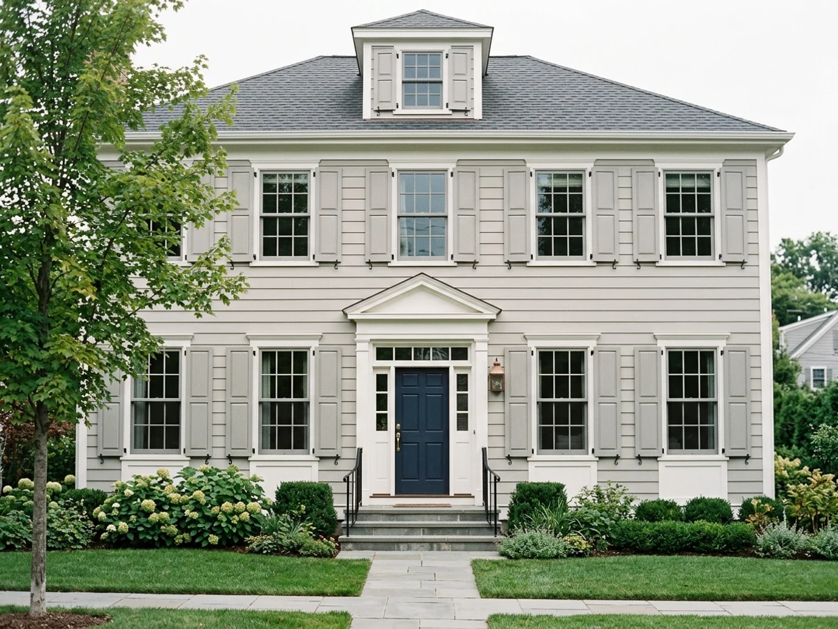
Shutters generally work best with more contrast than similarity to the body color — either noticeably lighter or noticeably darker, not a near-match. On white or light siding, a deeper pick like Coastal Plain or Louisburg Green creates that contrast; on darker or busier siding, a lighter pick like Soft Fern or Vale Mist keeps the shutters from disappearing into the background instead of framing the windows.
What two-color combination works best in a green shutters?
The reliable pattern is a quiet main color plus one deep accent on a single wall. Keep trim and ceiling in one warm white so the two colors are the only event in the room — the combination cards above show complete schemes from real rooms.
What colors make a green shutters look bigger?
High-LRV, slightly warm colors — LRV 60–75 is the sweet spot. Paint the walls and trim close to the same light color so the corners blur, and keep the ceiling white. Stark cool white actually works against you; it creates hard shadows that show the room's edges.

Ask a Question