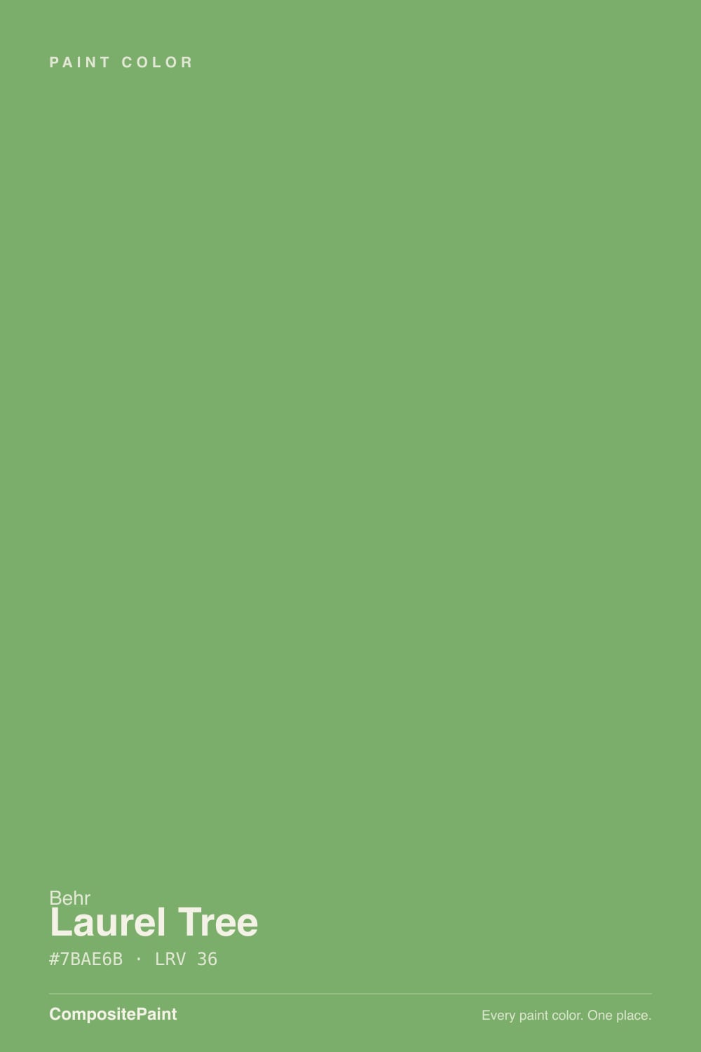
Laurel Tree
Behr's Color of the Month olive-green, reviewed honestly: the kitchens it was built for, the north-facing room where it goes flat, and the real complaints about how it lays down.

Jessica has spec'd whites and neutrals for more than 300 rooms and keeps a sample wall of painted drawdowns in her studio. Every color review is checked against real reader rooms in the comments and re-tested when a formula changes. About the testing process →
- 1Vintage Vogue12
- 2Sage Green22
- 3Laurel Tree29
- 4Clary Sage41
- 5October Mist47
The Fast Verdict
Laurel Tree is Behr's answer to the navy-cabinet trend: a warm, grayed-down olive green the brand named a Color of the Month rather than a Color of the Year, and the modest title fits it well. It glows next to brass and white oak, goes flat in a north-facing room with no warm light, and more than a few painters report it needs an extra coat to lay down evenly. Buy it for what it actually is — a genuinely useful cabinet green with real-world application quirks — not for hype it never claimed.
Kitchen islands and lower cabinets · home offices and built-ins that want a cocooning green · bedrooms lit by warm lamps · anyone who wants a green alternative to navy or charcoal cabinets
You want a true grass green, not olive · your kitchen counters or floors are icy white or gray · you're covering a whole exterior in strong afternoon sun · your painter won't keep a wet edge (this color flashes)
- A believable, warm olive-green alternative to navy or charcoal on kitchen islands and lower cabinets
- Loves brass, aged copper, and white oak — the exact combination it was built for
- Deep enough (LRV 29) to anchor a room without reading as a moody near-black green
- Behr's own pick for its Color of the Month program — a real design endorsement, not a random strip color
- Works past the kitchen: bedrooms, offices, and built-ins all take it well as a cocooning accent
- Real coverage complaints: several painters report a thin formula that needs a careful third coat over primer
- Mid-tone greens flash easily, and this one is no exception — roller marks show if you don't keep a wet edge
- A full exterior in strong sun washes it out, several shades lighter and grayer than the chip
- North-facing rooms without warm bulbs lose the olive warmth and read as a flat, cool gray-sage
What Color Is Laurel Tree, Really?
Warm, grayed-down olive green built on a base of yellow ochre, then softened with a veil of gray so it never reads as a bright primary green or a true grass color. Behr describes it as a "restorative, herbal" green, and gave it a turn as a Color of the Month — the brand's smaller, rotating spotlight, not the annual Color of the Year crown. That's an honest way to size it up: a genuinely useful color with a design team behind it, not an instant icon.
At LRV 29 it sits solidly in the middle of the deck — noticeably darker than a pastel sage like Saybrook Sage (LRV 56) but a good deal lighter than a true cabinet olive like Dried Thyme (LRV 21). That middle position is why it reads as approachable rather than moody: enough depth to anchor an island or a wall of built-ins, not so dark that a kitchen needs extra lighting to compensate.
Undertone in one line: warm olive-yellow first, a gray veil second — never a cool blue-green. In natural daylight it reads as a clean leaf green, close to pastel in a bright room; under overhead artificial light the yellow and olive come forward instead. If your sample looks flat and lifeless, that's a north-facing room or cool bulbs talking, not a hidden blue undertone.
Where It Shines
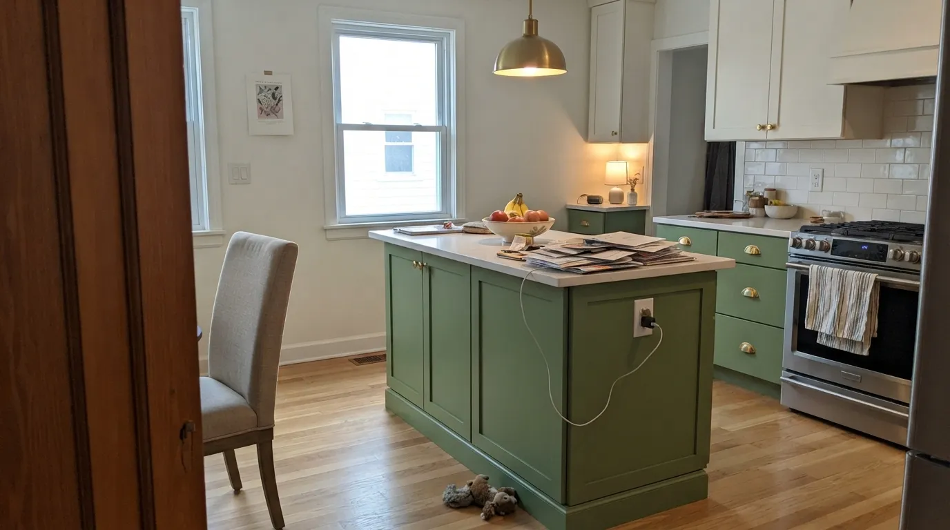
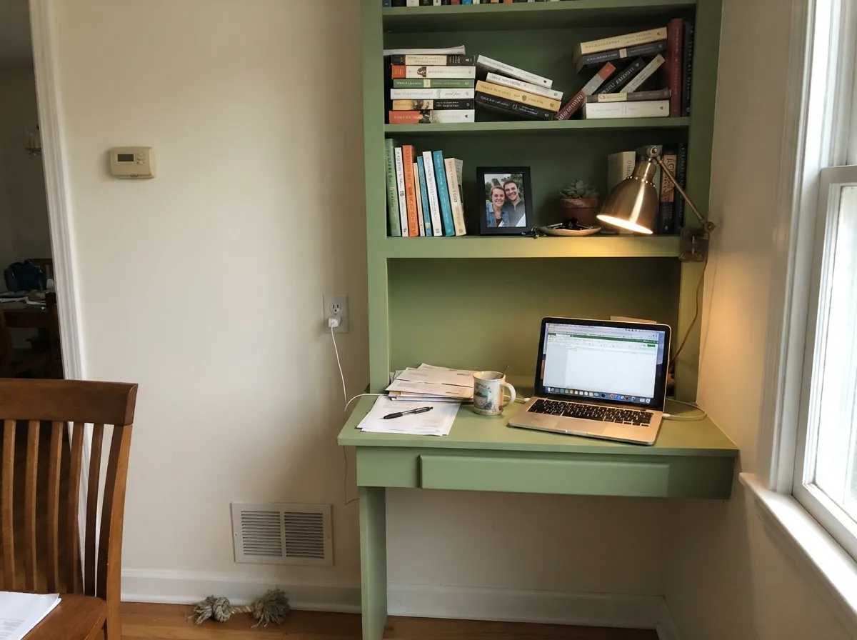
Give it brass hardware, white oak floors, and either real daylight or a warm lamp, and Laurel Tree does exactly what Behr built it to do: a kitchen island or wall of lower cabinets that reads as a genuine, grown-up alternative to navy — herbal and warm rather than cold and moody. It carries the same charm into a home office or a built-in bookcase, where the gray veil keeps it from feeling like a kid's-room green.
Where It Fails
Most of the real complaints about Laurel Tree trace back to one of three predictable situations — two about the room's light, one about the paint job itself. None of them make it a bad color; they make it a color that rewards planning.
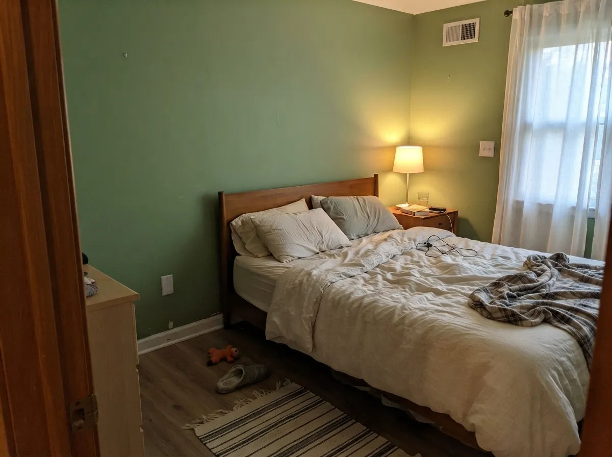
Cool north daylight (or cold LEDs) strips out the yellow-olive base and leaves a flatter, cooler gray-sage that several owners describe as lifeless. The paint didn't change — the light did. Add a warm 2700K lamp or accept the cooler read before you commit a whole room.
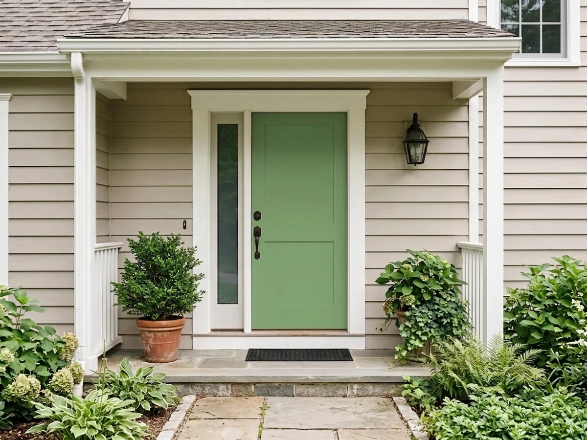
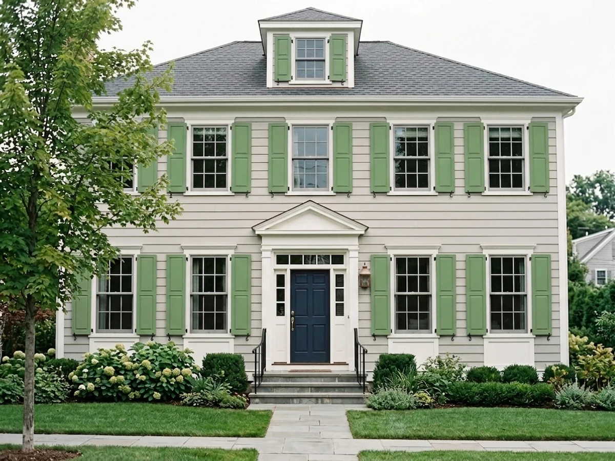
Direct sunlight washes Laurel Tree out several shades lighter and grayer than the chip — a common surprise on siding. It holds its color far better as a shaded front door, shutters, or trim than as a full south-facing facade.
Home Depot reviewers report a thinner-than-average formula that needs a careful third coat over a primed surface, and mid-tone greens like this one flash — show visible roller-mark banding — if you don't keep a wet edge. Budget the extra can and the extra time.
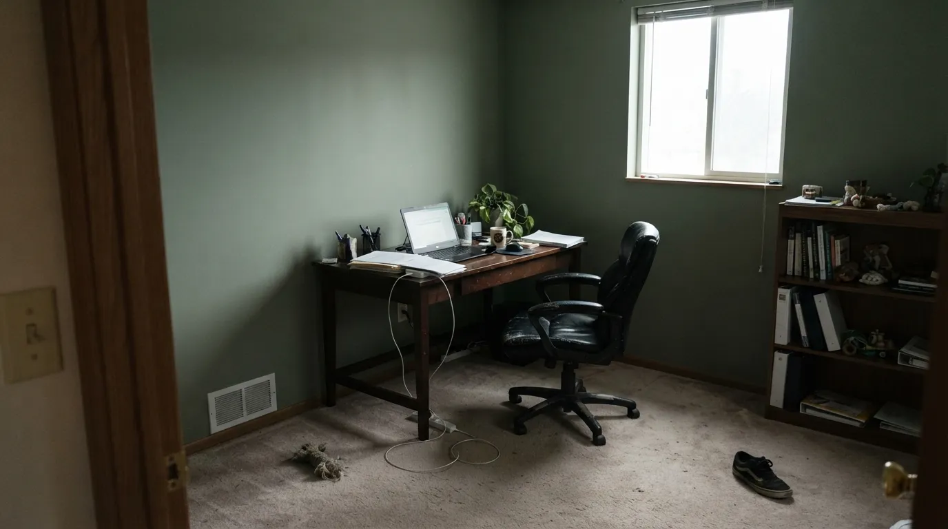
Room by Room
Islands and lower cabinets under a lighter upper (Alabaster, White Dove) are exactly what Behr built this color for. Brass and aged-copper hardware, white oak floors, and butcher block all love it; icy quartz or cool gray countertops argue with it. Semi-gloss or satin cabinet enamel.
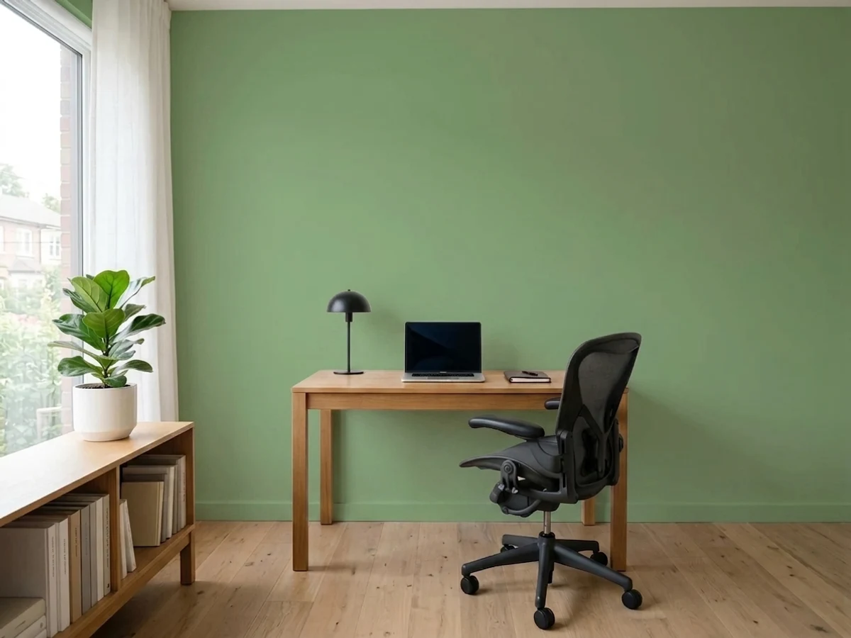
A bookcase, credenza, or wall of built-ins in Laurel Tree against cream walls reads calm and a little bit library-like. Satin finish stands up to daily hands and pens without going glossy.
It's genuinely cocooning under 2700K light — owners have used it in nurseries and adult bedrooms alike. Skip it if the room is north-facing and you refuse to add a warm lamp; that combination is where the flat, gray complaints come from.
Below a chair rail with a lighter wall above, it feels intentional and spa-like without steaming up a small room. Full four-wall coverage in a windowless bath risks the cave effect at LRV 29.
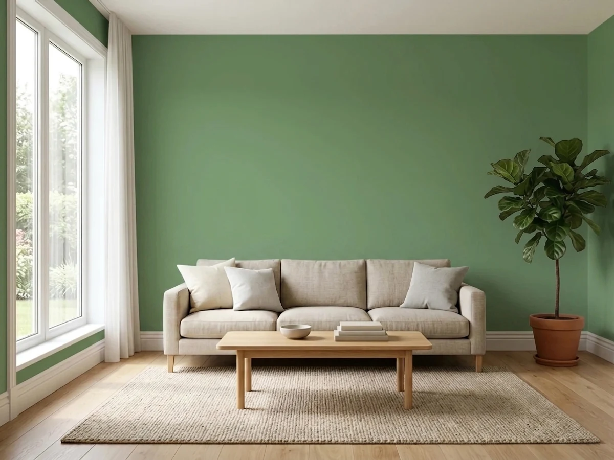
Beautiful as an accent wall or shelving unit with walnut and brass in the room. Riskier as the whole room's color in an open-plan house, where it has to negotiate with every adjacent wall and whatever light each one gets.
It's sold in exterior-rated enamels and works well on a front door or shutters in some shade. Painting a full south-facing facade in strong sun is the one place this color reliably disappoints — sample a large board in place first.
Your Light Is the Risk
South or west sun plus a brass fixture or hardware in the room is where the olive comes forward and the color reads exactly like its swatch — warm, herbal, alive.
No warm light source and a north exposure strip the yellow out fast; readers describe the walls going flat, cool, and gray-sage. Test a large sample before committing a whole room.
In natural daylight it reads as a clean leaf green, almost pastel in bright rooms; switch to overhead artificial light and the olive and yellow undertones come forward instead. Same paint, two honest faces.
Warm 2700K bulbs deepen the earthy olive after dark — the cozy, cocooning effect Behr markets it for. Cool white LEDs push it toward a crisper, slightly colder herbal green.
Most complaints about Laurel Tree are a light mismatch. Upload a photo of your actual room and see it on your walls — then ask for the same wall in north light or evening lamps before you buy a single sample.
Need It From Another Brand?
Any paint counter can custom-tint Behr S390-5 directly. If you would rather stay in one brand's own deck, these are the closest stock matches, measured as ΔE2000. Under 2 is a difference you will not see on the wall.
| Brand | Closest color | ΔE | LRV | |
|---|---|---|---|---|
| Sherwin-Williams | LeafletSW 9674 · Sherwin-Williams | 0.9 | 30 | Color page → |
| Benjamin Moore | Adirondack Green453 · Benjamin Moore | 1.7 | 29 | Color page → |
| Valspar | Leafy Rise5007-4A · Valspar | 2.2 | 27.8 | Color page → |
| PPG / Glidden | HemlockPPG1125-5 · PPG / Glidden | 4.6 | 28 | Color page → |
| Glidden | Pine Forest Green10GY 29/158 · Glidden | 2.7 | 29 | Color page → |
| Dutch Boy | Shaded Fern327-4DB · Dutch Boy | 3.2 | 32 | Color page → |
Similar Behr Colors
The nearest shades to Laurel Tree within Behr's own range, ranked by perceptual color distance — useful when you want the same look a touch lighter, darker, or warmer.
WCAG 2.1: AA is 4.5 : 1 for normal text, 3 : 1 for large text, AAA is 7 : 1.
Laurel Tree vs the Colors You're Also Considering
Every Laurel Tree sample board has the same rivals on it. The numbers show the real lightness gap — then it comes down to which risk you would rather live with.
Pick this when you want more actual green — Evergreen Fog is grayer and reads closer to neutral in weak light.
Sherwin-Williams SW 9130 · LRV 30Evergreen FogPick this for the same warm-cabinet-green idea in a lighter, quieter gray-sage — the safer pick for nervous painters.
Pick this for more daylight brightness — Laurel Tree's higher LRV (36 vs. 21) keeps a room from feeling closed in.
Sherwin-Williams SW 6186 · LRV 21Dried ThymePick this for a deeper, dustier olive that holds its color better in a dim room — Dried Thyme has less light to lose.
Pick this for real olive depth and saturation — Saybrook Sage is nearly twice as light and reads closer to pastel.
Benjamin Moore HC-114 · LRV 56Saybrook SagePick this for a much lighter, softer sage that works on full walls without the cabinet-level commitment.
Pick this for a color with real presence on an island — Clary Sage reads close to gray-beige at a glance; Laurel Tree is unmistakably green.
Sherwin-Williams SW 6178 · LRV 41Clary SagePick this if the flashing and coverage complaints worry you — Clary Sage is the easier-going, more forgiving application.
Milkweed Pod S380-5 shares the same LRV of 36 but at hex #8BAA76 it is grayer and quieter, so it behaves more like a soft sage while Laurel Tree stays a clear leaf green. Boston Fern 410F-5 at LRV 33 pushes the yellow harder and reads closer to grass. Track Green S410-5 at LRV 40 is lighter and slightly cooler, better for a room that needs more light back.
Across brands, Sherwin-Williams Organic Green SW 6732 at #7FAC6E and LRV 35 is a deltaE of 1.29 away, which looks identical in normal room light. Diamond Vogel Gentle Caress 0766 at LRV 36 is closer still in lightness at deltaE 1.66.
Further out, Valspar Snipped Chive 8002-30E at LRV 37 and deltaE 2.48 is very close but worth sampling. Benjamin Moore Napa Vineyards 427 at LRV 35 and deltaE 4.39 is close but visibly different side by side, reading brighter and more yellow.
Laurel Tree Coordinating Colors
The rule for coordinating with Laurel Tree: warm creams over stark whites, and one true dark note rather than several competing accents. It loves brass and aged copper, and it stays calm next to soft off-whites instead of cool, blue-based ones. These are the partners that keep showing up in rooms that work:
A Color of the Month, Not a Color of the Year
It is worth being precise about Laurel Tree's fame, because it is easy to overstate: Behr runs a rotating Color of the Month program, and Laurel Tree had its turn under that smaller spotlight. It has never carried the Color of the Year title, and there is no documented viral moment, celebrity room, or TV-show cameo behind it — just a solid, well-liked olive green that Behr's own design team chose to feature for a month.
That is not a knock. Most of the paint colors that earn genuine long-term loyalty in real kitchens are exactly this kind of quiet, useful color rather than a headline-grabbing trend shade. Laurel Tree's actual reputation, built from Home Depot reviews and kitchen-cabinet forums rather than marketing copy, is that of a dependable warm green with a couple of real, fixable application quirks — an honest position, and a good one.
Laurel Tree With Wood Tones and Floors
White oak is this color's best friend. Its neutral, not-too-warm cast lets Laurel Tree's olive read clearly instead of muddying into brown, and the pairing is the one Behr itself photographs most often for kitchen islands. Walnut and other deep, cool-brown woods work well too, especially on built-ins and bookcases.
The one wood tone to avoid is anything red-leaning — cherry, mahogany-stained trim, red oak with a warm orange finish. Two warm tones fighting for attention next to each other tends to read muddy rather than rich, and the green loses definition. Keep countertops and floors on the warmer-neutral side as well: icy white quartz and cool gray luxury vinyl plank both push Laurel Tree toward looking dated rather than intentional.
Three Ready Palettes Built on Laurel Tree
A color is never alone on the wall. These are complete combinations in the 60-30-10 pattern, with the reason each one holds together. Every one opens in the visualizer.
Alabaster keeps the upper cabinets soft and warm rather than stark, so the island doesn't have to fight a cold white. Iron Ore on the hood gives the kitchen one true dark note, and both partners let the brass hardware and white oak floor do the rest of the work.
Try this palette in your roomWhite Dove trim keeps the room from feeling closed in, while Chelsea Gray on one accent surface adds a second grounded, warm-neutral note without competing with the green. Under a 2700K lamp, all three deepen together instead of clashing.
Try this palette in your roomSwiss Coffee keeps the walls creamy rather than stark, so the green built-ins read as the room's real color decision. Sable adds one deep, warm brown for a desk or window trim — the same warm-on-warm logic that makes Laurel Tree pair so well with walnut and aged leather.
Try this palette in your roomLaurel Tree FAQ
Is Laurel Tree Behr's Color of the Year?
No — it's a Behr Color of the Month pick, which is a smaller, rotating spotlight, not the annual crown. That's an honest way to think about it: a genuinely useful cabinet green, not a headline color with a marketing campaign behind it.
Is Laurel Tree warm or cool?
Warm — it's built on an olive-yellow base with a gray veil over it. In a north-facing room with cool light, that warmth fades and it can read as a flatter gray-sage; give it real daylight or warm bulbs and the olive comes back.
Is it good for kitchen cabinets?
Yes, especially islands and lower cabinets paired with a lighter upper — it's Behr's pitched alternative to navy or charcoal cabinets. It pairs best with white oak, brass, and aged copper hardware; keep icy quartz and cool gray countertops away from it.
Does Laurel Tree work on exteriors?
It's sold in exterior-rated enamels, but strong sun washes it out several shades lighter and grayer than the chip. It's safer as a front door, shutters, or trim color than a full-house exterior — sample a large board in place before committing the whole facade.
What wood floor goes with Laurel Tree?
White oak is the natural partner — its cool-warm neutrality lets the olive read clearly. Red-toned woods like cherry fight it; the warm-versus-warm clash tends to read muddy rather than rich.
How many coats does Laurel Tree need?
Plan on more than the standard two. Multiple painters report a thinner formula that needs a careful third coat over primer for even coverage, and mid-tone greens like this one flash — show roller marks — if you don't keep a wet edge while rolling.
Have you painted with Laurel Tree?
Rate it — one tap helps the next reader decide.
Ask a Question