Room Colors · Blue Nursery
8 Best Blue Nursery Paint Colors for 2026
ideas, combinations, and real rooms
8 curated picks from real blue nurserys — with the exact colors, honest reasons why, and the combinations that hold the room together.

Former interior stylist who can spot a green undertone from across a room. Jessica writes the color and mood pieces — what to choose, what pairs, and why your "white" looks pink.
The Fast Answer
Don't want to read 8 picks? These four are the safe answers.

Top Picks for the Blue Nursery
Tap a shade to see the blue nursery in it, then try it on your own room.
Blue Nursery Color Trends 2026 — What's In, What's Out


- Icy Pale Baby Blue — The classic cold, high-LRV pastel baby blue feels sterile next to 2026's warmer, dustier blue choices for nurseries.
- Cool Gray-Blue Everything — A flat cool gray-blue with no warmth reads dated compared to 2026's move toward softer, more inviting nursery blues.
- Flat Single Pastel With No Depth — One flat pastel blue across the whole room with no layering or contrast is losing ground to 2026's more considered nursery color schemes.
The 8 Best Blue Nursery Paint Colors
Every pick below is a real rendered blue nursery, not a chip. The lead color first; the swatches are the full scheme in the photo — walls, furniture, textiles, accent.

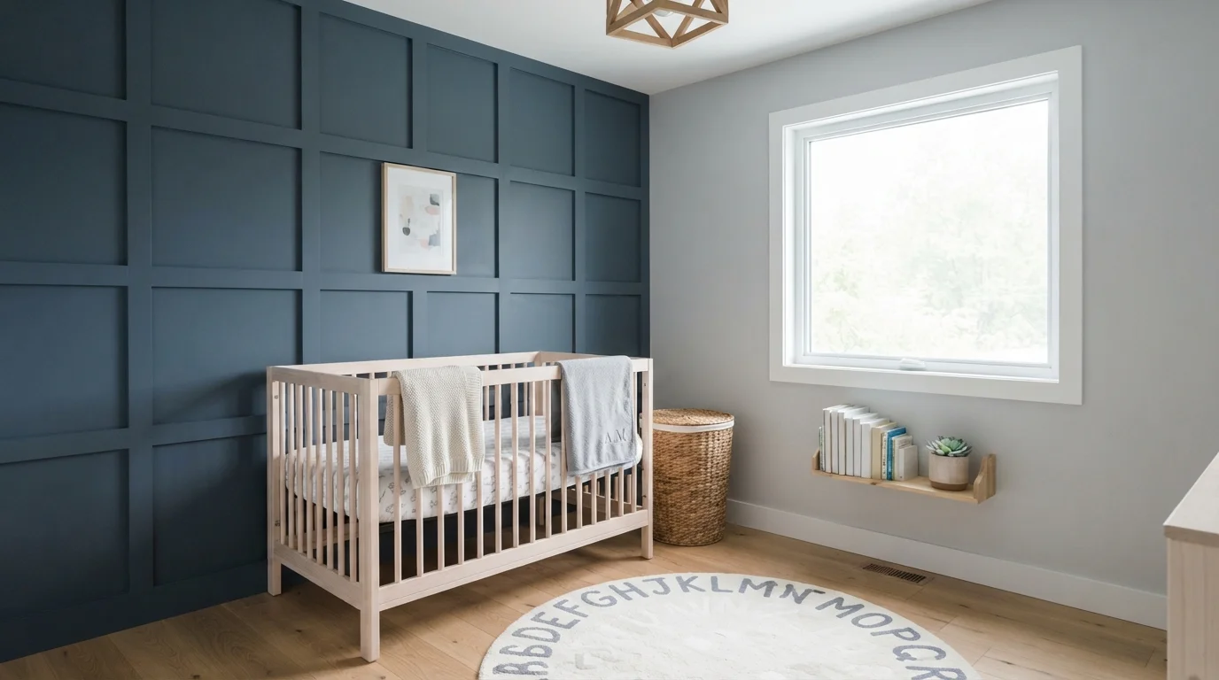
Rich slate blue paneling pairs with soft gray walls and pale wood for a calm, modern baby room.
Slate blue is a deep, quiet navy with soft smoky undertones. In this nursery, rich blue coats a tailored grid accent wall, while cool light gray wraps the surrounding walls around a pale blonde wood crib. The room feels grounded, tidy, and peaceful. The combination works because natural daylight and light wood tones balance the deep wall color, keeping the corner bright and airy. It is ideal for anyone looking to build a modern, restful nursery that effortlessly matures into a toddler bedroom.
SEE NORDIC NOIR ON YOUR WALLS →
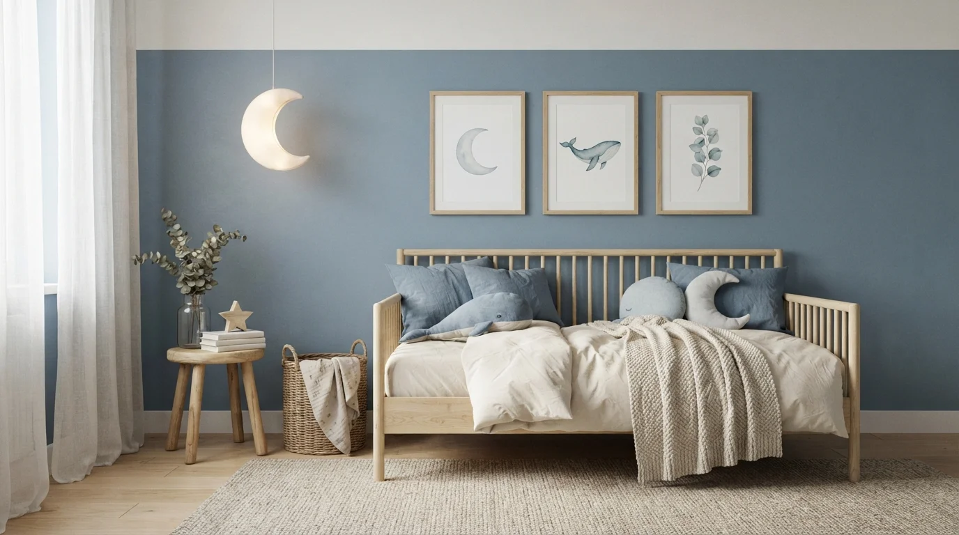
Soft dusty blue walls paired with light wood and cozy textures create an ultra-calm, whimsical nursery retreat.
Dusty blue is a muted, peaceful shade with soft grey undertones stripped down to pure calm. In this sweet room, the walls wear gentle slate blue, paired with a pale blonde wood toddler bed, ivory linens, and a chunky cream rug. The entire space feels snug, restful, and deeply soothing. This combination works because cool wall tones blend effortlessly with warm, natural timber and soft knitted textures. It is an ideal look for parents wanting a timeless, peaceful sanctuary for their little one.
SEE BROOKSIDE BLUE ON YOUR WALLS →
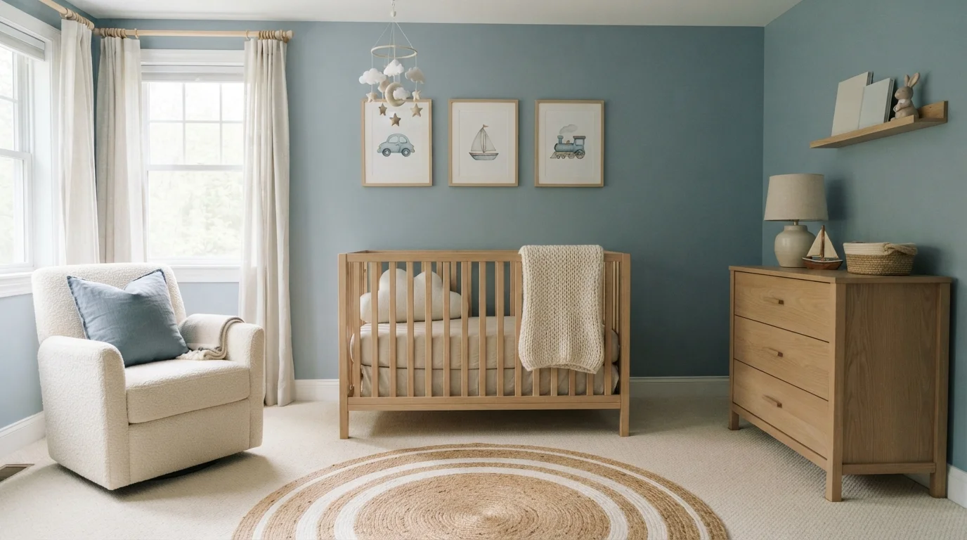
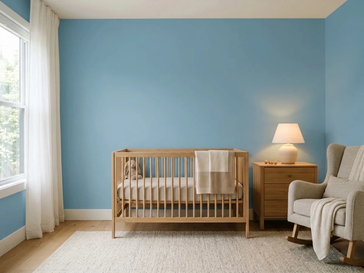
Soft slate blue walls blend with warm oak furniture and creamy boucle for a restful, dreamy nursery.
Slate blue is a gentle, muted blue with a relaxed touch of gray. Here, soft blue covers the walls, paired with a natural light oak crib, a textured cream boucle chair, and warm wooden wall art. The space feels sweet, calm, and wonderfully cozy. It works because the cool wall color is balanced by the warmth of natural wood and chunky knitted blankets. It is the perfect choice for anyone wanting a peaceful, timeless baby room that feels grounded and cheerful.
SEE LAKEFRONT BLUE ON YOUR WALLS →
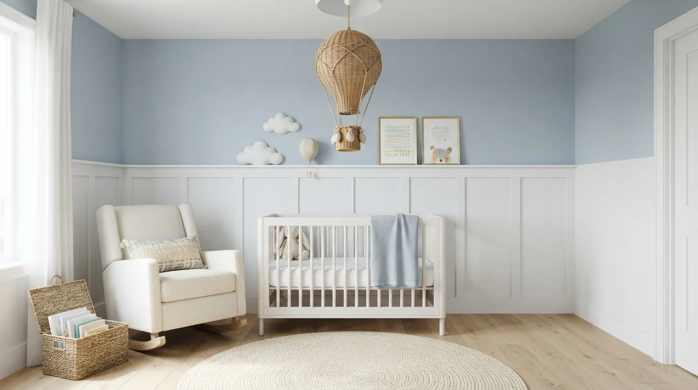
Soft powdery blue walls meet crisp white wainscoting and natural woven textures for a soothing, dreamy nursery space.
Powder blue is a soft, calming pastel inspired by clear morning skies. In this nursery, the upper walls wear this gentle blue above bright white wainscoting, complemented by an ivory glider, a classic white crib, and warm woven baskets. The room feels incredibly serene, airy, and snug. Pairing cool sky tones with crisp white millwork keeps the room looking open while letting warm natural textures stand out. It is ideal for parents who want a gentle, storybook space that grows effortlessly with their child.
SEE DENIM LIGHT ON YOUR WALLS →
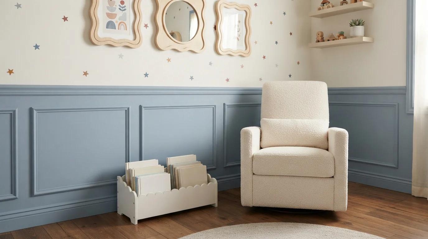
A soothing touch of soft blue paneling pairs with playful starry accents to create a dreamy, restful sanctuary.
Soft dusty blue is a calming, muted sky shade with a gentle feel. In this room, it covers the classic picture-frame wainscoting, balanced by creamy white upper walls speckled with charming little stars. A cozy white boucle armchair and a scalloped book caddy make the reading nook feel snug and inviting. This combo works because the grounded blue adds classic structure while the light walls keep the nursery bright and airy. It is a wonderful look for anyone wanting a peaceful, storybook-inspired space.
SEE WHISPER WHITE ON YOUR WALLS →
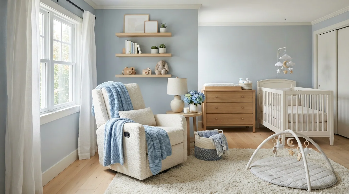
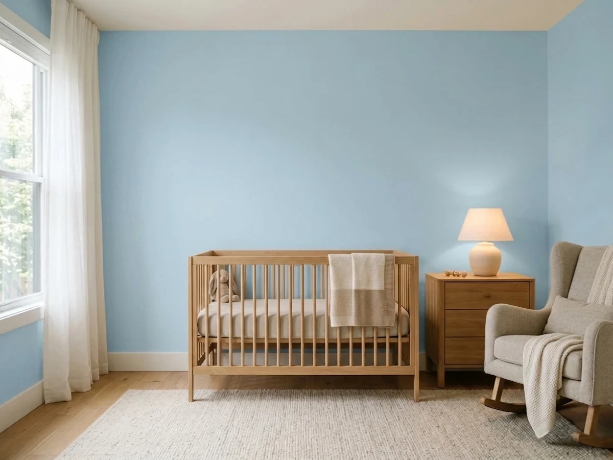
Soft sky blue walls and cloud-like textures create an airy, comforting retreat perfect for quiet nursery moments.
Powder blue is a soft, calming sky shade with a whisper of gray. Here, it covers the walls, wrapping the nursery in tranquility alongside a plush ivory recliner, crisp white crib, and light blonde wood dresser. A thick cream rug softens the floor while blue throws and baskets echo the wall tone. The space feels gentle, peaceful, and wonderfully snug. Pairing cool muted blue with cozy warm whites and natural wood keeps everything bright and inviting. It is perfect for anyone creating a dreamy, relaxing space for baby.
SEE PALISADE BLUE ON YOUR WALLS →
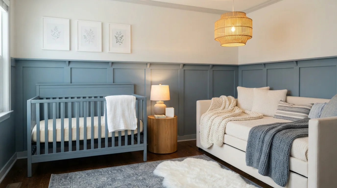
Soft slate blue walls and warm natural textures create a calming, dreamy nursery filled with gentle light.
Dusty slate blue is a gentle, soothing grayish blue. In this room, the soft blue covers the paneled walls and matching crib, beautifully framed by crisp white trim and cozy ivory bedding. The space feels peaceful, snug, and effortlessly timeless. The cool blue pairs naturally with warm wood tones and knitted fabrics, preventing the space from ever feeling cold. It is an ideal look for anyone wanting a restful, classic nursery that grows easily with their child.
SEE BLUE NOSE ON YOUR WALLS →Blue Nursery Wall Color Combinations
A wall color never works alone. These are the full schemes from the rooms above — the lead color first, then the supporting colors that make the photo work.
Rich slate blue paneling pairs with soft gray walls and pale wood for a calm, modern baby room.
TRY THIS PALETTE →Soft dusty blue walls paired with light wood and cozy textures create an ultra-calm, whimsical nursery retreat.
TRY THIS PALETTE →Soft slate blue walls blend with warm oak furniture and creamy boucle for a restful, dreamy nursery.
TRY THIS PALETTE →Soft powdery blue walls meet crisp white wainscoting and natural woven textures for a soothing, dreamy nursery space.
TRY THIS PALETTE →Pair Windmill Wings or Blue Hydrangea with a crisp white trim and a natural or light oak crib and dresser — the pale blue keeps the walls from competing with wood grain, and white trim adds the contrast that keeps a very light room from feeling flat or washed out. If you want warmth instead of contrast, swap the white trim for a warm off-white and let a wood rocking chair or shelf carry the room's only other color.
For the deeper picks, lead with Resolute Blue, Nightlife, Time's Current, or Encore on the walls and keep trim, ceiling, and crib white or a soft warm white — the light trim stops a saturated blue from making the room feel small, especially where the ceiling is under 9-foot. Walnut or dark-stained wood furniture reads richest against these deeper blues; if the furniture is already light pine or birch, expect more contrast and less of the moody, wrapped-in feeling that's the whole point of going with Nightlife or Time's Current in the first place.
More Nursery Color Ideas
Set on a color family already? Each page has its own real rooms and picks.
Light or Dark Blue Nursery Colors?
Go Light (LRV 60+) If…
The room is small, faces north, or has to work at every hour. Light warm colors make it feel bigger and stay calm in evening light — the light you actually live in.
Go Dark (LRV Under 20) If…
You want the cocoon effect and the room has real daylight. Dark works best on one feature wall — or fully color-drenched in a large room with good windows.
Go lighter — Windmill Wings or Blue Hydrangea — if the nursery has one small window, faces north, or doubles as a changing station you'll use at all hours; both sit in the low-60s LRV range, so they keep the room feeling open under a single overhead fixture instead of swallowing what little daylight comes in. A pale blue also forgives a nursery that will get repainted in a hurry before a second kid arrives, since primer coverage over light colors is faster than over deep ones.
Go darker — Resolute Blue, Nightlife, Time's Current, or Encore — when the room already gets strong afternoon sun, when you want the space to read as intentionally cozy rather than just "kid pastel," or when the nursery sits next to the parents' room and a quieter, less bright wall color at night matters more than daytime brightness. Resolute Blue's LRV of 40 is a useful marker here: it's dark enough to feel restful at nap time but still far short of navy, so the room doesn't turn cave-like once the sun goes down and the only light is a nightlight.
See It. Love It.
Paint It.
Upload one photo of your blue nursery and try every color on this page on your own walls — in your own light, before you buy a drop of paint.

Reflecting PoolBeforeSheen And Finish For Nursery Walls
Eggshell is the softer-looking choice and it's what most nurseries end up with — low glare, smooth to the touch, and forgiving of minor wall imperfections, which matters if you're painting over an older bedroom's patched holes. It wipes clean for light marks but won't take heavy scrubbing without some sheen change showing through.
Satin costs you a little glare in exchange for real durability: it shrugs off fingerprints, formula splashes, and the scuffs a crib or glider leaves against the wall over months of use, and it holds up better once the room turns into a toddler's space with crayons in reach. On a deeper color like Resolute Blue or Nightlife, satin's extra sheen also helps the color read less flat under a single overhead light — on the paler picks like Windmill Wings, eggshell's lower glare keeps the softness that's the reason you picked a light blue in the first place.
Painting Timeline And Low-VOC Safety
Paint the nursery as early as you reasonably can — most guidance points to finishing at least a few weeks before the due date, and ideally around two months out, so the room has time to fully off-gas and cure before the baby is sleeping in it every night. That buffer matters more than any single product claim.
Look for a zero-VOC or low-VOC line when you're picking up Windmill Wings, Blue Hydrangea, Resolute Blue, or any of the other picks here — nearly every major brand now offers one, and asking your paint store to mix the color into their zero-VOC base doesn't change the price much. Keep windows open and a fan running for at least 24 to 48 hours after the final coat, longer if the room doesn't get much cross-ventilation, and hold off moving the crib in until the paint smell is fully gone.
Common Mistakes With Blue Nurseries
The biggest one is treating every blue as interchangeable with "gender neutral." A crisp, saturated blue like Blue Hydrangea reads more classically boyish to a lot of eyes, while a softer, grayed-down shade like Reflecting Pool or a dustier pick closer to Windmill Wings reads more neutral. If gender-neutral is the actual goal, lean toward the muted end of the family rather than assuming any blue clears that bar automatically.
The second mistake is going all-in on a deep, cozy blue like Nightlife or Time's Current on all four walls in a small or dim room — it can tip from "restful" to "dark" fast once the only light source is a nightlight. Painting three walls in the deep color and the fourth (usually behind the crib) or the ceiling in white keeps the mood without losing the room. And don't skip test swatches on the actual wall — nursery lighting is often just one overhead fixture plus a lamp, which shifts how these blues look compared to a showroom or a phone screen.
About Blue Nursery Paint Colors
Blue reads calmer than almost any other family in a nursery, which is why it shows up on so many must-paint lists for baby's room. Windmill Wings (Benjamin Moore 2067-60, LRV 63) and Blue Hydrangea (Benjamin Moore 2062-60, LRV 62) sit at the light end of that range — both bounce enough daylight around a room to stay usable for 2 a.m. diaper changes and daytime tummy time without a lamp on, and both are pale enough that they'll still work when the nursery becomes a toddler room and later a kid's bedroom.
For a nursery built around sleep first, Resolute Blue (Sherwin-Williams SW 6507, LRV 40) and Nightlife (Portola Paints) go the other direction — deep enough to dim the room at nap time and hold up as a backdrop once the crib gives way to a bed and a bookshelf. Time's Current and Encore, both Valspar, land in that same deeper, cozier register; Encore leans toward a classic storybook blue while Time's Current reads a shade moodier, closer to a dusk sky than a daytime one.
Reflecting Pool is the middle option worth knowing about: it's softer than a true sky blue and doesn't carry the boardroom weight some navies do, so it works as a compromise pick when one parent wants something soothing and the other wants something with a little more presence than a pastel. Because every one of these is a standard mixed color, you're not locked into a single supplier — pick the shade first, then match it to whichever paint store is closest.
The Questions Everyone Asks
What color should I paint my blue nursery?
If you want one answer, start with the safe picks above — Whisper White, After Rain, Nordic Noir, Brookside Blue. They read well in any light and survive furniture changes. Then check the light: strong afternoon sun wants a step cooler, a north-facing room wants a step warmer.
what color blue is best for a nursery?
There isn't one right blue — it depends on how much natural light the room gets and whether you want it bright or cozy. Windmill Wings (Benjamin Moore, LRV 63) and Blue Hydrangea (Benjamin Moore, LRV 62) work well in smaller or darker rooms because they stay light and airy. Resolute Blue (Sherwin-Williams, LRV 40) or Nightlife (Portola Paints) suit a nursery with plenty of daylight where you want a calmer, sleep-focused feel.
is a blue nursery too cold or cool-feeling for a baby's room?
It can be, if you pick a very crisp, high-saturation blue with no warmth in it. Colors like Reflecting Pool or Encore avoid that problem because they're softer and slightly muted rather than icy. Pairing any blue with warm wood furniture, warm-white trim, and soft textiles also cuts the coolness — the wall color rarely feels cold once the room has warm materials around it.
what paint sheen should I use for nursery walls?
Eggshell for a softer, lower-glare look that hides small wall flaws, or satin if you want more durability against scuffs, splashes, and eventual crayon marks. Satin is the better pick if the nursery is likely to become a toddler room within a couple of years, since it holds up to more contact. Either works fine over Resolute Blue, Nightlife, or any of the lighter picks — the choice is about durability versus glare, not the color itself.
is blue nursery paint gender-neutral?
Not automatically. A saturated, classic blue like Blue Hydrangea reads more traditionally boyish, while a muted, grayed-down shade like Reflecting Pool or Windmill Wings reads more neutral. If gender-neutral is the goal, choose from the softer, less saturated end of the blue family rather than assuming any blue clears the bar.
how soon before the baby arrives should I paint the nursery?
Aim to finish at least a few weeks ahead, ideally around two months before the due date, so the paint has time to fully cure and off-gas before the baby sleeps in the room nightly. Use a zero-VOC or low-VOC version of whichever pick you choose — Time's Current, Encore, and the rest are all available in low-emission lines — and ventilate the room for at least 24 to 48 hours after the last coat.
What two-color combination works best in a blue nursery?
The reliable pattern is a quiet main color plus one deep accent on a single wall. Keep trim and ceiling in one warm white so the two colors are the only event in the room — the combination cards above show complete schemes from real rooms.
What colors make a blue nursery look bigger?
High-LRV, slightly warm colors — LRV 60–75 is the sweet spot. Paint the walls and trim close to the same light color so the corners blur, and keep the ceiling white. Stark cool white actually works against you; it creates hard shadows that show the room's edges.


Ask a Question