Room Colors · Gender-Neutral Nursery
8 Best Gender-Neutral Nursery Paint Colors for 2026
ideas, combinations, and real rooms
8 curated picks from real gender-neutral nurserys — with the exact colors, honest reasons why, and the combinations that hold the room together.

Former interior stylist who can spot a green undertone from across a room. Jessica writes the color and mood pieces — what to choose, what pairs, and why your "white" looks pink.
The Fast Answer
Don't want to read 8 picks? These four are the safe answers.

Top Picks for the Gender-Neutral Nursery
Tap a shade to see the gender-neutral nursery in it, then try it on your own room.
Gender-Neutral Nursery Color Trends 2026 — What's In, What's Out


- Cool Greige Everything — Blue- and violet-undertoned grays that dominated the last decade of neutral nurseries now read cold and impersonal.
- Stark All-White Nurseries — Bright white walls paired with white furniture are losing appeal as parents want more warmth and texture in the room.
- Matchy Gender-Neutral Sage — The once-default sage-green-for-everyone approach is giving way to warmer, more personal neutral tones.
The 8 Best Gender-Neutral Nursery Paint Colors
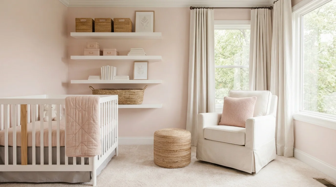
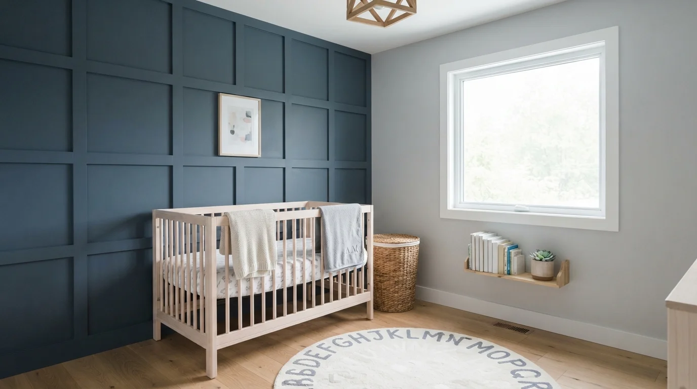
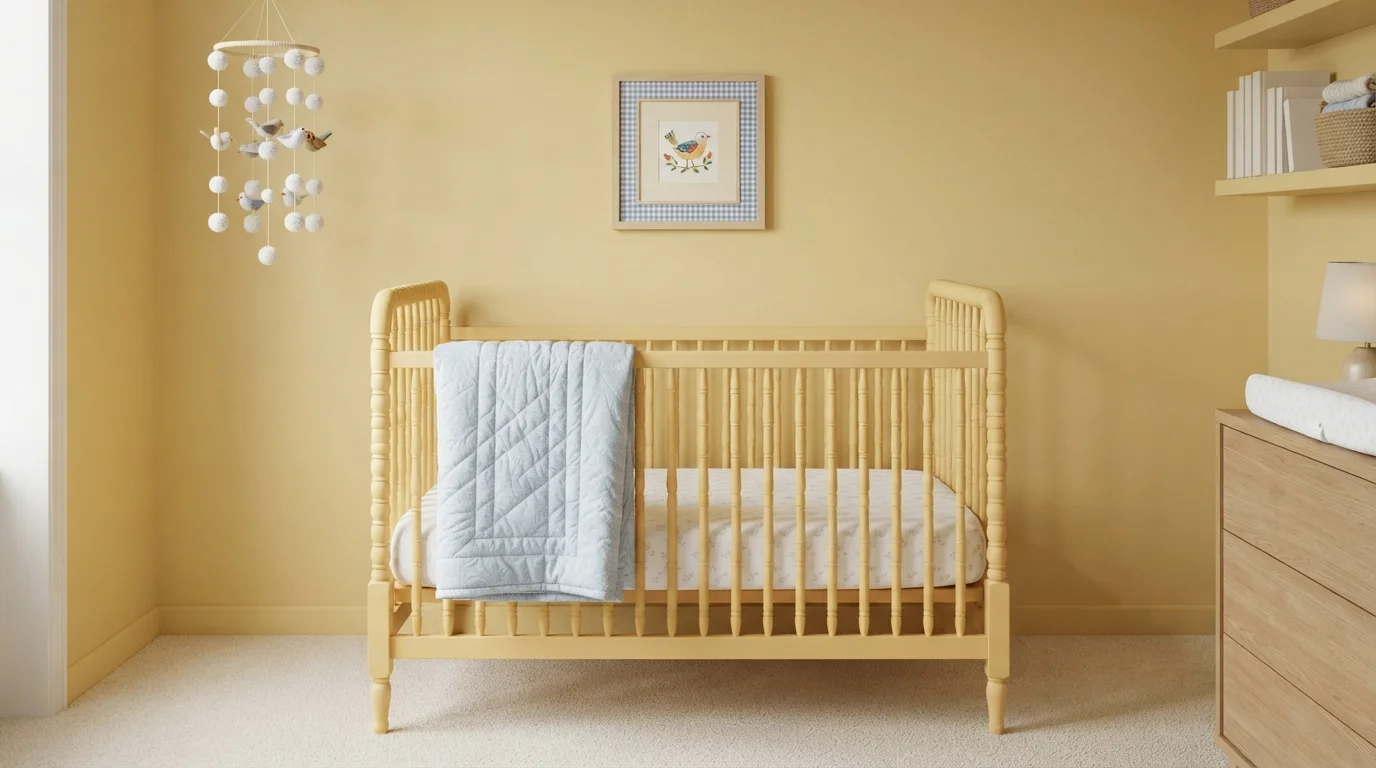
Every pick below is a real rendered gender-neutral nursery, not a chip. The lead color first; the swatches are the full scheme in the photo — walls, furniture, textiles, accent.

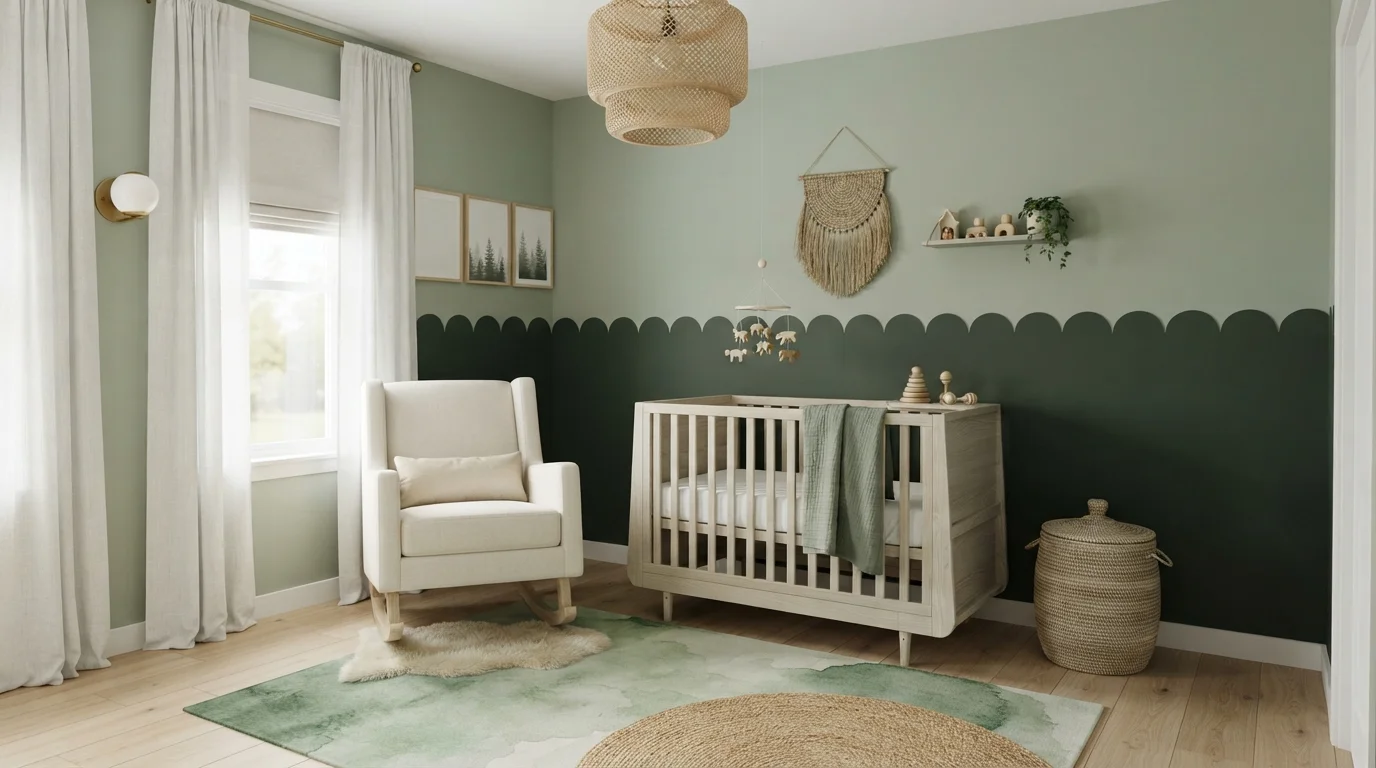
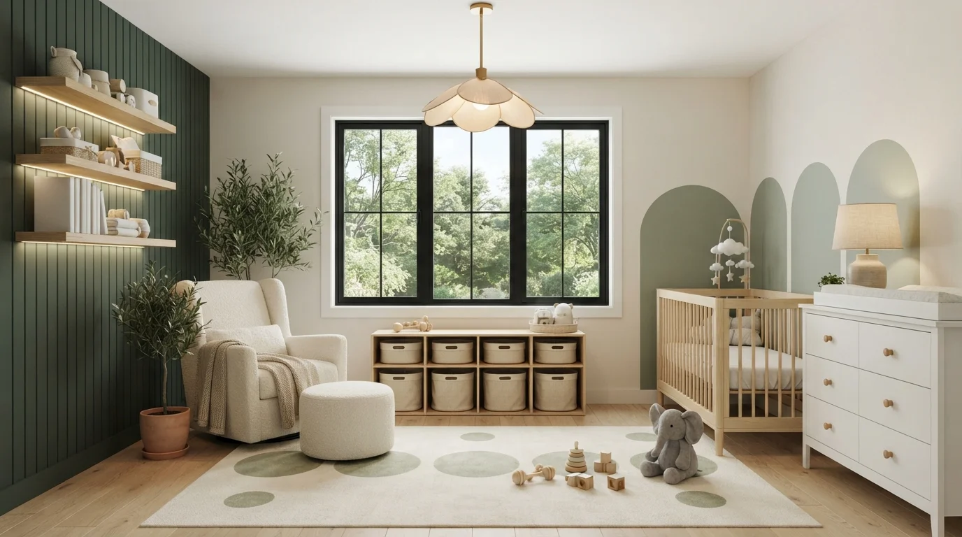
Warm cream walls, mossy green paneling, and natural blonde wood create a calm, cozy woodland nursery.
Warm cream is a soft, gentle off-white with just enough warmth to feel inviting. In this nursery, cream walls wrap the room, balanced by a deep forest green slat feature wall and muted sage arches behind the crib. Natural blonde wood furniture, a bouclé glider, and a soft spotted rug ground the space. The room feels grounded, quiet, and deeply soothing. This combo works because earthy greens and creamy neutrals naturally mimic the outdoors, keeping the room relaxing rather than overstimulating. It is perfect for parents who want a gender-neutral, nature-inspired nursery that grows with their child.
SEE IT ON YOUR WALLS →
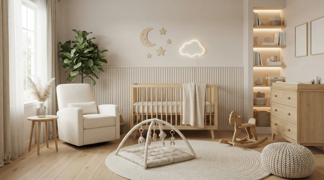
Soft creamy walls, natural blond wood, and glowing ambient light wrap this gentle nursery in soothing, peaceful comfort.
Warm cream is a soft, buttery off-white with an inviting glow. In this serene space, gentle cream coats the upper walls and fluted lower paneling, paired seamlessly with pale oak furniture and a plush ivory glider chair. The room feels deeply calm, snug, and peaceful at any hour of the day. Sticking to soft off-whites alongside natural blonde wood works because earthy textures keep neutral rooms cozy without feeling flat. It is the perfect look for parents wanting a dreamy, gender-neutral nursery.
SEE BALANCE ON YOUR WALLS →
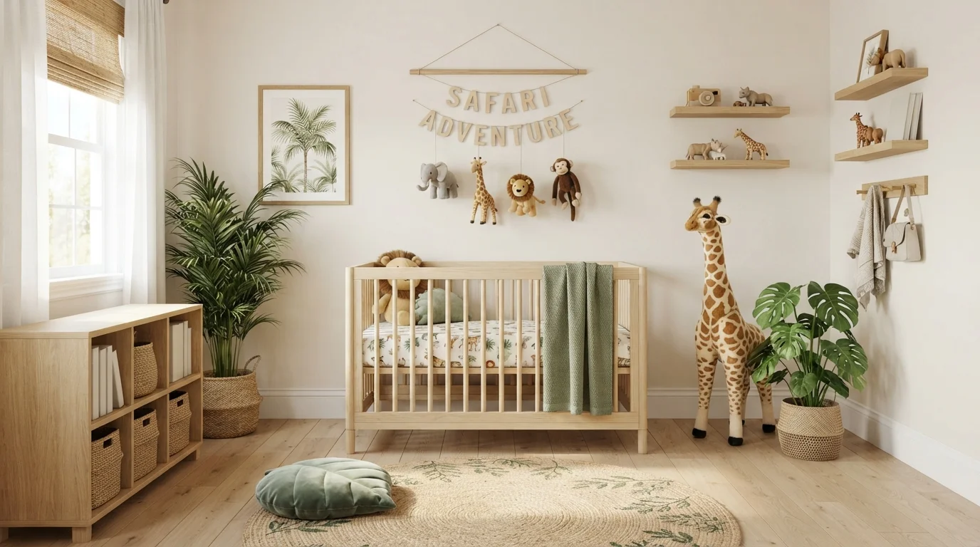
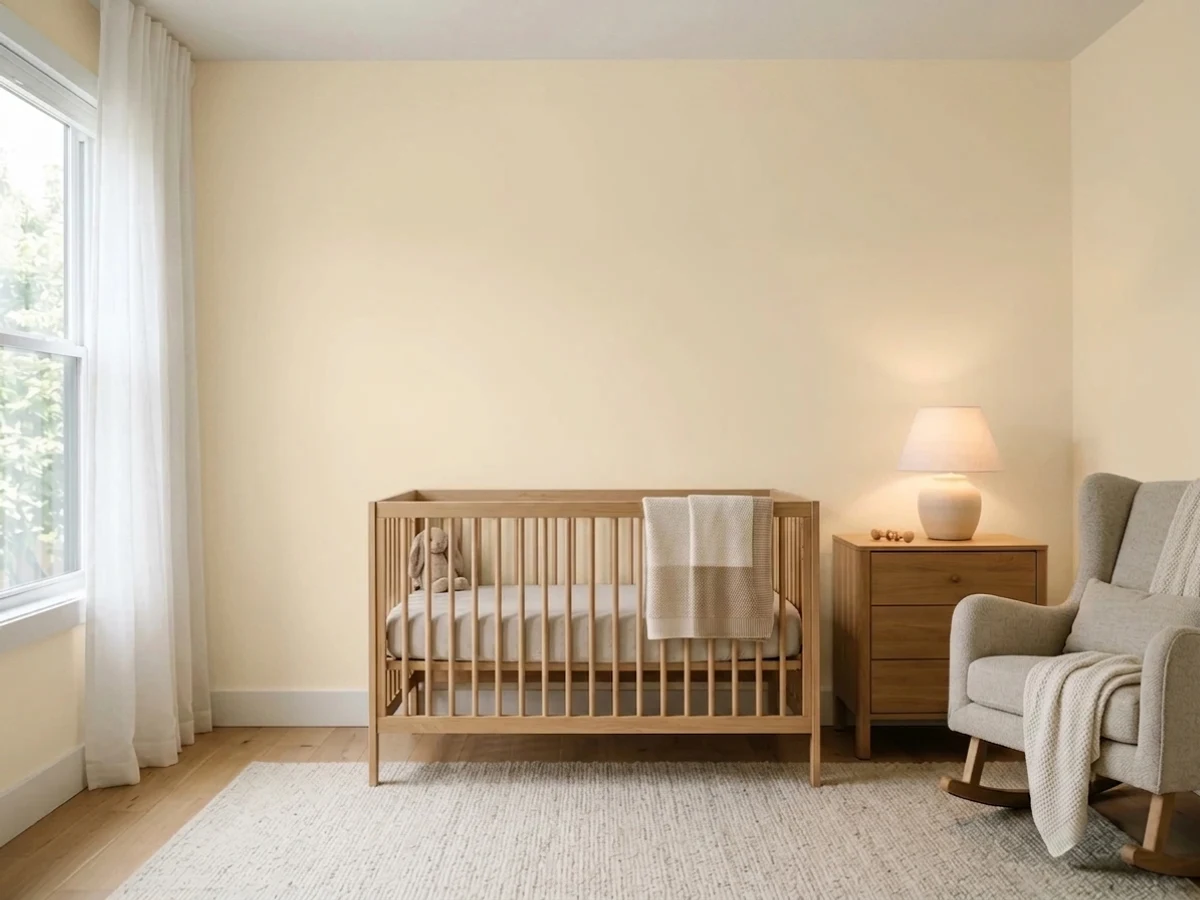
Soft warm cream walls pair effortlessly with light wood, leafy greens, and gentle safari accents for a peaceful nursery.
Creamy off-white is a soft, soothing neutral that gives any space a gentle glow. In this nursery, creamy walls surround a light blonde wood crib, woven storage baskets, and leafy sage green textiles. The whole room feels remarkably calm, cozy, and playfully sweet. The combo works because warm neutrals and natural timber naturally complement earthy botanical greens without overwhelming the senses. It is perfect for anyone designing a tranquil, nature-inspired space for their little one.
SEE STONE QUARRY ON YOUR WALLS →
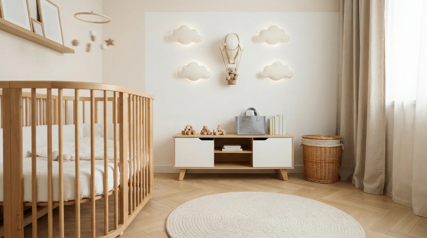
Soft cream walls and light blonde wood create a dreamy, cloud-like space that feels peaceful and deeply soothing.
Warm cream is a gentle, soothing off-white that brings subtle warmth to any room. In this nursery, the creamy tone blankets the walls, complementing a natural blonde oak crib, a low wooden toy bench, and a plush round coiled rug. The room feels wonderfully calm and snug, making it an inviting place to rest. The combination works effortlessly because light natural woods and soft milky walls share an organic, easy harmony. It is a timeless choice for anyone wanting a peaceful, gender-neutral sanctuary.
SEE PERCALE ON YOUR WALLS →
You'll love how this tender shade keeps the nursery bright yet wonderfully restful.
SEE INTIMATE WHITE ON YOUR WALLS →

Create a snug, grounding nest that pairs effortlessly with all your cute decor.
SEE PERFECT TAUPE ON YOUR WALLS →
Wrap your little one's room in cozy warmth that feels like a sunny hug.
SEE GENTLE CREAM ON YOUR WALLS →Gender-Neutral Nursery Wall Color Combinations
A wall color never works alone. These are the full schemes from the rooms above — the lead color first, then the supporting colors that make the photo work.
Warm cream walls, mossy green paneling, and natural blonde wood create a calm, cozy woodland nursery.
TRY THIS PALETTE →Soft creamy walls, natural blond wood, and glowing ambient light wrap this gentle nursery in soothing, peaceful comfort.
TRY THIS PALETTE →Soft warm cream walls pair effortlessly with light wood, leafy greens, and gentle safari accents for a peaceful nursery.
TRY THIS PALETTE →Soft cream walls and light blonde wood create a dreamy, cloud-like space that feels peaceful and deeply soothing.
TRY THIS PALETTE →For a classic, resale-friendly scheme, pair Classic Gray walls with bright white trim and a natural wood crib or dresser — the gray keeps the palette calm while the wood warms it up, and white trim keeps the room from feeling monochrome. Butter Yellow works the same way: white trim, wood furniture, and it photographs well against both navy and sage accents if the parents add color later through bedding or a rug.
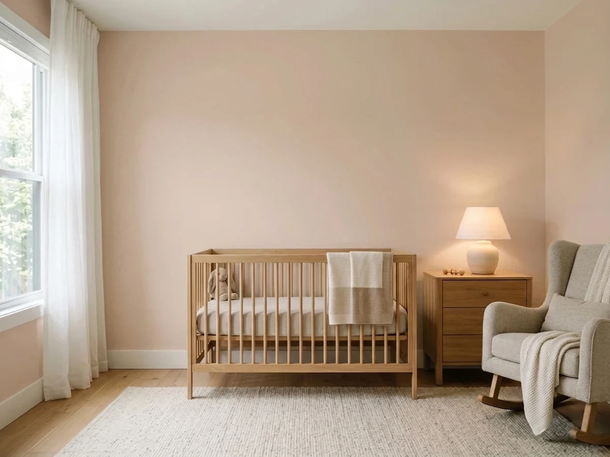
For a softer, more designed look, pair Tissue Pink or Setting Plaster walls with Accessible Beige or Perfect Taupe on a closet door or built-in — two warm neutrals from different families read as intentional, not mismatched, because they share the same dusty, low-saturation base. Gentle Cream and Intimate White both pair cleanly with black or oil-rubbed-bronze hardware if the room is going for a slightly more grown-up, less "baby" look.
More Nursery Color Ideas
Set on a color family already? Each page has its own real rooms and picks.
Light or Dark Gender-Neutral Nursery Colors?
Go Light (LRV 60+) If…
The room is small, faces north, or has to work at every hour. Light warm colors make it feel bigger and stay calm in evening light — the light you actually live in.
Go Dark (LRV Under 20) If…
You want the cocoon effect and the room has real daylight. Dark works best on one feature wall — or fully color-drenched in a large room with good windows.
Most of this list sits deliberately light — Butter Yellow, Intimate White, Gentle Cream, and Classic Gray all land between LRV 71 and 86, which keeps a nursery bright enough for daytime naps and diaper changes without a lamp on. That matters more in a nursery than almost any other room: these are often the smallest bedroom in the house, frequently with one window, and a dark wall color there reads as cramped rather than cozy.
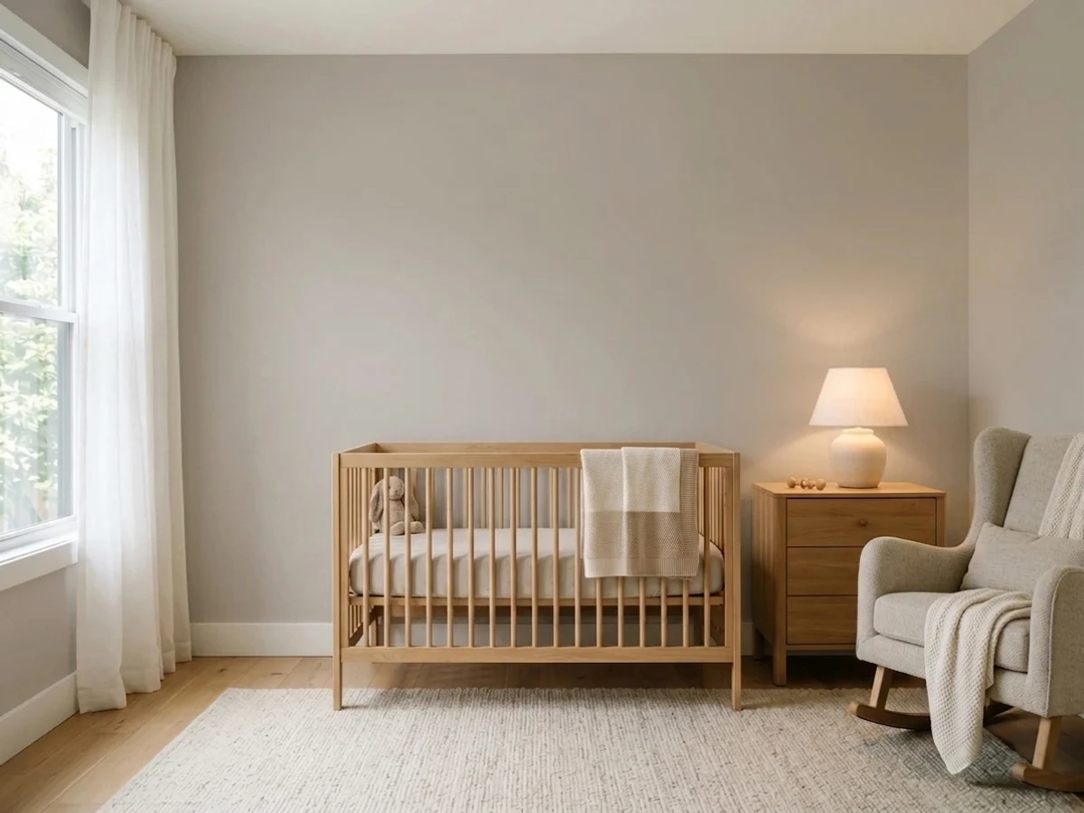
Perfect Taupe (LRV 42) is the exception, and it works best used narrowly — one accent wall behind the crib, or the lower half of a board-and-batten treatment — rather than on all four walls. In a north-facing nursery with limited natural light, keep Perfect Taupe to that single wall and let Gentle Cream or Intimate White carry the rest of the room so the space doesn't feel closed in by afternoon.
See It. Love It.
Paint It.
Upload one photo of your gender-neutral nursery and try every color on this page on your own walls — in your own light, before you buy a drop of paint.

Setting PlasterBeforeWhere To Put Color In A Nursery
Most nurseries don't need all four walls in the same color to feel finished. The crib wall is the one place a slightly deeper choice like Perfect Taupe earns its keep — it becomes the backdrop for photos and gives the room a focal point without committing the whole space to a darker palette. The other three walls in a lighter pick like Gentle Cream or Intimate White keep the room feeling open for the parts of the day spent on the floor playing or pacing with a fussy baby.
Ceilings are worth a second thought in a nursery specifically because so much time is spent lying on your back looking up at one — a rocking chair, a changing table, a crib. A ceiling in the same color as Butter Yellow or Tissue Pink, just at half strength, keeps the room from feeling like a box and softens the transition where wall meets ceiling.
Sheen And Finish For Nursery Walls
Nursery walls take more abuse than a normal bedroom — bottle spit-up, marker experiments once the baby becomes a toddler, and constant wiping down near the changing table. An eggshell or satin finish is the standard choice for any of these eight colors; it wipes clean without the glare a semi-gloss gives a small room lit by one window or a single overhead fixture.
Check that whatever brand you're mixing Classic Gray, Butter Yellow, or the rest in offers a zero-VOC or low-VOC line — Benjamin Moore's Natura and Sherwin-Williams' Harmony are both built for exactly this room. Let the room air out and off-gas for a few days before moving the crib and furniture back in, even with low-VOC paint.
Common Mistakes With Gender-Neutral Nursery Colors
The biggest one is overcorrecting into beige-on-beige and ending up with a room that reads unfinished rather than neutral — Accessible Beige and Perfect Taupe both need a genuine accent, whether that's a wood crib, a patterned rug, or one wall in Tissue Pink, or the room can feel like a hallway instead of a nursery.
The second is mixing warm and cool neutrals without checking undertones first — Classic Gray leans warm-neutral, so pairing it with a cool blue-gray trim or rug can make both colors look muddy rather than coordinated. Test the actual picks against each other in the room's real light before committing, since a color like Setting Plaster can shift from "dusty pink" to "gray" depending on whether the nursery gets morning or afternoon sun.
About Gender-Neutral Nursery Paint Colors
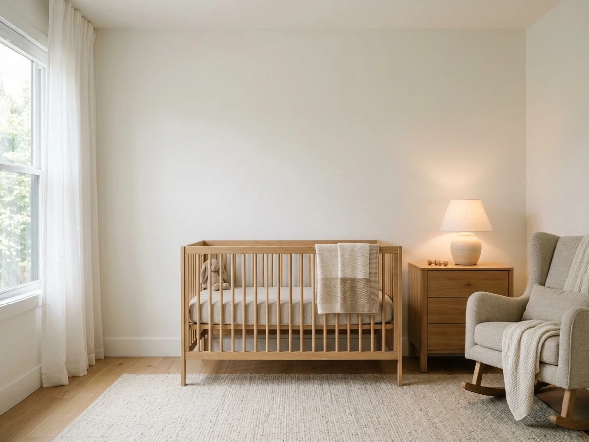
A gender-neutral nursery isn't just "skip the pink and blue" — it's picking a color that reads calm and warm no matter who's decorating the crib next to it. Classic Gray (Benjamin Moore OC-23, LRV 74) is the workhorse pick here: it's warm enough not to feel clinical, light enough to keep a windowless nursery corner from going dim, and it moves straight into a toddler room without a repaint. Butter Yellow (Behr ICC-90, LRV 86) does the same job with more energy — it's the color most people mean when they say "gender-neutral nursery," because yellow has never belonged to one gender in paint marketing, and at LRV 86 it stays sunny rather than saccharine.
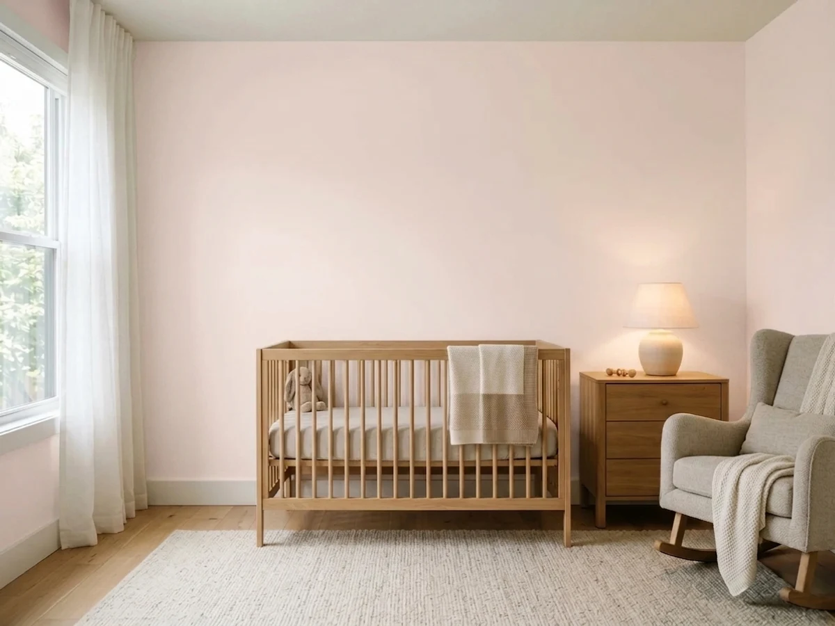
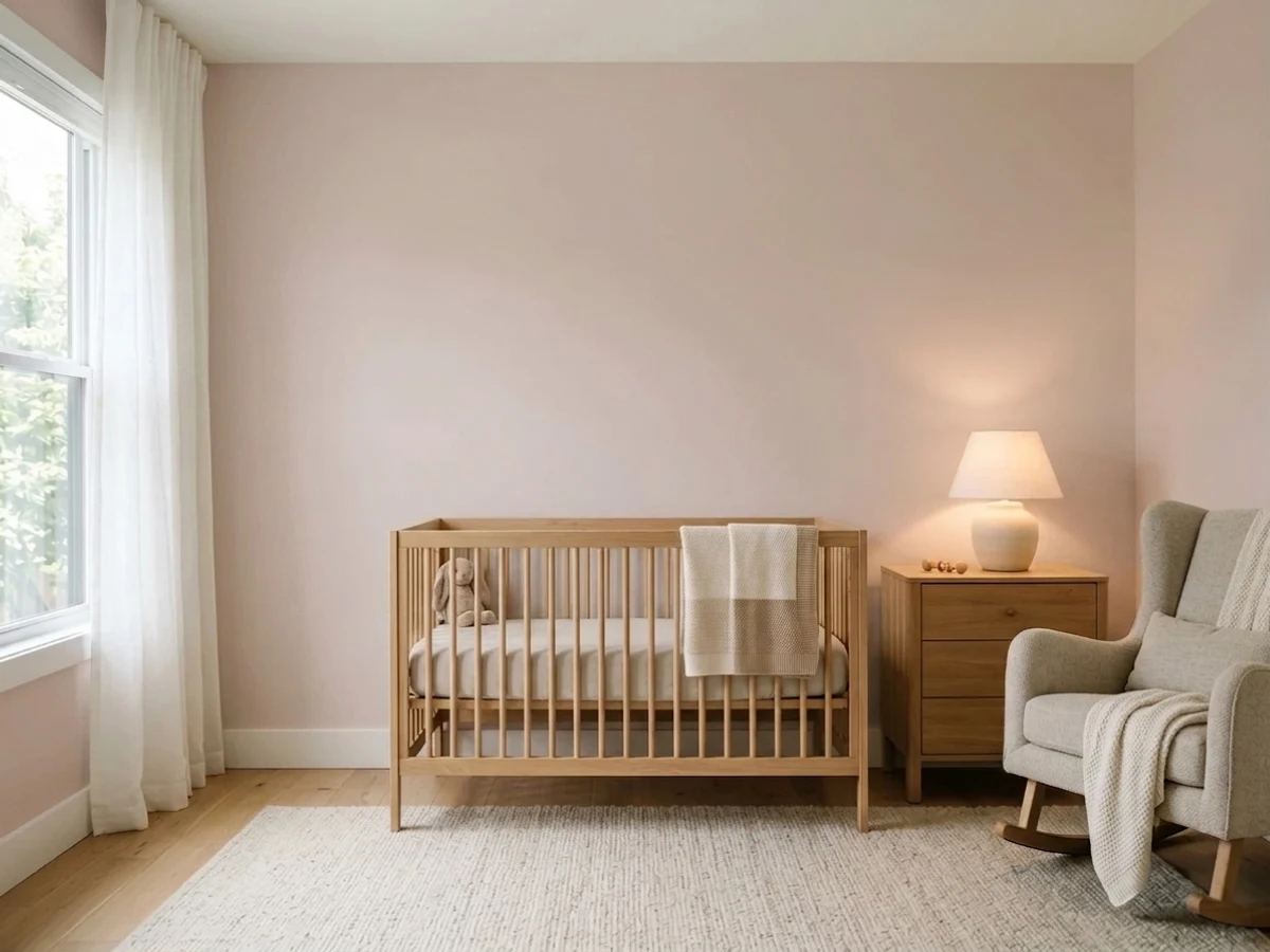
If gray feels flat and yellow feels loud, Intimate White (Sherwin-Williams SW 6322, LRV 77) and Gentle Cream (Benjamin Moore OC-96, LRV 76) split the difference — both are whites with just enough pigment to avoid the stark, sterile look a pure white gives a room this small. Tissue Pink (Benjamin Moore 1163, LRV 71) and Setting Plaster push further into color without picking a gender: both are dusty, grayed-down pinks that read as "warm neutral" on the wall, not "girl's room," especially next to white or wood furniture.
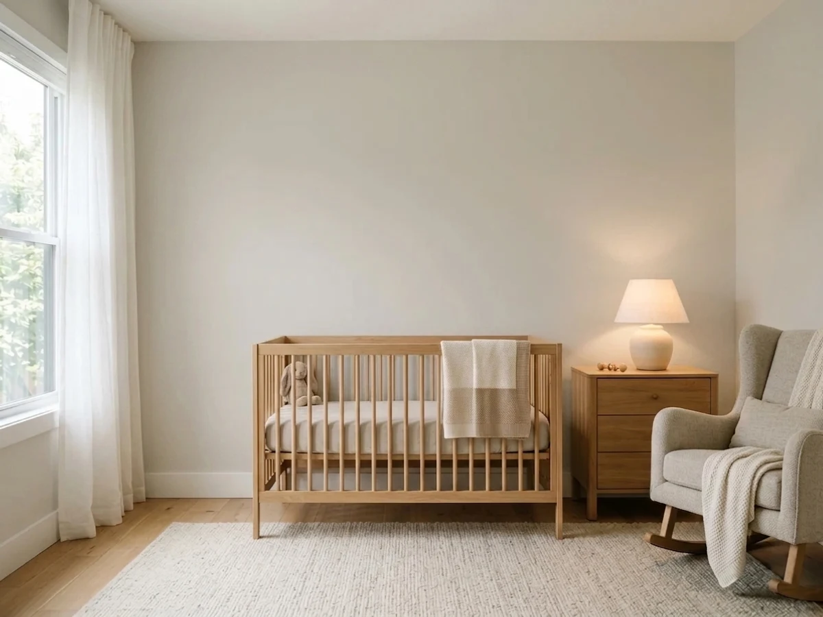
Accessible Beige is the safest long-game choice on this list — a true warm greige built to outlast the nursery phase and carry into a kids' room without complaint. Perfect Taupe (Behr PPU18-13, LRV 42) is the one deliberately deeper option here, for parents who want one wall with real weight instead of an all-pastel room.
The Questions Everyone Asks
What color should I paint my gender-neutral nursery?
If you want one answer, start with the safe picks above — Intimate White, Mocha Ice, Perfect Taupe, Gentle Cream. They read well in any light and survive furniture changes. Then check the light: strong afternoon sun wants a step cooler, a north-facing room wants a step warmer.
what color should i paint a gender-neutral nursery
A soft, warm neutral works best — Classic Gray (Benjamin Moore OC-23) and Butter Yellow (Behr ICC-90) are the two most reliable choices because neither reads as a "boy color" or "girl color" and both stay light enough to keep a small nursery bright. Warm creams like Gentle Cream or Accessible Beige are the safest option if you want the color to carry into a toddler room later without repainting.
is yellow a good gender-neutral nursery color
Yes — yellow has never carried a gender association in paint marketing the way pink and blue have, which is why it's one of the most common gender-neutral nursery picks. Butter Yellow (Behr ICC-90, LRV 86) stays soft and sunny rather than bright or juvenile, which keeps it working for a baby's room and, later, a toddler's.
what two colors go together in a nursery
A light wall color paired with white or natural wood trim is the most reliable nursery combination — Classic Gray or Butter Yellow walls with bright white trim and a wood crib is a classic, easy-to-resell pairing. For more depth, pair a warm neutral like Accessible Beige with a dusty accent like Tissue Pink or Setting Plaster on a closet door or single wall.
how do i make a small nursery look bigger with paint
Stick to lighter colors on all four walls — Intimate White (SW 6322, LRV 77) or Gentle Cream (OC-96, LRV 76) reflect more light than anything under LRV 60 and keep a small room from feeling boxed in. Painting the trim the same white as the walls, rather than a contrasting white, also removes visual lines that make a small room read smaller than it is.
is gray too cold for a nursery
Not if you pick a warm gray. Classic Gray (Benjamin Moore OC-23) has enough warmth in its undertone that it doesn't read cold or clinical the way a blue-based gray can — it's one of the most-used nursery grays for that reason. If a room gets little natural light, pair it with warm wood furniture and warm-white trim rather than a stark white to keep the room feeling cozy instead of sterile.
What two-color combination works best in a gender-neutral nursery?
The reliable pattern is a quiet main color plus one deep accent on a single wall. Keep trim and ceiling in one warm white so the two colors are the only event in the room — the combination cards above show complete schemes from real rooms.
What colors make a gender-neutral nursery look bigger?
High-LRV, slightly warm colors — LRV 60–75 is the sweet spot. Paint the walls and trim close to the same light color so the corners blur, and keep the ceiling white. Stark cool white actually works against you; it creates hard shadows that show the room's edges.


Ask a Question