Gentle Cream
A genuine warm cream reviewed honestly: the light where it glows, the light where it turns custard, and what to pick if you actually wanted a quieter white.

Jessica has spec'd whites and neutrals for more than 300 rooms and keeps a sample wall of painted drawdowns in her studio. Every color review is checked against real reader rooms in the comments and re-tested when a formula changes. About the testing process →
- 1Agreeable Gray60
- 2Balboa Mist66
- 3Gentle Cream71
- 4Pearly White77
- 5Dover White83
The Fast Verdict
Gentle Cream is not the shy off-white its name suggests — it's a real, soft yellow cream with an earthy beige base, closer in family to Benjamin Moore's true creams than to a stealth neutral. Give it a nursery, a family room, or a warm-wood kitchen in moderate daylight and it glows exactly the way its fans want. Give it a sun-flooded south or west room with warm wood and warm bulbs stacked on top, and the yellow compounds fast — that's the one thing to plan around before you buy the gallon.
Nurseries and kids' rooms · family rooms with warm wood · entryways and dining rooms that want a soft glow · anyone who actually wants cream, not a stealth white
You want a quiet, low-yellow neutral · your room is flooded with south or west sun and warm bulbs everywhere · your grays are lighter or cooler than the wall · you're picturing something closer to white than beige
- A real, honest cream — not a beige pretending to be white or a white pretending to be neutral
- Settles into a calm warm off-white in north and moderate daylight
- A genuine standout in nurseries, kids' rooms, and family rooms with warm wood
- Deep enough (LRV 76) to read as intentional color, not a compromise white
- Plays beautifully with brass, walnut, oak, and other warm wood tones
- Full south/west sun plus warm wood plus warm bulbs can tip it toward custard-yellow
- Fights lighter or cooler grays paired at the same depth
- The name undersells it — buyers expecting a soft white get real cream instead
- Narrower lane than the deck's true off-whites; not the whole-house safe pick for gray-leaning homes
What Color Is Gentle Cream, Really?
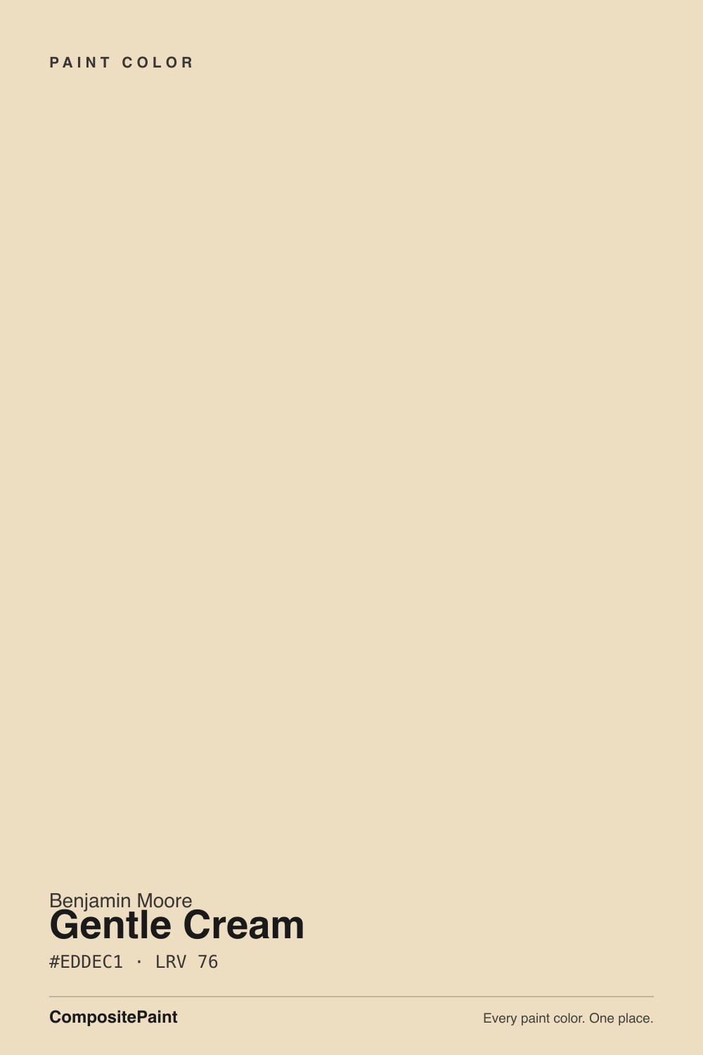
Gentle Cream is a genuine cream, not a shy off-white borrowing the word for marketing. The undertone is a soft yellow riding on an earthy beige base, with a touch of orange underneath — closer in family to the deck's true creams than to a quiet, barely-there neutral. Designers who reach for it are usually asking for exactly this: a nursery or family room that reads warm and finished, not a compromise white that happens to test a little cream.
At LRV 76 it sits mid-pack among Benjamin Moore's warm whites — deeper and more saturated than Navajo White (LRV 78) or Linen White (LRV 80), well short of the near-white end where Cloud White and White Dove sit at LRV 85. That gap matters on the wall: put a brighter white trim next to it and Gentle Cream reads unmistakably as color, not as a slightly-off white. It behaves like cream because it is cream.
Undertone in one line: soft yellow over an earthy beige base, with a whisper of orange underneath — never gray, never pink. If your sample looks custard or golden, that's south or west sun and warm bulbs stacking together, not a bad can; if it looks a little quiet and flat, that's honest north light doing exactly what it should.
Where It Shines
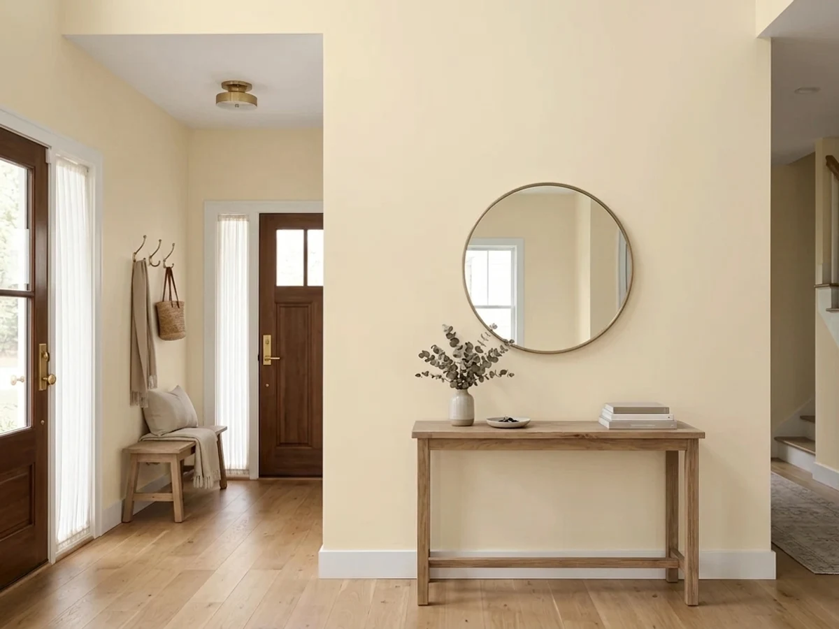
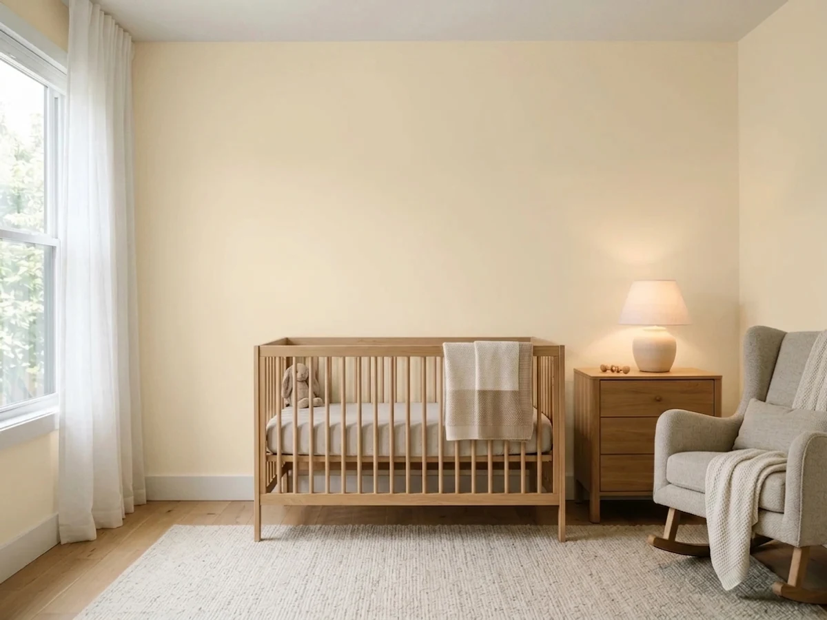
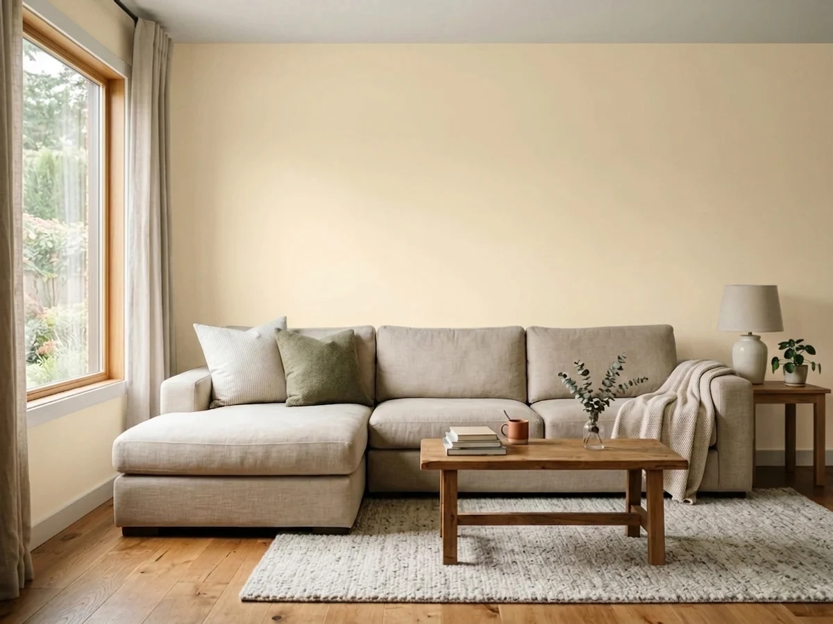
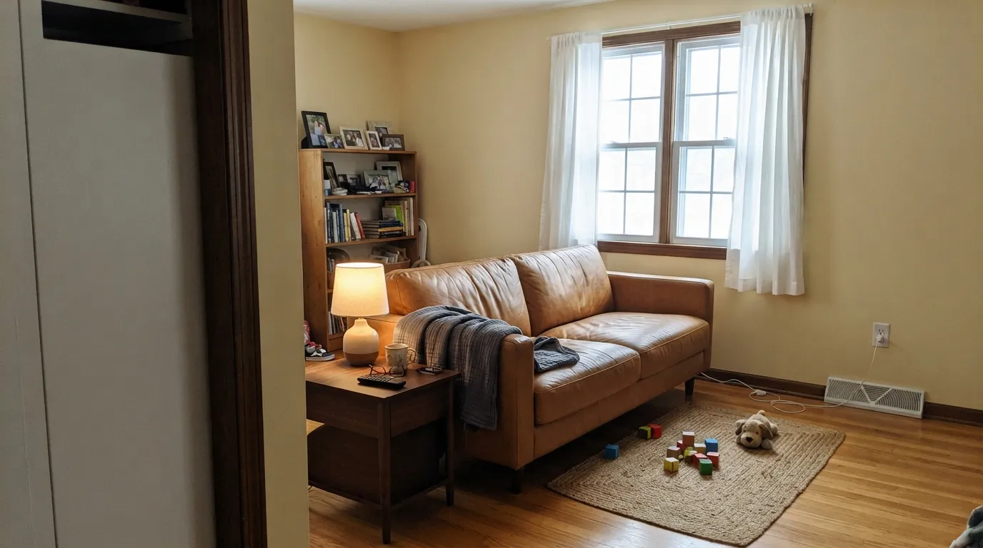
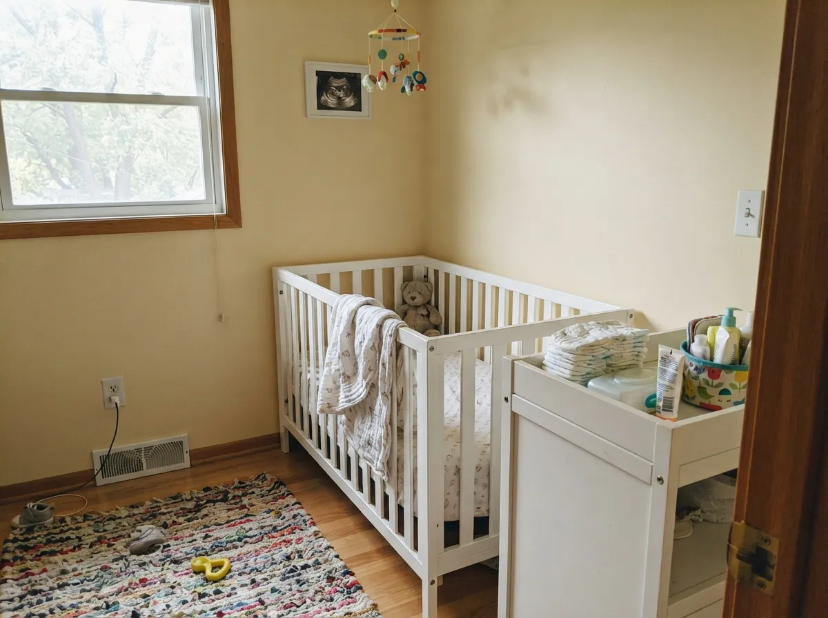
Give it a nursery, a kids' room, or a family room with warm wood and moderate daylight, and Gentle Cream does exactly what its fans want: a soft, glowing warmth that reads finished rather than beige-by-default. It's a recurring pick on design blogs for precisely those rooms — the cream people actually asked for, not a compromise white that happened to test warm. Entryways and dining rooms that catch mixed light through the day suit it too; the color shifts gently rather than sitting flat.
Where It Fails
Almost every regret story about Gentle Cream comes from one of three predictable mismatches, and all three show up before the first coat if you know to look for them. None of them are the paint's fault — but if your room or your expectations match one of these, this is not your color.
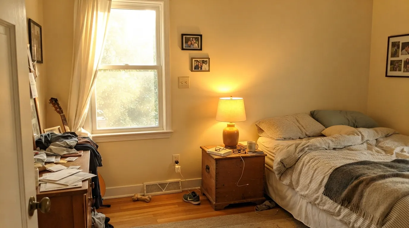
Stack strong afternoon sun with warm wood floors and 2700K bulbs everywhere and the yellow compounds fast. Readers describe the result as custard, and "if it were any darker it would just be golden beige." It's not a flaw, it's physics — pull back one of the three warm elements (cooler bedding, a bright-white trim, or LED bulbs) and the color settles down.
The name says gentle, but at LRV 76 with a real yellow-orange undertone this reads as unmistakable cream on four walls, not a quiet off-white. If what you actually pictured was something closer to White Dove or Cloud White, this color will surprise you — the wrong direction is expensive to fix.
Set Gentle Cream against a gray at the same depth or cooler, and the two fight instead of coordinating — the gray reads dingy, the cream reads muddier. If gray has to be in the room, make it noticeably darker than the wall, not a same-tone partner.
Room by Room
Design blogs return to Gentle Cream for nurseries again and again: matte finish is forgiving of fingerprints, and the warmth reads calm and gentle without tipping into pastel-baby territory. It's the room this color was made for.
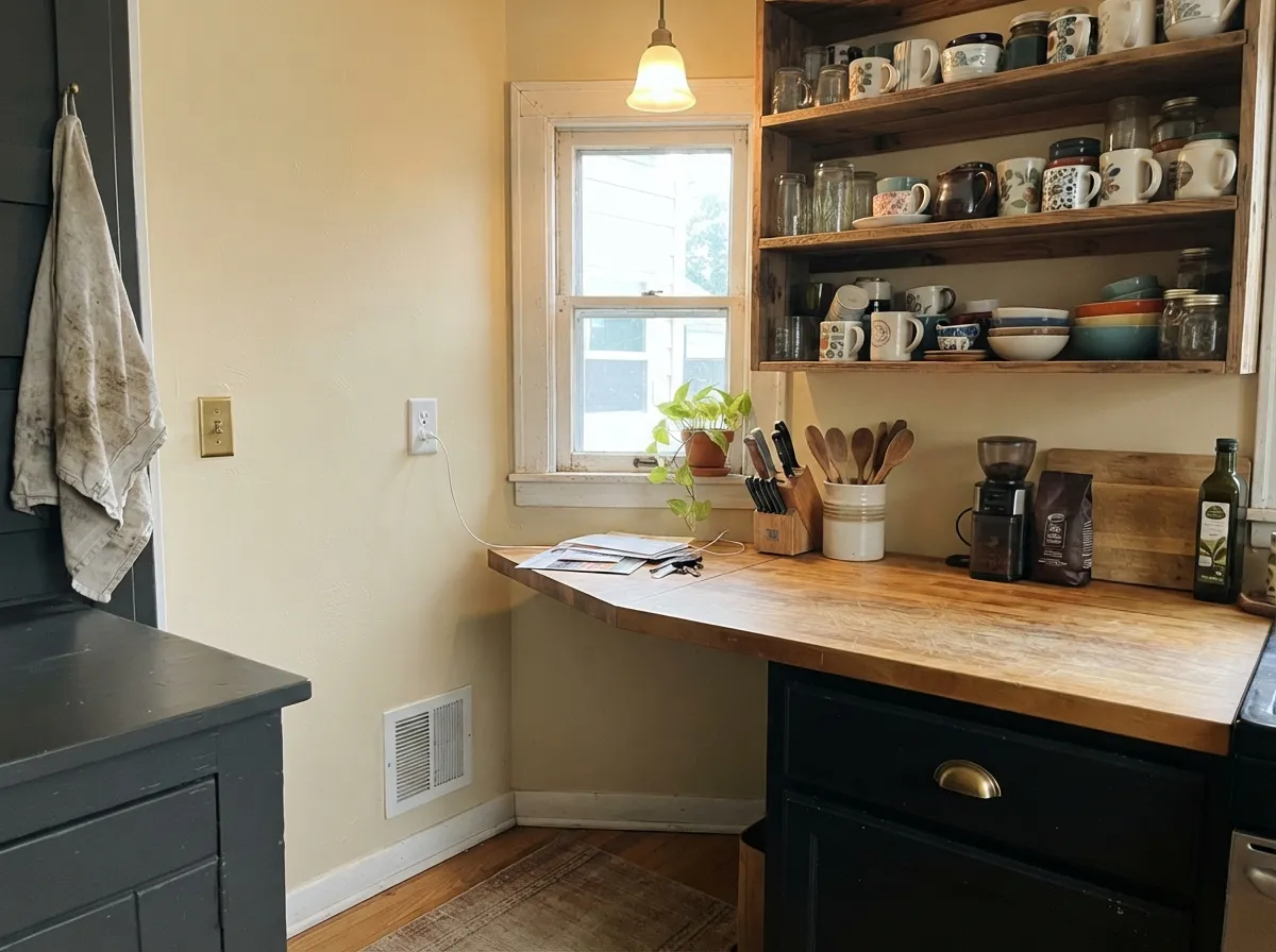
Warm cabinets, butcher block, and brass all love it, and it's a natural for French-country and farmhouse looks. Skip it in a cool-white-quartz, stainless-heavy modern kitchen — there's nothing here for that palette to hold onto.
Best in north or east rooms, or rooms that don't bake in full afternoon sun. A cool-toned rug or sofa keeps the room from tipping too sweet if the light runs warm.
Gorgeous with walnut furniture and cream linens. In a sun-flooded west bedroom, dial it back with cooler bedding or a navy accent so sunset light doesn't push it toward custard.
With warm stone and brass fixtures it's lovely. With cool white or gray tile and flat overhead LEDs it can read muddy rather than warm — test a sample under the actual bathroom lighting first.
Entryways see mixed light all day, and Gentle Cream's shift from golden at the door to quieter cream farther in reads dynamic rather than inconsistent. Cloud White trim keeps the transition clean.
Your Light Is the Risk
Cool, indirect daylight calms the yellow and lets the warmth show without tipping toward candy-corn. This is the light where Gentle Cream earns its name.
Stack strong afternoon sun with warm wood and 2700K bulbs and the yellow compounds fast — readers describe it going custard. Pull back one warm element and it settles.
Warmer and more golden at the sun hours, quieter and more beige-cream the rest of the day. Expect real movement, not a flat color.
2700K lamps push it further into cream-gold; cool LEDs flatten it toward plain beige. Pick the bulb on purpose, not by accident.
Most complaints about Gentle Cream are a light mismatch. Upload a photo of your actual room and see it on your walls — then ask for the same wall in north light or evening lamps before you buy a single sample.
Need It From Another Brand?
Any paint counter can custom-tint Benjamin Moore OC-96 directly. If you would rather stay in one brand's own deck, these are the closest stock matches, measured as ΔE2000. Under 2 is a difference you will not see on the wall.
| Brand | Closest color | ΔE | LRV | |
|---|---|---|---|---|
| Sherwin-Williams | Navajo WhiteSW 6126 · Sherwin-Williams | 1.1 | 72 | Color page → |
| Behr | Authentic TanN290-2 · Behr | 0.7 | 73 | Color page → |
| Valspar | Malted Milk7003-9 · Valspar | 1.6 | 73.9 | Color page → |
| PPG / Glidden | Heavy CreamPPG1098-2 · PPG / Glidden | 0.9 | 73 | Color page → |
| Glidden | Heavy CreamPPG1098-2 · Glidden | 0.5 | 73 | Color page → |
| Dutch Boy | Antique White011W · Dutch Boy | 0.8 | 72 | Color page → |
Similar Benjamin Moore Colors
The nearest shades to Gentle Cream within Benjamin Moore's own range, ranked by perceptual color distance — useful when you want the same look a touch lighter, darker, or warmer.
WCAG 2.1: AA is 4.5 : 1 for normal text, 3 : 1 for large text, AAA is 7 : 1.
Gentle Cream vs the Colors You're Also Considering
Every Gentle Cream sample board has the same rivals on it. The numbers show the real lightness gap — then it comes down to which risk you would rather live with.
Pick this for the Benjamin Moore version, and a little more LRV headroom before the yellow reads sun-bleached.
Sherwin-Williams SW 9109 · LRV 67Natural LinenPick this if your painter works in Sherwin-Williams — same warm-beige weight, with its own single loud stretch of afternoon sun to test for.
Pick this when you want a deeper, more deliberate cream — Navajo White can read flat and characterless by comparison.
Benjamin Moore 947 · LRV 78Navajo WhitePick this for a lighter, fresher cream that's easier to keep from turning custard in full sun.
Within the brand, Bracken Cream CW-105 at LRV 75 is the closest in lightness, while Barely Beige 1066 and CC-140 at LRV 73 have slightly less yellow and read more as beige. Butter Cookie CSP-995 at LRV 72 and hex #E9E0C0 is a touch greener, and Heartsmere 1114 and Flawless AF-320 both at LRV 70 are the deepest of the group.
Across brands the near matches are very tight. Glidden Country Cream 40YY 72/164 at deltaE 0.42, Kompozit Golden Weave 0888 at 0.65, Behr Golden Haystack ECC-23-1 at 0.68 and Valspar Candelabra V092-1 at 0.89 are all effectively the same color. C2 Alpaca C2-562 at 1.34, Farrow & Ball Ringwold Ground No. 208 at 1.36 and Sherwin-Williams Napery SW 6386 at 1.52 are visually identical in normal room light.
Dunn-Edwards Jakarta DEC737 at 2.05 and Rodda Bone CA103 at 2.08 are very close but worth sampling first, and Magnolia Home Ambient Light JG-38 at 3.51 is close but visibly different side by side.
Gentle Cream Coordinating Colors
The rule for coordinating with Gentle Cream: keep trim warm, keep any gray dark, and let wood tones do the heavy lifting. It's easiest to live with next to true warm whites, deep near-blacks, and one cooling accent color to keep the room from running too sweet. These are the partners that keep showing up in rooms that work:
Gentle Cream's Story: An Honest Workhorse, Not a Headline Color
Gentle Cream has never been a Color of the Year and it doesn't have a viral before-and-after attached to its name — and that's a fair, honest thing to say about it rather than a knock. It shows up quietly and repeatedly on interior-design blogs as a go-to for nurseries, guest rooms, and warm family rooms, the kind of recommendation that comes from designers solving the same real problem over and over: a client who wants genuine warmth on the wall without landing on 1990s builder-beige or gold.
That quiet-workhorse status is the honest read on this color. It is not trying to be the deck's signature white, and it doesn't need to be — it does one specific job, a soft glowing cream for rooms that want exactly that, and it does it well as long as the light and the company are right.
Gentle Cream With Wood Tones and Floors
This is a rare warm cream that genuinely likes honey and golden oak — because the wall and the floor share the same temperature instead of fighting across it. Walnut, butcher block, and most brownish or yellowish wood stains all sit comfortably next to it, which is exactly why it keeps showing up in farmhouse and French-country kitchens.
Cool, gray-washed or ashy floors are the pairing to sample first. They don't clash the way they would with a true neutral, but they do throw the wall's warmth into sharper relief, and in a dim room that contrast can read a little unbalanced. A warm rug or runner usually settles it.
Three Ready Palettes Built on Gentle Cream
A color is never alone on the wall. These are complete combinations in the 60-30-10 pattern, with the reason each one holds together. Every one opens in the visualizer.
Cloud White is the deck's best trim white for a warm room, so it frames the cream instead of fighting it. Wrought Iron adds one soft near-black note without cooling the room down the way a true black would.
Try this palette in your roomA charcoal island keeps a warm cream kitchen from tipping sweet, and Cloud White is at its best in exactly this kind of warm room — the trim and the wall agree on temperature instead of arguing over it.
Try this palette in your roomA navy accent wall cools the room enough to keep the custard risk in check even under evening lamps, and crisp Simply White trim gives the warm cream a clean edge instead of letting it spread everywhere.
Try this palette in your roomGentle Cream FAQ
Is Gentle Cream more cream or more beige?
More cream. The undertone is a soft yellow over an earthy beige base with a touch of orange — it reads as genuine cream on the wall, not the beige-leaning neutral its softer name might suggest.
Will it look yellow or custard-colored?
Only under a specific stack: full south or west sun, warm wood floors, and warm 2700K bulbs all at once. Pull back any one of those three and it settles into a calm warm cream instead.
What trim white goes with Gentle Cream walls?
A warm trim white, not a stark one — Benjamin Moore Cloud White or Simply White both work, since they're built for rooms that already run warm. A cool, blue-white trim will make the wall look dingy by comparison.
Does it work in a north-facing room?
Yes, and it's arguably the color's best light — cool, indirect daylight calms the yellow without draining the warmth entirely, unlike colors that go flat and gray in north rooms.
Is it good for kitchen cabinets?
Yes, in kitchens with real wood, brass, or butcher block — French-country and farmhouse kitchens are its natural home. In a cool, stainless-and-quartz modern kitchen it has nothing to agree with.
What gray pairs with it without a fight?
A gray noticeably darker than the wall. A gray at the same depth or lighter and cooler will fight Gentle Cream instead of coordinating with it — that mismatch is one of the most common regret stories.
Have you painted with Gentle Cream?
Rate it — one tap helps the next reader decide.
Ask a Question