Mocha Ice
The latte-toned taupe-pink everyone reaches for as a safe whole-house neutral, reviewed honestly: the light where it turns gorgeous, the light where it turns fleshy, and what to pick instead.

Jessica has spec'd whites and neutrals for more than 300 rooms and keeps a sample wall of painted drawdowns in her studio. Every color review is checked against real reader rooms in the comments and re-tested when a formula changes. About the testing process →
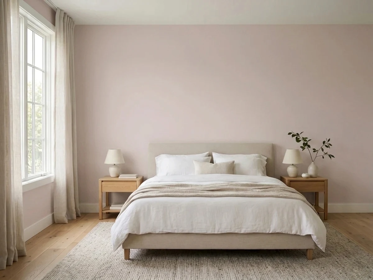
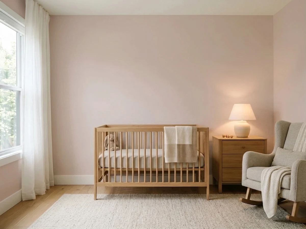
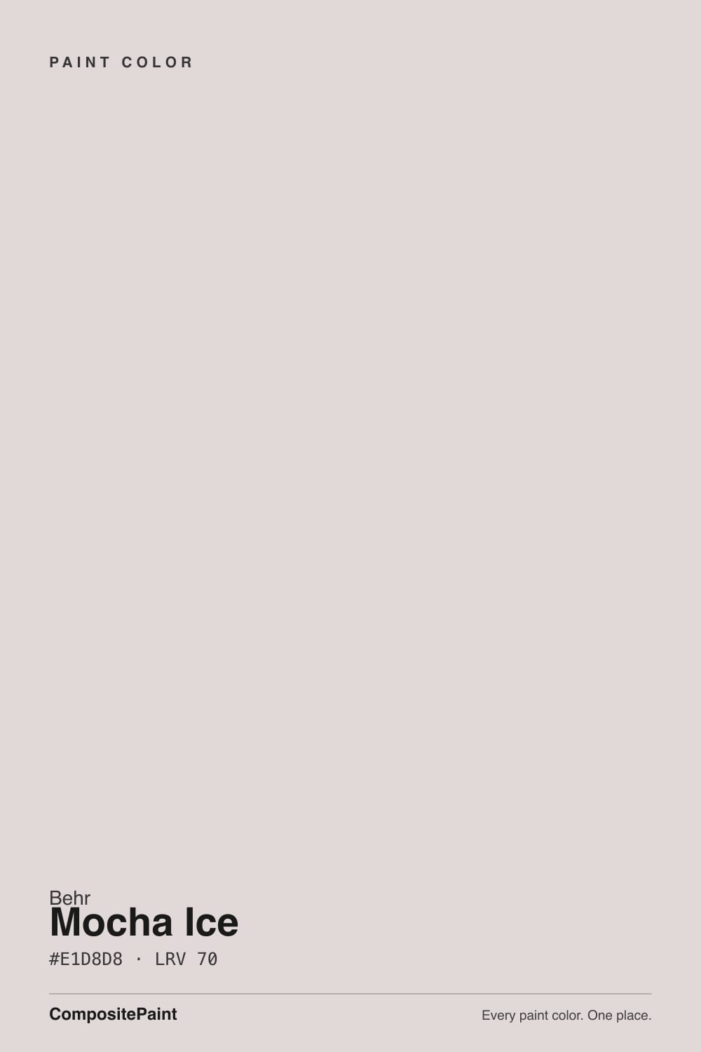
- 1Revere Pewter55
- 2Agreeable Gray60
- 3Mocha Ice66
- 4Shoji White74
- 5Dover White83
The Fast Verdict
Mocha Ice is a soft, low-chroma taupe with a real thread of pink running through it — close enough to a warm greige to pass for one in the wrong light, and close enough to blush to surprise you in the right one. Nobody put it on a Color of the Year shortlist and it never went viral, which is exactly why it works: a dependable, whole-house-safe neutral that happens to ride the current mocha-and-latte mood without chasing it.
Primary bedrooms, especially color-drenched · open-concept living areas with south light · guest baths and powder rooms · anyone who wants warmer than greige without committing to visible pink
Your room gets strong late-afternoon west sun and you hate a flush of pink · your only daylight is north-facing · your floors are honey oak or golden pine · you want a color nobody will ever call "pink"
- Reads as a rich, latte-warm taupe in real daylight — a step warmer than greige without going full pink
- LRV 66 keeps rooms bright while still holding real color against white trim
- Color-drenched primary bedrooms are its strongest, most repeated success story
- Neutral enough to work whole-house, distinctive enough not to be another beige
- Rides the current mocha/latte color mood without being a loud trend color that will date fast
- Late-afternoon west sun can flash it visibly pink or "fleshy" for an hour or two
- Goes flat and muddy-taupe in dim, north-facing rooms with no warm light
- Fights honey oak and golden pine — both the wood and the wall lose
- Deck LRV (70) reads meaningfully lighter than the LRV most third-party color sites quote for it — sample in person, not just from a screen
What Color Is Mocha Ice, Really?
A soft, creamy taupe built on warm red plus a good dose of gray — the kind of low-chroma neutral that reads "latte" more than "paint chip." The red is the whole story: strip it out and this is just another beige-gray, but that whisper of red is what makes Behr file it in the pink family rather than the neutral wall of greiges. It sits in the crowded middle ground between stark off-white and heavy old-school brown, which is precisely why it shows up so often as a "safe" whole-house pick — it reads warm without reading dated.
At LRV 66 it is genuinely light — closer to a soft off-white than a mid-tone wall color — and that lightness is doing real work. It keeps rooms bright while still holding enough color to contrast against crisp white trim, instead of washing out flat like a true near-white. Put it next to a true warm greige like Pale Oak and Mocha Ice reads noticeably pinker; put it next to an actual blush pink like First Light and it reads noticeably more taupe. That in-between position is the whole appeal, and also the whole risk.
Undertone in one line: warm red first, gray second — it is not a true beige and it is not a true gray, it is a pink that learned to behave like a taupe. In strong warm light the red steps forward and the color goes latte-rich; in flat or cool light the gray takes over and it settles into a plain muted taupe. Both are the same paint being honest about the light in your room.
Where It Shines
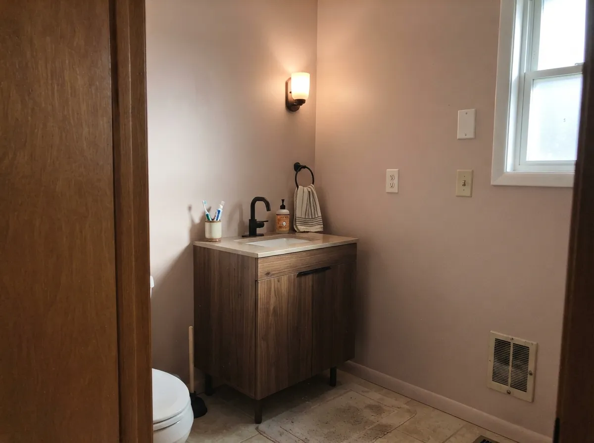
Give it real daylight and it earns its reputation as an easy, grown-up neutral. South-facing rooms amplify the red and beige together, so the color reads rich and latte-like rather than pink — this is the light in almost every glowing before-and-after photo of this color. Its best job is the primary bedroom taken all the way to a color-drenched treatment: walls, trim and even the ceiling in Mocha Ice reads calm and cocooning rather than pink, because there is no crisp white edge nearby to make the undertone argue with itself. Paired with walnut wood, matte black hardware and a stone like travertine, it looks considered rather than accidental.
Where It Fails
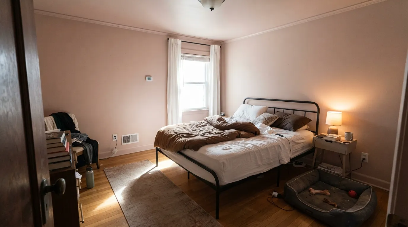
Almost every disappointed review of Mocha Ice traces back to one of three predictable situations, and none of them are really the paint's fault — they are the paint doing exactly what a warm, pink-leaning taupe does in the wrong light or the wrong company.
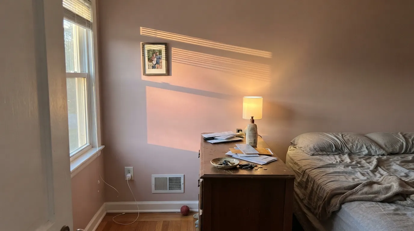
Low, warm west sun pushes the red undertone forward hard, and readers describe the walls turning "fleshy" or noticeably pink for the hour or two around golden hour. It settles back down once the sun drops, but if a full-on pink flash would bother you, sample the wall at 6pm before you commit — not at noon.
Without warm daylight to carry the red, the gray base takes over and the color slides into a flatter, more muted — some readers say "muddy" — taupe-gray. It is not a bad color in that light, just a different and less interesting one than the swatch promised. Add warm 2700K lamps or size up to a lighter, warmer neighbor if the room stays dim all day.
Yellow-toned wood pulls against the pink in Mocha Ice and both sides lose — the floor looks more orange, the wall looks more washed-out pink instead of warm taupe. It wants walnut, espresso or a pale, cool-leaning oak instead. With golden wood already in the room, test big before you paint the whole space.
Room by Room
Color-drenched (walls, trim, ceiling) in a room with any real daylight, it reads warm and cocooning rather than pink. Eggshell on walls, semi-gloss on trim if you keep the trim in the same color for the one-color effect.
Bright, south-facing open plans are where the latte read shows up most reliably. Pair with a crisp white trim and walnut furniture rather than honey-toned wood.
Small rooms take the color's warmth well, and it pairs cleanly with matte black fixtures and travertine or marble. Satin or semi-gloss for the moisture and the wipe-down.
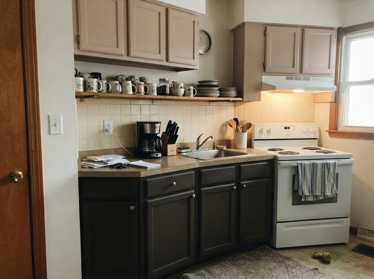
On upper cabinets over a darker lower cabinet color it reads soft and current without going full pink kitchen. On four walls under warm can lights it can look pinker than intended by evening — sample under your actual kitchen lighting.
Warm and gentle without being an obvious "pink nursery" color, especially with white furniture and natural wood accents. It ages out of babyhood better than a true pastel pink does.
This is where the complaints concentrate. Without warm light to carry the red, expect a flatter, more muted taupe-gray than the chip suggests. Warm bulbs help; they do not fully fix a room with almost no daylight.
Your Light Is the Risk
Red and beige amplify together — the walls read rich, latte-warm, and clearly intentional. This is the light behind almost every glowing review.
Without warmth to carry the red, the gray base takes over and it settles into a flatter, muddier taupe than the chip shows. Sample first if this is your only light.
Low warm sun pushes the pink forward hard for an hour or two — some readers love the flush, some call it fleshy. Test at 6pm before deciding.
Warm 2700K bulbs lean into the beige and calm the pink. Cool daylight LEDs flatten it toward a plainer gray-taupe — swap the bulb before you swap the paint.
Most complaints about Mocha Ice are a light mismatch. Upload a photo of your actual room and see it on your walls — then ask for the same wall in north light or evening lamps before you buy a single sample.
Need It From Another Brand?
Any paint counter can custom-tint Behr N150-1 directly. If you would rather stay in one brand's own deck, these are the closest stock matches, measured as ΔE2000. Under 2 is a difference you will not see on the wall.
| Brand | Closest color | ΔE | LRV | |
|---|---|---|---|---|
| Sherwin-Williams | LimewashSW 9589 · Sherwin-Williams | 3.9 | 67 | Color page → |
| Benjamin Moore | Kitten Whiskers1003 · Benjamin Moore | 2.1 | 65 | Color page → |
| Valspar | Warm Fog1002-10C · Valspar | 0.5 | 66 | Color page → |
| PPG / Glidden | Pale TaupePPG1073-3 · PPG / Glidden | 1.6 | 66 | Color page → |
| Glidden | Pale TaupePPG1073-3 · Glidden | 2.0 | 66 | Color page → |
| Dutch Boy | Thinking Pink305-1DB · Dutch Boy | 4.2 | 66 | Color page → |
Similar Behr Colors
The nearest shades to Mocha Ice within Behr's own range, ranked by perceptual color distance — useful when you want the same look a touch lighter, darker, or warmer.
WCAG 2.1: AA is 4.5 : 1 for normal text, 3 : 1 for large text, AAA is 7 : 1.
Mocha Ice vs the Colors You're Also Considering
Every Mocha Ice sample board has the same rivals on it. The numbers show the real lightness gap — then it comes down to which risk you would rather live with.
Pick this for the lighter, brighter version that stays taupe-quiet more often and only flashes pink in strong warm light.
Sherwin-Williams SW 6057 · LRV 62Malted MilkPick this if you want the same blush-taupe idea a shade deeper and more visibly pink from the start — no surprises later.
Pick this for more body and depth — Mocha Ice holds its taupe read better in a big, bright room.
Benjamin Moore 2102-70 · LRV 76First LightPick this for a paler, more clearly pink off-white that still reads warm-neutral most of the time.
Pearls And Lace N130-1, #DFD7DA at LRV 69, swaps the red for a faint violet, so it reads cooler and slightly more mauve. Smoked Oyster 780A-2, #DCDADA at LRV 70, is the neutral version of the same lightness, with no pink at all, and is the safer choice if you want a plain soft white. Jodhpur Tan N180-2, #DDD9D5 at LRV 70, moves the warmth toward yellow instead of red. Kangaroo Tan 770A-2, #E4DAD9 at LRV 72, is a touch lighter and slightly warmer.
Across brands, Valspar Napa Dawn 1003-10C at LRV 69.4 and a difference of 1.04, Sherwin-Williams Quartz White SW 6014 at LRV 71 and 1.06, and Benjamin Moore Majestic Mauve 2115-60 at LRV 68 and 1.51 are all visually identical in normal room light. Dunn-Edwards Fleur de Sel DEGR55 at 3.63 is close but visibly different side by side, reading cooler and less pink.
Mocha Ice Coordinating Colors
The rule for coordinating with Mocha Ice: lean into cool-gray or blue-green partners to calm the pink, and reach for dark, warm neutrals rather than true black for contrast. It pairs more predictably with muted coastal tones and near-blacks than it does with other warm pinks or beiges, which can amplify each other into looking overly sweet. These are the partners that keep showing up in rooms that work:
Mocha Ice and the Mocha Moment
Mocha Ice was never a marketing launch — it is a longtime Behr deck color that happens to sit right in the middle of a color mood the whole industry has been chasing since Pantone named Mocha Mousse its Color of the Year for 2025. Latte tans, cappuccino taupes and dusty mocha-pinks have shown up across paint, textiles and even nail polish in the years since, and Mocha Ice reads exactly like the paint version of that mood without ever having been repositioned or relaunched to catch it.
That is the honest case for it over a splashier, newly-launched "mocha" color: it was not engineered to peak on a trend cycle. A quiet deck color that already reads current has less repaint risk than a color built specifically to ride one — when the mocha moment cools, a taupe this understated just goes back to being a taupe.
Mocha Ice With Wood Tones and Floors
Walnut and espresso are the safest, best-looking partners — the depth and cool-brown cast in the wood keeps Mocha Ice reading taupe instead of pink, the same way it does in the color-drenched bedroom photos that made the color popular. Pale, cool-leaning white oak and gray-washed floors are also safe, giving the room a soft, quiet, slightly Scandinavian cast.
Honey oak and golden pine are the real mismatch. Yellow-orange sits close to the opposite side of the wheel from the red-pink in Mocha Ice, so the two exaggerate each other: the floor can look more orange, the wall can look more washed-out and pink than intended. If the golden floor is not changing, sample a large swatch directly above it before committing the whole room — a rug underfoot helps more than most people expect.
Three Ready Palettes Built on Mocha Ice
A color is never alone on the wall. These are complete combinations in the 60-30-10 pattern, with the reason each one holds together. Every one opens in the visualizer.
One color at two sheens removes the trim-line argument that causes most of the pink complaints — with no crisp white edge nearby, the undertone has nothing to fight and just reads warm. The near-black gives the room its one deliberate dark note.
Try this palette in your roomThe coastal-blue-green pairing readers keep reaching for: Sea Salt's cool gray-green calms the pink in Mocha Ice instead of fighting it, and Alabaster trim gives a soft, not stark, edge — a safer choice here than a bright cool white.
Try this palette in your roomDark warm lowers ground the kitchen and keep Mocha Ice from reading pink up top; Whisper White walls give the room the bright neutral backdrop that a Mocha Ice ceiling-to-floor kitchen would lack.
Try this palette in your roomMocha Ice FAQ
Is Mocha Ice pink, beige, or gray?
All three, in different lights, but pink is the real driver. It has warm red plus gray in its formula, which makes it read as a soft taupe most of the time — but the red is what shifts it toward visible pink in strong warm light, especially late-afternoon western sun. If you cannot live with any pink at all, this is not your neutral.
Does it work in a north-facing room?
It works, but it will not look like the swatch. Without warm daylight the gray base takes over and it settles into a flatter, more muted taupe-gray — some readers call it muddy. Warm 2700K lamps help; if the room stays dim all day, a lighter, warmer color will be more forgiving.
What trim white goes with Mocha Ice?
A crisp cool white gives real contrast and reads clean; a softer warm white gives a gentler transition and reads more cohesive. Either works — pick crisp if you want the walls to look intentionally warm-against-cool, pick soft if you want the room to feel like one continuous idea.
Will it clash with my wood floors?
Depends on the wood. Walnut, espresso and pale cool-leaning oak all sit well with it. Honey oak and golden pine are the real risk — yellow-toned wood pulls against the pink in the paint, and both the floor and the wall end up looking slightly off. Test a large sample above the actual floor first.
Is Mocha Ice a Color of the Year?
No — it has never held that title for Behr. It is riding the same general mocha-and-latte color mood that made Pantone's Mocha Mousse its 2025 pick, but Mocha Ice itself is a longtime deck color, not a marketed trend launch. That is arguably in its favor: it was not built to peak and fade.
Best rooms for Mocha Ice?
A color-drenched primary bedroom is the strongest, most repeated success story — walls, trim and ceiling in one sheen-varied color removes the trim-line contrast that triggers the pink complaints. Bright, south-facing open living areas and guest baths are close behind.
Have you painted with Mocha Ice?
Rate it — one tap helps the next reader decide.
Ask a Question