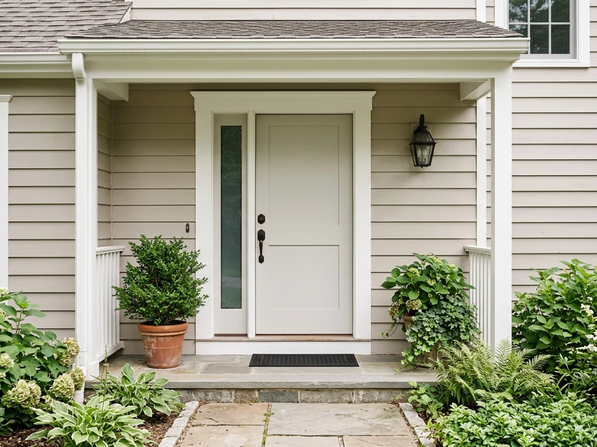
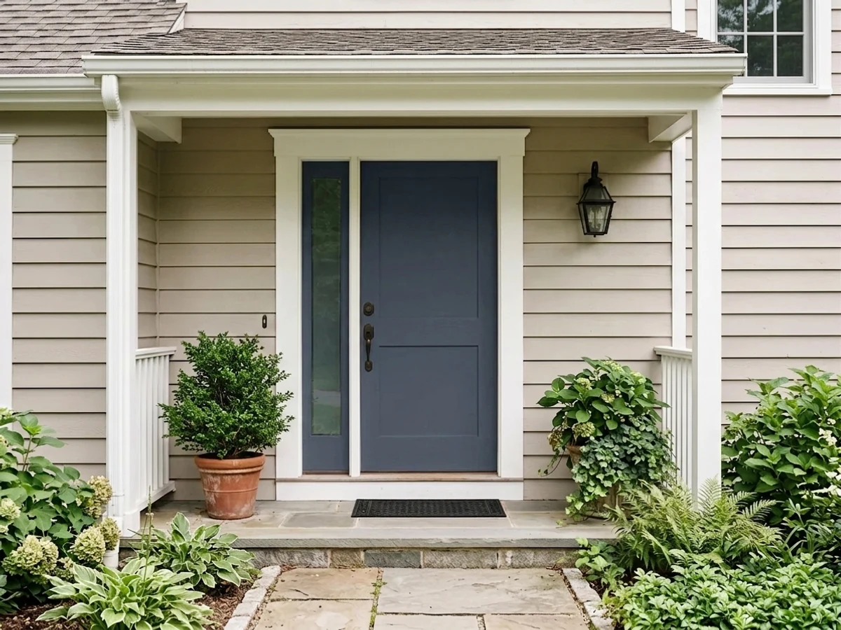
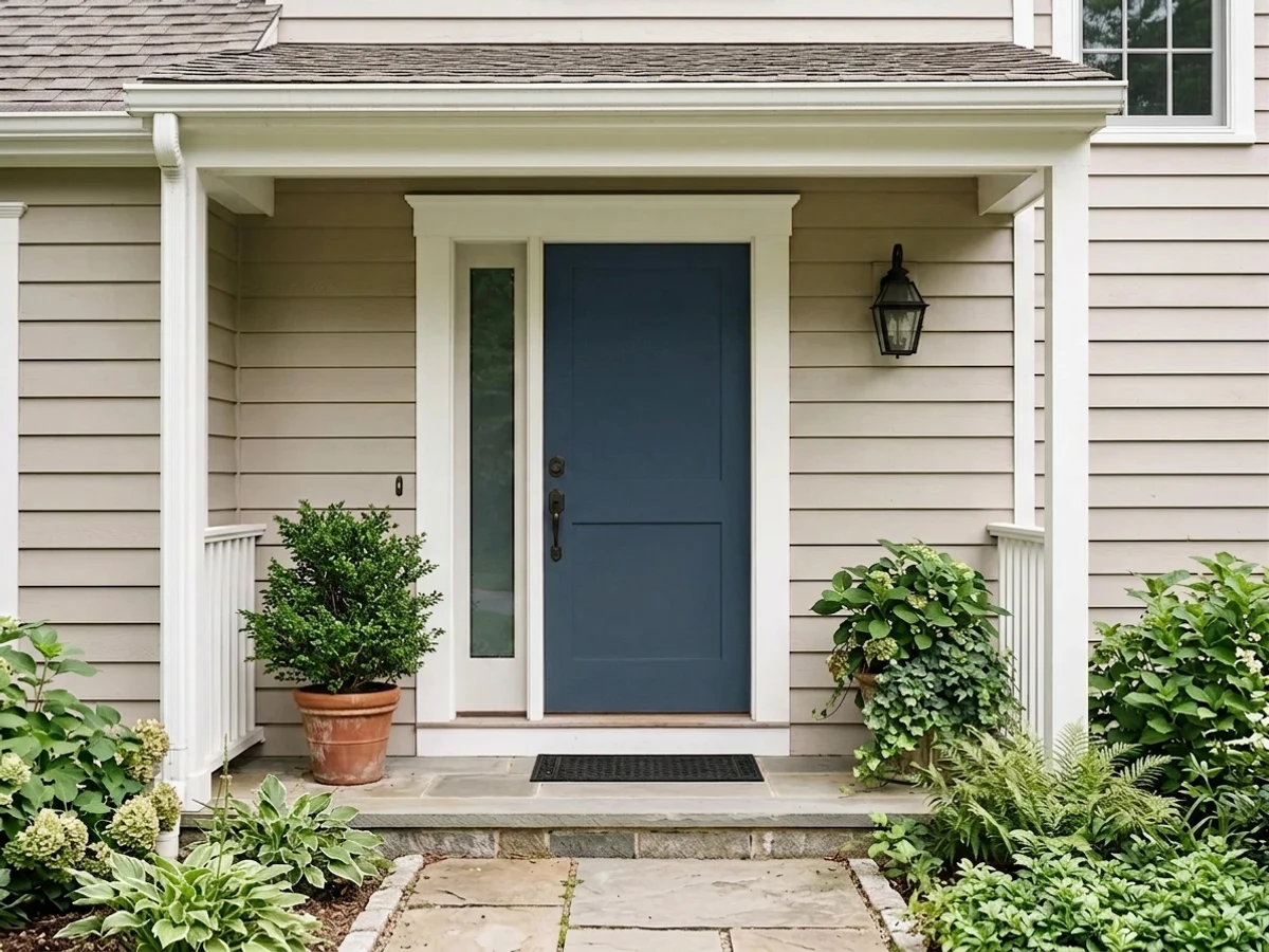
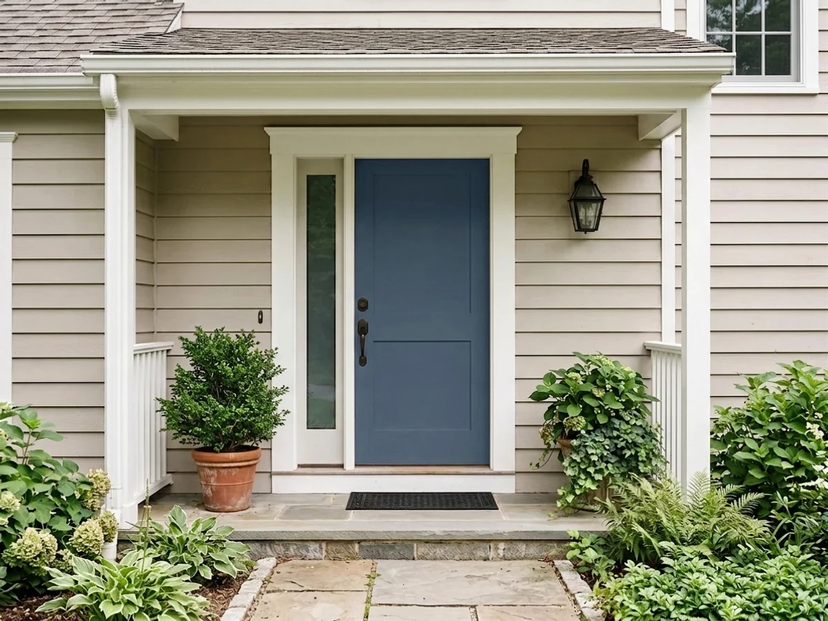
Room Colors · Blue Front Door
8 Best Blue Front Door Paint Colors for 2026
ideas, combinations, and real rooms
8 curated picks from real blue front doors — with the exact colors, honest reasons why, and the combinations that hold the room together.

Former interior stylist who can spot a green undertone from across a room. Jessica writes the color and mood pieces — what to choose, what pairs, and why your "white" looks pink.
The Fast Answer
Don't want to read 8 picks? These four are the safe answers.

Top Picks for the Blue Front Door
Tap a shade to see the blue front door in it, then try it on your own room.
Blue Front Door Color Trends 2026 — What's In, What's Out


- Bright Coastal Blue Door — Cheerful, saturated coastal blues on front doors now read dated next to 2026's deeper, near-black navy and indigo tones.
- Cool Sky Blue — Light, cool sky-blue doors are losing ground to darker, warmer-leaning blues that feel more grounded against neutral siding.
- Blue Door With Cool Silver Hardware — Pairing a blue door with cool chrome hardware is giving way to warm brass and bronze pairings in 2026 entryways.
The 8 Best Blue Front Door Paint Colors
Every pick below is a real rendered blue front door, not a chip. The lead color first; the swatches are the full scheme in the photo — walls, furniture, textiles, accent.

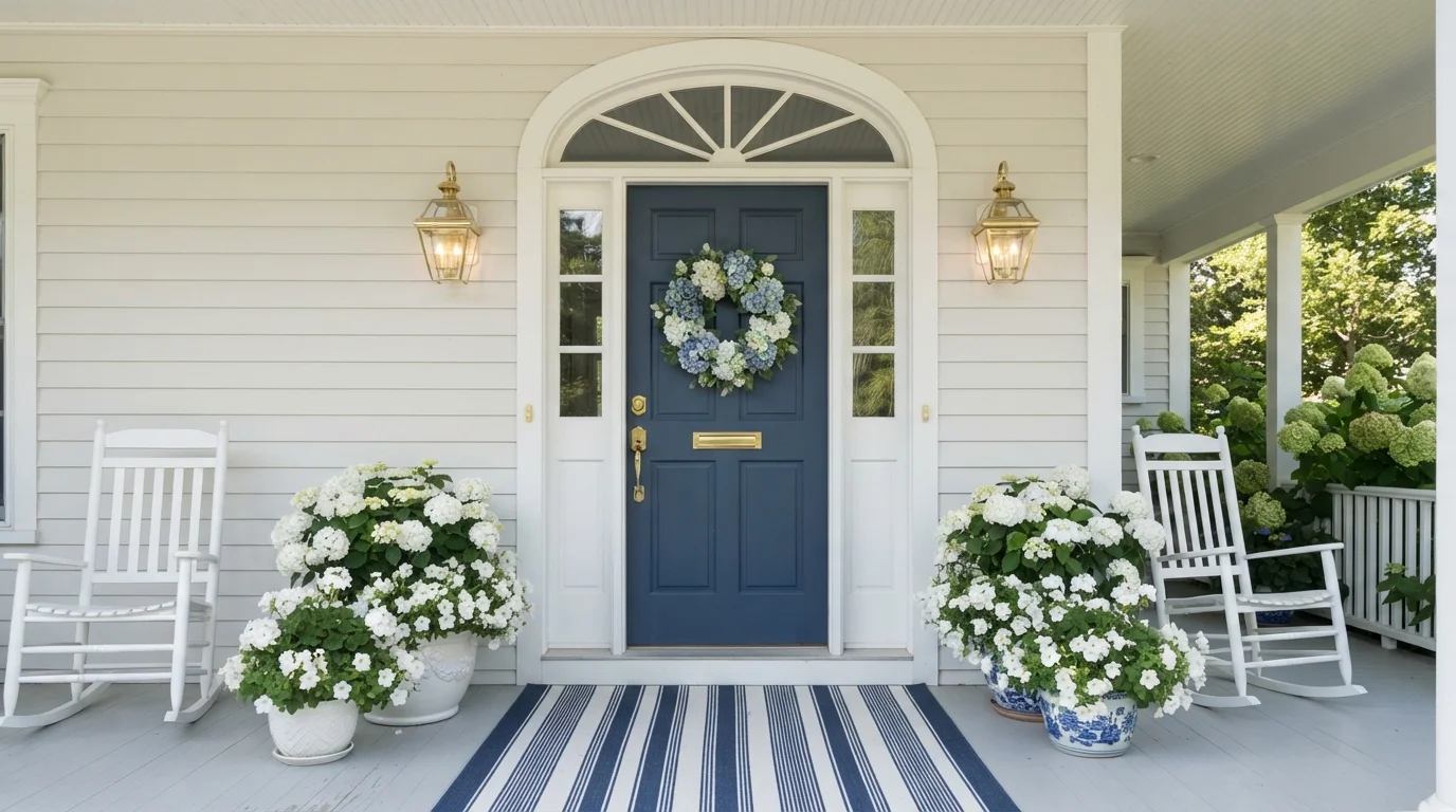
Crisp white siding meets a classic deep navy door adorned with lush hydrangeas for effortless seaside curb appeal.
Navy blue is a deep, timeless maritime blue that always makes an entrance. Here, it covers the paneled front door, perfectly framed by crisp off-white siding, clean white trim, and matching rocking chairs. The porch feels fresh, cheerful, and unmistakably coastal. The combination works because the bold, dark blue gives the entryway a focal point while the surrounding light white keeps everything feeling airy and bright. If you love classic curb appeal with a breezy seaside charm, this is the look for you.
SEE INDIGO ON YOUR WALLS →
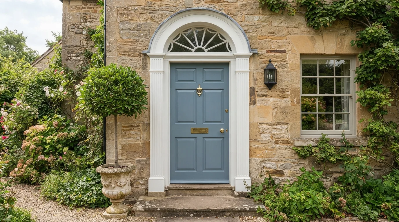
A soft slate blue door framed by crisp white trim brings peaceful, storybook cottage charm to rustic stone walls.
Slate blue is a gentle, dusty grey-blue with a calm vibe. In this entryway, that soothing shade covers a classic paneled front door, framed by crisp white trim and a sunburst fanlight. The entrance feels peaceful, tidy, and welcoming. The combo works because the cool blue tones balance the earthy, textured stone while the bright white trim defines the doorway. It is great for anyone who loves timeless country cottage style with plenty of curb appeal.
SEE IT ON YOUR WALLS →
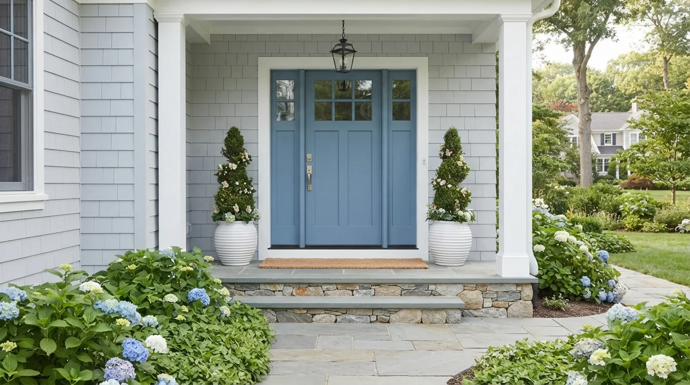
A soft slate blue door greets guests with an inviting, breezy charm set against crisp white woodwork.
Slate blue is a calm, dusty medium blue with soft gray undertones. In this photo, the blue dresses the paneled front door, framed cleanly by bright white sidelights, trim, and light gray shingle siding. The space feels breezy, crisp, and timelessly welcoming. The combination works because the cool blue pops distinctly against bright white molding while harmonizing with the natural stone steps and lush foliage. It is a fantastic choice for anyone looking for classic, polished curb appeal with a relaxed coastal vibe.
SEE BLUE MOON ON YOUR WALLS →
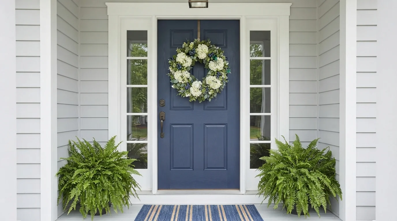
A timeless blue front door framed by crisp white trim and vibrant green ferns brings effortless charm to your entrance.
Deep slate blue is a classic, rich navy with a cool touch of gray. In this entryway, the front door is finished in bold blue, highlighted by crisp white sidelight frames and bright white trim. The whole entry feels clean, balanced, and remarkably inviting. The cool blue pairs effortlessly with pure white while green ferns add a lively burst of life. It is the perfect choice if you want traditional curb appeal that looks polished in every season.
SEE JAZZ AGE BLUES ON YOUR WALLS →
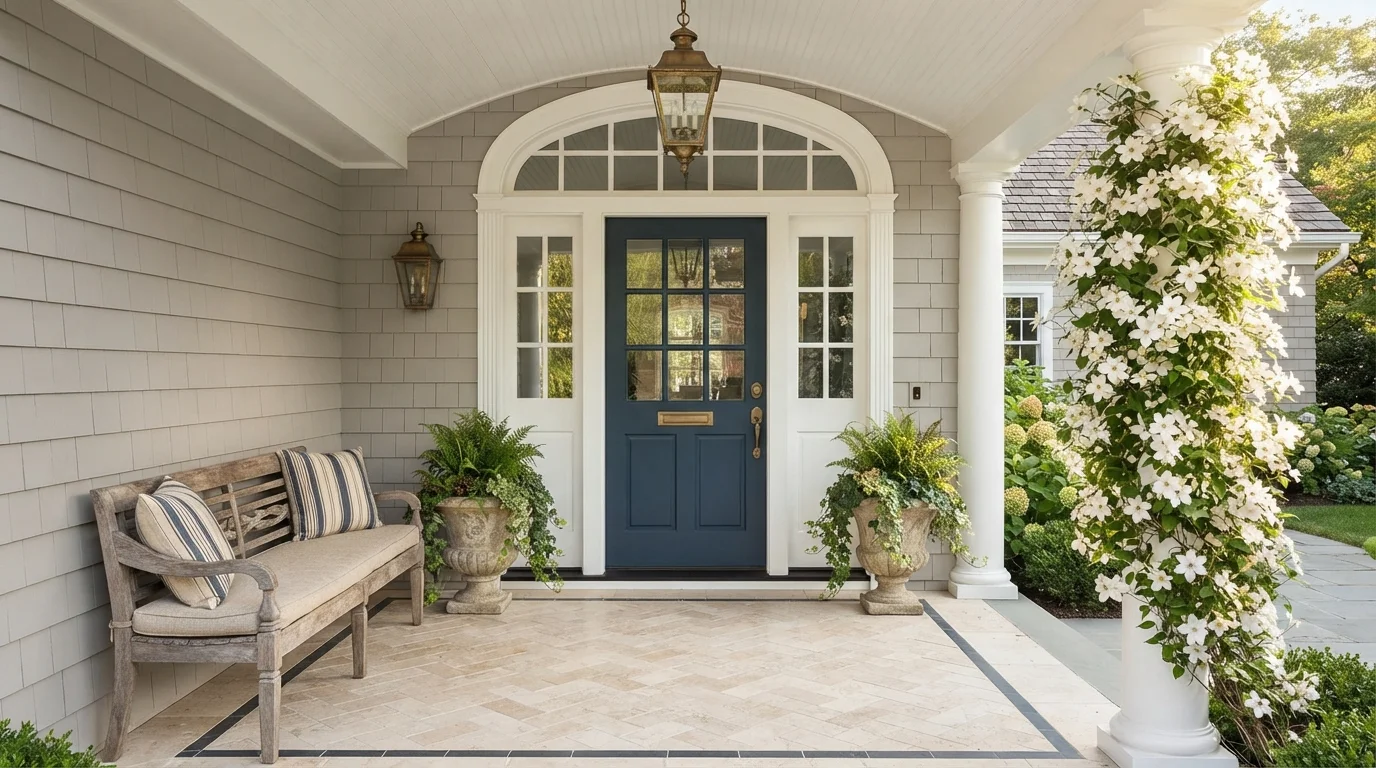
A deep slate blue front door greets you with timeless poise alongside warm stone and weathered wood accents.
Deep slate navy is a rich, grounded blue that never goes out of style. Here, that moody blue dresses the front door, framed by crisp off-white trim and soft greige shingle siding. The porch feels calm, elegant, and instantly welcoming. This pairing works because the dark blue anchors the space while the warm stone floor and white trim keep the entry bright. It is the perfect choice for anyone wanting classic curb appeal with a touch of seaside charm.
SEE NEW NAVY BLUE ON YOUR WALLS →
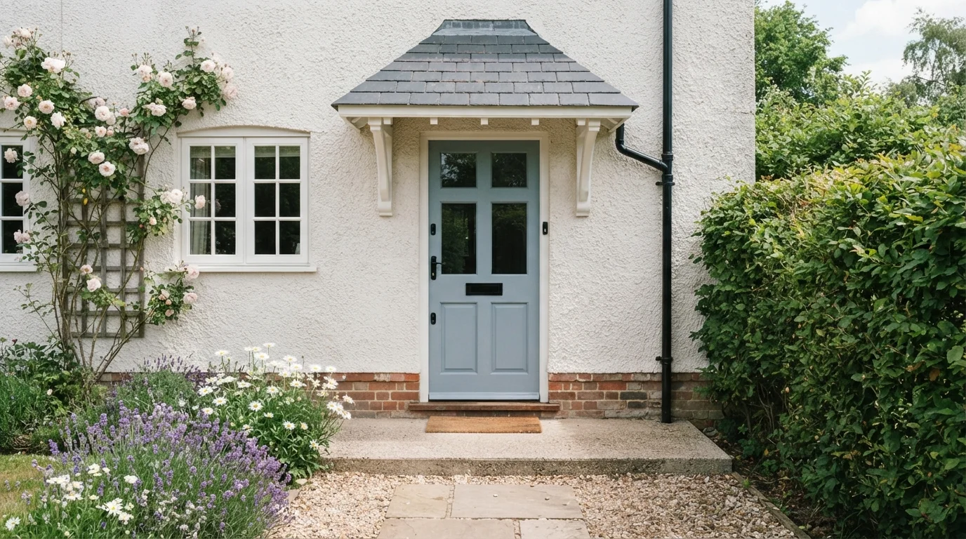
Soft slate blue brings a gentle, storybook charm to a classic cottage entry framed by climbing roses.
Slate blue is a soft, calming blue with a gentle touch of gray. In this entryway, that soothing shade coats the paneled front door, standing out against creamy off-white stucco walls and crisp white trim. The space feels peaceful, friendly, and utterly timeless. The combination works so well because cool blue tones create a refreshing contrast against natural greenery, blooming roses, and warm brickwork. It is an ideal look for anyone looking to add classic storybook curb appeal to their home.
SEE SEABROOK ON YOUR WALLS →
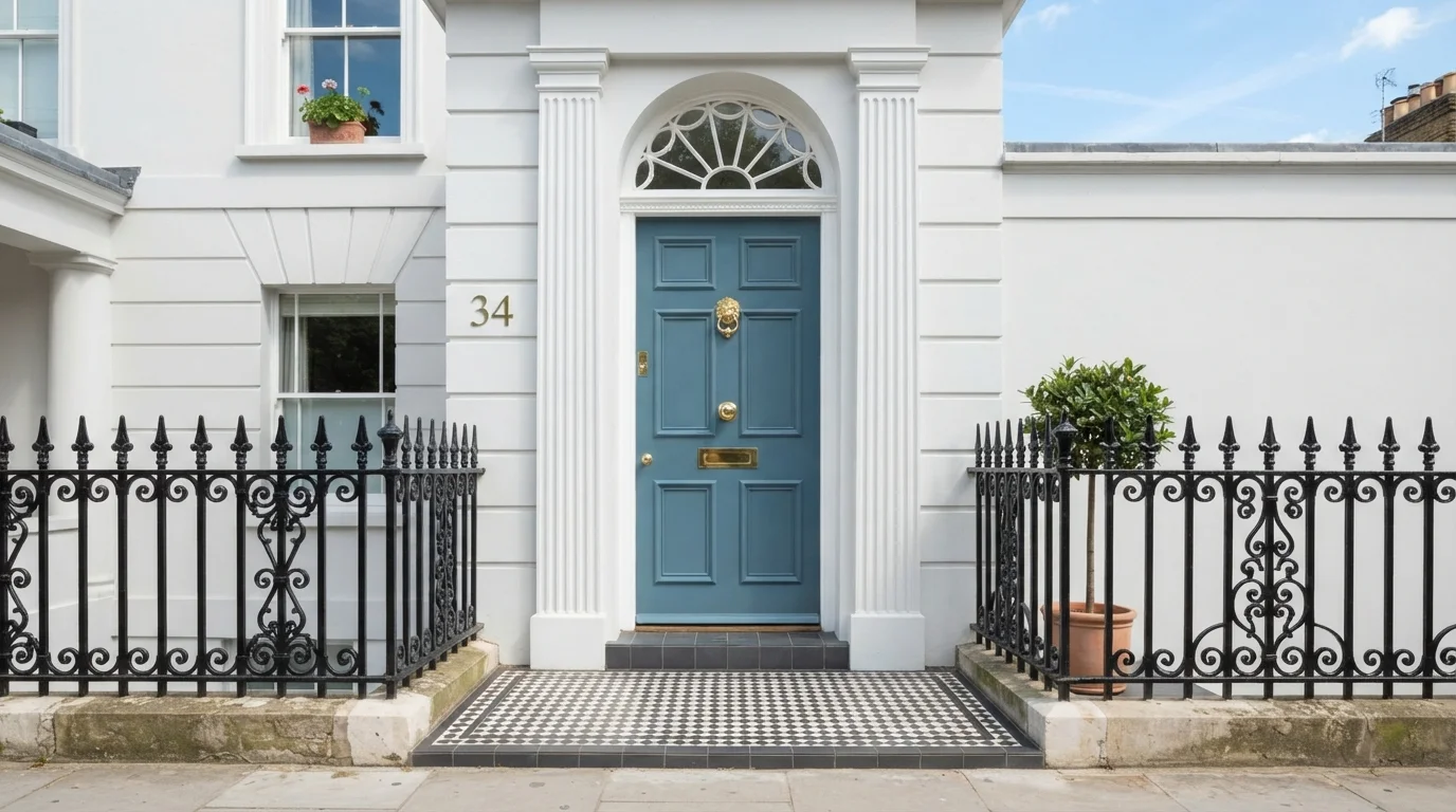
A stately teal door against crisp white masonry creates a bright, tailored entrance full of classic architectural charm.
Slate teal is a balanced, medium blue with soft green depth. In this entrance, the rich teal door stands proudly against brilliant white masonry walls and clean door trim. The whole setting feels poised, fresh, and deeply welcoming from the curb. The combination works because the rich blue-green gives crisp white architecture a focal point while letting brass metalwork gleam. It is ideal for anyone who loves timeless historic style with a touch of fresh personality.
SEE IT ON YOUR WALLS →
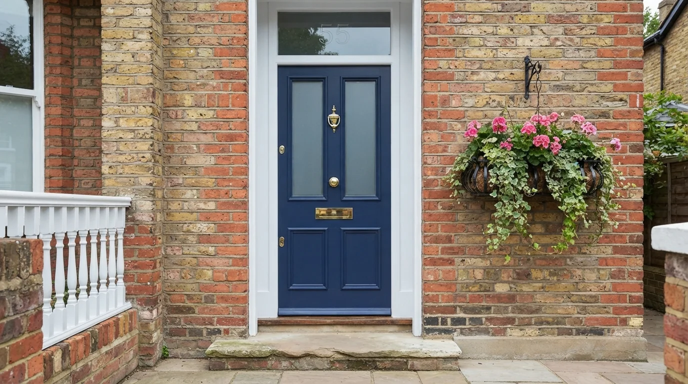
Rich navy blue and gleaming brass create a timeless, inviting greeting against warm, weathered exterior brickwork.
Navy blue is a deep, dignified maritime shade with timeless appeal. In this space, it coats a handsome paneled front door framed by crisp white trim and set into warm red brick walls. The entrance feels smart, grounded, and thoroughly inviting. This look works because the cool, deep blue balances the fiery warmth of the brick masonry while shiny brass hardware adds a bright sparkle. If you want classic curb appeal that always looks put-together, this door color is a perfect choice.
SEE NIGHT WATCH ON YOUR WALLS →Blue Front Door Wall Color Combinations
A wall color never works alone. These are the full schemes from the rooms above — the lead color first, then the supporting colors that make the photo work.
Crisp white siding meets a classic deep navy door adorned with lush hydrangeas for effortless seaside curb appeal.
TRY THIS PALETTE →A soft slate blue door framed by crisp white trim brings peaceful, storybook cottage charm to rustic stone walls.
TRY THIS PALETTE →A soft slate blue door greets guests with an inviting, breezy charm set against crisp white woodwork.
TRY THIS PALETTE →A timeless blue front door framed by crisp white trim and vibrant green ferns brings effortless charm to your entrance.
TRY THIS PALETTE →White trim is the pairing that never misses with a navy door — Hale Navy or Naval against crisp white casing and black hardware is the classic look that shows up on brick colonials and craftsman porches alike, and it's the safest combination if you're not sure. Where the siding is already white or a soft gray, Indigo Batik reads richer than a flat navy without losing that same white-trim pairing.
For the mid-tone and lighter picks, warm wood tones do more of the work than white trim alone. Blueprint or Gothic Purple against a natural or stained wood porch ceiling and matching wood house numbers grounds the color instead of letting it feel like a paint-chip accent. Honolulu Blue, Upward, and Yarmouth Blue pair best with either white trim on a cottage-style exterior or natural wood tones on a covered porch — the goal with these lighter blues is to keep the rest of the entry simple so the door stays the focal point rather than one bright note among several.
More Front Door Color Ideas
Set on a color family already? Each page has its own real rooms and picks.
Light or Dark Blue Front Door Colors?
Go Light (LRV 60+) If…
The room is small, faces north, or has to work at every hour. Light warm colors make it feel bigger and stay calm in evening light — the light you actually live in.
Go Dark (LRV Under 20) If…
You want the cocoon effect and the room has real daylight. Dark works best on one feature wall — or fully color-drenched in a large room with good windows.
Which end of the range to pick comes down to two things: how much sun the door gets, and how dark your siding already is. Naval (LRV 4) and Hale Navy (LRV 6) are dark enough to almost disappear into shadow on a covered, north- or east-facing porch, so they read best against light-colored siding — white, light gray, or beige — where the contrast does the work. On a door that takes direct afternoon sun, especially south- or west-facing, that same darkness absorbs more heat, which matters more on fiberglass or vinyl doors than on solid wood.
For a door that gets full sun most of the day, Blueprint (LRV 19) or Gothic Purple (LRV 25) give you saturated color without the heat load of a true navy. If the house is already dark — dark brick, charcoal siding, black shutters — Upward, Yarmouth Blue, or Honolulu Blue (LRV 39–62) create the contrast a navy door would lose against a dark backdrop.
See It. Love It.
Paint It.
Upload one photo of your blue front door and try every color on this page on your own walls — in your own light, before you buy a drop of paint.

Hale NavyBeforeSun Exposure and Door Orientation
Front door orientation changes which of these colors actually holds up. A south- or west-facing door gets hours of direct afternoon sun, and dark colors absorb more heat than light ones — that's a bigger deal on fiberglass and vinyl doors, which can warp or bow under repeated heat swings, than on solid wood. If your door faces south or west and you want Naval or Hale Navy, check with the door manufacturer about heat limits on dark colors, or ask your paint store about a heat-reflective additive.
North- and east-facing doors, or ones under a deep covered porch, don't have this problem — they get filtered or morning light, so Naval's LRV 4 and Hale Navy's LRV 6 read exactly as dark and dramatic as intended without the heat trade-off. If you're set on a true navy but your door bakes in the sun all afternoon, Blueprint or Indigo Batik give a similar mood at a lighter LRV that runs cooler.
Sheen and Finish
Front doors get more hand contact and weather exposure than any other exterior surface, so flat and eggshell aren't the move. Satin is the standard choice — it hides brush strokes well, which matters if you're painting by hand rather than spraying, and it wipes clean without looking plasticky. Semi-gloss adds more durability and is easier to wipe down if the door gets heavy daily use, like a mudroom entry with kids and pets going through it.
For a color meant to be a statement — and a navy like Naval or Hale Navy usually is — high-gloss makes the color read deeper and more saturated, almost lacquered, which is why it's become the front-door-specific finish designers reach for on bold colors. It shows every imperfection in the surface prep, though, so it only looks good over a door that's been properly sanded and primed first.
Mistakes Specific to a Blue Front Door
The most common miss is painting the door but leaving the surrounding frame and trim in whatever color it already was. A navy door against an unpainted, weathered wood frame looks unfinished — either paint the frame the same navy for a color-drenched look, or paint it crisp white so the contrast is intentional rather than accidental.
The second mistake is picking a blue in isolation from the siding. Indigo Batik and Gothic Purple both carry a visible purple undertone that can clash with warm-toned brick or yellow-based siding — bring the actual paint chip outside and hold it against the house in daylight before committing, since blues shift more under exterior light than almost any other family. Last, skipping primer on bare or previously varnished wood is the reason navy and indigo doors fade patchy within a year or two; these darker pigments need a stable primed surface to hold their depth.
About Blue Front Door Paint Colors
A blue front door works because it reads as put-together rather than trendy — it's the one bold color choice that neighbors compliment instead of question. Unlike red or yellow, blue sits comfortably next to brick, stone, gray siding, and white siding alike, which is why it keeps showing up as the safe-but-interesting pick for people who want curb appeal without gambling on something they'll want to repaint in two years.
The range on this page splits into three real choices, not just shades of the same idea. Benjamin Moore Hale Navy (HC-154, LRV 6) and Sherwin-Williams Naval (SW 6244, LRV 4) are both near-black navies — from the sidewalk they read as a deep, grounded blue that acts almost like a neutral against most siding colors. Behr Blueprint (S470-5, LRV 19) sits in the middle, a true mid-tone blue with enough saturation to feel current without the weight of a navy. Sherwin-Williams Indigo Batik (SW 7602, LRV 8) leans darker and moodier with a purple-blue undertone, and Behr Gothic Purple (N110-4, LRV 25) pushes that further into a blue-lavender blend that reads as genuinely distinctive rather than a stock navy.
On the lighter end, Benjamin Moore Honolulu Blue (2066-60, LRV 62), Sherwin-Williams Upward (SW 6239, LRV 39), and Benjamin Moore Yarmouth Blue (HC-150, LRV 39) all bring a sky-blue, coastal feel instead of navy's formality. These work best on homes that already lean casual — cottage trim, shingle siding, a covered porch — where a near-black door would look out of place against a lighter exterior.

The Questions Everyone Asks
What color should I paint my blue front door?
If you want one answer, start with the safe picks above — Indigo, American Anthem, Blue Moon, Jazz Age Blues. They read well in any light and survive furniture changes. Then check the light: strong afternoon sun wants a step cooler, a north-facing room wants a step warmer.
does a blue front door hurt home resale value?
No — blue is one of the safer bold front door colors for resale, unlike louder choices like orange or bright red. Navy shades like Hale Navy or Naval read as classic rather than trendy to most buyers, since they pair with almost any siding color. If you're specifically selling soon, a mid-tone like Blueprint is the least polarizing option; deep navies and lighter sky blues both test well too.
what color trim goes with a blue front door?
White trim is the classic pairing for any blue front door, from a dark navy like Naval to a lighter shade like Yarmouth Blue — it creates clean contrast without competing with the door. Light gray trim works nearly as well if the siding is already gray. For the darker picks, black hardware and house numbers sharpen the look further.
should i paint my front door a dark or light blue?
It depends on sun exposure and your siding color. A door in direct afternoon sun runs cooler in a mid-tone like Blueprint (LRV 19) than a true navy. Against light siding, dark options like Hale Navy or Naval create strong contrast; against dark brick or charcoal siding, lighter picks like Honolulu Blue or Upward stand out better instead of blending in.
what sheen should i use to paint a front door?
Satin or semi-gloss, not flat or eggshell. Satin hides brush marks and looks clean without being shiny — the easier choice for a DIY repaint. Semi-gloss holds up better to heavy daily use and wipes down easier. For a statement color like Naval or Hale Navy, high-gloss makes the navy read deeper and more saturated, but it needs a well-prepped, primed surface to look right.
will a dark navy front door get too hot in direct sun?
It can, on a south- or west-facing door that takes hours of direct afternoon sun — dark colors like Naval (LRV 4) and Hale Navy (LRV 6) absorb more heat than lighter ones, which matters most on fiberglass or vinyl doors that can warp under repeated heat swings. If your door bakes in full sun, ask the door manufacturer about heat limits on dark colors, or choose a lighter mid-tone like Blueprint instead.
What two-color combination works best in a blue front door?
The reliable pattern is a quiet main color plus one deep accent on a single wall. Keep trim and ceiling in one warm white so the two colors are the only event in the room — the combination cards above show complete schemes from real rooms.
What colors make a blue front door look bigger?
High-LRV, slightly warm colors — LRV 60–75 is the sweet spot. Paint the walls and trim close to the same light color so the corners blur, and keep the ceiling white. Stark cool white actually works against you; it creates hard shadows that show the room's edges.


Ask a Question