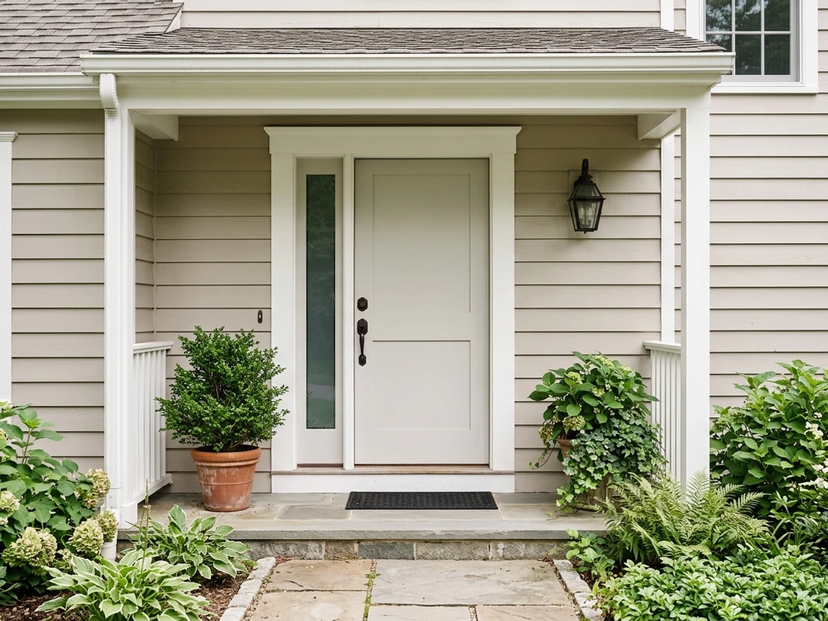
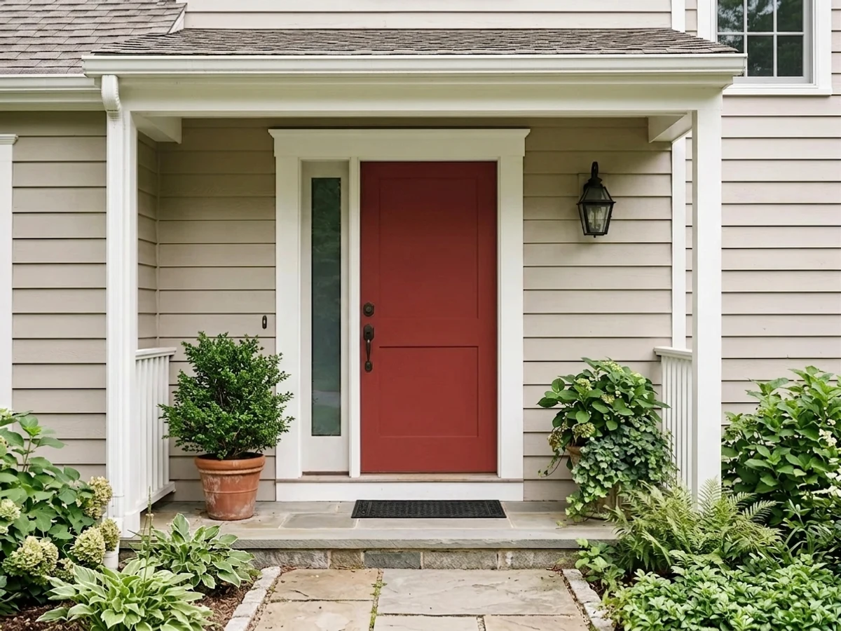
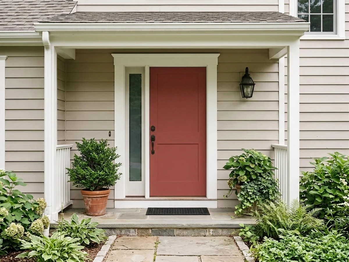
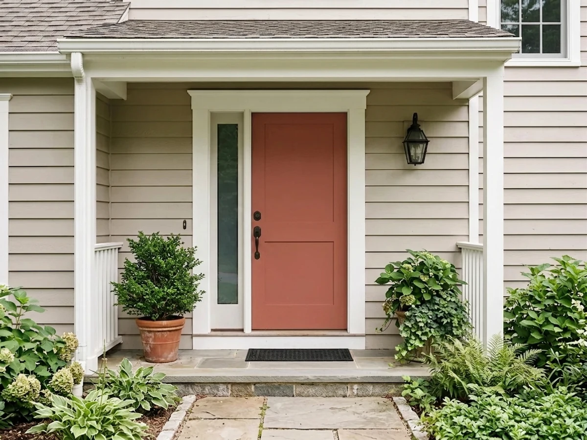
Room Colors · Red Front Door
8 Best Red Front Door Paint Colors for 2026
ideas, combinations, and real rooms
8 curated picks from real red front doors — with the exact colors, honest reasons why, and the combinations that hold the room together.

Former interior stylist who can spot a green undertone from across a room. Jessica writes the color and mood pieces — what to choose, what pairs, and why your "white" looks pink.
The Fast Answer
Don't want to read 8 picks? These four are the safe answers.

Top Picks for the Red Front Door
Tap a shade to see the red front door in it, then try it on your own room.
Red Front Door Color Trends 2026 — What's In, What's Out


- Bright Fire-Engine Red — Pure, cool-toned fire-engine red is reading dated next to the warmer, earthier reds now leading front-door color picks.
- Red Door, White Everything Else — The classic red door against plain white trim is giving way to color-drenched entries where the door color wraps the surround too.
- High-Gloss Candy Finish — Ultra-glossy red doors are losing ground to satin and low-luster finishes that read designed rather than showroom-car shiny.
The 8 Best Red Front Door Paint Colors
Every pick below is a real rendered red front door, not a chip. The lead color first; the swatches are the full scheme in the photo — walls, furniture, textiles, accent.

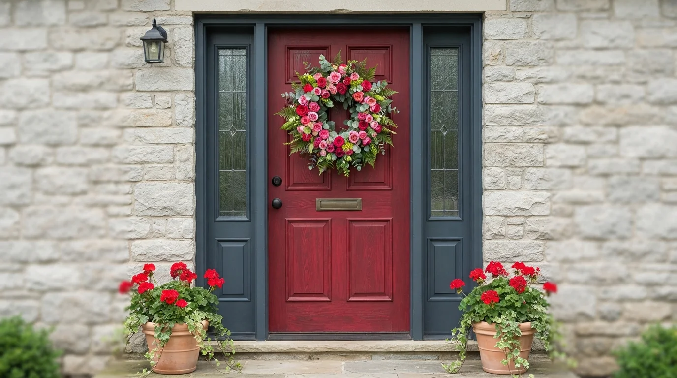
A rich crimson front door paired with deep slate blue trim creates an undeniably welcoming and timeless cottage entryway.
Crimson is a rich, energetic classic red. In this entryway, vibrant red coats the paneled front door, framed sharply by deep slate-blue trim and sidelights. The space feels instantly warm, cheerful, and full of vintage character. The bold combination works because the deep blue trim grounds the fiery red, letting the door stand out beautifully alongside the lush rose wreath. It is perfect for anyone who wants their front entry to make a memorable, storybook first impression.
SEE IT ON YOUR WALLS →
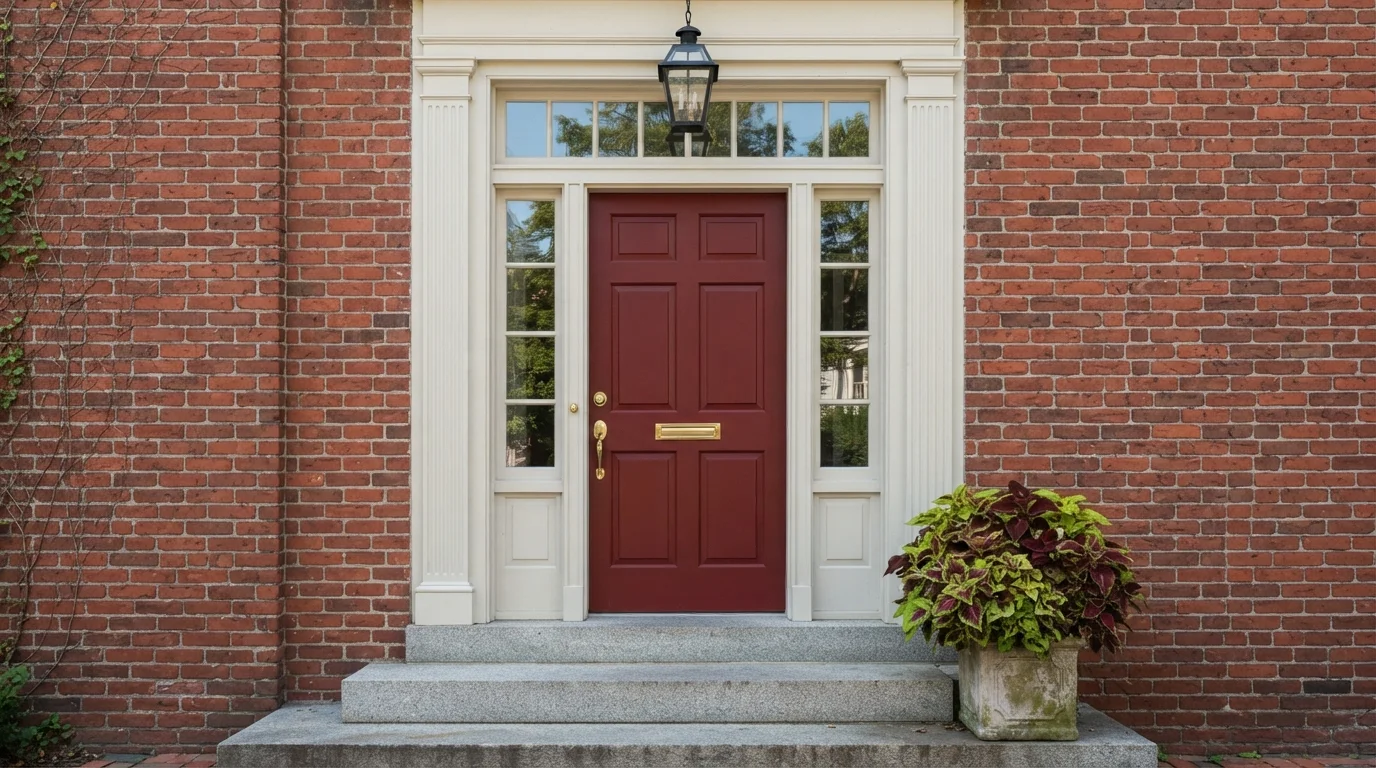
Rich crimson creates a dignified, welcoming focal point against crisp white framing and traditional red brick masonry.
Crimson is a deep, rich berry red with timeless charm. In this entry, the bold red covers the paneled front door, framed sharply by clean off-white trim, glass sidelights, and classic red brick. The space feels warm, dignified, and instantly inviting from the street. This combination works because the crisp white outline cleanly separates the painted door from the brick, allowing the vibrant shade to shine. It is perfect for anyone wanting traditional curb appeal with a confident, welcoming statement.
SEE CRIMSON RED ON YOUR WALLS →
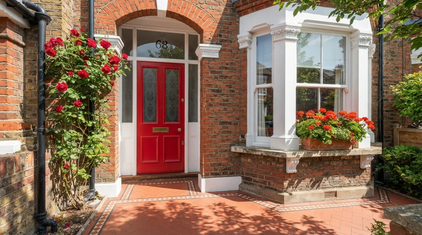
Warm sunshine illuminates a glossy crimson front door framed by weathered red brick and lush climbing roses.
Crimson is a rich, energetic cherry red that commands attention. In this sunny entryway, a glossy red door pairs with clean white trim against traditional red brick and lush green climbing roses. The space feels cheerful, warm, and utterly charming. The combination works because the bright door amplifies the natural red tones already found in the surrounding brickwork and flowering plants. It is perfect for anyone looking to give a classic brick home standout curb appeal.
SEE 100 MPH ON YOUR WALLS →
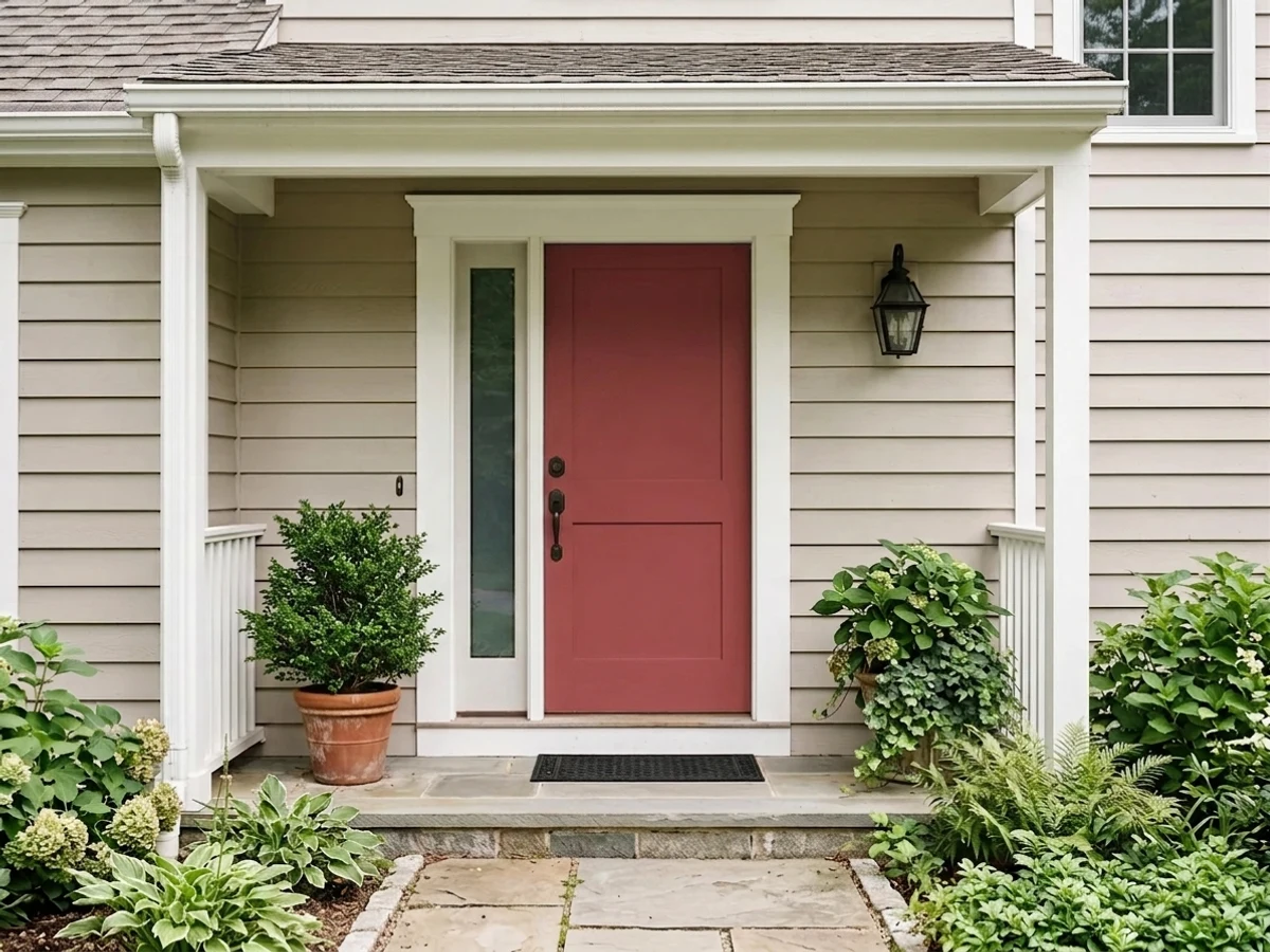
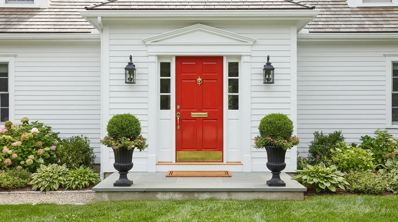
A bright crimson front door pops against crisp white siding to create a cheerful and timeless welcome home.
Vibrant red is an energetic, cheerful color that makes a bold statement. In this entry, the striking red covers the classic paneled front door, framed by crisp white siding and deep black iron carriage lanterns. The whole entrance feels wonderfully welcoming, bright, and full of life. This color combination works because pure white acts as a clean, high-contrast backdrop that allows the vivid red to truly shine. It is an ideal look for anyone wanting to boost their curb appeal with timeless, classic charm.
SEE FIRE ISLAND ON YOUR WALLS →
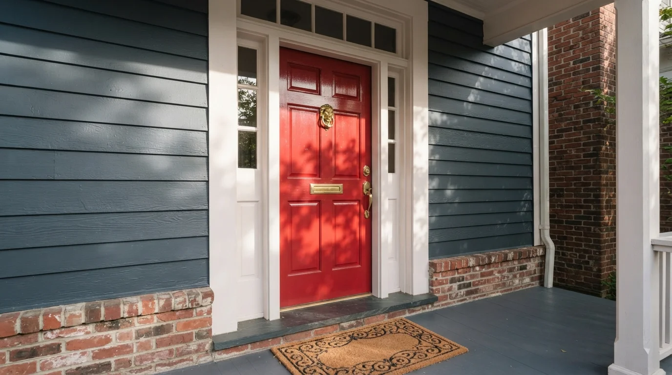
A glossy crimson front door framed by crisp white trim and slate blue siding creates an inviting, timeless entrance.
Crimson is a vibrant, rich red that brings classic energy to any home entrance. In this entryway, the bright red door stands boldly against deep slate blue lap siding, framed by crisp white architectural trim and polished brass hardware. The space feels cheerful, stately, and immediately welcoming from the street. The sharp contrast between the cool blue exterior and the warm red paint makes the entrance effortlessly pop. It is an ideal look for homeowners who want to boost their curb appeal with a cheerful, traditional focal point.
SEE RED TOMATO ON YOUR WALLS →
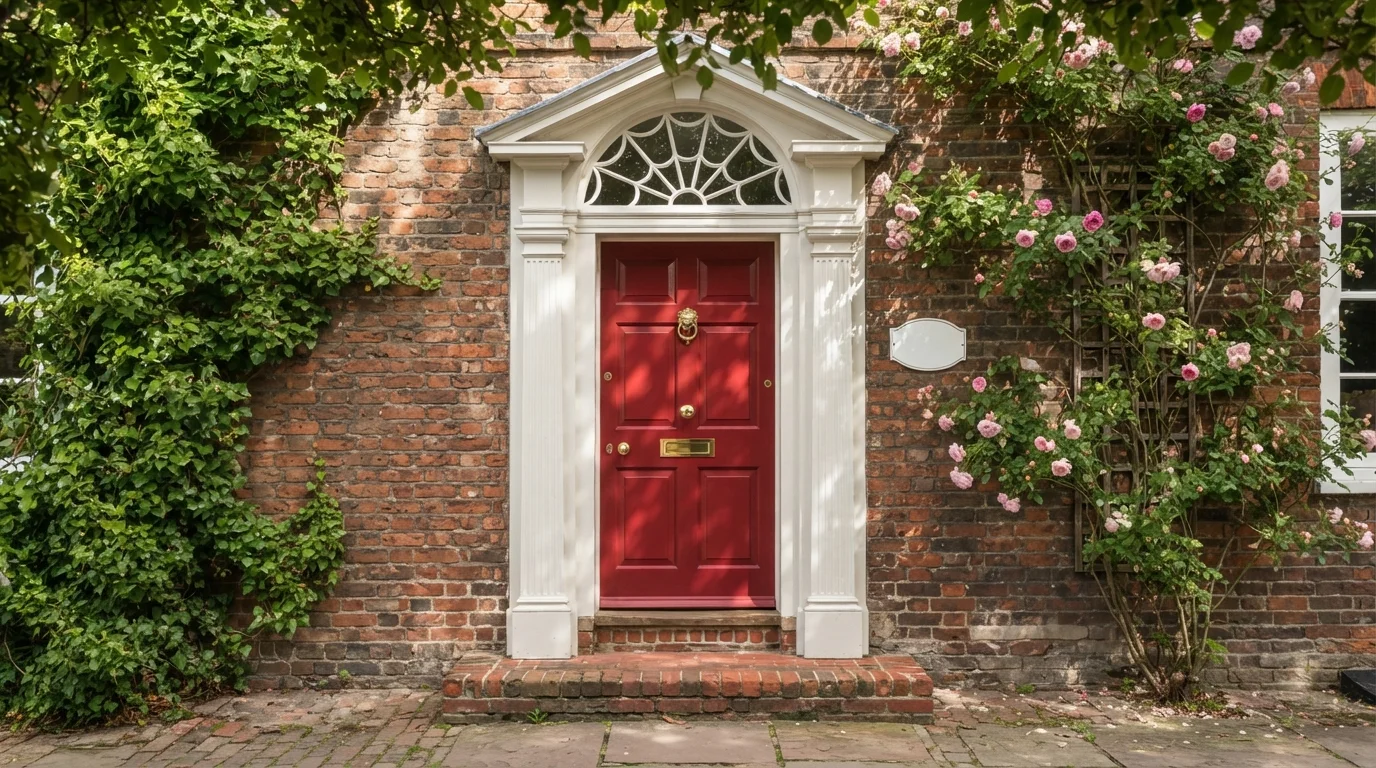
A vibrant red door framed by crisp white trim, aged brick, and blooming ivy creates an utterly charming, storybook welcome.
Crimson is a rich, energetic cherry red. In this classic entrance, the six-panel front door wears vivid red, beautifully framed by bright white architectural trim, aged red brick walls, and climbing green vines with soft pink roses. The entry feels cheerful, stately, and delightfully welcoming. The combo works because the bold red accentuates the natural tones of the brick masonry while clean white molding outlines the graceful arch. It is perfect for homeowners who love traditional curb appeal with timeless, vibrant character.
SEE STILETTO LOVE ON YOUR WALLS →
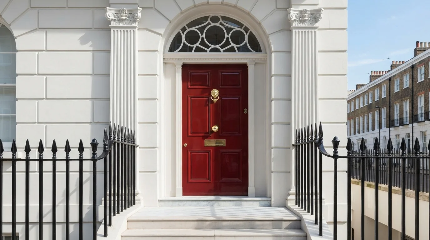
A glossy ruby-red front door makes a stately, welcoming statement against crisp white classical trim and brass hardware.
Deep crimson is a rich, dramatic red that brings immediate warmth and prestige. In this entryway, a high-gloss wine red coats the paneled front door and outer frame, set against pristine white stucco masonry and black iron railings. The entrance feels dignified, polished, and full of historic charm. This pairing works because the rich glossy red stands out brilliantly against clean white trim and glowing brass hardware. It is perfect for anyone wanting to give their home timeless, upscale curb appeal.
SEE POPPY FLOWER ON YOUR WALLS →
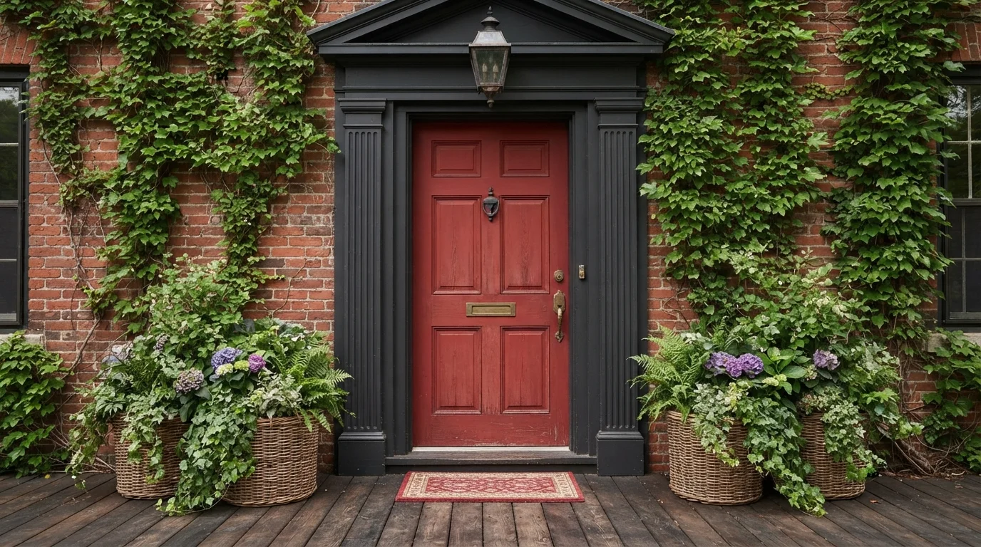
Rich weathered red contrasts with deep charcoal trim and lush climbing ivy for a storybook welcoming porch.
Crimson is a rich, energetic ruby red with vintage appeal. In this entryway, that bold red coats the paneled front door, while deep charcoal black surrounds it on the fluted trim and doorframe. The entrance feels historic, bold, and delightfully cozy. This pairing works because the dark trim creates a sharp frame that helps the rich red pop against the weathered brick. It is a fantastic choice for anyone looking to add timeless curb appeal and instant personality to a classic home.
SEE CARDINAL ON YOUR WALLS →Red Front Door Wall Color Combinations
A wall color never works alone. These are the full schemes from the rooms above — the lead color first, then the supporting colors that make the photo work.
A rich crimson front door paired with deep slate blue trim creates an undeniably welcoming and timeless cottage entryway.
TRY THIS PALETTE →Rich crimson creates a dignified, welcoming focal point against crisp white framing and traditional red brick masonry.
TRY THIS PALETTE →Warm sunshine illuminates a glossy crimson front door framed by weathered red brick and lush climbing roses.
TRY THIS PALETTE →A bright crimson front door pops against crisp white siding to create a cheerful and timeless welcome home.
TRY THIS PALETTE →Cottage Red and Rosy Apple are the two easiest to pair because they're closest to a classic red: both look right with plain white trim and a white or black porch ceiling, the combination that shows up on colonial and farmhouse entries. If your trim is already white, either color reads as intentional rather than random. Million Dollar Red and Caliente want more contrast to carry their intensity — black trim, black hardware, or a black storm door frame keeps the saturation from feeling like the only decision on the facade, and it's the pairing behind most of the doors people photograph and share.
Cinnamon Slate is the one pick built for a different job: pair it with gray, greige, or warm white siding and it reads as a soft, modern accent rather than a traditional "red door." It's also the safest choice next to natural wood tones — a stained wood porch floor or wood garage door won't clash with it the way it might with a true saturated red. Sunset Orange and Red Tomato both lean warm enough to work with wood front-door surrounds or a wood-tone storm door, since their undertone is closer to terracotta than to blue-red, so they sit with brown and tan instead of fighting it.
More Front Door Color Ideas
Set on a color family already? Each page has its own real rooms and picks.
Light or Dark Red Front Door Colors?
Go Light (LRV 60+) If…
The room is small, faces north, or has to work at every hour. Light warm colors make it feel bigger and stay calm in evening light — the light you actually live in.
Go Dark (LRV Under 20) If…
You want the cocoon effect and the room has real daylight. Dark works best on one feature wall — or fully color-drenched in a large room with good windows.
Every pick on this page falls between LRV 8 and LRV 19, which is normal for red — the pigments that make a color read as true red keep it from ever getting pale. So "light vs. dark" here really means muted vs. saturated. Cinnamon Slate (LRV 19) and Sunset Orange (LRV 17) are the closest this family gets to light: they still show detail and texture on the door in full sun and won't go flat-black in shadow, which matters if your entry sits under a deep porch roof or faces north. Cottage Red and Raspberry Truffle, both under LRV 12, need real light to read as red at all — in a shaded entry they can look closer to brown or near-black, which some homeowners want (it reads quiet and rich) and others find disappointing after they've pictured a brighter door.
Caliente and Million Dollar Red, both LRV 8, are the most saturated picks and do best on a sun-hit entry where the color gets a chance to show its full intensity — a west- or south-facing door, or one with a porch light that's not blocking direct sun for most of the day. Put either of those two on a deeply shaded north entry and they'll look muddier and darker than the fan deck suggested, so if your porch stays in shadow most of the day, Sunset Orange or Rosy Apple will actually read truer to the color you're picturing than the darkest options will.
See It. Love It.
Paint It.
Upload one photo of your red front door and try every color on this page on your own walls — in your own light, before you buy a drop of paint.

CabaretBeforeSheen And Fade Protection For A Red Front Door
Red pigment fades faster in direct sun than almost any other paint color, and that's especially true of the saturated picks here — Million Dollar Red and Caliente will lose depth and start looking chalky or pink on the sun-exposed side within a few years if they're painted with a standard exterior wall paint instead of a real exterior door enamel. A satin or semi-gloss exterior door enamel holds pigment better and gives the door the slight sheen that makes a color like Cottage Red or Raspberry Truffle look intentional rather than flat.
A south- or west-facing door in any of the saturated reds should be planned for a recoat every 3-5 years rather than the 7-10 years you'd expect from a shaded entry. Cinnamon Slate and Sunset Orange, being lower-chroma to start, show fading less obviously because there's less pure pigment to lose — one more reason they're the lower-maintenance picks on this list if your entry gets hard afternoon sun.
The Red-On-Red-Brick Mismatch To Avoid
Painting a true saturated red door on a red or orange-toned brick house is the single most common mistake with this color family — the door and the brick compete instead of working together, and neither one reads as intentional. If your siding is red brick, skip Million Dollar Red or Caliente and either go deep and muted with Raspberry Truffle, which reads closer to wine or near-black against brick than to a matching red, or step outside true red altogether toward Cinnamon Slate's dusty, brown-leaning tone, which sits close enough to the brick's undertone to look coordinated rather than clashing.
On white, cream, gray, or blue siding this problem doesn't exist — any of the eight picks will contrast cleanly, which is why red is consistently recommended for white-sided and craftsman-style homes and consistently flagged as risky on red brick.
Hardware And House Numbers Against A Red Door
Warm-metal hardware — aged brass, bronze, or matte black — reads best against the warmer picks: Sunset Orange, Red Tomato, and Cottage Red all have enough orange in them that brass looks like it belongs, not like leftover 1990s hardware. The cooler, more saturated reds — Caliente, Million Dollar Red, Raspberry Truffle — look sharper with black or brushed nickel hardware, since warm brass can fight with a true red's blue undertone instead of complementing it.
House numbers and a doorbell in a dark or black finish stay legible against every pick on this page; the one to watch is Cinnamon Slate, which is muted enough that light gray or brushed-nickel numbers can nearly disappear against it in shade — go dark for contrast there specifically.
About Red Front Door Paint Colors
A red front door is one of the only places on a house where the paint is allowed to be the loudest thing in the picture, and that's exactly why it works. The eight picks here cover a wide spread within one family: Cinnamon Slate (Benjamin Moore 2113-40) sits at LRV 19, a soft, dusty red with almost as much brown and mauve in it as red, while Caliente (Benjamin Moore AF-290) and Million Dollar Red (Benjamin Moore 2003-10) drop to LRV 8, fully saturated and unmistakably red from the sidewalk. A door only has to answer to the house behind it, not a whole room full of furniture, so it can go bolder than almost anything else you'll paint.
The picks split into a few real camps, not just light-to-dark. Sunset Orange (Behr BXC-39) and Red Tomato (Sherwin-Williams SW 6607) lean warm and earthy, closer to terracotta than fire-engine red, so they read approachable rather than dramatic — a good fit for craftsman, cottage, or brick-adjacent homes where a true red would fight the trim. Cottage Red (Benjamin Moore HC-184) is the true, historic barn-red that's been the default "red door" color for decades; it's the safe, recognizable choice. Raspberry Truffle (Benjamin Moore 2080-10), Million Dollar Red, and Caliente all go deep and saturated — these are the doors people slow down to look at, and Caliente in particular shows up again and again as the most-picked Benjamin Moore red for entry doors.
Rosy Apple (Benjamin Moore 2006-30) is the outlier of the group. At LRV 15 it reads more pink-red than true red, cheerful rather than commanding, so it fits a homeowner who wants red's warmth without the weight of Cottage Red or the intensity of Caliente. None of these eight are pastel — front-door reds don't get much lighter than the high teens on the LRV scale — so the real decision isn't light versus light, it's muted versus saturated, and warm-orange versus true red.

The Questions Everyone Asks
What color should I paint my red front door?
If you want one answer, start with the safe picks above — 100 Mph, California Poppy, Crimson Red, Fire Island. They read well in any light and survive furniture changes. Then check the light: strong afternoon sun wants a step cooler, a north-facing room wants a step warmer.
what does a red front door mean?
Red doors carry a few overlapping traditions: in Feng Shui they signal welcome, luck, and protection; American folklore ties them to safe-house signals along the Underground Railroad and to hospitality on the frontier; in Scotland, painting the door red traditionally marked a paid-off mortgage. None of that dictates which shade to use — a soft, dusty red like Cinnamon Slate carries the same welcome as a bold Caliente, just quieter.
what color should I paint a red front door if my house is brick?
If the brick itself is red or orange-toned, avoid a true saturated red like Caliente or Million Dollar Red — they'll compete with the brick instead of pairing with it. Go deep and near-black with Raspberry Truffle, which reads as shadow against brick rather than a clashing red, or shift toward Cinnamon Slate's dusty, brown-leaning tone, which sits close enough to brick's undertone to look coordinated. On gray, tan, or beige brick, any of the eight picks work fine.
does a red front door hurt resale value?
No — red is consistently one of the top-recommended front door colors for curb appeal, not a color agents warn against. It photographs well for listings and reads as a well-kept, intentional choice rather than a personal risk, the way an unusual color like bright purple might. The color that hurts resale is a door that's chalky, peeling, or clearly overdue for a repaint, regardless of hue.
what's the best red for a front door?
There's no single best red — it depends on your siding and how bold you want the entry to read. Caliente (Benjamin Moore AF-290) is the most consistently recommended true red for front doors and shows up as the default pick across paint-brand and design roundups. Cottage Red (Benjamin Moore HC-184) is the safer, more traditional alternative if Caliente's intensity feels like too much.
will a red front door fade in the sun?
Yes, more than most colors — red pigment is one of the fastest to lose depth under UV exposure. The saturated picks here, Million Dollar Red and Caliente, will show fading soonest on a south- or west-facing door, typically needing a recoat every 3-5 years instead of 7-10. Painting with a real exterior door enamel instead of standard wall paint slows this down noticeably.
What two-color combination works best in a red front door?
The reliable pattern is a quiet main color plus one deep accent on a single wall. Keep trim and ceiling in one warm white so the two colors are the only event in the room — the combination cards above show complete schemes from real rooms.
What colors make a red front door look bigger?
High-LRV, slightly warm colors — LRV 60–75 is the sweet spot. Paint the walls and trim close to the same light color so the corners blur, and keep the ceiling white. Stark cool white actually works against you; it creates hard shadows that show the room's edges.


Ask a Question