Cabaret
A muted magenta-purple from the 2006 Dunn-Edwards deck, reviewed honestly: the rooms where it turns theatrical, the light that turns it bruise, and what to pick instead.

Jessica has spec'd whites and neutrals for more than 300 rooms and keeps a sample wall of painted drawdowns in her studio. Every color review is checked against real reader rooms in the comments and re-tested when a formula changes. About the testing process →
- 1Nocturne Shade5
- 2Cabaret14
- 3Gothic Purple24
- 4Hazy Lilac29
The Fast Verdict
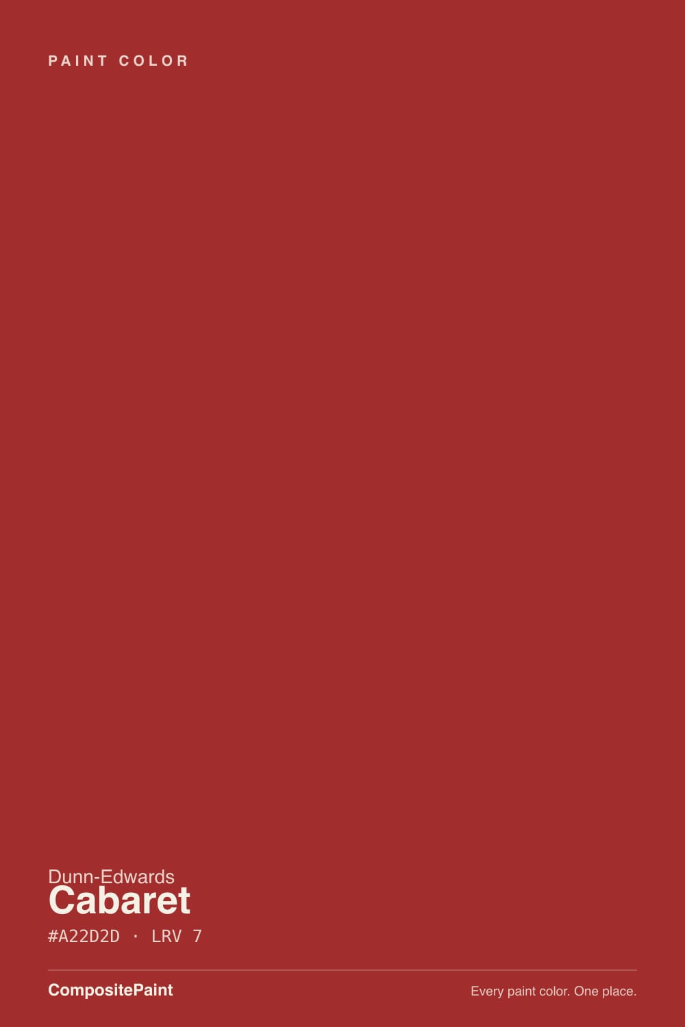
Cabaret is not dusty mauve and it is not a front-door red. It is a cool-leaning purple with a magenta cast, deep enough at LRV 14 to drench a room and clear enough to stay purple instead of going black. Under warm lamps it reads jewel-box and a little nightclub; in dim north light it goes muddy grape. If you want Sleepy Hollow's grayed-down calm, this is the wrong chip — Cabaret is the color you buy when you actually mean purple.
Powder rooms and dining rooms · a bedroom that should feel like evening · one accent wall · a front door on a light house
You actually wanted dusty mauve · the room is dim and north-facing · honey oak floors stay · you are painting for resale
- Actual purple — magenta you can see, not a grayed maybe
- LRV 14 holds color in daylight instead of collapsing to black
- Powder rooms, dining rooms and doors look custom in one decision
- Warm 2700K lamps turn it jewel-box instead of gloomy
- In the Dunn-Edwards deck since 2006, so it is not a one-season SKU
- Too chromatic if you wanted dusty mauve or a purple-gray
- Four walls in a dim north room go muddy grape
- Fights honey oak, golden beige and everything yellow-warm
- Resale risk is real — this is a commitment color, not a greige
What Color Is Cabaret, Really?
A muted, cool-leaning purple with a magenta cast — red-violet, not candy lilac and not blue-periwinkle. Dunn-Edwards filed it in 2006 among the Blue Violets / Red Violets / Purples, and the name is the tell: Cabaret is theatrical on purpose. The green is knocked down so the red and blue can argue, which is why the wall never reads as a simple lavender. Compared with a grayed mauve like Sleepy Hollow, this one still has saturation left in it.
At LRV 14 it is a genuine deep. That is the usable range for a purple: dark enough to feel like a drench, light enough that daylight still shows magenta instead of a near-black hole. Four walls will read a step deeper and more saturated than the chip — every mid-chroma violet does this, and at this depth the surprise is bigger. Plan for jewel-box, not a hint of color.
Undertone in one line: violet first, magenta second — cool, not dusty-rose. If the sample goes bruise-blue, your light is cold; if it flushes pink-magenta, that is west sun or 2700K bulbs doing it. Both versions are the same paint being honest about the room.
Where It Shines
This color is built for small, lamplit rooms and for one committed surface. A powder room, a dining room you use after dark, a bedroom with warm bulbs, a front door on a white or cream house — those are the jobs it was mixed for. Give it cream linen, walnut, unlacquered brass and a soft near-black, and it looks custom instead of themed. Eggshell or satin keeps the magenta from going chalky the way a dead-flat can on a deep purple.
Where It Fails
Cabaret has almost no public owner-review trail — it is a regional deck color, not a national bestseller — but the failure modes are the same ones every deep magenta-purple hits. All three are predictable before the first coat. If your room matches one, this is not your color, and a bigger sample will only confirm it.
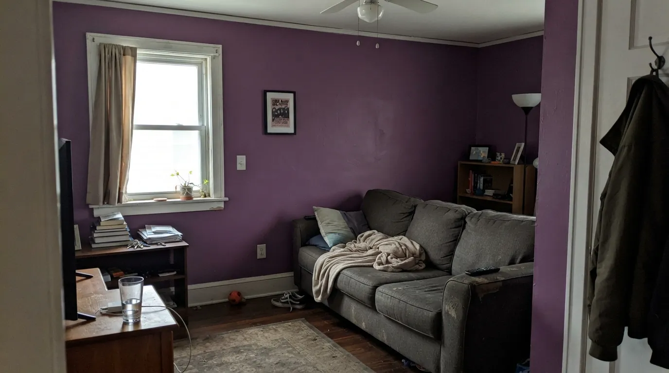
LRV 14 on all four walls with one small north window and no lamps is a cave. The magenta drops out and you are left with muddy grape — readers of every similar purple call it a bruise. Cabaret needs either daylight or warm lamps; if you will not add light, do not drench.
On the fan deck it can look quieter than it is. On a wall the magenta is unmistakable. If your goal is Sleepy Hollow's grayed-down purple — atmosphere, not a color guests can name — Cabaret is too much chroma. Sample both in the same corner before you commit.
Yellow-orange is violet's complement, so golden oak floors, orange-stained trim and builder-beige carpet all amplify the purple while the walls push the floor toward orange. Both sides lose. Cabaret needs walnut, espresso, pale white oak, or a large rug between it and anything golden.
Room by Room
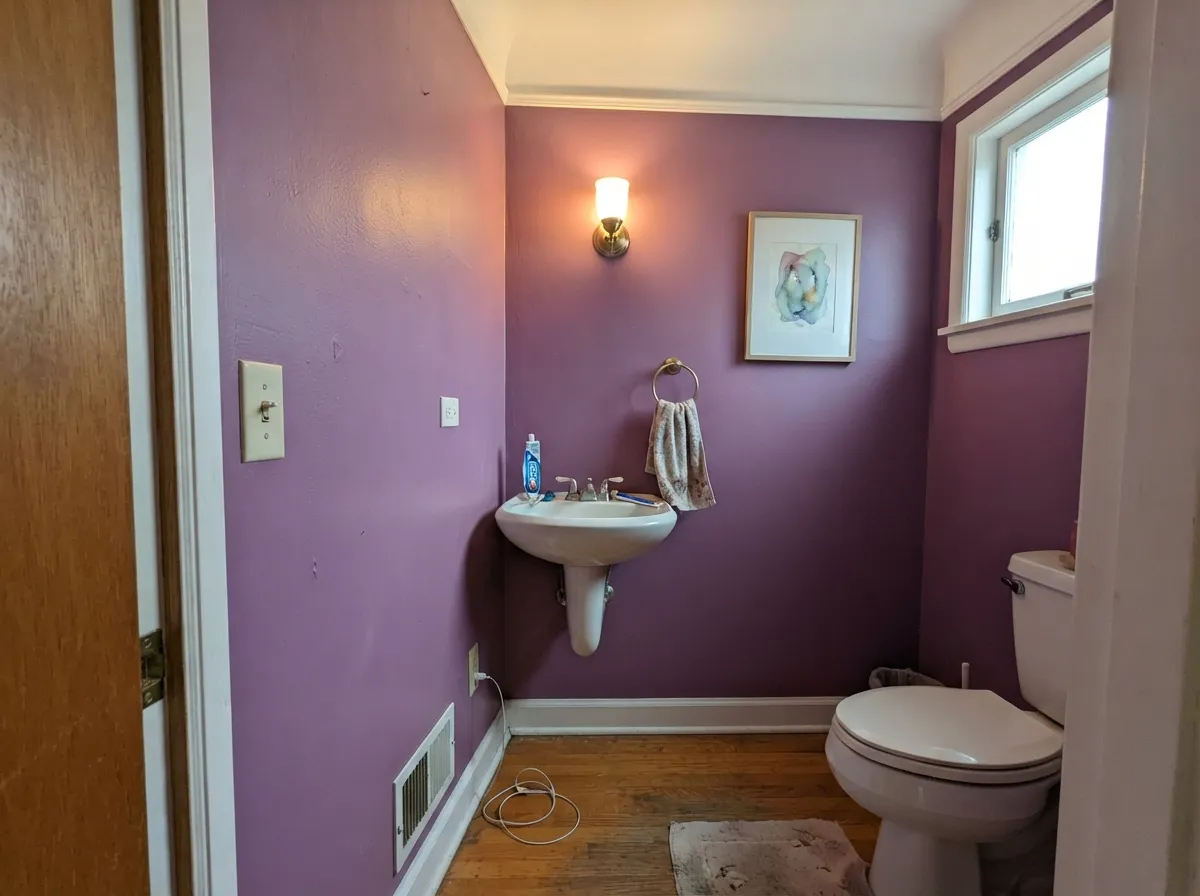
Small, no resale jury, and you control the bulbs. Drench all four walls in eggshell or satin, keep trim in a warm white, and put 2700K in the sconce. This is the jewel-box use the name promises, and the one room where LRV 14 is a feature.
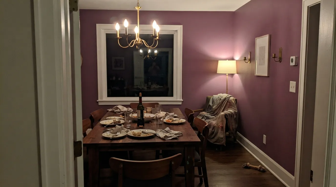
Cabaret was mixed for rooms you use at night. Under a dimmer and warm lamps the magenta comes forward and the table looks like an occasion. Keep it off an open breakfast area that has to match the kitchen wood. Satin if chairs scuff; matte only if the walls are already smooth.
A closed bedroom with cream bedding and 2700K bulbs can feel like a theater lobby in the best way. A dim north bedroom with cool LEDs will feel like a bruise. Matte or eggshell; do not skip the lamp plan. One headboard wall is the reversible version of the same idea.
Four living-room walls of Cabaret is a hard sell in daylight and a harder one at resale. One chimney breast or the wall behind the sofa, with Pale Oak or a warm white on the rest, lets the magenta show without boxing the room in. Open plans are the wrong place to find out.
Full kitchen walls in a chroma this high fight wood, stone and whatever the adjacent rooms wear. A pantry door, a hutch, or the back of a bookshelf is plenty. If the cabinets are already a cream like Swiss Coffee, leave them; do not add purple box-store.
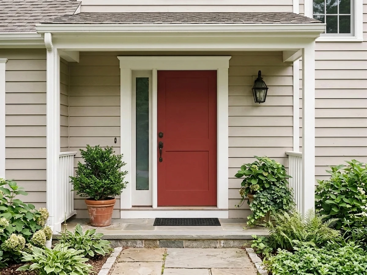
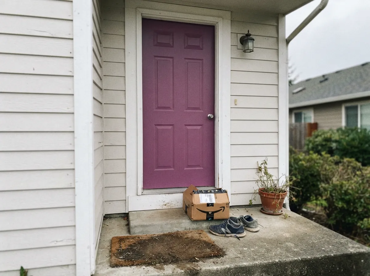
Siding in Cabaret is a mistake — full sun washes the magenta toward grape-gray and the street read is 'faded purple house.' A shaded or north-facing front door on a white, cream, or pale-gray house is the exception: it reads intentional, a little odd in a good way. Satin or semi-gloss exterior enamel; skip it on a honey-stained door surround.
Your Light Is the Risk
2700K bulbs wake the magenta and the walls go jewel-box. This is the light the color was mixed for — dining rooms and bedrooms after dark.
Cool, low daylight kills the red and leaves muddy grape. Fine if you half-wanted a dark wall; disappointing if you wanted purple you can see.
Morning light reads cooler, more violet; west afternoon and golden hour flush it distinctly magenta. Sample at 9am and at 6pm before you commit.
Warm 2700K is part of this paint job. Cool 4000K LEDs push it toward bruise-blue and make the magenta look dirty. Swap the bulbs before you blame the can.
Most complaints about Cabaret are a light mismatch. Upload a photo of your actual room and see it on your walls — then ask for the same wall in north light or evening lamps before you buy a single sample.
Need It From Another Brand?
Any paint counter can custom-tint Dunn-Edwards DE5992 directly. If you would rather stay in one brand's own deck, these are the closest stock matches, measured as ΔE2000. Under 2 is a difference you will not see on the wall.
| Brand | Closest color | ΔE | LRV | |
|---|---|---|---|---|
| Sherwin-Williams | ClematisSW 6831 · Sherwin-Williams | 4.9 | 16 | Color page → |
| Behr | Meadow Flower690D-6 · Behr | 2.9 | 17 | Color page → |
| PPG / Glidden | Royal LilacPPG1250-7 · PPG / Glidden | 0.5 | 14 | Color page → |
| Glidden | Royal LilacPPG1250-7 · Glidden | 0.7 | 14 | Color page → |
| Dutch Boy | Purple Tulips145-7DB · Dutch Boy | 4.6 | 12 | Color page → |
| HGTV Home by Sherwin-Williams | Opulant PurpleHGSW 1422 · HGTV Home by Sherwin-Williams | 4.9 | 16 | Color page → |
Similar Dunn-Edwards Colors
The nearest shades to Cabaret within Dunn-Edwards's own range, ranked by perceptual color distance — useful when you want the same look a touch lighter, darker, or warmer.
WCAG 2.1: AA is 4.5 : 1 for normal text, 3 : 1 for large text, AAA is 7 : 1.
Cabaret vs the Colors You're Also Considering
Every Cabaret sample board has the same rivals on it. The numbers show the real lightness gap — then it comes down to which risk you would rather live with.
Pick this when the magenta is the point and you are done pretending you wanted gray.
Benjamin Moore 1454 · LRV 28Sleepy HollowPick this if you want purple that behaves like a grown-up mauve-gray — atmosphere, not a color guests name on sight.
Pick this for the lighter, more magenta read that still shows as purple in daylight.
Sherwin-Williams SW 6286 · LRV 7Mature GrapePick this if you want wine-plum that only pays off in a small, lamplit room — darker, browner, less clearly purple.
Cabaret sits at the darkest end of Dunn-Edwards' warm reds. Red Ink (DEA151, LRV 11) is its closest sibling but reads a few shades lighter and slightly brighter, so it feels a touch more lively and less black in low light. If you want the same red character with a little more openness on a full wall, Red Ink is the safer pick; if you want maximum depth and drama, Cabaret wins.
Scarlet Past (DEA150, LRV 11) is another near neighbor that lands a bit cleaner and lighter, better for a front door you want to pop in daylight.
Vintage Red (DET427, LRV 10) leans slightly toward a dustier, more muted brick red, which suits a traditional or historic exterior, whereas Cabaret stays purer and more saturated. In practice, choose Cabaret when you want the boldest, deepest statement and one of the lighter reds when the color will cover a larger area or sits in a darker room.
Cabaret Coordinating Colors
The rule for coordinating with Cabaret: warm whites, grayed mauves, and a soft near-black — and keep everything yellow at arm's length. It pairs with cream far better than with beige, loves walnut and brass, and needs a quieter neighbor in any room that shares a doorway. These are the partners that keep the magenta from looking stranded:
A 2006 Purple That Showed Up Again On The Silk Road
Cabaret is not a Color of the Year — Dunn-Edwards does not run that program — and it is not a viral national bestseller. It has sat in the deck since 2006, which is the honest kind of staying power: nobody retired the SKU. In 2020 the brand put DE5992 back in front of cameras as part of its Color + Design Silk Road story, next to other saturated jewels, which tells you how they still see it: a destination color, not a whole-house neutral.
That is the useful history. If you came here because a mood board said mauve, look at Sleepy Hollow. If you came here because you want a purple that still behaves like purple in 2026, Cabaret is the older, more chromatic answer — and the lack of a trend stamp is in its favor, as long as you put it in a room that can take the chroma.
Cabaret With Wood Tones and Floors
This decision gets made at the floor, not the paint store. Walnut and espresso are the color's best friends — the dark red-brown depth makes the magenta read smoky and deliberate. Pale white oak and gray-washed floors are safe and keep the room from going Victorian. Cream carpet is fine; true gray carpet is fine.
The one honest no is golden: honey oak floors, orange-stained trim, yellow-beige carpet. Yellow-orange sits directly opposite violet on the wheel, so each side exaggerates the other — the floor reads more orange, the walls read more purple, and no amount of coats fixes geometry. If the golden floor is staying, put a large rug between it and this paint, or choose Sleepy Hollow and keep the mood without the fight.
Metals are the easy part: unlacquered brass, antique bronze and matte black all work; polished chrome is the one that leans cold against it.
Three Ready Palettes Built on Cabaret
A color is never alone on the wall. These are complete combinations in the 60-30-10 pattern, with the reason each one holds together. Every one opens in the visualizer.
Cream-warm White Dove keeps the little room from going nightclub-black, and Wrought Iron gives one soft near-black note so the magenta reads deliberate. Brass hardware and 2700K sconces finish it; a stark gallery white on the trim would make the walls look dusty by comparison.
Try this palette in your roomSwiss Coffee is the soft white that hands off to a saturated purple without a temperature fight — sample it in afternoon light, because it does go warmer when the sun does. Mature Grape, a darker wine-plum, layers behind glass or on furniture so the scheme stays tonal instead of one loud wall.
Try this palette in your roomPale Oak is a light neutral that still has a little body, so a Cabaret accent wall looks like the same house getting quieter on the other three sides, not a poster glued on beige. It needs decent daylight to stay pretty; in a dim room it goes moody, and then you have two mood colors arguing. White Dove trim ties both back together.
Try this palette in your roomCabaret FAQ
Is Cabaret purple or red?
Purple — a cool-leaning violet with a magenta cast. It is not a saturated front-door red, and it is not a grayed mauve. If the chip looks redder in the store, take it outside: on a wall in real light it reads as purple first.
What trim white goes with Cabaret?
A warm, soft white. White Dove is the default; Swiss Coffee if you want a creamier, vintage handoff — just know Swiss Coffee goes warmer as the light does. A stark bright white makes the walls look dusty and theatrical in the wrong way. Semi-gloss on the trim, eggshell or satin on the walls.
Can I paint a whole bedroom Cabaret?
Yes, if the room has lamps you actually use and the bulbs are 2700K. A bright south or west bedroom will show the magenta clearly at midday and go jewel-box at night. A dim north bedroom with cool LEDs is the cave version — use one accent wall, or pick Sleepy Hollow.
Does Cabaret work with oak floors?
Depends on the oak. Walnut, espresso and pale unstained white oak are excellent. Golden honey oak is the clash: yellow-orange sits opposite violet, so the floor goes more orange and the walls go more purple. A large rug helps; wall-to-wall honey tones need a different color.
Is it a good front door color?
On a white, cream, or pale-gray house, yes — especially a door that is shaded part of the day, where the magenta stays saturated instead of washing out. Full-sun siding is a no. Pair it with a soft near-black like Wrought Iron on the hardware, not orange-stained wood trim.
Will a deep purple date itself?
Saturated trend-purples date; Cabaret has been in the Dunn-Edwards deck since 2006 and showed up again in the brand's 2020 Silk Road color story, which is a long time to still be mixing the same SKU. It still carries more repaint risk than a greige. Use it in a powder room, on a door, or on one wall if you want an exit.
Have you painted with Cabaret?
Rate it — one tap helps the next reader decide.
Ask a Question