Room Colors · Green Front Door
8 Best Green Front Door Paint Colors for 2026
ideas, combinations, and real rooms
8 curated picks from real green front doors — with the exact colors, honest reasons why, and the combinations that hold the room together.

Former interior stylist who can spot a green undertone from across a room. Jessica writes the color and mood pieces — what to choose, what pairs, and why your "white" looks pink.
The Fast Answer
Don't want to read 8 picks? These four are the safe answers.

Top Picks for the Green Front Door
Tap a shade to see the green front door in it, then try it on your own room.
Green Front Door Color Trends 2026 — What's In, What's Out


- Bright Kelly Green — Saturated, true-green front doors that felt bold years ago now read artificial next to 2026's muted, earthy greens.
- Cool Mint Or Teal-Green — Cool, blue-leaning greens on entry doors are losing ground to warmer, olive- and sage-toned greens paired with wood accents.
- Green Door With No Coordinating Accents — A standalone green door with unrelated trim colors is giving way to green doors paired with matching planters or house numbers in 2026.
The 8 Best Green Front Door Paint Colors
Every pick below is a real rendered green front door, not a chip. The lead color first; the swatches are the full scheme in the photo — walls, furniture, textiles, accent.

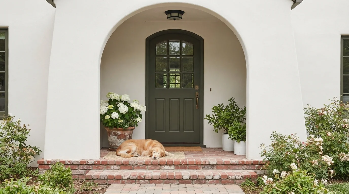
A deep olive front door paired with creamy stucco and red brick steps creates an instantly welcoming, storybook entrance.
Olive green is a rich, earthy moss tone that feels grounded and classic. In this entryway, that deep green covers an arched multi-pane door set inside creamy white exterior walls. The porch feels snug, serene, and full of vintage character. The combination works effortlessly because organic greens naturally pair with warm red brick and blooming potted plants. It is the perfect choice for anyone who loves timeless curb appeal with a relaxed, English-cottage spirit.
SEE WILD RICE ON YOUR WALLS →
Lush moss green doors stand out against textured white brick and climbing ivy for an inviting, storybook entrance.
Moss green is a rich, earthy herbal green with a grounded feel. In this exterior, deep green covers the arched entry doors and upper window trim against bright white-painted brick walls. The space feels snug, historic, and wonderfully charming. Natural greens always work with crisp white walls because the contrast keeps the look fresh while pulling in the surrounding foliage. It is a fantastic choice for anyone who loves European cottage curb appeal with timeless character.
SEE INLAND ON YOUR WALLS →
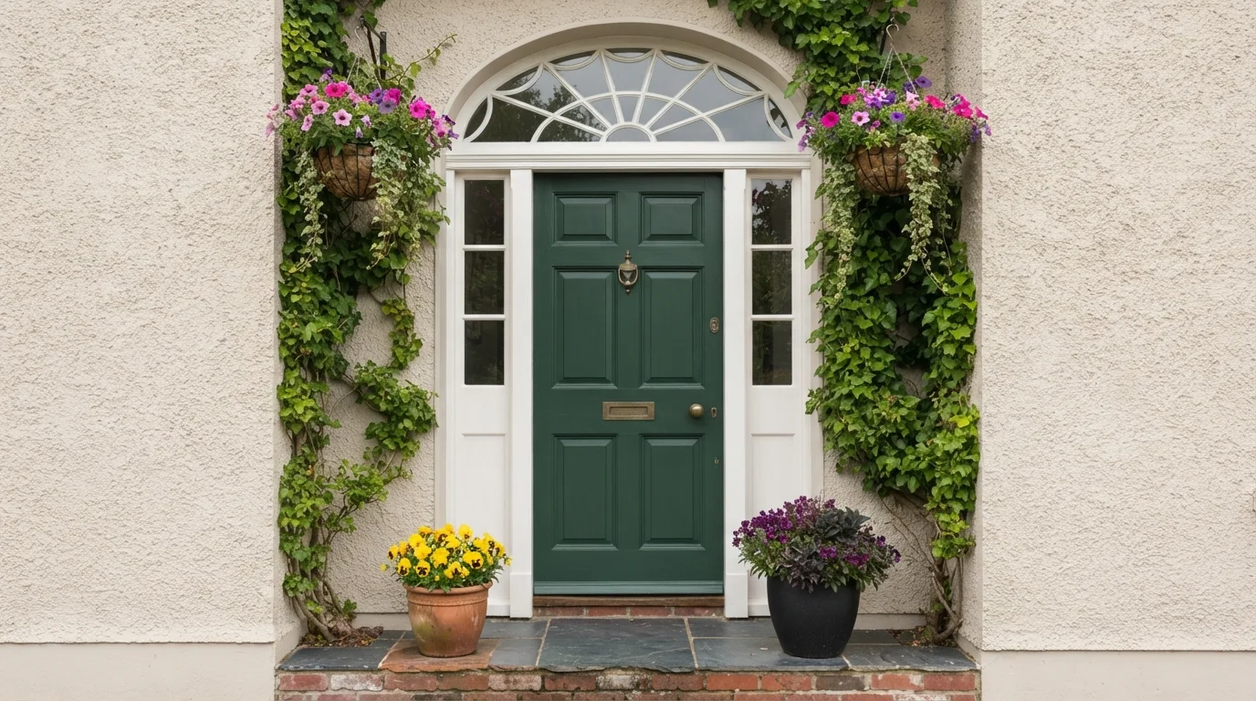
Deep green wood and vibrant hanging blooms turn a classic doorway into a warm, storybook cottage welcome.
Forest green is a deep, rich earthy shade that feels rooted in nature. Here, it covers a classic paneled front door, trimmed in crisp off-white and surrounded by warm beige stucco. The entrance feels inviting, lush, and full of storybook charm. Pairing deep green with cheerful flowering pots and natural red brick works because the botanical colors feel right at home together outdoors. It is perfect for anyone wanting to give their front entry a timeless, garden-inspired lift.
SEE SYCAMORE TREE ON YOUR WALLS →
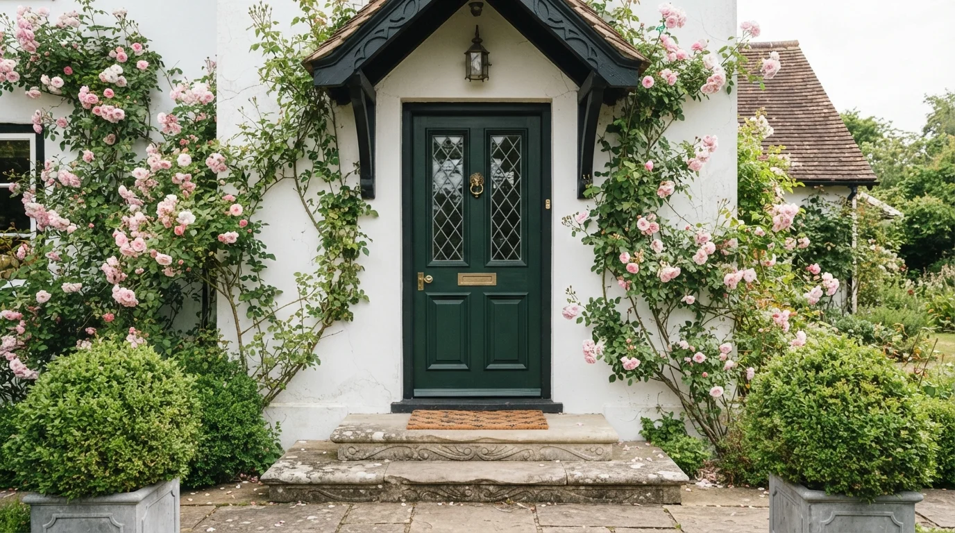
Climbing pink roses and gleaming brass accents frame an inviting forest green door on a storybook cottage facade.
Forest green is a deep, rich jewel tone inspired by lush woodland leaves. Here, it covers the traditional panelled front door, surrounded by deep black trim, white stucco walls, and polished brass hardware. The entrance feels enchanting, welcoming, and full of historic character. The rich green works effortlessly because it mirrors the garden foliage while the bold black casing provides crisp definition. It is the perfect choice for anyone wanting to give their home timeless curb appeal and storybook romance.
SEE IT ON YOUR WALLS →
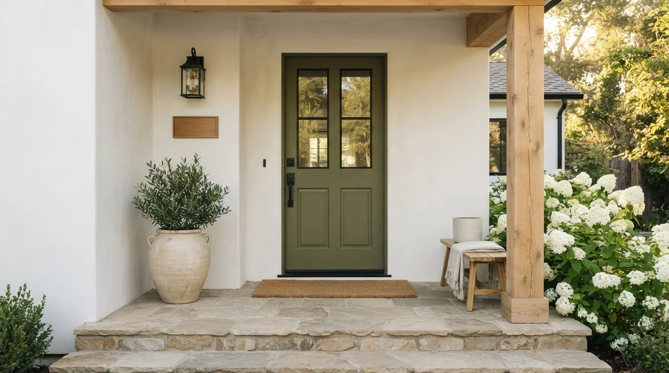
Sunlight filters through leafy branches onto a rich olive door framed by warm wood, stone, and blooming hydrangeas.
Olive green is a rich, earthy herbal green with warm undertones. In this entry, the shade coats the paneled front door, standing out against creamy off-white stucco, a raw wood post, and stone steps. A woven coir mat and a potted olive tree complete the look. The space feels grounded, cozy, and timelessly charming. The pairing works because natural greens effortlessly match stone and raw timber. It is the perfect choice for anyone looking to give their home an inviting, nature-inspired entry.
SEE COCONUT GROVE ON YOUR WALLS →
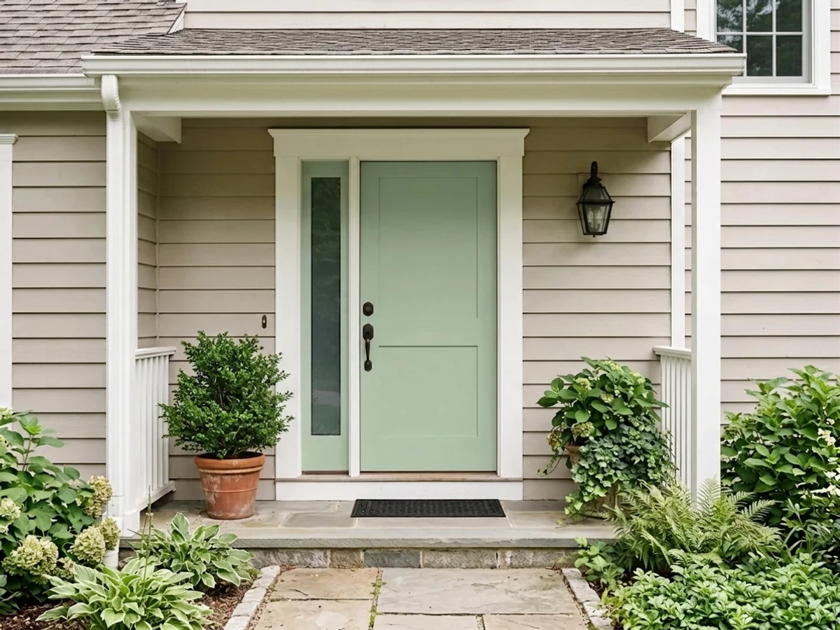
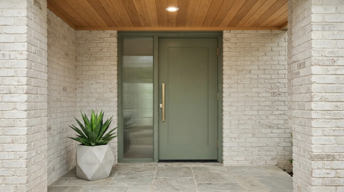
A soft sage green door pairs with natural stone, warm wood, and light brick for an organic, welcoming entrance.
Sage is a soft, muted earthy green with gentle gray notes. In this photo, the sleek front door and matching fluted-glass trim are painted in this calming sage, set right against crisp light brick. The whole porch feels grounded, fresh, and remarkably serene. Natural colors naturally work well together, letting the warm wood ceiling and flagstone pavers tie everything into the surrounding landscape. This look is perfect for anyone wanting clean, modern curb appeal that still feels warm and connected to nature.
SEE PINELANDS ON YOUR WALLS →
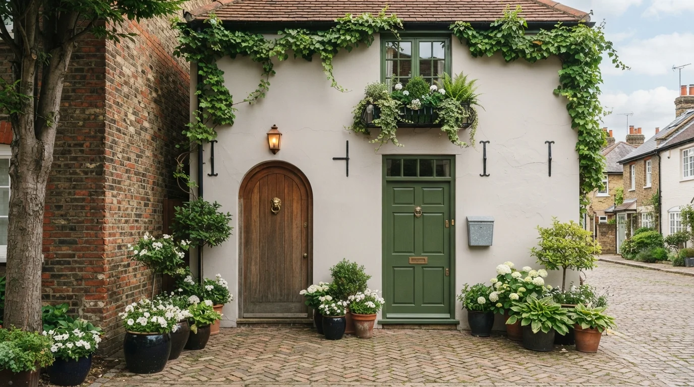
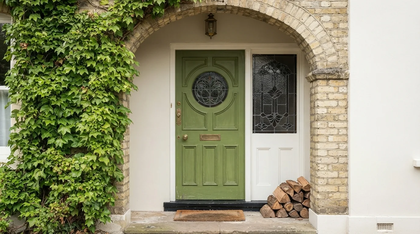
Leafy green paint brings historic charm and natural garden warmth to a classic arched front entrance.
Leaf green is a lively, garden-fresh shade with a grounded feel. In this entryway, that cheerful green covers the panelled front door, framed by crisp white trim and soft cream brickwork. The space feels bright, inviting, and full of vintage personality. The combination works because the green door connects naturally with the climbing ivy outside while the bright white trim frames the dark stained glass. It is a lovely choice if you want to add instant character and curb appeal to an older home.
SEE YOGI ON YOUR WALLS →
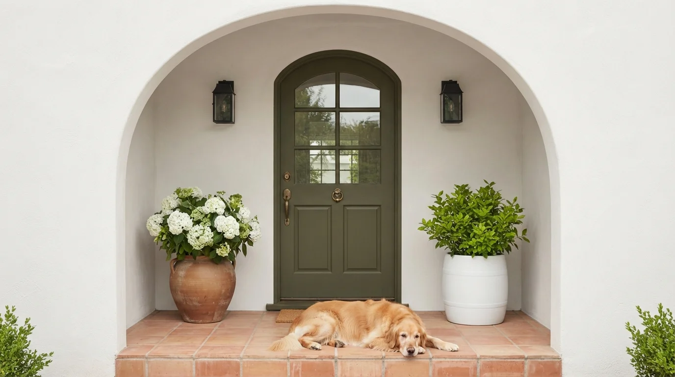
A deep olive green front door framed by clean white stucco and warm terracotta tiles creates an inviting entry.
Olive green is a rich, earthy leaf green with warm, grounded depth. In this photo, deep olive coats the paneled front door, framed cleanly by soft white stucco arches, black carriage sconces, and terracotta steps. The whole entryway feels relaxed, fresh, and exceptionally welcoming. The combo works because deep natural green balances the brightness of the white walls and complements the warmth of the clay tile. It is a fantastic look for anyone wanting timeless curb appeal with an organic touch.
SEE SECRET GARDEN ON YOUR WALLS →Green Front Door Wall Color Combinations
A wall color never works alone. These are the full schemes from the rooms above — the lead color first, then the supporting colors that make the photo work.
A deep olive front door paired with creamy stucco and red brick steps creates an instantly welcoming, storybook entrance.
TRY THIS PALETTE →Lush moss green doors stand out against textured white brick and climbing ivy for an inviting, storybook entrance.
TRY THIS PALETTE →Deep green wood and vibrant hanging blooms turn a classic doorway into a warm, storybook cottage welcome.
TRY THIS PALETTE →Climbing pink roses and gleaming brass accents frame an inviting forest green door on a storybook cottage facade.
TRY THIS PALETTE →Salamander pairs best with a lighter body color — white, light gray, or a pale greige siding — so the door reads as a deliberate dark accent instead of blending into dark trim. Brass or aged-bronze hardware warms it up; black hardware pushes it more modern and moody. Louisburg Green is the traditional match for brick: its muted, slightly gray-green tone doesn't fight brick's warm undertone the way a brighter green can, and it looks right with white trim and black shutters on a colonial or farmhouse front.
Fresh Apple and Coastal Plain want contrast to earn their boldness — white or light gray siding lets them read as a real color statement, while black or oil-rubbed-bronze hardware keeps the look current rather than cottage-y. Vale Mist and Jojoba, being close to pastel, look best against white or light-toned siding with natural wood accents (a stained porch floor, a wood storm door) and brass hardware, since a cool metal on a soft, warm-leaning green can read flat. Back to Nature and Laurel Tree sit in the middle and are the most forgiving — they work with white, gray, or warm-toned siding and take either brass or black hardware without a clear mismatch.
More Front Door Color Ideas
Set on a color family already? Each page has its own real rooms and picks.
Light or Dark Green Front Door Colors?
Go Light (LRV 60+) If…
The room is small, faces north, or has to work at every hour. Light warm colors make it feel bigger and stay calm in evening light — the light you actually live in.
Go Dark (LRV Under 20) If…
You want the cocoon effect and the room has real daylight. Dark works best on one feature wall — or fully color-drenched in a large room with good windows.
Light and dark green front doors ask for different exposure. Vale Mist and Jojoba, both at LRV 56, hold their color and stay legible on a covered porch or a north-facing entry where direct sun rarely hits the door — a dark green in that same shaded spot can go muddy and lose the qualities that made it attractive on the fan deck. Salamander, at LRV 5, is the opposite case: it needs real daylight hitting the door at some point in the day to read as a deep green rather than flat black, so it's the stronger choice on a south- or west-facing entry with some sun exposure, or under a porch light that turns it on at night.
The mid-range picks — Back to Nature (LRV 38), Fresh Apple (LRV 42), Coastal Plain (LRV 37), Laurel Tree (LRV 36), and Louisburg Green (LRV 33) — are the safer default for entries with mixed light through the day, since they hold a visible green in both bright sun and porch shade without needing to be calibrated to one specific exposure.
See It. Love It.
Paint It.
Upload one photo of your green front door and try every color on this page on your own walls — in your own light, before you buy a drop of paint.

Watered GardenBeforeSheen And Finish For A Green Front Door
Satin and semi-gloss are the two finishes that make sense on a front door, and the choice mostly comes down to how much wear and weather the door takes. Satin gives a clean, slightly polished look without highlighting every ding, and it's the more common pick for a door that isn't getting hit with direct rain or full afternoon sun. Semi-gloss adds more protection and wipes clean more easily, which matters on an exposed entry or a door that gets touched a lot — package deliveries, dogs, kids.
For a dark color like Salamander (LRV 5), finish also affects how the color reads: gloss and semi-gloss bounce more light off a dark surface, which keeps it from looking flat and helps it hold its green tone instead of reading as near-black in shade. Lighter picks like Vale Mist and Jojoba don't need that boost, so satin is usually enough to keep them looking soft rather than shiny.
Sun exposure matters more for dark exterior colors than light ones — darker pigments absorb more heat and UV, so a south- or west-facing door in Salamander will fade and need a fresh coat sooner than a lighter pick like Coastal Plain or Back to Nature in the same spot. Budget for a repaint every few years on a heavily sun-exposed dark door rather than assuming it'll hold as long as a lighter color would.
Hardware And Trim For Each Shade
Hardware color depends on the temperature of the green as much as the finish. Warmer, yellow-leaning greens like Fresh Apple and Back to Nature pair naturally with brass or gold-toned hardware, since both sit on the warm side of the color wheel. Cooler, blue-leaning greens like Coastal Plain or Vale Mist look cleaner with nickel or chrome, though satin brass still works if you want warmth in the mix rather than a strict match.
Salamander, being both dark and desaturated, is flexible — satin brass looks traditional and a little formal against it, while matte black hardware keeps the whole door reading as one dark, modern block. Louisburg Green, as the most historically-rooted pick here, reads best with black or aged-bronze hardware and house numbers rather than anything polished or contemporary, since that's the hardware era it was originally paired with on colonial and craftsman doors.
Mistakes To Avoid With A Green Front Door
The most common mistake is matching the door too closely to the shrubs or lawn right in front of it — instead of standing out, the door disappears into the landscaping, especially with mid-tone picks like Laurel Tree or Coastal Plain against a green hedge. Pull the paint chip out to the actual planting bed before deciding; if it vanishes against the leaves in daylight, size up in contrast or go a shade or two darker.
The second mistake is ignoring the house's own undertone. Brick, stone, and warm-toned siding all have an undertone that a green door either complements or clashes with — Louisburg Green's muted, slightly gray cast was chosen for exactly this reason, since it sits neutral enough to work against most brick, while a brighter, cooler green can read oddly next to warm brick red.
The third is skipping the sample stage on a dark color. Salamander looks very different in a paint store's fluorescent light than it does on an actual door in morning shade versus afternoon sun — paint a large sample board and move it around the entry at different times of day before committing, since LRV 5 leaves very little room for the color to read differently than expected once it's on.
About Green Front Door Paint Colors
A green front door reads as intentional in a way almost no other color does, because green is already the color a house is surrounded by — hedges, lawn, ivy, the tree line behind the roof. Paint the door to match that palette instead of fighting it and the entry looks like it belongs to the property, not bolted onto it. That's why a near-black green like Salamander (Benjamin Moore 2050-10, LRV 5) reads as sophisticated rather than gloomy: against green shrubs it disappears into the landscape at a glance, then reveals itself as a rich, saturated color up close.
The eight picks here split by how much green you want people to notice. Louisburg Green (Benjamin Moore HC-113, LRV 33) is the traditional pick — a deep, slightly muted garden green that's been used on colonial and farmhouse doors for decades and reads as classic rather than trendy. Fresh Apple (Behr P360-6, LRV 42) and Coastal Plain (Sherwin-Williams SW 6192, LRV 37) sit at the livelier end, with enough saturation to be a real focal point without going as dark as Salamander. Back to Nature (Behr S340-4, LRV 38) and Laurel Tree (Behr S390-5, LRV 36) land in between — warm, friendly greens that don't demand attention the way a bold accent color does.
Vale Mist (Benjamin Moore 1494, LRV 56) and Jojoba (Behr N390-3, LRV 56) are the outliers — soft, pastel-adjacent greens with LRVs above 50, closer to sage than to a true statement green. They work when the goal is a welcoming, softened entry rather than a bold one. All eight are standard mixes at any Behr or Benjamin Moore counter, and a front door usually takes less than a quart, so testing one against your actual siding costs very little before you commit a whole door to it.

The Questions Everyone Asks
What color should I paint my green front door?
If you want one answer, start with the safe picks above — Secret Garden, Wild Rice, Inland, Sycamore Tree. They read well in any light and survive furniture changes. Then check the light: strong afternoon sun wants a step cooler, a north-facing room wants a step warmer.
what does a green front door say about a house?
Green reads as welcoming, balanced, and connected to nature — it's why real estate photographers like it and why it tests well for curb appeal. A softer green like Vale Mist or Back to Nature leans friendly and approachable, while a dark, saturated green like Salamander reads as more formal and deliberate. Either way, green avoids the aggressive statement a bright red or black door can make while still standing out from beige or white.
what color hardware goes with a green front door?
Brass or gold-toned hardware is the classic pairing, especially with warmer greens like Fresh Apple or Back to Nature, since both sit on the warm end of the color wheel. Cooler, blue-leaning greens like Coastal Plain look cleaner with nickel or chrome. Matte black works with almost any green, including a dark pick like Salamander, and is the safest choice if you're not sure which way a particular green leans.
what sheen should i use to paint a front door?
Satin or semi-gloss, not flat or matte. Satin gives a clean look without showing every imperfection and suits most doors, including lighter picks like Jojoba or Vale Mist. Semi-gloss adds more durability and is easier to wipe down, which is worth it on a heavily used or weather-exposed door — and it helps a dark color like Salamander hold its green tone instead of looking flat black in shade.
what house colors go with a green front door?
White and light gray siding give any of these greens the most contrast to stand out, which works especially well with bolder picks like Fresh Apple or Coastal Plain. Brick houses do best with a muted, traditional green like Louisburg Green, since its gray-green undertone doesn't fight brick's warm red. Warm-toned siding — beige, tan, warm gray — pairs naturally with Back to Nature or Laurel Tree.
will a dark green front door fade in the sun?
Yes, more than a lighter color will. Dark pigments like Salamander (LRV 5) absorb more heat and UV than a lighter pick like Coastal Plain or Vale Mist, so a south- or west-facing door in a dark green will fade and chalk faster and likely needs repainting sooner. A quality exterior paint in satin or semi-gloss slows this down, but a heavily sun-exposed dark door should be budgeted for touch-ups every few years rather than assumed to last indefinitely.
What two-color combination works best in a green front door?
The reliable pattern is a quiet main color plus one deep accent on a single wall. Keep trim and ceiling in one warm white so the two colors are the only event in the room — the combination cards above show complete schemes from real rooms.
What colors make a green front door look bigger?
High-LRV, slightly warm colors — LRV 60–75 is the sweet spot. Paint the walls and trim close to the same light color so the corners blur, and keep the ceiling white. Stark cool white actually works against you; it creates hard shadows that show the room's edges.


Ask a Question