Secret Garden
A near-black olive green reviewed honestly: the light that makes it read green, the light that turns it brown, and where it actually earns its keep.

Jessica has spec'd whites and neutrals for more than 300 rooms and keeps a sample wall of painted drawdowns in her studio. Every color review is checked against real reader rooms in the comments and re-tested when a formula changes. About the testing process →
- 1English Ivy2
- 2Secret Garden8
- 3Sage Green22
- 4Evergreen Fog30
The Fast Verdict
Secret Garden is a genuinely deep, bronze-tinted olive green — not a hyped color, not a Color of the Year, just a steady member of Sherwin-Williams's collection deck that keeps getting picked for kitchen islands and Arts and Crafts exteriors. At LRV 8 it lives right on the edge of black, and which side it lands on depends almost entirely on how much real light hits it. Give it that light and it is a serious, sophisticated green. Deny it, and you bought a brown-black wall by accident.
Kitchen cabinets and islands in a bright kitchen · Arts and Crafts or craftsman exteriors · a powder room you're willing to drench · anyone who wants a deep green that isn't the trendy sage everyone already has
Your room is north-facing or dim · you're painting all four walls of a small, low-light space · you want a color that photographs the same in every light · you can't commit to real ambient lighting
- Reads as a genuine, sophisticated deep green in real daylight — not just "dark"
- One of the reliable dark greens behind the current green-kitchen-cabinet trend
- Warm bronze-khaki undertone flatters brass, matte black hardware, and white counters
- Deep enough (LRV 8) to anchor an exterior body color or a drenched powder room on its own
- A steady collection color with no trend hype attached — unlikely to look dated in five years
- Without direct light it drops the green and reads flat brown-black
- Dark, saturated color fades and chalks faster on a sun-hit exterior wall
- Too deep for whole-house or mixed-light walls without real ambient lighting
- Almost no online reviews or designer write-ups to compare your own read against — you're mostly sampling blind
What Color Is Secret Garden, Really?
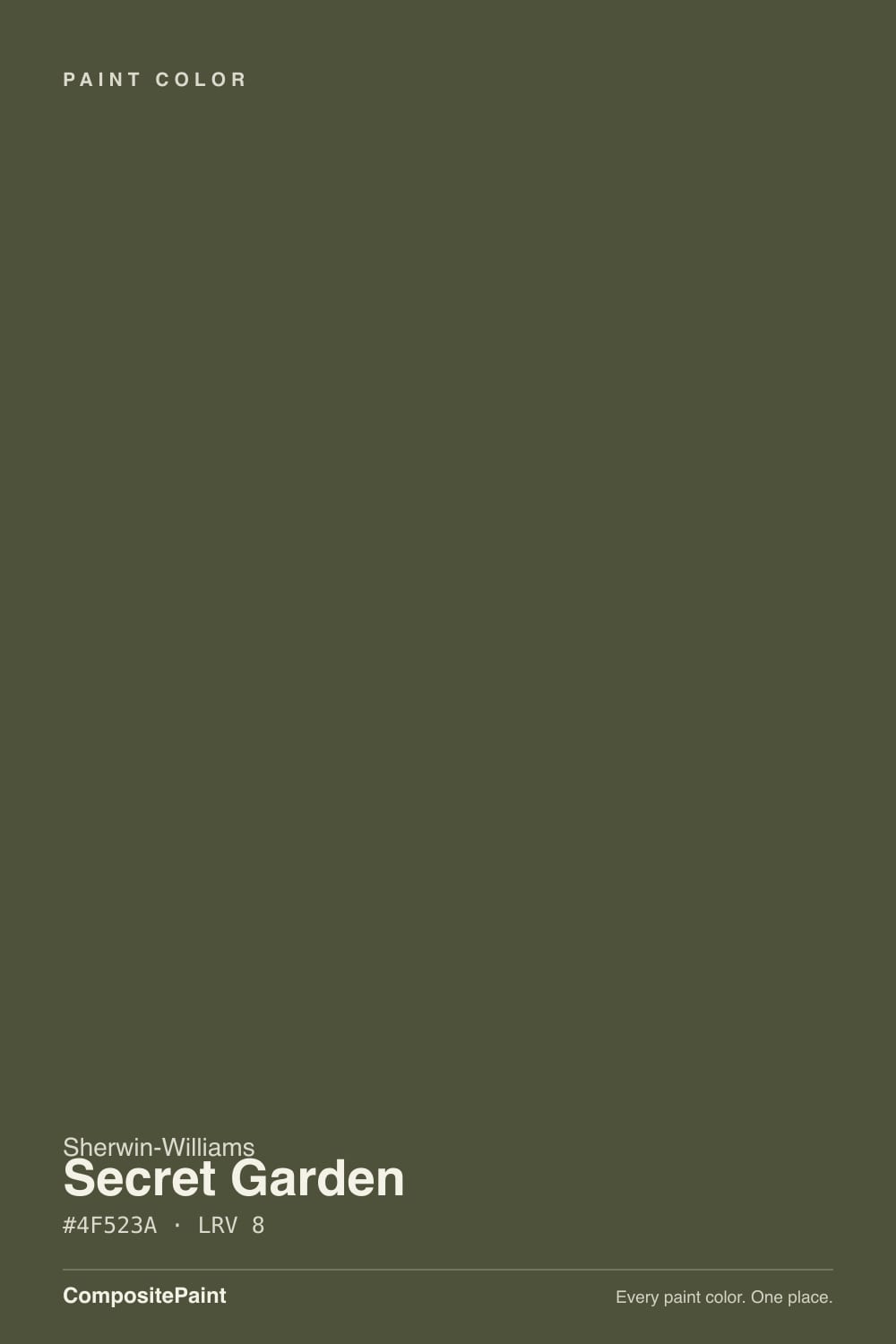
A dark, warm olive green with a bronze-and-khaki undertone doing most of the work. Sherwin-Williams places it in a seasonal collection deck rather than a marquee line, and there is no viral before-and-after or Color of the Year moment attached to it — this is an honestly quiet color, the kind a designer reaches for because it works, not because it trended last week. If you came looking for a famous backstory, there isn't one; what there is instead is a genuinely useful deep green that shows up again and again on kitchen islands and craftsman-style front doors without anyone making a fuss about it.
LRV 8 puts it near the bottom of the entire paint deck — darker than most people mean when they say "dark green." At that depth, a color's identity stops being fixed and starts being a function of light: hit it with real daylight and the green pigment comes forward, unmistakably. Starve it of light and the bronze-khaki undertone takes over, and it reads as a flat brown-black instead. That single fact — light decides whether this is green or brown — is the whole review.
Undertone in one line: warm bronze-olive, khaki-leaning, never blue and never a true neutral black. If your sample looks more brown than green, that isn't a bad can — it's a room that isn't giving the color enough light to do its job.
Where It Shines
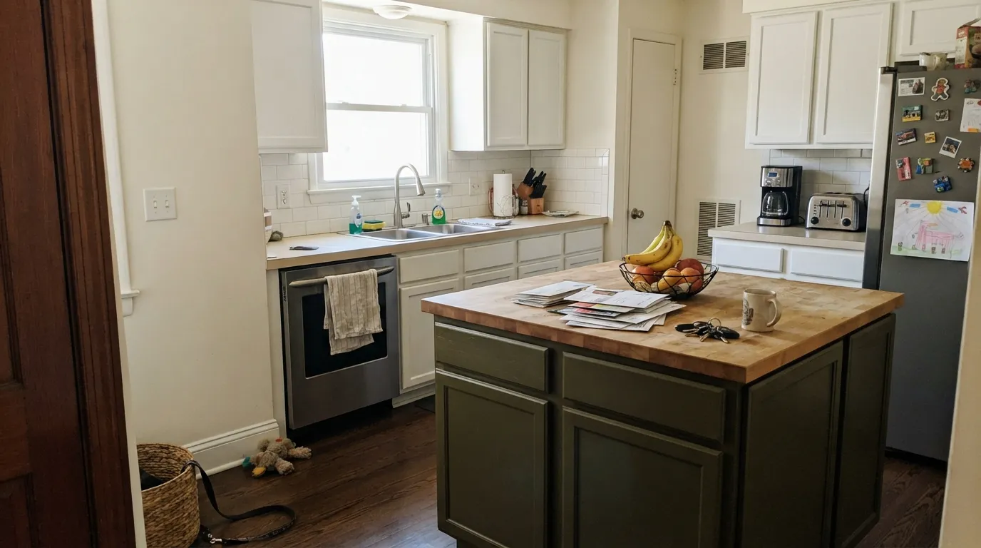
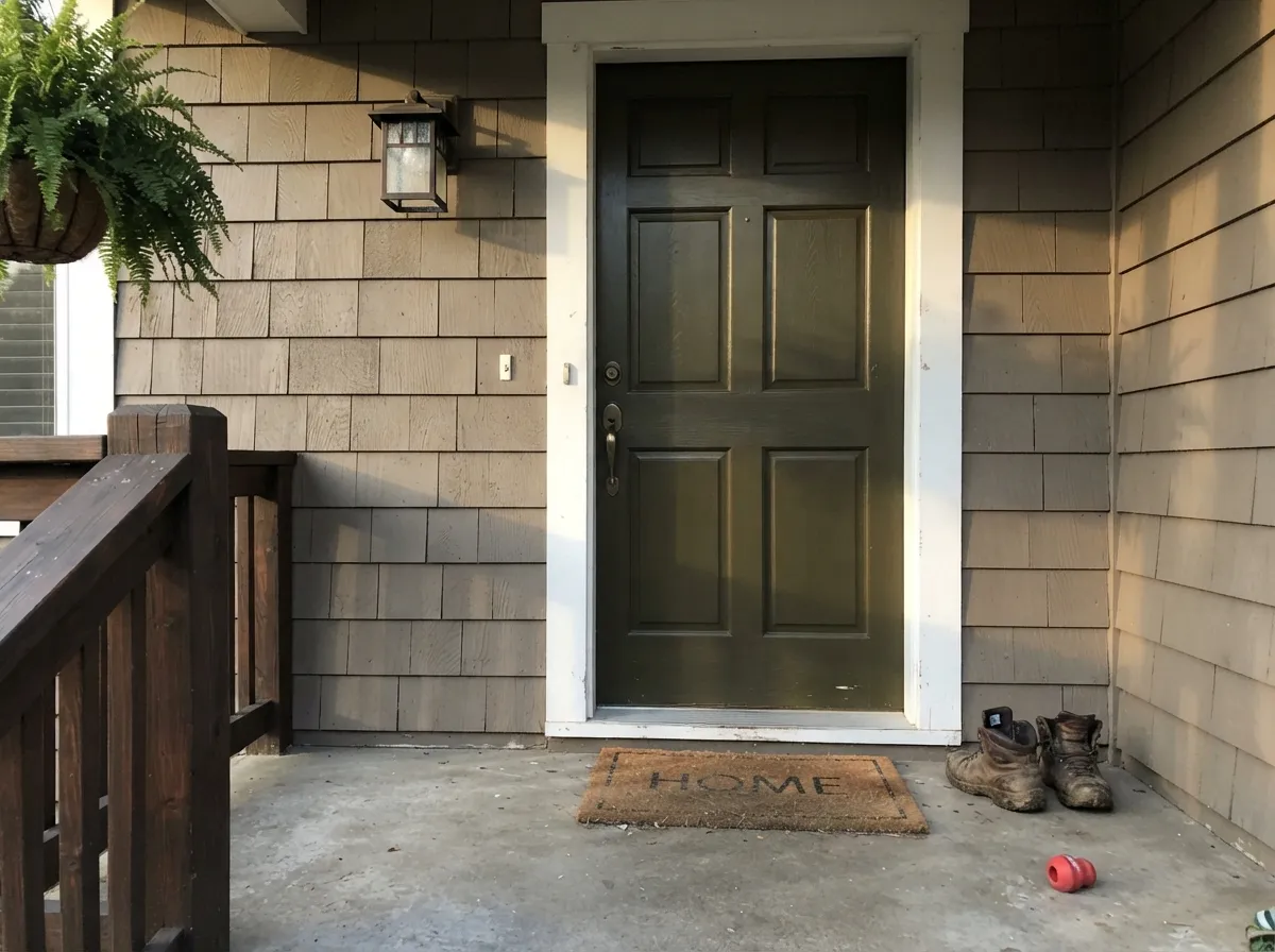
Point real daylight at it and Secret Garden stops being a mystery. On a kitchen island under a window, or on an exterior wall in full sun, the green reads clearly — deep, botanical, a little moody, but unmistakably green rather than black. It's become one of the reliable dark greens behind the current wave of green kitchens for exactly this reason: against white counters, subway tile, and matte black or brass hardware, it looks intentional and expensive rather than like a mistake. Arts and Crafts and craftsman exteriors are its other natural home — the bronze undertone matches the era's palette almost by accident.
Where It Fails
The complaints that exist about Secret Garden all trace back to the same fact: it's an LRV 8 color that needs light to prove it's green. Skip the light, and you get one of three predictable disappointments.
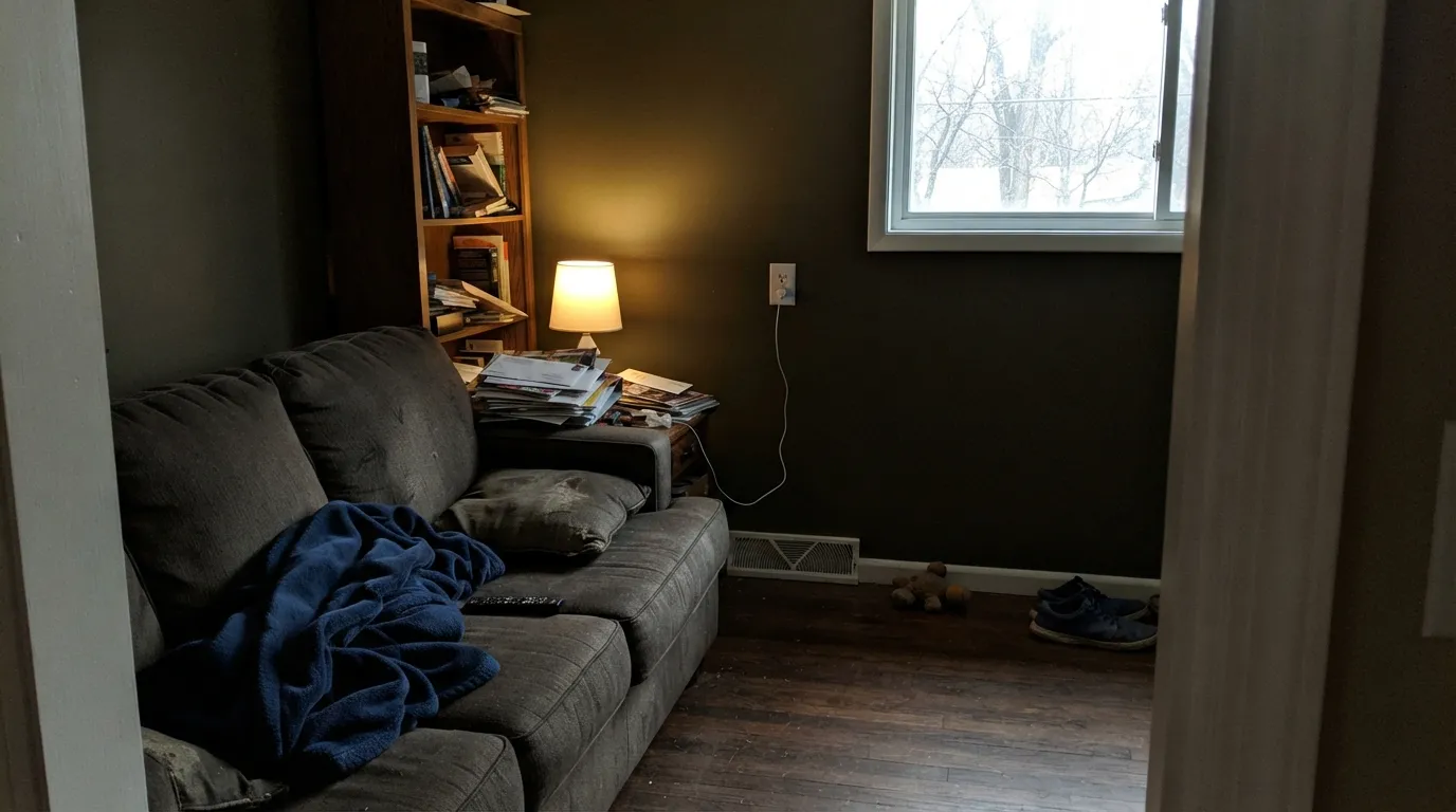
Without direct daylight, the bronze-khaki undertone dominates and the green disappears — the wall reads flat brown-black instead of the sophisticated deep green on the fan deck. This is the single most common surprise with this color. If your room doesn't get real daylight, don't drench it in Secret Garden and hope; sample a full board on the actual wall, at the actual time of day you'll be in the room.
Dark, heavily pigmented colors absorb more heat and fade faster under UV than mid-tone paints. On an exterior, expect the south- or west-facing wall to visibly dull and chalk years before the shaded side of the same house. It's not a defect in this specific color — every deep saturated exterior color does this — but budget a shorter repaint cycle on the sunny elevation, not the whole house at once.
At LRV 8 this is one of the deepest colors in the deck. A small room with no white trim to break it up, no real window, and dim overhead lighting can feel like a closet rather than a considered dark room. Give it a light ceiling or trim line and real lumens, or keep it to cabinetry, doors, and single accent walls instead of every surface.
Room by Room
With daylight from a window and white counters, subway tile, and matte black or brass hardware, this is exactly the moody-but-livable green driving the current green-kitchen trend. Satin or semi-gloss cabinet enamel for durability.
In full exterior daylight it reads as a deep, deliberate green rather than black, and pairs cleanly with white trim on both traditional and Arts and Crafts facades. Expect faster fade on a sun-facing elevation — see the fails section.
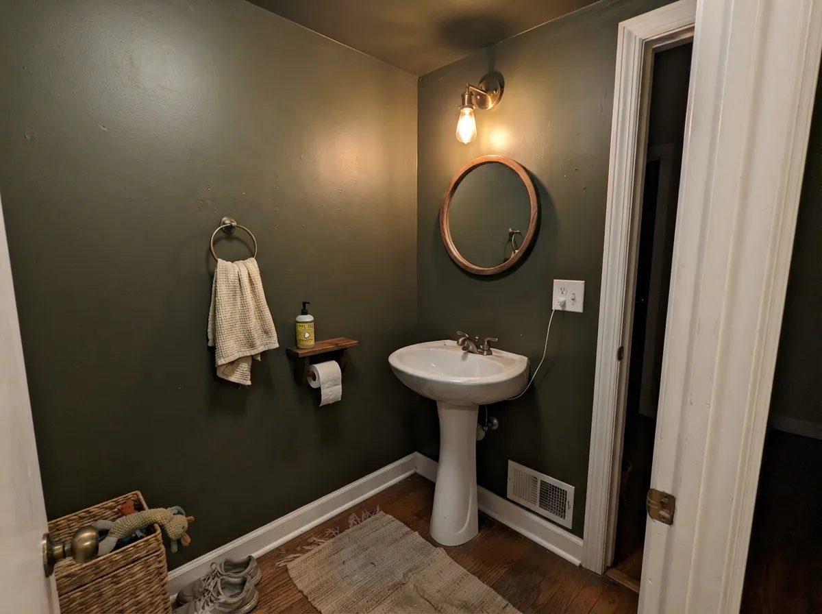
Small rooms take deep color well, and a windowless-feeling powder room can handle walls, ceiling, and trim all in Secret Garden if you keep the actual trim white and add a real light fixture. Skip it if the room's only light is a single dim bulb.
Gorgeous behind a fireplace or built-ins when the wall gets real daylight. As the single accent wall in a room lit mostly by lamps or afternoon shade, it will read as a dark blob rather than a green one.
LRV 8 across every wall of a large, mixed-light floor plan is a hard sell — the color will read differently on every face of the house at once, brown here and green there. Reserve it for one room, cabinetry, or the exterior rather than the whole interior.
A classic craftsman or bungalow body color, especially with white trim. Commit knowing dark, saturated exteriors need repainting sooner than mid-tones because of heat absorption and UV fade.
Your Light Is the Risk
The green pigment comes forward fully — deep, botanical, unmistakably green rather than black. This is the light the color needs to make its case.
The bronze-khaki undertone dominates without direct sun; the wall goes flat brown-black. Sample it in your actual room before trusting the fan deck.
Cooler and greener at midday, warmer and more bronze as the light lowers toward evening. The shift is real but gentle if the room gets any daylight at all.
Warm 2700K bulbs pull the bronze forward into a rich brown-green. Cool white LEDs flatten it toward charcoal-black — pick warm bulbs on purpose here.
Most complaints about Secret Garden are a light mismatch. Upload a photo of your actual room and see it on your walls — then ask for the same wall in north light or evening lamps before you buy a single sample.
Need It From Another Brand?
Any paint counter can custom-tint Sherwin-Williams SW 6181 directly. If you would rather stay in one brand's own deck, these are the closest stock matches, measured as ΔE2000. Under 2 is a difference you will not see on the wall.
| Brand | Closest color | ΔE | LRV | |
|---|---|---|---|---|
| Behr | Frontier Shadow740D-7 · Behr | 2.1 | 8 | Color page → |
| Benjamin Moore | Artichoke2141-10 · Benjamin Moore | 4.1 | 8 | Color page → |
| PPG / Glidden | Castle StonePPG1128-7 · PPG / Glidden | 3.6 | 9 | Color page → |
| Glidden | Castle StonePPG1128-7 · Glidden | 3.5 | 9 | Color page → |
| Dutch Boy | Brackish Water323-7DB · Dutch Boy | 0.0 | 8 | Color page → |
| HGTV Home by Sherwin-Williams | Urban GardenHGSW 3241 · HGTV Home by Sherwin-Williams | 0.0 | 8 | Color page → |
Similar Sherwin-Williams Colors
The nearest shades to Secret Garden within Sherwin-Williams's own range, ranked by perceptual color distance — useful when you want the same look a touch lighter, darker, or warmer.
WCAG 2.1: AA is 4.5 : 1 for normal text, 3 : 1 for large text, AAA is 7 : 1.
Secret Garden vs the Colors You're Also Considering
Every Secret Garden sample board has the same rivals on it. The numbers show the real lightness gap — then it comes down to which risk you would rather live with.
Pick this for the more clearly olive, more overtly bronze-green of the two — Pewter Green reads closer to plain dark gray-green.
Sherwin-Williams SW 6208 · LRV 12Pewter GreenPick this for the same deep-green mood with a grayer, cooler base that drifts toward charcoal instead of brown in weak light.
Pick this when you actually want the color to visibly read green in real daylight, not just a warm black.
Sherwin-Williams SW 6209 · LRV 6Ripe OlivePick this if you'd rather just commit to near-black outright — Ripe Olive skips the green-or-brown guessing game by not trying to read as green in normal light.
Pick this when green needs to stay the dominant read even in imperfect light, not bronze.
Sherwin-Williams SW 2846 · LRV 9Roycroft Bronze GreenPick this for the same Arts and Crafts era feel leaning further into brown from the start — the more honest pick if brown is really what you're after.
Inside the Sherwin-Williams deck, Shade-Grown (SW 6188), hex #4E5147 at LRV 8, is the closest gray version. It has the same depth but far less yellow, so it reads as a dark neutral where Secret Garden reads as olive. Courtyard (SW 6440), hex #475842 at LRV 9, is greener and cooler, a clearer forest tone. Nocturne (SW 9520), hex #544E42 at LRV 8, tips brown instead of green.
Across brands, Dutch Boy Brackish Water (323-7DB) and HGTV Home by Sherwin-Williams Urban Garden (HGSW 3241) both share the exact hex #4F523A and LRV 8, so they are effectively the same color. Behr Frontier Shadow (740D-7), hex #515038 at LRV 8, has a color difference of 2.12, which is very close but worth sampling first.
Magnolia Home Step Stool Green (JG-160) at 3.12 and Glidden Castle Stone (PPG1128-7) at 3.45 are also very close, while Benjamin Moore Artichoke (2141-10), hex #535140, sits at 4.06 and looks close but visibly different side by side.
Secret Garden Coordinating Colors
The rule with Secret Garden is to feed it light-bouncing partners: clean whites for trim and counters, and either a much lighter member of its own green family or a true near-black for contrast — nothing in between that would muddy the undertone. These are the partners that keep it reading as green rather than brown:
Secret Garden on Exteriors
Outside is where the light-dependency story matters most, because a house doesn't get to pick its light — different elevations get different amounts of sun all day, every day. In full sun, Secret Garden is a confident, era-appropriate green that suits craftsman bungalows and traditional facades equally well, especially against white trim, which bounces enough light back onto the body color to keep the green legible.
The tradeoff is durability, not looks: dark, heavily pigmented exterior paint absorbs more heat and fades under UV faster than a mid-tone color, so the sun-facing wall of a Secret Garden house will visibly dull and chalk before the shaded side does. That is true of essentially every dark saturated exterior color, not a defect specific to this one — but plan the maintenance schedule with the sunny elevation in mind, not the shaded one.
Secret Garden With Wood Tones and Metals
Warm metals are the easy call here: unlacquered brass, aged bronze, and matte black hardware all sit comfortably with the bronze-khaki undertone rather than fighting it, which is a large part of why it works so well on kitchen cabinet hardware and exterior fixtures alike. Polished chrome is the one metal that reads slightly cold and out of place next to it.
For wood, white oak and butcher block keep the pairing light and current — the classic green-cabinet, white-counter, warm-wood-floor kitchen. Very orange honey oak fights it a little, pulling the undertone toward muddy rather than rich; walnut and darker stained wood are safer if the floor itself is already warm and saturated.
Three Ready Palettes Built on Secret Garden
A color is never alone on the wall. These are complete combinations in the 60-30-10 pattern, with the reason each one holds together. Every one opens in the visualizer.
A soft white keeps the perimeter bright enough to feed the island real light, which is exactly what Secret Garden needs to read green instead of brown. Iron Ore on a single door gives the room one more dark note without doubling down on green.
Try this palette in your roomWhite trim gives full-sun daylight something to bounce off the body color, which is what keeps Secret Garden reading green rather than black on a facade. Iron Ore on the door and window frames adds contrast without introducing a second undertone to negotiate.
Try this palette in your roomThe small room can absorb the full-strength green with a real fixture doing the work daylight can't. Sea Salt in the hallway outside is a light, easy handoff rather than a second dark color fighting for attention at the doorway.
Try this palette in your roomSecret Garden FAQ
Is Secret Garden more green or more brown?
Both undertones are really there — it's a bronze-khaki olive green — and which one you see depends on light. Direct daylight pulls the green forward; dim or north light lets the bronze-khaki win and it reads brown-black. It is not inconsistent paint, it's a genuinely light-dependent dark color.
Will Secret Garden look black in my room?
At LRV 8 it's close enough to black that a dim or north-facing room can absolutely read it that way. Test a large sample on the actual wall at the time of day you use the room most before committing to all four walls.
Does it work for kitchen cabinets?
Yes — it's one of the more reliable dark greens showing up on cabinets and islands right now, especially with white counters, subway tile, and matte black or brass hardware. Use a satin or semi-gloss cabinet enamel; the kitchen's ambient light is usually enough to keep it reading green.
Is it a good exterior color, and does dark paint fade faster outside?
It's a strong pick for craftsman and Arts and Crafts exteriors, but yes — dark, saturated colors absorb more heat and fade under UV faster than mid-tones. Expect the sun-facing side of the house to dull noticeably sooner than a shaded side, and plan the repaint schedule around that.
What trim or wall white goes with Secret Garden?
A clean, not-too-warm white — Pure White or Alabaster both work — bounces enough light back onto the green to keep it reading as green rather than brown. A very warm cream trim can push the whole pairing further into brown territory.
Is Secret Garden a trendy color that will date?
It doesn't carry a trend story to begin with — no Color of the Year moment, no viral room. It's a steady seasonal-collection color that designers reach for because it does a specific job well, which is usually the kind of color that ages the most quietly.
Have you painted with Secret Garden?
Rate it — one tap helps the next reader decide.
Ask a Question