Ripe Olive
The near-black olive nobody asks for by name, reviewed honestly: where the green actually shows, where it just reads as black, and what to pick instead.

Jessica has spec'd whites and neutrals for more than 300 rooms and keeps a sample wall of painted drawdowns in her studio. Every color review is checked against real reader rooms in the comments and re-tested when a formula changes. About the testing process →
- 1Black Emerald1
- 2Ripe Olive6
- 3Sage Green22
- 4Evergreen Fog30
The Fast Verdict
Ripe Olive is what happens when a dark olive-brown gets pushed almost all the way to black. At LRV 6 it sits right on the line the industry itself uses to call a color "black," and most of the time it behaves like one — a warm, brown-green black rather than a cold blue one. Catch it in direct sun and the olive steps forward; catch it under a cloudy sky with the lamps off and you would swear it was just a very good black. Both readings are honest. Neither is a defect.
Kitchen islands and cabinets that want black without the flatness · front doors and shutters · built-ins and accent walls in rooms with real daylight or lamps · anyone who wants "black" but wants it to have a little more going on up close
You want the olive to read as visible green every day, not just in direct light · your room is dim with no lamps · you already own a true neutral black and just want more of it · you are painting the only wall a small, low-light room has
- A warm near-black that still carries a real, verifiable olive-brown undertone up close
- Genuinely good on kitchen islands and cabinets — same trick as pricier boutique near-blacks
- Holds its color in full outdoor sun without drifting blue or purple, unlike some cooler blacks
- Hides scuffs and fingerprints on cabinetry as well as any dark satin finish
- A widely available way to get a near-black-with-depth look without hunting down a specialty brand
- At LRV 6 it reads as plain black in anything but strong direct light — buyers expecting visible everyday green are often disappointed
- Whole rooms without real daylight or lamps go flat and cave-like fast
- Deep-base coverage means real prep — tinted primer and careful rolling, or expect flashing and extra coats
- Overshadowed by Sherwin-Williams' own better-known blacks and greens, so inspiration photos and real samples are harder to find
What Color Is Ripe Olive, Really?
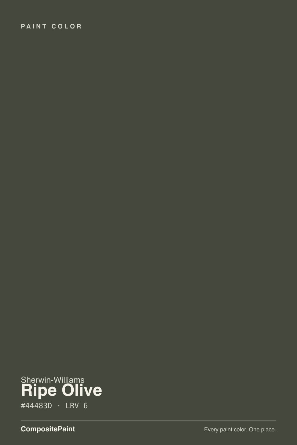
Ripe Olive is a warm, brown-leaning olive green pushed almost to black — the deck's own RGB tells the story: red and green sit close together and blue trails behind, which is the exact fingerprint of a warm, earthy near-black rather than a cool one. The name is doing real work here: like an olive gone from green to black on the tree, this color keeps a trace of its green origin inside a mostly-black surface. It is not a bright, obvious green in the way Rosemary or Clary Sage are. It is a black with green in its blood.
At LRV 6, Ripe Olive sits exactly on the boundary the paint industry itself draws between "charcoal" and "black" — this site's own black-colors page uses that same number as the cutoff. That borderline position explains its whole personality: in flat, low light it drops fully into black, undertone invisible, indistinguishable at a glance from Tricorn Black or Wrought Iron. In strong, direct, or raking light — morning sun across a paneled door, a spotlight on a kitchen island — the brown-green comes forward and the color announces itself. Most near-blacks do some version of this; Ripe Olive's shift is unusually complete, closer to on/off than a gentle drift.
Undertone in one line: warm olive-brown, never blue, never a clean neutral. If your sample reads plain black on the wall, that is completely normal — the green only shows up in direct light or close inspection, not from across the room.
Where It Shines
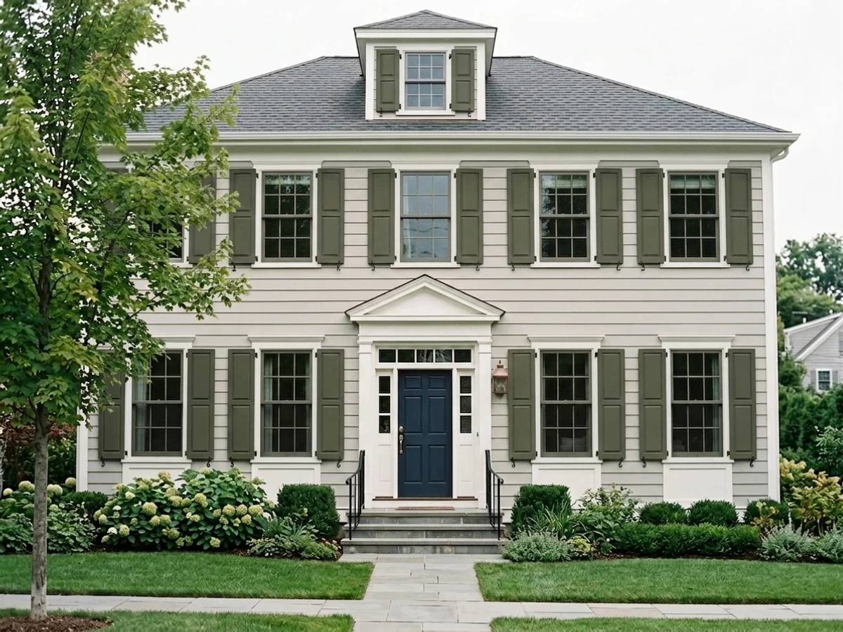
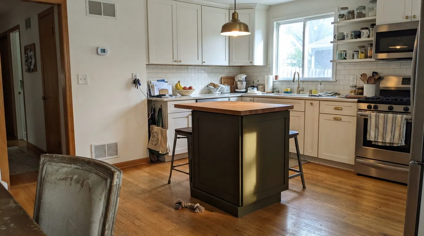
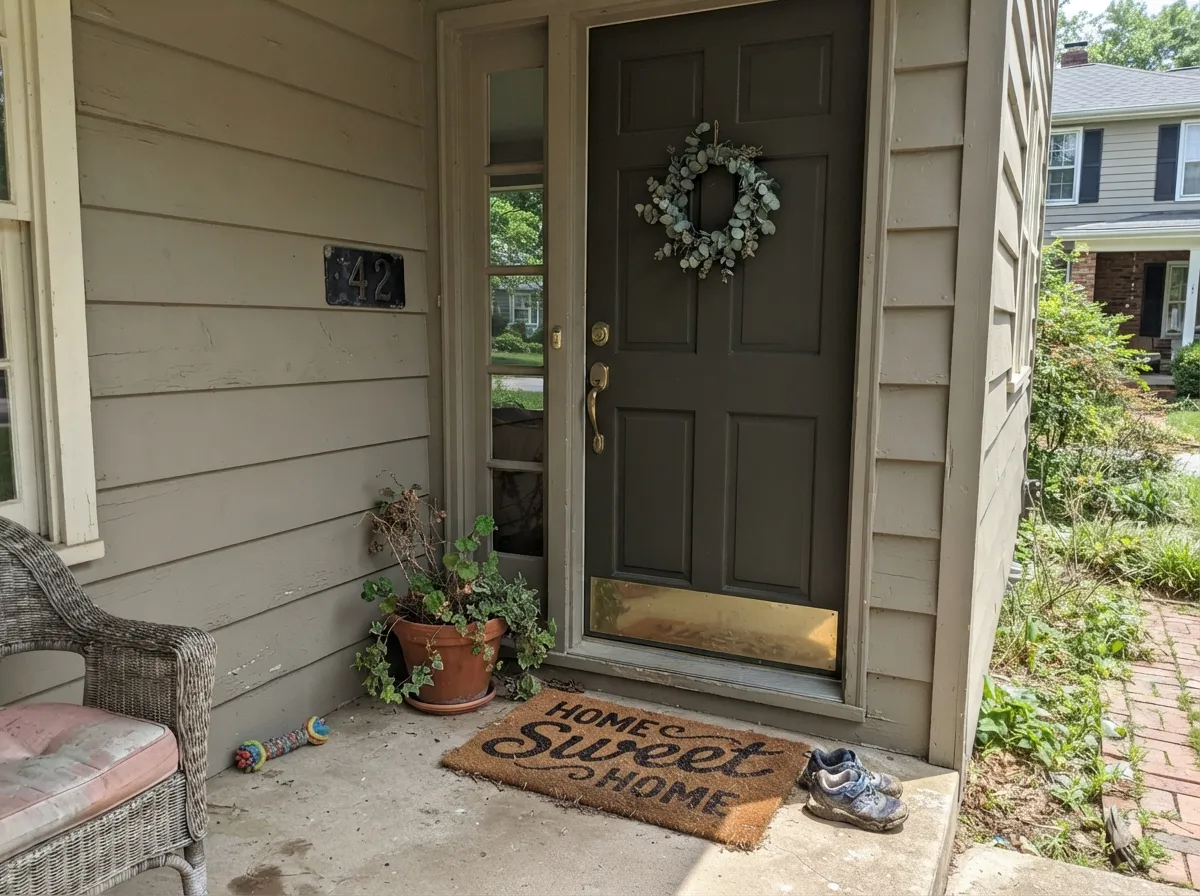
This is a color for the places designers already put black, run through a warmer, more textured filter. On a kitchen island or a full run of lower cabinets it gives the same grounding, high-contrast anchor a true black would, but photographs slightly less flat because the surface never goes perfectly neutral — there is always a hint of warmth sitting under the shadows. Front doors and exterior shutters are its other natural home: full sun brings the olive-brown forward the way it never quite does indoors, and against a warm-white or greige body it reads custom rather than off-the-shelf.
Where It Fails
Almost every disappointed story about Ripe Olive comes from one of three predictable situations, and none of them are the paint's fault — they are what happens when a color sitting right on the black/charcoal line gets asked to do a job outside its actual range.
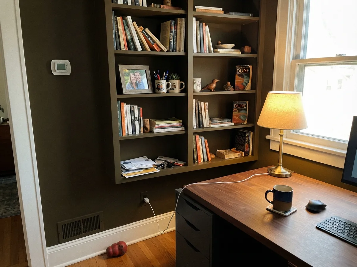
Ripe Olive photographs as a clear olive-brown on a paint chip held up to the light, then disappears the moment you paint four walls and turn the overhead light on. At LRV 6 it is functionally black in most home lighting — the undertone needs direct sun or a bright lamp to show at all. If you want the color to read as green from across the room every day, this is not that color; Rosemary (LRV 12, two steps lighter) shows its green in ordinary daylight instead of only at noon.
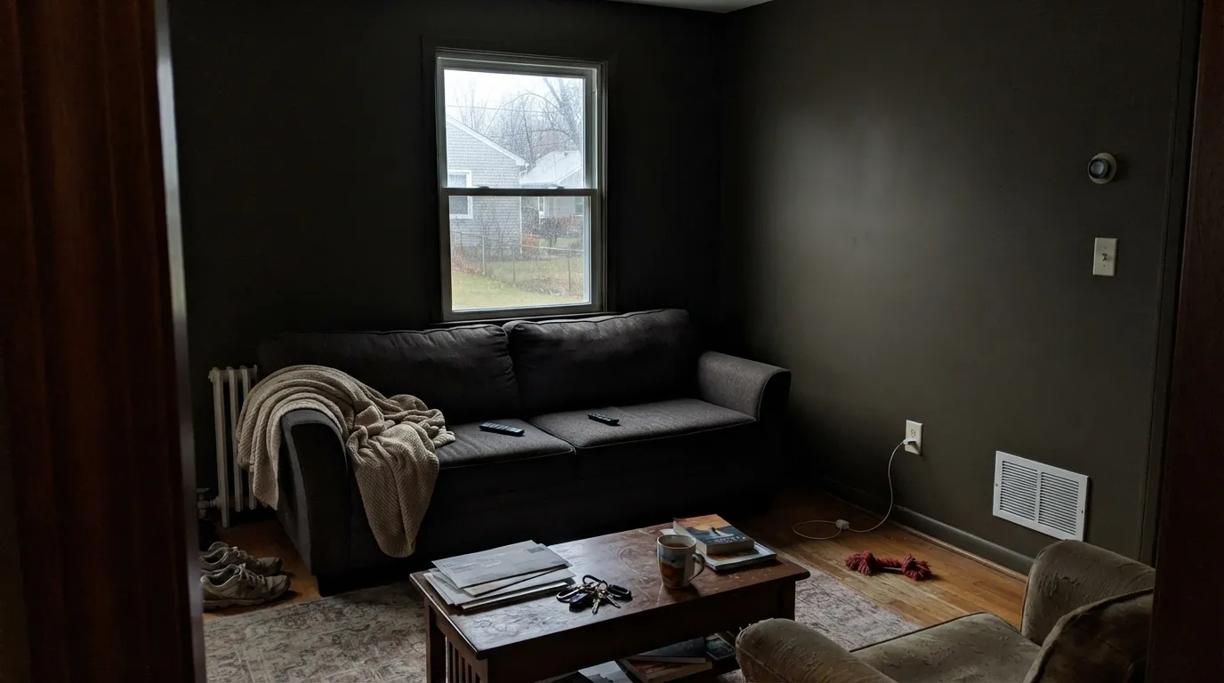
Near-blacks need light to have anything to work with, and Ripe Olive is no exception. A north-facing room, or any room without a real window and warm bulbs, turns four walls of this color into a flat, cave-like box — readers describe it as "swallowing the room." Use it as an accent wall opposite a window, on cabinetry under task lighting, or commit to real lamps if you go whole-room.
Colors this dark are mixed from a deep base with far less white pigment than a standard tint, which means two real consequences: roller flashing (uneven sheen patches) if you do not maintain a wet edge and back-roll consistently, and weak coverage over white or light-primed drywall — often three coats, not two. A gray-tinted primer under it cuts that back to two finish coats and is worth the extra can.
Room by Room
A full run of lower cabinets or a single island in Ripe Olive gives the black-kitchen look with a warmer, less severe edge than a true neutral black. Pairs especially well with brass and warm wood open shelving. Satin urethane-fortified cabinet enamel; it needs the extra durability more than a wall paint does.
Full outdoor sun is the light this color has been waiting for: the olive-brown comes forward against a warm-white or greige house in a way it rarely manages indoors. Semi-gloss for the door, and expect the color to read noticeably warmer than it does on an interior sample.
Bookshelves and paneling under a window or a good reading lamp let the color show its texture instead of going flat. Walnut, leather and brass all sit well against it. Eggshell holds up better than matte where hands and books brush the surface.
In a room with real daylight from a second wall, one Ripe Olive wall reads as a deep, warm near-black anchor for art and furniture. In a room that only gets light from the wall it is painted on, it goes dark and flat by mid-afternoon — check the room's actual light pattern before committing a full wall.
Four walls of any LRV 6 color in a room that is mostly used with the lights off is a hard sell even for people who like dark bedrooms; this one adds nothing over a true black for that use, and loses the daylight moments where its actual personality shows. A single headboard wall or the ceiling is the safer version of the idea.
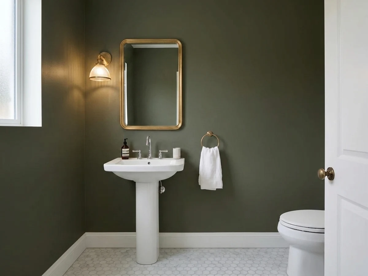
A Ripe Olive vanity under a brass mirror and a lit sconce is the same trick as the kitchen island move, scaled down: enough color to feel deliberate, small enough that the room stays bright everywhere else. Satin cabinet enamel.
Your Light Is the Risk
Sunlight hitting the surface at an angle — a front door in the morning, a spotlighted island — is the only light where the olive-brown genuinely reads as color rather than black.
Flat, indirect light leaves the undertone essentially invisible. Fine if you wanted black; disappointing if you specifically bought it for the green.
Low morning or evening sun briefly warms the surface and lifts the brown-green forward; midday light flattens it back toward neutral black.
2700K lamps keep a trace of warm olive visible in the highlights. Cool white LEDs flatten it to a plain graphite-black with no green left at all.
Most complaints about Ripe Olive are a light mismatch. Upload a photo of your actual room and see it on your walls — then ask for the same wall in north light or evening lamps before you buy a single sample.
Need It From Another Brand?
Any paint counter can custom-tint Sherwin-Williams SW 6209 directly. If you would rather stay in one brand's own deck, these are the closest stock matches, measured as ΔE2000. Under 2 is a difference you will not see on the wall.
| Brand | Closest color | ΔE | LRV | |
|---|---|---|---|---|
| Behr | Black Bean790D-7 · Behr | 2.6 | 6 | Color page → |
| Benjamin Moore | TopsoilCC-692 · Benjamin Moore | 1.1 | 8 | Color page → |
| Farrow & Ball | Carriage GreenNO. 94 · Farrow & Ball | 4.3 | 7 | Color page → |
| Diamond Vogel | Macon SpruceH098 · Diamond Vogel | 3.6 | 6 | Color page → |
| Hirshfield's | Clover Patch0431 · Hirshfield's | 2.0 | 8 | Color page → |
| Kompozit | Clover Patch0431 · Kompozit | 2.0 | 7 | Color page → |
Similar Sherwin-Williams Colors
The nearest shades to Ripe Olive within Sherwin-Williams's own range, ranked by perceptual color distance — useful when you want the same look a touch lighter, darker, or warmer.
WCAG 2.1: AA is 4.5 : 1 for normal text, 3 : 1 for large text, AAA is 7 : 1.
Ripe Olive vs the Colors You're Also Considering
Every Ripe Olive sample board has the same rivals on it. The numbers show the real lightness gap — then it comes down to which risk you would rather live with.
Pick this if you want that one flash of brown-green in direct sun — Wrought Iron never does that; it stays the same neutral warm black regardless of light.
Benjamin Moore 2124-10 · LRV 6Wrought IronPick this if you want the classic soft, neutral near-black with no olive lean at all — Wrought Iron reads warm-black start to finish, in every light.
Pick this for warmth — Iron Ore can read cold and a little institutional under gray daylight; Ripe Olive never goes cold, even at its blackest.
Sherwin-Williams SW 7069 · LRV 6Iron OrePick this for a true cool, whole-house-safe black with no green or brown lean — the reference black for anyone who wants zero undertone surprises.
Pick this for the closer-to-black depth a kitchen island or front door usually wants — Rosemary is lighter and won't give you that near-black look.
Sherwin-Williams SW 6187 · LRV 12RosemaryPick this if you want the green to actually show without needing direct sun — Rosemary sits two shades lighter and reads as a dark green in ordinary daylight, not just at noon.
Pick this if brown-black feels like it is everywhere already — Ripe Olive is the same depth with a cooler, greener signature that shows up far less often.
Sherwin-Williams SW 7048 · LRV 8Urbane BronzePick this for a browner, less green near-black — Urbane Bronze is one of Sherwin-Williams' most popular darks for exactly that warm-without-olive quality.
Laurel Woods (SW 7749), #44493D at LRV 6, is close enough to Ripe Olive's #44483D that the two are very hard to tell apart on a wall. Foxhall Green (SW 9184) at LRV 7 is marginally lighter and slightly greener. Dard Hunter Green (SW 41), #3A4A3F at LRV 6, is a truer, colder green with less yellow in it, and Sealskin (SW 7675) at LRV 6 goes the other way into brown.
Across brands, Benjamin Moore Topsoil (CC-692) at LRV 8 sits at a color difference of 1.12 and Behr Potting Soil (N360-7) at LRV 6 sits at 1.48, both visually identical in normal room light. Kompozit Clover Patch (0431) at 1.96 is in the same group. Diamond Vogel Macon Spruce (H098) at 3.56 and Farrow & Ball Carriage Green (No. 94) at 4.32 are close but visibly different side by side, the Farrow & Ball noticeably greener.
Ripe Olive Coordinating Colors
The rule for coordinating with Ripe Olive is the same rule that governs any warm near-black: keep the neighbors warm, and give the color enough light to work with. It pairs cleanly with warm off-whites and greiges, brass and unlacquered metals, and lighter members of its own green-brown family. These are the partners that keep showing up in rooms that actually use it well:
Why Ripe Olive Stays Under the Radar
Sherwin-Williams has built two genuinely famous reputations in this territory: Tricorn Black and Iron Ore as reference blacks, Rosemary and Evergreen Fog as go-to greens. Ripe Olive sits in the narrow gap between those two famous camps, and it pays a real price for it — search for inspiration photos and they thin out fast next to what you find for its more famous neighbors. That is not a flaw in the paint. It is simply a color whose whole identity is a compromise: dark enough to read black, colored enough to not quite be one, which makes it a harder color for a single Pinterest board to claim.
That obscurity is also the honest case for it. If you like the idea of a near-black cabinet or door but do not want the exact same color as every other black kitchen island on your feed, Ripe Olive gives the same functional trick — grounding, high-contrast, forgiving of scuffs — with a warmer, quieter signature that most people will not immediately name.
Ripe Olive With Wood Tones and Metals
Warm woods are the easy answer here: walnut, white oak, butcher block and leather all sit comfortably against Ripe Olive because their warmth meets the paint's brown lean halfway. Cool, gray-washed wood is the harder pairing — it can make the near-black read colder and more like a plain charcoal than the warm olive-brown it actually is, so test a sample against your actual floor before committing cabinetry to it.
Metals follow the same logic as most warm darks: unlacquered brass and aged bronze look intentional and expensive next to it; matte black hardware disappears into it entirely, which is sometimes exactly the point on an island. Polished chrome or nickel is the one finish that can look slightly out of place — it pulls cool against a color that is trying hard to stay warm.
Three Ready Palettes Built on Ripe Olive
A color is never alone on the wall. These are complete combinations in the 60-30-10 pattern, with the reason each one holds together. Every one opens in the visualizer.
Alabaster keeps the room bright enough for Ripe Olive's undertone to actually catch daylight instead of just reading as shadow; Peppercorn bridges the two depths on the hood and shelving so the near-black island doesn't sit alone in the room.
Try this palette in your roomA warm greige body lets the door's olive-brown stay warm instead of reading cold and isolated; charcoal shutters echo the depth without duplicating it exactly, leaving the door as the single true near-black note on the house.
Try this palette in your roomRetreat is a lighter cousin in the same warm-green family, so the near-black built-ins don't feel like an isolated decision from the rest of the house; Natural Linen keeps the trim warm instead of stark white, matching Ripe Olive's earthy lean.
Try this palette in your roomRipe Olive FAQ
Is Ripe Olive green or black?
Both, depending on the light — and mostly black. At LRV 6 it sits right at the industry line between charcoal and black. In direct or raking sun the olive-brown shows clearly; under ordinary overcast daylight or evening light with no lamps, it reads as a plain warm black. If you need the green visible every day, this is not the color; Rosemary shows more of its green more of the time.
What trim or wall color goes with Ripe Olive?
A warm off-white or warm greige, not a stark cool white. Alabaster, Cloud White or a warm greige like Oyster White let the olive-brown read warm instead of muddy. A cold, blue-white trim can make Ripe Olive look flat and lifeless by comparison.
Is it good for kitchen cabinets or an island?
Yes — this is its strongest use. It gives the popular black-kitchen look with a warmer, more textured edge than a true neutral black, and it pairs especially well with brass hardware and warm wood open shelving. Use a satin, urethane-fortified cabinet enamel, not a wall paint.
Does Ripe Olive work on a front door?
Very well. Full outdoor sun is the light where this color's undertone shows most clearly and most consistently — better than it usually does indoors. Pair it with a warm-white or greige house body and expect the door to read noticeably warmer than an interior paint chip suggests.
How many coats does Ripe Olive need?
Two over an existing mid-to-dark color; often three over white or light-primed drywall, because deep-base colors like this one carry less white pigment. A gray-tinted primer under it cuts that back to two finish coats and also prevents the roller flashing dark colors are prone to.
Can I paint a whole room in Ripe Olive?
Only if the room gets real daylight or you plan to run warm lamps regularly. Without either, four walls in an LRV 6 color go flat and cave-like fast. A single accent wall opposite a window, or built-ins under a reading light, get the look with far less risk than a full room.
Have you painted with Ripe Olive?
Rate it — one tap helps the next reader decide.
Ask a Question