Laurel Woods
A near-black forest green reviewed honestly: the light that finds the green in it, the light that flattens it to black, and what to pick instead.

Jessica has spec'd whites and neutrals for more than 300 rooms and keeps a sample wall of painted drawdowns in her studio. Every color review is checked against real reader rooms in the comments and re-tested when a formula changes. About the testing process →
- 1Black Emerald1
- 2Laurel Woods6
- 3Sage Green22
- 4Evergreen Fog30
The Fast Verdict
Laurel Woods is what you get when a paint company tries to split the difference between black and green — and mostly succeeds. In full daylight the olive-charcoal green comes forward and it reads unmistakably like a color, not a shadow. Drop the light and it slides toward plain near-black. At LRV 6 it is genuinely dark, and Sherwin-Williams files it under "Neutral" rather than green, which tells you how close it sits to that line. Buy it for what it actually is: a dark green that needs light to prove it, not a safe substitute for true black.
Kitchen islands and cabinets · front doors and exterior trim · dens, libraries, and powder rooms with lamps · anyone who wants black's drama with a living undertone underneath
You want the color to read clearly at a glance in any light · your room is dim and north-facing with no lamps · you're committing to four full walls with no daylight test first · you actually wanted a true, unwavering black
- Reads as a genuine olive-forest green in daylight, not just another black
- Cabinets, front doors, and exterior trim all take it beautifully
- LRV 6 depth hides scuffs and fingerprints better than a painted true black
- A real, organic following on Pinterest and TikTok for doors and islands
- Filed as "Neutral" by Sherwin-Williams, so it pairs easily without a color-wheel fight
- Reads flat near-black in any room without strong daylight or lamps
- Buyers hoping for true black get visible green once the sun hits it
- No Color of the Year moment or major designer story to lean on — you're testing it cold
- Four full walls is a much bigger commitment than the door or island doses it's usually used in
What Color Is Laurel Woods, Really?
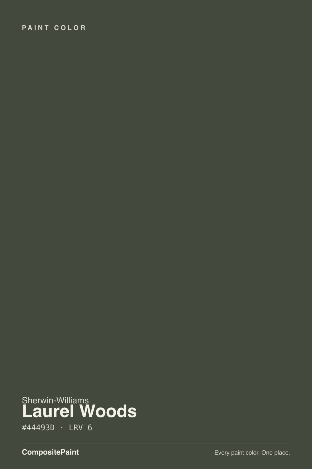
A deep, muted green with a noticeable gray-charcoal cast and a soft olive edge — low saturation, not a bright forest green. Sherwin-Williams puts it in the Neutral family on its own site, not Green, which is a real quirk worth knowing before you buy: the company itself isn't fully committing to calling this a green, because in a lot of light it doesn't act like one. That in-between identity is the whole character of the color.
At LRV 6 it sits in true near-black territory, the same depth as SW's own Iron Ore (also LRV 6, filed as black) and Benjamin Moore's Wrought Iron (LRV 6, a green-black). What separates Laurel Woods from those is what happens when real light hits it: Iron Ore stays a steady neutral black in almost any light, while Laurel Woods opens up into visible olive-green the moment daylight or a warm lamp reaches it. That split personality is the whole reason to pick this over a true black — and the whole reason it disappoints buyers who wanted a true black without knowing it.
Undertone in one line: olive-charcoal green, never a true black and never blue. If your sample reads flat and colorless, that's cool or dim light doing what it does to every near-black paint — not a defect in this one.
Where It Shines
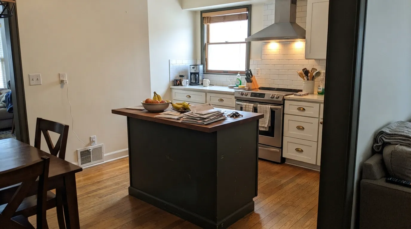
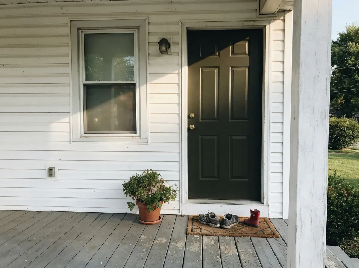
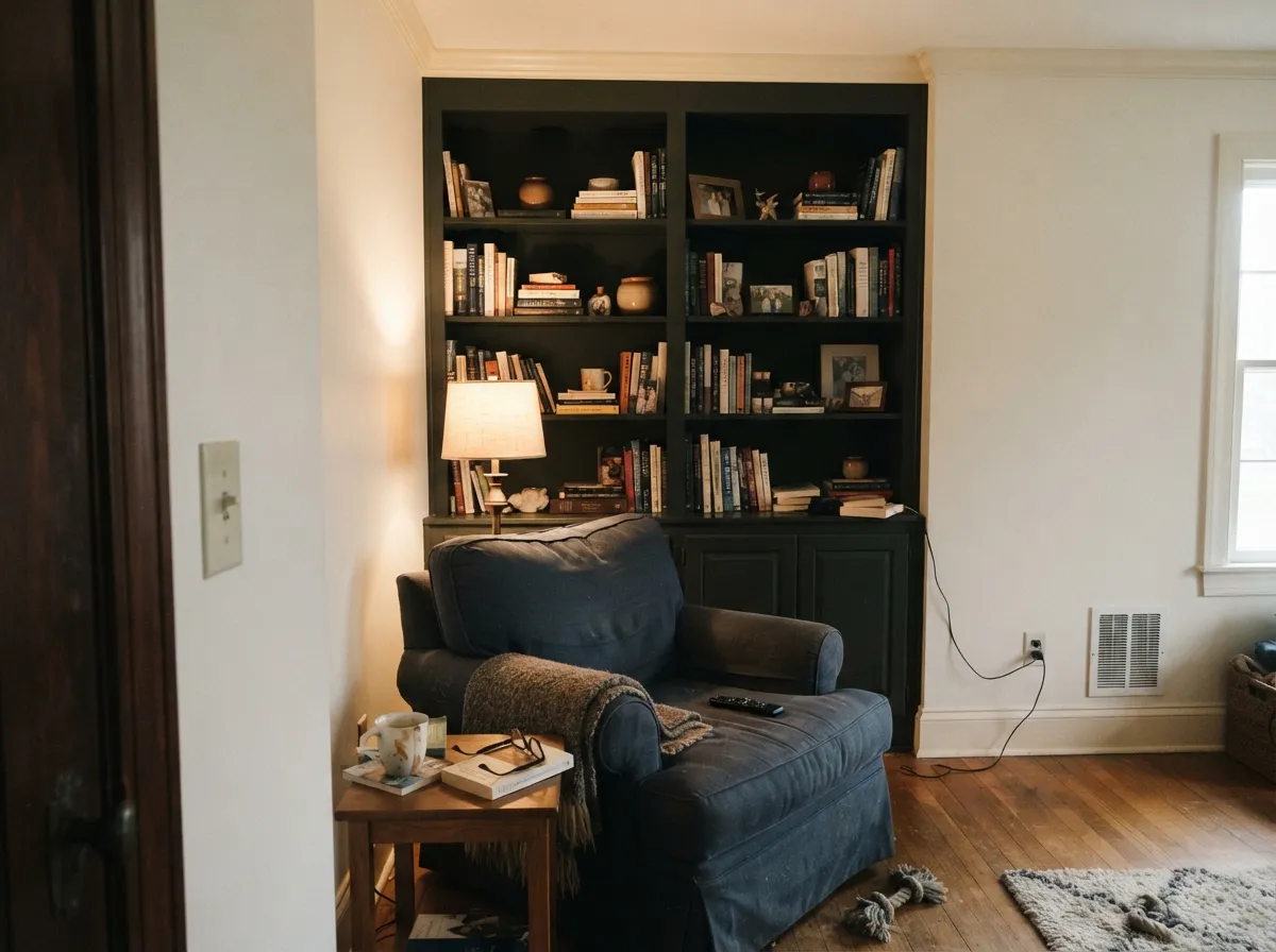
This is not a Color of the Year pick and there's no big designer moment behind it — it has built its following quietly, on Pinterest boards and TikTok kitchen-reno clips, one island and one front door at a time. That's an honest kind of popularity: people who painted it and liked it enough to film it. It earns that following on cabinets, front doors, and exterior trim, where daylight reaches it directly and the green has a reason to show up. Give it real light and something pale to sit next to — a white cabinet run, a light-colored house — and it reads as a genuinely sophisticated dark green, not just another black.
Where It Fails
Almost every disappointed review of Laurel Woods traces back to one of three setups, and all three are predictable before the first coat goes on. None of them are the paint failing — but if your project matches one, this isn't the color to gamble on.
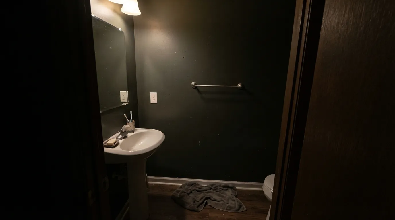
At LRV 6, without strong daylight or a warm lamp reaching the surface, Laurel Woods just reads flat near-black — the olive-green that makes it interesting needs light to show up at all. A dim hallway or a windowless powder room with a single overhead bulb will not give you a green wall; it will give you a dark wall.
Buyers who pick this expecting an unwavering black get surprised when afternoon sun hits an exterior door or a kitchen island and it visibly greens up. If you want a black that stays black in every light, that's Iron Ore or Tricorn Black's job, not this one's.
Almost every successful room you'll find used this color in doses — an island, a door, a run of trim — not a full four-wall commitment. That's not an accident. A whole room this dark and this light-dependent needs a big sample taped up and watched through a full day before you commit a gallon to it.
Room by Room
An island or a full lower-cabinet run against white uppers is where this color earns its Pinterest following. Satin cabinet enamel wipes clean and the depth hides fingerprints better than a painted black would.
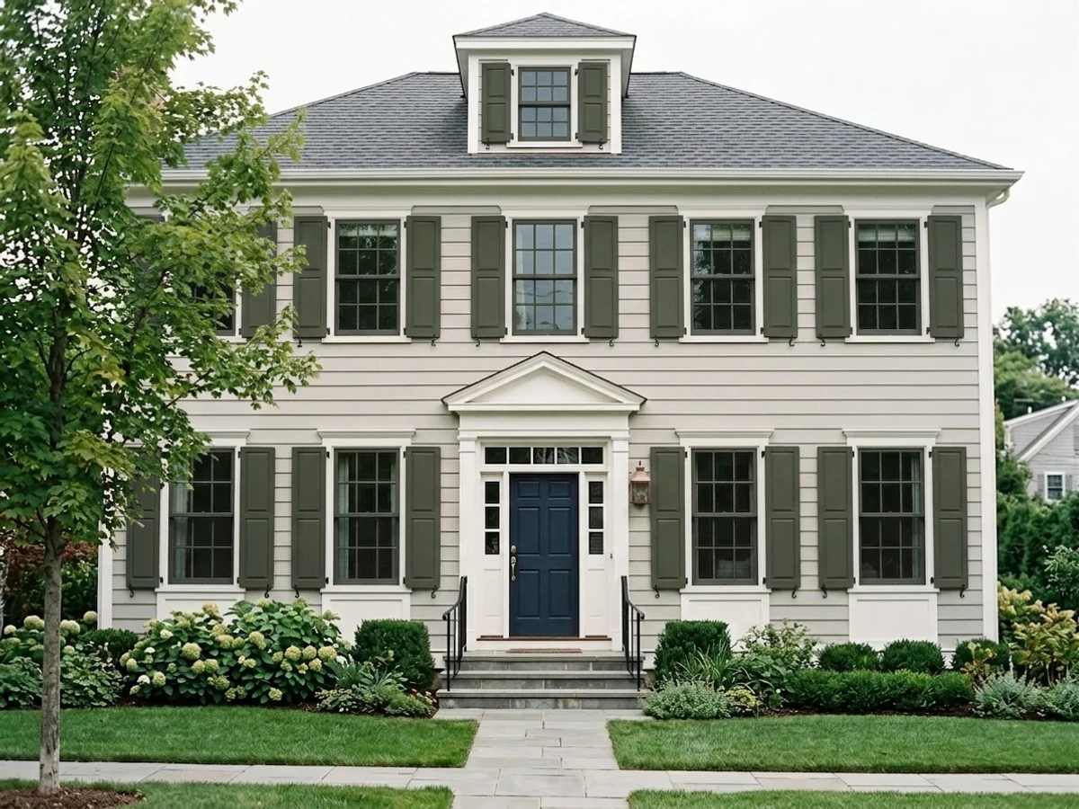
Full daylight is exactly the light this color wants, and a front door gets it all day. Against a white or light-gray house it reads as a deliberate, grounded dark green instead of just "the dark door."
Built-ins, wainscoting, or a full wall behind warm lamplight turn genuinely moody and rich. Skip it here if the room has no lamps and one small north window — that's the flat-black setup.
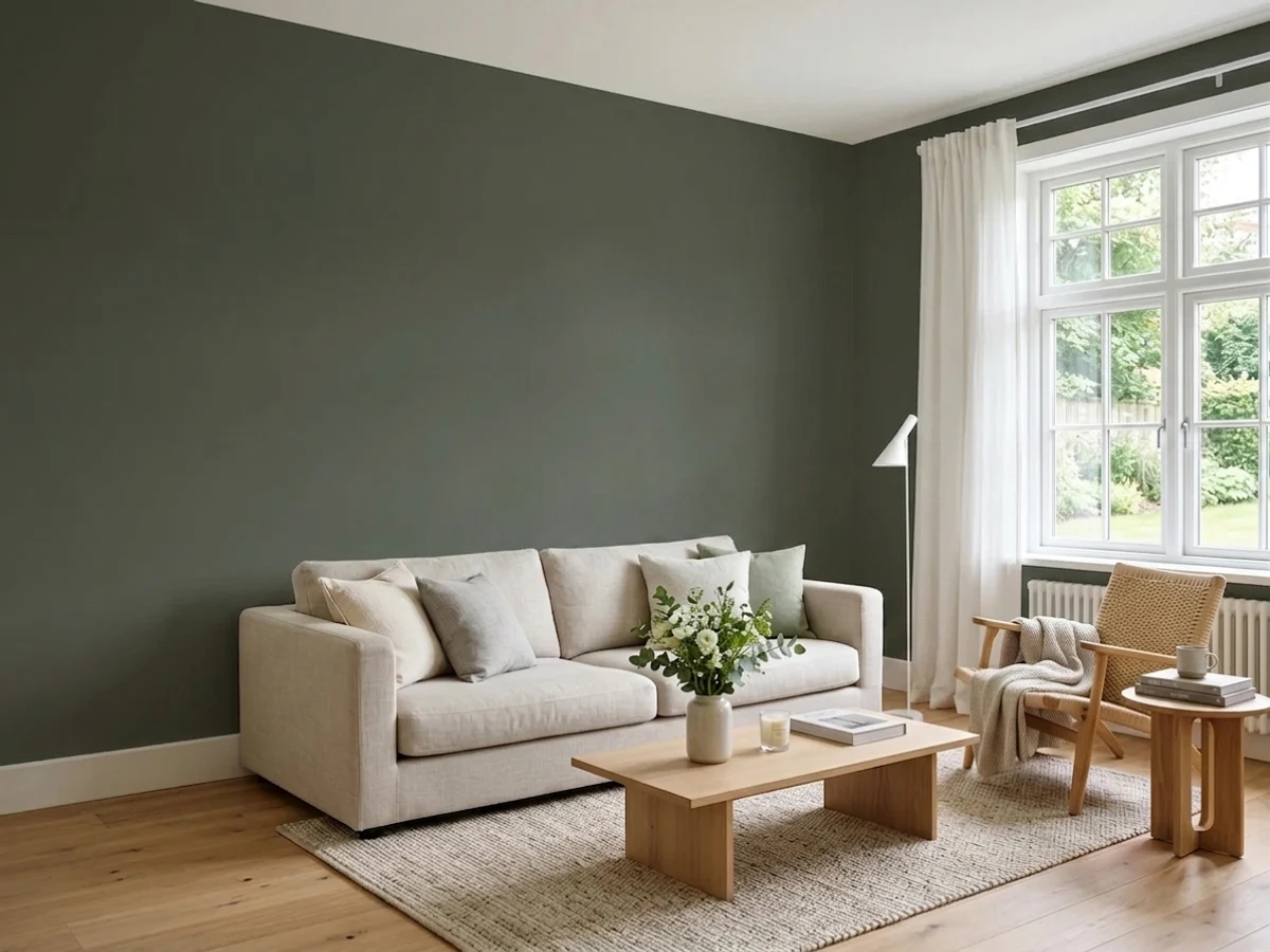
Works as a full-wall color only in a bright, south-facing room. In an average living room it's safer as an accent wall or built-ins than all four walls.
The near-black depth can feel like a cave without real daylight and evening lamps doing real work. If the room is dim, a lighter dark green (Rosemary, Evergreen Fog) gives more of the mood with less risk.
Best as trim, shutters, or a door against a pale body color, where the contrast lets the green register. As a full-siding color it needs a lot of surrounding daylight to avoid reading as plain dark gray from the curb.
Your Light Is the Risk
Full sun or a bright south-facing window is what actually finds the green — the olive and charcoal separate out and it stops reading as plain black.
Cool or minimal daylight flattens it toward near-black; the green all but disappears. This is the single most common regret.
Warmer and more visibly green at golden hour, closer to plain charcoal at midday and after dusk. Expect it to change through the day.
2700K lamps hold the olive-green after dark. Cool white LEDs push it toward flat black-gray — swap the bulb before you second-guess the paint.
Most complaints about Laurel Woods are a light mismatch. Upload a photo of your actual room and see it on your walls — then ask for the same wall in north light or evening lamps before you buy a single sample.
Need It From Another Brand?
Any paint counter can custom-tint Sherwin-Williams SW 7749 directly. If you would rather stay in one brand's own deck, these are the closest stock matches, measured as ΔE2000. Under 2 is a difference you will not see on the wall.
| Brand | Closest color | ΔE | LRV | |
|---|---|---|---|---|
| Behr | Black Bean790D-7 · Behr | 2.0 | 6 | Color page → |
| Benjamin Moore | TopsoilCC-692 · Benjamin Moore | 1.1 | 8 | Color page → |
| Glidden | Charcoal SmokePPG1033-7 · Glidden | 2.3 | 7 | Color page → |
| Dutch Boy | Baked Spinach327-7DB · Dutch Boy | 5.0 | 6 | Color page → |
| Farrow & Ball | Carriage GreenNO. 94 · Farrow & Ball | 4.3 | 7 | Color page → |
| Diamond Vogel | Macon SpruceH098 · Diamond Vogel | 4.3 | 6 | Color page → |
Similar Sherwin-Williams Colors
The nearest shades to Laurel Woods within Sherwin-Williams's own range, ranked by perceptual color distance — useful when you want the same look a touch lighter, darker, or warmer.
WCAG 2.1: AA is 4.5 : 1 for normal text, 3 : 1 for large text, AAA is 7 : 1.
Laurel Woods vs the Colors You're Also Considering
Every Laurel Woods sample board has the same rivals on it. The numbers show the real lightness gap — then it comes down to which risk you would rather live with.
Pick this for the same LRV-6 depth with a living green underneath instead of true neutral black.
Sherwin-Williams SW 7069 · LRV 6Iron OrePick this if you want a near-black that reads black in every light, with no green flash to manage.
Pick this when you want the deepest, most near-black green Sherwin-Williams makes.
Sherwin-Williams SW 6187 · LRV 12RosemaryPick this for a dark green with double the daylight reflectance — easier to read as green in an average room.
Laurel Woods Coordinating Colors
The rule for coordinating with Laurel Woods is simple: give it a light, bright partner so daylight has something to bounce off before it reaches the dark surface. It pairs cleanly with warm whites, quiet neutrals, and lighter members of its own green family — these are the partners that keep showing up in real rooms:
An Honest Quiet Workhorse, Not a Headline Color
Laurel Woods has never been a Color of the Year and doesn't carry a famous designer story — there's no viral moment behind it. What it does have is a genuine, organic following: search Pinterest or TikTok and you'll find real homeowners posting real kitchen islands and front doors painted in it, one project at a time, not a marketing campaign pushing it.
That's a fair trade for a color this specific. It's popular in the way a good tool is popular — people who need a near-black with a green undertone find it, use it, and tell other people about it. If you're looking for validation from a magazine cover, you won't find it here. If you're looking for a color that quietly does its job on a door or an island, the evidence is already out there.
Laurel Woods With Wood Tones and Floors
This color reads best against warm, medium wood — oak, walnut, butcher block — where the contrast between the near-black green and the wood's warmth does most of the visual work. On a kitchen island, unlacquered brass or matte black hardware both sit comfortably against it; polished chrome is the one metal that leans cold and slightly fights it.
On floors, it's genuinely low-risk: at LRV 6 it's dark enough that it doesn't argue much with any floor tone, light or dark. The one thing to watch is a very cool gray floor next to a dim room — that combination pushes the whole space toward flat charcoal with neither the wood nor the green getting to show its warmth. A rug or a warmer floor tone fixes it.
Three Ready Palettes Built on Laurel Woods
A color is never alone on the wall. These are complete combinations in the 60-30-10 pattern, with the reason each one holds together. Every one opens in the visualizer.
Alabaster keeps the room bright enough that daylight can actually reach the island and reveal the green, instead of letting it read as plain black. Iron Ore on a single accent door gives the room a true black to compare against, so Laurel Woods' green is unmistakable next to it.
Try this palette in your roomSnowbound gives the door the full daylight exposure it needs to green up instead of going flat. Rosemary on the shutters is the same green family at a lighter depth, so the two dark notes read as one deliberate palette instead of two different near-blacks.
Try this palette in your roomWhite Dove's warmth keeps the near-black built-ins from going flat under lamplight, and Evergreen Fog gives the room a second, paler green so the space reads as a considered green scheme rather than one very dark surface fighting for attention.
Try this palette in your roomLaurel Woods FAQ
Is Laurel Woods green or black?
Both, depending on the light — that's the whole point of the color. Sherwin-Williams itself files it under "Neutral," not green. In direct daylight the olive-charcoal green is clearly visible; in a dim room it reads as plain near-black. Buy it expecting that shift, and it's a great color; buy it expecting a steady green or a steady black, and one of those expectations will be wrong.
What's the difference between Laurel Woods and Iron Ore?
Same depth — both sit at LRV 6 — but different behavior. Iron Ore is a true black in the SW deck and stays neutral black in almost any light. Laurel Woods is the one that visibly greens up once real daylight or warm lamplight reaches it. Pick Iron Ore if you want consistency; pick Laurel Woods if you want the green underneath.
Does it work on kitchen cabinets?
Yes — it's one of its best uses. An island or a full lower-cabinet run against white uppers is the setup that shows up again and again in real kitchen photos. Use a satin cabinet enamel; it wipes clean and the depth hides fingerprints well.
What color goes with Laurel Woods walls or trim?
Warm whites and light neutrals do the most work — Alabaster or Snowbound keep enough daylight in the room to let the green register. A lighter cousin from the same green family, like Rosemary or Evergreen Fog, layers well if you want two greens instead of one dark note.
Is it good for a front door?
Yes, and it's one of the color's most common real-world uses. A front door gets full daylight exposure most of the day, which is exactly the condition Laurel Woods needs to read as green instead of black. Semi-gloss holds up to weather and wipes clean.
Will it look too dark once it's on the wall?
At LRV 6, yes — it is a genuinely dark color, and it will look darker on four walls than it does on a chip. That's normal for any near-black paint, not a defect specific to this one. Sample a large board and watch it through a full day before committing a room to it, and lean on lamps if the room doesn't get strong daylight.
Have you painted with Laurel Woods?
Rate it — one tap helps the next reader decide.
Ask a Question