Shade-Grown
The darkest color in a three-shade Sherwin-Williams strip, reviewed honestly: the near-black green that shows its color in real light and disappears without it.

Jessica has spec'd whites and neutrals for more than 300 rooms and keeps a sample wall of painted drawdowns in her studio. Every color review is checked against real reader rooms in the comments and re-tested when a formula changes. About the testing process →
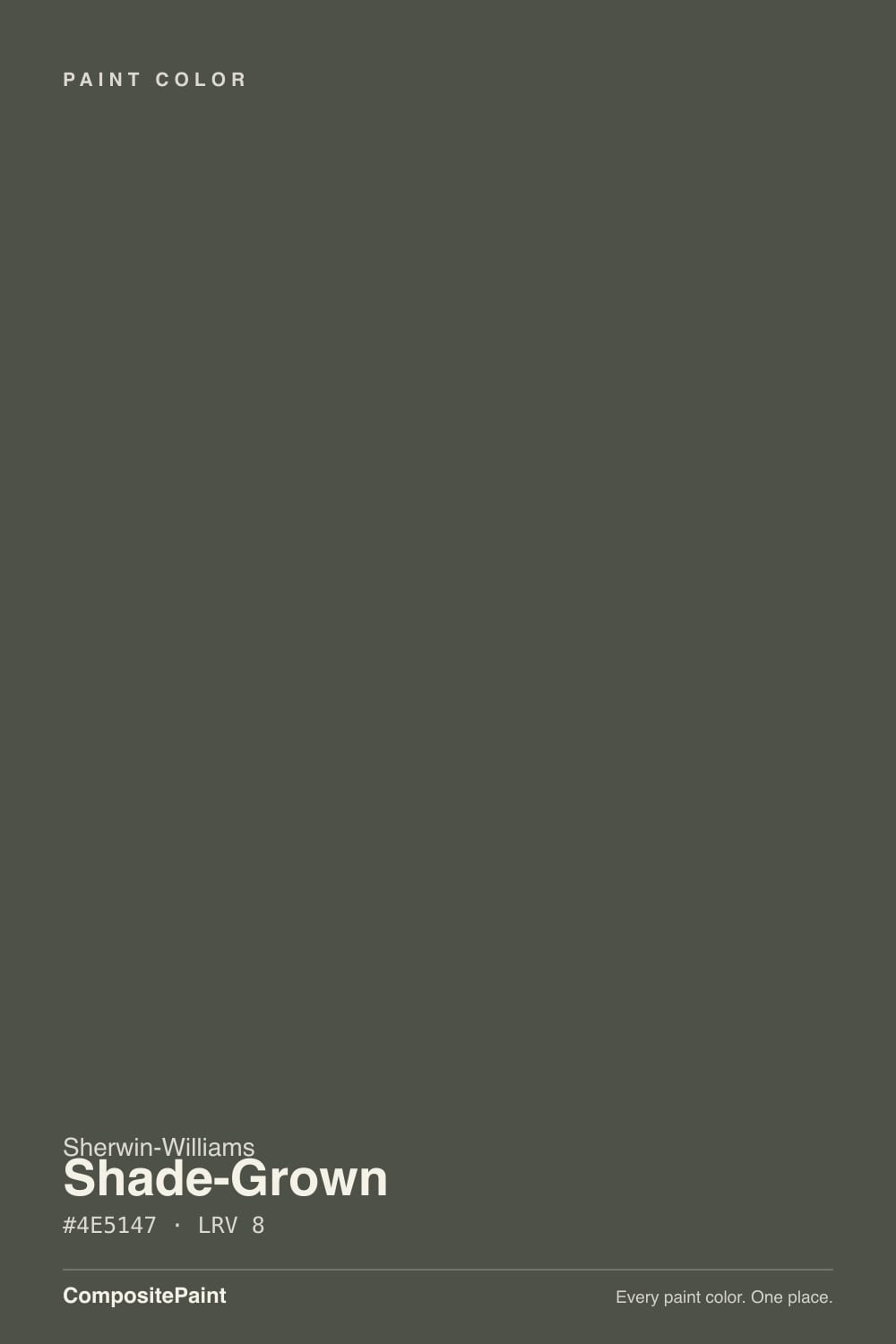
- 1English Ivy2
- 2Shade-Grown8
- 3Sage Green22
- 4Evergreen Fog30
The Fast Verdict
Shade-Grown is a near-black with a whisper of green left in it — the darkest member of a three-color strip in the SW deck, sitting a full step below its cousin Rosemary. In real daylight it reads like dark-roast coffee with a leaf still in it; in a dim room it just reads black, full stop. It is a genuinely useful color for a specific job — islands, doors, cabinetry — not a wall color for a room that never sees sun.
Kitchen islands and cabinets · front doors and exterior shutters · dens and offices with real daylight · anyone who wants a black with a pulse instead of a flat one
You want a literal, no-argument black · your room stays dim and cool all day · you're painting all four walls of a windowless space · you actually want the easier-to-read green of Rosemary or Dried Thyme
- Near-black with a real green pulse in good light — not flat
- Grounds warm wood, brass, and cream beautifully
- Hides scuffs and fingerprints on cabinets, islands, and doors
- A more interesting alternative to true black without going cold
- Sits in a coordinated three-color strip with Dried Thyme and Rosemary for easy tonal layering
- Reads flat black the moment the room goes dim or cool — the most common letdown
- Too dark for four walls without serious daylight
- Fights cool gray stone and quartz
- Obscure enough that real-room references are hard to find before committing
What Color Is Shade-Grown, Really?
Shade-Grown sits at the dark end of a three-color strip in the Sherwin-Williams deck: Dried Thyme (SW 6186, LRV 21) is the palest, Rosemary (SW 6187, LRV 12) is the mid-depth workhorse, and Shade-Grown (SW 6188, LRV 8) is the deepest — same green-gray undertone, pushed almost to black. The name borrows from shade-grown coffee, beans cultivated under a forest canopy instead of open sun, and the color reads exactly that way on a wall: a dark roast with a trace of leaf-green still visible underneath, not a flat black.
At LRV 8 it sits in genuine near-black territory — the same depth as Urbane Bronze and two points above Iron Ore. That is dark enough that most rooms will read it as simply "black" unless real light is doing real work. Give it a south or west window and the green comes forward as a rich, warm dark olive; put it in a dim hallway and it collapses into the same black as anything else on the shelf. Every near-black color makes this trade, and Shade-Grown makes it more honestly than most — it never promises to glow.
Undertone in one line: green first, warm gray second, never blue and never a true cold black. If your sample reads flat charcoal with no color in it at all, that is dim or cool light doing its job — carry it to a window before deciding the green isn't there.
Where It Shines
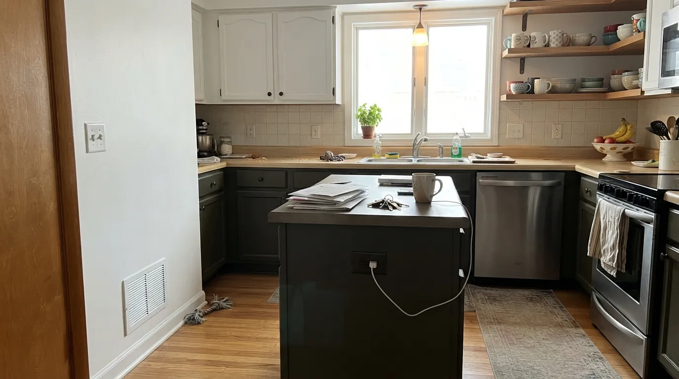
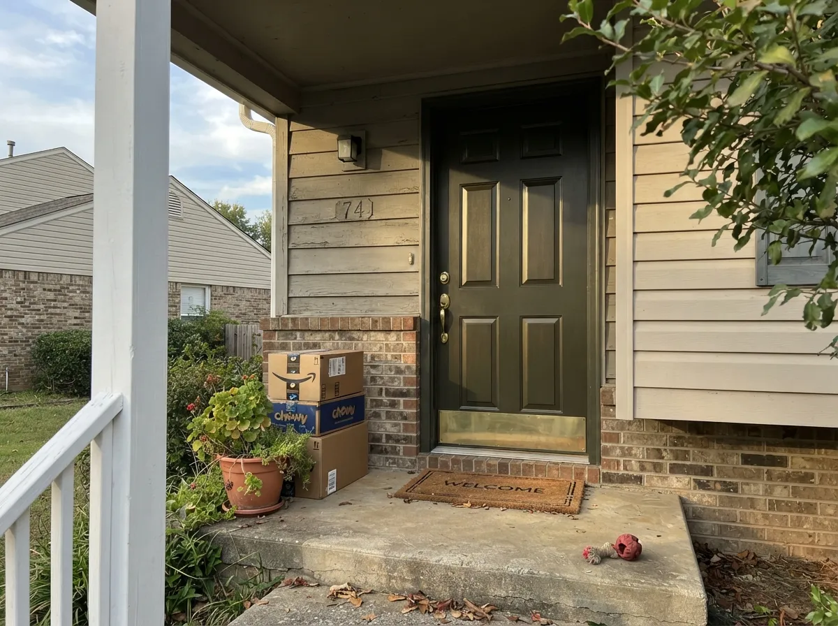
Give it real daylight, warm wood, and brass, and Shade-Grown earns its keep as the near-black with more personality than a true black. Kitchen islands are its best-known job — cabinet painters reach for it as a step darker and greener than Rosemary when a client wants the room to feel grounded, not just dark. Front doors and exterior shutters are its second home: full sun reads it as a rich, almost bronzed dark green rather than the flat black every other house on the block already wears.
Where It Fails
Almost every letdown story with Shade-Grown comes from one of three situations, and all three are predictable before the first coat. None of them are the paint's fault — but if your room matches one, this is not your color, and a bigger sample will only confirm it.
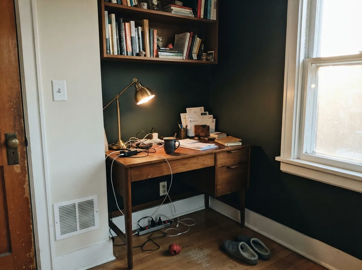
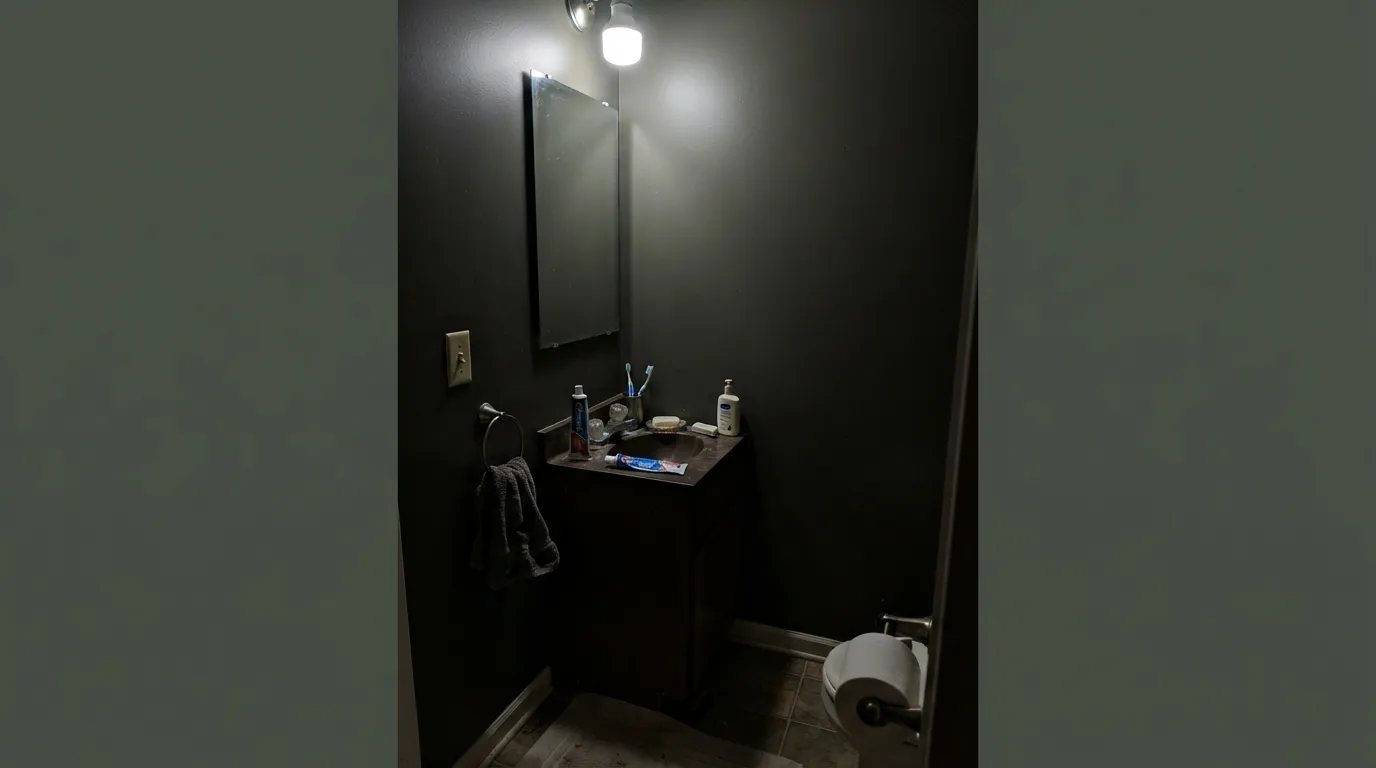
Take away daylight and Shade-Grown stops being green — it just reads black, same as anything else at LRV 8. Buyers who fell for the name expecting a visible dark green in a north-facing den or a cool-LED hallway report it looks like they bought the wrong can. It didn't fail; the light did. If your room stays dim, either commit to warm lamps or buy an actual black (Iron Ore, Tricorn Black) and stop expecting green.
At this depth, a small room with no natural light turns cave-like fast, and cool LEDs make it worse — they sharpen the black and erase the green completely. It performs far better as an island, a door, cabinetry, or one accent wall than as a windowless powder room's entire envelope.
Like its lighter sibling Rosemary, Shade-Grown wants warm company. Set it against cool gray quartz or blue-gray tile and the pairing goes flat and muddy instead of grounded. Warm white oak, brass, and cream linen bring the green forward; cool stone erases it.
Room by Room
Under real kitchen light it grounds warm wood and brass without the flatness of a true black. Satin urethane-fortified cabinet enamel; the sheen does real work at this depth.
Full daylight reads it as a rich, faintly bronzed near-black instead of the plain black on every third door in the neighborhood. Deep shade will just look black — still fine, just less distinctive.
A south or west window makes this one of the better moody-but-warm dark colors in the deck. Walnut shelving and brass task lighting are its natural company. Eggshell for durability where chairs scuff the baseboards.
On a vanity or a single accent wall under a warm sconce it reads custom and expensive. Four walls with no window is the one combination to skip — add a warm lamp if you insist.
Beautiful behind a media console or a fireplace in a room with other light sources. Riskier as the whole room's color, where it has to carry the space alone.
At a distance it reads as plain dark charcoal more than green, so the color's real personality is wasted on a full facade. Save it for the door and shutters and let a lighter body color do the heavy lifting.
Your Light Is the Risk
Full sun pulls the green forward and it reads a rich, almost bronzed dark olive instead of flat black. The light this color was built to be judged in.
Without real light it collapses into plain black — the green disappears, and so does the reason to pick it over Iron Ore or Tricorn Black.
Morning east light keeps it neutral-dark; by afternoon west sun it warms and the green shows more. Subtle, but real on cabinets and doors that catch both.
Warm 2700K lamps hold a trace of green after dark; cool white LEDs flatten it straight to black. Bulb choice matters more here than on almost any lighter color.
Most complaints about Shade-Grown are a light mismatch. Upload a photo of your actual room and see it on your walls — then ask for the same wall in north light or evening lamps before you buy a single sample.
Need It From Another Brand?
Any paint counter can custom-tint Sherwin-Williams SW 6188 directly. If you would rather stay in one brand's own deck, these are the closest stock matches, measured as ΔE2000. Under 2 is a difference you will not see on the wall.
| Brand | Closest color | ΔE | LRV | |
|---|---|---|---|---|
| Benjamin Moore | Tavern CharcoalCW-90 · Benjamin Moore | 3.5 | 10 | Color page → |
| Valspar | Sable Calm5002-2C · Valspar | 2.9 | 7.3 | Color page → |
| PPG / Glidden | LicoricePPG1009-7 · PPG / Glidden | 2.1 | 8 | Color page → |
| Glidden | LicoricePPG1009-7 · Glidden | 2.1 | 8 | Color page → |
| Dutch Boy | Mertie Kay425-7DB · Dutch Boy | 4.2 | 7 | Color page → |
| HGTV Home by Sherwin-Williams | Shade-GrownHGSW 3261 · HGTV Home by Sherwin-Williams | 0.0 | 8 | Color page → |
Similar Sherwin-Williams Colors
The nearest shades to Shade-Grown within Sherwin-Williams's own range, ranked by perceptual color distance — useful when you want the same look a touch lighter, darker, or warmer.
WCAG 2.1: AA is 4.5 : 1 for normal text, 3 : 1 for large text, AAA is 7 : 1.
Shade-Grown vs the Colors You're Also Considering
Every Shade-Grown sample board has the same rivals on it. The numbers show the real lightness gap — then it comes down to which risk you would rather live with.
Pick this when you want the strip's darkest, most near-black option for a door or an island.
Sherwin-Williams SW 6187 · LRV 12RosemaryPick this for a green that pays off in more rooms — one step lighter, easier to read as color on a normal day.
Pick this when you specifically want the green to be there in good light, not a brown undertone.
Sherwin-Williams SW 7048 · LRV 8Urbane BronzePick this for the same depth in a warm brown-black instead — it also reads black in the wrong light, just without the green.
Inside the line, Forestwood SW 7730 shares the same LRV of 8 with a hex of #4D5346, so it is a near twin that holds slightly more green. Urbane Bronze SW 7048, also LRV 8, sits at #54504A and reads warmer and browner, which is the main choice most people are weighing. Rock Garden SW 6195 at LRV 8 and Vogue Green SW 65 at LRV 9 both step further into obvious green, while Nocturne SW 9520 at LRV 8 goes warm and bronze.
Across brands, HGTV Home Shade-Grown HGSW 3261 carries the identical hex at deltaE 0, so it is the same color under another label. Diamond Vogel Clover Patch 0431 at 1.99 is visually identical in normal room light. PPG Licorice PPG1009-7 at 2.12, Dunn-Edwards Iron River DEA176 at 2.68, and Valspar Sable Calm 5002-2C at 2.9 are very close, so sample first. Benjamin Moore Tavern Charcoal CW-90 at 3.46 and Behr Underground N200-7 at 3.58 are close but visibly different side by side.
Shade-Grown Coordinating Colors
The rule for coordinating with Shade-Grown: warm whites, warm wood, brass, and its own lighter siblings — keep cool gray stone and chrome at arm's length. These are the partners that keep it grounded instead of just dark:
The Name, the Deck, and Why This One Stays Quiet
Shade-Grown has not been a Color of the Year and there is no viral room built around it — this is an honest workhorse, not a headline color. Its real story is its position in the SW deck: the darkest of a three-color strip that also holds Dried Thyme and Rosemary, all sharing one green-gray undertone at climbing depths. That kind of strip exists so a cabinet painter or a specifier can pull one consistent family across trim, walls, and an island without guessing at a match.
That makes it the professional's pick more than the trend-follower's: the kind of color a kitchen designer reaches for by SKU because it does one job — a near-black with a pulse — reliably, not because it went viral on a renovation account. If you came here chasing a famous story, there isn't one; what you get instead is a color that behaves exactly as its LRV and undertone predict, which is its own kind of honest.
Shade-Grown With Wood Tones and Metals
Warm wood is the easy win: walnut, white oak, and butcher block all sit comfortably against Shade-Grown because the color's warmth meets theirs halfway, the same pairing that makes its lighter sibling Rosemary work on cabinets. Cream and warm white trim keep the whole thing from tipping into pure black.
Metals split the same way undertones always do: unlacquered brass, aged bronze, and matte black hardware all read warm and deliberate against it. Polished chrome and bright nickel are the one metal finish that fights it, pulling the eye toward cool and making the green underneath harder to see.
Three Ready Palettes Built on Shade-Grown
A color is never alone on the wall. These are complete combinations in the 60-30-10 pattern, with the reason each one holds together. Every one opens in the visualizer.
Pure White keeps the room bright enough for Shade-Grown's green to actually register; Rosemary on the open shelving ties the island back to the walls without repeating the same can twice — the coordinated-strip trick built right into the SW deck.
Try this palette in your roomExtra White gives the facade the daylight Shade-Grown needs to read green instead of black; true-black Iron Ore on the shutters keeps the two dark accents from competing — one reads warm-dark, the other reads flat black, and the eye can tell them apart.
Try this palette in your roomAll three come off the same strip in the SW deck, so the gradient from trim to wall never fights itself — it's the same green quietly getting darker, the tonal-layering trick that makes a small den feel intentional instead of just dim.
Try this palette in your roomShade-Grown FAQ
Is Shade-Grown green or black?
Both, depending on the light. At LRV 8 it is genuinely near-black, but it carries a green undertone that shows up in real daylight — south or west sun pulls it toward a dark olive; dim or north light collapses it into plain black. If you need the green visible on a cloudy Tuesday, this is not that color.
What is the difference between Shade-Grown, Rosemary, and Dried Thyme?
The same green-gray undertone at three depths, sitting next to each other in the SW deck: Dried Thyme (LRV 21) is the lightest and easiest to read as green on a wall; Rosemary (LRV 12) is the mid-depth cabinet workhorse; Shade-Grown (LRV 8) is the darkest, closer to black than to green unless the light is doing real work.
Is it good for kitchen cabinets or an island?
Yes — it's one of its best jobs. Under real kitchen light it grounds warm wood and brass without the flatness of a true black. Use a satin urethane-fortified cabinet enamel; the sheen matters more on a color this dark.
Does it work on a front door?
Yes, especially in real sun. Full daylight reads it as a rich near-black with a warm, faintly bronzed cast, which stands out next to the plain black doors most of the street already has. In deep shade it will just look black — still fine, just less distinctive.
Can I paint an entire room in Shade-Grown?
Only with real daylight and warm lamps at night — a windowless or north-facing room will feel like a cave at this depth. It works best as an island, a door, one accent wall, or cabinetry rather than all four walls of a small, dim space.
What trim white goes with Shade-Grown?
A soft warm white like Pure White keeps the pairing coherent without fighting the green; Extra White gives more contrast on exteriors and doors. Avoid a stark cool white — it pushes Shade-Grown toward plain black by comparison.
Have you painted with Shade-Grown?
Rate it — one tap helps the next reader decide.
Ask a Question