Back To Nature
Behr's 2020 Color of the Year, reviewed honestly: the light where it reads like fresh spring leaves, the light where it goes muddy, and what actually pairs with it.

Jessica has spec'd whites and neutrals for more than 300 rooms and keeps a sample wall of painted drawdowns in her studio. Every color review is checked against real reader rooms in the comments and re-tested when a formula changes. About the testing process →
- 1Anonymous20
- 2Dorian Gray39
- 3Back To Nature47
- 4Agreeable Gray60
- 5Pale Oak69
The Fast Verdict
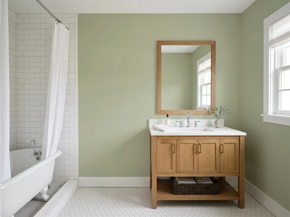
Back to Nature was Behr's pitch for "the new neutral" — a yellow-green sage grayed down just enough that it was supposed to live anywhere beige used to. It mostly delivers: give it real daylight and warm wood and it reads like a sunlit meadow, calm rather than loud.
But it is still, unmistakably, a green. Buyers who took the neutral marketing literally and expected something that could pass for greige on four walls are the ones leaving disappointed reviews — the color never promised that, they just heard it.
Kitchens with warm wood, white counters, and black hardware · front doors and exteriors that want a quiet, confident green · bedrooms and dens once the lamps are on · anyone who wants a genuinely yellow-green sage, not a gray-green one
You want an actual color-blind neutral · your room runs on cool LEDs with no lamp backup · your existing trim or cabinets already lean honey-yellow · you'd rather have a cooler, grayer sage
- A genuine, verified 2020 Color of the Year — not a manufactured trend claim
- Yellow-green undertone reads like real foliage, not a flat gray-sage
- Mid-depth LRV holds its color on all four walls instead of washing out
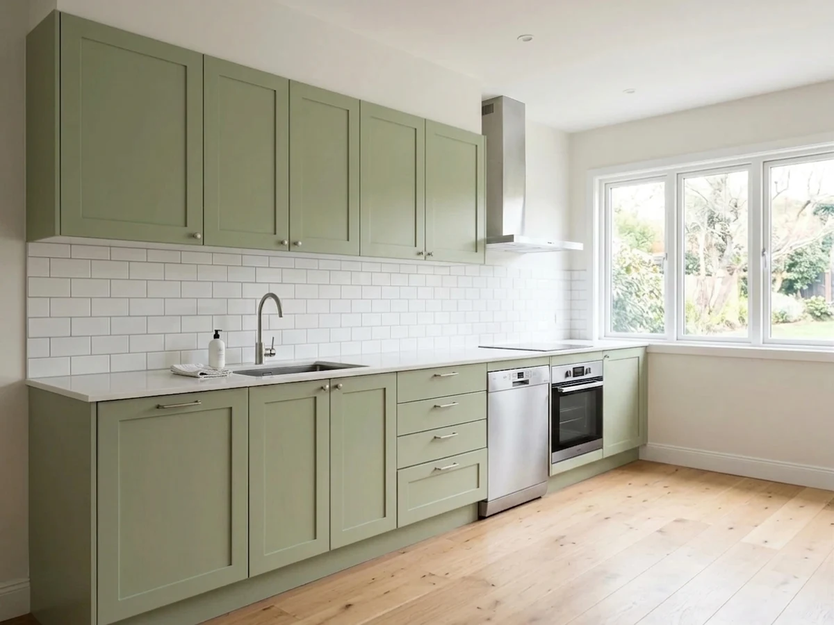
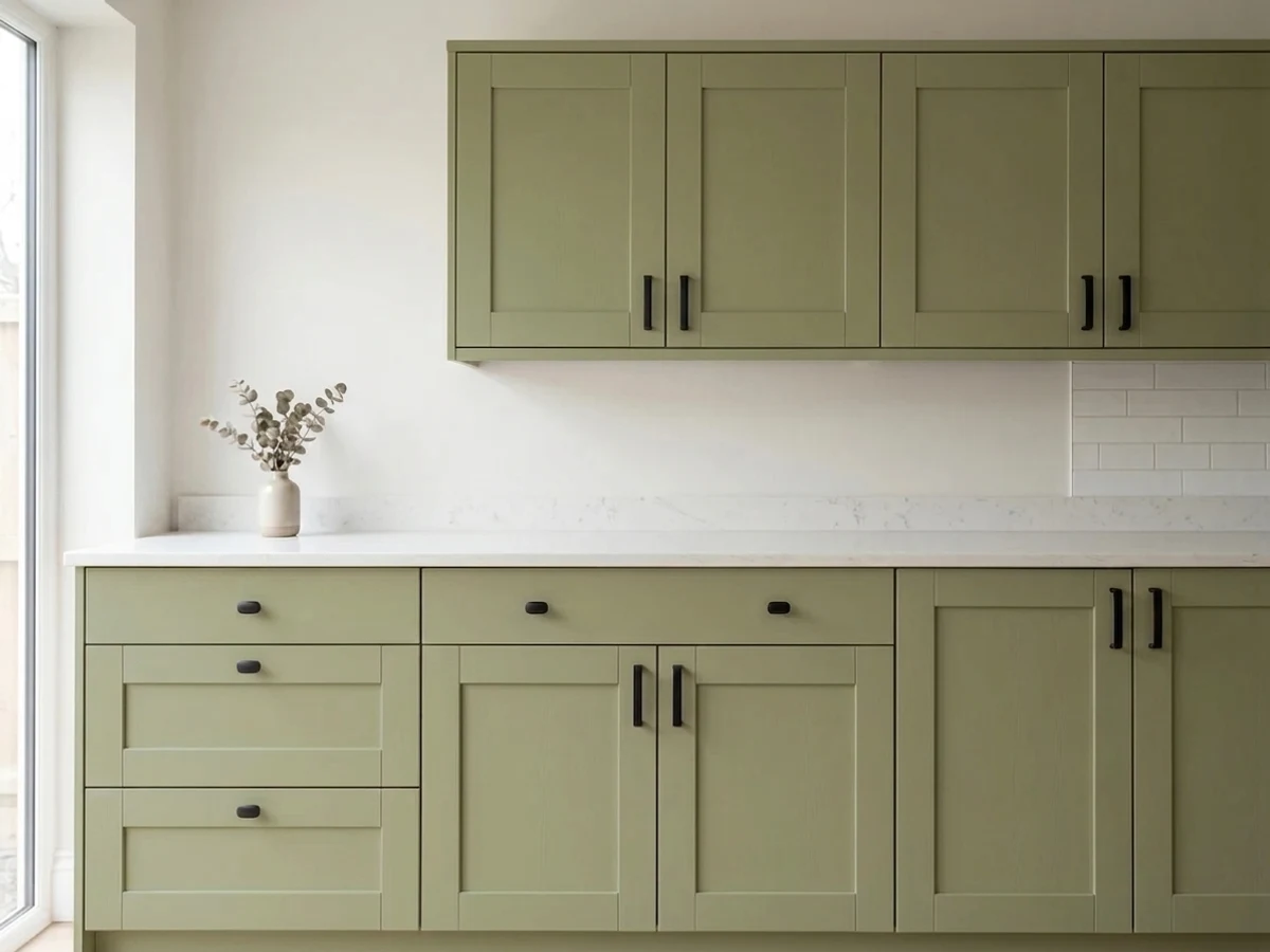
- Strong kitchen-cabinet and front-door performer with black hardware or trim
- Pairs cleanly with white, black, and warm wood without a lot of second-guessing
- Not the neutral its own marketing implied — it reads as green in a full room
- Cool north light drains it toward flat, muddy khaki
- Warm incandescent bulbs at night can push it toward a dated avocado cast
- Needs daylight or lamp warmth to stay fresh; a permanently dim room is a poor match
What Color Is Back To Nature, Really?
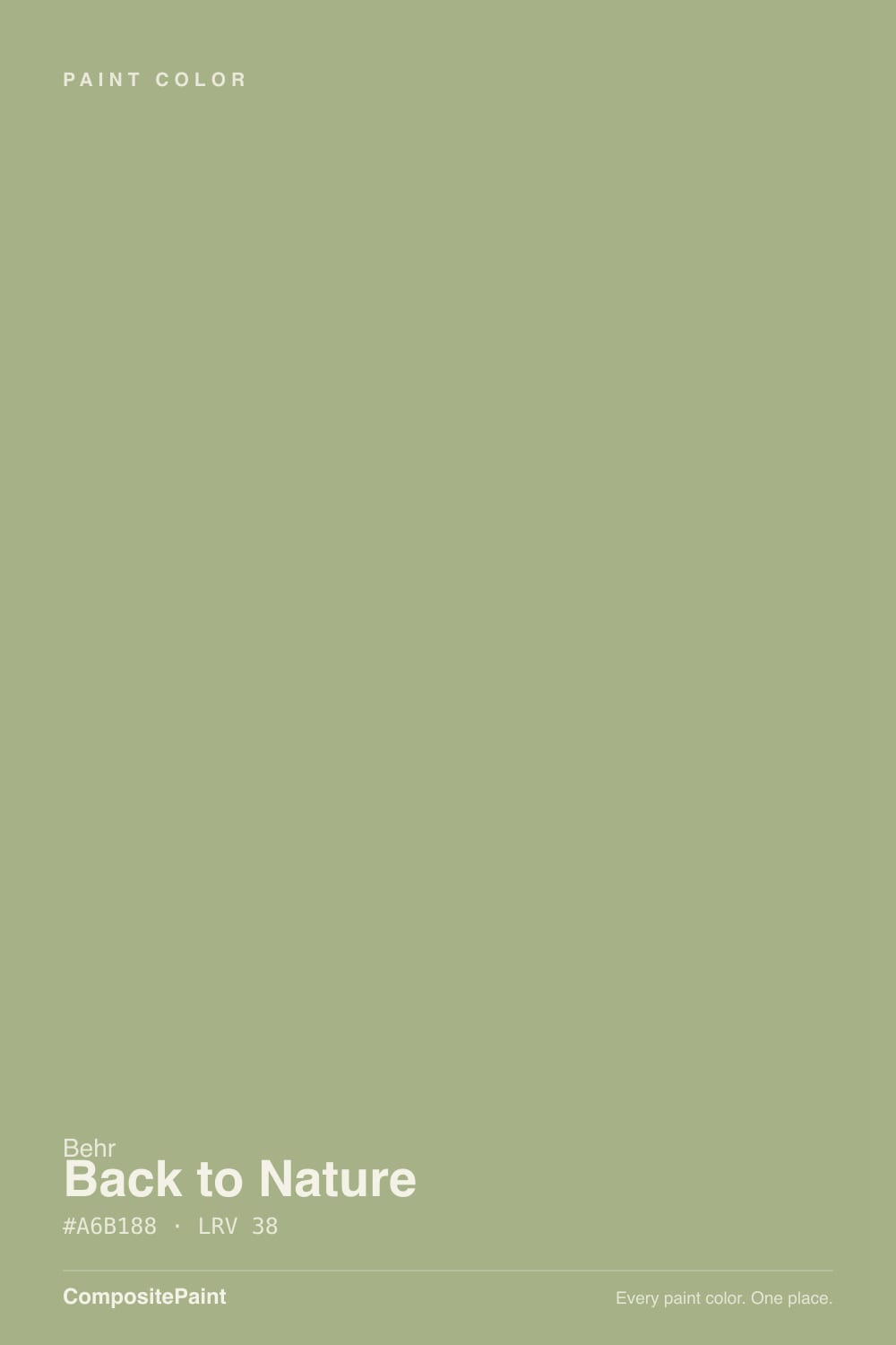
A yellow-green sage with the vividness deliberately knocked back. Behr named it 2020's Color of the Year and marketed it as a stand-in neutral — the calm, grounding shade for anyone tired of gray — but the formula is still built on green-yellow first, with a good dose of gray added to keep it from reading like spring-lawn bright. That balance is the whole idea: enough gray to feel restrained, not enough to erase the green. Behr's own copy leans on words like "wilderness," "indoor garden," and "sunlit meadow," which is unusually accurate marketing — this is what a shaded hedge or new leaf growth actually looks like, not a cartoon green.
Our deck lists it at LRV 38, a genuine mid-tone — light enough not to swallow a room, dark enough to hold real color on all four walls instead of washing pale like a paler sage would. (A few color-matching sites publish a higher LRV in the mid-40s for this same formula; treat our deck's 38 as the working number for how the paint actually behaves at depth.) At that depth it does not read as a whisper-quiet backdrop the way a paler sage does — it commits, which is exactly why the "safe neutral" framing sets some buyers up to be surprised.
Undertone in one line: yellow-green first, gray second, never blue and never true olive-brown. If your sample looks flat and khaki-ish, that's cool light stripping the yellow; if it looks almost mustard, that's a warm incandescent bulb pushing the yellow too far the other way. Both are the same paint reacting honestly to different light — not a bad batch.
Where It Shines
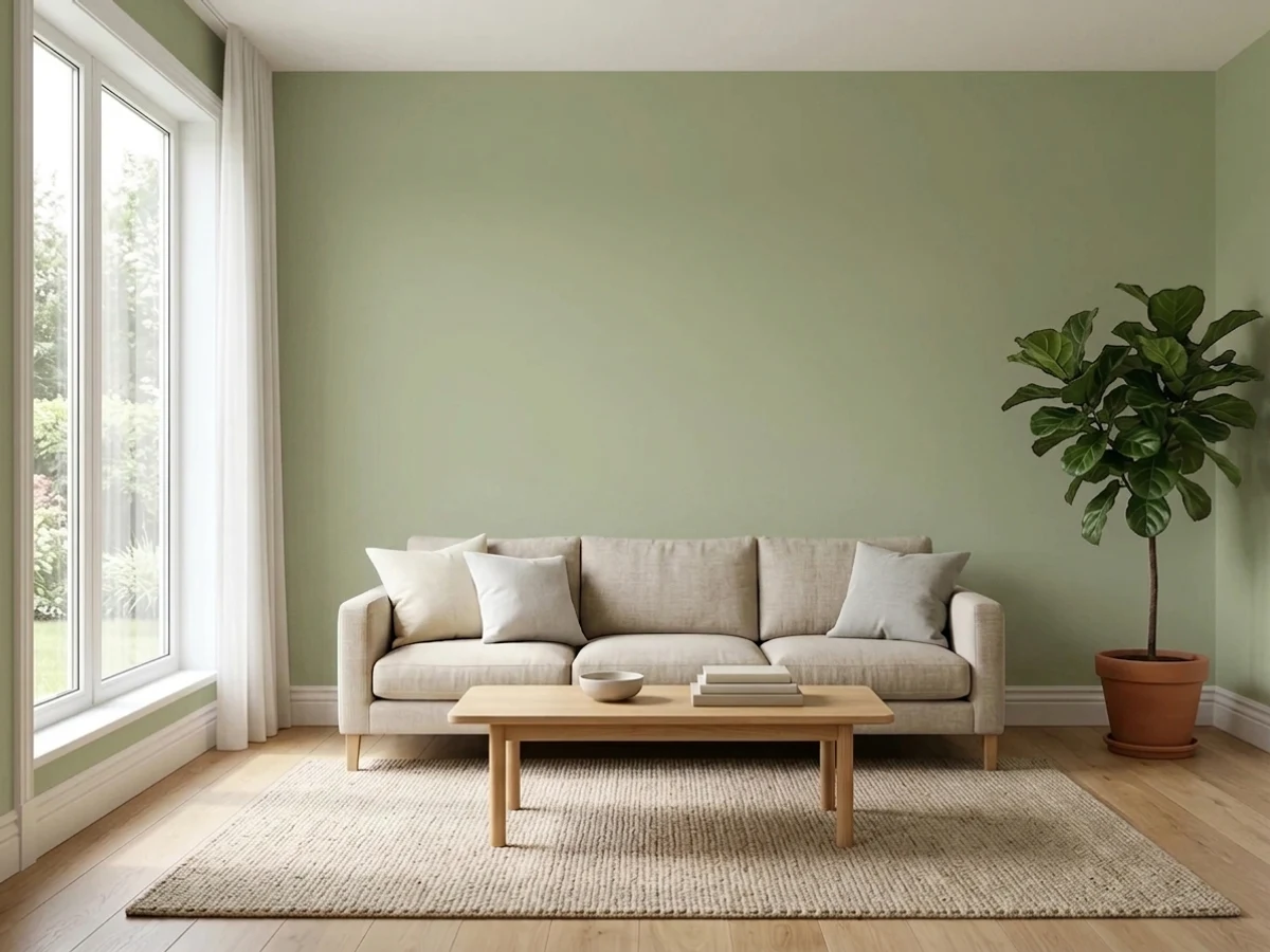
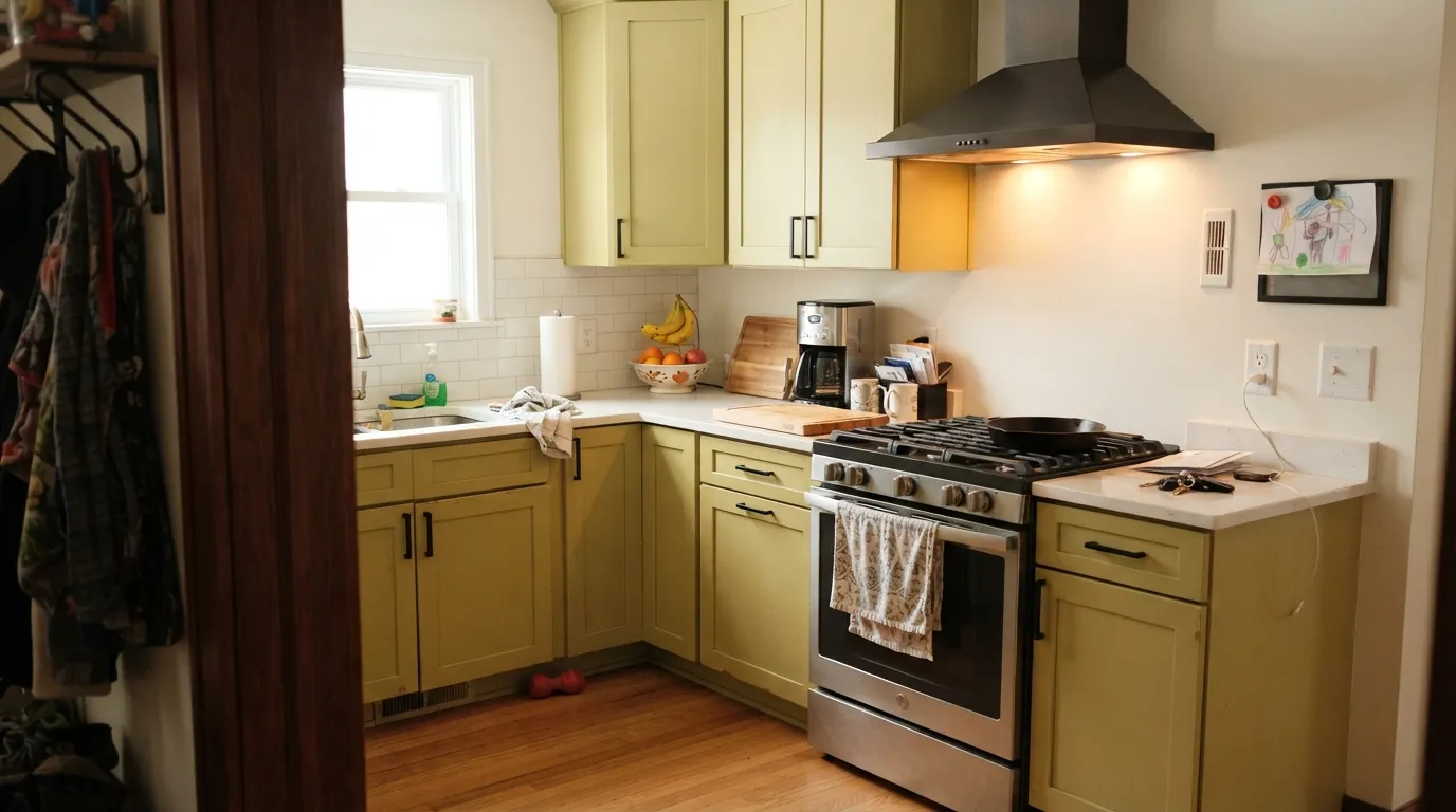
Real daylight is what sells this color, and it does not need to be direct sun — bright, indirect south or west light is enough to keep the yellow-green fresh instead of murky. It is at its best doing exactly what Behr designed it for: a whole-kitchen cabinet color against white counters and black pulls, a front door with black shutters, an accent wall behind warm wood furniture. Repeat it two or three times in a room — a rug, a few pillows, a piece of pottery — and it stops reading as "a green wall" and starts reading as a deliberate, put-together palette, which is the difference between the rooms that photograph well and the ones that don't.
Where It Fails
Almost every disappointed review of Back to Nature traces to one of three honest mismatches, and none of them are a defective can of paint. If your room or your expectations match one of these, sample big before you commit — a swatch this size of color needs a real wall test, not a paint chip.
Without warm light to carry the yellow, the gray in the formula takes over and the wall reads flat, muddy, almost khaki-brown instead of green. This is the single most common complaint pattern for grayed-down sages generally, and Back to Nature is no exception — it needs light to do its job.
"New neutral" was Behr's marketing line for the Color of the Year, not a literal promise. On a paint chip next to beige it can look restrained enough to pass; on four walls in a full room it reads as green, full stop. If you actually want something that argues with nothing, this was never that color — look at a genuine greige instead.
2700K bulbs push the yellow hard, and in a room that only ever sees lamp light, Back to Nature can drift toward a dated avocado-green rather than the fresh spring-leaf look daylight gives it. It is not a flaw exclusive to this color, but the yellow undertone makes it more noticeable here than in a gray-based sage.

Room by Room
Cabinets or an island in Back to Nature against white counters and black hardware is the exact combination Behr built the launch campaign around, and it holds up. Satin or semi-gloss cabinet enamel; avoid it as the sole color if the kitchen only gets cool overhead LEDs and no window.
A confident accent wall or a full room in bright indirect light behind leather or warm wood furniture. Repeat the green in a few accessories rather than isolating it to one wall alone — it reads more intentional and less like a leftover test swatch.
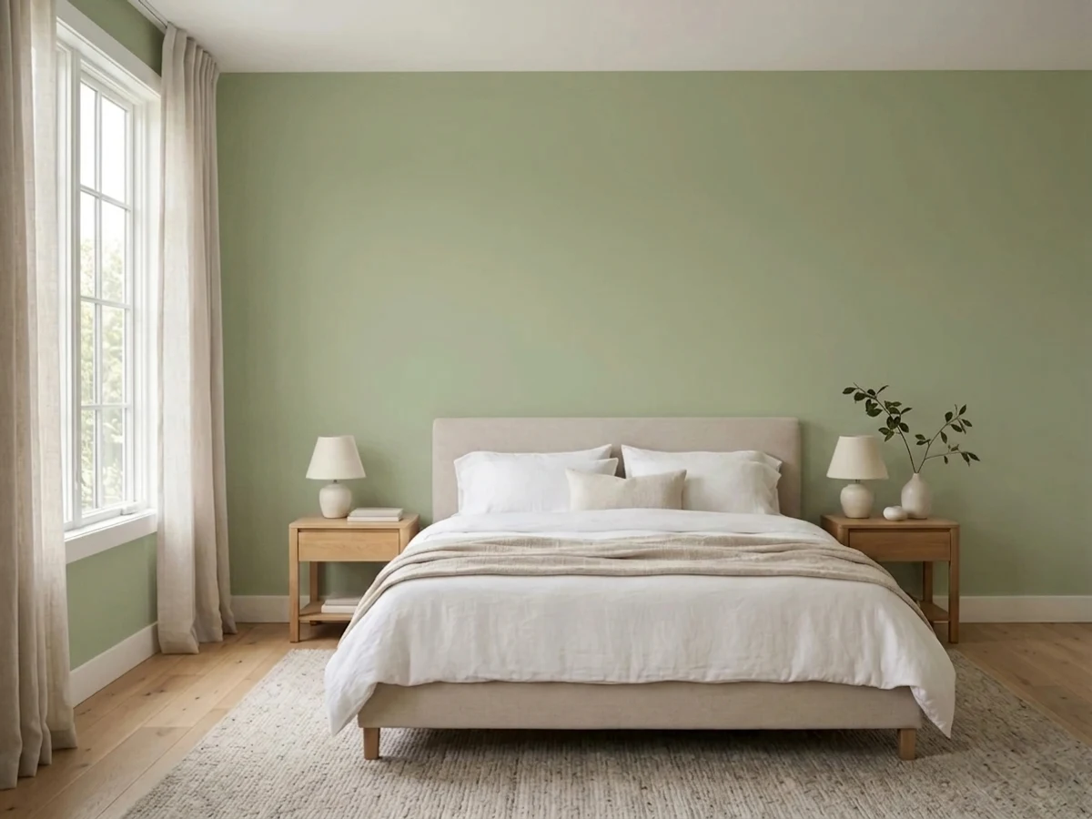
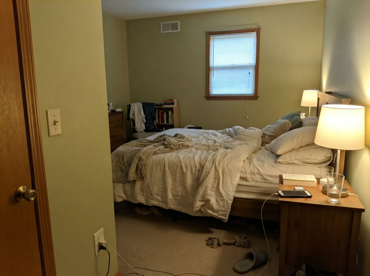
Calm and grounding at night under warm bulbs; in a north-facing bedroom with no lamp backup it can go flat and dull during the day. Eggshell walls, cream or white bedding rather than gray.
With warm wood vanities and brass it works well as an accent or vanity color. Against cool white or gray-veined tile it can look slightly off — sample against your actual tile before committing.
Behr specifically markets it for these rooms, and the mid-depth LRV is genuinely useful here: dark enough to hide scuffs and shoe marks, light enough not to make a small room feel closed in.
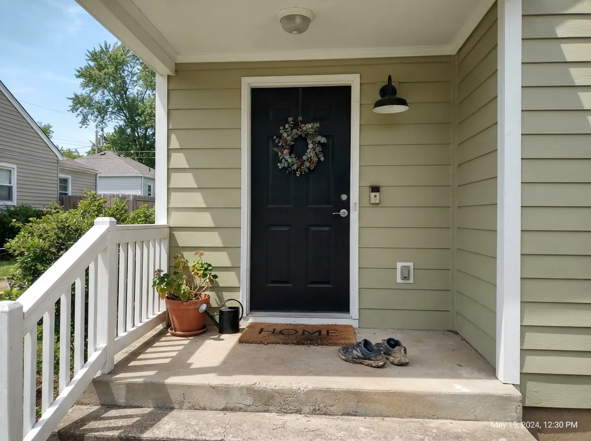
Full sun keeps the green honest and reads as a quiet, confident color rather than a bold one. Black shutters or a black door alongside it is the pairing that shows up most often in real listings and real reviews — it grounds the green instead of competing with it.
Your Light Is the Risk
The yellow-green stays fresh and "leafy" without direct sun washing it out — this is the sunlit-meadow look the marketing promised, and here it actually delivers.
The gray in the formula takes over and the yellow drains out; the wall reads flat and muddy rather than green. Sample here before you commit to a whole room.
Bright and clearly green at the sun hours, softer and more muted the rest of the day — a gentle shift most owners describe as pleasant, not a problem.
2700K warm bulbs push the yellow further and can drift toward avocado if that's the only light the room ever gets; cooler LEDs keep it truer to green but flatter and less "warm."
Most complaints about Back To Nature are a light mismatch. Upload a photo of your actual room and see it on your walls — then ask for the same wall in north light or evening lamps before you buy a single sample.
Need It From Another Brand?
Any paint counter can custom-tint Behr S340-4 directly. If you would rather stay in one brand's own deck, these are the closest stock matches, measured as ΔE2000. Under 2 is a difference you will not see on the wall.
| Brand | Closest color | ΔE | LRV | |
|---|---|---|---|---|
| Sherwin-Williams | Baby Bok ChoySW 9037 · Sherwin-Williams | 1.5 | 47 | Color page → |
| Benjamin Moore | Burwell GreenCW-445 · Benjamin Moore | 1.9 | 48 | Color page → |
| Valspar | Fields Afar8003-28D · Valspar | 0.8 | 47 | Color page → |
| PPG / Glidden | Cress GreenPPG1114-4 · PPG / Glidden | 1.5 | 46 | Color page → |
| Glidden | Cress GreenPPG1114-4 · Glidden | 1.5 | 46 | Color page → |
| Dutch Boy | New Crop324-3DB · Dutch Boy | 2.4 | 47 | Color page → |
Similar Behr Colors
The nearest shades to Back To Nature within Behr's own range, ranked by perceptual color distance — useful when you want the same look a touch lighter, darker, or warmer.
WCAG 2.1: AA is 4.5 : 1 for normal text, 3 : 1 for large text, AAA is 7 : 1.
Back To Nature vs the Colors You're Also Considering
Every Back To Nature sample board has the same rivals on it. The numbers show the real lightness gap — then it comes down to which risk you would rather live with.
Pick this for the warmer, sunnier, more clearly green read — Evergreen Fog leans gray-taupe, Back to Nature leans leaf.
Sherwin-Williams SW 9130 · LRV 30Evergreen FogPick this if you want the internet-famous version of this color family — grayer, a touch darker, dominates cabinet threads online.
Pick this for more visible yellow-green — October Mist can slide toward taupe in low light, Back to Nature holds its color better.
Benjamin Moore 1495 · LRV 39October MistPick this if you want Benjamin Moore's more muted, more gray-green take on the same idea.
Pick this for the earthier, more yellow, more meadow-like read — Bitter Sage can look almost mint next to it.
Behr N390-4 · LRV 40Bitter SagePick this for a cooler, more clearly green sage from the same Behr deck, with less yellow in the mix.
Pick this for the Color-of-the-Year pedigree, the slightly deeper LRV, and a name people will actually repeat out loud.
Behr N350-4 · LRV 43Jungle CamouflagePick this if you land on this exact family and want it a shade lighter — it's Behr's closest twin, just under a name nobody wants to say to a painter.
Within Behr's own deck, the closest neighbor is Willow Grove (PPU11-06), LRV 42. It is a step lighter and very slightly grayer, so it reads calmer in bright rooms; Back to Nature holds noticeably more color in the same light. If your room is small or dim, Willow Grove keeps things airier; if you want the sage to be clearly present, stay with Back to Nature.
Promenade (400F-5), LRV 41, is also a touch lighter but leans slightly greener and fresher, less khaki in warm light. Choose it when you want a hint more life in the green, and Back to Nature when you want a softer, dustier sage.
Sanctuary (PPU9-21), LRV 42, drifts further toward khaki and beige-green. It blends better with tan and beige finishes, while Back to Nature reads as the truer green of the two.
Back to Nature Coordinating Colors
The rule for coordinating with Back to Nature: let white and black do the heavy lifting, and keep warm wood close by. It handles both a warm white and a crisp cool white depending on the mood you want, pairs confidently with true black, and gets along with a warm beige in an adjoining room without a hard clash. These are the partners that show up again and again in real rooms:
The Color of the Year Behind the Marketing
Behr named Back to Nature its Color of the Year for 2020, framing it as a calming, grounding shade for people who wanted to unplug from screens and bring the outdoors in — official copy leaned hard on words like "wilderness" and "indoor garden." It arrived at the tail end of a run of much bolder, more saturated Colors of the Year, and its restraint was the point: Behr was betting on a quiet green that could function like a neutral rather than another loud accent color chasing a trend cycle.
The bet mostly paid off. Unlike a saturated trend color that dates itself within a few years, a grayed-down sage like this ages more like a greige than like an accent wall — which is also exactly why some buyers were disappointed by it: a genuinely restrained, grown-up green does not photograph as dramatically as a splashier Color of the Year pick, even though it tends to outlast one.
Back to Nature With Wood Tones and Floors
Warm, mid-tone woods are this color's best company: white oak, walnut, and butcher block all sit comfortably against the yellow-green because the warmth in both meets in the middle. Black hardware and black-framed windows are the other consistent winner — they give the green a clean, deliberate edge instead of letting it blur into the wood around it.
The one floor to test carefully is bright honey-orange builder oak. Because Back to Nature already carries yellow, a strongly orange floor can push the whole room warm and slightly murky rather than fresh. It is not an automatic clash the way a true olive-brown would be, but it is worth a large sample above the actual floor before committing to cabinets or a full room.
Three Ready Palettes Built on Back To Nature
A color is never alone on the wall. These are complete combinations in the 60-30-10 pattern, with the reason each one holds together. Every one opens in the visualizer.
This is the exact combination Behr's own launch photography leaned on: green cabinets, a warm white wall, black to ground the palette. Whisper White keeps the room bright without competing with the green; Cracked Pepper gives it one confident dark note.
Try this palette in your roomFull sun keeps Back to Nature reading as a quiet, confident green rather than a loud one, and this is the pairing that shows up most often in real curb-appeal photos: white trim to frame it, black door and shutters to ground it.
Try this palette in your roomA crisp cool trim white keeps the green from feeling heavy, and a warm beige in the next room over gives an open-plan house a soft, neutral hand-off instead of a hard color-block line.
Try this palette in your roomBack To Nature FAQ
Is Back to Nature actually a neutral?
No — that was Behr's marketing angle for the Color of the Year, not a literal description. On a small chip next to beige it can read restrained; on four walls in a full room it reads unmistakably as a yellow-green. If you want an actual neutral, treat this as a green and pick a real greige instead.
What is Back to Nature's undertone?
Yellow-green first, with gray mixed in to keep it from looking like bright spring grass. It never turns blue or true olive-brown, but cool light can strip the yellow toward a flat khaki, and warm incandescent bulbs can push it the other way toward mustard or avocado.
Is it good for kitchen cabinets?
Yes — it's one of the color's strongest jobs. Against white counters and black hardware it's the exact look Behr built its launch campaign around. Use a satin or semi-gloss cabinet enamel; a kitchen with no window and only cool overhead LEDs is the one setup where it can look flat.
What trim color goes with Back to Nature?
A warm or cool white both work depending on the mood: Whisper White keeps things soft and kitchen-warm, while a crisper white like Chantilly Lace sharpens the contrast for a living room or exterior. Black doors, shutters, or hardware are the accent color that shows up most consistently with it.
Does it work on an exterior?
Yes, and it's one of its better jobs. Full sun keeps the green reading confident rather than loud, and black trim or a black door is the pairing seen most often in real listings. Shaded north-facing elevations will read flatter and grayer than the sunny side — walk the sample around the house before committing.
Is a 2020 Color of the Year going to look dated?
Less than most trend colors. It was chosen specifically because it was muted and grounded rather than bold — the opposite of a loud, timestamped accent color. The bigger risk is buyer expectation, not the color's staying power: people who bought it expecting a safe neutral are the ones most likely to repaint.
Have you painted with Back To Nature?
Rate it — one tap helps the next reader decide.
Ask a Question