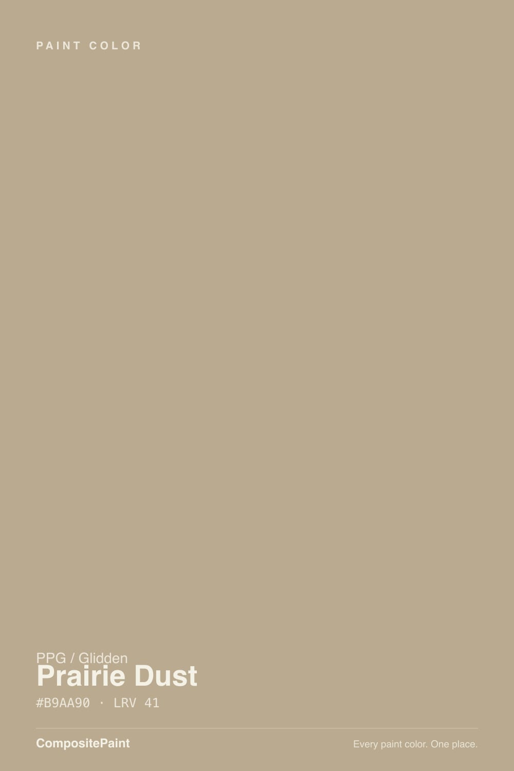
Color spec
| Brand | PPG / Glidden |
| Name | Prairie Dust |
| SKU | PPG1102-4 |
| Hex | #B9AA90 |
| RGB | 185, 170, 144 |
| HSL | 38°, 23%, 65% |
| LRV | 41 |
| Undertone | warm red-orange tone |
| Family | Neutral |
About PPG / Glidden Prairie Dust
Prairie Dust sits in the mid-range at LRV 41, so it shifts visibly through the day — lighter and more open in morning light, deeper and moodier after dark. Its orange undertone is the part to watch: it gets picked up by whatever sits next to it, so test it against your trim, floor and the room's main light before committing. South-facing rooms will pull it lighter and warmer, while north light cools it down.
Prairie Dust is versatile enough for full rooms but has enough depth to anchor a space, so it suits living rooms, bedrooms and cabinetry alike. Greige-leaning neutrals like this are the safe whole-home choice when you want warmth without committing to a color.
Closest matches by brand
18 brands within ΔE 5The closest matches per brand by ΔE2000, computed against each brand's full deck. Only colors within ΔE 5 (close enough to substitute on a wall) are shown — brands with no real match are left off. Tap any swatch for its full single-color spec; tap the brand title to browse all neutral from that brand.
Sherwin-Williams
Behr
Benjamin Moore
Valspar
Glidden
Dutch Boy
HGTV Home by Sherwin-Williams
Dunn-Edwards
Magnolia Home
Farrow & Ball
Diamond Vogel
Hirshfield's
Rodda
C2 Paint
Portola Paints
Annie Sloan
Backdrop
Kompozit
Similar PPG / Glidden colors
closest in the PPG / Glidden deckThe nearest shades to Prairie Dust within PPG / Glidden's own range, ranked by perceptual color distance — useful when you want the same look a touch lighter, darker, or warmer.
Coordinated palette
Generated by hue-rotating #B9AA90 in HSL space. Pair Prairie Dust with one accent and one neutral — the swatches below are starting points, not final picks.
Accessibility (WCAG contrast)
WCAG 2.1: AA = 4.5:1 normal text · AA Large = 3:1 large text · AAA = 7:1 normal text.
PPG / Glidden Prairie Dust Equivalents at Other Brands
Matching Prairie Dust from a different paint counter? Below is the single closest color in each major US deck and how close it really is. Remember that any paint store can also custom-tint PPG / Glidden PPG1102-4 directly — these equivalents are for when you'd rather stay inside one brand's own deck.
Sherwin-Williams Equivalent of Prairie Dust
Sherwin-Williams's nearest match is Universal Khaki (SW 6150), visually identical in normal room light (ΔE 1.17). It sits at the same lightness (LRV 40 vs 41) and carries a warm red-orange undertone, so it substitutes for Prairie Dust without repainting risk. See the full Universal Khaki swatch →
Behr Equivalent of Prairie Dust
At Behr, the closest color to Prairie Dust is Natural Chamois (HDC-NT-16) — very close at ΔE 2.21, though not an exact twin. It sits at the same lightness (LRV 41 vs 41) and carries a warm red-orange undertone; sample both side by side if the room gets strong natural light. See the full Natural Chamois swatch →
Benjamin Moore Equivalent of Prairie Dust
Benjamin Moore's nearest match is Greenbrier Beige (HC-79), visually identical in normal room light (ΔE 1.02). It sits at the same lightness (LRV 42 vs 41) and carries a warm red-orange undertone, so it substitutes for Prairie Dust without repainting risk. See the full Greenbrier Beige swatch →
Valspar Equivalent of Prairie Dust
At Valspar, the closest color to Prairie Dust is Brown Bunny (T577) — very close at ΔE 2.48, though not an exact twin. It sits at the same lightness (LRV 41.3 vs 41) and carries a warm red-orange undertone; sample both side by side if the room gets strong natural light. See the full Brown Bunny swatch →
Glidden Equivalent of Prairie Dust
Glidden's nearest match is Prairie Dust (PPG1102-4), visually identical in normal room light (ΔE 1.03). It sits at the same lightness (LRV 41 vs 41) and carries a warm red-orange undertone, so it substitutes for Prairie Dust without repainting risk. See the full Prairie Dust swatch →
Dutch Boy Equivalent of Prairie Dust
Dutch Boy's nearest match is Khaki-ed (419-4DB), visually identical in normal room light (ΔE 1.17). It sits at the same lightness (LRV 40 vs 41) and carries a warm red-orange undertone, so it substitutes for Prairie Dust without repainting risk. See the full Khaki-ed swatch →
HGTV Home by Sherwin-Williams Equivalent of Prairie Dust
HGTV Home by Sherwin-Williams's nearest match is Universal Khaki (HGSW 3185), visually identical in normal room light (ΔE 1.17). It sits at the same lightness (LRV 40 vs 41) and carries a warm red-orange undertone, so it substitutes for Prairie Dust without repainting risk. See the full Universal Khaki swatch →
Dunn-Edwards Equivalent of Prairie Dust
At Dunn-Edwards, the closest color to Prairie Dust is Twisted Sisal Rope (DEBN68) — very close at ΔE 3.06, though not an exact twin. It sits at the same lightness (LRV 41 vs 41) and carries a warm yellow undertone; sample both side by side if the room gets strong natural light. See the full Twisted Sisal Rope swatch →
Magnolia Home Equivalent of Prairie Dust
At Magnolia Home, the closest color to Prairie Dust is Juniper Tree (JG-166) — very close at ΔE 3.41, though not an exact twin. It runs slightly darker (LRV 39 vs 41) and carries a warm yellow undertone; sample both side by side if the room gets strong natural light. See the full Juniper Tree swatch →
Diamond Vogel Equivalent of Prairie Dust
At Diamond Vogel, the closest color to Prairie Dust is Macadamia Brown (0184) — very close at ΔE 2.56, though not an exact twin. It sits at the same lightness (LRV 41 vs 41) and carries a warm red-orange undertone; sample both side by side if the room gets strong natural light. See the full Macadamia Brown swatch →
Hirshfield's Equivalent of Prairie Dust
At Hirshfield's, the closest color to Prairie Dust is Travertine Path (0345) — very close at ΔE 2.75, though not an exact twin. It sits at the same lightness (LRV 41 vs 41) and carries a warm red-orange undertone; sample both side by side if the room gets strong natural light. See the full Travertine Path swatch →
Rodda Equivalent of Prairie Dust
At Rodda, the closest color to Prairie Dust is Basket (CA096) — very close at ΔE 2.55, though not an exact twin. It sits at the same lightness (LRV 41 vs 41) and carries a warm red-orange undertone; sample both side by side if the room gets strong natural light. See the full Basket swatch →
C2 Paint Equivalent of Prairie Dust
C2 Paint's nearest match is Trenchcoat (C2-893), visually identical in normal room light (ΔE 1.26). It sits at the same lightness (LRV 40 vs 41) and carries a warm red-orange undertone, so it substitutes for Prairie Dust without repainting risk. See the full Trenchcoat swatch →
Kompozit Equivalent of Prairie Dust
At Kompozit, the closest color to Prairie Dust is Travertine Path (0345) — very close at ΔE 2.75, though not an exact twin. It sits at the same lightness (LRV 41 vs 41) and carries a warm red-orange undertone; sample both side by side if the room gets strong natural light. See the full Travertine Path swatch →