Flirt Alert
Behr's confident true red, reviewed honestly: the door and island it was built for, the whole-room mistake that ruins it, and what to pick instead.

Jessica has spec'd whites and neutrals for more than 300 rooms and keeps a sample wall of painted drawdowns in her studio. Every color review is checked against real reader rooms in the comments and re-tested when a formula changes. About the testing process →
- 1Rookwood Dark Red3
- 2Rumors8
- 3Flirt Alert14
- 4Cinnamon Slate19
- 5Rejuvenate30
The Fast Verdict
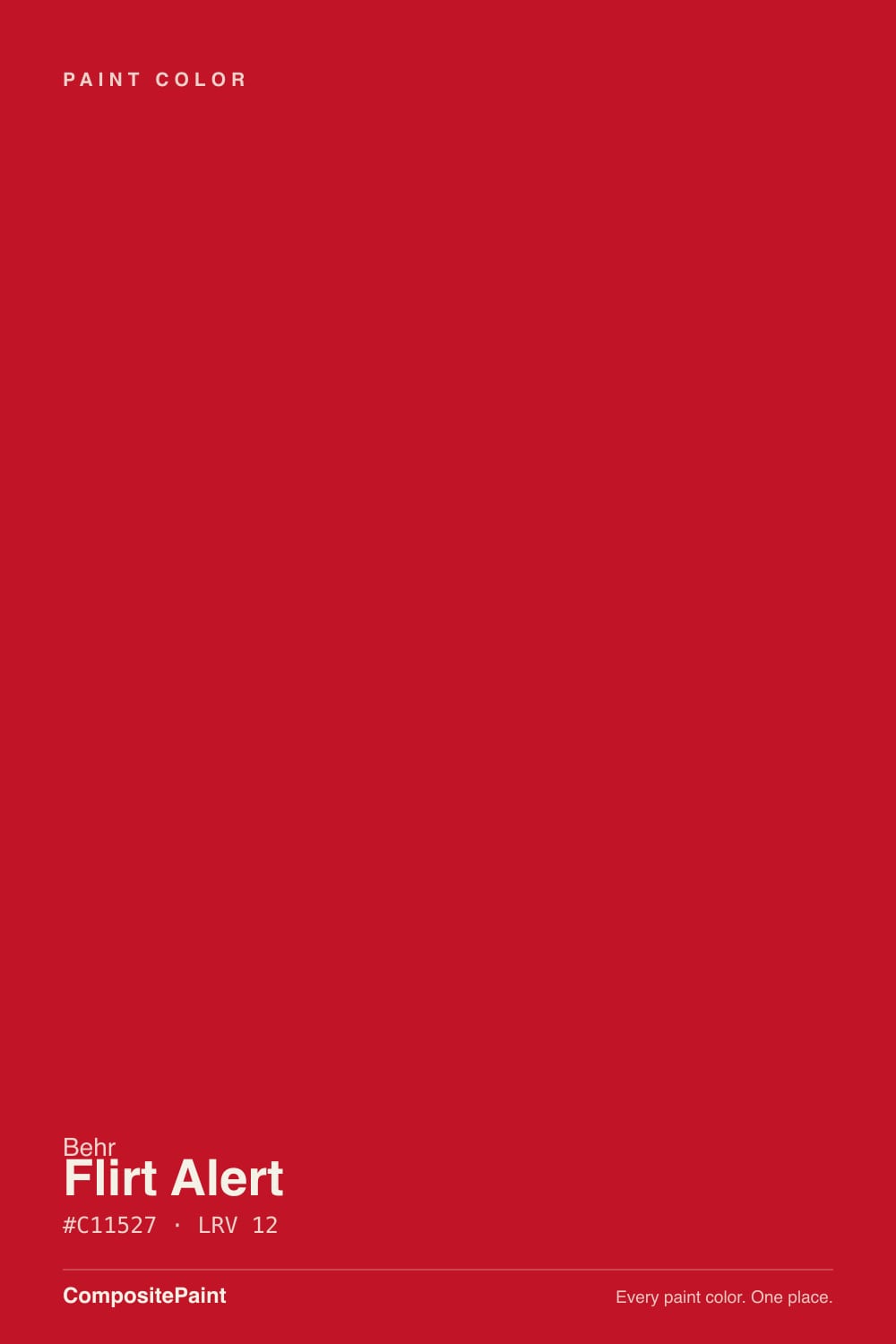
Flirt Alert is Behr's straight-up, no-apologies red — warm and orange-leaning rather than cool and blue, saturated enough at LRV 12 to read as true "lipstick" red rather than brick or wine. It's built to be looked at, not lived inside: a front door, a kitchen island, one wall that isn't afraid of itself. Getting it to lay down evenly takes real coats — reds this saturated fight the white base underneath them.
Front doors in real daylight · a kitchen island or single hutch · one accent wall backed by neutral walls · furniture and built-ins that want a moment
You want a cooler, blue-based red · you're painting more than one wall · the room stays dim or north-facing · you can't commit to real prep and multiple coats
- A genuinely confident true red without drifting pink or neon-orange
- Warm undertone flatters brass, wood, and cream trim instead of fighting them
- Perfect scale for a door, island, or single wall — no half-measures needed
- Available tinted into Behr's one-coat-hide lines for faster application
- Reads consistently — what you see on the chip is close to what you get in real daylight
- Needs real prep — a tinted primer or several coats to lay down evenly
- Fades faster than a neutral on a sun-exposed exterior door
- Overwhelming and slightly muddy across four walls, especially under cool lighting
- A style-forward color, not a safe pick if you're repainting to sell soon
What Color Is Flirt Alert, Really?
A saturated true red with a warm, orange-leaning base — not the cool blue-red of a fire truck, and not the browned-down oxblood of a door classic like Caliente. It sits between Behr's own bolder reds: more centered and daylight-honest than the orange blaze of Inferno, more saturated and confident than a quieter brick tone. The undertone is what keeps it from feeling alarming — it reads as deliberate and warm rather than a warning color.
At LRV 12 it is a genuinely dark, saturated color, not a pastel accent. That depth is exactly why it holds its punch instead of washing out in daylight, but it also means the work isn't over after one coat. Reds this saturated are notorious for showing streaks and hot spots over a white or light base — owners rolling straight from a standard quart often need three to four coats before it lays down even, and a tinted gray primer first makes a real difference. Behr's higher-end Dynasty and Marquee lines promise one-coat hide when the color is factory-tinted into them, which is worth asking for at the counter if you want to skip the extra coats.
Undertone in one line: warm and orange-leaning, never blue — the reason it reads more "confident lipstick" than "fire engine," and the reason it sits comfortably next to wood and brass instead of fighting them.
Where It Shines
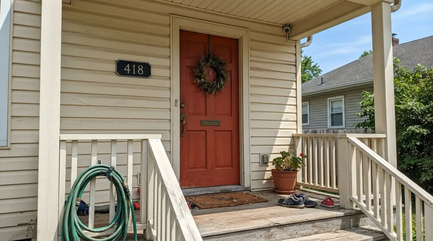
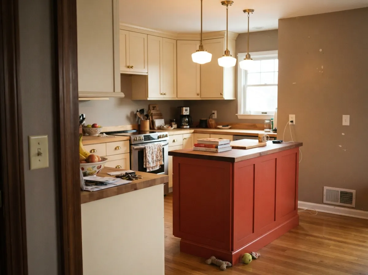
Give it one surface and real light and it does exactly the job it was bought for. A front door in full sun is the classic use — the warm undertone keeps it from looking harsh even at full saturation — and a kitchen island under pendant light is its second home, especially next to warm cream cabinetry and brass hardware. It photographs the way a before-and-after post wants it to: unmistakable, a little theatrical, done in an afternoon.
Where It Fails
Every regret story about Flirt Alert follows one of three scripts, and all three are avoidable once you know them going in.
This is a door-and-doses color, not a wall-to-wall one. On all four walls under ordinary room lighting the saturation stops reading as confident and starts reading as heavy — closer to a dim, brownish-maroon box than the bright red on the chip, especially under cool LEDs. Keep it to a door, an island, or a single accent wall with neutral walls to answer it.
Saturated reds fade faster than almost any other paint family in direct sun — a south- or west-facing door can visibly dull within a few summers. Use an exterior-grade formula built for UV exposure, and expect to touch it up sooner than you would a neutral door.
Reds this saturated show streaks and hot spots without real prep. Skip a tinted gray primer and you're looking at three or four coats to get even coverage — budget the time, or ask the store to tint the color into a one-coat-hide line.
Room by Room
Full daylight, seen for seconds at a time, no living-with-it fatigue. The warm undertone keeps it curb-appeal confident instead of alarming. Semi-gloss or gloss, and an exterior-grade formula for UV resistance.
Against warm cream perimeter cabinets and brass hardware it reads custom and deliberate. A full kitchen of red cabinetry is a much bigger, riskier bet — keep it to one piece.
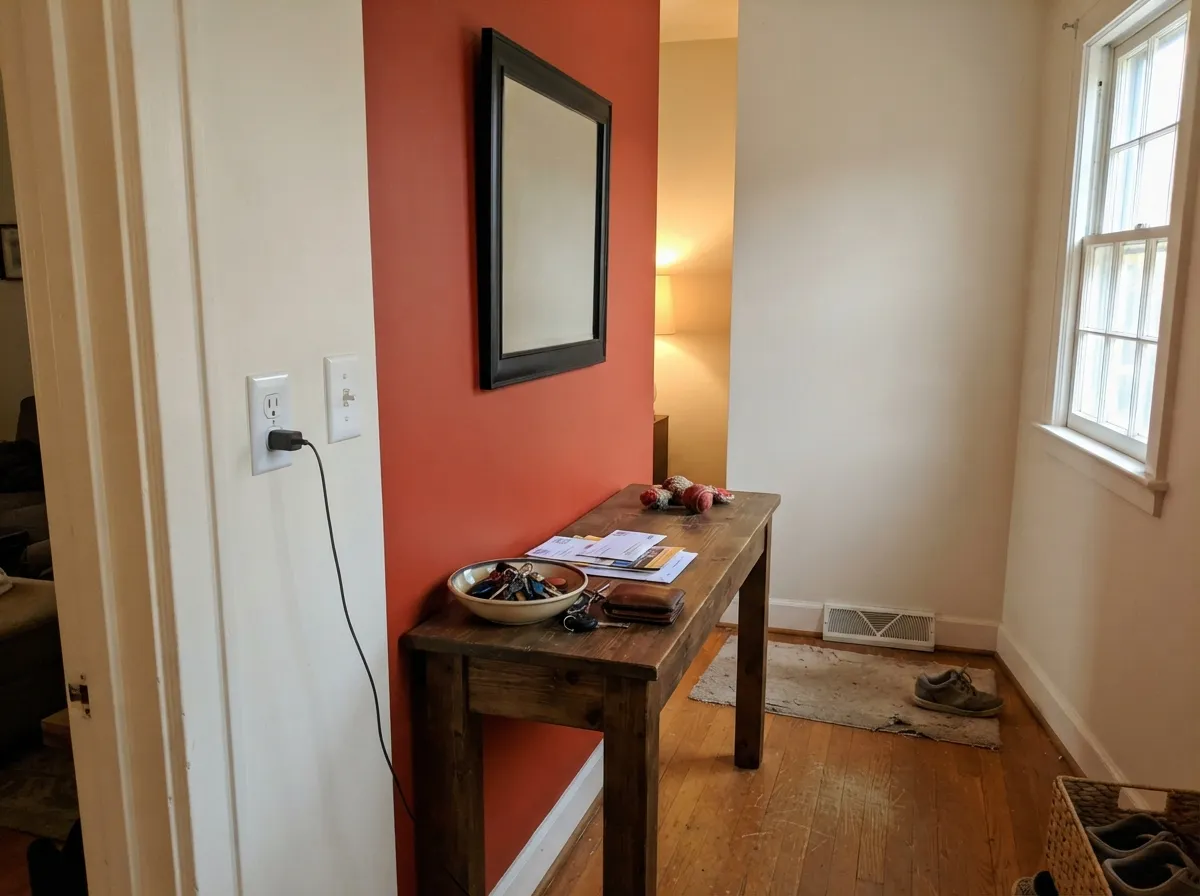
Works in a living room, dining room, or entryway when the other three walls stay a warm neutral. Alone in a small enclosed space with no daylight relief, it closes the room in fast.
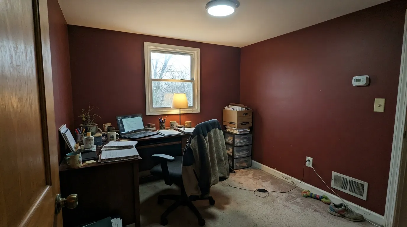
Under ordinary indoor lighting, four walls of this saturation reads heavy and slightly muddy rather than the bright true red on the chip. This color needs a job with an edge, not a room to fill.
A refinished dresser, a bookcase, a console table — small-scale pieces let the color be as bold as it wants without overwhelming the room around it. Satin or semi-gloss holds up to handling.
Shutters or a small accent trim panel can work in climates without brutal, constant sun. Anywhere the surface takes direct afternoon light for years, expect it to fade noticeably faster than a neutral color would.
Your Light Is the Risk
Midday sun on a door or in a sunny kitchen keeps the warmth up front — this is the color at its truest and most confident.
At LRV 12 it already sits deep; without real daylight it slides toward a flat, brownish maroon and loses the pop it was bought for.
Brightest and most true-red at midday sun; as light drops in the evening it deepens toward wine. Most owners like the shift — test past sunset before committing a whole door to it.
2700K warm bulbs push it toward brick and wine; cool white LEDs sharpen it back toward its orange-red edge. Either works on a door — indoors, pick the bulb on purpose.
Most complaints about Flirt Alert are a light mismatch. Upload a photo of your actual room and see it on your walls — then ask for the same wall in north light or evening lamps before you buy a single sample.
Need It From Another Brand?
Any paint counter can custom-tint Behr P150-7 directly. If you would rather stay in one brand's own deck, these are the closest stock matches, measured as ΔE2000. Under 2 is a difference you will not see on the wall.
| Brand | Closest color | ΔE | LRV | |
|---|---|---|---|---|
| Sherwin-Williams | StopSW 6869 · Sherwin-Williams | 0.9 | 15 | Color page → |
| Benjamin Moore | Strawberry Red2003-20 · Benjamin Moore | 1.8 | 16 | Color page → |
| Valspar | Oh So Red1009-1 · Valspar | 0.6 | 14.3 | Color page → |
| PPG / Glidden | Teaberry BlossomPPG1189-7 · PPG / Glidden | 3.0 | 15 | Color page → |
| Glidden | Red Geranium19YR 14/629 · Glidden | 2.4 | 14 | Color page → |
| Dutch Boy | Poppied Red106-7DB · Dutch Boy | 2.4 | 14 | Color page → |
Similar Behr Colors
The nearest shades to Flirt Alert within Behr's own range, ranked by perceptual color distance — useful when you want the same look a touch lighter, darker, or warmer.
WCAG 2.1: AA is 4.5 : 1 for normal text, 3 : 1 for large text, AAA is 7 : 1.
Flirt Alert vs the Colors You're Also Considering
Every Flirt Alert sample board has the same rivals on it. The numbers show the real lightness gap — then it comes down to which risk you would rather live with.
Pick this for the brighter, more orange-warm version that still reads confidently red, not brown.
Benjamin Moore AF-290 · LRV 8CalientePick this if you want the browner, more restrained benchmark true red — Caliente reads more brick, less lipstick.
Pick this for more daylight brightness and less brooding depth.
Sherwin-Williams SW 6866 · LRV 7HeartthrobPick this for a darker, cooler front-door red built for exactly one job.
Flirt Alert Coordinating Colors
The rule for Flirt Alert is simple: let it be the loudest thing in the room. Warm whites keep it from looking harsh, a warm greige gives it a quiet landing pad, and a near-black adds just enough contrast without competing for attention. These are the partners that keep showing up in rooms that work:
A Front-Door Red, Not a Room Red
Behr's own reds split roughly into two families: browned-down oxblood door colors on one side, and true, saturated reds like Flirt Alert built to be looked at rather than lived inside on the other. Flirt Alert sits firmly in the second group, and its LRV of 12 tells the story — deep enough to hold real color in daylight, but far too saturated to spend all day surrounded by without real light to answer it.
That's exactly why a front door is such a natural fit: it gets full daylight, it's seen for seconds at a time rather than lived in for hours, and a confident color there reads as curb appeal rather than commitment. Indoors, the same logic applies to an island or a single wall — give it a job with an edge, not a whole room to fill.
Flirt Alert With Wood Tones and Metals
Warm woods are the easy pairing: golden oak, walnut and cherry all sit comfortably next to Flirt Alert because the red's own undertone is warm rather than blue. Where a cooler true red would fight golden wood tones, this one doesn't.
Metals split the way most warm colors do: unlacquered brass and warm gold hardware look intentional and a little vintage against it; matte black reads modern and graphic; polished chrome is the one finish that argues with the warmth, going slightly cold and clinical by comparison.
Three Ready Palettes Built on Flirt Alert
A color is never alone on the wall. These are complete combinations in the 60-30-10 pattern, with the reason each one holds together. Every one opens in the visualizer.
Crisp white siding keeps the red from feeling heavy, and the warm greige trim is the quiet middle step that keeps the whole facade from reading like a dare. The door does all the talking.
Try this palette in your roomThree warm-white walls give the red room to be loud on the fourth without taking over the whole space; one near-black frame or console keeps the pairing from feeling like a valentine.
Try this palette in your roomThe classic red-island trick: keep the perimeter and ceiling quiet and warm-white so the eye has somewhere to rest, and let the island carry the room's personality. Brass hardware finishes it.
Try this palette in your roomFlirt Alert FAQ
Is Flirt Alert warm or cool?
Warm — it leans orange rather than blue, which is why it reads more like confident lipstick than a stop-sign or fire-engine red. That warmth is what lets it sit near wood and brass without a fight.
Will it fade outside on a front door?
Some, over time, like every saturated red. South- and west-facing doors in full sun fade fastest — use an exterior-grade, UV-stable formula and expect to refresh it sooner than a neutral door color.
How many coats does it need?
Plan on three to four over a white or light base if you're rolling from a standard can — reds this saturated show through easily. A tinted gray primer first, or having the store tint the color into a one-coat-hide line like Behr Dynasty or Marquee, cuts that down significantly.
Can I paint a whole room in it?
You can, but it isn't really built for it. On all four walls under ordinary lighting it tends to read heavy and slightly brownish rather than the bright, confident red on the chip. It earns its keep in doses — a door, an island, one wall.
What white goes with Flirt Alert?
A warm white or off-white, not a stark cool one — Behr Swiss Coffee or Ultra Pure White both keep the red from looking harsh. A blue-white trim will make it look slightly orange by contrast.
Is Flirt Alert the same as Behr's other reds like Inferno or 100 Mph?
No — they're related but distinct. Inferno pushes further into orange and sits noticeably lighter at LRV 19; Flirt Alert is the more centered, classic true red of the group.
Have you painted with Flirt Alert?
Rate it — one tap helps the next reader decide.
Ask a Question