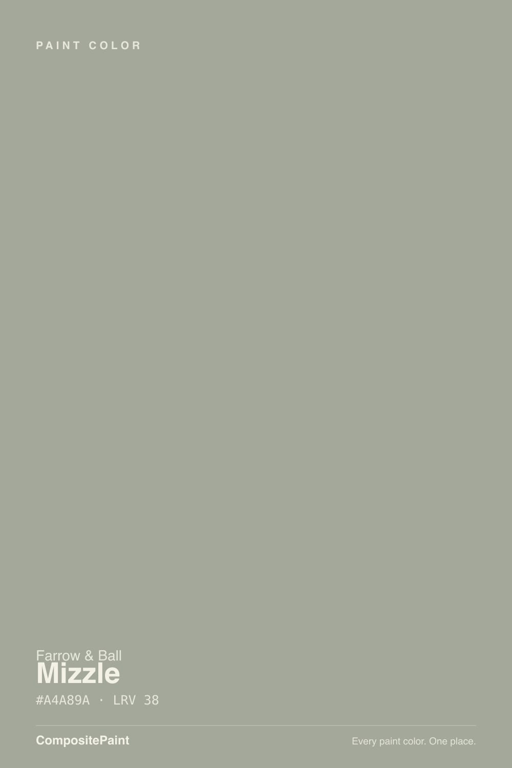
Mizzle
The mist-and-drizzle gray-green, reviewed honestly: where it stays soft, the light that turns it blue, and what to pick instead.

Jessica has spec'd whites and neutrals for more than 300 rooms and keeps a sample wall of painted drawdowns in her studio. Every color review is checked against real reader rooms in the comments and re-tested when a formula changes. About the testing process →
- 1Storm Cloud23
- 2Stardew43
- 3Mizzle52
- 4Upward57
- 5Sea Salt63
The Fast Verdict
Mizzle is Farrow & Ball's quiet weather color: a mid-light gray-green with a drop of blue, named for West Country skies that mix mist and drizzle. In north or overcast light it reads as a soft sage-gray and never goes cold; in hard south sun the blue comes forward and people who sampled a green get a spa wall. It is the lighter, livable cousin of Pigeon and the airy alternative to Inchyra Blue — just never buy it hoping for gray.
Kitchen cabinets and color-drenched kitchens · bedrooms and living rooms with soft daylight · hallways and powder rooms · anyone who wants Inchyra Blue's mood without the depth
You actually wanted gray · honey oak floors are staying · the room runs on cool white LEDs and south glass · you want a saturated sage that stays green all day
- Soft gray-green that never feels cold — packed with enough green to stay inviting
- Mid-light (LRV 52): airy on four walls without washing out to white
- Excellent on kitchen cabinets — the designer use that made it famous
- Shifts with the weather in a way most greiges cannot, which is the point
- The livable, lighter alternative to Pigeon and Inchyra Blue in the same family
- Not gray — buyers expecting gray see green-blue by the second wall
- South sun and cool LEDs pull a spa-mint blue a cloudy sample never showed
- Fights honey oak, orange stain and golden builder beige
- Too pale and too shifting for most exteriors; too chromatic for a no-risk whole-house gray
What Color Is Mizzle, Really?
A pale gray-green with a whisper of blue — and the blue is the whole argument. Farrow & Ball built Mizzle as a lighter shade of Pigeon and Blue Gray, then added green pigment to knock the chill out of those cousins. The result is a color that looks like quiet stone on the chip and like weather on the wall: green in cool light, bluer when the sun hits it, gray only if you squint. Farrow & Ball files it with the blues on one page and calls it a grey-green on the tin. Both are true. That split is why designers love it and why first-time buyers sample it twice.
At LRV 52 it is a genuine mid-light, not a pale wash and not a mood color. It reflects about half the light that hits it, so a room stays airy without reading white. Pigeon sits at LRV 35 — the same family, a full step deeper and smokier. Inchyra Blue sits at LRV 12, the dark chameleon people reach for when they want this exact blue-green idea as a cocoon. Mizzle is the one that still lets the room breathe. Plan for four walls to read a notch deeper and more colorful than the chip; every muted green-gray does this once it wraps a room.
Undertone in one line: green first, blue second, gray as the body — never yellow, never pink. If your sample goes mint-blue, that is south sun or a cool LED doing it. If it goes mossy, that is north light or an overcast day. Both versions are the same paint being honest about the weather, which is the joke of the name.
Where It Shines
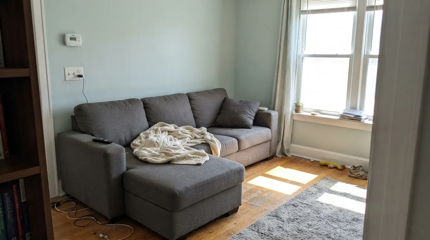
Give it soft daylight and this color earns the Hall of Fame slot Farrow & Ball gave it. North and overcast rooms are its best light: the green comes forward, the blue stays in the background, and the wall reads like mist instead of mint. Its second home is the kitchen — satin Mizzle on cabinets under Pointing or All White walls is the designer move that made the color famous in American houses, including Sarah Sherman Samuel's 2018 Pasadena kitchen for Mandy Moore. Linen, pale stone, unlacquered brass and walnut all sit comfortably against it. Color-drench a hallway or powder room and it looks considered, not themed.
Where It Fails
Almost every regret story about Mizzle follows one of three scripts, and all three are visible on a sample board before anyone opens a gallon. None of them are the paint's fault — but if your room matches one, this is not your gray-green, and a bigger sample will only confirm it.
On the chip it passes for a quiet greige. On four walls the green-blue is unmistakable — muted colors get louder with coverage. If your goal is a true gray with a little personality, this is too much personality. Light French Gray stays gray; Mizzle lives in the weather.
Hard midday south light pulls the blue forward until the wall reads spa-mint, not sage. Cool 4000K bulbs do the same after dark. Farrow & Ball's own colour curator says south rooms go softer and bluer, north rooms greener — believe that before you believe the chip. If you sampled it on a cloudy afternoon and live in a glass south box, you will not get the color you approved.
Yellow-orange is this color's complement, so honey oak floors, orange-stained trim and builder-beige carpet all amplify the blue-green while the walls push the wood toward pumpkin. Both sides lose. Mizzle wants walnut, pale white oak, painted floors, or a large rug between it and anything golden. If the honey oak is staying wall-to-wall, French Gray (more olive, less blue) is the kinder F&B cousin.
Room by Room
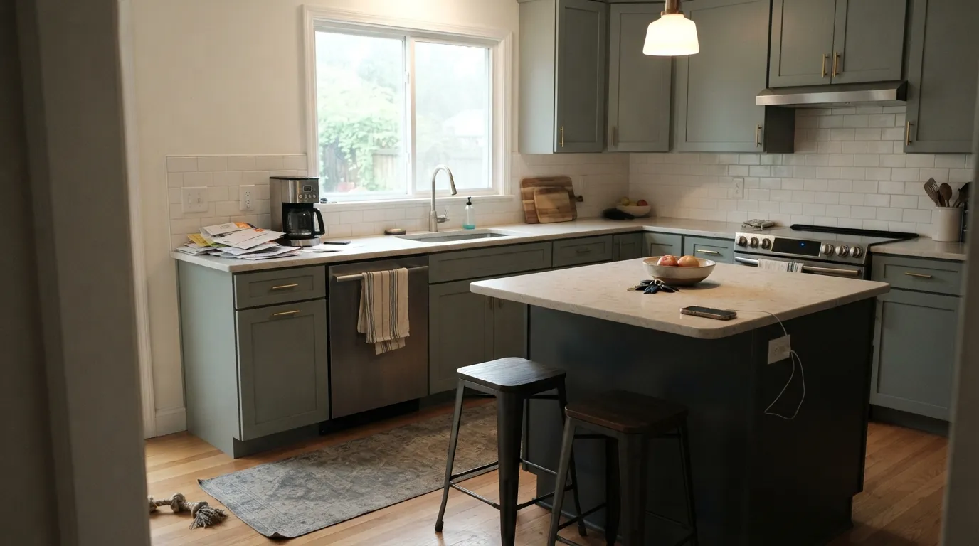
This is where Mizzle became a designer default: satin or Modern Eggshell on shaker boxes, pale stone or butcher block, brass pulls. Pair perimeter cabinets with Pointing or All White walls, or color-drench walls and boxes together. A Down Pipe island grounds it. Honey-oak boxes staying put is the one kitchen it will fight.
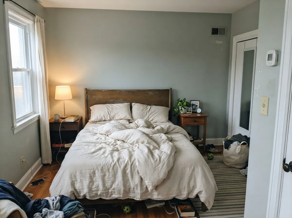
North- or east-facing bedrooms get the misty green the name promises. Matte or Estate Emulsion; Wevet or Strong White trim so the edge stays quiet. Cream linen, not yellow-beige bedding. A west bedroom with late sun will flash bluer for an hour — most people like it; test at 6pm if you do not.
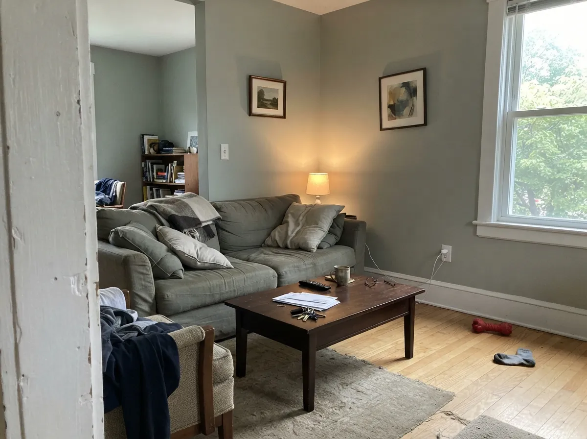
Beautiful in a room that already has windows, art, and wood that is not honey. It recedes enough to let furniture read, then shifts through the afternoon so the space never looks static. Eggshell; sample the darkest wall, not the sun patch. Open plans that dump into a warm-beige kitchen need a shared trim white or the handoff will argue.
Small rooms take the color well, and Modern Emulsion handles steam. A Mizzle vanity under marble or pale quartz looks custom; drenching all four powder-room walls is the weekend project that reads expensive. Keep bulbs at 2700K — cool vanity LEDs will mint it overnight. With peachy stone or Setting Plaster walls it is quietly pretty instead of spa-cold.
Victorian hallways are a documented sweet spot: color-drench walls and keep Strong White or Wevet on the woodwork, or reverse it with Pigeon on doors. A dining room next to a Mizzle kitchen flows. A windowless office under cool overheads is the muddy version — add a lamp or pick something with more body.
At LRV 52 it is too pale and too shifting for a whole facade; full sun will read it mintier than any interior sample. A cottage door or shutters against Pointing or brick is the honest exterior job, in Full Gloss or Exterior Eggshell. For a dark blue-green body, that is Inchyra Blue's assignment.
Your Light Is the Risk
Cool, even light pulls the green forward and the walls read misty sage-gray — never icy. This is the weather the name was built for.
Midday south glass exposes the blue until it reads spa-mint, not the quiet green on the chip. Sample on the sunniest wall at noon before you commit.
Greener and softer in morning light, noticeably bluer through west afternoon. The swing is the color, not a defect — watch a sample at both hours.
2700K lamps warm it toward an olive-gray and keep the mist. 4000K LEDs push the blue-green spa read — swap bulbs before you repaint.
Most complaints about Mizzle are a light mismatch. Upload a photo of your actual room and see it on your walls — then ask for the same wall in north light or evening lamps before you buy a single sample.
Need It From Another Brand?
Any paint counter can custom-tint Farrow & Ball No. 266 directly. If you would rather stay in one brand's own deck, these are the closest stock matches, measured as ΔE2000. Under 2 is a difference you will not see on the wall.
| Brand | Closest color | ΔE | LRV | |
|---|---|---|---|---|
| Sherwin-Williams | ContentedSW 6191 · Sherwin-Williams | 0.5 | 52 | Color page → |
| Behr | Arbor HollowECC-37-1 · Behr | 1.0 | 53 | Color page → |
| Benjamin Moore | Horizon Gray2141-50 · Benjamin Moore | 1.0 | 52 | Color page → |
| Valspar | Mother Nature8004-26C · Valspar | 2.9 | 51 | Color page → |
| PPG / Glidden | Misty MeadowPPG1031-2 · PPG / Glidden | 1.1 | 51 | Color page → |
| Glidden | Misty MeadowPPG1031-2 · Glidden | 0.9 | 52 | Color page → |
Similar Farrow & Ball Colors
The nearest shades to Mizzle within Farrow & Ball's own range, ranked by perceptual color distance — useful when you want the same look a touch lighter, darker, or warmer.
WCAG 2.1: AA is 4.5 : 1 for normal text, 3 : 1 for large text, AAA is 7 : 1.
Mizzle vs the Colors You're Also Considering
Every Mizzle sample board has the same rivals on it. The numbers show the real lightness gap — then it comes down to which risk you would rather live with.
Pick this when you want Inchyra's weather without the cave: same family, four times the light, still not gray.
Farrow & Ball No. 289 · LRV 12Inchyra BluePick this if you want this same blue-green chameleon as a dark cocoon — it never settles on one color, and at LRV 12 it will close a room in.
Pick this when you want the airier, livable version of that family and still need the room to bounce light.
Farrow & Ball No. 25 · LRV 35PigeonPick this if Mizzle sampled too pale — Pigeon is the same gray-green-blue idea a step deeper, and it also reads a different color in every room.
Vitty Green No. G3 at LRV 40 is Mizzle's closest neighbor. It is a shade lighter and reads a little greener and fresher, so choose Vitty Green when you want more of the green to show and Mizzle when you want it held back.
London Stone No. 6 at LRV 37 sits at nearly the same depth but leans warm and brown rather than cool and green. In a room where wood and warm light dominate, London Stone blends in; Mizzle keeps a cooler, grayer presence.
Manor House Gray No. 265 at LRV 35 is the more truly gray option, slightly darker and with far less green. If Mizzle's undertone looks too soft or too warm in your light, Manor House Gray gives a cleaner, more neutral mid-gray instead.
Mizzle Coordinating Colors
The rule for coordinating with Mizzle: stay in the cool-green family or jump to plaster-pink — and keep yellow-beige at arm's length. It layers with deeper members of its own weather system (Pigeon, Inchyra Blue, Down Pipe), loves a grey-based white, and is one of the few greens that actually flatters Setting Plaster. These are the partners that keep showing up in rooms that work:
Mist, Drizzle, and a Famous Kitchen
The name is a West Country portmanteau: mist plus drizzle, the low grey-green of an English evening sky. Farrow & Ball put Mizzle in its own Hall of Fame, which tells you how the company ranks it — not a trend color, a house color. It has never been a Color of the Year; Farrow & Ball does not name one. The American fame is more specific: in 2018 Sarah Sherman Samuel painted the cabinets of Mandy Moore's Pasadena kitchen Mizzle and the walls All White, and the photos have been circulating in kitchen roundups ever since.
That kitchen is the useful lesson. Mizzle as a whole-house gray is a bet against the undertone. Mizzle as cabinets, a drench, or a bedroom in decent light is the job it was mixed for. If you came here from Inchyra Blue and lost your nerve at LRV 12, this is the quieter door in the same hallway — just sample it in the actual sun, because the blue in this family always shows up eventually.
Mizzle With Wood Tones and Floors
This decision gets made at the floor. Walnut, teak, espresso and pale unstained white oak are the easy yes — the cooler brown lets the gray-green read as atmosphere instead of mint. Painted floors, grey-washed oak and pale limestone are also safe. Cream marble and Calacatta (the Mandy Moore kitchen pairing) work because the stone's gray veins meet Mizzle halfway.
The honest no is golden: honey oak, orange builder stain, yellow-beige carpet, honey-oak kitchen boxes you were hoping to keep. Blue-green sits across the wheel from yellow-orange, so each side exaggerates the other. A large rug is a patch, not a cure. If that floor is staying, French Gray or Calke Green — a warm heritage sage that reads olive, not gray-green — will fight it less.
Metals are simple: unlacquered brass, antique bronze and aged nickel all work; chrome is the one that leans showroom-cold against it. Black window muntins, used in more than one published Mizzle living room, sharpen the green without chilling it.
Three Ready Palettes Built on Mizzle
A color is never alone on the wall. These are complete combinations in the 60-30-10 pattern, with the reason each one holds together. Every one opens in the visualizer.
This is the scheme Farrow & Ball itself sketches: Mizzle on the boxes, a warm off-white on the walls so the green-gray can read, and Down Pipe — the original lead-gray, bluer than its reputation — on the island so the room has one dark note. Brass hardware and pale stone finish it.
Try this palette in your roomTonal gray-green layering is what keeps this from looking like a painted box: Mizzle on the walls, Pigeon a step deeper on one piece of woodwork, Wevet — Farrow & Ball's coolest, most delicate white — on the trim so the edges stay misty instead of creamy. Warm 2700K lamps are part of the job.
Try this palette in your roomFarrow & Ball's own bright scheme puts the plaster-pink that started a design trend on the walls and grounds it with Mizzle on the woodwork. Strong White — the grey-based white for people who find cream boring — on the ceiling keeps the plane from going yellow against either color.
Try this palette in your roomMizzle FAQ
Is Mizzle gray, green, or blue?
All three, depending on the light — which is why people argue in the comments. Green first, blue second, gray as the body. In north or overcast light it reads sage-gray; in south sun it flashes a quiet blue. Nobody who paints four walls will call it a true gray. If gray is what you actually want, Light French Gray or Ammonite is the safer F&B-adjacent bet.
What trim white goes with Mizzle?
Stay slightly cool or grey-based: Wevet, Strong White, or All White. Pointing works if you want a warmer wall-to-trim contrast in a kitchen. A creamy yellow-based white makes Mizzle look minty and dirty by comparison. Eggshell or Estate Eggshell on the woodwork, matte on the walls.
Is it good for kitchen cabinets?
Yes — it is arguably the best use. Satin or Modern Eggshell on shaker boxes is the designer default, and it hides knuckle marks better than a pale cream. Pair with Pointing or All White walls, pale stone, and brass. A whole kitchen of Mizzle walls and cabinets is a color-drench that works in decent daylight; it is a heavier bet in a dark galley.
Does Mizzle work with oak floors?
Depends on the oak. Walnut, espresso and pale unstained white oak are excellent. Honey oak and orange builder stain are the clash: the blue-green undertone makes the floor look more orange and the walls look more mint. A large rug helps. If the golden floor is staying, look at French Gray instead — more olive, less blue.
How does it compare to Inchyra Blue?
Same weather, different depth. Inchyra Blue is the dark blue-green chameleon (LRV 12) that never settles on one color; Mizzle is the mid-light version (LRV 52) that still lets a room bounce daylight. People shopping Inchyra for a bedroom and then getting cold feet often land here. You cannot use them as the same job.
Will it look too green in a north-facing room?
It will look greener — Farrow & Ball's colour curator says so outright — but that is usually the flattering version, not a failure. North light is this color's best light: mossy, soft, never cold. The failure is the opposite room: a south wall of glass that turns it blue. Sample the actual wall at noon and at dusk.
Have you painted with Mizzle?
Rate it — one tap helps the next reader decide.
Ask a Question