Pavilion Gray
Farrow & Ball's cool mid-gray, reviewed honestly: the Swedish kitchens it flatters, the north light that turns it baby blue, and what to pick instead.

Jessica has spec'd whites and neutrals for more than 300 rooms and keeps a sample wall of painted drawdowns in her studio. Every color review is checked against real reader rooms in the comments and re-tested when a formula changes. About the testing process →
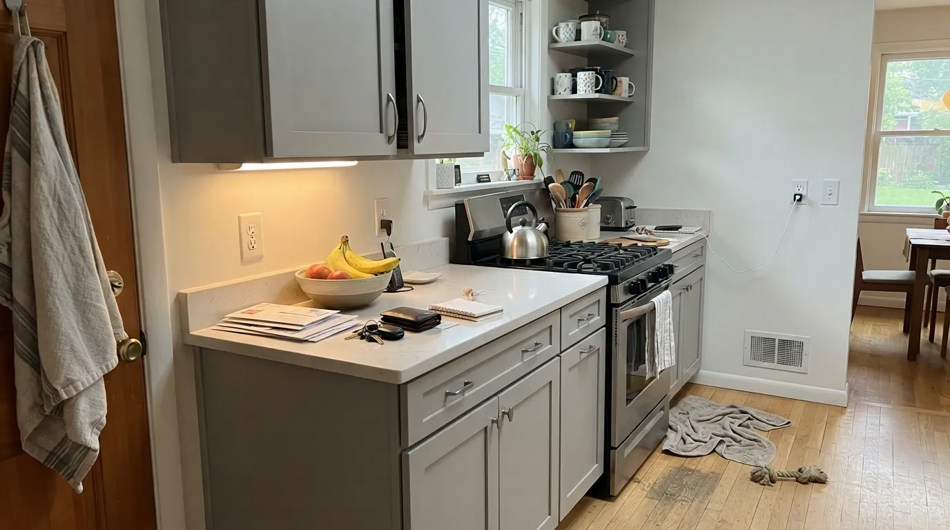
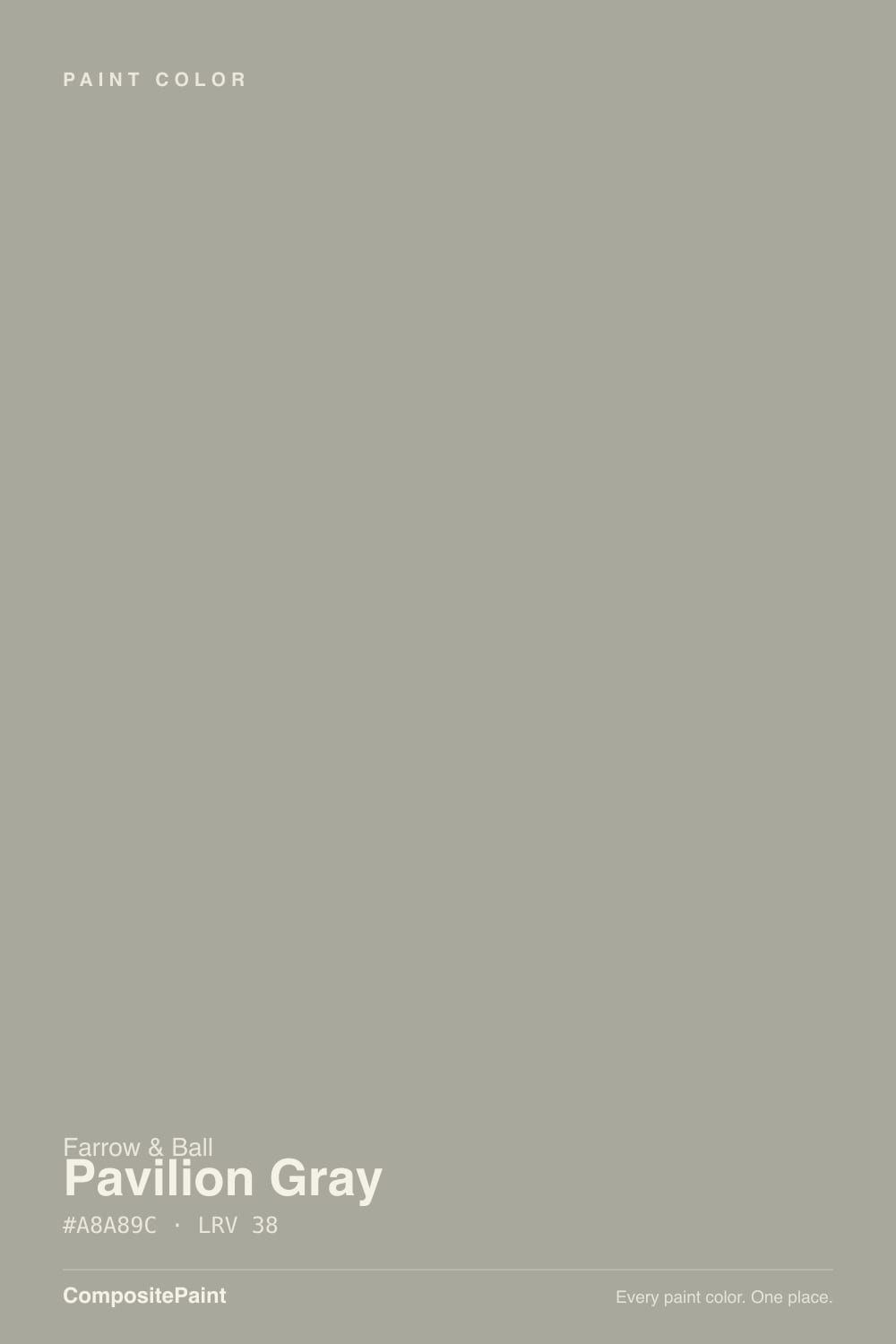
- 1Dorian Gray39
- 2Mindful Gray48
- 3Pavilion Gray53
- 4Agreeable Gray60
- 5Pale Oak69
The Fast Verdict
Pavilion Gray is the gray you pick when greige feels too beige and builder gray feels too dead — a cool mid-tone with a Gustavian lean and a blue undertone Farrow & Ball never hid. On kitchen cabinets it is one of the brand's most-used colors; on four walls in a north room it can go baby blue. If you want a contemporary, slightly silvery gray that still has body, this is it — sample it on the actual wall before you commit the room.
Kitchen cabinets and islands · bedrooms with real daylight · living rooms that want a cool, spacious gray · Gustavian and Swedish interiors
Your room faces north and stays dim · you actually wanted a warm greige · honey oak floors · cream trim that will push it baby blue
- Cool mid-gray with real body (LRV 53) — not a washed pale fog
- Kitchen cabinets look custom, Gustavian, and finished
- Blue undertone reads Swedish, not builder gray
- Pairs cleanly with marble, chrome, pale oak and gray-based whites
- Architectural Neutral — behaves on woodwork as well as walls
- North light and overcast days turn it baby blue
- Fights honey oak, golden beige and orange-stained wood
- Warm cream trim (Pointing, Dimity) makes the walls look dingy-blue
- Not a greige — anyone wanting warmth will feel tricked
What Color Is Pavilion Gray, Really?
A cool mid-gray with a blue undertone — not a greige, not a taupe, and not the beige-gray most American decks sell as gray. Farrow & Ball mixed it for a bespoke pavilion, then kept it in the Architectural Neutrals as a lighter, less-blue cousin of Lamp Room Gray. The Swedish, 18th-century Gustavian read is the whole personality: silvery, a little chalky, slightly aristocratic. Designers put it on kitchen cabinets because it looks custom without looking painted-gray; homeowners put it on walls because the chip looks like a well-behaved neutral. The chip is lying a little. The blue is quiet on a 2-inch square and loud on four walls.
At LRV 53 it is a genuine mid-tone, sitting in the same light-reflectance neighborhood as Sherwin-Williams Light French Gray. That depth is useful. It holds as a color in a bright kitchen instead of washing to pale fog, and it still leaves a room feeling open — darker than Ammonite (LRV 67), clearly lighter than Lamp Room Gray (LRV 44). Next to a true white it shows its body; next to a warm greige it looks cooler and more 'gray' than you expected from the name.
Undertone in one line: cool, blue first, a faint green second in mixed daylight — never pink, never yellow. If your sample goes baby blue, that is north light doing what north light does to every blue-based gray. If it reads smoky green, you are seeing the same paint in leafy or west light. Both versions are Pavilion Gray being honest about the room.
Where It Shines
Give it daylight, pale wood, and a kitchen and it earns the reputation. On cabinets in Modern Eggshell it is the Farrow & Ball move: not white, not navy, a cool mid-gray that makes marble, chrome, unlacquered brass and pale oak look deliberate. Bedrooms with east or south light get the Gustavian calm without going gloomy. The color wants company that is also cool — Strong White or Wevet on trim, not cream.
Where It Fails
Almost every regret story about Pavilion Gray follows one of three scripts, and all three are visible on the sample board if you know where to look. None of them are a bad batch — but if your room matches one, this is not your gray.
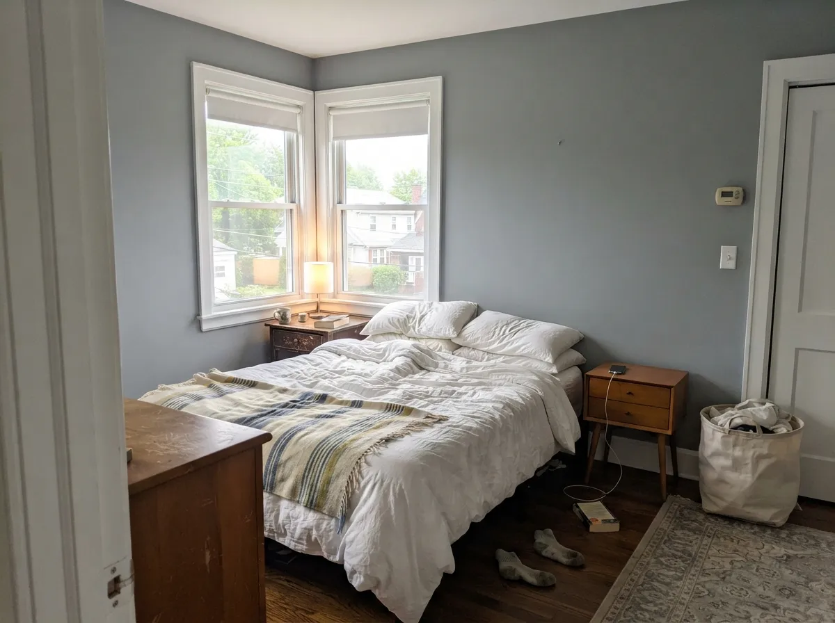
Houzz threads say it plainly: Pavilion Gray goes baby blue in cool light. North rooms, overcast days, and rooms with no lamps strip the gray and leave the blue base on the wall. The color did not fail; the light did. If the room stays dim, pick a warmer gray (Elephant's Breath) or a true greige (Ammonite) instead of hoping more coats will warm it.
Yellow-orange wood is this color's complement. Honey oak floors, orange-stained trim and builder-beige carpet all push Pavilion Gray toward blue-gray while the walls push the floor toward pumpkin. Both sides lose. It wants pale white oak, walnut, painted floors, or a large rug between it and anything golden.
Pointing and Dimity are beautiful Farrow & Ball whites — and they are the wrong whites here. Warm cream makes Pavilion Gray look dingy and blue by comparison, the same pairing mistake that sinks every cool gray. Trim it in Strong White or Wevet so the edge stays in the same temperature family.
Room by Room
This is where Pavilion Gray became a staple. Modern Eggshell on cabinets, Strong White on the walls, pale stone or marble on the counters: the gray reads custom and slightly Swedish, never builder. Satin-equivalent sheen wipes fingerprints. Honey-oak cabinets being painted over is the one case to sample twice — the leftover orange in the grain can still warm the gray from underneath.
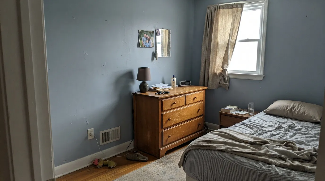
In a south- or east-facing bedroom it is restful without being beige. Eggshell on walls, Wevet on trim, warm 2700K lamps at night so the blue does not take over after dark. North bedrooms are the skip: you will wake up in a nursery-blue room you did not order.
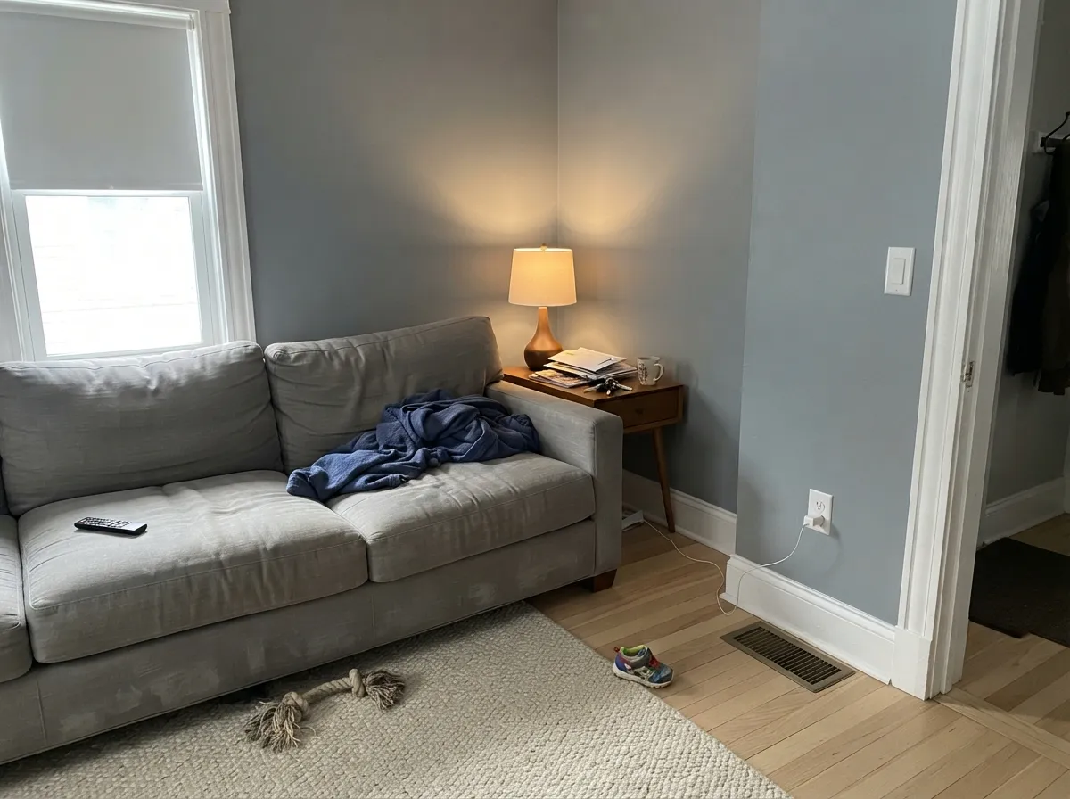
Open, daylit living rooms get the spacious cool-gray the Architectural Neutrals were built for. Pair with a gray-based white on trim and keep the upholstery on the linen-cream or charcoal side, not gold. In a closed north living room with one window, test a big board first or pick Elephant's Breath.
White marble, gray quartz, chrome and nickel all sit in the same temperature, so Pavilion Gray on walls or a vanity is an easy yes. Warm beige tile and honey-oak vanities are the no. Modern Emulsion or eggshell on walls; Modern Eggshell on the vanity.
Cool, quiet, and not a corporate cubicle gray. Daylight from the side keeps it silvery; under cool LEDs it will flash bluer, so swap the bulbs to 2700–3000K if the room is used at night. Strong White trim keeps it contemporary.
Evening dining rooms can handle the blue if the bulbs are warm and the table is walnut or painted, not golden oak. It looks considered next to Hague Blue or Railings on a door or hutch. Skip it if the dining room is a dim north box with a cream chandelier glow and orange wood — that is three clashes at once.
Your Light Is the Risk
The honest Gustavian read: a cool mid-gray with a silvery blue whisper, spacious rather than cold. This is the light the kitchen-cabinet photos were taken in.
Cool gray daylight strips the mid-tone and leaves baby blue on the wall. The most-reported complaint, and the one sampling on a north wall will catch in a day.
Morning keeps it cooler and more gray; west and leafy light can flash a smoky green. It is the same paint, not a second color — but the shift is real enough to sample at 8am and 5pm.
2700K bulbs pull the blue back and it reads closer to a true mid-gray. Cool white LEDs (4000K+) push the baby-blue the north window already started. Swap bulbs before you repaint.
Most complaints about Pavilion Gray are a light mismatch. Upload a photo of your actual room and see it on your walls — then ask for the same wall in north light or evening lamps before you buy a single sample.
Need It From Another Brand?
Any paint counter can custom-tint Farrow & Ball No. 242 directly. If you would rather stay in one brand's own deck, these are the closest stock matches, measured as ΔE2000. Under 2 is a difference you will not see on the wall.
| Brand | Closest color | ΔE | LRV | |
|---|---|---|---|---|
| Sherwin-Williams | Knitting NeedlesSW 7672 · Sherwin-Williams | 0.5 | 53 | Color page → |
| Behr | Foggy LondonPPU25-09 · Behr | 2.1 | 54 | Color page → |
| Benjamin Moore | Cumulus Cloud1550 · Benjamin Moore | 1.5 | 52 | Color page → |
| Valspar | SleepyT678 · Valspar | 3.5 | 52.9 | Color page → |
| PPG / Glidden | Rabbit's EarPPG0999-2 · PPG / Glidden | 1.5 | 54 | Color page → |
| Glidden | Jade Frost50GY 53/033 · Glidden | 3.0 | 53 | Color page → |
Similar Farrow & Ball Colors
The nearest shades to Pavilion Gray within Farrow & Ball's own range, ranked by perceptual color distance — useful when you want the same look a touch lighter, darker, or warmer.
WCAG 2.1: AA is 4.5 : 1 for normal text, 3 : 1 for large text, AAA is 7 : 1.
Pavilion Gray vs the Colors You're Also Considering
Every Pavilion Gray sample board has the same rivals on it. The numbers show the real lightness gap — then it comes down to which risk you would rather live with.
Pick this when you want the Farrow & Ball chalk and the Gustavian blue, not a deck-true gray.
Sherwin-Williams SW 55 · LRV 53Light French GrayPick this if your painter is already in Sherwin-Williams — same LRV, a truer gray that flashes violet rather than Swedish blue.
Pick this when you want the cooler, more clearly gray version and you have the daylight to support it.
Farrow & Ball No. 228 · LRV 60Cornforth WhitePick this for a lighter F&B gray that shifts beige, gray and taupe depending on the hour — more chameleon, less committed blue.
French Gray No. 18 is the closest relative in the range. At LRV 42 it is a step lighter and carries a more obvious green cast, so it reads as more of a soft sage-gray. Choose French Gray if you want the green to show; choose Pavilion Gray if you want the color to stay more neutral.
Hardwick White No. 5, at LRV 42, is also a touch lighter and leans warmer and more stone-colored. It suits rooms where you want a mellow, earthy neutral rather than a clean gray.
Light Gray No. 17 shares the same LRV of 38, so it holds equal depth, but it runs warmer and more taupe. In a low-light room Light Gray feels cozier, while Pavilion Gray keeps a crisper, cooler feel at the same lightness. Sample all three together, because at this depth the differences are easy to miss on a small chip.
Pavilion Gray Coordinating Colors
Stay on the cool side of the fence. Grey-based whites, blue-blacks, and smoky greens agree with it; cream, peach, and golden beige argue with it. These are the partners that keep showing up in rooms that work:
The Pavilion, and Why It Reads Swedish
The name is literal. Farrow & Ball mixed this gray for a bespoke pavilion, then kept it in the Architectural Neutrals as a classic mid-gray with a Swedish 18th-century echo — the Gustavian palette of pale gray woodwork, cool daylight, and very little yellow. That origin is why it behaves better on cabinets and paneling than a typical wall greige: it was always a woodwork color as much as a wall color.
It is not a Color of the Year and it does not need to be. The reason it keeps showing up in kitchen after kitchen is narrower than fame: at LRV 53 it is dark enough to look like a decision on a cabinet door and light enough not to shrink the room. Lamp Room Gray is the darker, smokier step if this one feels too open; Ammonite is the greige step if the blue is more than you wanted.
Pavilion Gray With Wood Tones and Floors
Pale white oak, whitewashed pine, painted floorboards and walnut are the woods this gray was waiting for — they share the cool-to-neutral temperature and let the Swedish read come through. Gray-washed LVP is fine. Marble and cool quartz are better than warm granite.
The honest no is golden: honey oak, orange-stained builder trim, yellow-beige carpet. Complementary colors amplify each other, so the floor goes more orange and Pavilion Gray goes more blue. If the golden floor is staying, put a large rug between it and this paint, or choose Elephant's Breath and keep the mid-gray depth without the fight.
Metals are easy: unlacquered brass, antique bronze, chrome and matte black all work. Polished gold next to honey oak is the combination that makes the blue obvious. Keep one temperature dominant and the gray will behave.
Three Ready Palettes Built on Pavilion Gray
A color is never alone on the wall. These are complete combinations in the 60-30-10 pattern, with the reason each one holds together. Every one opens in the visualizer.
Strong White is the grey-based white this cabinet gray actually wants — cream would make the doors look blue. Railings supplies one blue-black note so the kitchen has a dark, and the blue in Railings agrees with the blue in Pavilion Gray instead of fighting it.
Try this palette in your roomWevet is the coolest, most delicate white in the F&B deck, so the trim stays in Pavilion Gray's temperature instead of warming it into blue. Hague Blue is the teal-navy accent that makes a gray bedroom feel designed rather than undecided.
Try this palette in your roomA cooler whole-floor scheme that still belongs to one family: mid-gray walls, grey-white architecture, and Down Pipe as the lead-gray dark — bluer and lighter than a true black, which is why it sits next to Pavilion Gray without looking like a costume.
Try this palette in your roomPavilion Gray FAQ
Is Pavilion Gray warm or cool?
Cool. The blue undertone is the point, not a surprise. In south light it reads as a silvery mid-gray; in north light it goes baby blue. If you wanted a warm greige, this is the wrong color — look at Elephant's Breath or Ammonite instead.
Is it good for kitchen cabinets?
That is its best use. Modern Eggshell on the doors, a grey-based white on the walls, pale stone or marble on the counters. It hides the 'I painted the oak' look better than a true white and still feels lighter than navy. Sample over any remaining honey oak — leftover orange grain will warm the gray.
What trim white goes with Pavilion Gray?
Strong White or Wevet, in Estate Eggshell. Strong White is grey-based and keeps the edge quiet; Wevet is the cooler, more delicate option. Skip Pointing and Dimity — those creams make the walls look blue and a little dirty. All White can work on a ceiling but still leans warm, so test it on a board next to the gray first.
Will Pavilion Gray look blue?
In north light, overcast weather, and under cool LEDs — yes, and that is the complaint that shows up again and again. In a bright south or east kitchen it stays a cool gray with only a blue whisper. Put a large sample on the actual wall and look at it in the morning and at 6pm before you buy gallons.
Pavilion Gray vs Cornforth White vs Elephant's Breath?
Same brand, three personalities. Pavilion Gray (LRV 53) is the cool blue-gray. Cornforth White (LRV 60) is lighter and reads three different colors depending on the hour. Elephant's Breath (LRV 52) is the same mid depth with beige, gray or a faint pink instead of blue. Pick Pavilion Gray only if cool is what you actually want.
Does it work with oak floors?
Pale, ashy, or limewashed white oak is excellent. Walnut is excellent. Golden honey oak is the clash: yellow-orange sits opposite this blue-gray, so the floor goes more orange and the walls go more blue. A large rug can broker a truce; wall-to-wall honey tones cannot.
Have you painted with Pavilion Gray?
Rate it — one tap helps the next reader decide.
Ask a Question