Compass Blue
MQ5-54 · #37485E · LRV 6 — cool blue tone, very dark — reads black in most rooms.
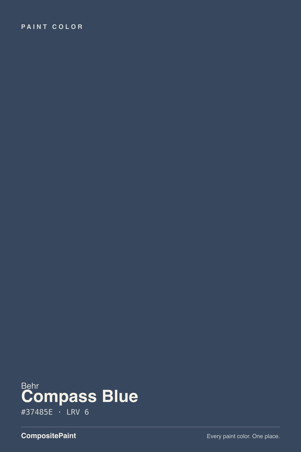
- 1Compass Blue6
- 2Waterloo13
- 3Charcoal Blue19
What Color Is Compass Blue, Really?
Compass Blue MQ5-54 is a very dark blue with a hex of #37485E and an LRV of 6. That number belongs in the near-black range, so on most walls it reads as a soft black rather than a blue. The hue is 214 degrees, squarely in the cool blue band, but the saturation is only 26 percent, which strips out any brightness and leaves a slate-like, weathered blue.
People choose it when black feels too hard. It gives the same weight and the same grounding effect as a charcoal or a black, but the blue keeps a room from feeling severe, and it flatters brass, wood, and warm whites. Cabinets, islands, front doors, and single feature walls are where colors at this depth earn their keep. Behr is mixed at The Home Depot, which makes it easy to get a quart before committing.
The catch is that at LRV 6 the blue is conditional. In a north-facing room or under warm bulbs, Compass Blue will simply look black, and the color you paid for disappears. It only shows its blue where direct light hits it. If seeing the blue matters to you, put the sample on the wall that gets the most sun and check it again after dark.
The undertone is cool blue, held down by low saturation. At 26 percent, Compass Blue has roughly a quarter of the color intensity of a true navy, which is why it reads slate or ink rather than blue. Look at the hex, #37485E, and the green channel sits between the red and the blue, giving the color a faint gray-green softness that keeps it from feeling like a nautical navy.
What sits next to it decides what you see. Against a true black cabinet or a black window frame, the blue is unmistakable. Against a bright cobalt or a saturated navy, Compass Blue looks gray and dusty. Against warm wood or a cream wall it reads as a deep, quiet dark.
If you want the blue to be visible, give it something black nearby for reference. If you want it to behave like a black, keep black out of the room and it will quietly do that job instead.
Best Rooms and Uses for Compass Blue
At LRV 6 this is an accent and joinery color, not a whole-room default. It is at its best on kitchen islands, lower cabinets, built-in bookcases, and a fireplace wall, where the depth gives the room an anchor and the blue keeps it from reading as flat black.
It also works on a full bedroom or study if the room has good light and you actually want it enveloping. Expect the space to feel smaller and quieter. Pair it with generous lighting, because a 6 LRV wall gives nothing back.
On trim and interior doors it is striking against light walls, and on a front door it is one of the safest ways to add weight without going pure black. Outdoors it holds up as a shutter, door, or accent color on a light-bodied house, and as a full body color on a modern facade with pale trim. Ceilings are possible in a small room for a cocoon effect, but only with layered light.
How Lighting Changes Compass Blue
An LRV of 6 means Compass Blue absorbs almost all the light that reaches it, so lighting does not change its brightness so much as whether you can see any color at all. In north-facing rooms, where daylight is cool and weak, it goes dense and reads as a cool black with only a hint of blue near the window.
South and west rooms are where the blue survives. Direct sun lifts the surface enough for the 214 degree hue to register, and the wall looks slate blue in the middle of the day and near black by evening. East rooms show blue in the morning only.
Bulbs are decisive at this depth. Warm 2700K lamps push it toward a warm-black charcoal and kill the blue. Cooler bulbs near 4000K keep more of it. Sheen matters too, since a satin or eggshell finish catches light and shows color where a flat finish will read as a black void.
Most complaints about Compass Blue are a light mismatch. Upload a photo of your actual room and see it on your walls — then ask for the same wall in north light or evening lamps before you buy a single sample.
Need It From Another Brand?
Any paint counter can custom-tint Behr MQ5-54 directly. If you would rather stay in one brand's own deck, these are the closest stock matches, measured as ΔE2000. Under 2 is a difference you will not see on the wall.
| Brand | Closest color | ΔE | LRV | |
|---|---|---|---|---|
| Benjamin Moore | Stunning826 · Benjamin Moore | 4.1 | 8 | Color page → |
| Valspar | Blue FedoraV111-6 · Valspar | 3.2 | 6.2 | Color page → |
| PPG / Glidden | Annapolis BluePPG1164-7 · PPG / Glidden | 2.5 | 7 | Color page → |
| Glidden | Deep Arctic Night Blue10BB 07/150 · Glidden | 2.0 | 7 | Color page → |
| Dutch Boy | Inkstain238-7DB · Dutch Boy | 2.6 | 7 | Color page → |
| HGTV Home by Sherwin-Williams | Dress BluesHGSW 9176 · HGTV Home by Sherwin-Williams | 3.2 | 5 | Color page → |
Similar Behr Colors
The nearest shades to Compass Blue within Behr's own range, ranked by perceptual color distance — useful when you want the same look a touch lighter, darker, or warmer.
WCAG 2.1: AA is 4.5 : 1 for normal text, 3 : 1 for large text, AAA is 7 : 1.
Compass Blue vs Similar Colors
Within Behr, Dark Denim S510-7 at #304662 and LRV 6 is more clearly blue, with a stronger blue channel and less gray. Coal Mine N540-7 at #3D4B61 and LRV 7 is a shade lighter and slightly softer. Starless Night PPU14-20 at #3E4855 and LRV 6 has the least blue in it and reads closest to a plain charcoal.
Across brands, Dunn-Edwards Still Waters Run Deep DEFD60 at #344A61 and LRV 7 sits at deltaE 1.69, which is visually identical in normal room light. Glidden Deep Arctic Night Blue 10BB 07/150 at deltaE 2.01 and Kompozit Quiet Peace 0592 at deltaE 2.14 are very close but worth sampling first, as is PPG Annapolis Blue PPG1164-7 at LRV 7 and deltaE 2.46.
The gap widens further out. Valspar Blue Fedora V111-6 at LRV 6.2 and deltaE 3.16 is a little bluer, and Benjamin Moore Stunning 826 at #414A62 and LRV 8 with deltaE 4.06 is close but visibly different side by side, reading lighter and softer than Compass Blue.
Colors That Go With Compass Blue
Contrast is the whole job here. A clean white on trim, ceilings, and upper cabinets gives Compass Blue its edge, and a light warm neutral on surrounding walls softens the jump. Because the blue is cool but low in saturation, both warm whites and cool whites work, so pick based on the rest of the room. Oak, walnut, brass, and unlacquered bronze all sit well against it, and polished chrome reads crisp and modern.
Inside Behr, the same-depth neighbors are alternatives rather than partners. Coal Mine N540-7 at LRV 7 and Starless Night PPU14-20 at LRV 6 are grayer takes on the same idea, while Dark Denim S510-7 at LRV 6 and Rain Boots HDC-FL14-12 at LRV 7 push further into blue. Knighthood S550-7 at LRV 7 leans slightly violet, and Blue Vortex T16-10 at LRV 6 is the most neutral of the set.
Avoid pairing it with another near-black in the same room unless you want them to blur together.
Coordinated palette
Generated by hue-rotating #37485E in HSL space. Pair Compass Blue with one accent and one neutral — the swatches below are starting points, not final picks.
Compass Blue FAQ
Is Compass Blue warm or cool?
It is cool. The hue sits at 214 degrees, in the blue range, with 26 percent saturation, so it is a muted, slate-like cool color rather than a bright navy. Under warm bulbs it can pick up a slightly warmer charcoal cast, but it never becomes a warm color.
What LRV is Compass Blue?
Compass Blue MQ5-54 has an LRV of 6. That is very dark, near the bottom of the scale where 0 is black. In practice it absorbs almost all the light that reaches it and reads as a soft black in most rooms, showing its blue mainly in direct daylight.
Does Compass Blue work in a dark room?
It works in the sense that it will look intentional, but you will lose the blue. At LRV 6 with weak north light, the color reads as a cool black and the 214 degree hue barely registers. If you use it in a dim room, add layered lighting and choose a satin or eggshell sheen so the surface catches some light.
What white trim goes with Compass Blue?
Almost any clean white works, because the contrast against LRV 6 is enormous either way. A cool white keeps the pairing sharp and modern. A warm white softens the edge and flatters the muted, low-saturation quality of the blue. Choose based on the flooring and cabinetry rather than the blue itself.
Is Compass Blue good for exteriors or cabinets?
Yes to both. On cabinets and islands it gives the weight of black with a little more character, and it pairs well with brass and wood. Outdoors it holds up as a front door, shutter, or accent color on a light house, and as a full body color on a modern facade with pale trim.
How is Compass Blue different from Dark Denim?
Dark Denim S510-7 is #304662 at LRV 6, the same lightness as Compass Blue at #37485E. The difference is in the blue itself: Dark Denim has more blue and less gray, so it reads more clearly as a navy, while Compass Blue looks more slate and closer to black in average light.
Have you painted with Compass Blue?
Rate it — one tap helps the next reader decide.
Ask a Question