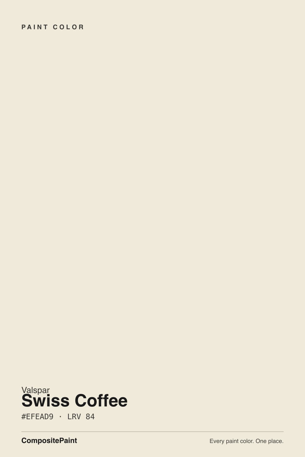
Swiss Coffee
The Lowe's warm white that borrowed a famous name, reviewed honestly: how it actually compares to the Benjamin Moore original, where it glows, and where it doesn't.

Jessica has spec'd whites and neutrals for more than 300 rooms and keeps a sample wall of painted drawdowns in her studio. Every color review is checked against real reader rooms in the comments and re-tested when a formula changes. About the testing process →
- 1First Star69
- 2Classic Gray74
- 3Swiss Coffee86.2
- 4Sleek White92
- 5Ultra Pure White97
The Fast Verdict
Valspar Swiss Coffee is a genuinely good warm white that happens to share a name with the most famous cream white in the business. It is not that paint in a different can — Valspar mixes its own formula, and it comes out cleaner and less muted than Benjamin Moore's version, with the same LRV 86.2 glow but a slightly brighter, less yellow personality. If you searched "Swiss Coffee" and landed at Lowe's instead of a BM dealer, you did not settle for a knockoff. You got a different, perfectly capable white.
Whole-house walls + trim for anyone already shopping Lowe's · warm oak and walnut floors · kitchens that want a soft, cream-leaning cabinet white · north rooms that need a touch more warmth than a stark white
You specifically want the Benjamin Moore original for a designer-matched project · your room already runs warm and yellow · your counters are cool white quartz or blue-grey stone · you want a crisp, high-contrast modern white
- Clean, warm cream white — brighter and less muted than the more famous Swiss Coffee
- LRV 86.2 hides scuffs and handprints better than a stark trim white
- Flatters warm oak, walnut and brass without reading yellow
- A dependable, widely available whole-house neutral at Lowe's prices
- Works as both a wall color and a trim white in the same can
- Gets confused with the Benjamin Moore original — they are not the same paint
- Goes flat and plain in dim, north-facing rooms with no warm light
- Looks dingy next to a brighter, cooler-toned trim white
- Not the pick if you specifically need a designer-matched BM chip
What Color Is Swiss Coffee, Really?
This is the color mix-up that happens more than paint brands like to admit: "Swiss Coffee" is a name, not a formula, and at least four major brands sell a color under it. Benjamin Moore's OC-45 is the famous one — a soft, muted cream that has been a go-to trim white for decades. Valspar's version, sold exclusively at Lowe's, is a separate mix that reviewers who have held both chips side by side describe as reading warmer, cleaner and brighter, with less of the grayed-down muting that makes BM's version so quiet. Same name, same general idea, genuinely different paint.
At LRV 86.2 it sits in the same brightness band as its BM namesake and reflects most of the light that hits it without going stark. That LRV is exactly what makes a warm white useful: bright enough to work as a whole-house neutral, warm enough to soften shadows and flatter wood instead of looking clinical. Because it reads a step cleaner than the muted original, it holds up slightly better in rooms that get less direct sun — the extra clarity reads as "bright cream" instead of "dingy" where a more muted white might start to look flat.
Undertone in one line: warm cream with a soft beige base — noticeably cleaner and less yellow-muted than most Swiss Coffee formulas from other brands, never pink, never green. If your sample looks flat or gray, that is your light, not the paint; if it looks distinctly peachy, that is west sun or warm bulbs doing exactly what warm bulbs do to any cream white.
Where It Shines
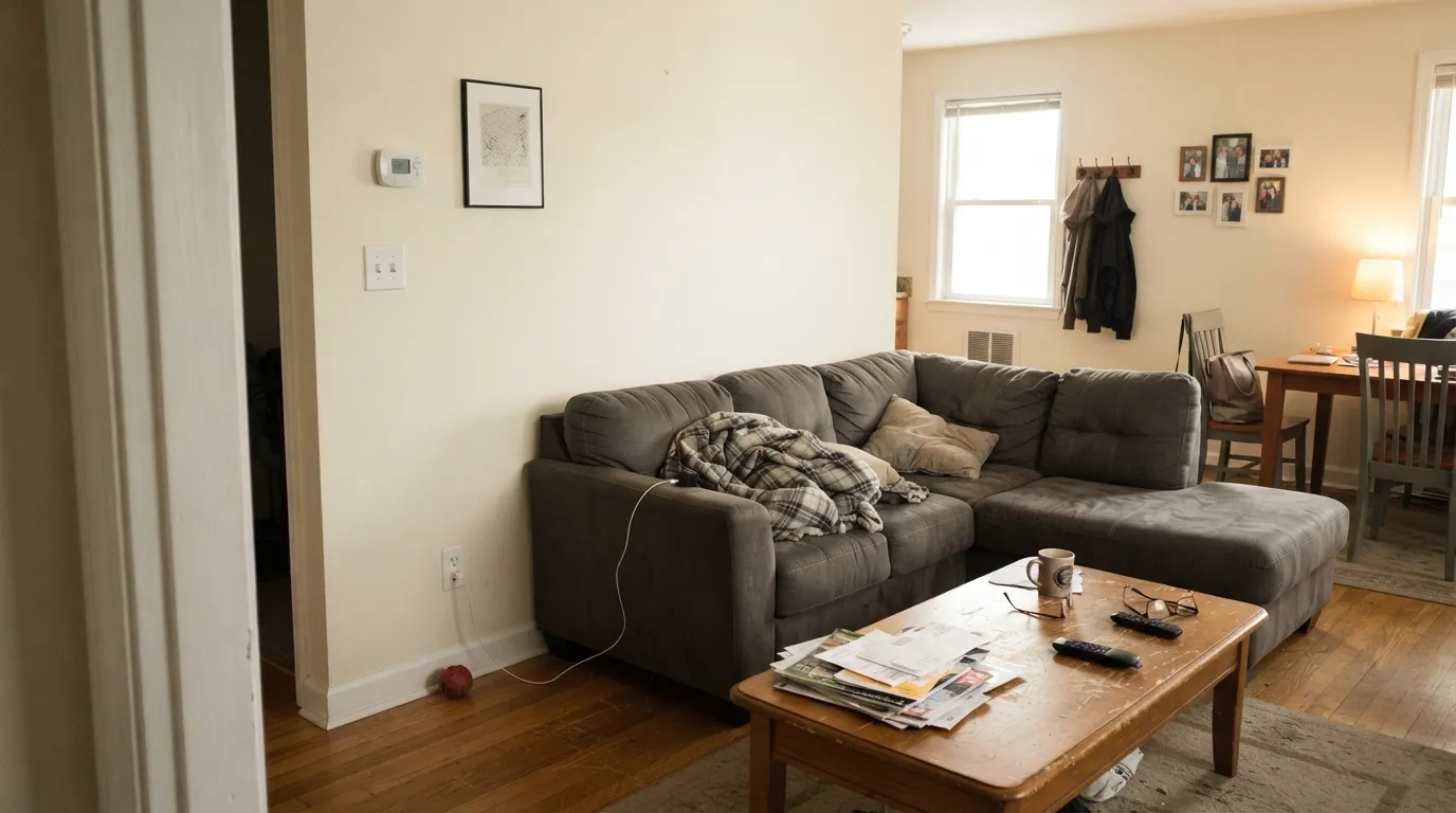
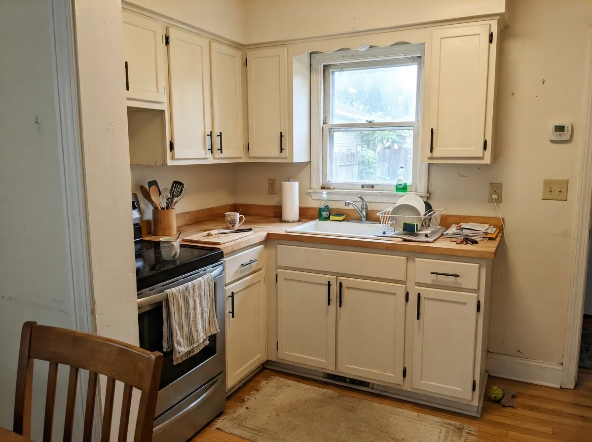
Give it real daylight and warm materials and it does what every good cream white does: recede just enough to let the room's real decisions — wood, brass, fabric — do the talking. Because it runs a touch cleaner than the more famous version of its name, it is a forgiving whole-house choice for buyers who want "a nice warm white, nothing fussy" without paying designer-brand prices. Kitchens are its strongest room: on cabinets it plays well with butcher block and warm hardware, and the LRV 86.2 base hides everyday scuffs and handprints far better than a stark white would.
Where It Fails
Almost every disappointed review of this color traces back to one of three situations, and none of them are really about the paint. If your project matches one of these, either adjust the plan or pick a different white — more coats will not fix any of them.
The single most common letdown is not about the paint on the wall — it is expecting Valspar's can to be a repackaged Benjamin Moore OC-45. It is not. Each brand mixes its own "Swiss Coffee," and Valspar's reads cleaner and less muted than BM's famous, grayed-down version. If a designer specified the Benjamin Moore original for a matched project, get it from a BM dealer — Lowe's Valspar version is a good white, not a substitute chip.
Like any warm white built on a cream base, it needs real light to hold its warmth. In flat, cool daylight the color settles toward a plainer, slightly flat off-white. It is not a failure of the paint — it is what every cream white does in cold light. Add warm 2700K bulbs or accept the quieter, less cream version of the color.
Pair these walls with a stark, blue-leaning trim white and the walls will look faintly dingy by comparison — the classic warm-white-next-to-cool-white mistake. Keep the whole room in Swiss Coffee at different sheens, or step the trim only slightly brighter within the same warm family (Valspar Ultra White, not a cool contractor white).
Room by Room
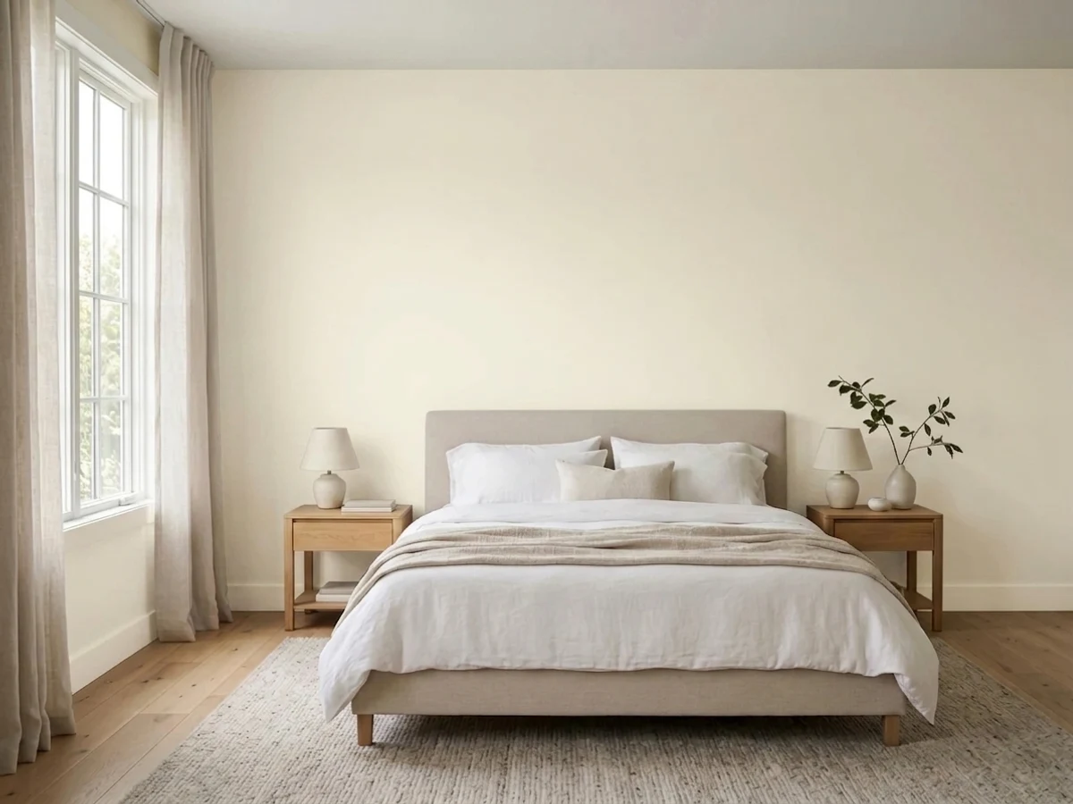
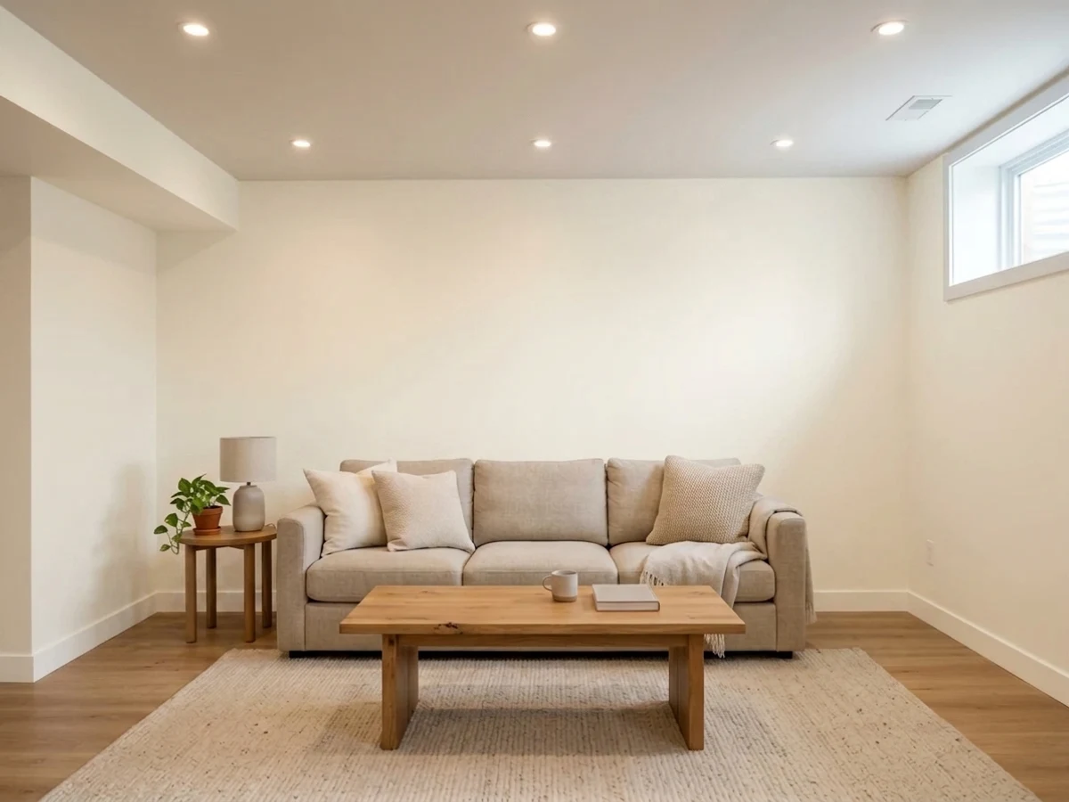
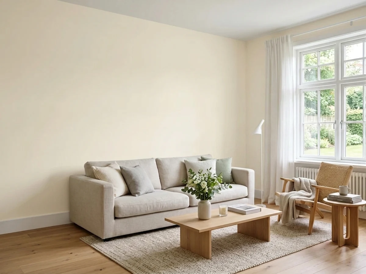
With decent daylight it is a calm, forgiving backdrop for wood furniture and mixed metals. Eggshell on the walls, semi-gloss on trim in the same color for the one-color-room look.
Warm counters, butcher block, brass or black hardware all sit well against it. Satin cabinet enamel wipes clean and hides the daily fingerprints around handles better than a brighter, starker white would.
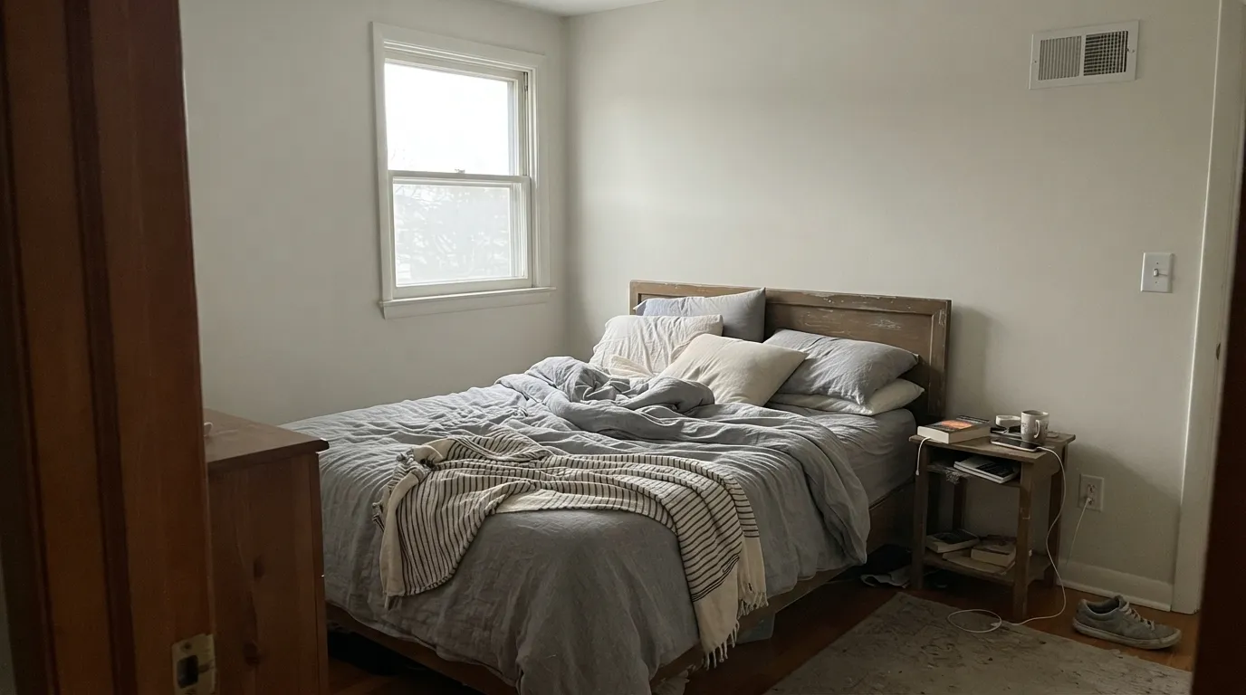
Under 2700K lamps it turns gently cozy at night without going dark. If the room is genuinely dim and north-facing, expect a flatter, less cream read during the day.
With warm-toned tile, wood vanities and brass fixtures it is quietly good. With cool grey marble or blue-white subway tile it starts to argue — sample first before committing a whole bath to it.
Semi-gloss Swiss Coffee trim under a mid-tone wall color (greige, sage, navy) softens the contrast the way a stark white cannot. It is a common, dependable choice on Lowe's paint counters for exactly this job.
Full sun reads it brighter and cleaner than indoors. Paired with black or charcoal trim it reads modern-farmhouse; paired with a bright cool white trim it can look slightly washed out by comparison, so keep exterior trim in the same warm family or go dark instead.
Your Light Is the Risk
The cream reads clean and bright without tipping yellow — its strongest, most flattering light.
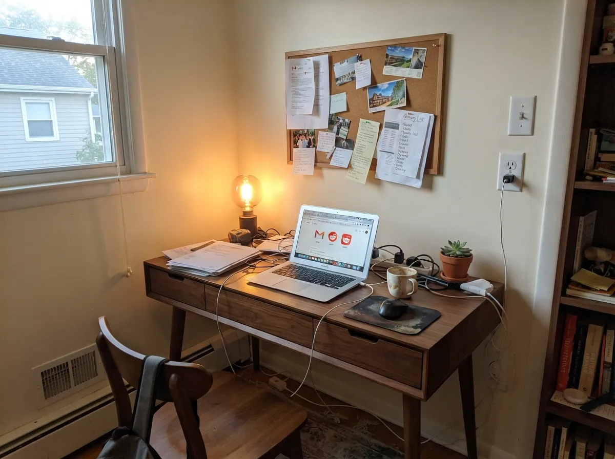
Cool, flat daylight strips the warmth and leaves a plainer off-white. Test a sample before committing a whole room.
Warmer and creamier at the sun hours, quieter and more neutral once the direct light passes.
2700K warm bulbs deepen the cream and make it cozy at night; cool white LEDs flatten it — swap the bulb before you swap the paint.
Most complaints about Swiss Coffee are a light mismatch. Upload a photo of your actual room and see it on your walls — then ask for the same wall in north light or evening lamps before you buy a single sample.
Need It From Another Brand?
Any paint counter can custom-tint Valspar 7002-16 directly. If you would rather stay in one brand's own deck, these are the closest stock matches, measured as ΔE2000. Under 2 is a difference you will not see on the wall.
| Brand | Closest color | ΔE | LRV | |
|---|---|---|---|---|
| Sherwin-Williams | Arcade WhiteSW 7100 · Sherwin-Williams | 1.7 | 86 | Color page → |
| Behr | Fuji SnowT11-13 · Behr | 0.5 | 86 | Color page → |
| Benjamin Moore | SteamAF-15 · Benjamin Moore | 0.8 | 84 | Color page → |
| PPG / Glidden | Cotton TailPPG0998-1 · PPG / Glidden | 0.5 | 87 | Color page → |
| Glidden | Muslin White82YY 85/038 · Glidden | 0.0 | 85 | Color page → |
| Dutch Boy | Simplified White020W · Dutch Boy | 0.5 | 86 | Color page → |
Similar Valspar Colors
The nearest shades to Swiss Coffee within Valspar's own range, ranked by perceptual color distance — useful when you want the same look a touch lighter, darker, or warmer.
WCAG 2.1: AA is 4.5 : 1 for normal text, 3 : 1 for large text, AAA is 7 : 1.
Swiss Coffee vs the Colors You're Also Considering
Every Swiss Coffee sample board has the same rivals on it. The numbers show the real lightness gap — then it comes down to which risk you would rather live with.
Pick this if you're already at Lowe's and want the same warm-white idea with a cleaner, brighter read.
Benjamin Moore OC-45 · LRV 84Swiss CoffeePick this if your project needs the famous, more muted original — for a designer-matched job, the two are not interchangeable.
Pick this when you want more visible cream and less pure-white brightness.
Valspar 7002-7 · LRV 85.1Dove WhitePick this for an even lighter, slightly cooler warm white at the same Lowe's counter.
Statuesque (7002-5) shares the exact LRV of 84 but its hex #F1ECDE reads a hair cleaner and less yellow. Choose Statuesque if Swiss Coffee looks too creamy in your light, and choose Swiss Coffee if you want the fuller warmth.
Shell White (7007-12, LRV 82) is close in lightness but slightly deeper and a touch more neutral, so it hides scuffs a little better in busy rooms while still reading as a warm white. Dover White (7007-1, LRV 81) goes one step further toward a soft antique cream and is the pick when you want the room to feel a little cozier and less bright.
All three sit within a couple of LRV points, so the practical difference is undertone, not lightness. Sample the finalists side by side, because the yellow lean is what separates them, and it only shows once the paint is on the wall.
Swiss Coffee Coordinating Colors
The rule for coordinating with this color is the same as for any clean warm white: lean into warm woods and let one dark or muted note anchor the room. It pairs comfortably with true blacks, warm browns and clean greens, and it stays out of the way of brass and walnut. These are the partners that keep showing up in rooms built around it:
Same Name, Different Paint
"Swiss Coffee" is one of the most borrowed color names in the paint industry. Benjamin Moore's OC-45 built the reputation — a muted, grayed-down cream that has been a default trim and whole-house white for decades — and at least three other major brands, Valspar included, sell their own "Swiss Coffee" that is not the same formula. This is common with generic-sounding color names; brands do not license them from each other, they just land on similar names independently.
Independent side-by-side comparisons consistently describe Valspar's version as reading warmer, cleaner and brighter than Benjamin Moore's more muted original, with less of the grey that mutes the BM version. Neither is more correct — they are simply two different paints wearing the same two words. If you are shopping by name alone at a Lowe's counter expecting the exact designer-favorite chip, that is the gap worth knowing about before you buy a gallon.
Swiss Coffee With Wood Tones and Floors
Warm wood is this color's natural partner. Oak, walnut and butcher block all sit comfortably against it because the paint's own warmth meets the wood halfway rather than fighting it. Orange-leaning builder oak in particular looks calmer next to this color than it does next to a starker, cooler white.
The flooring that needs a sample first is cool grey LVP or grey-washed wood. Because the paint leans warm, grey floors can pull it toward looking slightly yellow by contrast — not a dealbreaker in most rooms, but worth testing a large sample above the actual floor before committing a whole room to it.
Three Ready Palettes Built on Swiss Coffee
A color is never alone on the wall. These are complete combinations in the 60-30-10 pattern, with the reason each one holds together. Every one opens in the visualizer.
One color at two sheens keeps small rooms feeling continuous instead of chopped up by trim lines. The true black door supplies the one dark note the scheme needs, and it is the rare accent color that never fights a warm white.
Try this palette in your roomCocoa Dust's warm, gently muted brown grounds the island the way a Farrow & Ball tone would, Ultra White keeps the ceiling and trim crisp, and Swiss Coffee cabinets sit comfortably between the two without reading yellow against either.
Try this palette in your roomGreen Trellis leans clean green rather than muddy olive, so it pairs with Swiss Coffee's warm cream without either color turning yellow-green. Dove White trim keeps the room light without competing for attention.
Try this palette in your roomSwiss Coffee FAQ
Is Valspar Swiss Coffee the same as Benjamin Moore Swiss Coffee?
No — they only share a name. Every brand mixes its own version of "Swiss Coffee," and Valspar's, sold at Lowe's, reads cleaner and brighter than Benjamin Moore's more muted, famous OC-45. If a project specifically calls for the Benjamin Moore chip, buy it from a BM dealer; the Valspar version is a good white in its own right, not a substitute.
Is it warm or cool?
Warm — a soft, clean cream with a beige base. It never reads yellow or pink under normal light, and it stays on the warm side even in cooler light, just quieter.
What trim color goes with Swiss Coffee walls?
Swiss Coffee itself in semi-gloss is the safest match. If you want a brighter trim, stay in the same warm family (Valspar Ultra White) rather than a cool, blue-leaning contractor white, which will make the walls look dingy by comparison.
How many coats does it take?
Two coats over any existing light color is standard. Over a dark or saturated wall, prime with a tinted primer first — going straight to Swiss Coffee over navy or red will cost you a third coat you didn't plan for.
Does it work on kitchen cabinets?
Yes, and it is arguably its best use. It flatters butcher block and brass or black hardware, and the LRV 86.2 base hides scuffs and handprints better than a stark, high-brightness white. Use a satin, urethane-fortified cabinet enamel, not standard wall paint.
Does it work on exteriors?
Yes, with the right trim. Full sun reads it brighter and cleaner than indoors. Pair it with black or charcoal trim for a modern-farmhouse look, or keep exterior trim in the same warm family — a stark, cool white trim can make the body color look faintly washed out by comparison.
Have you painted with Swiss Coffee?
Rate it — one tap helps the next reader decide.
Ask a Question