Green Trellis
Valspar's 2023 Color of the Year, reviewed honestly: the nursery it was built for, the light that flattens it to gray, and how much deeper it lands than the chip.

Jessica has spec'd whites and neutrals for more than 300 rooms and keeps a sample wall of painted drawdowns in her studio. Every color review is checked against real reader rooms in the comments and re-tested when a formula changes. About the testing process →
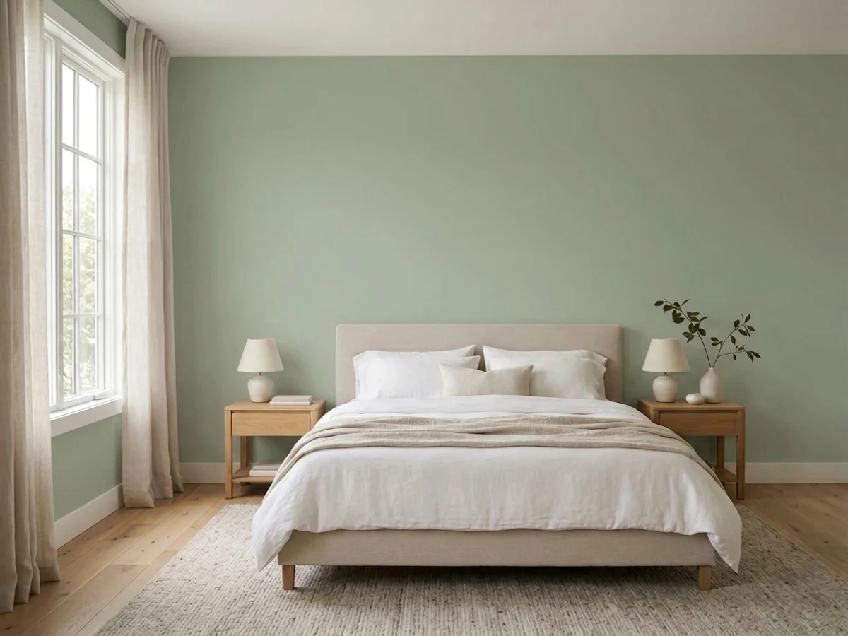
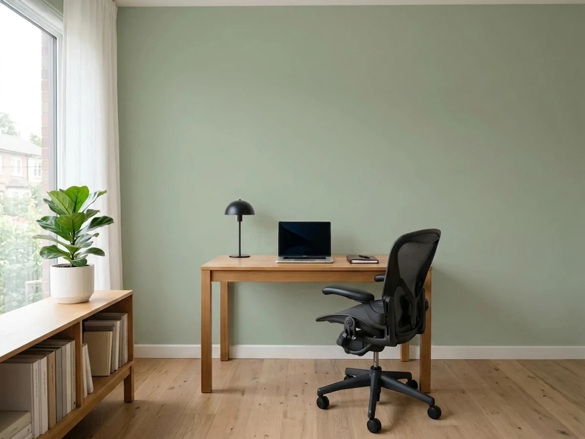
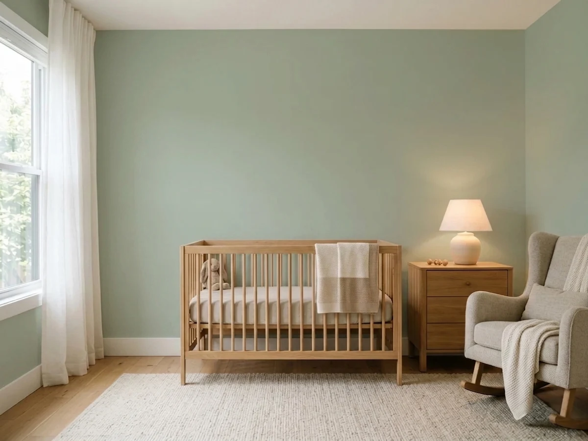
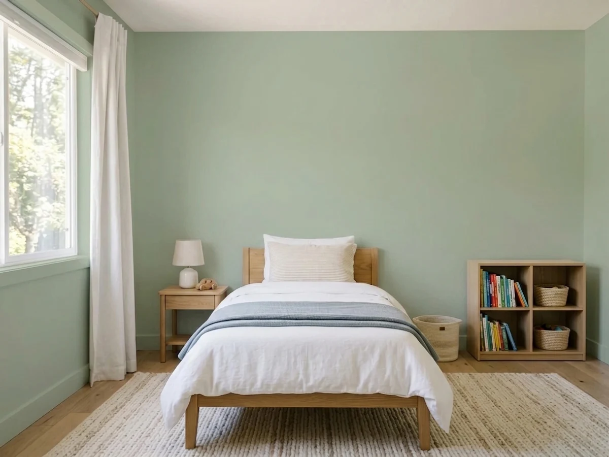
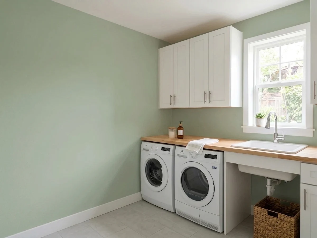
- 1Sage Green22
- 2Evergreen Fog30
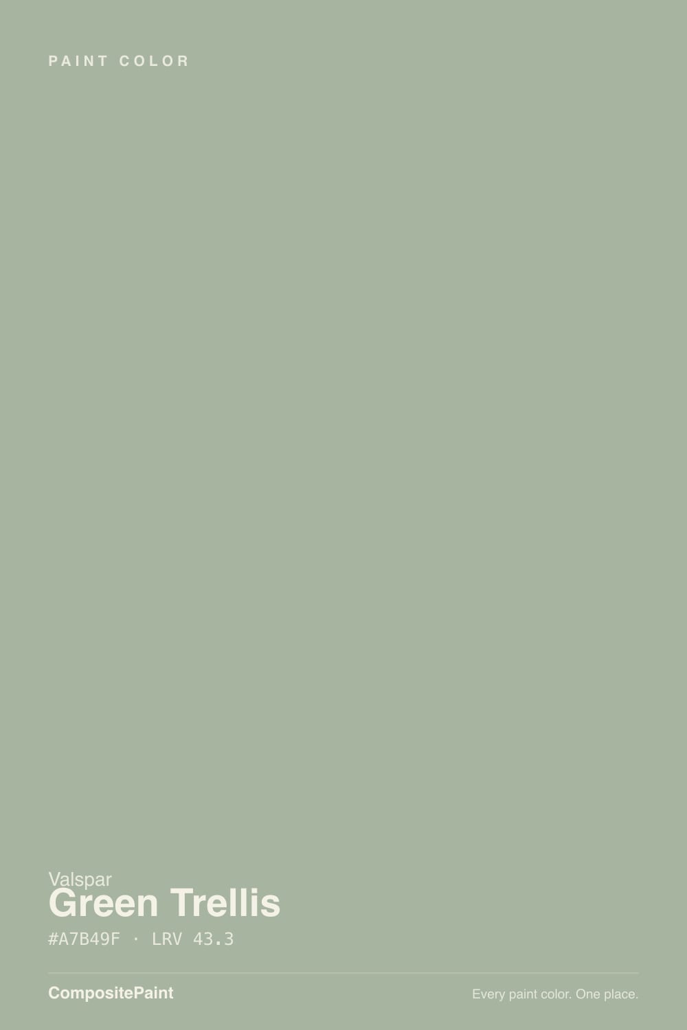
- 3Green Trellis43.3
- 4Softened Green49
- 5Soft Fern57
The Fast Verdict
Green Trellis is the rare muted green that is actually green. Most bestselling sages lean olive — yellow-gray with a green rumor — while this one sits a clear step closer to true green, quiet but unmistakable. Valspar named it one of its 2023 Colors of the Year under the heading "calm," and its own nursery project page still leads with it.
The catch is depth: at LRV 43.3 it is a mid-tone, not the pale baby green most people picture from the chip.
Nurseries and kids' rooms that should stay calm · bedrooms with real daylight · small bathrooms and laundry rooms · an island or a run of cabinets · anyone who found every other sage too olive
You want a pale, barely-there green · the room is small, north-facing and dim · your trim and floors are honey oak · the house runs on 4000K LEDs · you need one coat and no touch-ups
- A muted green that actually reads green, not olive or khaki
- The rare nursery color that still looks right ten years later
- Deep enough (LRV 43.3) to hold its color on a gray afternoon
- Small rooms — baths, laundries, powder rooms — take it easily
- Tinted at any Lowe's paint desk, in any Valspar line and sheen
- Lands a full step deeper than the chip suggests
- Flattens to a gray-green in dim north light and cool LEDs
- Fights honey oak trim and golden beige carpet
- Expect two full coats over white — the one-coat claim rarely holds for mid-tone greens
What Color Is Green Trellis, Really?
A softly muted green with a genuine green core — and that core is the whole reason to pick it over the famous sages. Measure Green Trellis against Sherwin-Williams Clary Sage or Benjamin Moore October Mist and the difference is not depth, it is direction: those two carry more yellow than green, which is why they read olive and khaki on a wall. Green Trellis carries roughly as much green as yellow, so it lands on the green side of sage. Valspar's own language for it — a hazy green tied to the feeling of calm — is unusually accurate marketing. It was one of twelve 2023 Colors of the Year, and it is still the green Valspar puts on its nursery project page.
At LRV 43.3 it is a real mid-tone, and this is where most surprises come from. A two-inch chip in a bright store looks like a pale nursery green; four walls of it read a full step deeper and noticeably more colored, because depth multiplies saturation. That is not a defect — it is why the color still looks like something at 4pm on a gray day, when a pale green would have vanished into the drywall. But if you are picturing the barely-there green from a baby-shower mood board, sample a big board on the actual wall before you buy the gallon.
Undertone in one line: green first, a soft yellow second — no blue in it. If your sample looks gray-green, your light is cool and it has drained the yellow half; if it looks olive, that is warm afternoon sun or a 2700K bulb pushing the yellow forward. Both are the same paint reacting honestly to the room.
Where It Shines
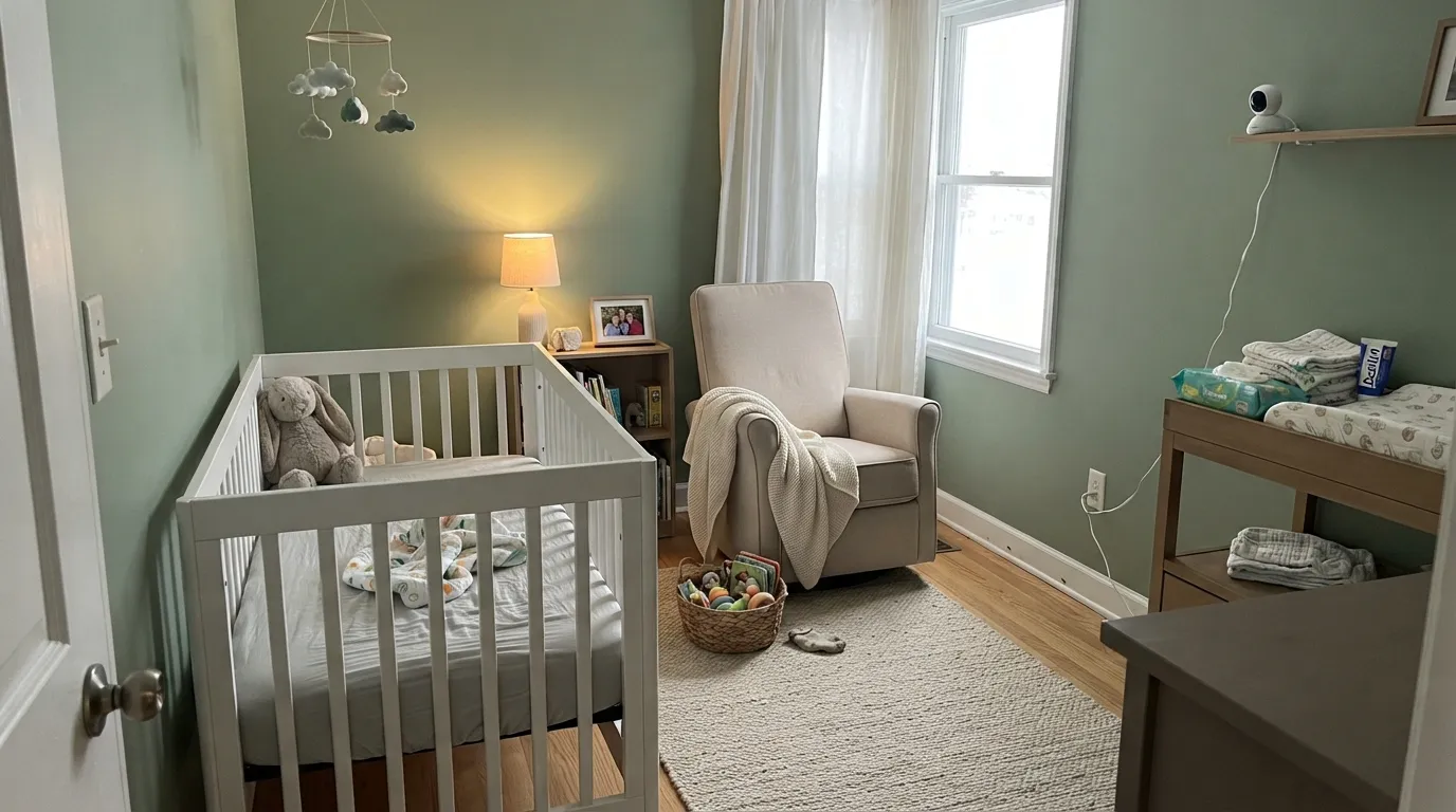
This color was made for rooms you want to feel quiet in, and the nursery is its home turf — green is the one hue that reads calm without reading like a theme, and Green Trellis has enough body to hold its own against a white crib and white trim instead of disappearing behind them. Its second strength is the small room: a windowless-ish laundry, a hall bath, a powder room, where a mid-tone green stops feeling like a decision and starts feeling like the room's actual color. Give it warm white trim, natural cane and rattan, white oak, and unlacquered brass, and it looks considered rather than trendy.
Where It Fails
The bad reviews of Green Trellis are remarkably consistent, and every one of them is predictable before the first coat. None of the three are the paint failing — but if your room matches one, sampling bigger will only confirm it faster.
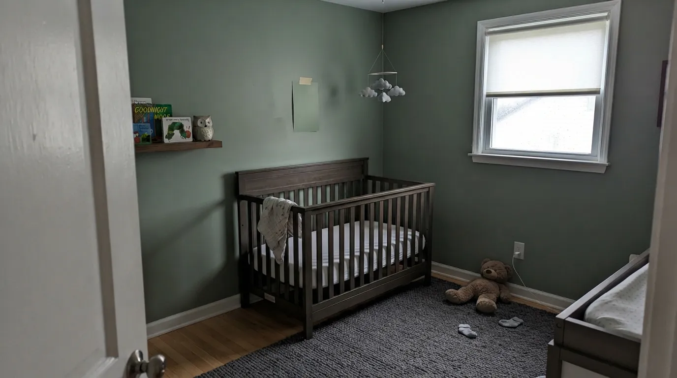
This is the number-one regret, and it is an LRV problem, not a color problem. At 43.3 the walls come out a real green — visible from the hallway, clearly deeper than the chip. In a small nursery with one window, a dark-stained crib and a dark rug, the room can close in fast. Want the pale version of this feeling? SW Sea Salt at LRV 63 is the honest alternative.
Red-orange sits opposite green on the wheel, so orange-toned oak trim, golden builder floors and yellow-beige carpet all push the walls greener while the walls push the wood more orange. Everyone loses. Green Trellis wants white oak, walnut, painted trim, or a big rug between it and anything golden — with wall-to-wall honey oak, pick a warmer olive-leaning sage instead.
Cold light strips the yellow half out and leaves a flat gray-green that owners describe as institutional — the "I wanted sage and got hospital wall" complaint. The fix is cheap: 2700K to 3000K bulbs and a lamp in the corner are part of this paint job. If the room is dim and you will not add warm light, this is not the green for it.
Room by Room
Calm without being a theme, and neutral enough that it does not need to be repainted when the baby turns four. Eggshell walls, warm white trim, a white crib to keep the room feeling light. The one rule: keep the rug and the furniture pale, because a dark crib plus mid-tone walls is what makes a small nursery feel closed in.
This is the strongest argument for the color. A green at LRV 43.3 survives the whole arc from crib to homework desk to teenager who hates everything you chose, because nothing about it is babyish. Eggshell for wipeability; expect to touch up around light switches.
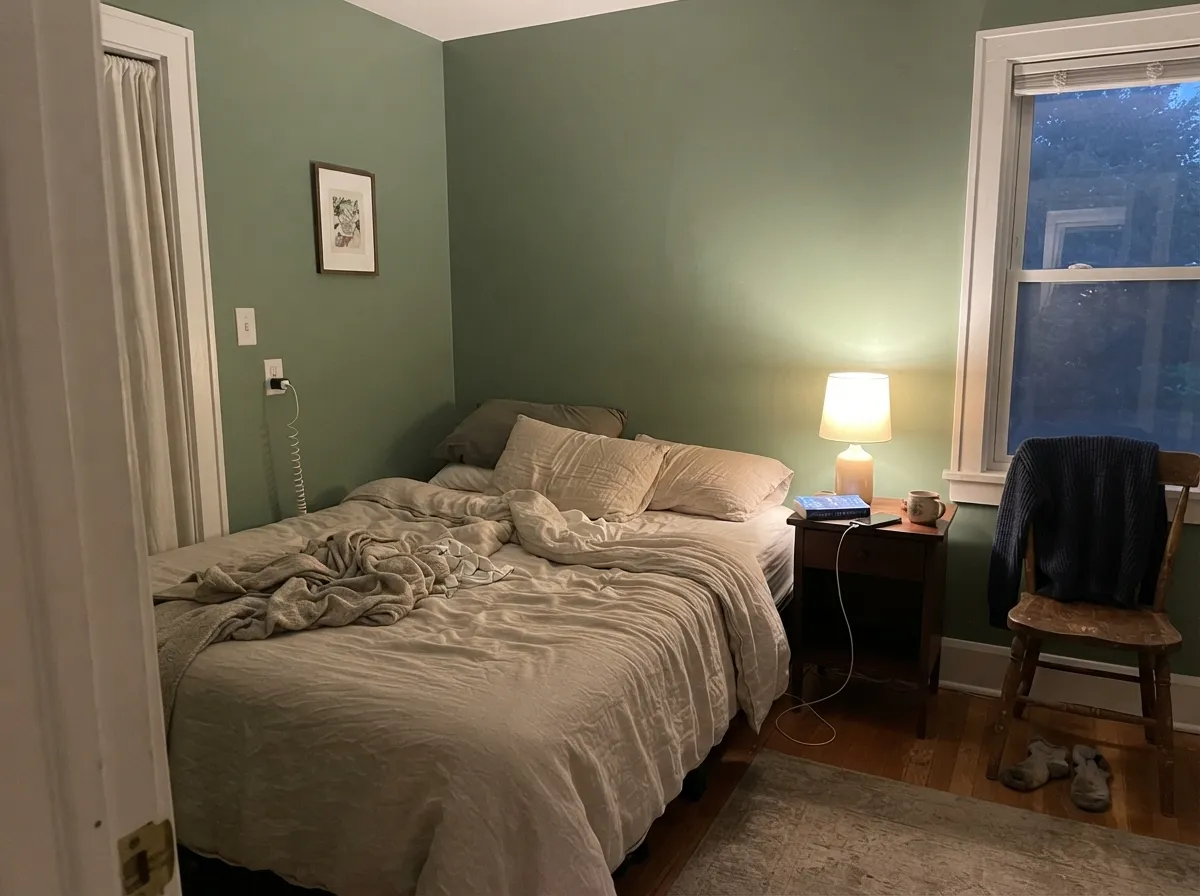
In a room with a decent window it is restful in a way gray never manages, and it flatters cream and oatmeal bedding. Under 2700K lamps at night it warms toward olive — most people like that shift. In a dim north bedroom with no lamps, it flattens; see the fails above.
A hall bath with white subway tile and a laundry room with white uppers are two of the easiest wins here: small rooms carry mid-tone color happily, and green next to white tile reads fresh rather than dated. Eggshell, not flat, so steam and splashes wipe off.
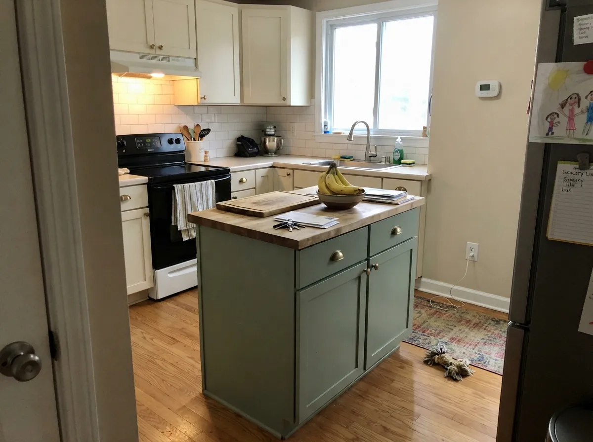
Green cabinets are a genuinely good use of this color, and at LRV 43.3 it is a lighter, friendlier cabinet green than the deep ones — an island or a bank of lowers under warm white uppers looks custom. Use a satin cabinet enamel, not wall paint. A whole kitchen of it is a much bigger bet, and a bad one over golden oak floors.
In an open main floor it works only if the adjoining rooms are warm neutrals, because a mid-tone green needs somewhere to hand off to. Outside is the real no: full sun bleaches low-chroma greens and Green Trellis reads washed-out gray-green from the curb, where a deeper exterior green would hold. The exception nobody argues with is a shaded porch or a shutter, not the whole body of the house.
Your Light Is the Risk
Even, strong sun is where the green reads cleanest and freshest — clearly a color, still quiet. This is the light the nursery photos were shot in.
Cool gray daylight drains the yellow and leaves a flat, chalky gray-green. Fine if you half-wanted gray; disappointing if you wanted green.
Cool and slightly grayer in east morning light, then noticeably warmer and more olive when late-afternoon west sun hits it. Sample the wall you will look at most.
2700K warm bulbs pull it toward olive and make it cozier; 4000K and cooler LEDs push it gray and slightly clinical. 3000K is the safe middle for a nursery.
Most complaints about Green Trellis are a light mismatch. Upload a photo of your actual room and see it on your walls — then ask for the same wall in north light or evening lamps before you buy a single sample.
Need It From Another Brand?
Any paint counter can custom-tint Valspar 5006-3C directly. If you would rather stay in one brand's own deck, these are the closest stock matches, measured as ΔE2000. Under 2 is a difference you will not see on the wall.
| Brand | Closest color | ΔE | LRV | |
|---|---|---|---|---|
| Sherwin-Williams | Cascade GreenSW 66 · Sherwin-Williams | 3.5 | 43 | Color page → |
| Behr | ConfederateN370-4 · Behr | 2.2 | 43 | Color page → |
| Benjamin Moore | Garden Path466 · Benjamin Moore | 1.1 | 43 | Color page → |
| PPG / Glidden | GargoylePPG1127-4 · PPG / Glidden | 1.6 | 43 | Color page → |
| Glidden | GargoylePPG1127-4 · Glidden | 1.9 | 43 | Color page → |
| Dutch Boy | Foggy Gray424-2DB · Dutch Boy | 3.0 | 45 | Color page → |
Similar Valspar Colors
The nearest shades to Green Trellis within Valspar's own range, ranked by perceptual color distance — useful when you want the same look a touch lighter, darker, or warmer.
WCAG 2.1: AA is 4.5 : 1 for normal text, 3 : 1 for large text, AAA is 7 : 1.
Green Trellis vs the Colors You're Also Considering
Every Green Trellis sample board has the same rivals on it. The numbers show the real lightness gap — then it comes down to which risk you would rather live with.
Pick this when every sage you sampled looked khaki and you wanted the green to actually show.
Sherwin-Williams SW 6178 · LRV 41Clary SagePick this for the olive-leaning version at almost the same depth — an easier sage that gets along better with warm oak.
Pick this for more actual green and a touch more light on the wall.
Benjamin Moore 1495 · LRV 39October MistPick this if you want the grayer, more neutral sage that behaves almost like a greige — the safest of the group, in a room with real daylight.
Green Trellis Coordinating Colors
The rule for coordinating with Green Trellis: warm whites and creams on the trim, one deeper green or a soft near-black for weight, and nothing golden touching it. It gets along with cream far better than with beige, loves white oak and cane, and takes brass hardware better than chrome. These are the partners that keep showing up in rooms that work:
The Color of the Year Badge, Read Honestly
Green Trellis was named a Valspar Color of the Year for 2023, filed under the feeling of calm. Worth knowing what that badge means at Valspar: unlike brands that crown a single color, Valspar names twelve at once, each matched to an emotion — comfort, balance, joy, calm. So the title is real, but it is a shortlist, not a coronation. What it does tell you is that Valspar's color team believed this green would sell for years rather than for one season, and three years on it is still the green sitting on their own nursery project page.
The timing also explains why it feels familiar. Green Trellis arrived at the peak of the muted-green wave that Sherwin-Williams and Benjamin Moore had both just leaned into with their own 2022 picks — Evergreen Fog and October Mist. Those two went gray and olive; Valspar went greener. If you sampled the famous sages and quietly thought they looked like dust, this is the version of that trend you were looking for, and it is the least likely of the three to be mistaken for a neutral.
Green Trellis With Wood Tones and Floors
The floor decides this one. White oak, pale engineered wood, natural cane and rattan, and walnut all sit comfortably against Green Trellis — the first three because they share its quiet warmth, walnut because the dark red-brown makes the green look deliberate instead of soft. Gray-washed LVP is safe and gives a cooler, more modern read. Cream carpet is fine; a jute or wool rug in oatmeal is the easiest nursery choice there is.
The one genuine no is golden. Honey oak trim, orange-stained doors and yellow-beige carpet sit opposite green on the color wheel, so each side exaggerates the other and the room ends up looking like a fight between the floor and the walls. If the golden floor is staying, either paint the trim a warm white to break the two apart, put a large pale rug between them, or pick an olive-leaning sage like Clary Sage that meets the wood halfway.
Metals are simple: unlacquered brass, antique bronze and matte black all flatter it. Polished chrome and cool nickel are the two that make it look gray.
Three Ready Palettes Built on Green Trellis
A color is never alone on the wall. These are complete combinations in the 60-30-10 pattern, with the reason each one holds together. Every one opens in the visualizer.
Soft green with a soft blush is the nursery pairing that reads calm instead of themed — First Light is pale enough to behave like a warm off-white, so it never turns the room pink. White Dove keeps the trim warm; a bright stark trim white would make the walls look dull by comparison and cost the room its softness.
Try this palette in your roomThree colors, one counter, one trip. Ultra White is the brightest workhorse white on the Lowe's shelf and belongs exactly here — on trim, where its crispness frames the green instead of competing with it on four walls. Dark Kettle Black is a true neutral black with no blue or green in it, so one door or one bookcase gives the scheme a spine without dragging a second undertone into the room.
Try this palette in your roomCream and green is the oldest working kitchen pairing there is, and Swiss Coffee's softness keeps the room from going cold above mid-tone cabinets. Wrought Iron is the softest near-black in the deck and sits on a green-gray base itself, so the dark note stays inside the same family instead of announcing itself. Unlacquered brass over chrome for the pulls.
Try this palette in your roomGreen Trellis FAQ
Is Green Trellis too dark for a nursery?
It is darker than most people expect, but not too dark for a nursery with a window. At LRV 43.3 it reflects a bit under half the light that hits it, so the room will read as a green room rather than a white room with a green hint. Keep the crib, the trim and the rug light, use warm bulbs, and it stays calm. In a small north-facing nursery with dark furniture, step lighter — Sea Salt at LRV 63 is the usual answer.
What white trim goes with Green Trellis?
A warm white. White Dove is the soft default and keeps the whole room gentle; Valspar's own Ultra White is the crisp option if you want the green sharply framed and you are buying everything at the same counter. What to avoid is a cool blue-white — against a yellow-green wall it makes the trim look blue and the wall look dirty.
Is Green Trellis a sage or a real green?
Both, honestly — it is a muted green, so it belongs to the sage family, but it sits closer to true green than the bestsellers people compare it to. Clary Sage and October Mist both carry more yellow than green, which is why they read olive; Green Trellis is balanced enough that the green shows. If sage to you means khaki, this will look greener than you expect.
Does Green Trellis work in a north-facing room?
It works, but it changes. North light is cool and it takes the yellow half of this color away, leaving a flatter gray-green that some people love and some people call institutional. If the room is north-facing and you want the green to stay green, warm 2700K to 3000K bulbs and one lamp are not optional. If the room is north-facing and dim, pick something warmer.
How many coats does Green Trellis need?
Plan on two full coats over an existing light wall, and prime first if you are covering anything dark or saturated. Mid-tone greens are among the harder colors to get uniform in one pass, and coverage falling short of the one-coat promise is the most repeated complaint in Valspar's own product reviews — not specific to this color, but worth budgeting a second gallon for. Keep the leftover paint labeled; touch-ups on a mid-tone color show if you re-tint later.
Can I get Green Trellis in a different brand of paint?
Green Trellis is a Valspar color sold through Lowe's, and the cleanest way to buy it is at the Lowe's paint desk in whichever Valspar line and sheen your room needs. Most paint stores will also color-match it into their own base from a chip or a sample, and for a low-chroma green like this the match usually lands close — but expect a small shift, and never mix a matched batch with the original on the same wall.
Have you painted with Green Trellis?
Rate it — one tap helps the next reader decide.
Ask a Question