Valspar Orange All 205, sorted honestly.
Every orange in the Valspar Reserve / Signature deck: 205 colors, LRV 76 down to 8, grouped by undertone and depth.
All 205 Valspar Orange Paint Colors
Every orange in the Valspar Reserve / Signature deck, LRV 76 down to 8. Grouped by undertone, warm to cool. Filter by depth or change the order.
Hex values are display approximations from Valspar's published swatch tools, not a physical sample under controlled lighting. Order a brand-direct sample before specifying.
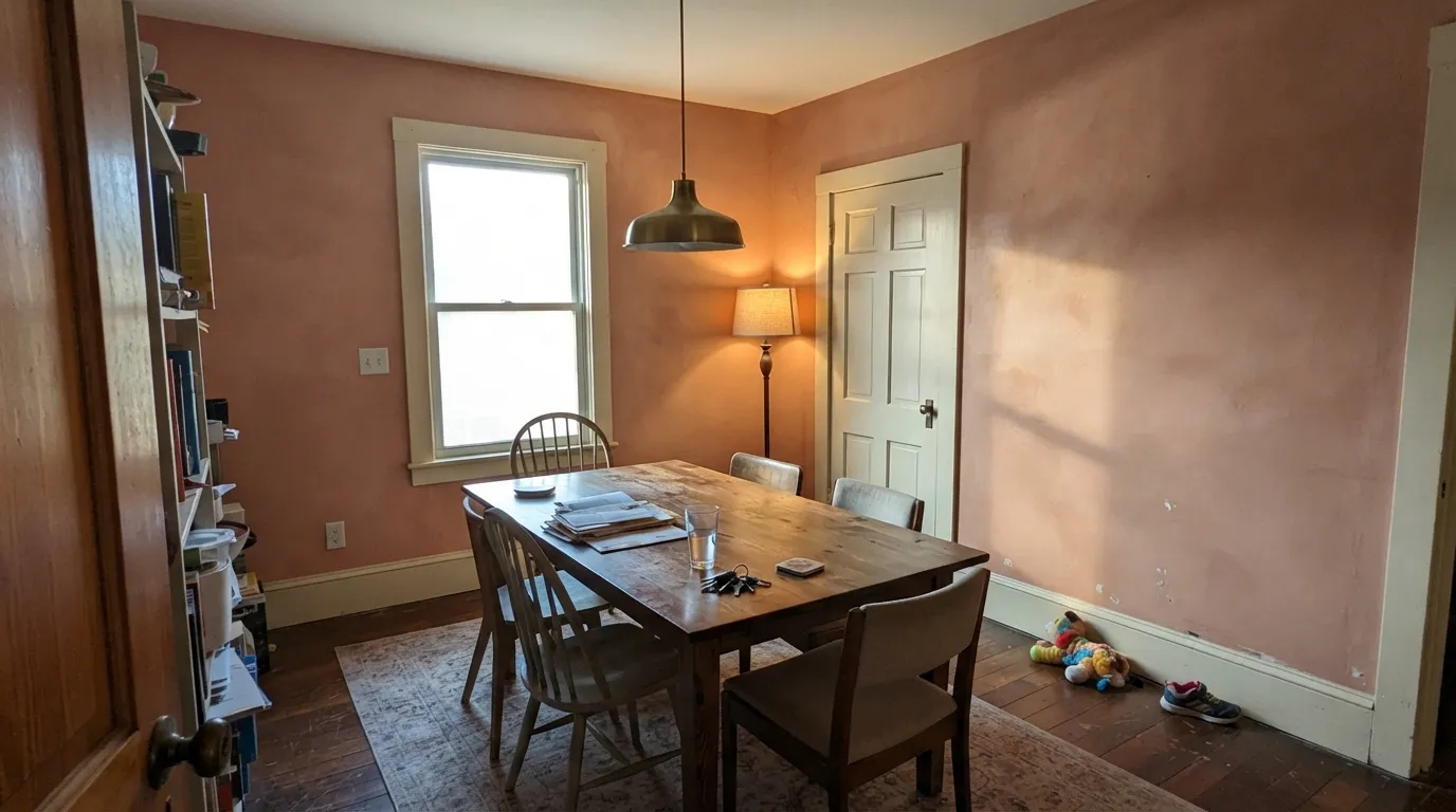
Upload a photo of the room. We paint it in the orange you chose with your light and your floor, and you can swap colors until one holds.
Valspar is sold at Lowe's and Ace Hardware. Every color here is mixed to order at the paint counter, so the swatch you choose gets tinted into the base and line you pick, usually Signature (around $40 a gallon, with ScuffShield) or Reserve (around $52, anti-microbial), with Ultra also available. Nothing on this page is a pre-bottled product sitting on a shelf; it is custom-tinted when you buy it.
Because oranges are matched by their LRV and undertone, you can cross-shop across brands. If a store carries a different line, ask them to color-match a Valspar shade by its code, or use the LRV as your anchor to find a near-twin. You can do the same with the featured Kompozit deck or other US brands. Worth knowing: Valspar and Pratt & Lambert are sibling brands, both owned by Sherwin-Williams, so a counter that handles one often knows the others.
Light to Dark
The whole Valspar orange range by depth. LRV is the number to trust: the same orange looks two steps darker on a wall than on a chip.
LRV (Light Reflectance Value) tells you how light or dark a color reads on the wall. In this orange slice it runs from 70.4 at the lightest down to 14.8 at the darkest, so there is a clear path from airy to deep. Apricot Froth (M205) at 70.4 is nearly a soft neutral and bounces a lot of light. Adobe Dusk (M145) at 22.8 reads as a rich, grounding clay tone.
A simple rule: pick higher LRV (50 and up) for full walls in small or low-light rooms, where you want the orange to feel like a warm tint rather than a statement. Mid-range picks like Safari Sun (3004-5B) at 43 or Vienna Beige (2004-8A) at 39.2 work well in rooms with good daylight. Save the lower numbers like Rouge Red (1007-1B) at 28.8 for accent walls, doors, or spaces you want to feel snug.
Valspar Orange, Room by Room
Each room page shows orange picks from every US brand side by side, so you can compare in context.
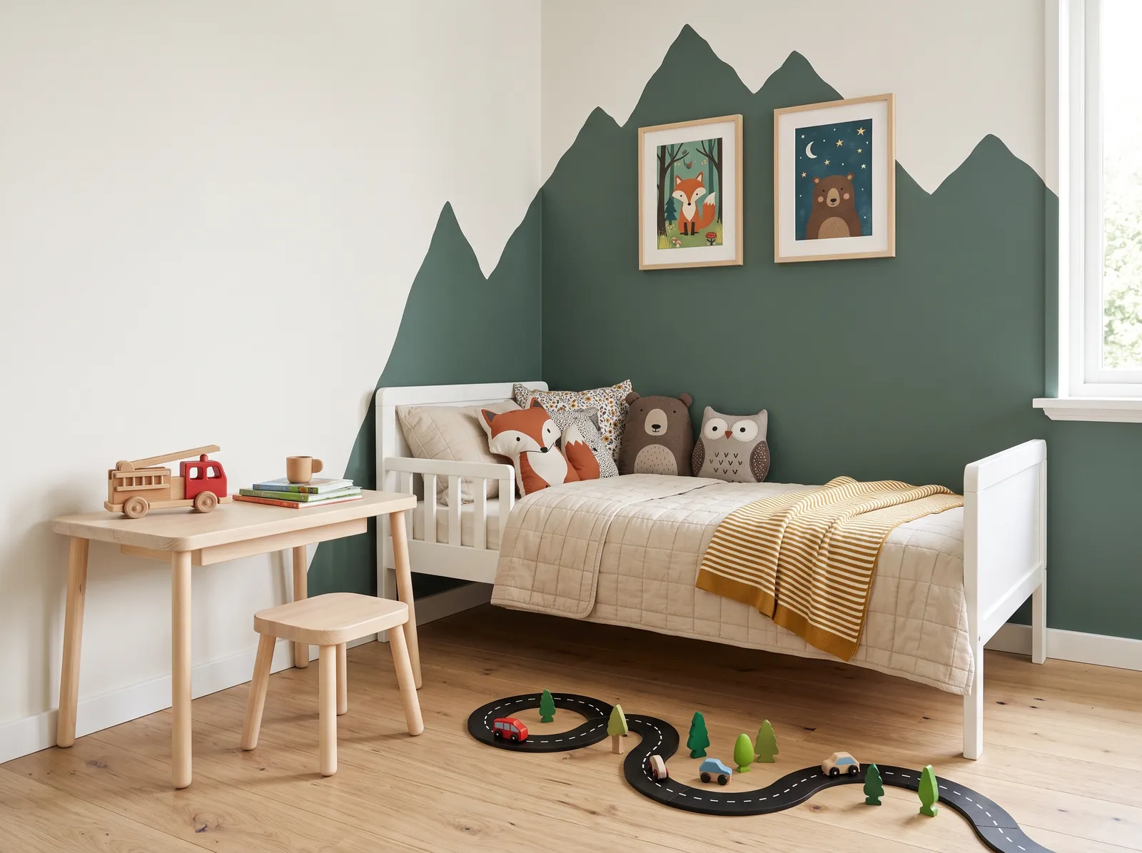
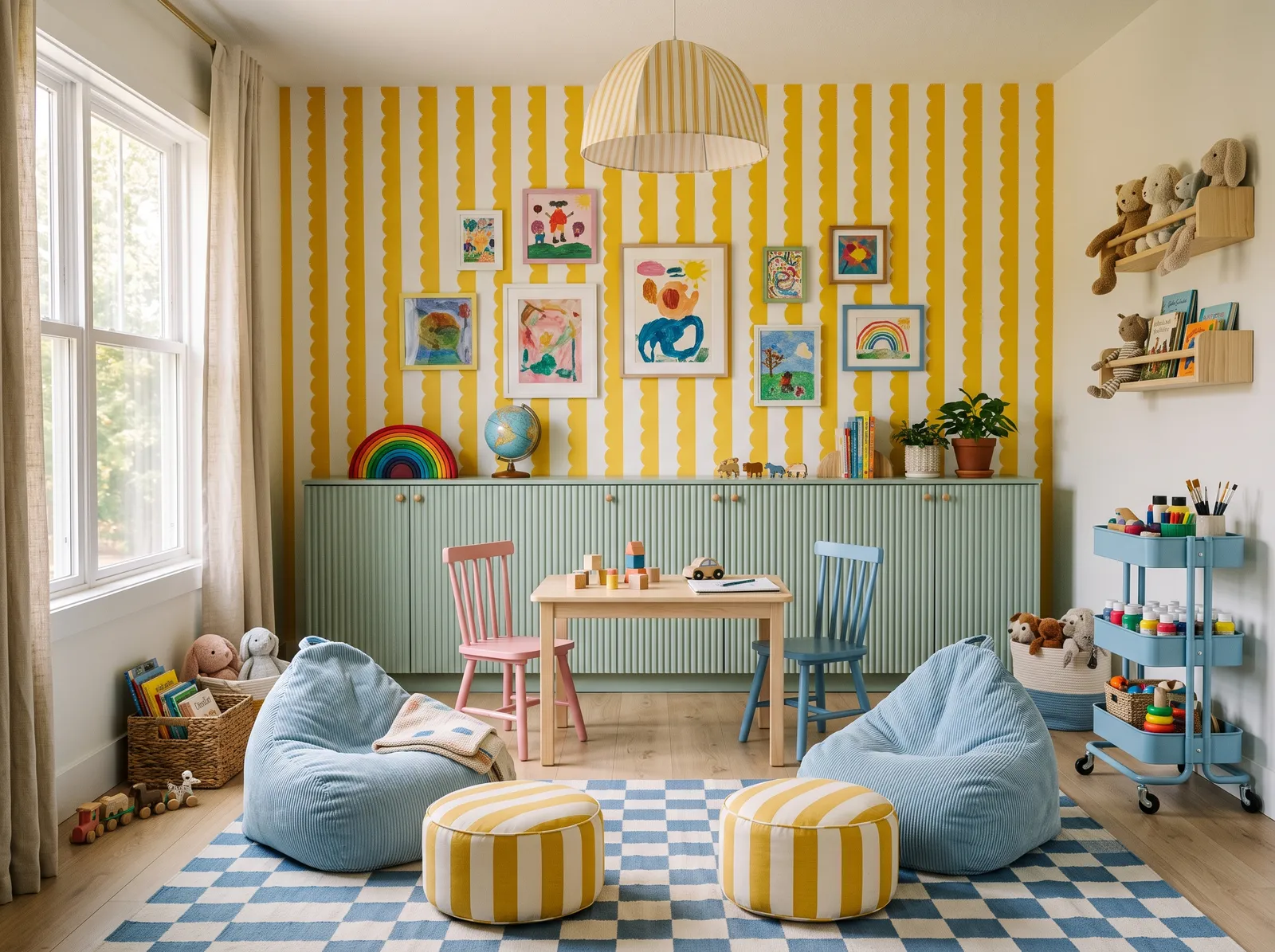
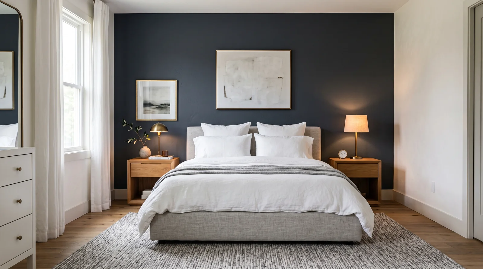
The lighter peaches and apricots are easy on bedrooms, nurseries, and bathrooms because they add warmth without taking over. Sassy Peach (2003-2A) and Apricot Froth (M205) are the kind of soft colors that read almost neutral in morning light and only show their warmth when the sun hits.
The deeper caramels and clays earn their place in dining rooms, dens, and entryways where you want a cocooning feel. Hint of Caramel (V049-5) and Adobe Dusk (M145) also pair naturally with wood, leather, and brass, so they suit rooms with a lot of natural materials. For exteriors, the terracotta-leaning shades work on doors, shutters, and accents.
How Deep Each Orange Deck Goes
How many orange colors each brand carries, drawn with that deck's own oranges from light to dark. Pick your store first, then the color. Every brand equal, no favorites.
More on Valspar orange paint colors
What Valspar's Orange Colors Are Really Like
Valspar builds its reputation on warm, livable colors, and the orange family is where that warmth comes through most clearly. These 174 oranges lean soft and earthy rather than loud. You see it in shades like Apricot Froth (M205) and Sassy Peach (2003-2A) on the light end, and Hint of Caramel (V049-5) and Adobe Dusk (M145) as you move toward terracotta and clay.
Undertones here run peach, caramel, and red-brown rather than neon. Even a name like Pouty Pink (V006-2) sits in the orange family because of its warm pink-coral cast. If you want a color that feels cozy and sunbaked instead of high-energy, this slice is a good place to start.
Pairing With Trim, Ceiling, and Coordinating Colors
Warm oranges look best against a soft white trim and ceiling rather than a stark, blue-white. A creamy or warm white keeps the whole room feeling consistent instead of fighting the orange's undertone. For a deeper wall color like Rouge Red (1007-1B) or Adobe Dusk (M145), a warm off-white trim makes the contrast feel intentional, not jarring.
For coordinating colors, lean on the brand's strength in greens and warm neutrals. A muted sage or eucalyptus green is a natural partner to terracotta, and warm grays sit comfortably next to the peachy lights. If you want a soft, livable scheme, pair a mid-tone orange with a quiet neutral rather than another saturated color.
Valspar Orange Paint FAQ
What is the most popular Valspar orange paint color?
Venetian Plaster (8002-12C) — A terracotta blush at LRV 42 with a clay-pink cast, the warm plaster tone searched for accent walls and Mediterranean-leaning rooms. round out the short list most people choose from.
How many orange paint colors does Valspar have?
This slice of the Valspar deck holds 174 colors in the orange family, ranging from soft peaches and apricots through caramels to deep terracotta and clay. The lightest reads at an LRV of 70.4 and the darkest at 14.8.
Which Valspar orange is best for a small or dark room?
Reach for a higher-LRV shade so the color adds warmth without making the space feel heavy. Apricot Froth (M205) at 70.4 or Sassy Peach (2003-2A) at 55.4 keep a small room feeling open while still reading warm.
What white trim goes with Valspar's orange colors?
A warm or creamy white works far better than a cool, blue-white. It keeps the room consistent with the orange's warm undertone instead of clashing with it, and it lets a deeper shade like Adobe Dusk (M145) feel intentional.
Are Valspar orange colors pre-made or mixed to order?
They are mixed to order. At Lowe's or Ace, the counter tints your chosen color into the base and line you pick, such as Signature or Reserve, so you are buying a custom-tinted gallon rather than a stock can.
Can I match a Valspar orange to another brand?
Yes. Use the color's LRV and undertone as your anchor, or ask a paint counter to color-match by the Valspar code. You can cross-match to other US brands or the featured Kompozit deck the same way.
What rooms suit Valspar's deeper oranges?
The caramels and clays like Hint of Caramel (V049-5) and Adobe Dusk (M145) suit dining rooms, dens, and entryways where a cozy, enclosed feel is welcome. They also pair naturally with wood, leather, and brass.
Ask a Question