Room Colors · Orange Playroom
8 Best Orange Playroom Paint Colors for 2026
ideas, combinations, and real rooms
8 curated picks from real orange playrooms — with the exact colors, honest reasons why, and the combinations that hold the room together.

Former interior stylist who can spot a green undertone from across a room. Jessica writes the color and mood pieces — what to choose, what pairs, and why your "white" looks pink.
The Fast Answer
Don't want to read 8 picks? These four are the safe answers.

Top Picks for the Orange Playroom
Tap a shade to see the orange playroom in it, then try it on your own room.
Orange Playroom Color Trends 2026 — What's In, What's Out


- Neon Halloween Orange — Candy-bright, cool-cast orange feels more novelty-costume than 2026's warmer, earthier palette.
- Orange Confined To A Single Toy-Bin Accent — Using orange only as a tiny accent is giving way to full walls or ceilings in confident, muted orange.
- Orange Paired With Stark White Only — Pairing orange strictly with bright white trim is losing ground to warmer cream and wood-tone pairings.
The 8 Best Orange Playroom Paint Colors
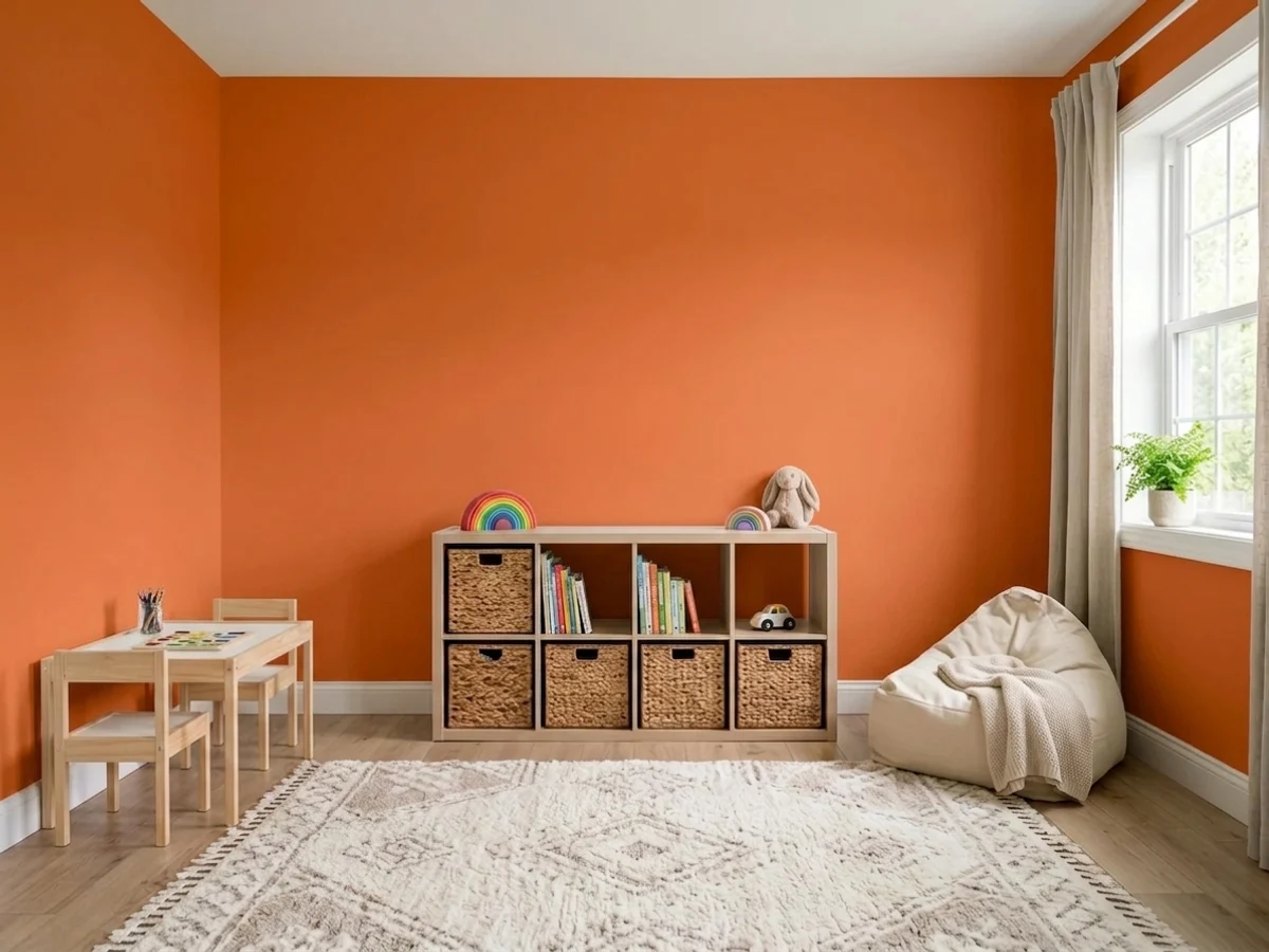
Every pick below is a real rendered orange playroom, not a chip. The lead color first; the swatches are the full scheme in the photo — walls, furniture, textiles, accent.

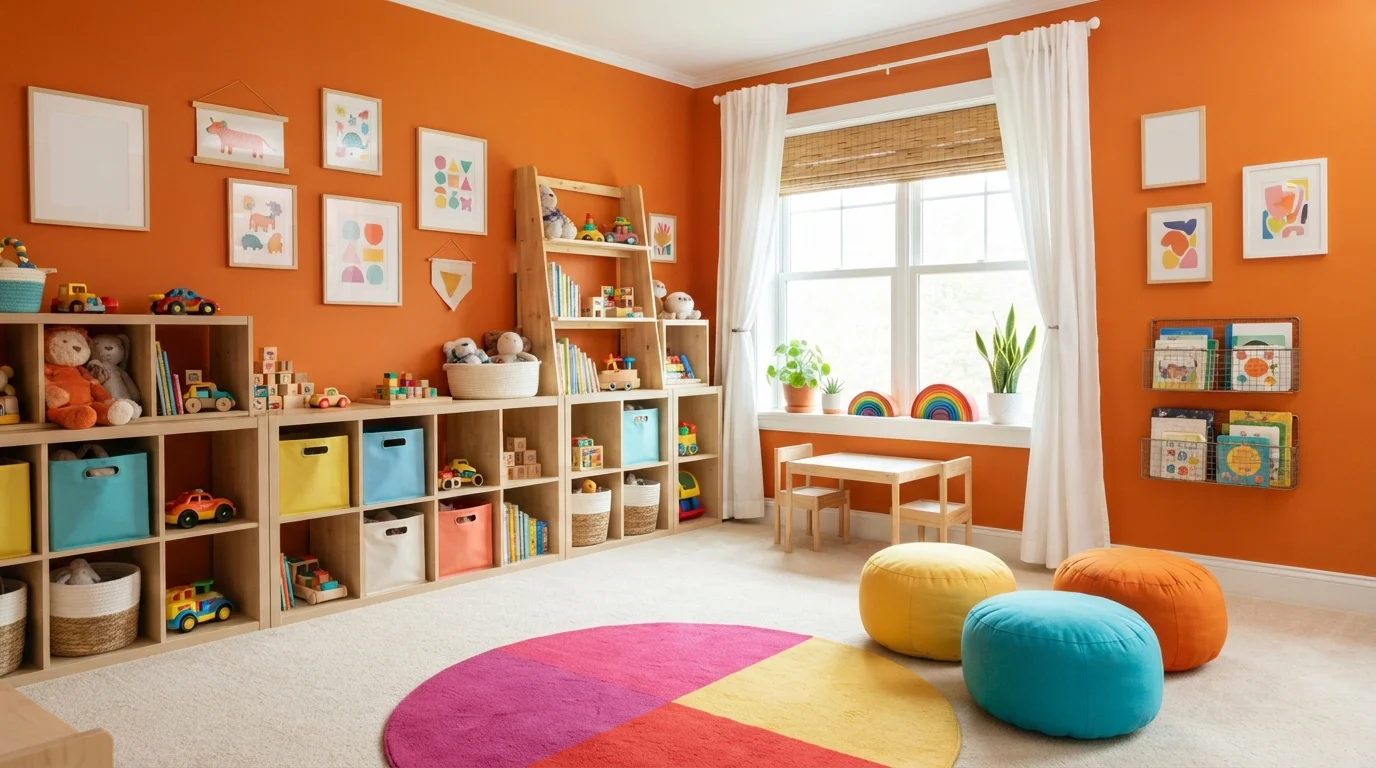
Bursting with cheerful tangerine warmth, this lively play space energizes the whole room with sun-drenched creativity.
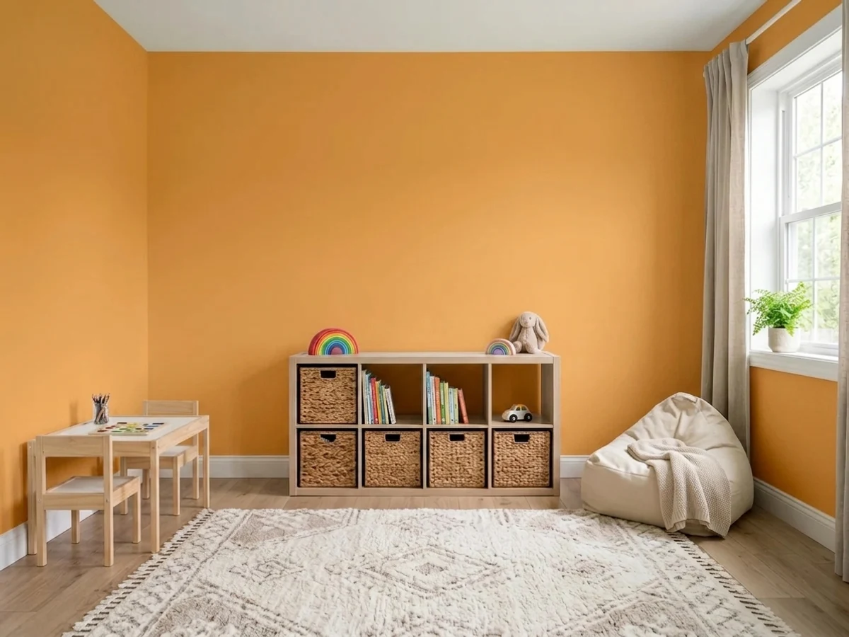
Tangerine is a bold, sunny citrus orange full of life. In this room, vivid orange coats the walls, perfectly framing natural wood storage cubbies, plush colorful floor poufs, and a graphic circular rug. The room feels intensely cheerful, sunny, and brimming with creative energy. The crisp white window dressing and soft blonde woods help ground the high-energy walls so the vibrant toy accents can shine. It is a fantastic choice for lively family spaces where play and fun take center stage.
SEE IT ON YOUR WALLS →
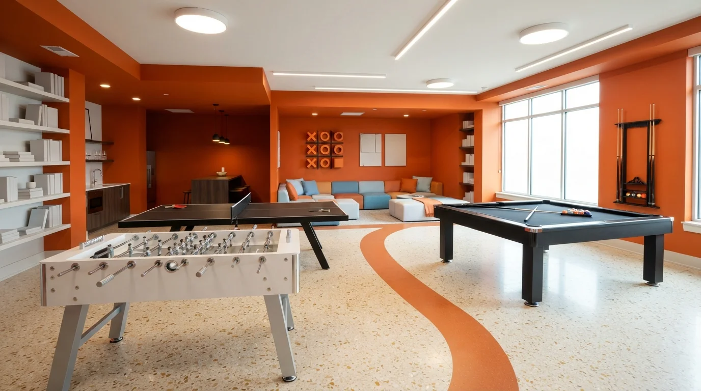
Punchy citrus orange walls inject boundless energy and lively modern style into this bright, multi-activity game zone.
Tangerine is a bold, energetic orange packed with high spirits. In this space, the vibrant citrus shade wraps the walls and ceiling drop, framing sleek black pool and ping-pong tables alongside a clean white foosball unit. The whole room feels wonderfully upbeat, modern, and ready for fun. The combination works because the neutral speckled terrazzo flooring and crisp white accents balance out the intense wall color. It's the perfect look for active basements, teen hangouts, or an ultra-creative family lounge.
SEE TROUBLEMAKER ON YOUR WALLS →
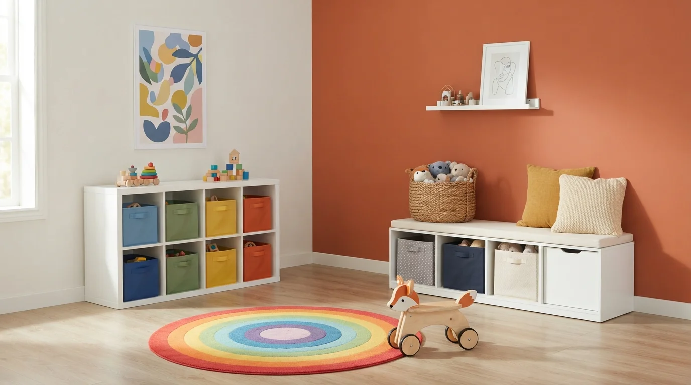
Warm terracotta walls pair with a bright rainbow rug to create a lively, imaginative space filled with playful energy.
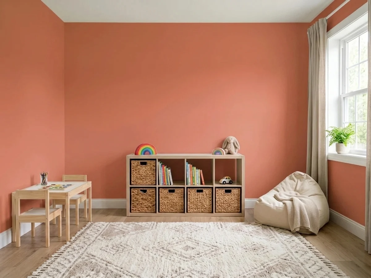
Terracotta is a rich, warm burnt-orange that adds instant heart and personality. In this cheerful playroom, that energetic hue coats the main accent wall, contrasted by creamy off-white side walls and crisp white storage benches. A vivid concentric rainbow rug anchors the floor alongside colorful toy bins and natural wood playthings. The room feels inviting, sunny, and endlessly fun. The clean white furniture keeps the bold wall color grounded and tidy. It’s perfect for anyone wanting a creative, joy-filled play space that looks modern.
SEE CITRUS NOTES ON YOUR WALLS →
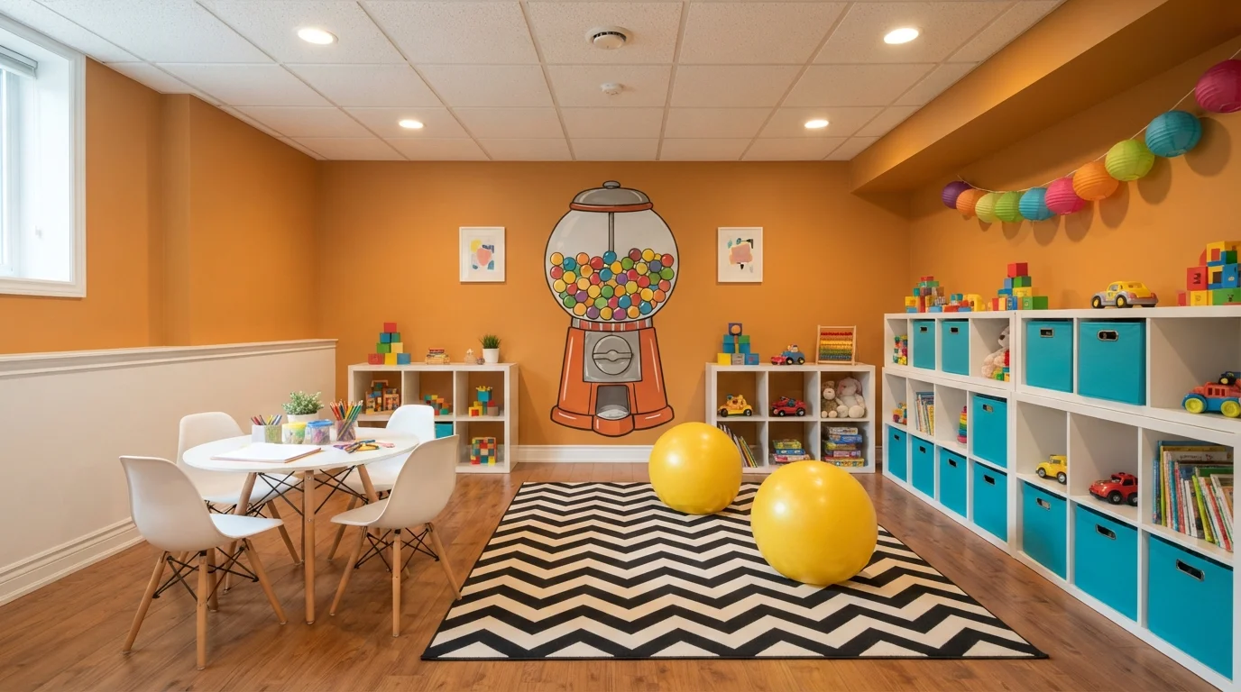
Vibrant golden walls fill this playful creative space with radiant warmth, sparking endless imagination and joy.
Golden amber is a rich, sunny yellow-orange packed with cheerful warmth. In this lively playroom, the walls are painted in glowing gold, complemented by crisp white cubby shelving, a white activity table, and a striking black-and-white chevron rug. The space feels spirited, sunny, and endlessly welcoming for little ones. The combination works because clean white furniture and cool turquoise bins balance the deep golden backdrop to keep the room light and organized. It is ideal for an energetic kids' play area or a lively family craft room.
SEE SUNLIT TOPAZ ON YOUR WALLS →
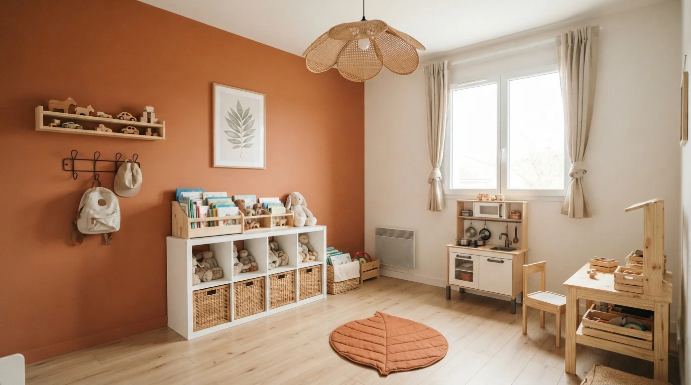
Sunlit terracotta and natural light wood create a cozy, whimsical corner brimming with warmth and imagination.
Terracotta is a warm, sun-baked clay orange. In this room, that rich color highlights an accent wall behind light pine bookshelves and play furniture, while creamy white covers the rest of the space. A rust-toned leaf mat and taupe curtains tie the whole look together over light wood flooring. The space feels snug, cheerful, and grounding. This combination works because the crisp white walls and light wood keep the deep orange feeling bright and fresh. It is perfect for anyone who loves an earthy, storybook nursery.
SEE SWEET CARROT ON YOUR WALLS →
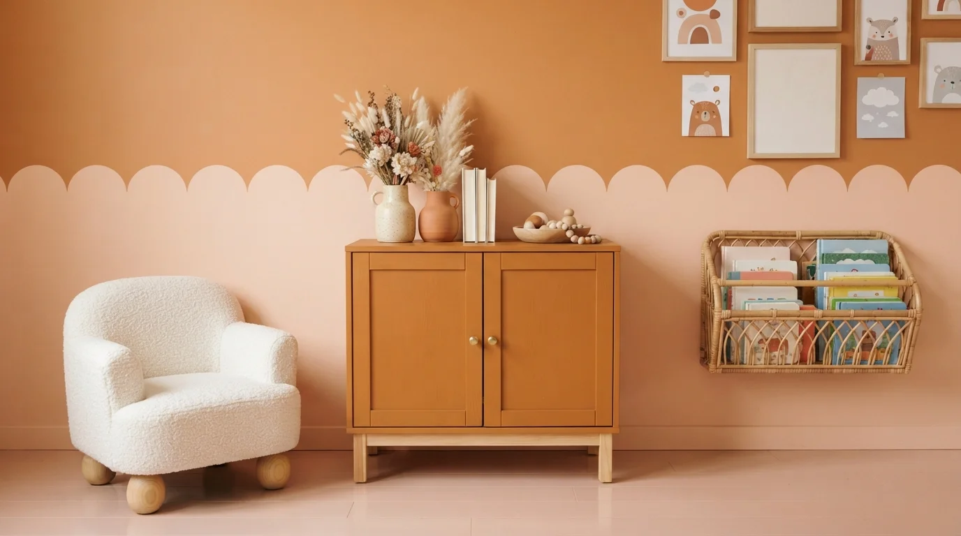
Warm apricot tones and tactile boucle make this cheerful corner feel delightfully cozy and full of storybook charm.
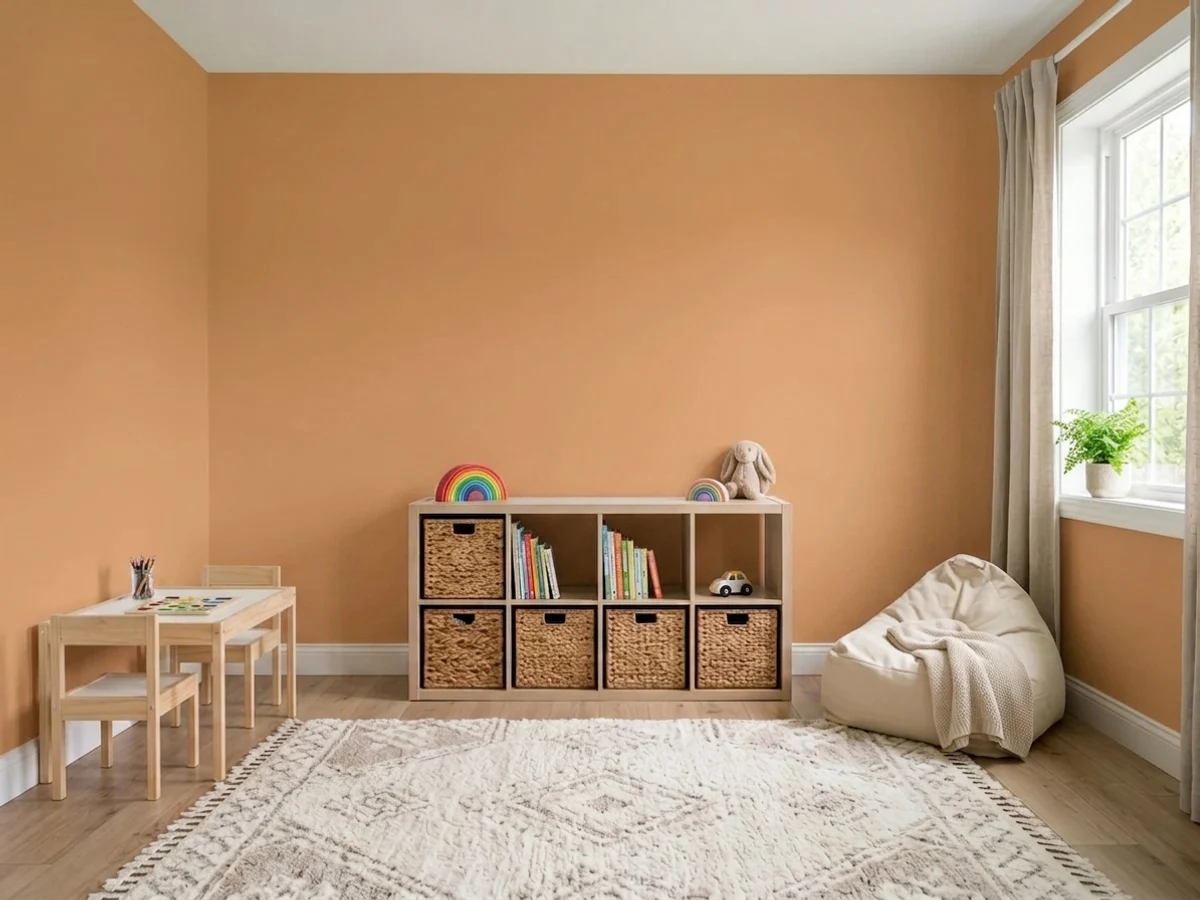
Apricot orange is a warm, sunny shade filled with welcoming energy. In this room, the lower wall shines in a rich clay apricot with a scalloped blush accent above, complemented by a matching painted cabinet and a plush white boucle chair. The entire corner feels snug, cheerful, and full of life. Crisp white textures and soft natural rattan keep the vibrant paint from feeling too heavy. It is a wonderful look for anyone building a playful, joyful nursery or toddler reading space.
SEE TANGO ON YOUR WALLS →
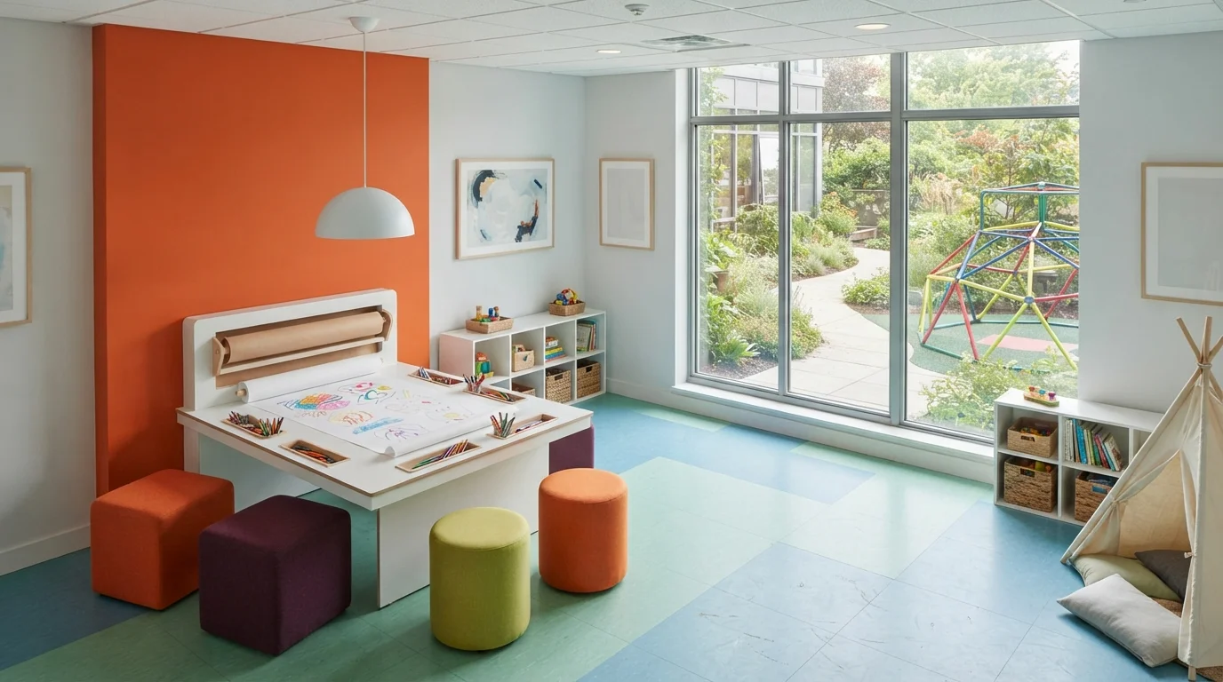
Bright orange walls and colorful poufs fill this sunlit activity room with infectious joy and creative energy.
Vibrant tangerine is a bold, sun-drenched orange that instantly sparks excitement. Here, a bright orange accent wall frames a sleek white craft station, paired with soft ottomans in orange, lime green, and deep purple across light pastel floor tiles. The space feels wonderfully cheerful, open, and buzzing with imaginative energy. Crisp white furniture and huge glass windows balance the fiery walls, letting the rainbow accents pop without overwhelming the room. It’s perfect for anyone wanting an inspiring, high-energy playroom where kids love to create.
SEE RUMBA ORANGE ON YOUR WALLS →
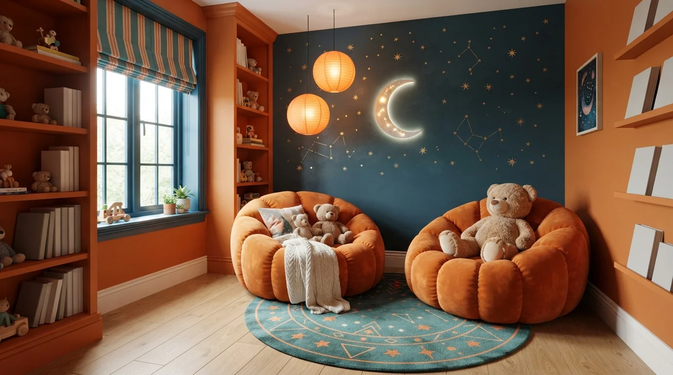
Glowing moonbeams and plush pumpkin chairs create an enchanting, dreamy reading corner bursting with joyful energy.
Tangerine is a bold, lively pumpkin-orange with lots of warmth. In this room, vibrant orange wraps the walls, built-in shelving, and two plush channeled armchairs, while a deep starry teal coats the whimsical feature wall. The room feels snug, imaginative, and brimming with childlike wonder. This combination works because high-contrast complementary shades make the warm orange glow vividly against the cosmic blue backdrop. It is ideal for anyone designing an inspiring, cozy storybook space for kids.
SEE MAPLE LEAF ON YOUR WALLS →Orange Playroom Wall Color Combinations
A wall color never works alone. These are the full schemes from the rooms above — the lead color first, then the supporting colors that make the photo work.
Bursting with cheerful tangerine warmth, this lively play space energizes the whole room with sun-drenched creativity.
TRY THIS PALETTE →Punchy citrus orange walls inject boundless energy and lively modern style into this bright, multi-activity game zone.
TRY THIS PALETTE →Warm terracotta walls pair with a bright rainbow rug to create a lively, imaginative space filled with playful energy.
TRY THIS PALETTE →Vibrant golden walls fill this playful creative space with radiant warmth, sparking endless imagination and joy.
TRY THIS PALETTE →The most reliable playroom combination pairs one of the lighter oranges on the main walls with crisp white trim and millwork — Osage Orange or Bergamot Orange against white baseboards and door casing is the classic version of the orange-and-white pairing designers reach for, and it keeps the room from feeling like a single block of color even when every wall matches. Soft Pumpkin works the same way but reads calmer, so it's the pick when the playroom needs to double as a wind-down space by evening.
For rooms that want more contrast, use one of the deeper shades as the accent and a lighter one as the backdrop rather than mixing two saturated oranges: Navel or Tart Orange on a single feature wall behind the play kitchen or reading nook, with Soft Pumpkin or Bergamot Orange carrying the remaining three walls. Orange's complementary color is blue, so a turquoise or soft denim-blue rug, bins, or curtains does real work cooling down any of the darker picks — Determined Orange and Fireball Orange both read less intense next to a cool blue than they do against another warm tone. Natural wood — oak toy shelves, a maple table, unfinished pine cubbies — pairs well with every shade on this page, since warm wood undertones echo orange rather than fighting it, which is why so many orange playrooms lean on wood furniture instead of white laminate.
More Playroom Color Ideas
Set on a color family already? Each page has its own real rooms and picks.
Light or Dark Orange Playroom Colors?
Go Light (LRV 60+) If…
The room is small, faces north, or has to work at every hour. Light warm colors make it feel bigger and stay calm in evening light — the light you actually live in.
Go Dark (LRV Under 20) If…
You want the cocoon effect and the room has real daylight. Dark works best on one feature wall — or fully color-drenched in a large room with good windows.
For a playroom, lean toward the lighter picks — Osage Orange, Soft Pumpkin, or Bergamot Orange, all sitting between LRV 40 and 45 — any time the room gets heavy daily use, has limited natural light, or serves double duty as a homework or quiet-play space. At that LRV range orange still reads as warm and inviting on every wall without pushing kids toward the overstimulation the color-psychology research flags, and the room stays bright enough to bounce light around on gray afternoons.
Save the darker picks — Determined Orange (LRV 22) and Fireball Orange (LRV 19) — for rooms that get real daylight through a window or two, or for one wall rather than four. These deep, spiced oranges absorb more light than they reflect, so a north-facing playroom painted floor to ceiling in Fireball Orange will feel dim and closed-in by late afternoon even though it photographs beautifully at noon. Used as a single accent wall behind open shelving, though, that same depth reads as intentional and energetic instead of cave-like — it gives the busiest corner of the room a visual anchor without swallowing the light the rest of the space needs.
See It. Love It.
Paint It.
Upload one photo of your orange playroom and try every color on this page on your own walls — in your own light, before you buy a drop of paint.

TerracottaBeforeWhere To Use The Deepest Shades
Determined Orange (LRV 22) and Fireball Orange (LRV 19) are the two picks most likely to overwhelm a room if they end up on all four walls. Both work best contained — one accent wall, the back of a built-in shelving unit, or a painted door — rather than as the room's dominant color. That containment is what lets them do the job the research credits orange with (sparking active, social play) without tipping into the overstimulation the same research warns about.
A good test: if the playroom is also where a child naps, reads alone, or does quiet tabletop activities, keep the deepest oranges to a single wall or skip them for one of the LRV 40+ picks instead. If the room is purely for active, high-energy play — a climbing corner, a ball pit, open floor space for running games — a full wall or even two of Fireball Orange or Determined Orange can carry that energy without a downside, since there's no quiet-time function competing with it.
Sheen And Finish For Playroom Walls
Playroom walls take more abuse than almost any other room in the house — crayon, marker, handprints, the occasional thrown toy. Eggshell or satin is the standard choice across all eight picks here: both hold up to a damp cloth or a magic eraser far better than flat, and neither throws the glare that semi-gloss can on a fully saturated wall like Fireball Orange or Determined Orange.
On trim and doors, stick with semi-gloss regardless of which wall color is chosen — it's the one surface in a playroom that gets touched constantly (door frames, window sills, cubby edges) and needs the wipeable durability semi-gloss provides. Avoid flat finish entirely in this room; it looks good on day one and shows every scuff by week two.
Common Mistakes In An Orange Playroom
The single biggest mistake is choosing a deep, saturated shade like Determined Orange or Fireball Orange for every wall because it looked good on a paint chip — at full room scale, that much saturated orange is exactly the overstimulation warm-color research warns families about, especially for kids who are already high-energy. Test any of the darker picks as a poster-size swatch on the actual wall for a few days before committing to all four.
The second mistake is skipping a cool counterpoint entirely. A playroom painted wall-to-wall in warm orange with no blue, gray, or white to balance it can feel visually loud even at a lighter LRV like Osage Orange or Bergamot Orange. A blue rug, gray storage bins, or white trim does more to keep the room livable long-term than swapping to a lighter orange would.
The third is ignoring how the color shifts under the room's actual lighting. Orange leans warmer and more saturated under incandescent or warm-LED bulbs and can read almost red by lamp light in the evening — a shade like Navel or Tart Orange that looks lively at noon can feel intense after dinner. Check any pick under the bulbs that will actually light the room, not just daylight.
About Orange Playroom Paint Colors
Orange has a real track record in play spaces. Studies on color and child behavior find kids in orange-toned rooms tend to be more cooperative, more extroverted, and more willing to jump into group play — it carries red's confidence without red's aggression, plus yellow's cheerfulness without yellow's glare. That's exactly what a playroom needs: a color that gets kids moving toward the blocks and the dress-up bin instead of staring at a blank wall. The catch is dosage. The same research that credits orange with sparking social play also warns that too much of it raises heart rate and pushes active kids into overstimulated, restless territory. The fix isn't avoiding orange — it's picking the right depth of orange for how the room actually gets used.
That's why this page spans a wide LRV range instead of one "playroom orange." Osage Orange (Sherwin-Williams SW 6890, LRV 45) is the lightest and most livable option here, warm enough to feel like a sunny craft table but soft enough to sit on every wall without vibrating. Soft Pumpkin (Benjamin Moore 2166-40, LRV 42) pulls back further still — a mellowed, dusty orange built for playrooms that double as reading corners or nap spots, where you want the cheer without the buzz. Bergamot Orange (Behr P220-6, LRV 40) sits between them, a true cheerful orange that still reads as an all-walls color rather than a jolt.
The lower end of the range is where orange starts doing accent-wall work instead of whole-room work. Navel (SW 6887, LRV 35) and Tart Orange (Behr HDC-MD-27, LRV 31) are saturated citrus tones that read as "orange" the second you walk in — great on one wall behind the toy shelves, a lot on four. Invigorate (SW 6886, LRV 29), Determined Orange (SW 6635, LRV 22), and Fireball Orange (BM 2170-10, LRV 19) go deeper still, closer to a burnt or spiced orange that anchors a bold LEGO corner or a climbing-and-tumbling zone rather than the whole room.

The Questions Everyone Asks
What color should I paint my orange playroom?
If you want one answer, start with the safe picks above — Bird of Paradise, Troublemaker, Citrus Notes, Sunlit Topaz. They read well in any light and survive furniture changes. Then check the light: strong afternoon sun wants a step cooler, a north-facing room wants a step warmer.
what color should i paint a playroom
There's no single right answer, but a lighter, warm shade like Osage Orange (SW 6890, LRV 45) or Bergamot Orange (Behr P220-6, LRV 40) is the safest whole-room choice — bright enough to feel energizing, light enough not to overwhelm a small space. If the room needs to feel calmer, Soft Pumpkin (BM 2166-40) is the mellow version of the same idea. Save deeper shades like Fireball Orange for a single accent wall.
is orange a good color for a playroom
Yes, with a caveat. Color-psychology research on children's spaces finds kids in orange rooms tend to be more cooperative and social, since orange combines red's confidence with yellow's cheer. But the same research warns that too much saturated orange overstimulates active kids. A lighter pick like Osage Orange or Bergamot Orange gets the benefit without the risk; save the deepest shades for one wall, not four.
will an orange playroom make my kids too hyper
It can if the whole room is painted in a deep, saturated shade like Fireball Orange (LRV 19) or Determined Orange (LRV 22) — warm colors at high saturation raise alertness and can tip into overstimulation. Lighter picks like Osage Orange (LRV 45) or Soft Pumpkin (LRV 42) give you the energizing, playful feel without the intensity, and they're the better choice if the playroom also needs to work as a quiet-play or reading space.
what color goes with orange in a playroom
Blue is orange's complementary color, so a soft denim-blue or turquoise rug, bins, or curtains balances any of these picks well, especially the deeper ones like Navel or Tart Orange. Crisp white trim is the classic pairing for the lighter shades like Osage Orange and Bergamot Orange. Natural wood furniture — oak, maple, unfinished pine — also pairs naturally with every pick here, since warm wood tones echo rather than fight orange.
should i paint the whole playroom orange or just an accent wall
It depends on the shade. LRV 40-plus picks like Osage Orange, Soft Pumpkin, and Bergamot Orange are light enough to work on every wall without feeling like too much. Anything below LRV 30 — Invigorate, Determined Orange, Fireball Orange — reads better as a single accent wall behind shelving or a play corner, with a lighter neutral or a paler orange carrying the rest of the room.
What two-color combination works best in a orange playroom?
The reliable pattern is a quiet main color plus one deep accent on a single wall. Keep trim and ceiling in one warm white so the two colors are the only event in the room — the combination cards above show complete schemes from real rooms.
What colors make a orange playroom look bigger?
High-LRV, slightly warm colors — LRV 60–75 is the sweet spot. Paint the walls and trim close to the same light color so the corners blur, and keep the ceiling white. Stark cool white actually works against you; it creates hard shadows that show the room's edges.


Ask a Question