San Antonio Rose
The Benjamin Moore classic that reads terracotta on the chip and coral on the wall, reviewed honestly: the one wall it was made for, the light that turns it peach, and what to pick instead.

Jessica has spec'd whites and neutrals for more than 300 rooms and keeps a sample wall of painted drawdowns in her studio. Every color review is checked against real reader rooms in the comments and re-tested when a formula changes. About the testing process →
- 1Rookwood Terra Cotta14
- 2Determined Orange22
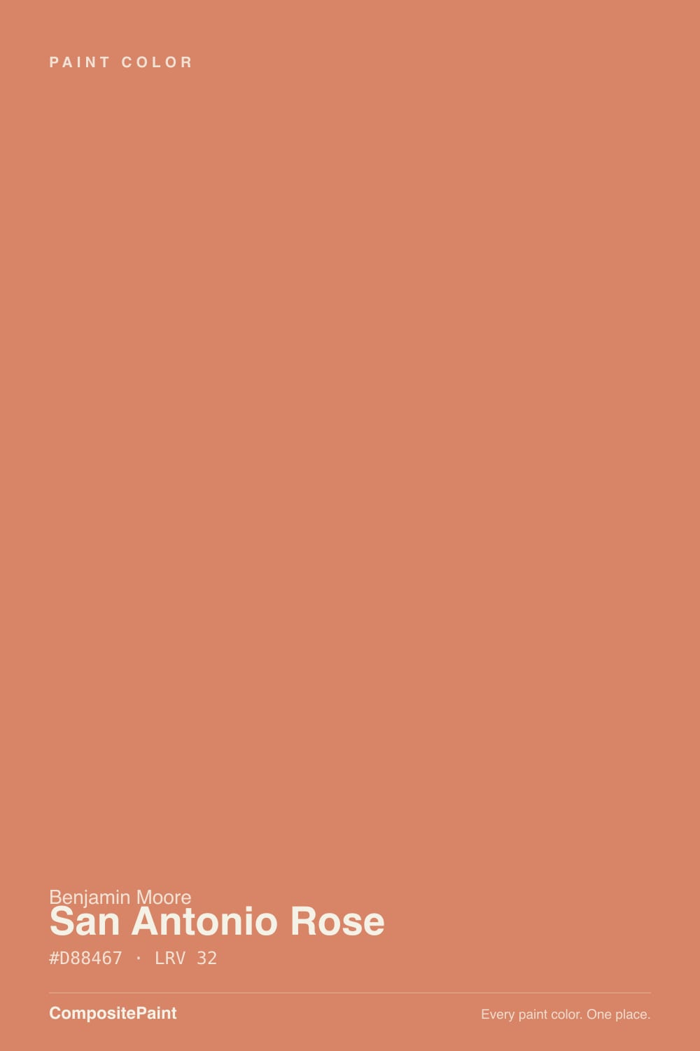
- 3San Antonio Rose32
- 4Venetian Plaster42
- 5Colonial Yellow59
The Fast Verdict
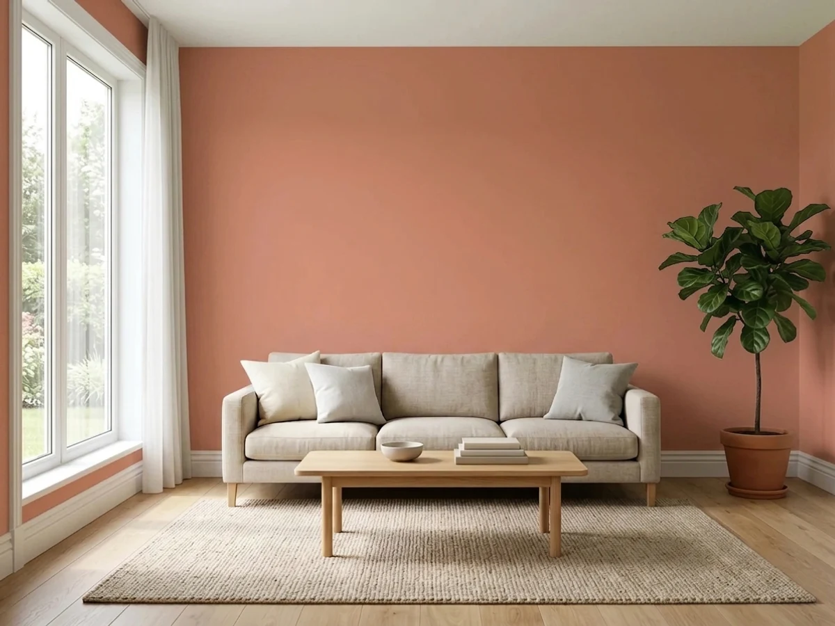
Benjamin Moore's own description is honest for once: coral crossed with terracotta. That is exactly what you get — a warm clay-orange with a rosy edge, bright enough to run a room's whole mood from a single wall. Given warm light, brown wood and a cream trim it looks like a hand-plastered adobe room. Given bright flat daylight, white trim and beige carpet it looks like 1994. The color is good; the room decides which version you get.
One accent wall in a warm room · dining rooms you use after dark · powder rooms and small entries · anyone who wants terracotta without going deep and dusty
You want a soft, quiet mid-tone · your floors are orange honey oak · the room is bright, white-trimmed and beige-carpeted · you are painting an exterior
- Real terracotta warmth without going deep or dusty
- A single wall of it gives a whole room a point of view
- Small dark rooms — powder rooms, windowless dining rooms — love it
- A decades-old Classics color, not a one-season trend shade
- Flatters brass, walnut, cream, muted green and unglazed pottery
- Brighter than the chip — daylight can push it toward coral or peach
- LRV 32 is misleading: the saturation makes it feel much bolder
- Blurs into honey oak floors and fights red brick
- Not made for exteriors, so it is an interior-only decision
What Color Is San Antonio Rose, Really?
A clay orange with a rose flush — and the rose is what separates it from a builder-grade terracotta. Benjamin Moore files it in the Orange family and describes it as coral meeting terracotta, which is a fair summary: there is real earth in it, but there is also real brightness. It has sat in the Benjamin Moore Classics collection for decades, long before the current earth-tone revival, which is why it feels grown-up rather than trendy — it was never invented to chase a season.
The number that fools people is LRV 32. That sounds like a comfortable mid-tone, and for a grayed color it would be. San Antonio Rose is not grayed. Saturation, not LRV, decides how loud a color feels in a room, and this one carries a lot of it — so at the same lightness as a muted sage it will read three times as present. Expect the wall to look brighter and cleaner than the chip did, because a two-inch chip surrounded by white paper always hides the intensity of a full wall.
Undertone in one line: orange first, a soft red-rose second — no brown, no yellow. If your sample looks peachy, that is bright daylight lifting the orange; if it looks dusty and almost brick, that is cool north light muting it. Both are the same paint reacting honestly to the room it is in.
Where It Shines
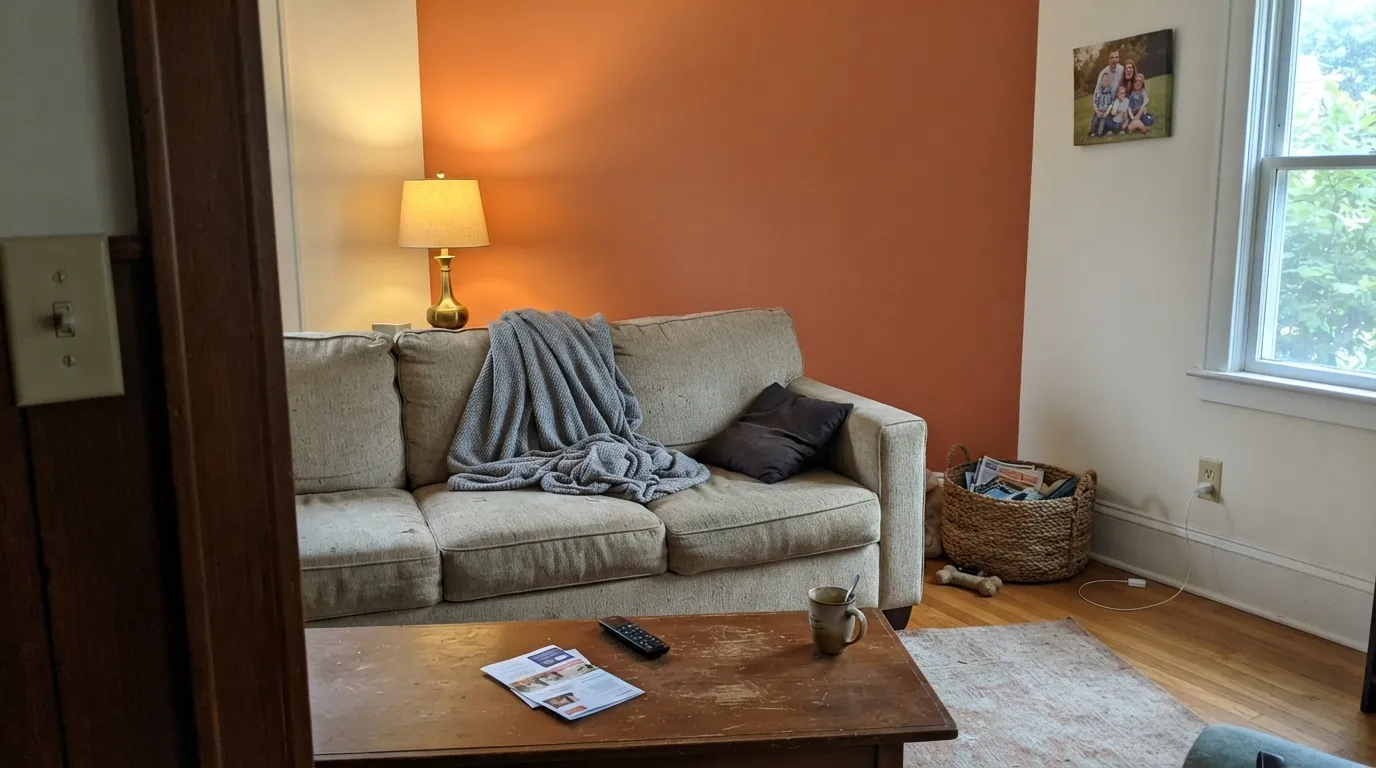
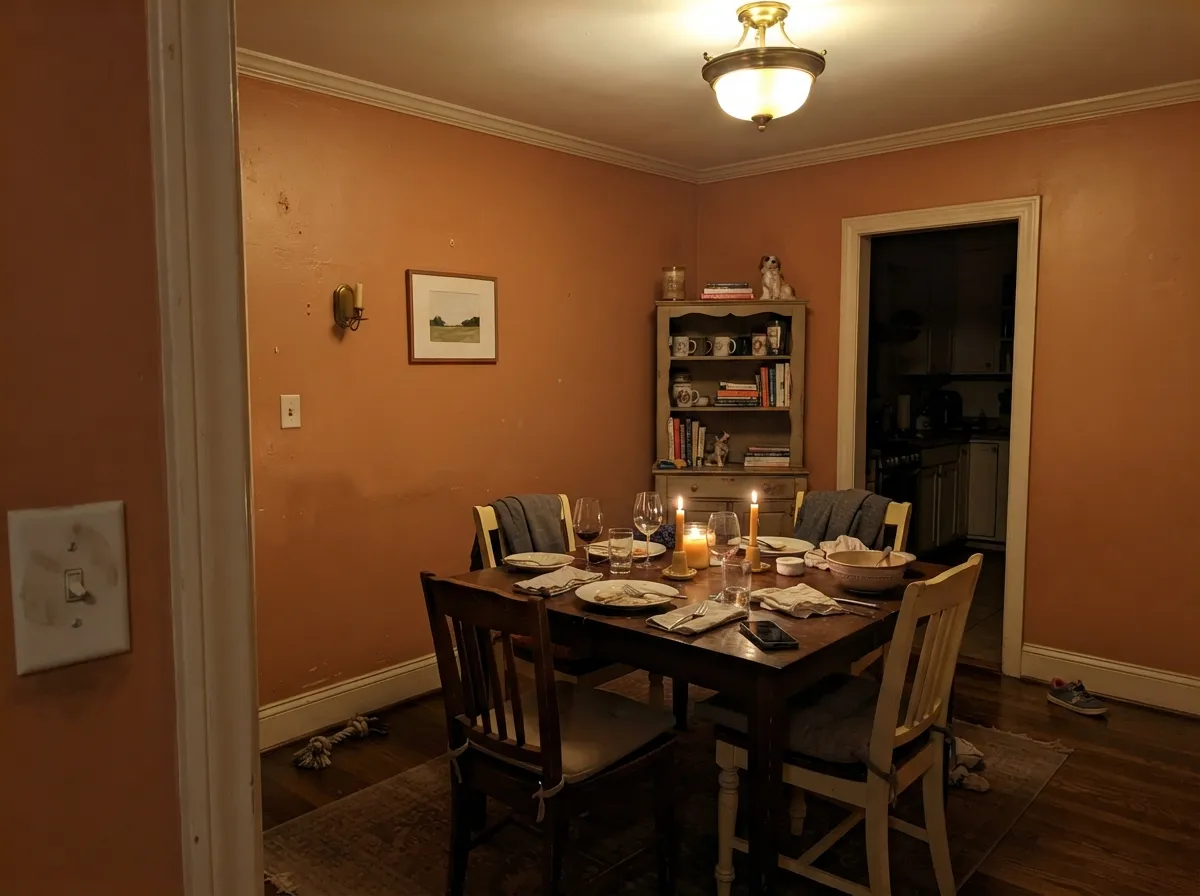
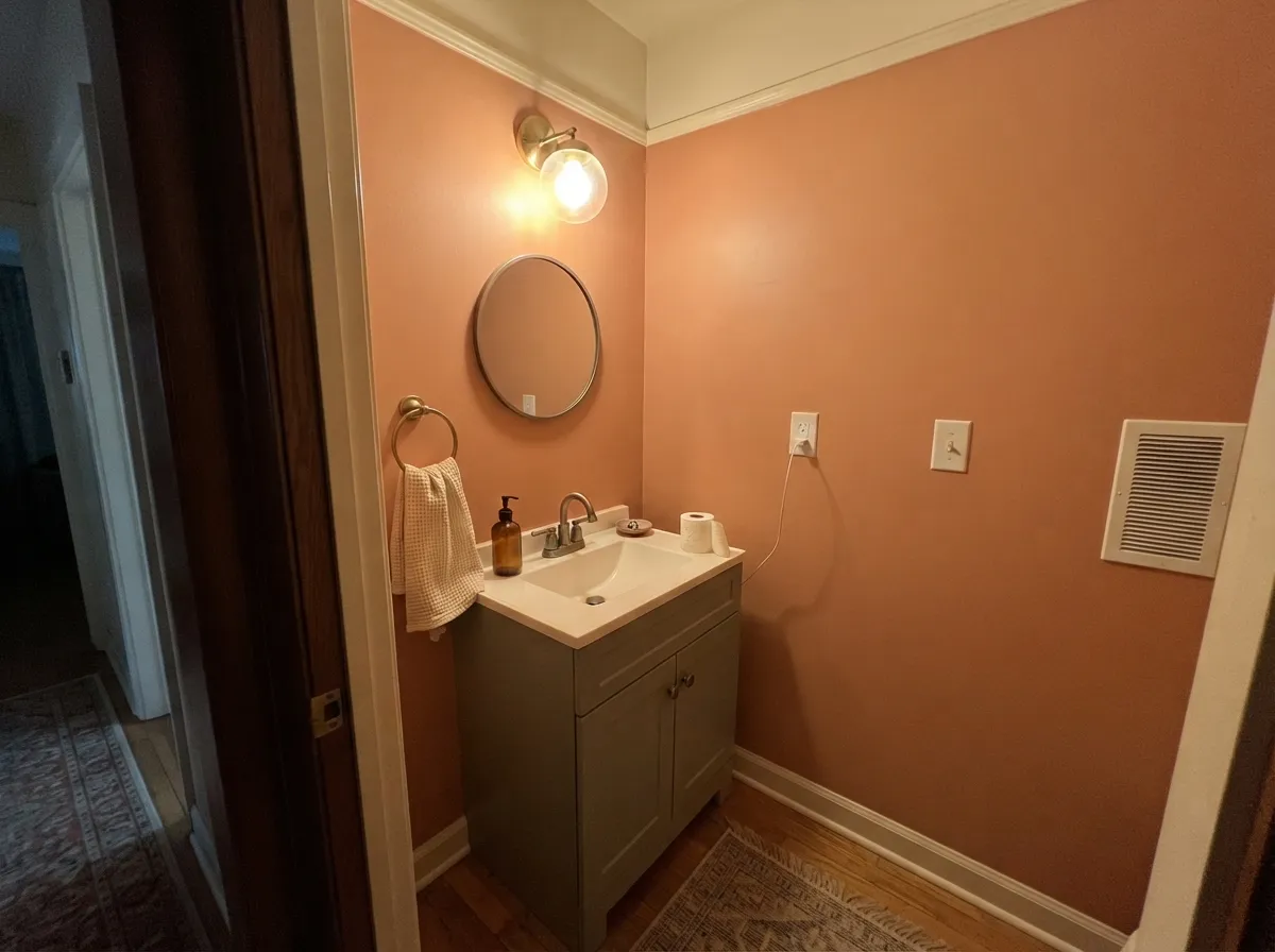
This color is at its best doing one big job in a warm room. On a single wall — behind a bed, behind a sofa, at the end of a hallway — it does what an expensive piece of art does: it gives the room a temperature and a point of view without asking the rest of the house to agree. Its second home is the small, dark, evening room: a powder room, a windowless dining room, a snug entry, where warm bulbs let the clay come forward and the walls glow instead of glare. Give it cream trim, walnut or espresso wood, unglazed pottery, brass and a muted green somewhere in the room, and it looks deliberate and Southwestern-modern rather than nostalgic.
Where It Fails
Almost every regret story about a color like this follows one of three scripts, and all three are visible before you open the can. If your room matches one, sampling a bigger square will only confirm it faster.
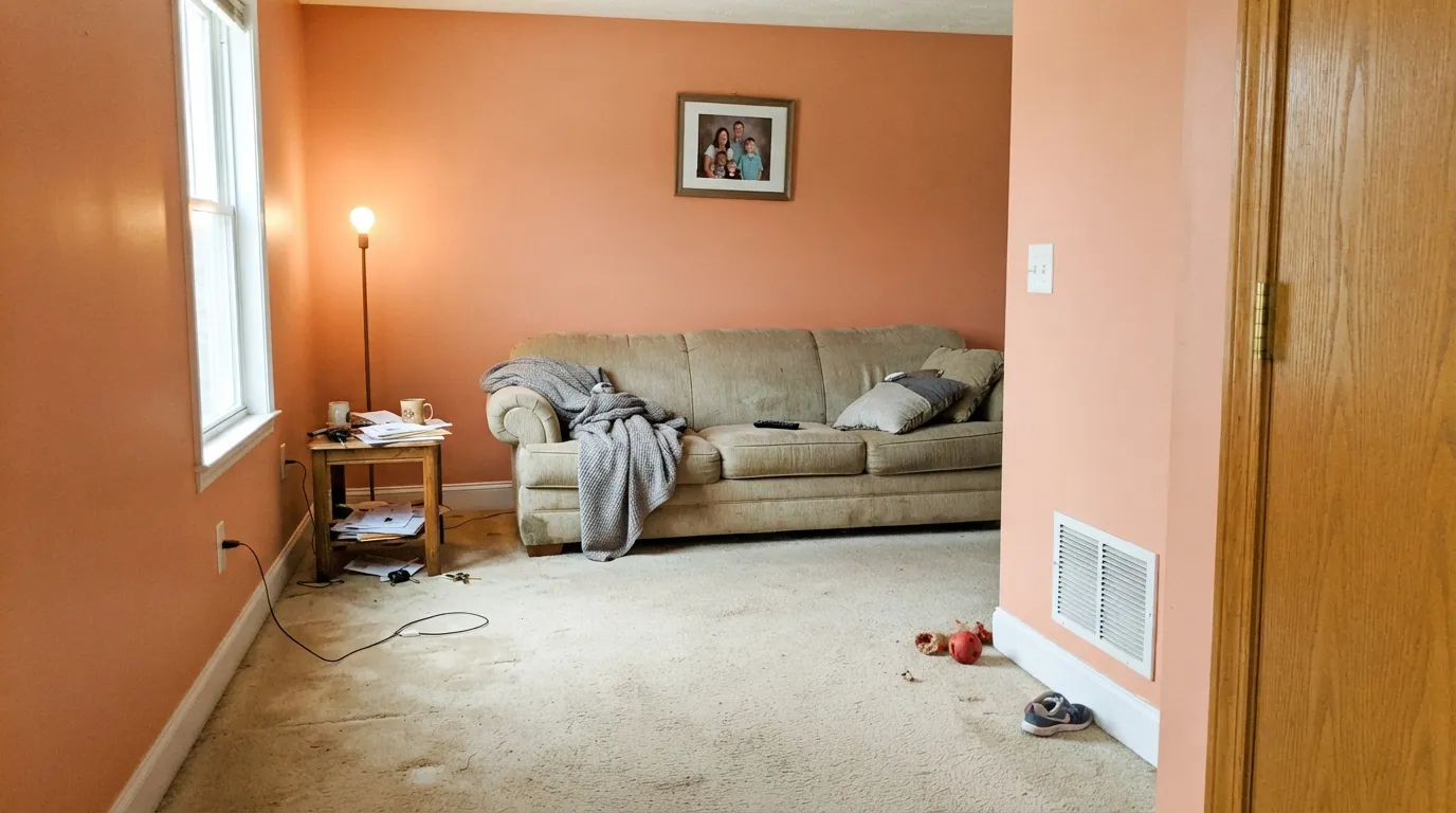
The earthy read on the chip comes from the white paper around it. Roll it across a bright wall and the orange-pink lifts, and in strong daylight it can slide toward salmon or peach. Put that next to crisp white trim and builder-beige carpet and you have rebuilt a 1990s living room by accident. If you want the dusty, dug-out-of-the-ground version, go to Cavern Clay or Terra Cotta Urn instead.
At this saturation the color is an event. On one wall it is confident; on four it takes over, and a sunny room turns into a heat lamp — people describe walking in and feeling the room is warm before they see why. Small dark rooms are the exception: powder rooms and windowless dining rooms can carry all four walls because there is no bright daylight to amplify the orange.
Honey oak floors, orange-stained oak trim and golden LVP are the same hue family as this paint, so the wall and the floor blur into one warm field and the color loses its edge. Red brick is the other fight: the blue-red of brick and the orange-red of San Antonio Rose sit close enough to look like a mistake rather than a pairing. Walnut, espresso, pale white oak, unglazed terracotta tile and matte black all get along with it.
Room by Room
One wall, matte or eggshell, with the other three in a warm white. Behind a headboard or a sofa it carries the whole room's mood and stays easy to undo later. This is the use case the color is genuinely great at, and the one we would recommend first.
Warm clay walls, candlelight and a dark wood table is a classic combination for a reason: the color flatters skin and food, and evening light is its friendliest. Benjamin Moore's own expert pairing puts it with Dove Wing trim and a deep brown, which is exactly the right instinct. Eggshell on the walls, semi-gloss on the trim.
Small windowless rooms are where saturated color earns its keep. Drench the walls, keep the ceiling a warm white, add brass and a dark mirror frame, and a boring half-bath turns into the most memorable room on the floor. No daylight means no salmon surprise.
Behind the bed it reads cocooning and a little sun-baked, especially in matte. Four walls in a bright east-facing bedroom is where it gets loud at 7am. Pair with cream or oatmeal bedding rather than pure white, which sharpens the contrast and makes the wall look brighter.
A short entry wall or the far wall of a hallway gives the color somewhere to land without surrounding you. A sunroom is the one bright room where it can work at full strength, because there is enough glass and greenery outside to give the orange something to argue with.
Benjamin Moore says so directly: this shade is not recommended as an exterior paint, so it is not offered in the exterior lines. Take that as a hard no rather than a preference — for siding, doors or shutters, choose a color formulated for outside.
Your Light Is the Risk
Under 2700K bulbs the orange settles into fired clay and the walls glow. This is the light the color looks expensive in — and the reason dining rooms and powder rooms are its best rooms.
Strong midday sun in a south room lifts the orange-pink and the earthiness drains out; this is the salmon-and-peach read behind most of its bad reviews. Sample a big square in that exact light before committing.
Morning east light reads it pinker and cooler; by late afternoon low west sun pushes it toward a deep, almost brick clay. Golden hour is when people fall in love with it — check it at noon too, because that is the other half of the deal.
2700K warm bulbs deepen it into terracotta; 4000K and cooler LEDs strip the warmth and leave a flat, chalky pink. With this color the bulbs are part of the paint job, not a detail.
Most complaints about San Antonio Rose are a light mismatch. Upload a photo of your actual room and see it on your walls — then ask for the same wall in north light or evening lamps before you buy a single sample.
Need It From Another Brand?
Any paint counter can custom-tint Benjamin Moore 027 directly. If you would rather stay in one brand's own deck, these are the closest stock matches, measured as ΔE2000. Under 2 is a difference you will not see on the wall.
| Brand | Closest color | ΔE | LRV | |
|---|---|---|---|---|
| Sherwin-Williams | Subdued SiennaSW 9009 · Sherwin-Williams | 3.4 | 32 | Color page → |
| Behr | King SalmonM180-5 · Behr | 0.7 | 33 | Color page → |
| Valspar | Rosy Pashmina8002-12D · Valspar | 1.3 | 30 | Color page → |
| PPG / Glidden | Summer SunsetPPG1192-6 · PPG / Glidden | 1.6 | 31 | Color page → |
| Glidden | Summer SunsetPPG1192-6 · Glidden | 1.4 | 31 | Color page → |
| Dutch Boy | Exotic Melon107-6DB · Dutch Boy | 2.1 | 32 | Color page → |
Similar Benjamin Moore Colors
The nearest shades to San Antonio Rose within Benjamin Moore's own range, ranked by perceptual color distance — useful when you want the same look a touch lighter, darker, or warmer.
WCAG 2.1: AA is 4.5 : 1 for normal text, 3 : 1 for large text, AAA is 7 : 1.
San Antonio Rose vs the Colors You're Also Considering
Every San Antonio Rose sample board has the same rivals on it. The numbers show the real lightness gap — then it comes down to which risk you would rather live with.
Pick this when you want the clay to feel alive and lit rather than sun-baked and heavy.
Sherwin-Williams SW 7701 · LRV 24Cavern ClayPick this for the dustier, deeper, more adobe version — at LRV 24 it is grounded where San Antonio Rose is bright.
Pick this when the point is the orange. Redend Point is a clay-pink; this is a clay-orange, and nobody will confuse them on a wall.
Sherwin-Williams SW 9081 · LRV 27Redend PointPick this if you want the same warmth pulled toward pink-brown — quieter, more neutral, easier on four walls.
San Antonio Rose Coordinating Colors
The rule for coordinating with this color: warm whites, real browns, one muted green, and nothing cool or crisp anywhere near it. Cream reads as company; bright white reads as contrast and makes the wall look brighter than it is. These are the partners that keep showing up in rooms where it works:
Where San Antonio Rose Came From, And Why It Is Back
This is not a trend color that got lucky. San Antonio Rose lives in the Benjamin Moore Classics collection, the deck of colors the company keeps in rotation for decades because professionals keep specifying them. It was there through the beige years and the gray years, waiting, and the earth-tone swing of the 2020s brought people back to it: terracotta, clay and warm rust are now the standard answer when a client says the house feels cold.
What it offers that the newer terracottas do not is brightness. Most of the popular clay colors are grayed and deep — the safe, dusty end of the family. San Antonio Rose keeps its chroma, which makes it riskier and also more alive; it is the color you pick when you want the wall to actually be orange rather than to hint at it.
One limit worth knowing before you plan around it: Benjamin Moore does not recommend this shade for exterior use, so it is an interior-only color. If you loved it on a sample and hoped for a clay front door or a stucco accent, you will need a different shade formulated for outside.
San Antonio Rose With Wood Tones, Floors And Tile
The floor makes this decision more than the paint does. Walnut, espresso and other dark red-browns are its best partners — they are deep enough that the wall stays the brightest thing in the room, which is what you want from an accent color. Pale white oak and natural sisal are the easy modern option, and unglazed terracotta or saltillo tile is a natural match as long as you accept that the room will be firmly in one warm key.
The honest no is orange oak. Honey oak floors, orange-stained trim and golden LVP sit in the same hue family as this paint, so instead of contrast you get one continuous warm field and the wall stops reading as a choice. Red brick is the other watch-out: brick leans blue-red, this leans orange-red, and side by side the near-miss looks accidental. A large neutral rug or a cream mantel between them helps; if the brick is a whole fireplace wall, pick a different color.
Metals are simple: brass, antique bronze and matte black all look intentional against it. Copper is the one to think twice about — it is the same hue as the paint, so it disappears into the wall instead of standing against it. Polished chrome reads cold and cheap next to this much warmth.
Three Ready Palettes Built on San Antonio Rose
A color is never alone on the wall. These are complete combinations in the 60-30-10 pattern, with the reason each one holds together. Every one opens in the visualizer.
White Dove is warm enough that the clay wall reads as a deliberate step in the same direction rather than a collision — a colder trim white would make the accent look brighter and pinker. The deep green built-ins give the eye somewhere to rest so the orange is not the only strong note in the room.
Try this palette in your roomBenjamin Moore's own expert combination for this color pairs it with Dove Wing and a deep brown, and it holds up: the soft off-white keeps the ceiling from closing in, while the Craftsman brown reads like stained wood and anchors the room at floor level. Warm bulbs and a dark table finish it.
Try this palette in your roomClay and muted green is the desert pairing, and it works here because both colors sit at almost the same lightness — the vanity reads as a change of color, not a change of contrast. Evergreen Fog is grayed enough that the combination never tips into holiday red-and-green, and the cream ceiling keeps a small room from feeling sealed.
Try this palette in your roomSan Antonio Rose FAQ
Is San Antonio Rose orange or pink?
Orange first, with a rose flush behind it — Benjamin Moore files it in the Orange family and describes it as coral meeting terracotta. On a wall most people call it terracotta in warm light and coral in bright light. Nobody calls it a neutral, and nobody calls it a true pink.
Is LRV 32 dark?
Not dark, but that number will mislead you. LRV only measures how much light bounces back; it says nothing about saturation, and this color has plenty. A muted sage at the same LRV will feel like a background; San Antonio Rose at LRV 32 feels like the main event. Judge it by intensity, not by the number.
Can I paint a whole room in it?
In a small, dim room — yes, and it is one of the best things you can do with a windowless powder room or an interior dining room. In a bright, sunny, white-trimmed room, four walls is where the coral read takes over and people start using the word peach. One wall in the bright room, all four in the dark one.
What trim white goes with San Antonio Rose?
A warm white. Dove Wing is Benjamin Moore's own pick and the softest handoff; White Dove and Swiss Coffee both work and keep the wall reading like clay. Avoid a crisp cool white such as Chantilly Lace — the sharper the trim, the brighter and pinker the wall looks by comparison.
Does it work on cabinets or a front door?
On interior cabinets, an island or a vanity, yes — it is available in Advance, so a satin cabinet enamel is straightforward, and the color is a genuinely good choice for a kitchen island under cream walls. On a front door or anything outside, no: Benjamin Moore does not recommend this shade as an exterior paint.
Will it look dated?
It depends entirely on the company it keeps. With bright white trim, beige carpet and oak everything, it reads 1990s salmon almost immediately. With cream trim, dark wood, matte black, brass and a muted green in the room, the same paint reads current Southwestern-modern. The color is a decades-old classic; the styling is what dates.
Have you painted with San Antonio Rose?
Rate it — one tap helps the next reader decide.
Ask a Question