Kaffee
The coffee brown Sherwin-Williams files under orange, reviewed honestly: the bedrooms where it turns velvet, the light that turns it rusty, and what to pick instead.

Jessica has spec'd whites and neutrals for more than 300 rooms and keeps a sample wall of painted drawdowns in her studio. Every color review is checked against real reader rooms in the comments and re-tested when a formula changes. About the testing process →
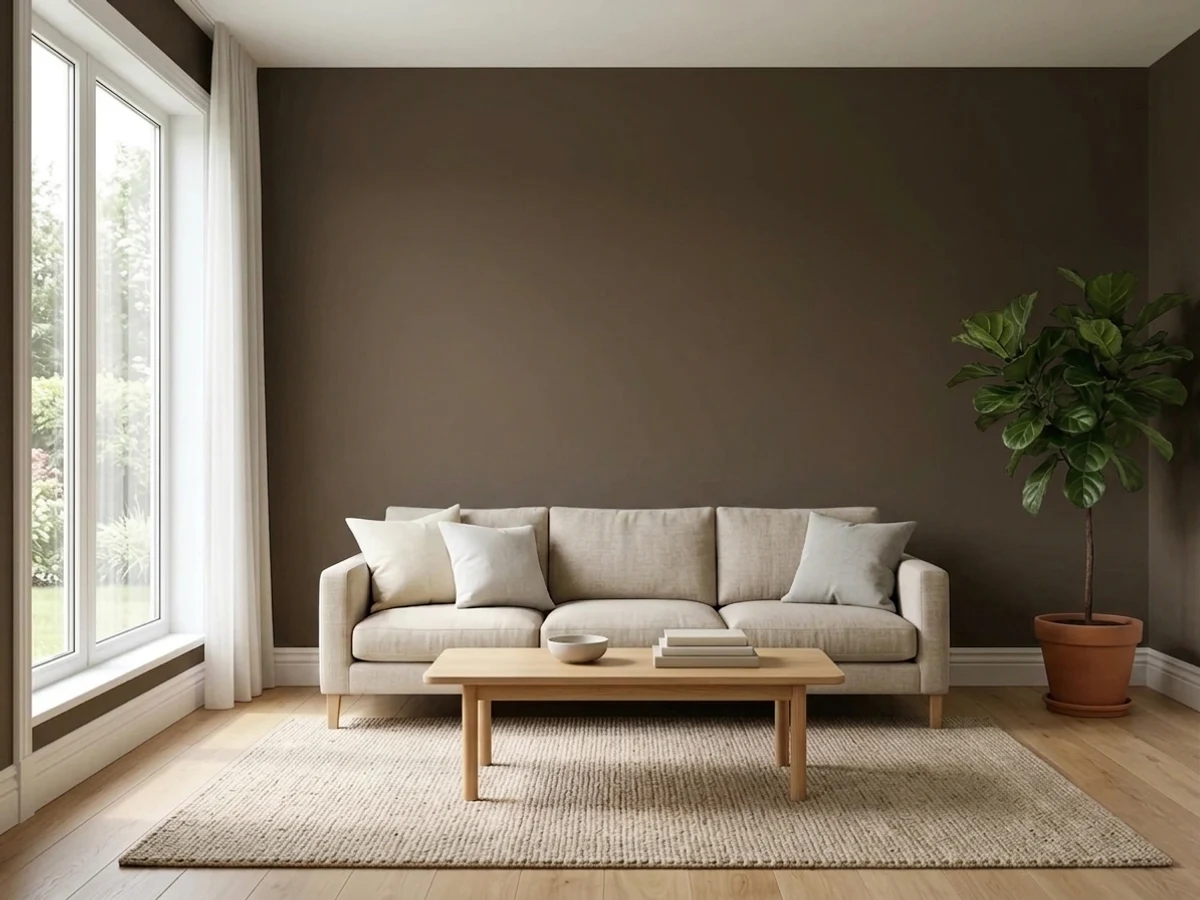
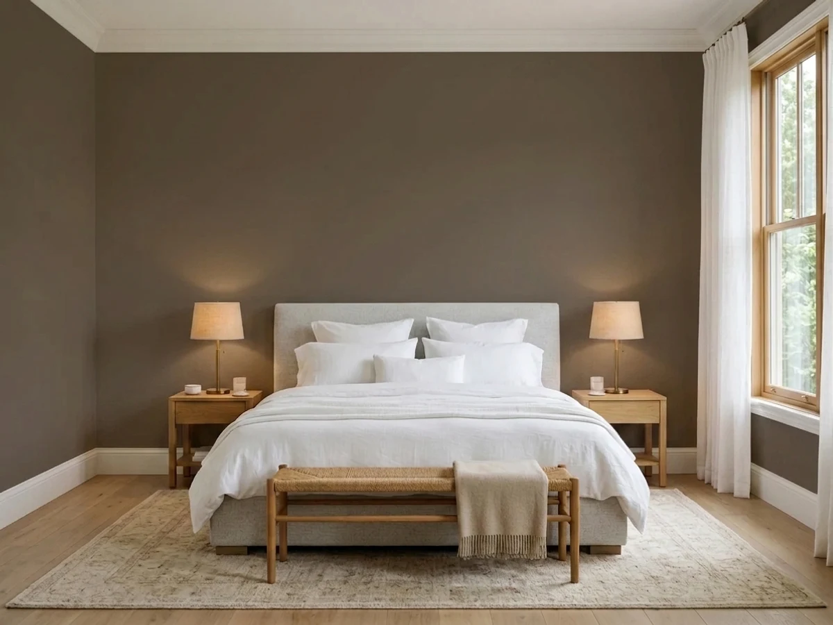
- 1Black Bean4
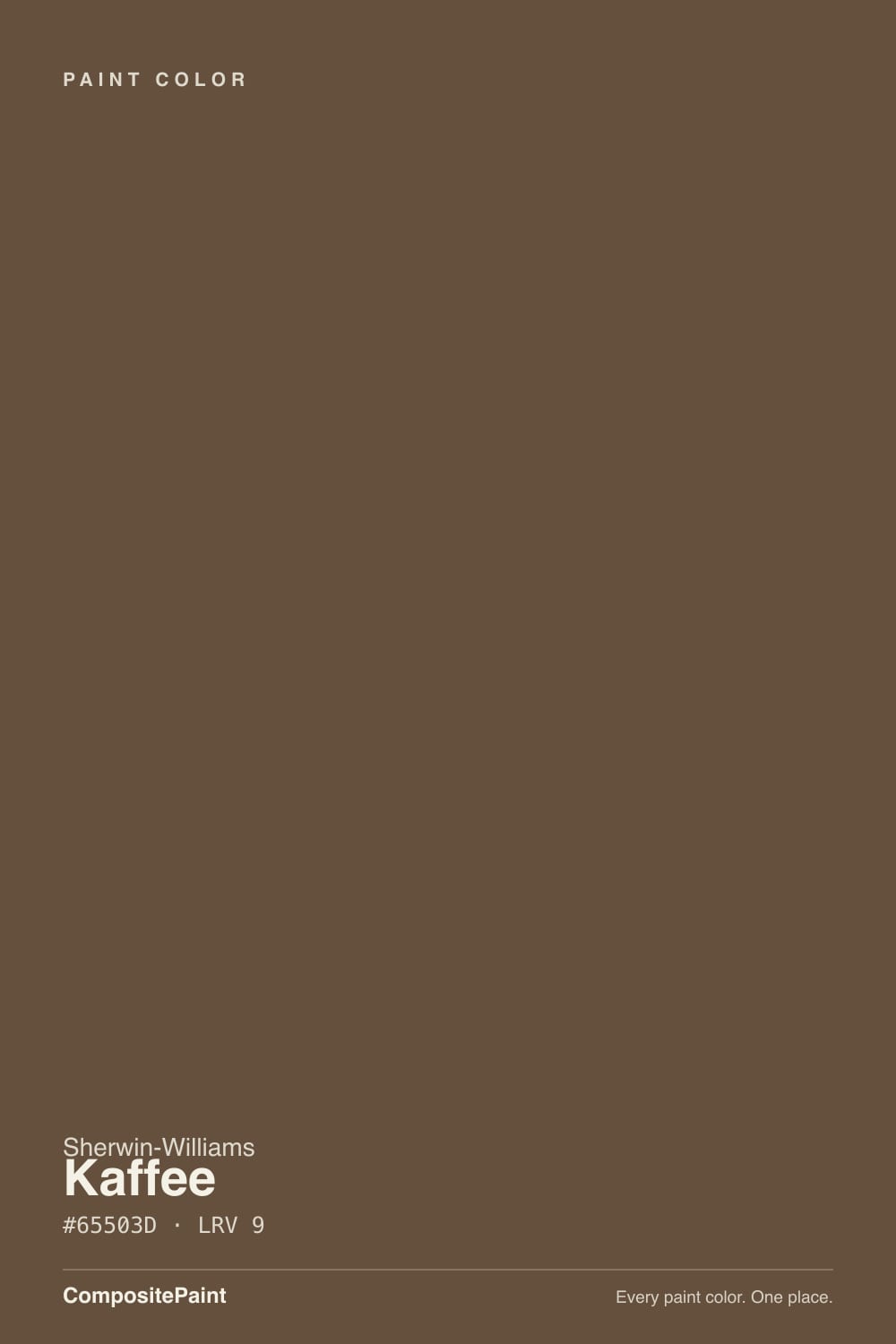
- 2Kaffee9
- 3Cavern Clay20
- 4Redend Point30
The Fast Verdict
Kaffee is the rare very dark brown that still looks like coffee instead of soot. At LRV 9 most browns this deep flatten into a brown-black, but Kaffee keeps a visible red-orange glow, which is both the reason to buy it and the reason to test it. Under warm lamps and late west sun it goes rich and rusty; in a dim room with no lamps it goes flat and cave-dark. Give it light, cream, and brass and it is one of the warmest cocoon colors in the Sherwin-Williams deck.
Bedrooms you want to feel like a cocoon · dining rooms and lamplit studies · built-ins, islands and interior doors · dark craftsman-style exteriors
The room is dim and you refuse to add lamps · your floors and trim are honey oak · you want a neutral gray-leaning dark · you repaint often and don't want the coverage tax
- A very dark brown that still reads brown, not black
- Turns velvety and rich under evening lamplight
- Warmer and more forgiving than a dark gray in the same depth
- Reads like stained wood on doors, islands and built-ins
- Riding the brown revival with a color that predates it
- The orange base shows on four walls — not a neutral dark
- Fights honey oak, orange LVP and stained 1990s trim
- Needs lamps: at LRV 9 a dim room goes flat brown-black
- Deep-base color: tinted primer, extra coats, and touch-ups that flash
What Color Is Kaffee, Really?
A deep, muted brown built on red and orange rather than gray. Sherwin-Williams files Kaffee in its orange family on its own site — the HGTV Home line files the same number under brown — and that split is the most useful fact about the color. There is real orange in the base. Grayed down this far it reads as roasted coffee and cocoa, not as a bright hue, but the warmth is doing all the work: this is a brown with a pulse, not a brown-black neutral.
At LRV 9 it reflects almost nothing, so the room's own light does the entire job. That is a lower number than it sounds like in practice, because Kaffee sits at the light end of Sherwin's dark browns: Van Dyke Brown is LRV 7 and Turkish Coffee is LRV 5, and both of those cross over into reading black in an average room. Kaffee mostly holds on to its color. Plan for the wall to look a step deeper and noticeably warmer than the chip, and plan for the corners of the room to disappear after sunset unless there are lamps in them.
Undertone in one line: brown first, red-orange second — no gray, no purple, no green. If your sample looks rusty, that is warm bulbs or west sun telling the truth about the base. If it looks black, your room does not have enough light for a color this deep, and no second coat will change that.
Where It Shines
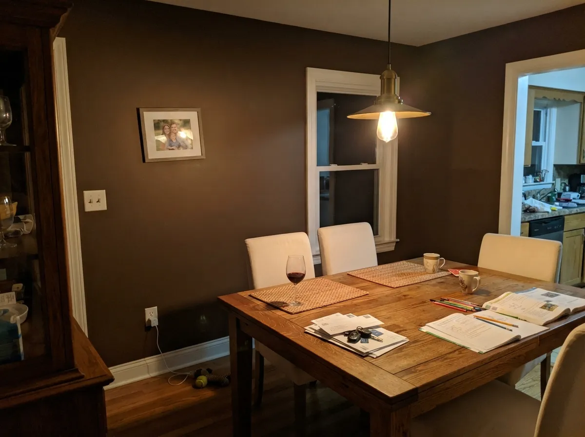
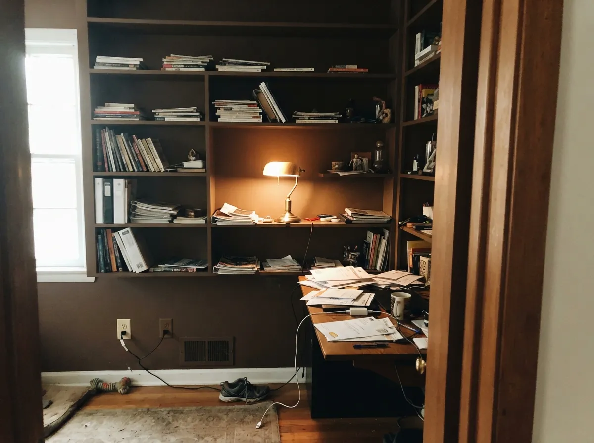
This is a color for rooms you live in after dark. Under 2700K lamplight the red-orange comes forward and the walls turn velvety, which is exactly what people are after when they search for a cozy brown bedroom — the effect is closer to a hotel room than a builder beige box. Its second life is the small confident dose: built-in shelves, a kitchen island, interior doors, a powder room drenched top to bottom. Outside, it is a genuinely good body color on craftsman and cabin-style houses, where full sun keeps the warmth honest all day. Give it cream, brass, leather, and pale oak and it looks expensive.
Where It Fails
The regret stories about very dark browns follow three scripts, and every one of them is predictable before you open the can. None are the paint's fault, but if your room matches one, this is not your color and sampling a bigger square will only make the problem clearer.
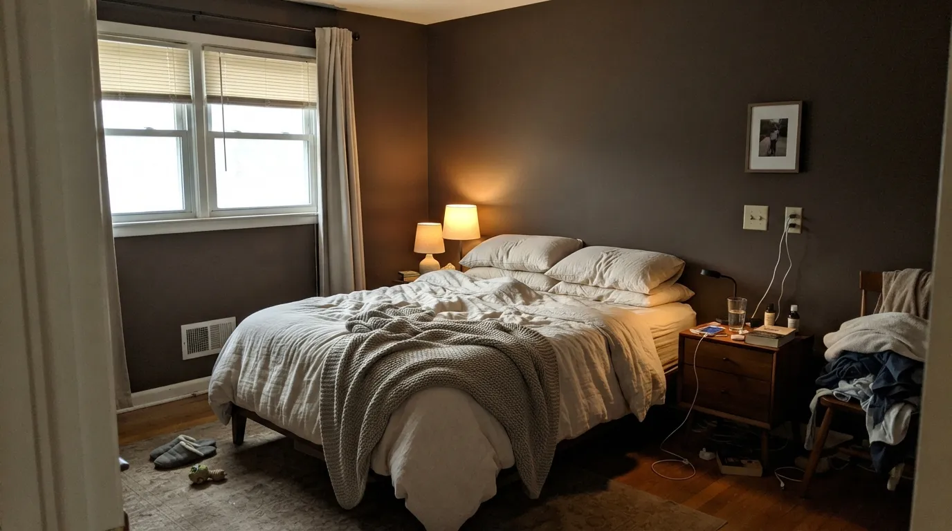
LRV 9 gives nothing back. In a north-facing or shaded room with a single window and an overhead fixture, Kaffee stops reading as coffee and turns into a flat brown-black that swallows the corners. Dark rooms can absolutely take dark color, but only with lamps in them — three warm light sources, not one ceiling can. If lamps are not part of the plan, pick something mid-depth instead.
This is the brown-on-brown trap. Golden oak, orange-toned LVP and 1990s stained trim share Kaffee's red-orange base, so the two amplify each other and the room reads as one heavy 2005-espresso blur with no edges. Kaffee needs contrast, not agreement: cream trim, pale white oak, black metal, or a big light rug between the paint and the floor.
People shopping for moody darks often want the gray-brown, hard-to-name kind — Urbane Bronze territory. Kaffee is not that. Depth multiplies undertone, so on four walls the orange in the base is obvious, especially beside cool gray marble or a blue-gray sofa, where it can read distinctly rusty. If the goal is a dark that keeps its opinions to itself, this is the wrong brown.
Room by Room
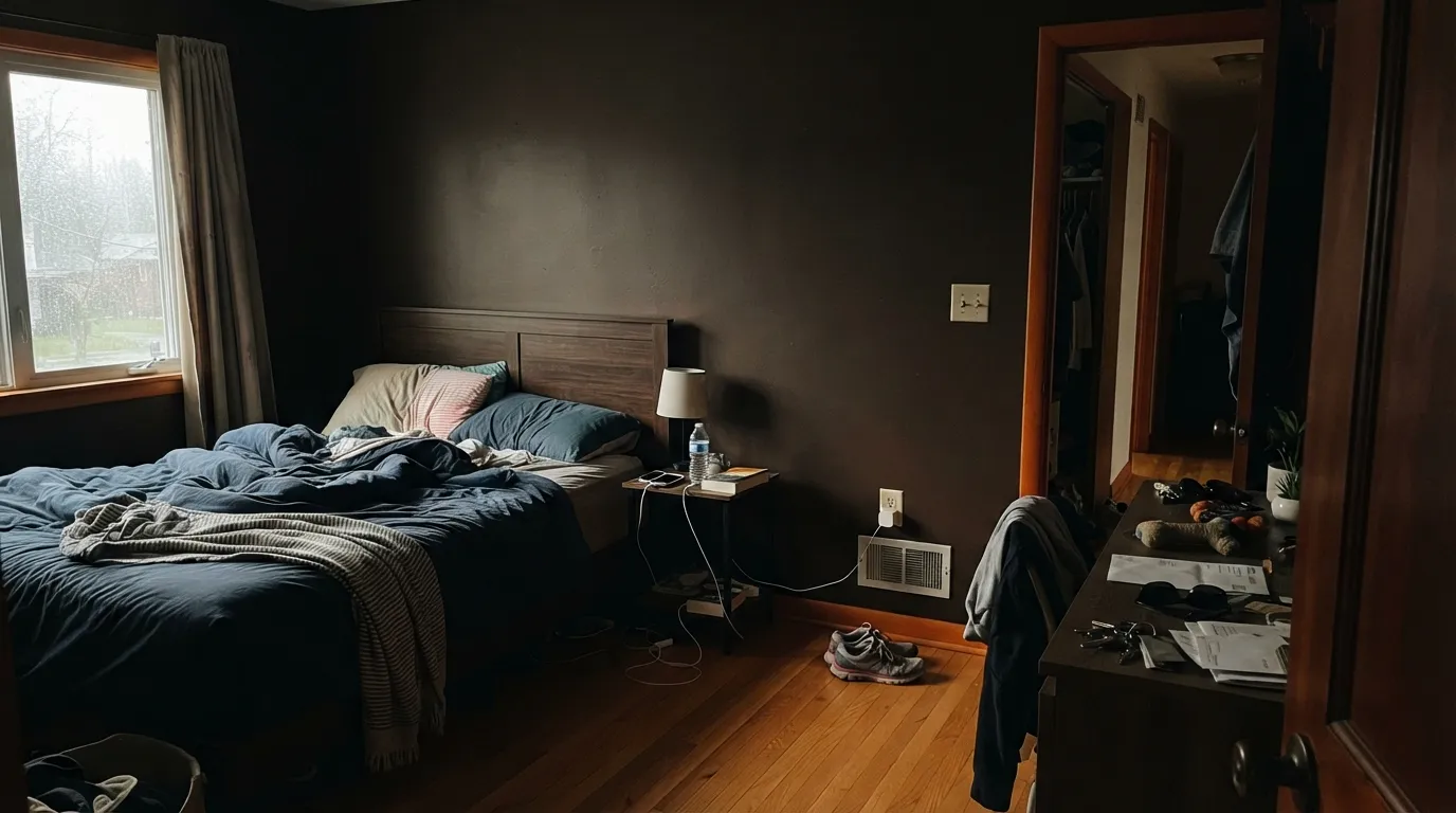
Drenched walls, matte finish, warm 2700K bulbs and cream bedding: this is the whole argument for the color. Dark brown reads restful in a way dark gray never does, and the room gets smaller and cozier in the good sense. Keep at least two lamps and a light headboard or bedding so the bed does not vanish into the wall.
Dining rooms are used at night and lit by a fixture over the table, which is precisely the light Kaffee wants. Brass or aged bronze lighting, cream upholstered chairs, and a walnut or light oak table. Eggshell here, since chair backs will meet the wall.
Low light flatters it, so rooms that never see noon are safe ground. Kaffee on the walls with the shelves painted the same color is the cheapest way to make plain builder built-ins look joined and deliberate. Leather, books, and a lamp finish it.
On an island, a pantry door, or a coffee hutch under warm off-white walls it looks custom and reads as stained wood from across the room. A full kitchen of brown cabinets is a much bigger bet and a losing one over golden floors. Satin cabinet enamel either way, and be honest about how much natural light the room has first.
Small windowless rooms are where deep color costs the least and pays the most. All four walls, the ceiling and the door in Kaffee, a brass sconce and a warm bulb, and a two-hour project looks like a design decision. In an entry it also hides the scuffs a light neutral broadcasts.
One of its stronger uses. Full sun keeps the warmth visible all day, and on cedar-shingle, cabin and craftsman houses it reads as a stained wood tone rather than a painted color. Pair with a khaki or cream trim and a deep green or black door. Deep colors on siding fade faster than mid-tones in strong southern sun, so buy the better exterior line rather than the cheapest one.
Your Light Is the Risk
2700K bulbs bring the red-orange forward and the walls go velvet coffee. This is the light the color was built for, and the reason people keep it.
Cool, weak daylight drains the warmth and leaves a flat brown-black with no visible color. The room stops feeling cozy and starts feeling closed.
Morning east light keeps it cooler and more chocolate; midday south sun gives the truest coffee read; late west sun flushes it distinctly rusty for an hour. Sample on the wall you actually care about.
Warm 2700K lamps push it toward rust and cocoa — usually the version people love. Cool 4000K-plus LEDs flatten it into a dull dark neutral and take the glow out entirely. Pick the bulbs before you blame the paint.
Most complaints about Kaffee are a light mismatch. Upload a photo of your actual room and see it on your walls — then ask for the same wall in north light or evening lamps before you buy a single sample.
Need It From Another Brand?
Any paint counter can custom-tint Sherwin-Williams SW 6104 directly. If you would rather stay in one brand's own deck, these are the closest stock matches, measured as ΔE2000. Under 2 is a difference you will not see on the wall.
| Brand | Closest color | ΔE | LRV | |
|---|---|---|---|---|
| Behr | Melted Chocolate250F-7 · Behr | 0.9 | 9 | Color page → |
| Benjamin Moore | Mocha Brown2107-20 · Benjamin Moore | 2.5 | 10 | Color page → |
| Valspar | If a Tree Fell …V131-6 · Valspar | 2.4 | 9.3 | Color page → |
| PPG / Glidden | PumpernickelPPG15-22 · PPG / Glidden | 1.9 | 9 | Color page → |
| Glidden | PumpernickelPPG15-22 · Glidden | 1.9 | 9 | Color page → |
| Dutch Boy | Bottle Neck419-7DB · Dutch Boy | 2.7 | 9 | Color page → |
Similar Sherwin-Williams Colors
The nearest shades to Kaffee within Sherwin-Williams's own range, ranked by perceptual color distance — useful when you want the same look a touch lighter, darker, or warmer.
WCAG 2.1: AA is 4.5 : 1 for normal text, 3 : 1 for large text, AAA is 7 : 1.
Kaffee vs the Colors You're Also Considering
Every Kaffee sample board has the same rivals on it. The numbers show the real lightness gap — then it comes down to which risk you would rather live with.
Pick this when you want the warmth to show: Kaffee is the more saturated, more clearly coffee-colored of the pair.
Sherwin-Williams SW 6083 · LRV 8SablePick this for the same depth with a redder, softer, less orange read — the quieter of the two on four walls.
Pick this if you want the room to look brown rather than dark — four LRV points is the whole difference between coffee and soot.
Sherwin-Williams SW 6076 · LRV 5Turkish CoffeePick this if you want near-black drama and accept that it reads black in most rooms.
Kaffee Coordinating Colors
The rule for coordinating with Kaffee: warm whites over bright whites, tan and caramel over gray, and one near-black note to keep the scheme from turning into a single soft brown haze. Sherwin-Williams pairs it with its own warm neutrals, and the ones we would actually put on a wall next to it are these:
Why Brown Came Back — and Why This One Is Not 2005 Espresso
Brown spent the gray decade as the color nobody would admit to liking, and it is now the color designers reach for first. The 1stDibs 2026 trend survey put chocolate brown at the top of the list, chosen by roughly a third of the designers polled — nearly double its share four years earlier — and Benjamin Moore named a velvety brown, Palio, its 2026 Color of the Year. Kaffee is not a new color riding that wave; it has sat in the Sherwin-Williams deck for years while nobody asked for it.
The difference between now and the espresso era is what you put next to it. The 2005 version was brown everything: brown walls, brown leather, brown granite, honey oak floors, and a beige carpet trying to referee. The current version keeps the brown and changes the company — cream and warm white trim, pale oak or walnut floors, brass and black metal, linen upholstery. Same paint, opposite result. If your room is already full of warm wood, adding Kaffee is not the trend, it is the 2005 version of it.
Kaffee With Wood Tones, Floors and Furniture
This decision is made at the floor. Pale white oak is the easiest partner, because the contrast lets the walls read as a deliberate color instead of an extension of the flooring. Walnut and dark espresso work too, but tonally — the room becomes one deep envelope, which is lovely in a den and claustrophobic in a small bedroom without light bedding to break it up. Gray-washed floors are fine and quietly modern.
The one genuine no is golden: honey oak floors, orange-stained trim, and the orange-toned LVP that ships in most rentals. Kaffee is built on the same red-orange note those surfaces are, so instead of contrast you get amplification — the floor looks more orange, the walls look muddier, and the room loses its edges. A large light rug is a real fix; a second coat is not.
Furniture follows the same rule. A dark walnut dresser against a Kaffee wall disappears at night, so give the room at least one light silhouette: cream bedding, a light upholstered headboard, an oak or rattan chair. Metals are easy — unlacquered brass, antique bronze and matte black all look intentional; polished chrome is the only finish that reads cold against it.
Three Ready Palettes Built on Kaffee
A color is never alone on the wall. These are complete combinations in the 60-30-10 pattern, with the reason each one holds together. Every one opens in the visualizer.
Dark brown needs a warm white, not a bright one: Alabaster keeps the trim soft so the edges of the room do not look cut out with scissors. Kilim Beige is Sherwin's own coordinating partner for Kaffee, which makes it the natural handoff for the hallway outside the door — same family, 40 points lighter.
Try this palette in your roomThe safest way to use Kaffee is on cabinetry under a warm off-white wall — Shoji White carries enough body to sit beside a color this deep without going stark. Caramelized adds the mid-step the scheme is otherwise missing, so the jump from wall to woodwork looks layered instead of abrupt. Brass hardware, not chrome.
Try this palette in your roomThe classic wooded-lot scheme: a dark brown body that reads like stained cedar, a khaki trim with enough weight to show against it, and a deep green door for the one note of color. A bright white trim would fight the whole idea — Universal Khaki keeps it in the earth-tone family the style depends on.
Try this palette in your roomKaffee FAQ
Is Kaffee brown or orange?
It reads brown on a wall, but Sherwin-Williams itself files it in the orange family, and that is a fair warning rather than a filing error. The base is red-orange, so in warm lamplight and late afternoon sun it can look distinctly rusty. In daylight and against cream, most people simply call it coffee brown.
Is Kaffee too dark for a bedroom?
Only if the bedroom has no lamps. At LRV 9 the paint reflects almost nothing, so the room's light does all the work — with two or three warm lamps it turns velvety and cocooning, and with one overhead fixture it turns flat and cave-like. Small bedrooms handle it fine; dim north-facing ones with a single window are the honest no.
What trim white goes with Kaffee?
A warm, soft white. Alabaster is the default and Shoji White works if you want even less contrast; both keep the edge between wall and trim soft. A stark bright white cuts a hard line against a color this deep and makes the walls look heavier than they are. Semi-gloss on the trim, matte or eggshell on the walls.
How many coats does Kaffee need?
Plan on a tinted gray primer plus two coats, and expect a third if you are going over a light wall or using a cheaper line. Saturated deep-base colors carry less hiding pigment, and this is where most bad reviews of dark paint actually come from. Also cut in and roll each wall wet-to-wet in one go: touch-ups on deep matte colors flash badly.
Does Kaffee work with oak floors?
Pale white oak, walnut and dark espresso floors are all good — the first gives contrast, the last two give a tonal look. Golden honey oak is the real clash, because it shares the same orange base and the two exaggerate each other until the room reads as one heavy brown blur. With honey floors staying, use a large light rug or pick a color from a different family.
Kaffee or Urbane Bronze for a moody room?
Urbane Bronze if you want the dark to feel neutral and architectural — it is the gray-brown that goes with everything. Kaffee if you want warmth you can see, especially at night in a bedroom or dining room. They are the same depth (LRV 8 and 9), so the choice is purely temperature, not brightness.
Have you painted with Kaffee?
Rate it — one tap helps the next reader decide.
Ask a Question