Black Bean
The espresso-brown near-black that's warmer than it looks in the fan deck, reviewed honestly: where it glows, the rooms where it just goes dark, and what to pick instead.

Jessica has spec'd whites and neutrals for more than 300 rooms and keeps a sample wall of painted drawdowns in her studio. Every color review is checked against real reader rooms in the comments and re-tested when a formula changes. About the testing process →
- 1Black Bean4
- 2Porpoise13
- 3Cavern Clay20
The Fast Verdict
Black Bean is what you get when you want a near-black without going full black: a genuinely warm cocoa-brown that reads more like an espresso stain than a flat paint chip. Give it a kitchen island, a front door, or an accent wall with real light and it looks rich and custom-built. Ask it to carry a small dim room or an entire exterior and it just goes dark, hard to read, and harder to keep clean.
Kitchen islands and cabinets · a dramatic front door · well-lit accent walls and built-ins · anyone who wants a near-black with real brown warmth, not a flat true black
You want a true, cool black with zero brown · the room has one small window and no lamps · you're painting a whole exterior, not just an accent · you can't commit to the upkeep a dark exterior needs
- Genuine cocoa-brown near-black — warmer and more interesting than a flat black
- Kitchen islands and cabinets read custom-built, not just "dark"
- Classic, low-risk drama on a front door against almost any siding
- Deep enough (LRV 5) to hold its color in bright rooms without washing out
- Hides scuffs and fingerprints on cabinets and doors better than a satin black
- Swallows light in small or dim rooms — needs a real window or serious lamps
- Brown undertone disappoints anyone shopping for a flat, true black
- Full exterior siding shows dust, water spots, and fade faster than lighter colors
- Two to three coats over a lighter existing color; a gray-tinted primer helps
What Color Is Black Bean, Really?
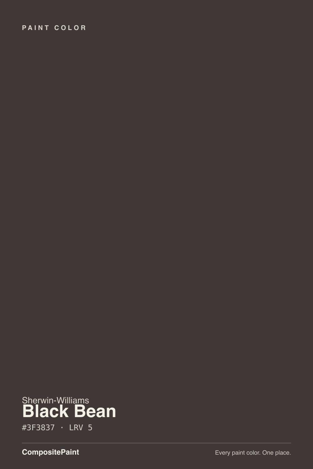
Black Bean is Sherwin-Williams' warm near-black — technically filed under Neutral on the SW site, but it reads brown-black on the wall, not gray-black. The undertone is a soft cocoa, almost mahogany, brown rather than a clean charcoal cast, which is the whole reason to pick it over a straight black: in good light it shows a little color instead of just absorbing everything into a flat void. It has had a moment as a Sherwin-Williams Color of the Month pick, but it has never been a Color of the Year — an honest, dependable near-black rather than a headline color.
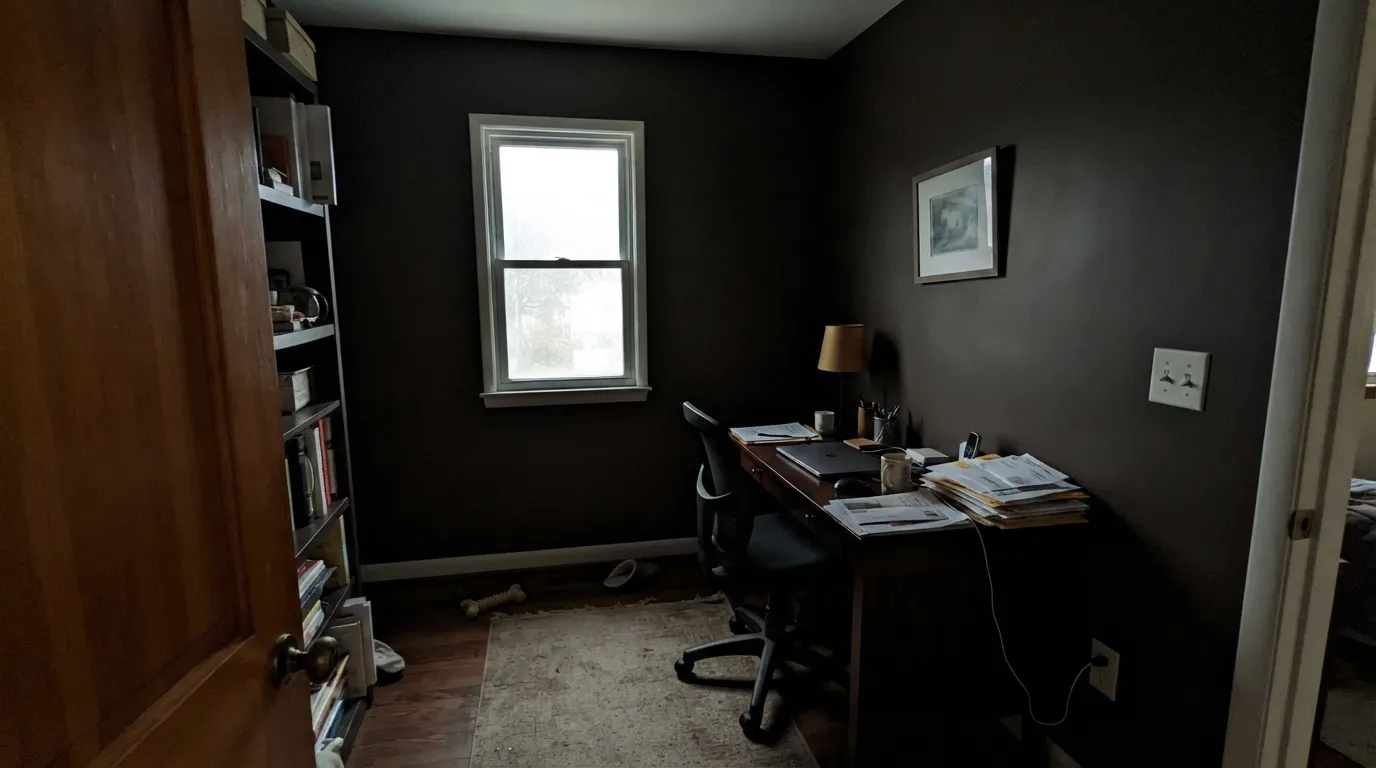
At an LRV around 5 it sits deep in the same near-black tier as Tricorn Black and Iron Ore, deep enough that it reflects almost none of the light that hits it. That is what makes it read black from across a room, and it is also the number-one thing to plan around: a color this dark needs real daylight or real lamp wattage to show its personality, or it just becomes a dark shape on the wall.
Undertone in one line: warm cocoa-brown, never a clean charcoal-gray and never true black. In strong daylight the brown comes forward and it looks alive; in a dim, cool-lit room it flattens toward soot. If your sample looks like plain flat black, that is the light draining the warmth out — not a different can of paint.
Where It Shines
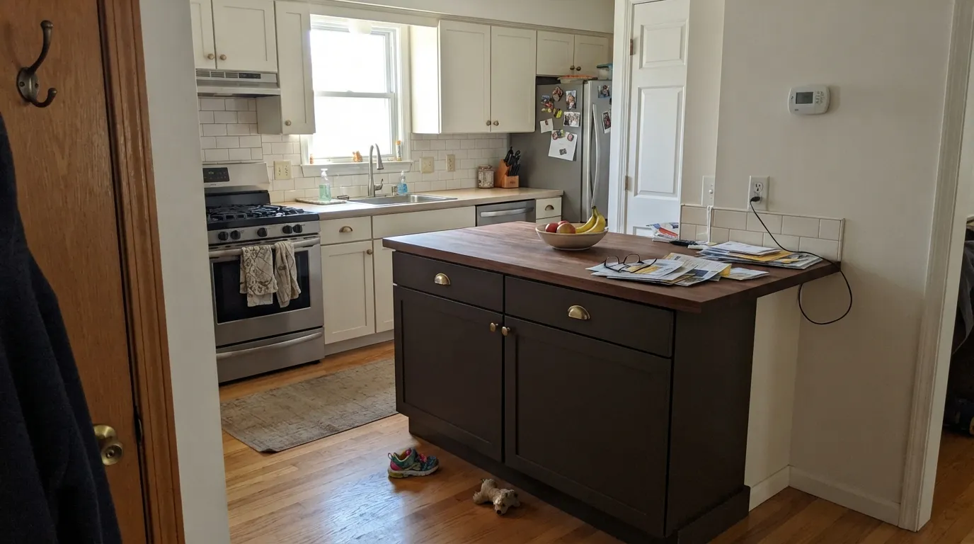
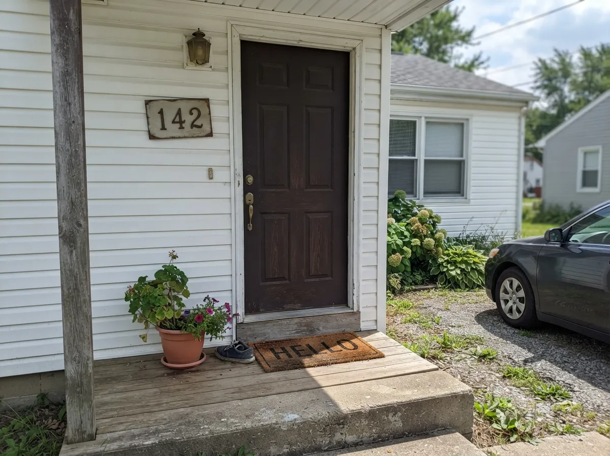
Give it a kitchen island, a front door, or an accent wall that actually gets light and it earns its keep fast. Against brass or unlacquered gold hardware the cocoa brown reads custom and expensive; against matte black hardware it goes moody and modern instead. As a front door against white, cream, or light gray siding it is a classic, low-risk way to make an ordinary house read intentional — the color equivalent of a good haircut.
Where It Fails
Almost every regret story about Black Bean comes from one of three situations, and all three are predictable before the first coat. None of them are the paint's fault — but if your project matches one, this is not your color, or at least not for that surface.
At LRV 5 the wall reflects almost nothing back into the room. Without a big window or serious lamp wattage, four walls of Black Bean just reads as a dark hole rather than a moody accent — Sherwin-Williams itself flags it for larger, well-lit spaces. Use it as an island, a door, or one wall with strong light, not the whole box.
The cocoa-mahogany undertone is real and it shows, especially in direct sun — buyers expecting a flat, cool black see a brown component and call it "not really black." If zero brown is the point, this is the wrong can; SW Tricorn Black is the true, cooler reference black.
On a front door or shutters, dark and dramatic is the goal. On full siding, a color this deep shows dust, water spots, and sun-fade lines faster than anything lighter, and touch-ups stand out more than on a mid-tone. It is an exterior accent color, not a house color, for most climates.
Room by Room
The signature use: a Black Bean island against lighter perimeter cabinets, warmed by brass or gold pulls, or cooled down with matte black hardware for a moodier read. Satin urethane-fortified cabinet paint wipes clean and hides fingerprints better than a flat black would.
Against white, cream, or light gray siding it is dramatic without being a gamble; the brown undertone keeps it from feeling stark. Satin or semi-gloss exterior enamel; expect to touch it up more often than a lighter door color.
One wall, a fireplace surround, or bookshelves in a room with a real window or good lamps looks intentional and rich. In a windowless nook it just disappears into shadow — check the light before committing a whole wall.
Cozy and cocoon-like at night under warm bulbs. In a small bedroom with only overhead cool lighting it can feel closed-in fast; keep it to one wall or add real lamp light if you go all four.
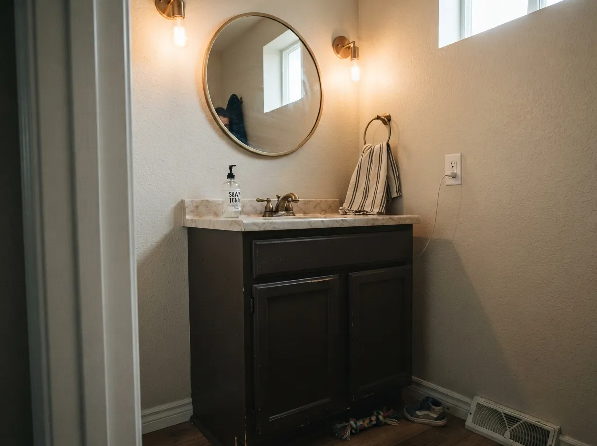
Small rooms take deep color well, and Black Bean on a vanity or a drenched powder room under a real light fixture reads expensive with brass fixtures and a marble or stone top. Matte or eggshell, not gloss — a dark gloss surface shows fingerprints and water spots harder than matte does.
Reserve it for the door, shutters, or trim against a lighter siding. As the dominant exterior color it shows every water stain and dust streak, and repaints come sooner than with a mid-tone or a true black formulated for exterior fade resistance.
Your Light Is the Risk
Direct warm daylight pulls the cocoa-mahogany brown forward — the color looks rich and alive instead of flat. This is the light that sells it.
Without a big window or serious lamp wattage it just reads as a dark hole, not a moody accent. Sherwin-Williams itself reserves it for larger, well-lit spaces.
A north-facing room holds the color true and deep all day; a south-facing room brightens it enough to actually show the brown. Sample in both before committing a whole room.
Warm 2700K bulbs push it further into cocoa and espresso — cozy, not gloomy. Cool white LEDs flatten it toward plain soot-black with the warmth gone.
Most complaints about Black Bean are a light mismatch. Upload a photo of your actual room and see it on your walls — then ask for the same wall in north light or evening lamps before you buy a single sample.
Need It From Another Brand?
Any paint counter can custom-tint Sherwin-Williams SW 6006 directly. If you would rather stay in one brand's own deck, these are the closest stock matches, measured as ΔE2000. Under 2 is a difference you will not see on the wall.
| Brand | Closest color | ΔE | LRV | |
|---|---|---|---|---|
| Behr | Cordovan LeatherBXC-78 · Behr | 1.8 | 4 | Color page → |
| Benjamin Moore | Espresso BeanCSP-30 · Benjamin Moore | 2.2 | 6 | Color page → |
| Valspar | Brown Velvet1011-10 · Valspar | 1.0 | 4 | Color page → |
| HGTV Home by Sherwin-Williams | Jumping JavaHGSW 3081 · HGTV Home by Sherwin-Williams | 0.0 | 4 | Color page → |
| Magnolia Home | MomentsJG-150 · Magnolia Home | 2.6 | 4 | Color page → |
Similar Sherwin-Williams Colors
The nearest shades to Black Bean within Sherwin-Williams's own range, ranked by perceptual color distance — useful when you want the same look a touch lighter, darker, or warmer.
WCAG 2.1: AA is 4.5 : 1 for normal text, 3 : 1 for large text, AAA is 7 : 1.
Black Bean vs the Colors You're Also Considering
Every Black Bean sample board has the same rivals on it. The numbers show the real lightness gap — then it comes down to which risk you would rather live with.
Pick this for the warmer, redder cocoa lean, and if your painter already works in Sherwin-Williams.
Benjamin Moore AF-180 · LRV 5WengePick this if you want the same near-black-brown mood from Benjamin Moore — Wenge is flatter and less red, built mainly for cabinets, doors, and built-ins.
Pick this for the softer, warmer near-black that still shows a little cocoa color up close instead of going flat black.
Sherwin-Williams SW 6258 · LRV 3Tricorn BlackPick this if you want a true, cool black with zero brown — the reference black in the SW deck.
Black Bean Coordinating Colors
The rule for coordinating with Black Bean is simple: give it a genuinely light, warm neighbor so the room has somewhere to reflect from, and let a second near-black cousin carry the darker accents without fighting it. These are the partners that keep showing up in rooms that work:
Black Bean's Story: A Quiet Workhorse, Not a Headline Color
Black Bean has never been a Sherwin-Williams Color of the Year and has no viral before-and-after story attached to it — it has had its moment as a Sherwin-Williams Color of the Month pick, and that is honestly the ceiling of its fame. What it has instead is steady use inside the same dark-cabinet, moody-kitchen-island wave that made SW Iron Ore, Tricorn Black, and Urbane Bronze into whole-house staples over the last several years.
Its actual job in that lineup is narrower and more specific: where Iron Ore reads charcoal-gray and Tricorn Black reads flat true black, Black Bean is the pick when the brief is specifically "near-black, but warm" — a color for people who tested a true black, decided it felt cold or harsh, and wanted the same drama with a cocoa undertone instead.
Black Bean With Wood Tones and Metals
Warm wood is the easy pairing: oak, walnut, and butcher block all sit comfortably next to Black Bean because the paint's own brown undertone meets them halfway instead of fighting for attention. Unlacquered brass and antique gold hardware push the whole look warmer and more traditional; matte black hardware keeps it modern and slightly cooler without clashing.
Cool white or gray-veined stone countertops are the one pairing worth sampling first — a very cold, blue-white quartz next to Black Bean's warm brown can read a little harsh, where a warmer white, cream, or beige-veined stone lets the two sides of the kitchen agree with each other.
Three Ready Palettes Built on Black Bean
A color is never alone on the wall. These are complete combinations in the 60-30-10 pattern, with the reason each one holds together. Every one opens in the visualizer.
Alabaster's warm-white perimeter keeps the kitchen bright enough for the island's cocoa-black to actually read as color instead of a hole; crisp Pure White trim frames the whole room so the dark island stays the single deliberate move.
Try this palette in your roomMatching the door and shutters in one paint keeps the near-black moves reading as a single deliberate frame instead of two competing darks; Pure White siding gives it maximum contrast and hides the least dirt of any white in the deck.
Try this palette in your roomCreamy Shoji White at the ceiling plane keeps the room from feeling boxed in under all that dark; Urbane Bronze on the built-ins sits close enough in depth to melt into shadow, so books and objects become the real accent, not the paint.
Try this palette in your roomBlack Bean FAQ
Is black bean actually black or brown?
Both, honestly — it is a warm cocoa-mahogany brown pushed dark enough (LRV around 5) to read as near-black from across a room. Up close and in good light the brown shows; from a distance or in dim light it reads flat black. If you want zero brown, look at SW Tricorn Black instead.
What's the difference between black bean and tricorn black?
Undertone. Tricorn Black is Sherwin-Williams' true, cool reference black with no visible color shift. Black Bean carries a real cocoa-brown warmth that comes forward in daylight. Pick Tricorn Black for a flat, graphic black; pick Black Bean when you want a near-black that still feels warm.
Is black bean too dark for a small kitchen?
As a full wall color in a small, dim kitchen — yes, it can feel like a box. As an island, it is one of its best uses in any size kitchen, because the surrounding light cabinetry and countertops do the reflecting the paint itself can't.
What trim color goes with black bean cabinets or walls?
A warm off-white reads best — SW Alabaster or SW Shoji White keep the transition soft. A stark, cool white works too for maximum contrast, but it makes the dark surface look slightly more black and less brown than it is.
Does black bean work on an exterior front door?
Yes — it is one of its strongest uses, dramatic against white, cream, or light gray siding. Save it for the door, shutters, or trim rather than the whole house: full siding in a color this deep shows dust and fade faster than a lighter or mid-tone exterior color.
How many coats does black bean need?
Plan on two coats minimum over a similar mid-tone, three over a bright existing color. A gray-tinted primer first cuts the number of finish coats needed and gets you truer, more even coverage on a color this deep.
Have you painted with Black Bean?
Rate it — one tap helps the next reader decide.
Ask a Question