Sherwin-Williams Accessible BeigevsSherwin-Williams Kilim Beige
Why this comparison: Kilim Beige is the yellower classic beige; Accessible Beige the modern greige-beige. Accessible Beige and Kilim Beige are very close (ΔE 3.8). The difference shows up most in side-by-side comparison and under specific light.

Built from our full reviews of both colors — same measured data, same real-room photos. About the testing process →
The Numbers
LRV is essentially equal (58 vs 57) — both reflect light the same.
What Each Color Really Is
A tan built on a real gray backbone — which is exactly why people argue about whether it is beige or greige. It sits on the line. The useful way to see it is by how it is put together compared to its rival: Agreeable Gray is a gray that has been warmed up with beige, and Accessible Beige is a beige that has been steadied with gray. The gray is doing a specific job. Old builder beige was mixed with yellow-orange pigment, which is what made it go gold under lamplight and eventually look dated; the gray in Accessible Beige cancels that gold before it can show up. Take the gray out and you have 1998 back.
LRV 58 means it bounces back a little under 60% of the light that lands on it — mid-light, not pale. That number is worth sitting with, because Agreeable Gray is LRV 60, which is effectively the same lightness. If Accessible Beige looks darker to you on the chip, you are reading the extra brown in it, not less light. Against a clean trim white like Pure White at LRV 84 there is a clear step, so trim reads as trim. In a room with real windows it behaves like a light neutral. In a room without them, it stops being light and starts being a mid-tone — same paint, different job.
A true warm beige with an orange base — and Sherwin-Williams says so itself, filing SW 6106 in the orange color family rather than with the neutrals. That single fact explains most of what the color does on a wall. There is no gray in it to mute the warmth, so it never turns drab; it reads tan, with a soft pink-gold flush that most people describe as cozy and a minority describe as peachy. Reviewers who love it and reviewers who returned it are usually looking at the same wall and disagreeing about how much orange they can live with.
At LRV 57 it sits at the deeper end of the light range — noticeably more body than the pale beiges people usually roll across a whole floor. That depth is useful: white trim gets real contrast instead of a mushy edge, scuffs and handprints disappear in a hallway, and the color still holds its identity in a dim room where a lighter beige would wash out. It is also the reason it looks stronger on the wall than on the chip. Every reviewer warns about the same surprise: it photographs grayer and flatter than it lives, so the real wall lands warmer, pinker and a touch deeper than the photo that sold it to you.
Specs Side by Side
| Spec | Accessible Beige | Kilim Beige |
|---|---|---|
| Brand | Sherwin-Williams | Sherwin-Williams |
| SKU | SW 7036 | SW 6106 |
| Hex | #D1C7B8 | #D7C5AE |
| RGB | 209, 199, 184 | 215, 197, 174 |
| LRV | 58 | 57 |
| Undertone | red-orange / warm | red-orange / warm |
| Family | Neutral | Neutral |
How Light Changes Them
Strong warm sun all day pushes the tan forward. Soft, creamy, and never orange.
Cool daylight kills the warmth and the gray takes over. Reads taupe, sometimes drab. Sample first.
2700K bulbs make it warm and cozy. Cool LEDs above 3500K flatten it to gray — change bulbs, not paint.
With no daylight it loses its lift and can read dingy or faintly pink-taupe. Go lighter or warmer here.
Its quiet superpower: with no gray in the mix, cool daylight cannot drain it. It stays a warm tan where popular greiges go flat.
Low afternoon sun pushes it to peach, sometimes salmon on tall bright walls. Test at 5pm before you commit.
A clean warm tan in the morning, steadily warmer and deeper toward evening. The swing is bigger than most beiges.
2700K bulbs deepen it and bring the orange forward. Cool 4000K LEDs flatten it and can expose a faint green-gray.
Both Colors in Real Rooms
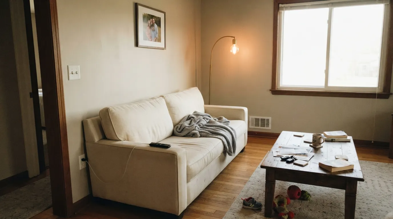
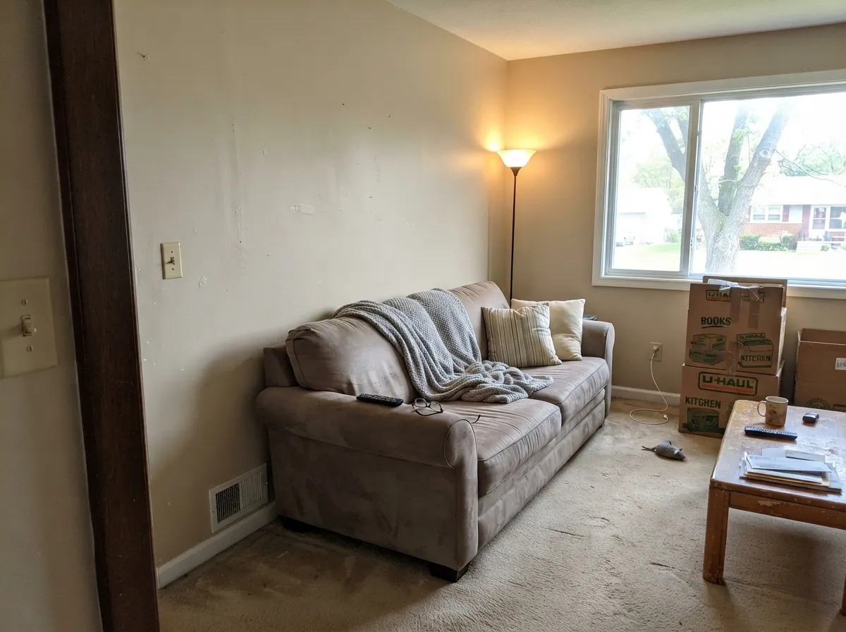
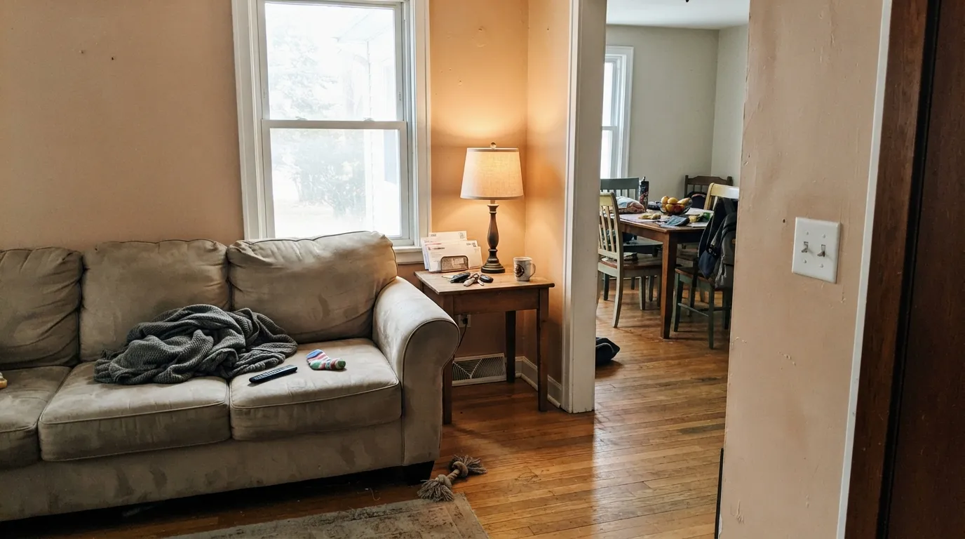
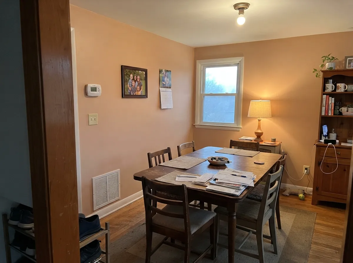
Photos from our full reviews — the same rooms and captions, so you can judge each color where it actually lives, not on a chip.
When to Pick Which
Open-plan main floors that need one color everywhere · south and west rooms with real daylight · resale prep and rentals · warm wood, brass, and cream furnishings
Your room faces north and stays dim · your floors are red-toned cherry or red oak · your trim is a warm white like Alabaster · you want a beige that reads clearly beige, not taupe
Living and family rooms in houses with oak, brick or travertine · dining rooms and open main floors · hallways, entries and closets · anyone whose greige sample looked cold and lifeless
You actually want greige · your trim and cabinets are yellow-based cream · your floors are cool gray LVP · the room takes hard west afternoon sun on tall walls
No comparison page can see your light. Upload one photo of your room and try both colors on the same walls, seconds apart.
Accessible Beige vs Kilim Beige FAQ
Which is lighter, Accessible Beige or Kilim Beige?
They are practically the same lightness — LRV 58 vs 57. Neither will make the room brighter than the other.
Which is warmer, Accessible Beige or Kilim Beige?
They share the same undertone family — both read red-orange / warm. The difference between them is lightness and depth, not temperature.
How similar are Accessible Beige and Kilim Beige?
Accessible Beige and Kilim Beige are very close (ΔE 3.8). The difference shows up most in side-by-side comparison and under specific light. The only reliable test is seeing both in your own room and light — a side-by-side on a screen or chip flattens the difference.
Can I use Accessible Beige and Kilim Beige together in one house?
Not in the same room, and be careful in the same house. At ΔE 3.8 they are so close that two walls in each will read as a tinting mistake, not a design choice. Pick one, or keep them on different floors where they are never seen together.
Ask a Question