Mahogany
Pratt & Lambert's wood-dark red-brown, reviewed honestly: the rooms where it reads like stained mahogany, the light that turns it black, and why almost nobody has photographed it.

Jessica has spec'd whites and neutrals for more than 300 rooms and keeps a sample wall of painted drawdowns in her studio. Every color review is checked against real reader rooms in the comments and re-tested when a formula changes. About the testing process →
- 1Redwood0
- 2Mahogany5
- 3Million Dollar Red13
- 4Cinnamon Slate19
The Fast Verdict
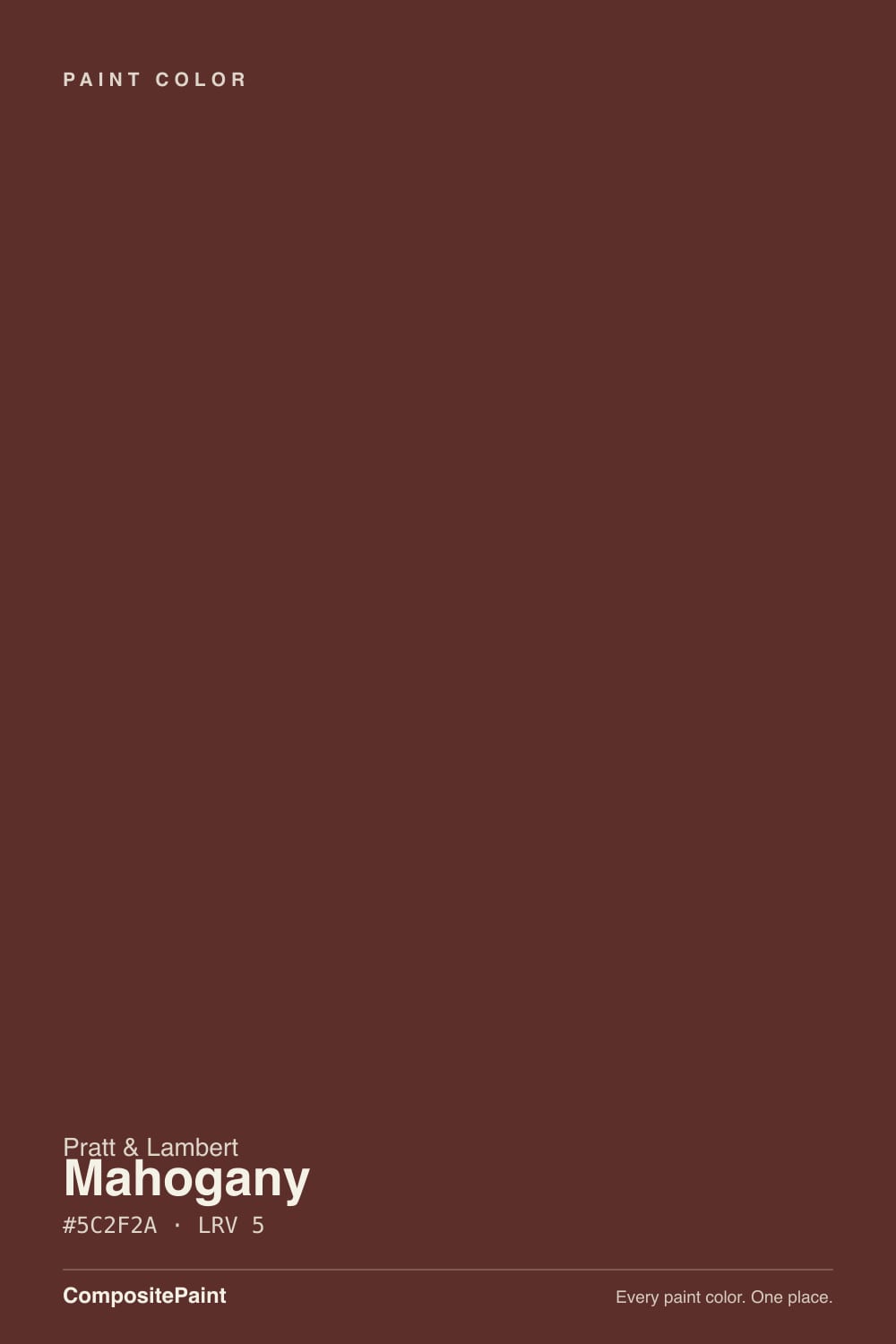
Mahogany 21-10 is a saturated red-brown at near-black depth — LRV 5, a clear wine-wood pull, no gray in it — from a numbered Pratt & Lambert chip almost no one has posted a real room of. Give it sun or a 2700K lamp and it looks like polished dark wood or old leather. Starve it of light and it is just a black wall. It is an accent, a door, an island, a dining-room drench — never a whole-house wall color, and never the cherry-red the name can trick you into picturing.
Front doors and shutters · dining rooms and dens with real lamps · kitchen islands and built-ins in wood-tone houses · powder rooms · anyone whose painter already buys Pratt & Lambert
You wanted a true, bright red · four walls of a dim living room · the bulbs are 4000K and you will not change them · you need it in stock at a home center this weekend
- Reads like stained mahogany and old leather once real light hits it
- Front door and island depth without going costume-red or true-black
- Hides scuffs and fingerprints the way any LRV 5 color does
- Same dark band as Bewitched and Cottage Red, so the behavior is known even if this SKU is not
- Quiet dealer-deck color — no trend timestamp, no Pinterest fame to age out of
- Almost no owner photos of this exact 21-10 formula to check before you buy
- Reads flat near-black in any room without sun or warm lamps
- Too brown and too dark for anyone who pictured a true red
- Not stocked at big-box counters — needs a Pratt & Lambert dealer or a match
What Color Is Mahogany, Really?
A saturated red-brown that wants to be wood, not a costume red. The mix sits on the red side of brown — wine, oxblood, old leather, the color of a mahogany table in late sun — and it is dense enough that the red only shows when light actually hits the surface. Pratt & Lambert files it as 21-10 in the old numbered, calibrated deck independent dealers have mixed for decades. It is not a Color of the Year, not a Pinterest famous door, and not the same chip as other brands' Mahogany stains. It is the red-brown a painter already standing in a Pratt & Lambert booth reaches for when the house is walnut, brass, and cream, and the job is one confident dark surface.
At LRV 5 it is as dark as Cottage Red (PM-15) and a hair darker than Bewitched (CSP-450) at LRV 6. That depth is the whole personality. In a bright dining room or on a sunlit door the red-brown is unmistakable — polished wood, not paint. In a hallway with no lamp it collapses to a flat near-black, and the name on the can will not save you. Brick Red (20-9) shares the same LRV and a sibling hex, but Brick Red is the brighter masonry-oxide; Mahogany is the woodier, more closed-down version of that same dark band. Cocoa (23-11) at LRV 7 is the chocolate cousin: same brand, less red, a little more light to give back.
Undertone in one line: warm red-brown first, wine second — never orange, never purple, never a true black. If your sample looks like espresso with no red in it, the room is short on light, not the formula. If it looks brick-bright, that is full sun doing exactly what a saturated red-brown does. Both versions are the same paint being honest about the room.
Where It Shines
Give it a job with real light behind it — a front door in afternoon sun, a dining room with lamps on at dinner, an island under 2700K pendants — and it earns the name: rich, wood-dark, slightly wine, the kind of depth that reads like stained mahogany rather than a painted red. It is built for single surfaces and small committed rooms, not open-plan walls, and it wants cream trim, brass, and actual wood in the room so the red-brown has something warm to talk to.
Where It Fails
There are almost no owner threads for this exact 21-10 formula, so the regret patterns below come from the color's own numbers and from the well-documented cousins it sits next to — Bewitched, Cottage Red, Brick Red. All three scripts are predictable before the first coat. If your room matches one, this is not your red-brown.
At LRV 5 there is almost nothing left to reflect. A north living room, a windowless hall, or a dining room you never light at night will read as a flat near-black hole, not mahogany. The red-brown did not fail; the light had nothing to give back. Keep it to a door, an island, one wall, or a room that actually gets sun or a lamp — or pick a color with more LRV in reserve.
The name is Mahogany, not Cherry, and the mix is brown enough that anyone picturing a fire-engine door or Caliente (AF-290, LRV 9) will be underwhelmed. This is wood-dark wine, not a clear red. If you want the color to read red from the curb at a glance, Caliente or Brick Red 20-9 is the fork; 21-10 is the one that behaves like dark furniture.
4000K LEDs and leftover builder-white casing squeeze the wine out and leave a muddy brown-black that looks dirty next to the crisp edge. Warm 2700K bulbs are part of this paint job, and the trim wants White Dove (PM-19), not Chantilly Lace (OC-65). Swap the bulbs and the white before you blame the can.
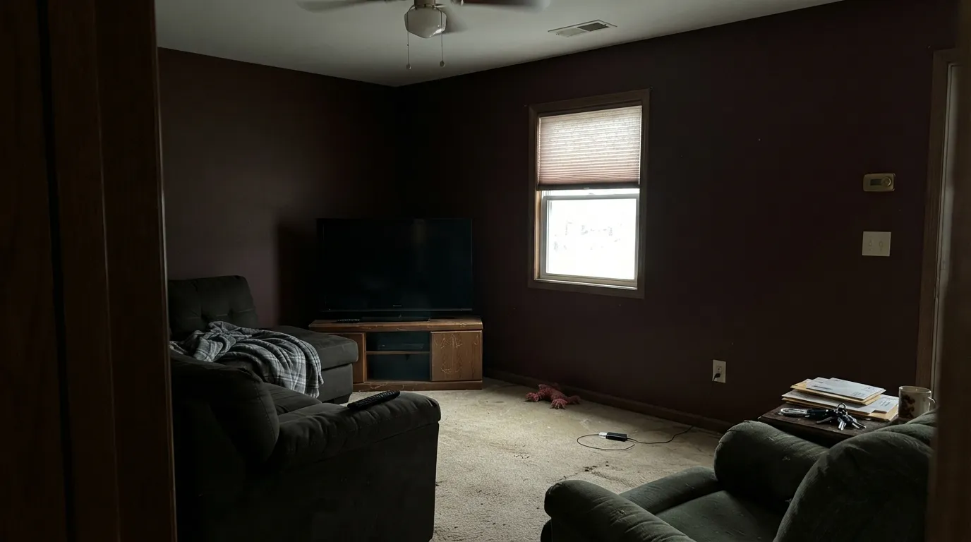
Room by Room
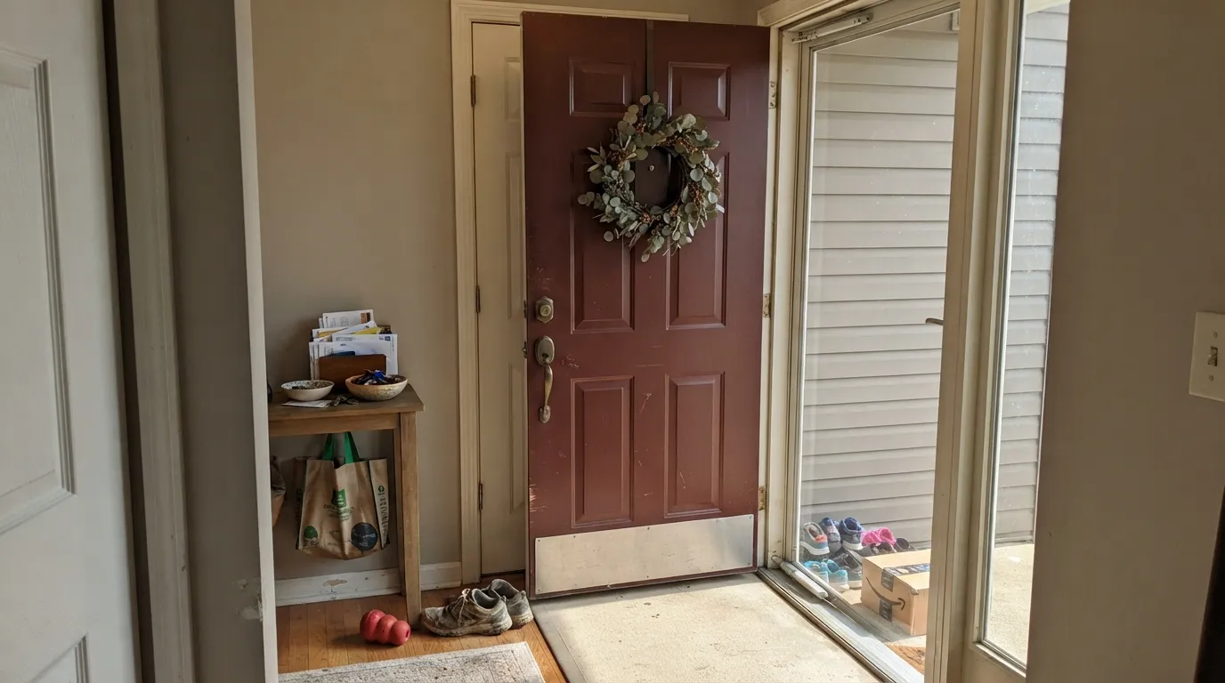
Semi-gloss, real sun, cream or warm-white siding: this is where 21-10 looks like stained wood instead of paint. It hides scuffs better than a true black door and still reads as a color from the walk. A shaded north porch will push it toward black — look at the actual door at the hour you see it most.
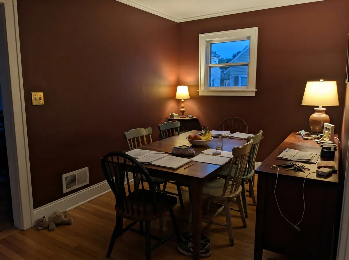
The wood-tone interior this chip was mixed for. Matte or eggshell on the walls, White Dove on the trim, walnut table or shelves, 2700K lamps on at dinner. Daylight through a real window keeps it from going cave-dark before 5pm. Skip it in an interior dining room that never gets a lamp.
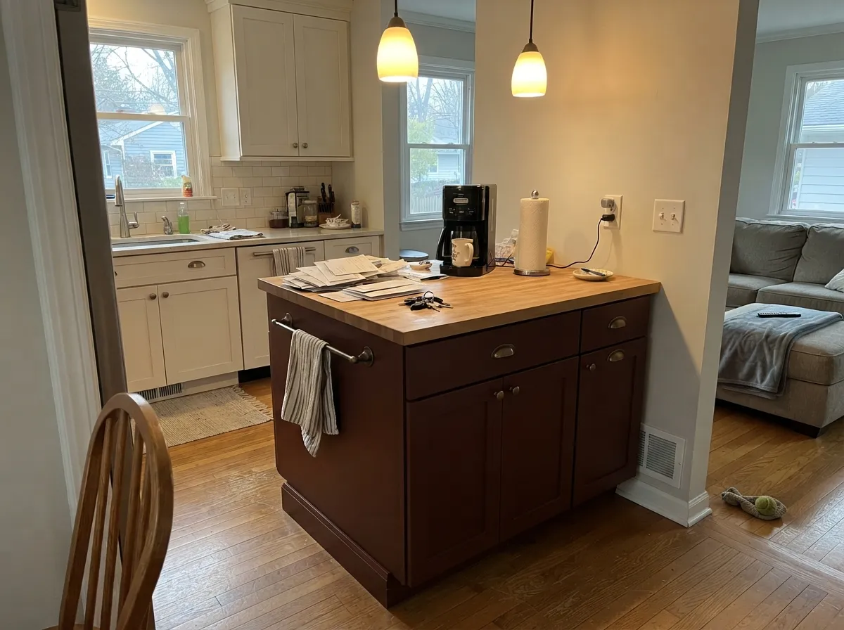
Satin on an island or a run of built-ins under cream or Alabaster (SW 7008) perimeters is the indoor version of the front-door trick: one dark wood-tone object, plenty of light around it. A full kitchen of Mahogany cabinets is a much bigger bet and needs strong task light or it reads as a black box by evening.
Small rooms take this depth well if a sconce or overhead fixture is actually doing work. Brass faucet, cream towels, a warm stone or wood top. A windowless powder room with one dim bulb is the black-hole version — upgrade the fixture first.
One wall behind a sofa or fireplace, with Pale Oak (OC-20) or cream neighbors, can anchor a wood-tone living room. Four walls in average living-room light ask more of LRV 5 than most rooms can give back. If you want the drench, do it in the dining room or the den, not the open main floor.
On a door or shutters against cream, brick, or a warm greige it reads like aged wood from the street. Full siding in Mahogany needs a genuinely sun-drenched lot or it just looks dark, not red-brown. Keep the field light; let 21-10 be the one dark note.
Your Light Is the Risk
South or west sun is what proves this is mahogany and not black — the red-brown comes forward like polished wood. Sample the sunlit wall first.
Cool, flat daylight plus LRV 5 leaves almost nothing to bounce back. The wine drains out and the wall is a characterless near-black. If the room lives this way, pick something with more light in it.
East mornings keep it quieter and browner; west afternoon and golden hour pull the wine. On a front door the swing can look like real wood changing with the hour. Both reads are the same paint.
2700K lamps keep the red-brown alive after dark and are part of the spec. 4000K LEDs and fluorescents flatten it to muddy brown-black — swap bulbs before you repaint.
Most complaints about Mahogany are a light mismatch. Upload a photo of your actual room and see it on your walls — then ask for the same wall in north light or evening lamps before you buy a single sample.
Need It From Another Brand?
Any paint counter can custom-tint Pratt & Lambert 21-10 directly. If you would rather stay in one brand's own deck, these are the closest stock matches, measured as ΔE2000. Under 2 is a difference you will not see on the wall.
| Brand | Closest color | ΔE | LRV | |
|---|---|---|---|---|
| Sherwin-Williams | Rookwood RedSW 2802 · Sherwin-Williams | 2.0 | 5 | Color page → |
| Behr | Mayan Red190F-7 · Behr | 4.6 | 5 | Color page → |
| Benjamin Moore | BewitchedCSP-450 · Benjamin Moore | 2.8 | 6 | Color page → |
| Valspar | One DozenT593 · Valspar | 2.3 | 5 | Color page → |
| Dutch Boy | Saw Mill407-7DB · Dutch Boy | 3.0 | 5 | Color page → |
| HGTV Home by Sherwin-Williams | Rouge RemixHGSW 3021 · HGTV Home by Sherwin-Williams | 3.0 | 5 | Color page → |
Contrast and Legibility
WCAG 2.1: AA is 4.5 : 1 for normal text, 3 : 1 for large text, AAA is 7 : 1.
Mahogany vs the Colors You're Also Considering
Every Mahogany sample board has the same rivals on it. The numbers show the real lightness gap — then it comes down to which risk you would rather live with.
Pick this if your painter is already in the Pratt & Lambert booth and you want the woodier, slightly darker version of the same near-black red-brown.
Benjamin Moore CSP-450 · LRV 6BewitchedPick this if you want the oxblood people have actually photographed — a half-step lighter, a hair more wine, built for drama rather than daylight.
Pick this when the red-brown is the point and you want it to read like stained mahogany, not melted chocolate.
Pratt & Lambert 23-11 · LRV 7CocoaPick this when you want a genuine cocoa brown with less red — same dealer, a little more light, clearly chocolate instead of wood-wine.
Pratt & Lambert offers a couple of dark warm colors close enough to Mahogany that they are worth comparing directly. Brick Red (20-9) shares the same LRV of 5 but its hex #7C2F2A is noticeably brighter and truer red. Brick Red reads as a bold red brick, while Mahogany reads as dark wood; choose Brick Red when you want obvious color energy and Mahogany when you want a color that behaves almost like a warm near-black.
Cocoa (23-11) at an LRV of 7 with hex #5C4435 goes the other direction. It is a genuine milk-chocolate brown with far less red, so it looks softer and more neutral on a wall. Pick Cocoa for a cozy, understated brown room, and pick Mahogany when you want that wine-red depth to show. Between the three, Mahogany is the balance point: darker and richer than Brick Red's brightness, warmer and redder than Cocoa's plain brown.
Mahogany Coordinating Colors
The rule for coordinating with Mahogany is simple: stay warm, keep a light neighbor nearby so LRV 5 has somewhere to bounce, and pick woods and metals that already live in the red-brown family. Cool grays, chrome, and ice-white trim fight it. These are the partners that keep it reading as stained wood instead of a black wall:
A Numbered Chip With Almost No Photographs
Pratt & Lambert started in Buffalo in 1849 and spent a long century as a professional, numbered deck that painters mixed at independent counters. Sherwin-Williams bought the brand in 1995 and kept selling it quietly through Ace, Do It Best, and regional shops rather than folding it into a big-box aisle. Mahogany 21-10 lives in that old calibrated sequence — the same numbering family as Brick Red 20-9 — which is why a restoration painter may already know the chip and a Houzz board will not.
Search this exact SKU and you will not find a Color of the Year campaign, a TV-set credit, or a stack of owner photos. That is not a defect in the paint. It behaves like the well-documented oxbloods and barn reds it sits next to in hex and LRV: Bewitched, Cottage Red, Brick Red. Order a large sample, look at it in the actual light, and lean on those cousins if you need to see the color already on someone else's door.
Mahogany With Wood Tones And Floors
Pale white oak, ash, maple, and a light butcher block are the easy pairings — the contrast keeps an island or a dining-room wall from merging into the floor. Cream carpet is fine. Brass, unlacquered bronze, and aged gold sit naturally against it; polished chrome is the metal that goes cold.
Dark walnut and espresso are trickier than they sound. The paint is trying to be that wood. Next to a walnut table it can disappear and read as more of the same dark mass rather than a chosen color. If the dark floor is staying, give Mahogany a break — a White Dove baseboard, a lighter rug, or hold the paint to the door and let the furniture own the brown.
The honest clash is golden honey oak and orange builder stain. Yellow-orange next to this red-brown is the 1990s cherry-and-oak kitchen: both sides get louder, the floor goes more orange, the wall goes more wine, and the room dates itself. A large rug helps. If the honey oak is staying and you cannot rug it, pick a cream or a greige and leave 21-10 on a door, not on four walls.
Three Ready Palettes Built on Mahogany
A color is never alone on the wall. These are complete combinations in the 60-30-10 pattern, with the reason each one holds together. Every one opens in the visualizer.
A dark red-brown door against a warm greige body and a soft white trim reads like stained wood, not a paint decision. Agreeable Gray stays on the warm side of greige so the door does not look muddy; White Dove keeps the casing from going icy next to the wine.
Try this palette in your roomTwo depths of warm dark — wood-wine walls and an espresso-brown buffet — separated by White Dove so the room does not merge into one hole. Barista turns wine-dark under the same 2700K lamps Mahogany needs, so they read as a set. This only works if the dining room has a real window by day and lamps at dinner.
Try this palette in your roomCream perimeters keep the kitchen from closing in while the island carries all the wood-dark color. Swiss Coffee can run a little warm in strong sun — that is its known trap — but against Mahogany the extra cream reads vintage on purpose. Brass or unlacquered pulls finish it; 2700K pendants are not optional.
Try this palette in your roomMahogany FAQ
Is Pratt & Lambert Mahogany red or brown?
Both, on purpose. It is a saturated red-brown — wood and wine, not a true red and not a chocolate brown. In sun or under 2700K lamps the red is obvious; in dim light it reads as a warm near-black. If you need it to stay clearly red at every hour, this is the wrong chip; look at Caliente or Brick Red 20-9.
What trim white goes with Mahogany?
A warm, soft white. White Dove is the default; Swiss Coffee if you want a creamier, more traditional frame. A stark cool white such as Chantilly Lace (OC-65, LRV 90) makes the walls look muddy and the contrast harsh. Semi-gloss on the trim, matte or eggshell on the walls.
Does it work on a front door?
Yes — it is arguably the best job for it. Semi-gloss in real sun against cream or warm-greige siding reads like stained mahogany rather than painted red. On a shaded north porch it will go closer to black, which some people want and some do not. Look at the door at the hour you actually come home.
Will Mahogany look black in a dim room?
Yes. At LRV 5 there is almost no light to bounce back. Four walls in a north room with no lamps on will look like a flat near-black, not a wood-tone red-brown. Use it where sun or a warm lamp hits it, or pick Cocoa (23-11, LRV 7) if you want a little more light in the mix.
Can I paint kitchen cabinets or an island in it?
An island or a run of built-ins, yes — satin cabinet enamel, cream or Alabaster perimeters, 2700K pendants. A whole kitchen of Mahogany doors is a serious commitment and goes black at the counter after dark unless the task lighting is strong. Prime, and do not use the wall formula on doors that get hands.
Where can I still get Pratt & Lambert 21-10 mixed?
Pratt & Lambert has been made by Sherwin-Williams since 1995 and is sold through independent dealers — Ace, Do It Best, regional paint shops — not a P&L storefront. If your dealer does not stock 21-10, most counters can match the hex; Bewitched (CSP-450) is the closest well-documented oxblood in Benjamin Moore, Brick Red 20-9 the redder sibling in the same P&L deck.
Have you painted with Mahogany?
Rate it — one tap helps the next reader decide.
Ask a Question