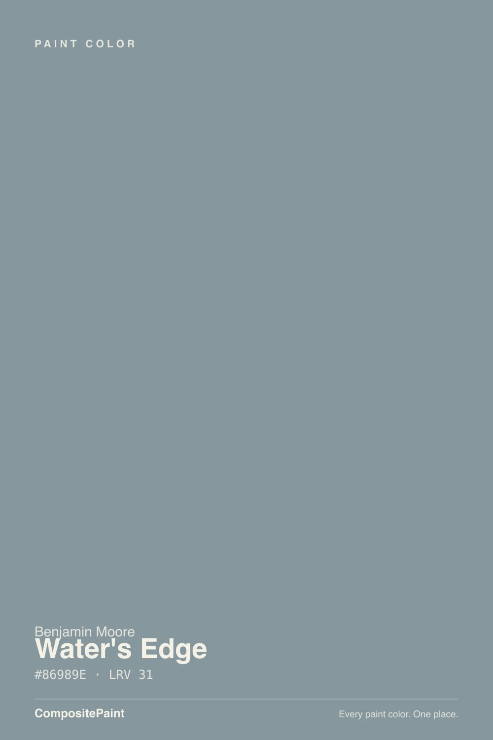
Water's Edge
1635 · #86989E · LRV 31 — cool blue-green tone, mid-tone — versatile but shifts visibly with light.
- 1Salamander6
- 2Hidden Gem14
- 3Water's Edge31
- 4Green Meets Blue36
- 5Wythe Blue48
What Color Is Water's Edge, Really?
Water's Edge (1635) is a soft blue-gray with a hex value of #86989E and an LRV of 31. Its hue lands at 195 degrees, the blue-green part of the wheel, but saturation is only around 11 percent, so this is a grayed, dusty color rather than a clear blue. The LRV of 31 puts it in the mid-tone band, dark enough to have real presence on a wall and light enough that a room does not close in around it.
People reach for it when they want the calm of blue without the coldness or the nursery feel of a saturated one. The cool blue-green base gives walls a settled, weathered look that suits bathrooms, bedrooms, and coastal-leaning rooms. It behaves almost like a neutral next to wood and white, then reads clearly blue against gray.
The thing to watch is how far it moves. A mid-tone with this little saturation is highly reactive to light. In north light it slides toward gray-green and can look cold, and under warm bulbs at night it flattens and loses its blue almost entirely. Sample it on two different walls before deciding.
The base is cool blue-green. At 195 degrees the hue sits right where blue starts turning toward teal, and the 11 percent saturation keeps that lean quiet rather than obvious. On a small chip the color often reads as a plain gray. Spread across a wall, the blue comes forward and the room takes on a soft aquatic cast.
What it stands next to decides which half you notice. Against a warm beige or an oak floor the blue is unmistakable. Against a true blue like Province Blue 2135-40 at #829BA1 it flattens into gray. Against a straight gray like Tucker Gray CW-705 at #909698 it looks clearly blue-green again.
Green tile, stone with a green fleck, or a teal countertop can push it further toward green than you expect. Hold a sample against every fixed surface in the room, and check it in the corner where two walls meet, since the color deepens there.
Best Rooms and Uses for Water's Edge
An LRV of 31 makes it a comfortable full-room wall color that still leaves the space feeling open. Bedrooms are the easiest use, since the cool base reads restful. Bathrooms suit it too, especially with white tile and chrome or polished nickel, where the blue-green looks intentional rather than accidental. Home offices and hallways handle it well because it holds its color under artificial light better than a paler blue would.
On cabinetry it gives a soft, weathered look instead of a bold statement, which works for bathroom vanities, laundry cabinets, and lower kitchen runs under lighter uppers. Built-ins and window seats take it well.
Outdoors it works as a shutter or porch-ceiling color, and as a full body color on shingled or coastal-style homes with crisp white trim. Keep trim in a separate white rather than the same color, since a mid-tone blue-gray needs a lighter edge to look finished. It is too colored for a general-purpose ceiling.
How Lighting Changes Water's Edge
At LRV 31 this is a genuine mid-tone, so it reflects a moderate amount of light and depends on the room to set its mood. North-facing rooms give it cool, indirect daylight that emphasizes the blue-green base and can make the color feel chilly and slightly stony. That can be beautiful in a bathroom and unwelcoming in a north bedroom.
South-facing rooms warm it noticeably. Strong daylight softens the cool edge and the color reads as a gentle, dusty blue rather than a gray one. East rooms feel fresh and clearly blue in the morning, then quiet down. West rooms stay muted until late afternoon, when warm sun pulls them toward soft gray-green.
Bulbs pull hard on a color this desaturated. Warm 2700K light drains the blue and leaves a warm gray. Cooler 3500K to 4000K light restores the blue-green and keeps it crisp. If the room is used mostly at night, judge your sample under those bulbs.
Most complaints about Water's Edge are a light mismatch. Upload a photo of your actual room and see it on your walls — then ask for the same wall in north light or evening lamps before you buy a single sample.
Need It From Another Brand?
Any paint counter can custom-tint Benjamin Moore 1635 directly. If you would rather stay in one brand's own deck, these are the closest stock matches, measured as ΔE2000. Under 2 is a difference you will not see on the wall.
| Brand | Closest color | ΔE | LRV | |
|---|---|---|---|---|
| Sherwin-Williams | Morning at SeaSW 9634 · Sherwin-Williams | 1.9 | 29 | Color page → |
| Behr | Rainy SeasonMQ5-27 · Behr | 1.6 | 30 | Color page → |
| Valspar | Evening Eclipse4007-3C · Valspar | 2.5 | 29.5 | Color page → |
| PPG / Glidden | SeastonePPG10-11 · PPG / Glidden | 2.7 | 30 | Color page → |
| Glidden | SeastonePPG10-11 · Glidden | 2.7 | 30 | Color page → |
| Dutch Boy | Neptune's Rings431-3DB · Dutch Boy | 1.8 | 31 | Color page → |
Similar Benjamin Moore Colors
The nearest shades to Water's Edge within Benjamin Moore's own range, ranked by perceptual color distance — useful when you want the same look a touch lighter, darker, or warmer.
WCAG 2.1: AA is 4.5 : 1 for normal text, 3 : 1 for large text, AAA is 7 : 1.
Water's Edge vs Similar Colors
Nothing in the cross-brand list lands under a deltaE of 1, so there is no exact stand-in. Rodda Garibaldi CA197 at #86979A and LRV 30 is closest at 1.52, followed by HGTV Home by Sherwin-Williams Marine Park HGSW 3314 at 1.59, Behr Rainy Season MQ5-27 at #8399A2 and LRV 30 at 1.6, Hirshfield's Standish Blue H0048 at 1.63, and Sherwin-Williams Morning at Sea SW 9634 at #82979B and LRV 29 at 1.87. All of those are visually identical in normal room light.
Valspar Evening Eclipse 4007-3C at LRV 29.5, Dunn-Edwards Cold and Rainy DESS36 at LRV 31, and Glidden Seastone PPG10-11 at LRV 30 all sit between 2.5 and 2.72, so they are very close but worth sampling first. Farrow and Ball Oval Room Blue No. 85 at #889B9B and LRV 31 is 3.39 away and greener.
Backdrop Polly Wants BD-PW at LRV 27 and Magnolia Home Sir Drake JG-02 at LRV 30 sit at 3.65 and 4.49, close but visibly different side by side. Benjamin Moore is sold through independent dealers.
Colors That Go With Water's Edge
White trim is the simplest partner. A clean, slightly cool white sharpens the blue and suits bathrooms. A warmer white softens the whole scheme and works better in bedrooms and older homes.
Within Benjamin Moore, the closest relatives make good tonal partners. Van Courtland Blue HC-145 shares the same hex of #86989E and the same LRV of 31, so it is effectively the same color under a different name and number. Brewster Gray HC-162 at #8A9696 and LRV 30 is the grayer, less blue option for an adjoining room. Province Blue 2135-40 at #829BA1 and LRV 32 pushes a touch bluer. Gibraltar Cliffs 1587 at #8F9999 and LRV 32 and Tucker Gray CW-705 at #909698 and LRV 31 both step toward neutral gray if you want the blue to appear only in one space. Amsterdam AF-550 at #81949D and LRV 29 is slightly deeper and cooler.
For materials, white oak, rattan, unlacquered brass, and warm leather all balance the coolness. Chrome and polished nickel reinforce it.
Coordinated palette
Generated by hue-rotating #86989E in HSL space. Pair Water's Edge with one accent and one neutral — the swatches below are starting points, not final picks.
Water's Edge FAQ
Is Water's Edge warm or cool?
It is cool. Benjamin Moore describes it as a cool blue-green tone, and its hue sits at 195 degrees, right at the boundary between blue and teal. The saturation is low at around 11 percent, so the coolness is soft rather than icy, but it will read cool in a north-facing room and against warm woods.
What LRV is Water's Edge?
Water's Edge 1635 has an LRV of 31. On the 0 to 100 scale that puts it in the mid-tone band, so it reflects a moderate amount of light. Walls in it will look clearly colored and have some depth, without turning the room dark the way a color under 20 would.
Does Water's Edge work in a dark room?
It can, with care. At LRV 31 it holds up better than a deep blue would, but low light pulls the color toward gray and takes away much of the blue. If the room has one window or faces north, add warm lamps and expect a stonier result than the chip suggests. Sample it on the darkest wall first.
What white trim goes with Water's Edge?
Both directions work. A clean, slightly cool white gives crisp contrast against the LRV 31 wall and suits bathrooms and modern rooms. A warmer, creamier white takes the chill off the blue-green base and looks better in bedrooms and older houses. Paint a sample of each on a board and hold it against the wall.
Is Water's Edge good for bathrooms and cabinets?
Yes. The cool blue-green base looks natural with white tile, chrome, and polished nickel, which makes it a common bathroom wall color. On cabinetry it reads soft and weathered rather than bold, so it suits vanities, laundry rooms, and lower kitchen cabinets under lighter uppers.
How is Water's Edge different from Van Courtland Blue?
They are the same color in practice. Van Courtland Blue HC-145 has the identical hex value of #86989E and the identical LRV of 31, so on a wall you would not be able to tell them apart. The difference is only which collection and number your dealer looks it up under.
Have you painted with Water's Edge?
Rate it — one tap helps the next reader decide.
Ask a Question