Morning at Sea
A muted blue-green-gray from Sherwin-Williams' quieter deck, reviewed honestly: the exact light where its color shows up, the lamp-lit rooms where it vanishes, and what to buy instead.

Jessica has spec'd whites and neutrals for more than 300 rooms and keeps a sample wall of painted drawdowns in her studio. Every color review is checked against real reader rooms in the comments and re-tested when a formula changes. About the testing process →
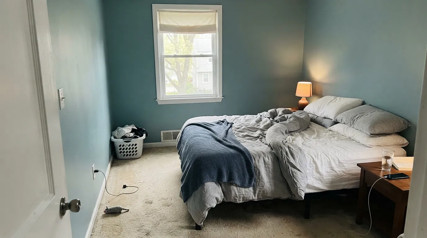
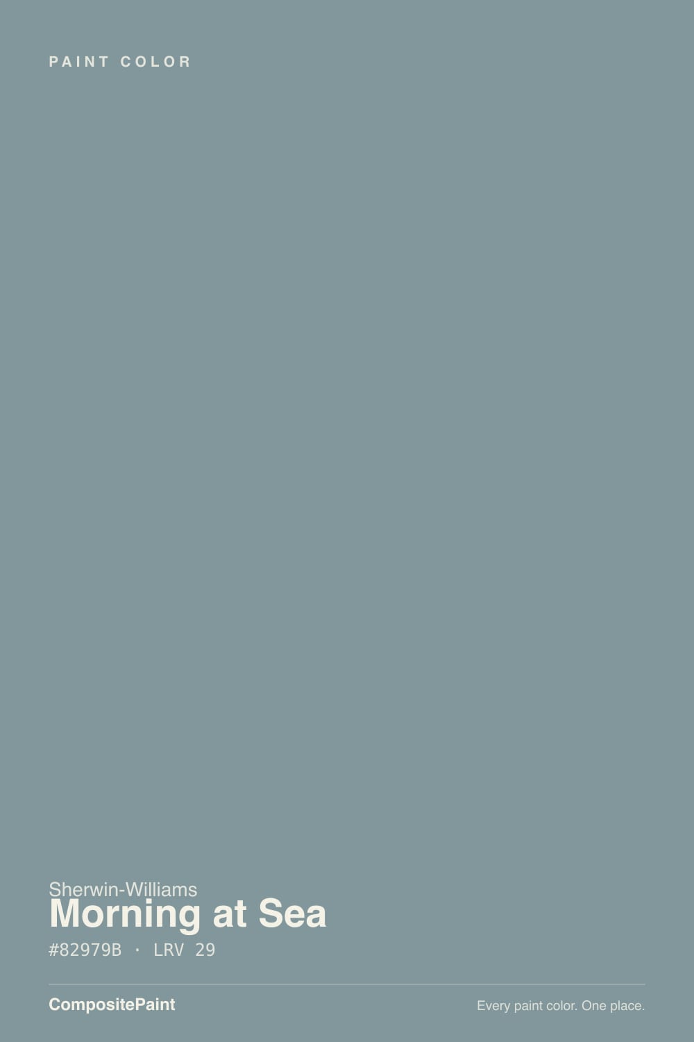
- 1Salamander6
- 2Hidden Gem14
- 3Morning at Sea29
- 4Peacock Blue35
- 5Wythe Blue48
The Fast Verdict
Morning at Sea is a cool, muted blue-green that behaves backward from most colors in this deck: bright daylight is what makes it look good, and warm lamplight is what makes it fade. Give it a real window and it reads confident and coastal without tipping into theme-park nautical. Skip the window and it settles into a flat, sleepy gray-green that has none of the color you bought it for. It is not famous, it has no design-blog moment behind it, and that is fine — it is a genuinely well-behaved color that just never asked for attention.
Bedrooms, bathrooms and home offices with real daylight · powder-room vanities · quiet coastal or modern-farmhouse schemes · kitchens with older warm-wood cabinets that need a cooling reset
Your only light source is a warm lamp with no window nearby · you actually want a true neutral gray · your floors and trim run deep honey-gold · you want a color with instant name recognition
- A genuine, confirmed cool blue-green — never drifts warm or pink
- Deep enough (LRV 29) to read as real color, not a whisper of gray
- Solid in the rooms it's built for — bathrooms, bedrooms and offices with real daylight all check out
- Cross-brand and in-deck twins exist if this exact can is hard to find nearby
- No trend timestamp on it — it never had a viral moment to fall out of
- Needs real daylight or a cool-white bulb; warm lamp-only rooms drain the color out
- Reads as color, not neutral — a letdown for shoppers who actually wanted gray
- Real owner reviews are thin, and the one that flags trouble confirms it: a reported "brownish," not blue-green, result
- Fights honey-oak floors and gold-toned trim
What Color Is Morning at Sea, Really?
Morning at Sea is a muted, cyan-leaning blue-green-gray — cool and low-saturation, never drifting toward true navy or true sage, just sitting quietly between them. Sherwin-Williams' own site files it under "Neutral," not blue or green, which is the most honest fact about this can: it is that gray-forward before daylight commits it to a color. It belongs to Rustic + Refined, a Sherwin-Williams designer collection built to give classic farmhouse design a cooler, more coastal update, with blues and greens the brand itself describes as "airy and serene... rooms of respite and retreat." Unlike the collection's bolder members, Morning at Sea plays support, not lead: it is the color you reach for when you want the calm of blue-green without asking a room to make a statement.
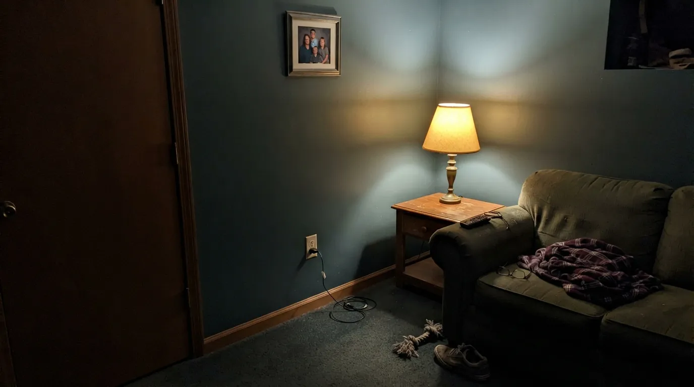
At LRV 29 it sits at genuine mid-depth — deep enough to read as a real color decision, not a whisper of gray. What matters more than the number is how it behaves with light temperature, and it runs backward from most colors in this deck: bright, cool daylight is what brings the blue-green forward and makes it read true; warm, low lamplight does the opposite, draining the color out and leaving a flatter, more neutral gray behind. Most warm-based colors need warm light to look their best. This one needs the opposite.
Undertone in one line: cool blue-green, mineral and slightly weathered — never warm, never pink. A second honest line: this is not a Color of the Year and has no viral room behind it. The few real owner reviews that do turn up match the pattern above exactly — one buyer used it in a kitchen with older cherry cabinets and said it made the space "feel much lighter"; another said it came out looking brownish, not the blue-green they expected. Two data points, one light-dependent story. Several genuinely good colors already reviewed on this site (Cadet, Jasper Stone, Debonair) share the same quiet, undercovered track record — you are trusting this one on its own merits, not a design blog's word.
Where It Shines
Give it real daylight — even indirect, even overcast-but-bright — and it holds a confident, genuine blue-green that reads coastal without leaning nautical-theme-park. It's aimed at bathrooms, bedrooms and home offices: the small-to-mid rooms where a little cool color goes a long way and a window is doing real work. Pair it with aged brass, pale or white oak, and natural linen and it looks like a deliberate, slightly expensive choice rather than an accident — or lean into it over warm wood the way one real owner did, using it to modernize a kitchen with older cherry cabinets.
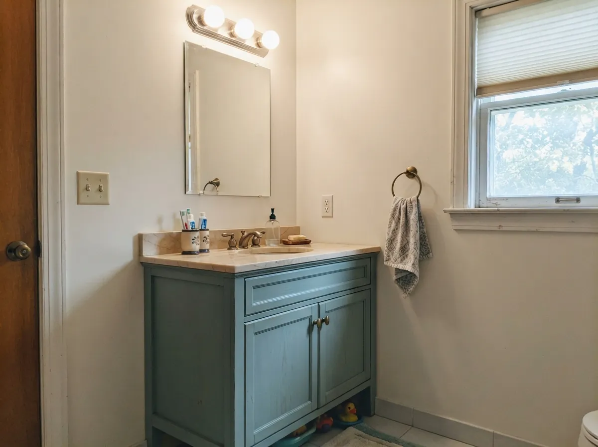
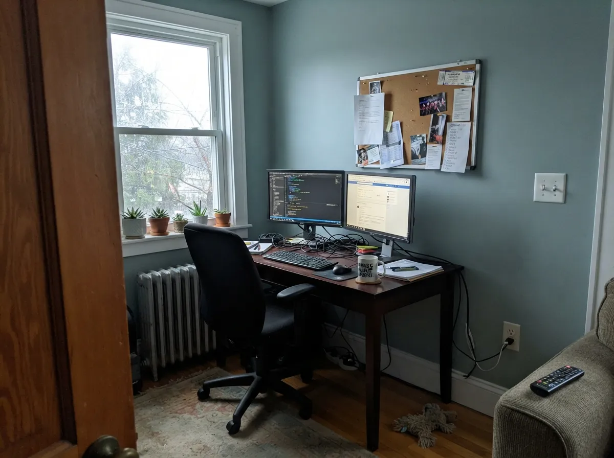
Where It Fails
Almost every way this color disappoints traces back to one of three predictable scripts. None of them are the paint's fault — they are what happens when the room or the goal does not match what this color actually is.
This is one of the few colors in the deck that runs backward: warm, dim light does not flatter it, it erases it. Without daylight or a cool-white bulb to back it up, Morning at Sea settles into a flat, sleepy gray-green that has none of the coastal blue it was bought for. One real buyer online described exactly this outcome — the color read brownish, not the blue-green they had pictured. If the room has no real window, test a sample under your actual evening bulbs before committing a whole gallon.
The undertone is a genuine, confirmed blue-green — not a trick of the light. On four walls it reads as color, and buyers hoping for a true neutral will notice by the second coat. If gray is the actual goal, Light French Gray is the truer answer; save Morning at Sea for when the color itself is the point.
Warm, golden wood pulls against a cool blue-green the same way it pulls against every cool color in this deck — the wood reads more orange, the wall reads more washed-out. It is not a dealbreaker in small doses (a vanity, an island, a laundry room), but four walls of it over honey oak asks two opposing temperatures to share a room. White oak, walnut, or older reddish cherry (which reads warm-neutral rather than gold) are the easier partners.
Room by Room
It earns a spot on any recommended list here: with morning light it is a calm, cool backdrop, not a moody one. Eggshell on the walls, and keep at least one lamp at 2700K for evening, since warm light alone will flatten the color.
Satin Morning at Sea on a vanity, under a window and a bright fixture, is the low-risk way to try this color: enough blue-green to feel intentional, small enough to repaint in a weekend if it turns out not to be for you.
One Samplize reviewer used it in a kitchen with older cherry cabinets and a new bar area, and reported the walls made everything "feel much lighter" even with the darker wood staying put — a genuine transitional trick, not a coastal cliché. It won't suit every kitchen (see the honey-oak warning above), but against reddish wood tones the cool cast reads modern instead of clashing.
A cool, quiet color in a room that runs on overhead light and a monitor glow makes sense — just do not rely on a desk lamp alone to carry the color after dark.
In a closed room with good daylight it is a confident, grown-up color. In an open floor plan it has to negotiate with every adjoining wall color and wood tone in sight — a warm greige next door (Revere Pewter, Accessible Beige) keeps the handoff friendly instead of cold.
This number is catalogued interior-only, unlike most of its Rustic + Refined siblings, which come in exterior-rated lines too. If you want this same cool, coastal read outside, confirm an exterior formulation with your store before ordering — do not assume the interior can carries over.
Your Light Is the Risk
Any real daylight, even overcast, is what brings the blue-green forward and makes the color read true and confident.
No daylight backup plus warm bulbs and the color drains to a flat, muddy gray-green — the one situation this paint does not survive.
Cooler and truer at midday, quietly grayer as the light warms toward evening — a gentle shift most people won't clock as a problem.
2700K warm bulbs mute it toward soft gray. Cool-white LEDs (4000K and up) keep the blue-green alive after dark.
Most complaints about Morning at Sea are a light mismatch. Upload a photo of your actual room and see it on your walls — then ask for the same wall in north light or evening lamps before you buy a single sample.
Need It From Another Brand?
Any paint counter can custom-tint Sherwin-Williams SW 9634 directly. If you would rather stay in one brand's own deck, these are the closest stock matches, measured as ΔE2000. Under 2 is a difference you will not see on the wall.
| Brand | Closest color | ΔE | LRV | |
|---|---|---|---|---|
| Behr | LakeviewECC-56-3 · Behr | 1.6 | 30 | Color page → |
| Benjamin Moore | Water's Edge1635 · Benjamin Moore | 1.9 | 31 | Color page → |
| Valspar | Café Blue5001-4A · Valspar | 3.1 | 29.1 | Color page → |
| PPG / Glidden | Cathedral GlassPPG1148-5 · PPG / Glidden | 3.1 | 29 | Color page → |
| Glidden | Cathedral GlassPPG1148-5 · Glidden | 3.4 | 29 | Color page → |
| Dutch Boy | Blue Laguna432-5DB · Dutch Boy | 3.6 | 29 | Color page → |
Similar Sherwin-Williams Colors
The nearest shades to Morning at Sea within Sherwin-Williams's own range, ranked by perceptual color distance — useful when you want the same look a touch lighter, darker, or warmer.
WCAG 2.1: AA is 4.5 : 1 for normal text, 3 : 1 for large text, AAA is 7 : 1.
Morning at Sea vs the Colors You're Also Considering
Every Morning at Sea sample board has the same rivals on it. The numbers show the real lightness gap — then it comes down to which risk you would rather live with.
Pick this for the green in the mix — Morning at Sea leans teal where Cadet stays a purer blue-gray.
Sherwin-Williams SW 9143 · LRV 31CadetPick this for the lighter, cooler sibling in the same SW blue-gray family — Cadet keeps the blue but drops most of the green.
Pick this if Sherwin-Williams is your store; there is no real difference in the result.
Benjamin Moore HC-145 · LRV 31Van Courtland BluePick this if your painter works in Benjamin Moore — nearly the same hex and depth, with the same light-dependent personality.
Pick this for the color — Light French Gray is the safer, quieter neutral if that flash of blue is too much commitment.
Sherwin-Williams SW 55 · LRV 53Light French GrayPick this if you actually want gray — it only flashes blue in cool light; Morning at Sea lives there full-time.
Morning at Sea Coordinating Colors
The rule for coordinating with Morning at Sea is simple: stay cool, and let it be the only blue-green voice in the room. It pairs cleanly with crisp cool whites, a warm neutral in adjoining rooms to keep an open floor plan from going cold, aged brass, and one confident near-black for contrast. These are the partners that make the most sense next to it:
Where the Name Comes From: SW's Rustic + Refined Collection
Morning at Sea (SW 9634) belongs to Sherwin-Williams' Rustic + Refined designer collection — a palette built to give classic farmhouse design a cooler, more coastal update. Sherwin-Williams describes the blues and greens in the collection as "airy and serene," meant for "rooms of respite and retreat," which is a fair description of what this specific can does at LRV 29: enough depth to be a real color decision, restrained enough to still function like a neutral.
One detail worth knowing before you order: this number is catalogued interior-only, while several of its collection siblings are offered in both interior and exterior lines. So if the plan was to carry this color outside, confirm the exterior formulation with your store first.
Morning at Sea With Wood Tones and Floors
White oak, gray-washed engineered wood and walnut are the safest floors under this color — all sit close enough in temperature that the wall reads intentional rather than cold. Cool gray LVP works too, though the room can start to feel chilly without a warm rug or brass hardware to balance it.
Golden, honey-toned oak is the one floor to sample carefully first. Blue-green and warm gold pull in opposite directions, and a whole room of both fighting for attention rarely settles down — the wood reads more orange, the wall reads more washed-out. In a powder room or on an island, that tension is small enough to read as contrast instead of conflict; across a full living room, pick a different wall color or a different floor. Older, reddish cherry cabinetry is the exception worth knowing — one real owner used this pairing to modernize a kitchen rather than fight it, since cherry's red-brown base sits closer in temperature to this color than true gold oak does.
Three Ready Palettes Built on Morning at Sea
A color is never alone on the wall. These are complete combinations in the 60-30-10 pattern, with the reason each one holds together. Every one opens in the visualizer.
A crisp, cool trim white keeps the blue-green honest instead of warming it into mush, and Naval lands the one true-dark note the room needs without competing for the same hue — it is simply deeper, same cool family. Built for a room with a real morning window.
Try this palette in your roomA crisp cool white keeps a small room bright and does not warm-fight the vanity's blue-green; the charcoal frame gives one grounding dark note. Aged brass hardware finishes the look without adding another color to track.
Try this palette in your roomRevere Pewter's warmth in the adjoining rooms keeps an open floor plan from going entirely cold, since Morning at Sea itself is fully committed to blue-green. The same trim white in both rooms ties the handoff together without introducing a third undertone.
Try this palette in your roomMorning at Sea FAQ
Is morning at sea blue or gray?
Blue-green, genuinely — the undertone is real, not a trick of the light, though Sherwin-Williams' own site files the color under "Neutral" rather than blue or green, which shows how gray-forward it reads before daylight commits it. It can pass for gray in warm, dim rooms, but on four walls with any daylight, the color is unmistakable. If you actually want a neutral gray, this is the wrong can; Light French Gray is the safer choice.
What light does it need to look good?
Real daylight, or at minimum a cool-white bulb. This color runs backward from most warm neutrals in the deck: bright, cool light is what makes it look best, and warm lamp-only light is what makes it fade. Test it under your room's actual evening lighting, not just daytime.
Is it a color of the year or a famous color?
No — and that is worth saying plainly. It belongs to Sherwin-Williams' Rustic + Refined designer collection, a quieter coastal-farmhouse palette, but it has no Color of the Year title, and only a couple of real owner reviews turn up online: one loved it in a kitchen with older cherry cabinets, another said it went brownish in the wrong light. That is not a mark against the paint; it just means you are buying it on the color itself, not a design blog's recommendation.
What trim white works with it?
A clean, cool-neutral white — Pure White or Extra White — keeps the pairing honest, since a warm cream trim fights the same cool undertone that makes this color work. Semi-gloss trim against eggshell walls is the standard split.
Does it work with oak floors?
White oak, gray-washed oak and walnut are fine partners. Honey-toned, golden oak is the one real mismatch — the warm wood and the cool wall pull in opposite directions. In small doses (a vanity, an island) it is forgivable; across four walls over honey oak, it is a fight neither side wins. Older reddish cherry, oddly, tends to read as a modernizing contrast rather than a clash — see the kitchen story above.
Can it be used outside?
This SW number is catalogued as interior-only, which is unusual since most of its Rustic + Refined siblings are offered in exterior-rated lines too. Confirm with your store before ordering an exterior gallon; do not assume the interior formula carries over.
Have you painted with Morning at Sea?
Rate it — one tap helps the next reader decide.
Ask a Question