Green Meets Blue
A green-blue with real color in it, reviewed honestly: the rooms where it reads coastal and confident, the light that flattens it to gray, and what to pick instead.

Jessica has spec'd whites and neutrals for more than 300 rooms and keeps a sample wall of painted drawdowns in her studio. Every color review is checked against real reader rooms in the comments and re-tested when a formula changes. About the testing process →
- 1Salamander6
- 2Hidden Gem14
- 3Green Meets Blue36
- 4Wythe Blue48
- 5Ocean Boulevard53
The Fast Verdict
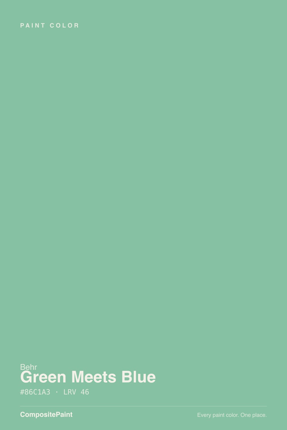
Green Meets Blue does what its name promises instead of hedging: it is genuinely both, a sea-glass green with a real blue lean, not a gray wearing a green whisper. At LRV 36 it holds that color in daylight instead of washing pale. Behr sells it hard across cabinet, door, trim and exterior lines — this is a color built for surfaces people touch and doors people walk through, and it is just as happy on four walls of a bathroom that wants actual color.
Bathrooms and powder rooms that want real color, not a hint of one · kitchen islands and cabinets · front doors and shutters on a neutral house · bedrooms with strong daylight
You wanted a barely-there spa gray · your room is dim and north-facing · your floors and trim run honey-orange · you're pairing it with a true, saturated blue
- A genuine green-blue with real color — not a whispered spa gray
- LRV 36 holds its color in daylight instead of washing out pale
- Sold across cabinet, door, trim and exterior lines — built for high-touch surfaces
- Reads coastal and deliberate without tipping into candy mint
- Pairs directly with its own darker Behr sibling (Hidden Gem) for a tonal scheme
- Goes flat, murky gray-green fast in dim north light
- Fights honey oak floors and gold-toned wood trim
- Looks undecided next to a true, saturated blue
- Not a background neutral — reads as a color decision on every wall it covers
What Color Is Green Meets Blue, Really?
A green-blue that actually commits to both halves of its name. Behr sells it across an unusually wide spread of product lines — Premium Plus interior/exterior, Premium and Ultra cabinet-door-and-trim enamel, Marquee exterior flat, and a Pro 5-gallon exterior line — which tells you where the color actually earns its keep: doors, cabinets, trim, and exteriors, not just as a wall paint picked off a fan deck. It sits in Behr's S430 hue family, and the family matters here — its darker sibling Hidden Gem (N430-6A) is the same green-blue pushed down to near-charcoal depth, so the two can be used together as a tonal pair without any guesswork.
At LRV 36 it is a true medium color — noticeably deeper than the grayed-out "spa" neutrals that dominate this part of the color wheel, and with more visible saturation than most of them too. That is the real distinguishing trait: it reads as a color choice, not a background. In good daylight it holds a clean, confident sea-glass green with a cool blue cast; it does not need direct sun to look intentional the way a paler, chalkier green-blue would.
Undertone in one line: green first, blue second — genuinely both, never a green pretending to be gray. If your sample reads teal, that is cool daylight or an LED bulb pulling it blue; if it reads more mossy sage, that is warm 2700K light or golden hour doing the pulling. Both are the same paint, honestly reacting to the room.
Where It Shines
This color is built for surfaces, not just walls, and that is where it is most convincing: a kitchen island, a front door, a bathroom vanity, a run of interior doors. In real daylight the green and blue both stay visible at once instead of one canceling the other out, which is the trick most green-blues fail at. Give it white or cream trim and a neutral house or room around it, and it reads coastal and deliberate rather than trendy.
Where It Fails
Every real complaint pattern for a color in this family comes down to one of three things, and none of them are a defect in the paint. If your room matches one of these, sample big before you commit — a small chip will not warn you.
Cool, flat daylight desaturates green-blues faster than almost any other family — the color has less warmth to lose, so it drops straight to a murky gray-green instead of just going quiet. If the room is dim and north-facing, this reads dull, not coastal. Add warm lamps or pick a lighter, higher-LRV color instead.
Orange sits opposite blue-green on the color wheel, so warm honey oak floors or gold-stained trim fight this color instead of complementing it — the wood looks more orange, the paint looks more gray. It wants white oak, walnut, black-stained wood, or painted trim instead.
Because this color is already a green-blue hybrid, putting it beside a confident navy or cobalt makes both look undecided — neither reads as clearly itself. Either lean into the family (pair it with its own darker sibling, Hidden Gem) or pair it with a color that commits fully to green or fully to neutral, not another blue.
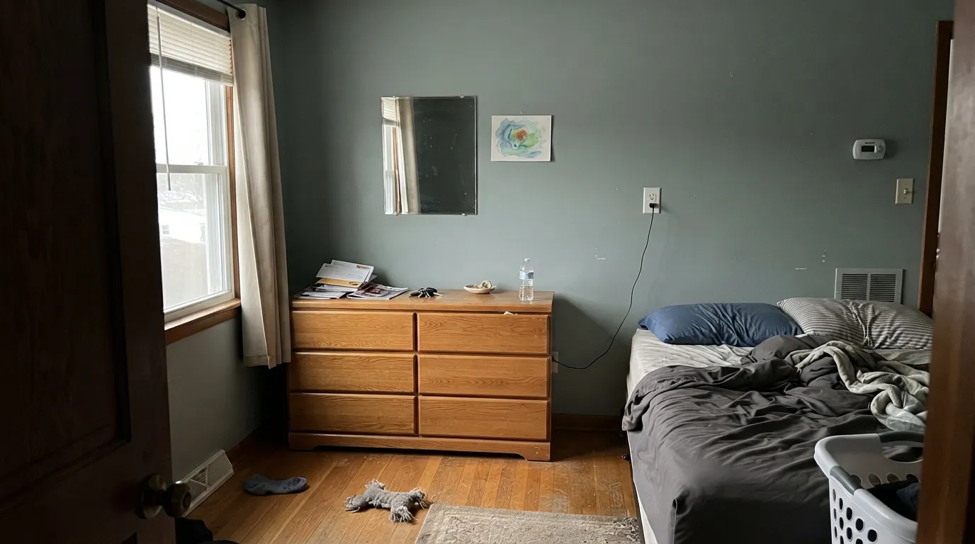
Room by Room
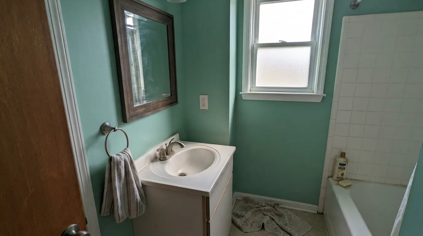
Small rooms take real color well, and this is real color. With white tile, chrome or brushed-nickel fixtures and a mirror in a dark or brass frame, it reads spa-like without going pale or timid. Satin or semi-gloss for the moisture.
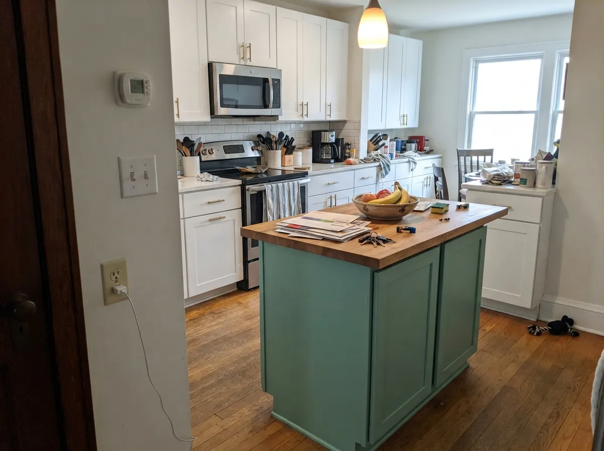
This is one of the formulations Behr sells it specifically for. A Green Meets Blue island under white perimeter cabinets and brushed brass hardware is a confident, current look — satin or semi-gloss enamel, not a wall-grade finish.
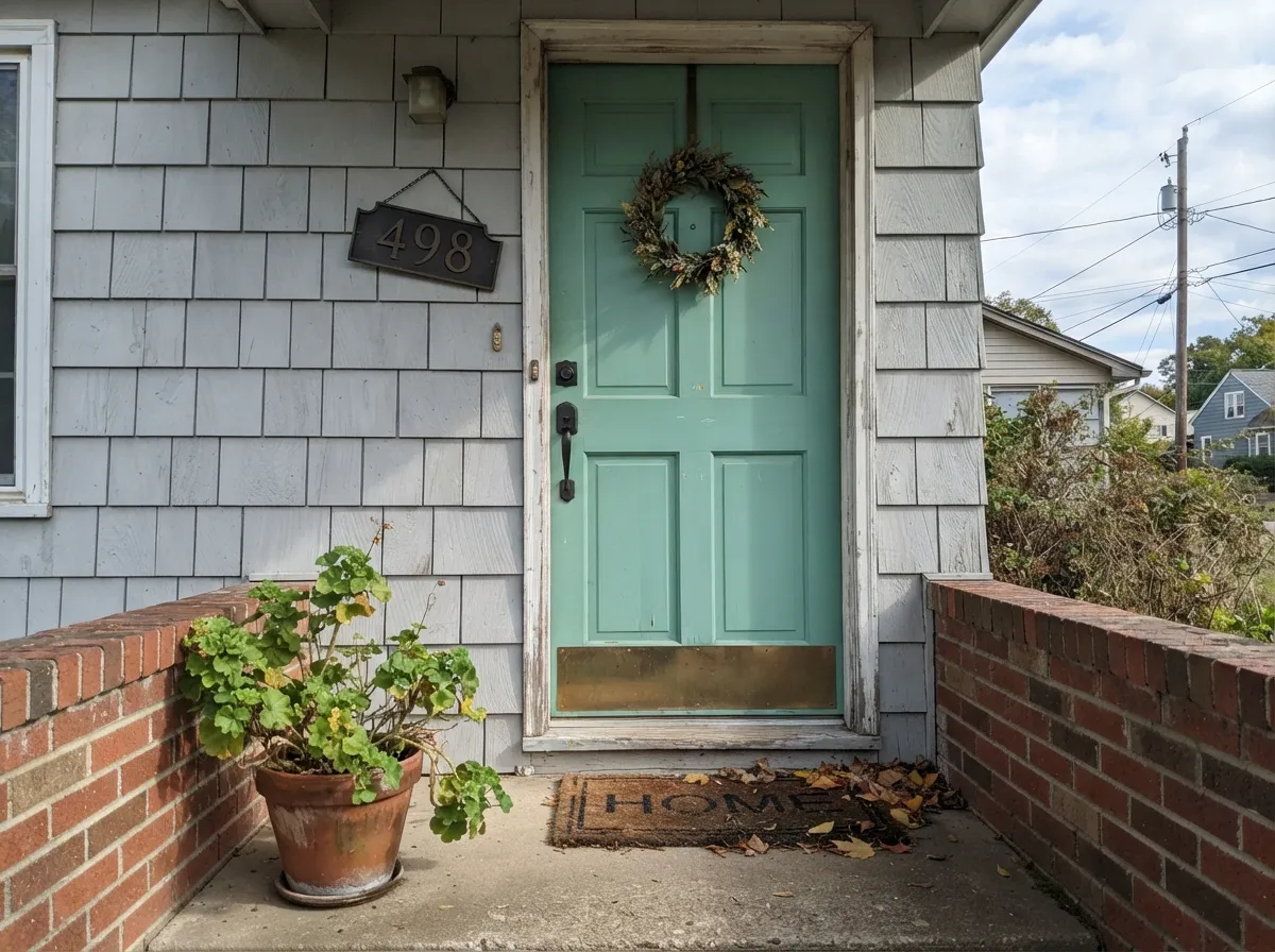
Sold in Behr's Marquee exterior and Pro exterior lines for exactly this. On a white, gray, or greige house it reads deliberate and a little unexpected — more interesting than the usual navy or black front door, and it holds its color in full sun better than paler green-blues.
In a bright room it is calming without being sleepy — genuinely restful color rather than a compromise gray. In a dim or north-facing bedroom, expect it to go flatter and cooler than the chip promised; test a large sample before committing four walls.
Beautiful as a full room in a house with good daylight and warm-neutral or white trim. In an open floor plan it has to negotiate with every adjacent wood tone and wall color, so it works best as a closed room rather than one wall of a great room.
This is not a safe, forgettable neutral, and it should not be treated like one. Used across a whole house without checking every room's light, the dim rooms will disappoint while the bright ones shine — pick it room by room, not blanket-style.
Your Light Is the Risk
Green and blue both stay visible at once — clean sea-glass color, not a muddy in-between. This is the light the name is honest in.
Cool flat daylight drains the color fast, leaving a murky gray-green instead of the sea-glass shown on the chip. Sample big before committing.
Cooler and more blue in morning light, warmer and more green as the sun swings west. The shift is real but gentle, not a color change.
2700K bulbs pull it toward soft mossy sage at night. Cool white LEDs push it colder and grayer — swap the bulb before you second-guess the paint.
Most complaints about Green Meets Blue are a light mismatch. Upload a photo of your actual room and see it on your walls — then ask for the same wall in north light or evening lamps before you buy a single sample.
Need It From Another Brand?
Any paint counter can custom-tint Behr S430-4 directly. If you would rather stay in one brand's own deck, these are the closest stock matches, measured as ΔE2000. Under 2 is a difference you will not see on the wall.
| Brand | Closest color | ΔE | LRV | |
|---|---|---|---|---|
| Sherwin-Williams | MarineSW 9659 · Sherwin-Williams | 2.7 | 36 | Color page → |
| Benjamin Moore | Del Mar Blue704 · Benjamin Moore | 1.4 | 38 | Color page → |
| Valspar | Phoenix Tears8003-35D · Valspar | 3.4 | 36 | Color page → |
| PPG / Glidden | Spruce ShadePPG1136-5 · PPG / Glidden | 2.0 | 35 | Color page → |
| Glidden | Spruce ShadePPG1136-5 · Glidden | 2.5 | 35 | Color page → |
| Dutch Boy | In The Abyss331-4DB · Dutch Boy | 1.8 | 36 | Color page → |
Similar Behr Colors
The nearest shades to Green Meets Blue within Behr's own range, ranked by perceptual color distance — useful when you want the same look a touch lighter, darker, or warmer.
WCAG 2.1: AA is 4.5 : 1 for normal text, 3 : 1 for large text, AAA is 7 : 1.
Green Meets Blue vs the Colors You're Also Considering
Every Green Meets Blue sample board has the same rivals on it. The numbers show the real lightness gap — then it comes down to which risk you would rather live with.
Pick this when you want the color to actually show up — Palladian Blue is softer and more washed-out by comparison.
Benjamin Moore HC-144 · LRV 53Palladian BluePick this for a lighter, quieter spa green-blue that asks for less commitment on the wall.
Pick this when muted feels like a compromise and you want the real color instead.
Sherwin-Williams SW 6211 · LRV 47RainwashedPick this for almost the same depth with far less saturation — a muted watery version of the same idea.
Within Behr, Gem Silica P420-4A at LRV 46, hex #73C4A4, is the same lightness but more saturated and more clearly jade. Tower Bridge S440-4 at LRV 42, hex #73BBA8, goes further toward blue and reads as a light teal. Country Weekend MQ6-40 at LRV 43, hex #83BD95, pulls back toward plain green, and Scotland Road 450F-4 at LRV 47, hex #95C198, is softer and less blue.
Across brands, Sherwin-Williams Lark Green SW 6745 at LRV 46 has a deltaE of 1.05 and HGTV Home by Sherwin-Williams Cohesive Green HGSW 1294 matches at the same figure, so both are visually identical in normal room light. Valspar Kelp 6001-8A at LRV 44.8, deltaE 1.38, behaves the same way. Benjamin Moore Northern Lights 586 at LRV 43, deltaE 2.34, is very close but a shade deeper, so sample first. Farrow and Ball Arsenic No. 214 at LRV 40, deltaE 3.99, is close but visibly different side by side.
Green Meets Blue Coordinating Colors
The rule for coordinating with Green Meets Blue: keep the neutrals cool-to-true (white, gray, black) rather than golden, and let the color do the work instead of fighting it with another saturated hue. These are the partners that keep it looking deliberate:
The Behr S430 Family: Green Meets Blue and Hidden Gem
Green Meets Blue is not an isolated fan-deck pick — it belongs to Behr's S430 hue family, and its darker relative Hidden Gem (N430-6A, LRV 14) is the same green-blue taken down to near-charcoal depth. That relationship is genuinely useful: instead of guessing at a coordinating dark accent, the two colors already share the same undertone by design, which is why they show up together in the kitchen palette above.
It is worth being honest about what this color is not: it has no Color of the Year moment, no viral room, no famous house behind it. What it has instead is a very deliberate multi-surface product lineup — interior/exterior enamel, cabinet-door-and-trim formulations, and dedicated exterior lines — which tells a plainer but more useful story: this is a color Behr built for doors, cabinets, trim and exteriors first, and a wall color second.
Green Meets Blue With Wood, Stone and Metal
White oak, walnut, and black-stained wood all sit comfortably with this color — cool-to-neutral woods let the green-blue read clearly instead of being pulled toward gray or orange. Painted millwork in white or off-white is the safest trim pairing by far.
Honey oak and other gold-toned wood are the real risk, since orange sits directly opposite blue-green on the color wheel and each side pushes the other the wrong way. For stone and countertops, white or gray quartz and marble stay neutral against it; warm gold-veined granite fights it the same way honey wood does.
Metals lean cool: brushed nickel, chrome and matte black all read clean against it. Warm unlacquered brass still works — the classic spa-bathroom pairing — but polished brass can tip the whole look gold rather than coastal, so test the actual hardware finish before ordering it.
Three Ready Palettes Built on Green Meets Blue
A color is never alone on the wall. These are complete combinations in the 60-30-10 pattern, with the reason each one holds together. Every one opens in the visualizer.
White keeps a small bathroom from feeling closed-in while the wall color does the real work; the near-black frame and fixtures give the scheme one grounding note so it reads finished, not pastel.
Try this palette in your roomA quiet off-white body lets the door carry all the color, and dark shutters frame it instead of competing with it — the classic way a single confident door color earns its keep on an otherwise neutral house.
Try this palette in your roomWhite perimeter cabinets keep the kitchen bright while the island carries real color; Hidden Gem is the same family at full depth, so a darker hood or lower run reads as one deliberate scheme instead of two colors competing.
Try this palette in your roomGreen Meets Blue FAQ
Is Green Meets Blue more green or more blue?
Green, with a real blue lean — not a green with a whisper of blue and not a blue-green so muted it reads gray. In cool light or under LEDs it drifts toward teal; under warm bulbs or golden-hour light it settles more into sage-green. Both are the same undertone reacting honestly to the light.
Is this a wall color or a cabinet color?
Behr sells it heavily as both, plus doors, trim and exteriors — it is genuinely a multi-surface color, not a wall paint that happens to also come in enamel. That versatility is real: satin or semi-gloss for cabinets and doors, eggshell for walls.
Does it work on kitchen cabinets or an island?
Yes — it is one of the formulations Behr specifically sells for cabinet, door and trim work. Use the satin or semi-gloss enamel line, not the flat wall paint, and pair it with white perimeter cabinets so the color reads as a choice, not the whole kitchen's mood.
What's a good front door pairing?
A quiet off-white or light gray house body with this color on the door and dark (near-black or charcoal) shutters. It holds its color in full sun better than paler green-blues, and it reads more distinctive than the usual navy or black front door.
Will it clash with honey oak floors?
Yes, more than most colors will tell you honestly. Orange sits opposite blue-green on the color wheel, so warm honey oak or gold-stained wood fights this color instead of complementing it. White oak, walnut, black-stained wood or painted millwork are the safer partners.
How does it behave in a dim room?
Not well. Green-blues lose saturation fast in cool, flat daylight, and a dim north-facing room will read this color as murky gray-green rather than the sea-glass shown on the chip. If the room is genuinely dark, test a large sample first or choose a lighter, higher-LRV color instead.
Have you painted with Green Meets Blue?
Rate it — one tap helps the next reader decide.
Ask a Question