Moscow Midnight
A deep navy with a smoky teal secret, reviewed honestly: the surfaces where it turns rich, the dim rooms where it just goes black, and what to pick instead.

Jessica has spec'd whites and neutrals for more than 300 rooms and keeps a sample wall of painted drawdowns in her studio. Every color review is checked against real reader rooms in the comments and re-tested when a formula changes. About the testing process →
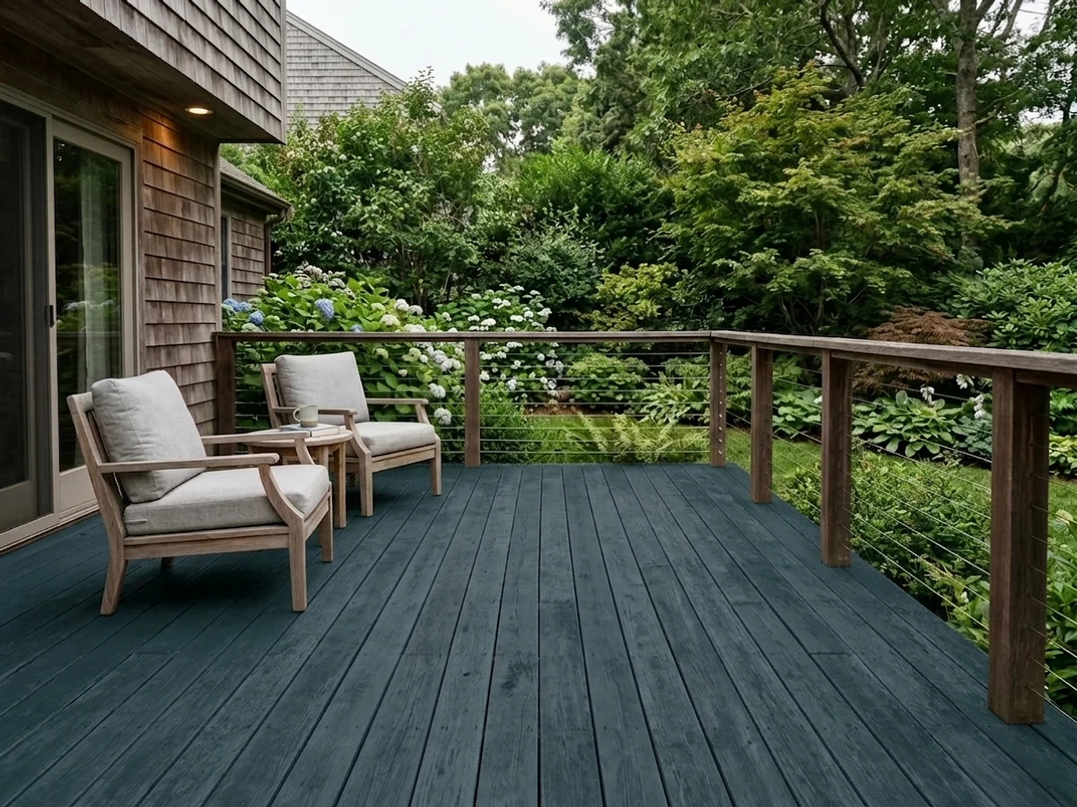
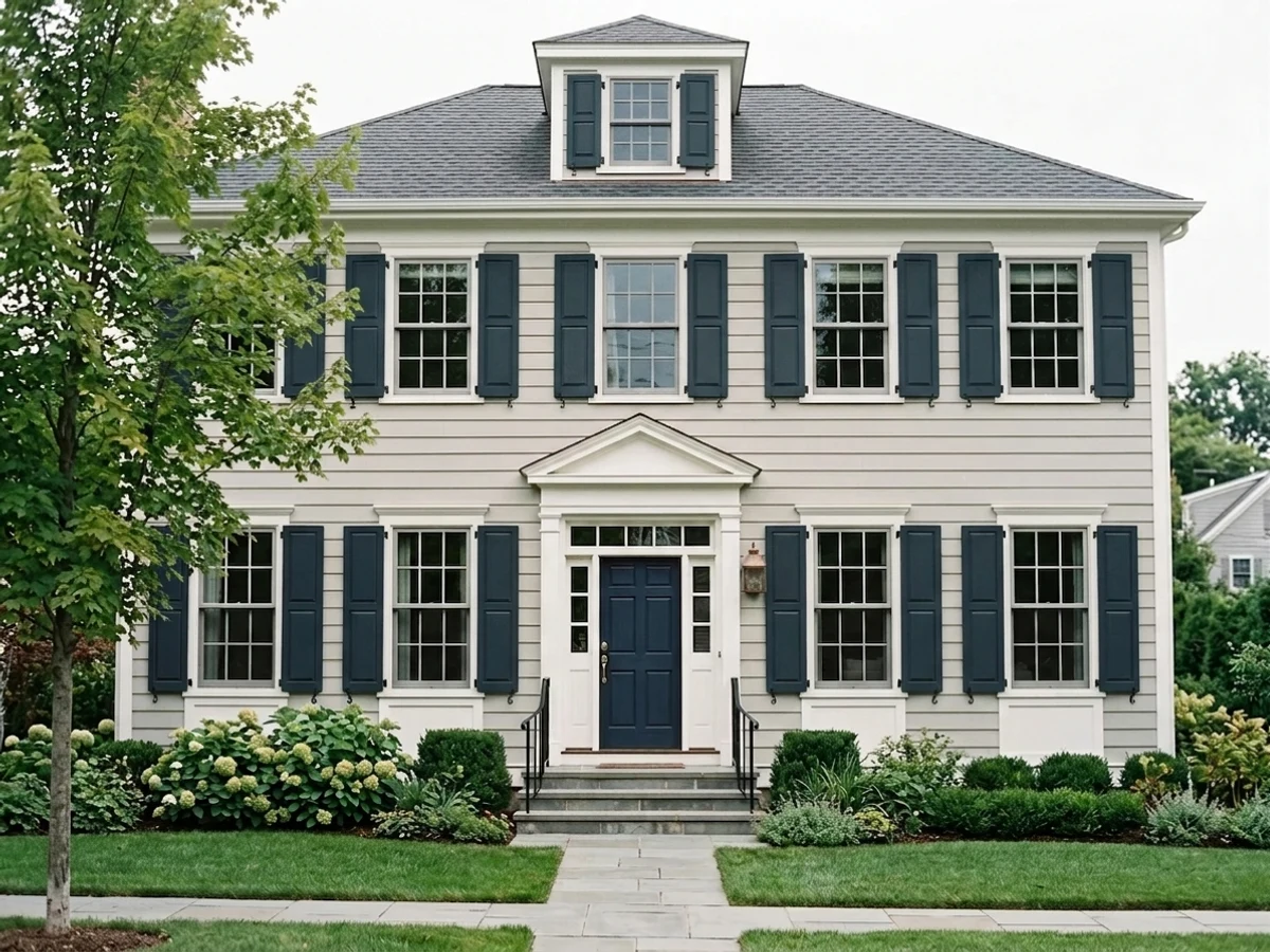
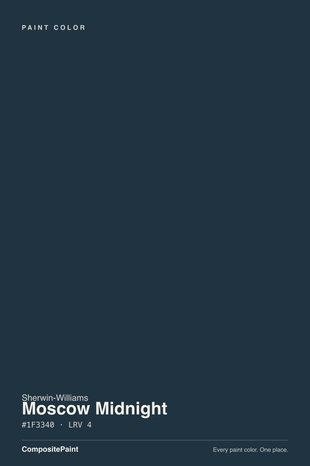
- 1Moscow Midnight5
- 2Hidden Gem14
- 3Van Courtland Blue31
The Fast Verdict
Moscow Midnight is a deep navy with a quiet teal undercurrent — smoky and cool rather than bright and primary, and dark enough (LRV 5) to sit in the same near-black bracket as Naval and Cascades. Give it a kitchen island against white cabinets, a front door against light siding, or one bedroom wall under warm lamps and it reads rich and deliberate. Ask it to carry four walls of a dim room and it just reads black.
Kitchen islands and cabinets · front doors and shutters · one bedroom accent wall with warm lamps · anyone who wants a navy with more depth and teal than Naval
You want a clean, uncomplicated navy with zero teal · your room stays dim with cool LEDs and no lamps · you're painting all four walls of a small room · you want a color with a documented Color-of-the-Year moment
- Genuine navy-teal depth — richer and more complex than a flat navy
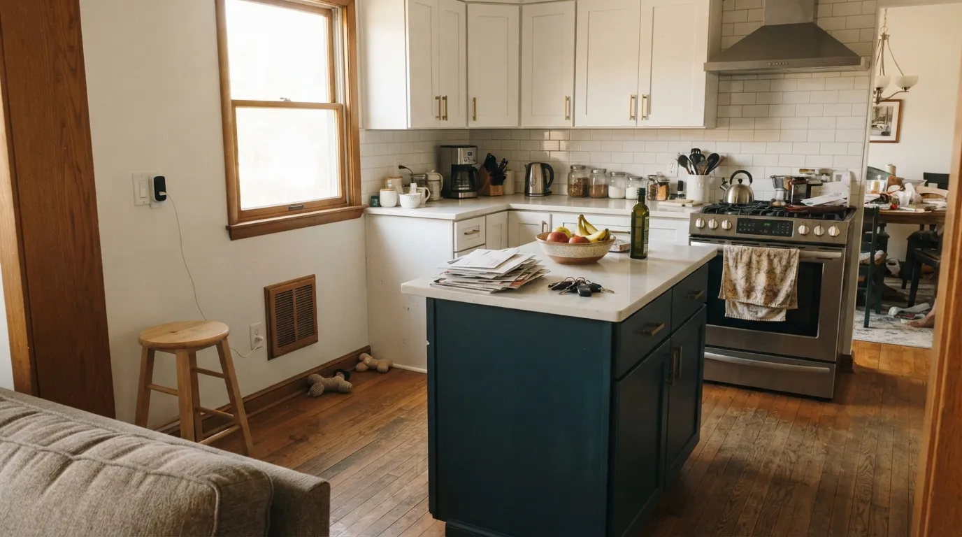
- One of the strongest colors in the deck for kitchen islands against white perimeter cabinets
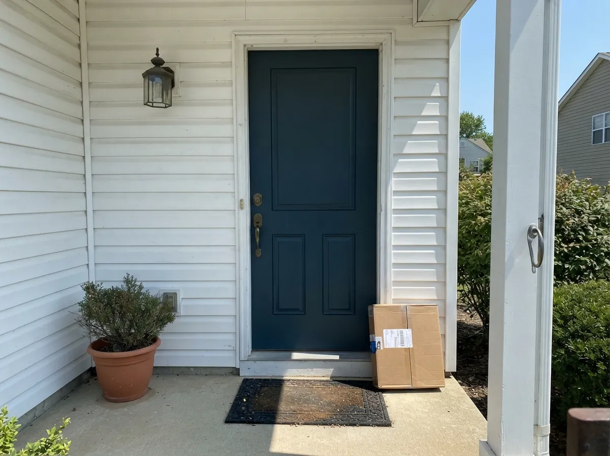
- Front doors and shutters: reads sophisticated against white or light siding, even better outdoors
- The smoky, muted base makes it easier to live with than a bright, saturated blue
- Deep enough (LRV 5) to anchor a room without turning purple or cheap-looking in strong sun
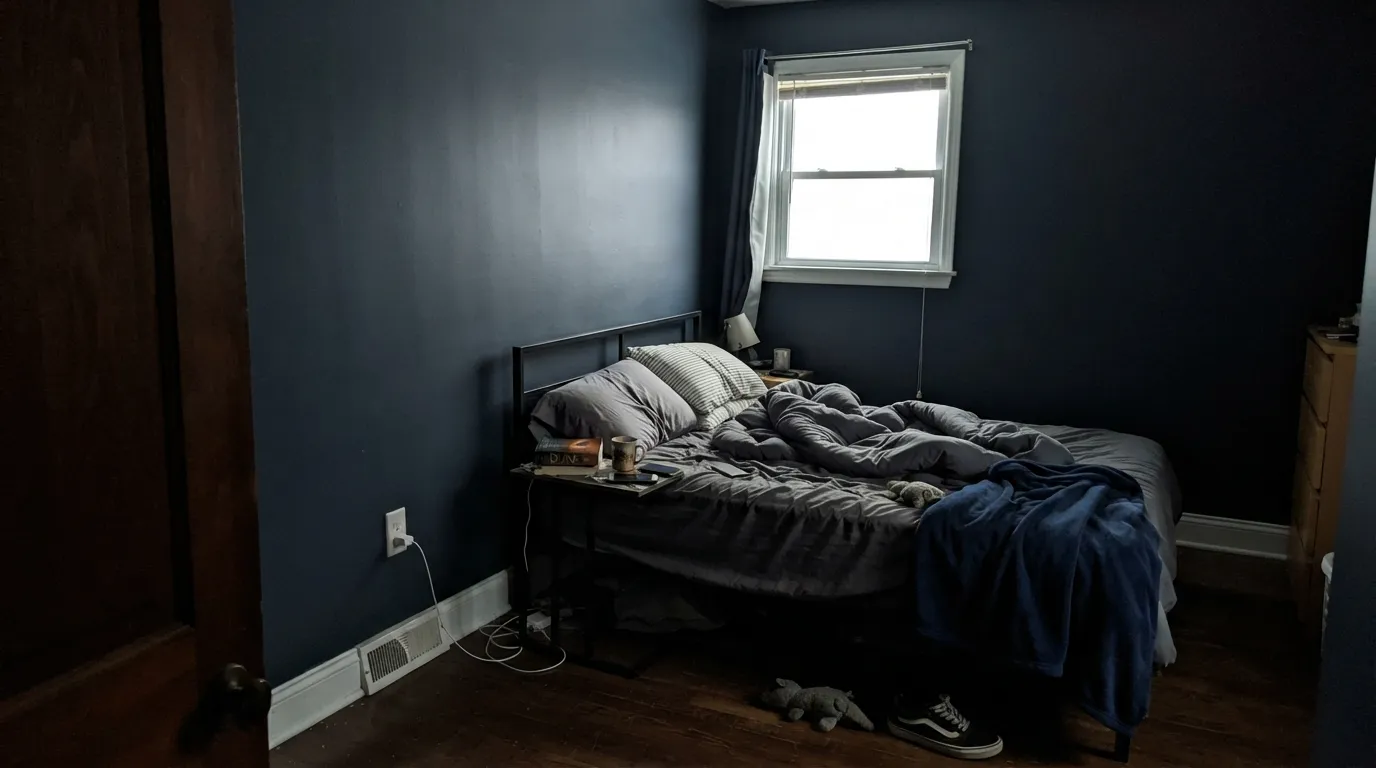
- At LRV 5 it swallows light — wrong for four walls in a small, dim room
- Cool LEDs and no natural light flatten it into plain near-black
- Not a clean navy — the teal undertone is obvious next to a straight navy like Naval
- Whole-room use needs real daylight or a lighting plan, or it reads heavy after dark
What Color Is Moscow Midnight, Really?
A deep navy built on a smoky, blue-gray base with a real teal secondary — not a clean primary navy like SW Naval, but one with a quiet green-blue undercurrent that surfaces the moment real light hits it. It has built its reputation the unglamorous way: showing up on kitchen-island repaints, cabinet re-dos and front doors across design blogs, cabinet-paint retailers and Pinterest boards rather than winning a marketing campaign — but the sheer volume of real rooms using it says the reputation is earned.
At LRV 5 it sits in the same near-black bracket as SW Naval and SW Cascades — genuinely one of the deepest colors in the deck, not just a "dark navy" in name. That depth is what lets it read as a serious, saturated statement instead of a pastel-adjacent blue, but it also means the color needs real light to prove it is not simply black. In a dim room, or under cool LEDs, it drops the blue-teal complexity and reads as plain charcoal.
Undertone in one line: cool navy with a teal secondary, never warm. In bright daylight the teal shows plainly next to a straight navy; in shade or evening it collapses toward a near-black charcoal-blue. If your sample reads pure black with no color at all, the room simply isn't giving it enough light — that is the paint being honest, not a flaw.
Where It Shines
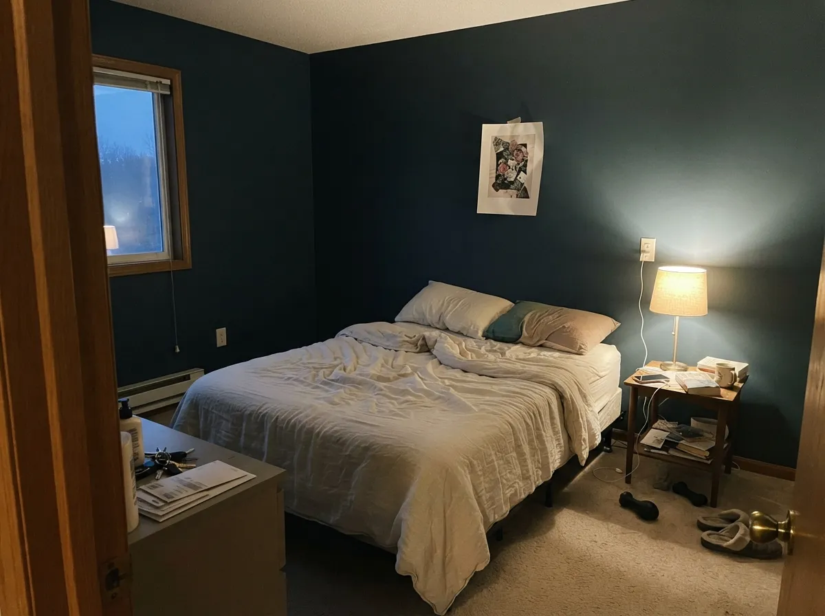
This is a color built for one surface, not a whole box. On a kitchen island against white perimeter cabinets, on a front door against light siding, on a single bedroom accent wall under warm lamps — anywhere it gets to be the one dark note in an otherwise bright room, Moscow Midnight earns its keep. Give it brass hardware, walnut or light oak, and a genuine light source, and the smoky teal comes forward instead of disappearing into black.
Where It Fails
Almost every disappointed story about Moscow Midnight comes from one of three situations, and all three are predictable before the first coat. None of them are the paint's fault — but if your room or your expectation matches one, this is not your color yet.
At LRV 5 it swallows almost all the light in the room; four walls of it in a bedroom with a small window reads like a cave, not a moody retreat. Use it on one wall, one door, or one island — not the whole box — unless the room is genuinely large and bright.
Cold bulbs strip out what little warmth carries the teal secondary, leaving a flat, featureless near-black. Warm 2700K bulbs are part of the paint job here, the same as with any color this deep.
Set next to a straight navy like SW Naval, Moscow Midnight's teal undercurrent is obvious, and some buyers expecting a simple dark blue call it "more green than I wanted." If a pure navy is the goal, this is the wrong can — go Naval instead.
Room by Room
White perimeter cabinets, brass or matte-black hardware, and one Moscow Midnight island is close to a formula at this point in real renovation photos. Satin or semi-gloss cabinet enamel, never flat.
Against white or light-gray siding it reads sophisticated rather than gloomy, and full outdoor light does more to show the teal than most interior rooms manage. Semi-gloss exterior enamel.
One wall behind the headboard, warm 2700K bulbs, and the rest of the room in a bright neutral is the safe way to get the mood without the cave effect. Matte or eggshell.
Gorgeous with a real window and reading lamps close by; without one it just reads dark and the room feels smaller than it is. Test the actual desk wall, not just a chip.
Under a marble or quartz top with brass fixtures it looks custom-made. Use a bath-rated satin or semi-gloss enamel, and keep the surrounding walls light so the room doesn't go cave-like.
Only in a genuinely large, bright room with big windows on more than one exposure. In an average-size room it needs a real lighting plan or it reads flat and heavy after sunset.
Your Light Is the Risk
Full daylight is what pulls the teal secondary out of the near-black base — this is the light where it actually looks like a color, not just dark paint.
Without real light the smoky teal disappears completely and the wall reads flat charcoal-black. If that's not what you paid for, test it in the actual room first.
On a gray day it sits close to black; step into full outdoor sun and the same door or island clearly shows navy-teal. The swing is bigger than most colors this deep.
2700K lamps keep a trace of warmth and depth alive after dark; cool white LEDs push it toward a flat, featureless black. Bulb choice matters as much as wall color here.
Most complaints about Moscow Midnight are a light mismatch. Upload a photo of your actual room and see it on your walls — then ask for the same wall in north light or evening lamps before you buy a single sample.
Need It From Another Brand?
Any paint counter can custom-tint Sherwin-Williams SW 9142 directly. If you would rather stay in one brand's own deck, these are the closest stock matches, measured as ΔE2000. Under 2 is a difference you will not see on the wall.
| Brand | Closest color | ΔE | LRV | |
|---|---|---|---|---|
| Benjamin Moore | Dark HarbourCSP-720 · Benjamin Moore | 2.8 | 8 | Color page → |
| Valspar | Mariana Trench8002-41G · Valspar | 1.8 | 6 | Color page → |
| PPG / Glidden | Sailor's CoatPPG1153-7 · PPG / Glidden | 4.5 | 6 | Color page → |
| Glidden | Ship'S HarborPPG1161-5 · Glidden | 4.5 | 6 | Color page → |
| Dutch Boy | Mariana Blue334-7DB · Dutch Boy | 1.3 | 5 | Color page → |
| HGTV Home by Sherwin-Williams | Blue MidnightHGSW 3321 · HGTV Home by Sherwin-Williams | 0.0 | 5 | Color page → |
Similar Sherwin-Williams Colors
The nearest shades to Moscow Midnight within Sherwin-Williams's own range, ranked by perceptual color distance — useful when you want the same look a touch lighter, darker, or warmer.
WCAG 2.1: AA is 4.5 : 1 for normal text, 3 : 1 for large text, AAA is 7 : 1.
Moscow Midnight vs the Colors You're Also Considering
Every Moscow Midnight sample board has the same rivals on it. The numbers show the real lightness gap — then it comes down to which risk you would rather live with.
Pick this for more depth and a smoky teal secret that Naval doesn't have.
Sherwin-Williams SW 6244 · LRV 4NavalPick this if you want a cleaner navy with none of the teal — Naval reads as navy in every light, no smoky drift.
Pick this for more visible blue — Cascades reads black far more often than Moscow Midnight does.
Sherwin-Williams SW 7623 · LRV 4CascadesPick this if you want the teal pushed further and don't mind it reading almost black in most light.
Inside the line the differences are subtle but real. In the Navy SW 9178 at LRV 4 is the cleaner, more classic navy, so choose it if you want the blue to be obvious. Dark Night SW 6237 at LRV 4 shifts toward blue-green and reads a touch more teal. Anchors Aweigh SW 9179 at LRV 3 is darker and grayer, and Inkwell SW 6992 at LRV 4 drops most of the color and behaves as a soft black. Night Watch SW 9680 at LRV 4 swaps the blue for green entirely.
Across brands, the nearest matches are not exact. Portola Paints Ghost Tree at LRV 4 is a deltaE of 3.32 away, very close but worth sampling first. Dutch Boy Spirited Navy 333-7DB and HGTV Home by Sherwin-Williams Dark Night HGSW 3331 both sit at 4.19, and Behr Deep Space 750F-7 at LRV 3 sits at 4.31, so all three are close but visibly different side by side. At this depth the gap is easier to see in direct sun than in a dim room.
Moscow Midnight Coordinating Colors
The pairing rule is simple: keep everything around it crisp, cool, or warm-metal — Moscow Midnight is cool-based and can look slightly at odds with heavy yellow-warm creams, the same way most navies do. Crisp whites for trim and perimeter cabinets, brass or matte black for hardware, and a muted sage for the rare accent detail are the combinations that keep showing up in real kitchens and entryways:
The Story Behind a Navy-Teal Nobody Had to Hype
Moscow Midnight has never been a Color of the Year, and there is no single viral room behind it — its reputation was built the slow way, one kitchen-island photo and one cabinet-paint retailer roundup at a time. Search the color and what comes back isn't a design-magazine feature; it's a stream of real renovation photos: an island here, a front door there, a powder-room vanity somewhere else.
That is the honest read on where this color sits: it rode the decade-long navy wave that made Hale Navy and Naval household names, without becoming the household name itself. For a buyer that is mostly good news — it means the color gets chosen by people solving an actual design problem, a plain white kitchen that needed one dark note, rather than people chasing a trend. It is priced and marketed like the workhorse it is, not a limited-run showpiece.
Moscow Midnight With Wood Tones and Floors
Wood is where this color gets forgiving. Light or white oak floors next to a Moscow Midnight island is close to a modern-kitchen standard at this point, because the contrast is clean: pale, warm wood against a near-black navy-teal reads current, not busy. Walnut and other dark woods pull the other direction — tonal and moody, best kept to a den or library where everything can sink into the same low register.
The one pairing worth sampling first is very cool, gray-washed wood. Two cool-toned materials next to each other can read chilly without a warm anchor somewhere in the room — brass hardware, a leather chair, a warm-toned rug. It isn't a hard clash the way true navy against orange-toned oak can be, just a room that wants one warm object so it doesn't feel cold.
Three Ready Palettes Built on Moscow Midnight
A color is never alone on the wall. These are complete combinations in the 60-30-10 pattern, with the reason each one holds together. Every one opens in the visualizer.
Extra White keeps the perimeter bright so the LRV 5 island can carry all the drama without the kitchen feeling closed in. Evergreen Fog echoes the navy's cool base on a shelf or trim detail without competing with it, and both partners love brass hardware.
Try this palette in your roomOne wall carries the depth while Alabaster keeps the rest of the room bright, so the color reads as mood rather than cave. Pure White trim gives the dark wall a crisp edge instead of letting it bleed into the corners.
Try this palette in your roomWhite siding, a near-black navy-teal door and Iron Ore shutters layer two darks that don't quite match — enough contrast to look deliberate, not matched-set. Brass or black door hardware finishes it.
Try this palette in your roomMoscow Midnight FAQ
Is Moscow Midnight navy or teal?
Navy first, with a real teal secondary — cool and smoky, never warm. In bright light the teal shows clearly; in dim light or under cool bulbs it flattens toward plain near-black. Both are the same paint, just different amounts of light.
Is it too dark for a whole room?
At LRV 5 it's genuinely one of the deepest colors in the deck. Four walls work only in a large, bright room with real windows on more than one exposure — in an average-size room, use it on one wall, a door, or an island instead.
Does it work on kitchen islands and cabinets?
Yes — this is its best-documented use. Against white perimeter cabinets with brass or matte-black hardware it reads as a deliberate statement piece. Satin or semi-gloss cabinet enamel, never flat.
What white pairs best with Moscow Midnight?
A crisp, cool-leaning white like Extra White or Pure White reads sharpest against the smoky navy-teal. A very warm cream can look slightly at odds with the color's cool undertone — keep the partner white clean, not yellow.
Is it good for a front door?
One of its strongest uses. Against white or light siding it reads sophisticated rather than heavy, and full outdoor daylight shows the teal secondary better than most interior rooms manage. Use a semi-gloss exterior enamel.
How is it different from Naval?
Naval is the cleaner, more straightforward navy — it reads as navy in almost any light. Moscow Midnight carries a visible teal undercurrent that shows up next to Naval in good light; both flatten toward near-black in a dim room.
Have you painted with Moscow Midnight?
Rate it — one tap helps the next reader decide.
Ask a Question