In the Navy
A near-black Sherwin-Williams navy reviewed honestly: how close it really is to Naval, the light it needs to show any blue at all, and where it actually earns its keep — kitchen islands and front doors, not casual wall color.

Jessica has spec'd whites and neutrals for more than 300 rooms and keeps a sample wall of painted drawdowns in her studio. Every color review is checked against real reader rooms in the comments and re-tested when a formula changes. About the testing process →
- 1In the Navy4
- 2Waterloo13
- 3Charcoal Blue19
The Fast Verdict
In the Navy is Sherwin-Williams' quieter answer to Naval — same cool blue-gray family, same near-black depth, a fraction less saturated. At LRV 5 it is genuinely close to black in everyday indoor light; only strong direct sun or a bright fixture pulls the blue forward. Its real job, more than any viral wall color, is kitchen islands and front doors, where a light-colored partner gives it something to contrast against. Buy it for the depth, not for a color that clearly reads "navy" at every hour.
Kitchen islands and cabinetry · front doors on light-colored houses · dens and home offices with warm lamps · anyone who wants Naval's depth without buying the exact chip everyone else's Pinterest board is running
You want a color that reads clearly blue in ordinary indoor light · your room has one small window and no supplemental lighting · you already can't tell it apart from Naval and don't want to buy two samples · your walls have patches or repairs that need skim-coating first
- True near-black navy that still reads as blue in strong light, not just muddy dark
- Kitchen islands, cabinetry and front doors — dramatic depth without going full black
- Pairs cleanly with brass, nickel and nearly any warm wood tone
- LRV 5 hides everyday wall grime and dust better than a mid-depth color
- A real alternative when Naval feels like it's on every third house on the block
- In most everyday indoor light it reads as black, not navy — the blue needs strong light to show
- Close enough to Naval that most people can't tell them apart without the label
- Small, dim rooms can feel closed-in without real windows or supplemental light
- Shows drywall patches, roller stipple and old repairs more than a mid-tone would
What Color Is In the Navy, Really?
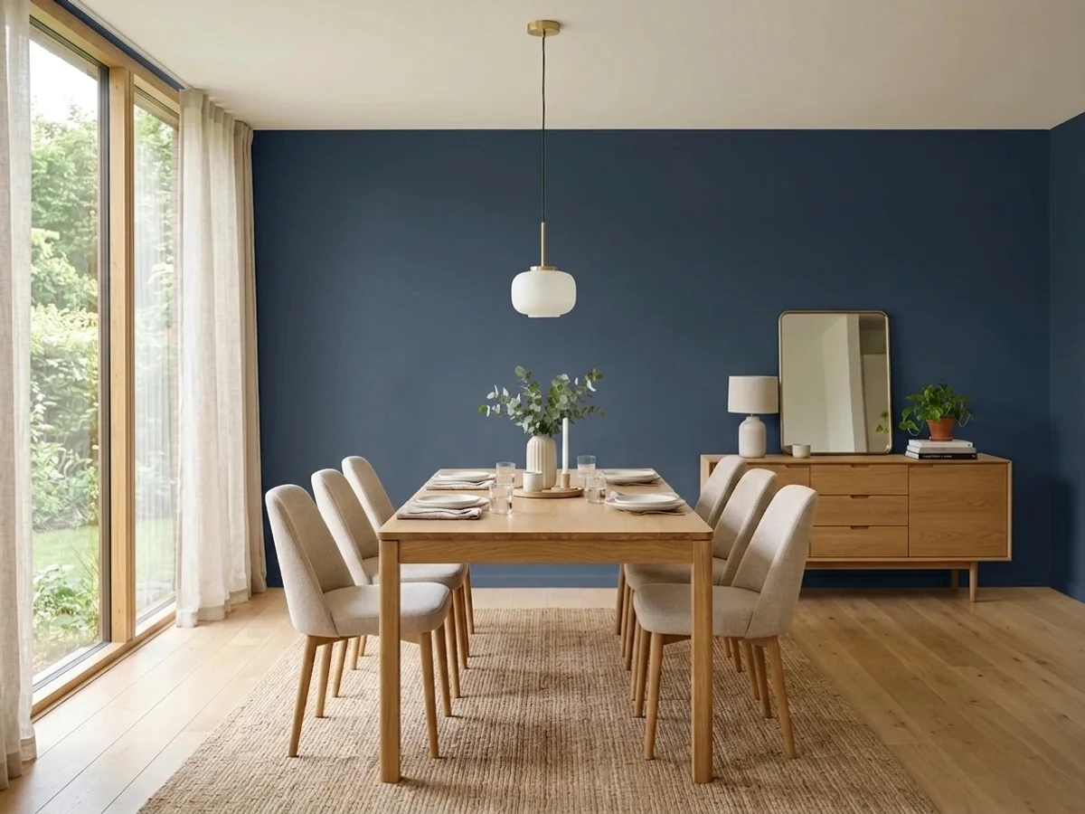
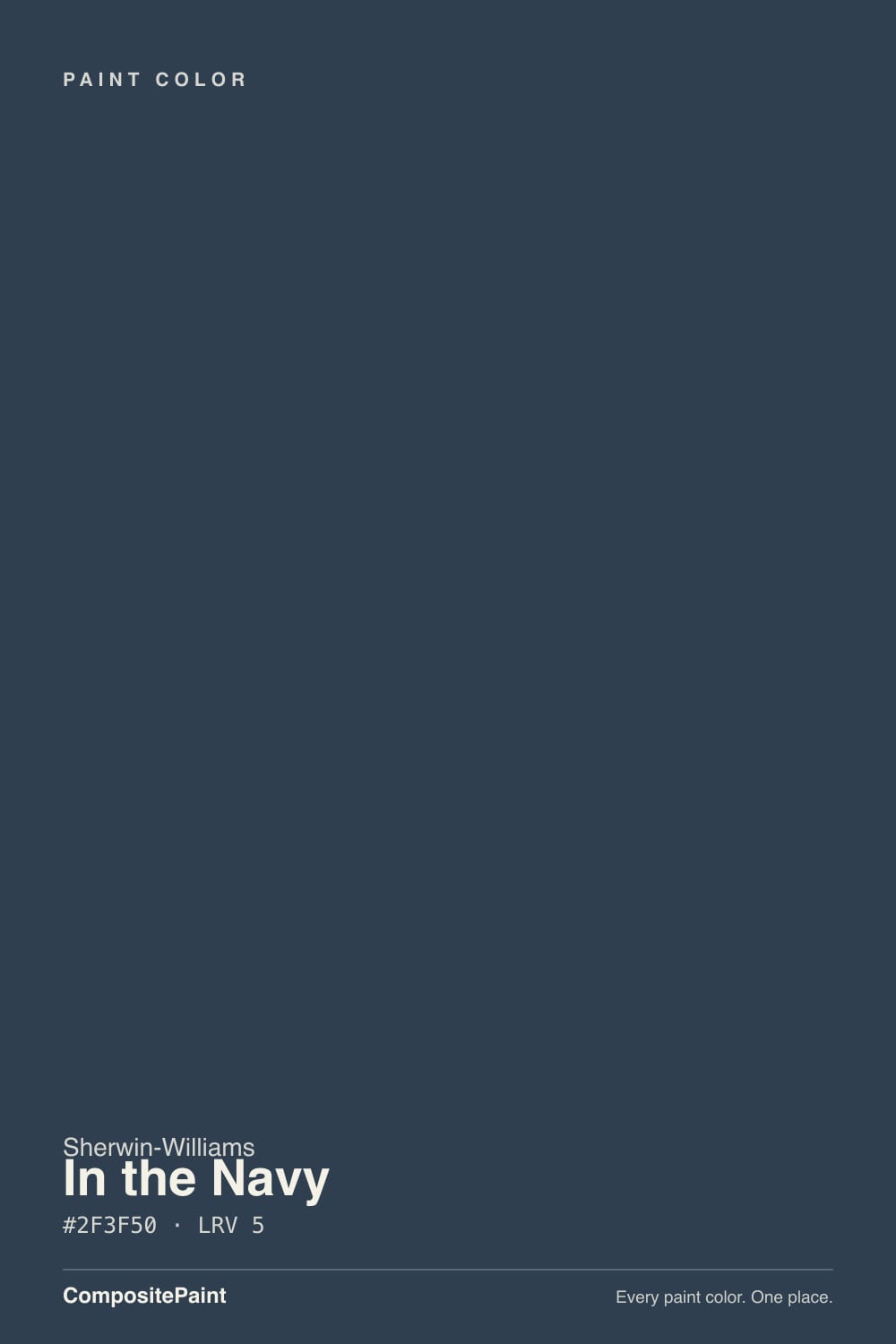
In the Navy is Sherwin-Williams' quieter cousin to Naval (SW 6244) — same blue-gray navy family, same near-black depth, a different SKU. At hex #2F3F50 the two are close enough on paper that color blogs actually disagree about which one is bolder: some call In the Navy the more saturated, richer twin, others say the opposite. Working from the chip data itself, In the Navy comes out fractionally less saturated and slightly grayer than Naval — the calmer of the two, not the louder one. It has never been a Color of the Year and it doesn't turn up in the celebrity-kitchen roundups the way Naval does. Its real market footprint is smaller and more specific: custom cabinet shops sell doors pre-painted in this exact SKU for kitchen islands, which is the honest use case to plan around, not a viral wall color.
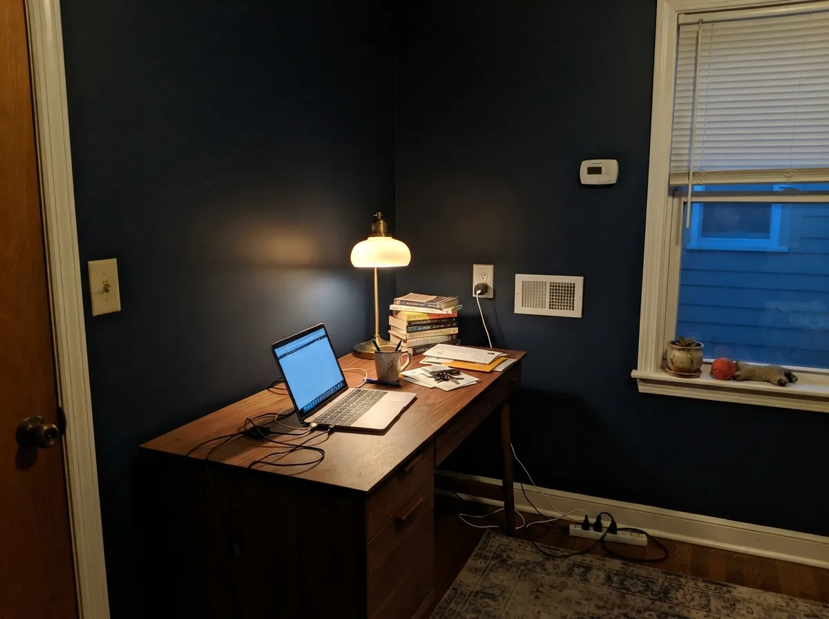
At LRV 5 this is genuinely near-black paint that happens to be blue, and that ordering matters. In typical indoor light — a lamp, an overcast window, a single ceiling fixture — it reads as a very dark charcoal-black; the blue only becomes obvious under strong, direct light: full sun through a south window, a bright task light over an island, direct sun on an exterior door. Buy it because you want a wall that clearly announces "navy" at a glance and you will be disappointed some of the time. Buy it because you want a near-black with a warmer, more layered undercurrent than flat black paint gives you, and it delivers exactly that.
Undertone in one line: cool blue-gray, no meaningful green or violet lean despite what a few color-matching sites claim — the hue sits within a couple of degrees of Naval's on the color wheel. What separates the two in practice is saturation, not direction: In the Navy is the desaturated, smoky version; Naval is the cleaner, more purely blue one. Side by side under the same light they are close enough that most people can't tell which is which without the label — sample both in the actual room if you're choosing between them, because the fan deck won't settle it.
Where It Shines
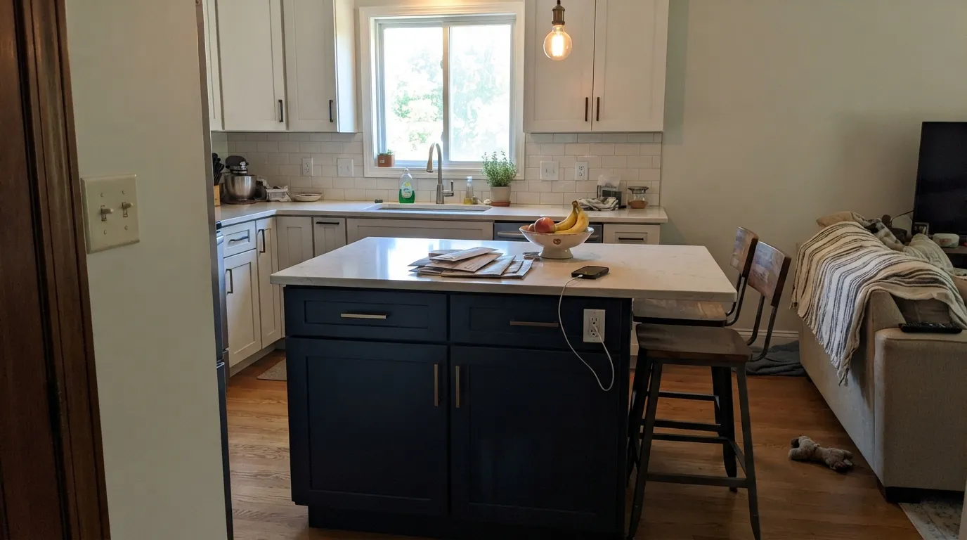
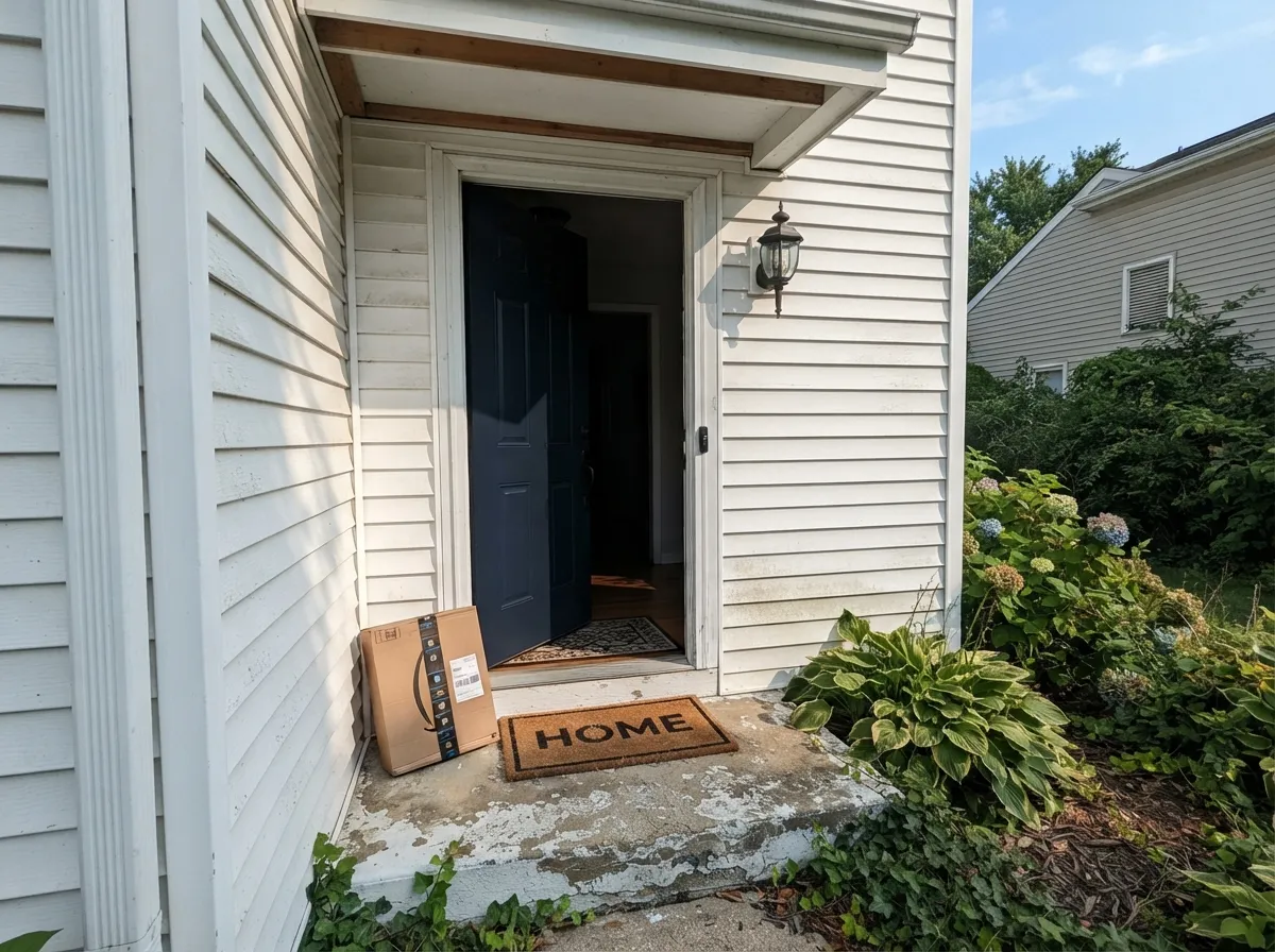
It does its best work wherever it gets real light and a light-colored partner to push against. Kitchen islands are its most literal job — custom cabinet shops sell it by name for exactly this — where a pale quartz counter and light perimeter cabinets bounce enough light onto the island to keep the blue visible instead of letting it collapse into black. Front doors on light-sided houses are its second home: full sun brings the blue clearly forward, and the depth reads as a deliberate dark accent rather than a weathered one.
Where It Fails
Almost every letdown story with In the Navy comes down to one of three things, and all three are avoidable before the gallon is open.
The two are close enough on a fan deck that buyers grab whichever chip happens to be closer to the register, then wonder why the wall looks like the color they didn't order. If you're choosing between them, that choice has to happen in your actual room under your actual light — on paper they are nearly the same color.
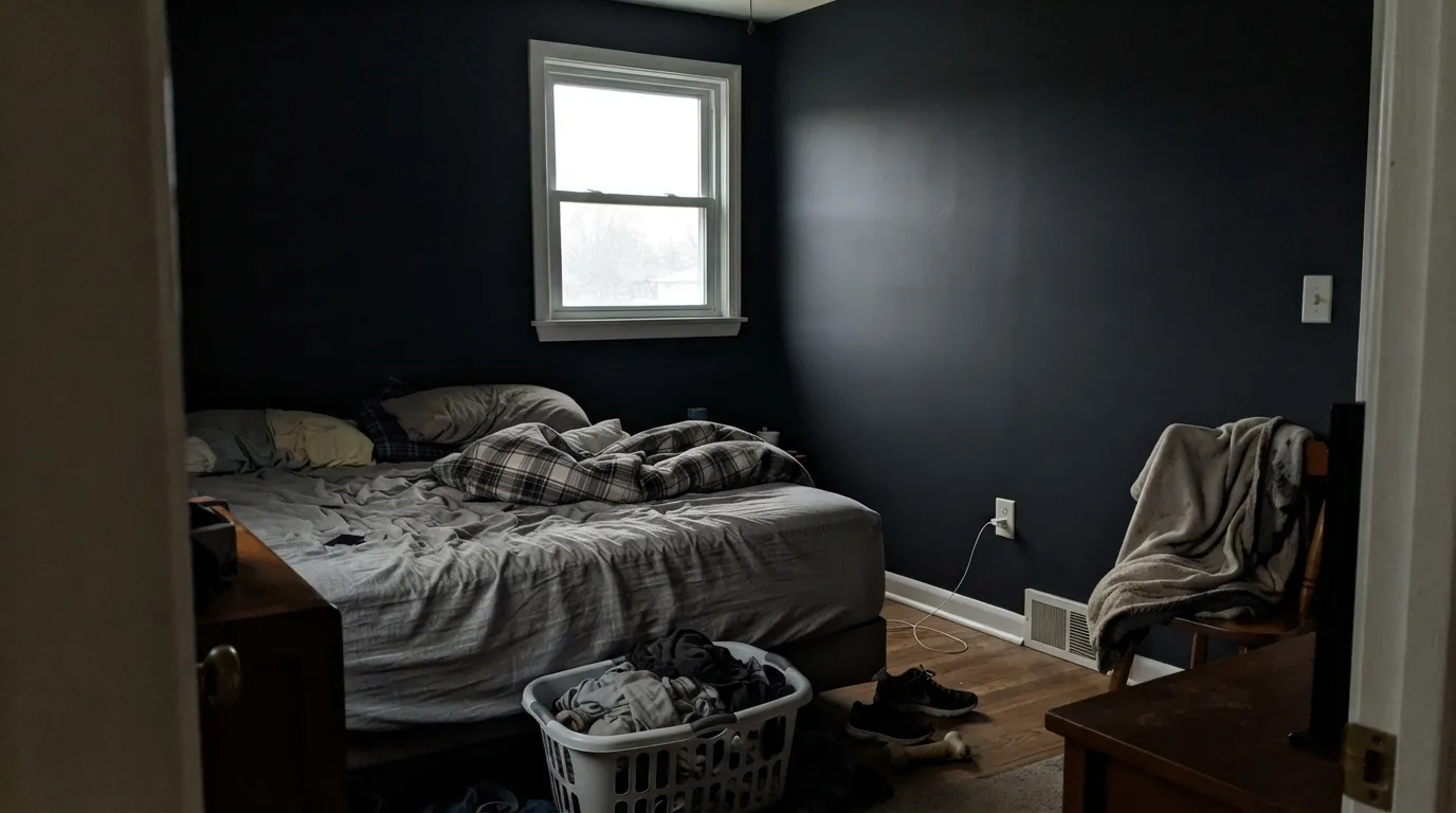
LRV 5 is genuinely close to black. Without a strong light source, a small room reads as a flat, featureless dark box by mid-afternoon — fine when that's the point (a den), a real disappointment when you wanted a room you could still read a book in without a lamp on.
A near-black paint is unforgiving of drywall patches, popped nail heads and roller stipple — everything flat light hides, raking light under a window exposes. Skim-coat and prime properly before committing to this much depth, or the flaws become the room's focal point.
Room by Room
Paired with a light perimeter — Alabaster or Pure White cabinets, pale quartz or marble — the island holds the room without needing full daylight to read as navy. Satin or semi-gloss for the wipe-down; fingerprints near the handles show as faint light smudges against the depth, so plan to wipe more often than you would with a mid-tone.
Full sun pulls the blue forward and reads as a deliberate dark accent against Extra White or Snowbound siding. On a shaded, north-facing porch it stays closer to black most of the day — some owners want that, some don't. Decide before you paint, not after.
Low ambient light is this color's comfort zone here rather than its weakness, because a den is allowed to feel moody. Walnut, leather and a warm brass lamp reinforce the effect instead of fighting it.
Beautiful under a dimmable chandelier or pendant with warm bulbs; without one, the room can go cave-like by dinner time. Not the color to pick for a dining room that only has a single overhead can light.
Enveloping and calm with real windows and lamps on both nightstands. In a small bedroom with one window it can feel like painting the walls shut. Test a large sample in the actual room, not the fan chip under store fluorescents.
A powder room with a strong vanity light and a mirror can carry it as a jewel-box statement. Without supplemental light it just reads as an unlit dark box — the fixture and the mirror are doing the real work, not the paint alone.
Your Light Is the Risk
South sun or a strong task light is what lets the blue register at all — it pulls the color out of near-black and shows it's genuinely navy, not charcoal.
Without a strong light source it reads as flat black with no visible blue — fine for a moody den, a letdown if you specifically wanted "navy" on your walls.
Low-angle morning or evening sun briefly catches the surface and shows more blue-gray at the edges; by midday it settles back toward near-black.
Warm 2700K lamps read as close to pure black at night; cool LEDs pull out a touch more blue-gray. Either way, expect black after dark, not navy.
Most complaints about In the Navy are a light mismatch. Upload a photo of your actual room and see it on your walls — then ask for the same wall in north light or evening lamps before you buy a single sample.
Need It From Another Brand?
Any paint counter can custom-tint Sherwin-Williams SW 9178 directly. If you would rather stay in one brand's own deck, these are the closest stock matches, measured as ΔE2000. Under 2 is a difference you will not see on the wall.
| Brand | Closest color | ΔE | LRV | |
|---|---|---|---|---|
| Behr | Sorcerer760F-7 · Behr | 1.8 | 4 | Color page → |
| Benjamin Moore | North SeaCC-932 · Benjamin Moore | 1.0 | 6 | Color page → |
| Valspar | Indigo Streamer4010-4 · Valspar | 2.5 | 3.7 | Color page → |
| Dutch Boy | Classical Navy336-7DB · Dutch Boy | 1.7 | 4 | Color page → |
| Dunn-Edwards | Old MillDEA185 · Dunn-Edwards | 4.9 | 5 | Color page → |
Similar Sherwin-Williams Colors
The nearest shades to In the Navy within Sherwin-Williams's own range, ranked by perceptual color distance — useful when you want the same look a touch lighter, darker, or warmer.
WCAG 2.1: AA is 4.5 : 1 for normal text, 3 : 1 for large text, AAA is 7 : 1.
In the Navy vs the Colors You're Also Considering
Every In the Navy sample board has the same rivals on it. The numbers show the real lightness gap — then it comes down to which risk you would rather live with.
Pick this if you'd rather have the calmer, more muted version of the same idea, without matching the chip your painter has already used on three other houses this year.
Sherwin-Williams SW 6244 · LRV 4NavalPick this if you want the version of this exact blue-gray navy that shows up in every navy-kitchen roundup — same depth, a hair more saturated blue.
Pick this for genuine near-black depth — In the Navy goes darker and only reads as navy when the light is strong.
Benjamin Moore HC-154 · LRV 6Hale NavyPick this for a navy that still reads clearly blue in ordinary room light — Hale Navy is a step lighter and far more forgiving in a dim room.
Pick this if you specifically want the blue — Iron Ore reads as black with a hint of green-gray, never navy.
Sherwin-Williams SW 7069 · LRV 6Iron OrePick this if you want a true charcoal-black with no blue lean at all — the safer whole-house dark neutral.
Pick this for the deepest, near-black end of the family — those extra LRV points make Indigo Batik read a shade lighter in everyday light than In the Navy does.
Sherwin-Williams SW 7602 · LRV 8Indigo BatikPick this for the same navy family at a touch more daylight-friendly depth — Indigo Batik sits three LRV points higher, enough to stay legible in more rooms.
The obvious comparison is Naval (SW 6244), which is #2F3D4C at LRV 4. It is a point darker and marginally less blue, and on a door or cabinet run the two are very hard to tell apart. Salty Dog (SW 9177), #234058 at LRV 5, is the same depth but noticeably more saturated and brighter blue. Gale Force (SW 7605), #35454E at LRV 6, drops some of the blue for a slate-gray cast, and Mountain Fig (SW 9690), #383C49 at LRV 4, leans further toward charcoal.
Across brands, Dutch Boy Ocean's Depth (337-7DB) and HGTV Home by Sherwin-Williams Naval (HGSW 3351) both come in at a deltaE of 1.08, and Benjamin Moore North Sea (CC-932) at 1.3, all visually identical in normal room light.
Behr Ink Black (N490-7) at 2.64, Valspar Gotham Gray (4009-3) at 2.93, and Dunn-Edwards Dark and Stormy (DET572) at 2.98 are very close but worth sampling first. Kompozit Star-Studded (0620) at 3.62 is close but visibly different side by side.
In the Navy Coordinating Colors
The rule for coordinating with In the Navy: give it a light partner with real LRV, because this color's depth needs contrast to read as navy instead of black. It pairs cleanly with warm brass, cool nickel, and nearly any oak or walnut wood tone — the wood usually does more visible work here than the paint's own undertone does. These are the partners that keep showing up wherever this color actually gets used:
A Cabinet Color First: In the Navy's Quiet Real Job
In the Navy has no Color of the Year attached to it and no viral kitchen photo driving its popularity. Search for it and you mostly find fan-deck listings and cabinet suppliers selling doors pre-painted in this exact SKU, not design-blog features. That is a real, if unglamorous, story: this is a working color, chosen by name for kitchen islands and cabinetry rather than discovered on a mood board. If you want the navy everyone already recognizes, that's still Naval or Hale Navy; if you want the same depth in a chip your painter hasn't already used on three other houses this year, this is the honest reason to reach for it instead.
That quiet profile also means there is far less crowd-sourced troubleshooting for it than for its famous cousins — no large public record of owner complaints or forum threads to check against. What can be verified is the chip data: LRV 5, a cool blue-gray hue essentially identical to Naval's, and slightly less saturated. Treat any other claim about how it behaves in your specific light as unverified until you've sampled it yourself — that goes double for a color deep enough to need real light just to prove it's blue.
In the Navy With Wood Tones and Metals
Wood does more to make this color read as navy than the paint alone does. Warm oak, walnut and butcher block all sit close enough in value contrast that the eye reads blue-against-brown rather than black-against-brown — the same trick that makes a navy blazer look blue next to a wood desk instead of black. Very pale, cool-toned floors like whitewashed oak or gray LVP don't do this favor as well; the two dark-adjacent neutrals can start to blur into one undifferentiated dark mass in low light.
Metals are the easy call: brushed brass and warm gold read rich against it, brushed or polished nickel reads crisp and a little more modern, and matte black hardware simply disappears into the color rather than contrasting with it — fine on a front door, a missed opportunity on a kitchen island where you actually want the hardware to show.
Three Ready Palettes Built on In the Navy
A color is never alone on the wall. These are complete combinations in the 60-30-10 pattern, with the reason each one holds together. Every one opens in the visualizer.
Alabaster perimeter cabinets and Pure White walls keep enough light in the room that the island's LRV 5 depth reads as navy instead of black. Brass or nickel hardware on the island is the detail that finishes it.
Try this palette in your roomExtra White's high LRV throws enough reflected light at the door for the blue to register even on a shaded porch. Iron Ore shutters echo the depth without competing to be the darkest thing on the house.
Try this palette in your roomAlabaster trim keeps the room from reading like an unlit box. Kendall Charcoal built-ins sit far enough above LRV 5 that shelving and books stay visible against the navy instead of vanishing into it.
Try this palette in your roomIn the Navy FAQ
Is In the Navy the same color as Naval?
No, but they're close enough that even color blogs disagree about which one is bolder. Both sit at essentially the same blue-gray hue with near-identical LRV — 5 for In the Navy, 4 for Naval — and working from the chip data, In the Navy is the slightly less saturated, grayer of the two. If you're choosing between them, sample both in your actual room; the difference on a fan deck chip is too small to trust.
Does In the Navy actually look blue, or just black?
In ordinary indoor light — a lamp, an overcast window — it reads as a very dark charcoal-black. The blue shows up under strong, direct light: full sun through a south window, a bright task light, or direct sun on an exterior door. Buy it expecting near-black with a blue undercurrent, not a color that announces "navy" in every light.
What white trim goes with In the Navy?
A soft warm white like Alabaster keeps the contrast from feeling clinical on interior trim; Extra White or Snowbound give a crisper, higher-contrast look outdoors on siding. Avoid a very cool, stark blue-leaning white next to it — it can make the navy look muddier by comparison instead of sharper.
Is it good for kitchen cabinets and islands?
Yes — this is arguably its most established real use. Custom cabinet shops sell doors pre-painted in this exact SKU for islands paired with a light perimeter. Keep the surrounding counters and cabinets light so the island has something to contrast against.
Will it feel too dark for a small room?
It can, if the room has only one small window and no supplemental lighting — LRV 5 is genuinely near-black, and small rooms lose light fast. A powder room or den with a strong fixture handles it fine; a small bedroom with a single window is the riskier bet. Test a large sample in the actual room before committing.
How is it different from Hale Navy?
Hale Navy (Benjamin Moore, LRV 6) is a step lighter and stays legibly blue in more ordinary light — it's the safer pick for a room that doesn't get strong direct sun. In the Navy goes darker, closer to black, and needs real light to prove it's navy at all.
Have you painted with In the Navy?
Rate it — one tap helps the next reader decide.
Ask a Question