Benjamin Moore Hale NavyvsSherwin-Williams Naval
Hale Navy and Naval are the two navies people argue about most. Hale Navy behaves like a dark neutral. Naval is the one that still looks blue from across the room.

Built from our full reviews of both colors — same measured data, same real-room photos. About the testing process →
The Numbers
Hale Navy is slightly lighter (LRV 8 vs 4, 4-point delta).
The Real Difference on a Wall
Same family, different jobs. Hale Navy carries a heavy dose of gray, and that gray is the whole product. It is why the color sits next to almost any white without a fight, and it is also why people post that their island looks gray, not blue. Naval keeps its color instead. On a wall in decent light, Hale Navy reads like a soft charcoal that happens to be blue, and Naval reads like a blue that happens to be dark. If your goal is for a guest to name the color from the doorway, that sentence is the answer to your whole question.
Light decides how far each one goes. Both are genuinely dark and both collapse in a small north-facing room, but they collapse differently. Naval is deeper, so it drops out faster and turns into a flat black shape, and corners stop reading as corners. Hale Navy loses its blue too, but the gray in it means it settles into charcoal rather than a hole in the house. In strong south light Hale Navy holds a readable navy all day, while Naval gets its best moment, showing real blue without the room feeling closed in. Either way, the surface needs a light source pointed at it. That is not optional with dark paint.
Neighbors and finish behave differently too. Hale Navy is the easier one to place: it forgives mixed whites, likes brass and matte black equally, and sits comfortably on red brick and warm stone. Naval wants a clean white beside it. Put a warm cream trim next to Naval and the blue goes cold while the cream looks yellowed. On cabinets, both show every brush mark, roller stipple and sheen change, because dark paint hides nothing, so spray them or accept the texture. On exteriors both fade faster than light colors on a sun-blasted door or a south wall.
Hale Navy's risk is not a color flash, it is vanishing. It reads gray rather than blue under bright light and goes near-black after dark. Naval can throw a faint purple in low-angle sun and on horizontal surfaces in full sun, so check the light and the sheen before you blame the can.
What Each Color Really Is
A dark blue with a heavy pour of charcoal in it — that is the whole color in one sentence. Most navies on the fan deck are built on a clean blue pigment that stays obviously blue no matter where you put it. Hale Navy is knocked back with gray, so the blue only steps forward when light lands on it directly. Stand a Hale Navy sample next to a true black like Onyx 2133-10 and the blue is unmistakable. Stand it alone on a wall across the room and most people will call it charcoal. Both reactions are correct, and which one you get depends almost entirely on where the color sits relative to your windows and lamps.
At LRV 8 it hands back only a few percent of the light that hits it. Practically, that means the wall contributes nothing to the brightness of the room — every bit of light you have has to come from the windows and the fixtures, and the corners farthest from both will go flat and dark. This is also why paper samples lie: a two-inch chip is floated in a sea of white paper that bounces light back into it, so it looks like a rich blue in your hand and like a shadow once it covers a wall. Paint a large sample board, lean it where the actual surface will be, and look at it at 9 a.m., 4 p.m., and after dinner.
A saturated dark blue with just enough gray to keep it from looking like a child's paint set. That gray is the whole reason it works: it takes the edge off the blue without draining it, so Naval lands between a primary navy and the gray-blues everyone else calls navy. There is no green pull and no teal to speak of. When someone says a color "looks navy" from across a kitchen, this is usually the one they mean.
At LRV 4 it reflects almost nothing — the same neighborhood as a true black. Put it beside Tricorn Black (SW 6258, LRV 3) and you finally see the blue clearly; put it in a hallway with no lamp on and that blue disappears. Compared with Hale Navy (BM HC-154, LRV 6), Naval is a step deeper and clearly more colorful, where Hale Navy behaves like a soft charcoal that happens to be blue. That difference decides most of the arguments people have about these two.
Specs Side by Side
| Spec | Hale Navy | Naval |
|---|---|---|
| Brand | Benjamin Moore | Sherwin-Williams |
| SKU | HC-154 | SW 6244 |
| Hex | #434B56 | #2F3D4C |
| RGB | 67, 75, 86 | 47, 61, 76 |
| LRV | 8 | 4 |
| Undertone | blue / cool | blue / cool |
| Family | Blue | Blue |
How Light Changes Them
Steady warm daylight lifts it into a real, readable navy most of the day.
Cool gray light drains it toward slate, then near-black by late afternoon.
2700K lamps blacken it. 3000–3500K keeps the navy legible. Bulbs matter here.
It will close the space in. Great in a powder room or den, wrong in a family bath.
Direct sun lifts the blue and the color finally shows its saturation. Midday is its best hour.
Cool, soft daylight has nothing to bounce off LRV 4. Expect near-black walls with a hint of blue at the edges.
Warm 2700K lamps keep it rich and cozy. Cool 4000K LEDs push it cold and stark — swap bulbs, not paint.
Basements, interior hallways, windowless baths: it stops being a color and becomes a black surface.
Both Colors in Real Rooms
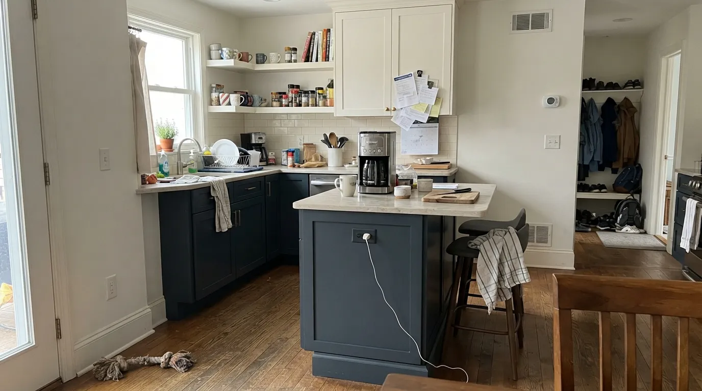
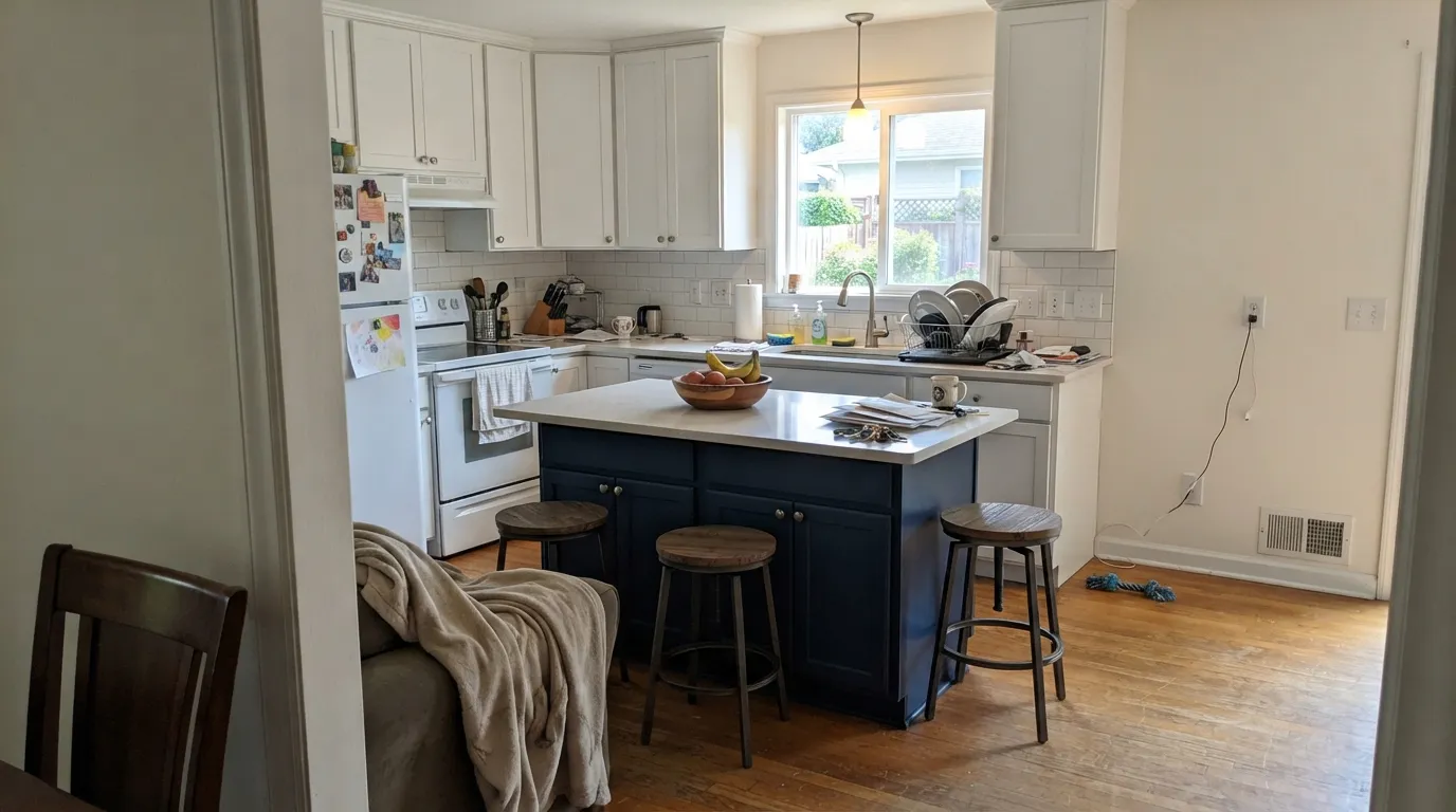
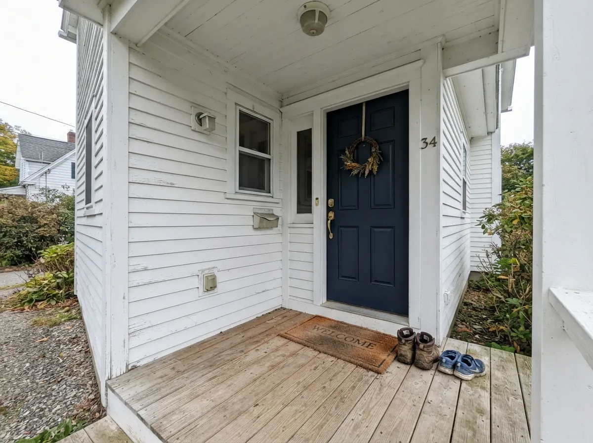
Photos from our full reviews — the same rooms and captions, so you can judge each color where it actually lives, not on a chip.

When to Pick Which
Choose Hale Navy if you want dark that behaves like a neutral, especially with mixed or creamy whites already in the room. It is the safer full-exterior color and the safer front door on red brick, because the gray in it softens the contrast. Pick it when you would rather the color feel settled than noticed.
Choose Naval if you want people to actually see blue, and if the surface gets real light: an island under white uppers, a front door on light siding, a study with proper windows. It is also the right answer if past navies disappointed you by turning charcoal. Give it a clean white nearby and a lamp aimed at it.
No comparison page can see your light. Upload one photo of your room and try both colors on the same walls, seconds apart.
Hale Navy vs Naval FAQ
Which one works in a north-facing room?
Neither, if you want to keep seeing blue. A small north-facing room in Hale Navy is the single most common regret story, and Naval is a step deeper still, so it goes further toward flat black. If the room is north-facing and you still want blue on the walls, go lighter: Newburyport Blue or Van Deusen Blue on the Benjamin Moore side, Indigo Batik on the Sherwin-Williams side.
Which is better for a kitchen island or lower cabinets?
Both are proven here, so it comes down to what you want people to see. Naval keeps the island visibly blue under white uppers and warm counter lighting. Hale Navy sits quieter and lets the counters and hardware lead. Do not put either one on all the cabinets in a small kitchen, uppers included, because it kills the light you cook by.
Which trim white goes with each?
Hale Navy is forgiving. Pure White, White Dove or Chantilly Lace all work, and even a slightly creamy white will not embarrass it. Naval is pickier and wants a clean, bright white, so use Pure White or Extra White. Cream trim next to Naval makes the blue look cold and the woodwork look yellow.
Which makes the better front door?
Naval reads blue from the street against white, light gray or pale siding, which is usually what people want from a navy door. Hale Navy is the better call on red brick or warm stone, because the gray in it keeps the contrast from shouting. Expect either one to fade on a door that bakes in southern sun all afternoon, and plan to refresh it sooner than you would a light color.
What do they look like at night under lamps?
Both go close to black once daylight is gone. Naval loses its blue more completely because it is deeper, while Hale Navy settles into a charcoal that still hints blue. The fix is light, not paint: a picture light over a navy wall, undercabinet lighting over an island, or warm 2700K lamps aimed at the surface rather than the ceiling.
Ask a Question