Blustery Sky
The deep blue-gray Sherwin-Williams never hyped into a Color of the Year, reviewed honestly: the light that makes it commit, the light that flattens it, and where it earns its keep.

Jessica has spec'd whites and neutrals for more than 300 rooms and keeps a sample wall of painted drawdowns in her studio. Every color review is checked against real reader rooms in the comments and re-tested when a formula changes. About the testing process →
- 1Salamander6
- 2Hidden Gem14
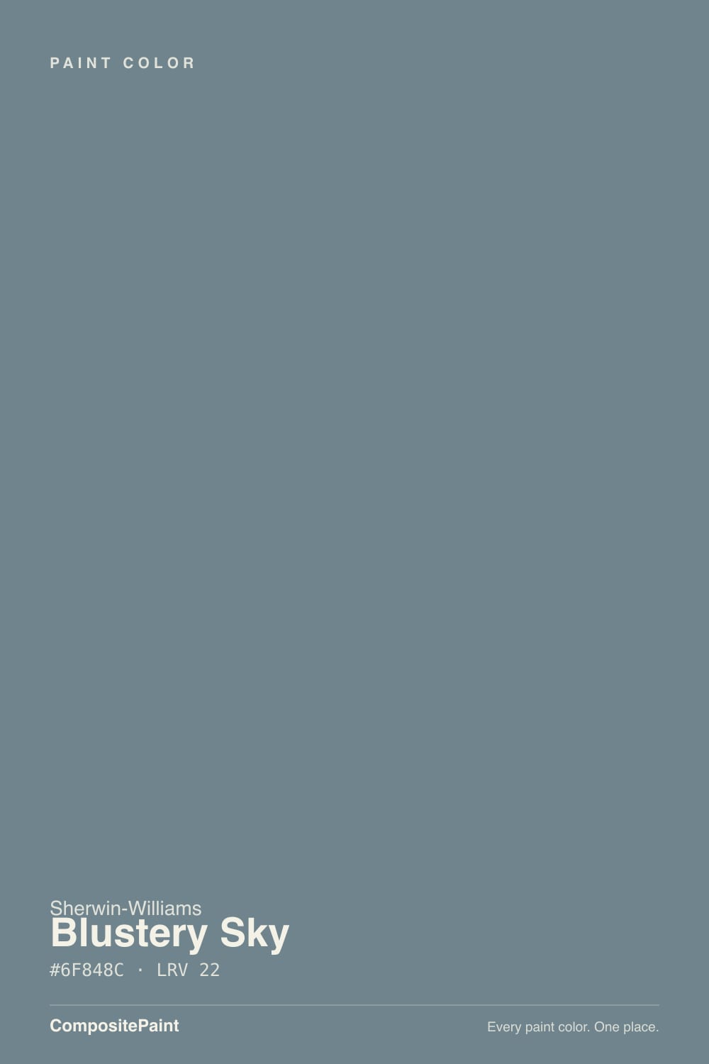
- 3Blustery Sky22
- 4Van Courtland Blue31
- 5Wythe Blue48
The Fast Verdict
Blustery Sky is a genuine blue-gray with a green whisper hiding under warm light — moody without going full navy, and honestly quiet enough that it never became a headline color. Give it real south daylight or an evening lamp and the blue steps forward; leave it in a dim north room and it slides toward flat gray. It reads less like a bold statement color and more like a dependable one — the kind designers reach for on an island, a front door, or a den when they want depth without drama.
Kitchen islands and cabinets · front doors and shutters · dens and bedrooms lit by warm lamps · anyone who wants a moody blue-gray without buying navy
Your room gets only weak north light and stays lamp-free · you want a color that reads the exact same blue every hour of the day · your space is small and already short on daylight · you were hoping for a true teal or aqua
- A genuine blue-gray depth that never tips into flat navy
- The hidden green undertone keeps warm-lit rooms from feeling cold
- Confident on an island, cabinets, or a front door without repainting the whole house
- Holds real color at LRV 22 instead of washing out like a pastel blue
- A quiet, dependable alternative to louder, more hyped moody blues
- Shifts noticeably: bluer in south light, grayer in north light, greener under warm bulbs
- Can read cave-like on four walls in a small, dim room
- Cool white trim in weak light makes it look muddy instead of sophisticated
- No wide design-world consensus behind it — sample a large board before committing
What Color Is Blustery Sky, Really?
A dark, muted blue-gray with a green undertone that only shows up when you give it warmth. Sherwin-Williams released it in 2021 with a run of quiet, unfussy neutrals and near-neutrals — Blustery Sky sits right next to SW 9139 Debonair in the numbering, and like its neighbor it never chased a Color of the Year moment or a viral room. It shows up in the site's own teal family bucket by hue math, but nobody who lives with it calls it teal on the wall — it reads blue-gray first, with the green only sneaking out under a warm bulb.
At LRV 22 it is a genuinely dark, mid-deep color — not a pastel spa blue, not a washed-out greige-blue. That depth is what makes it read as intentional rather than accidental: on an island or a front door it holds its color instead of thinning out, and on four walls in a bright room it goes properly moody instead of just dim.
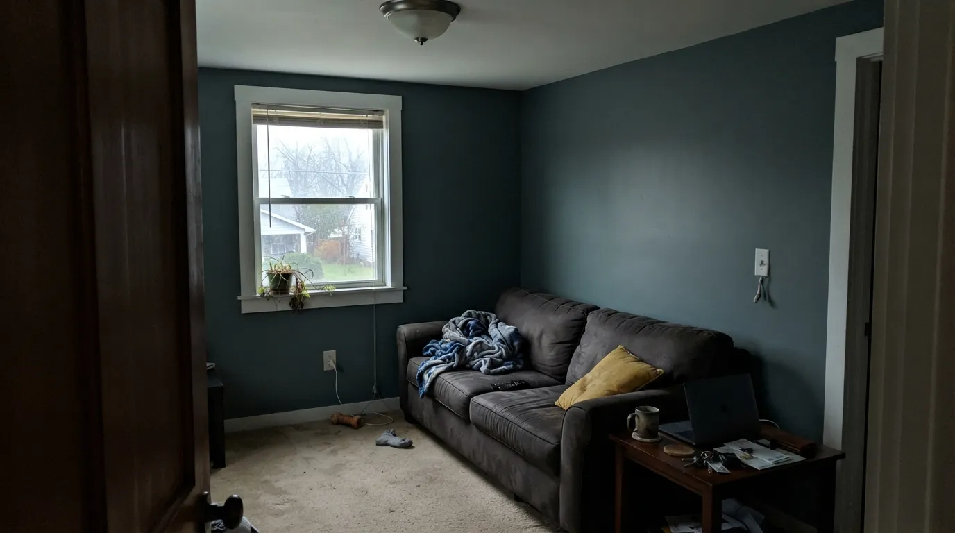
Undertone in one line: blue-gray first, with a green whisper that only surfaces under warm 2700K light. In strong south daylight the blue takes over; in cool, overcast, or north light the color grays out and the green all but disappears. Neither read is wrong — it is the same paint answering two different questions.
Where It Shines
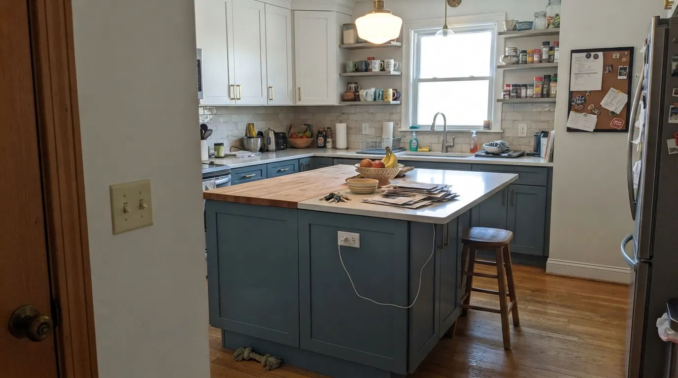
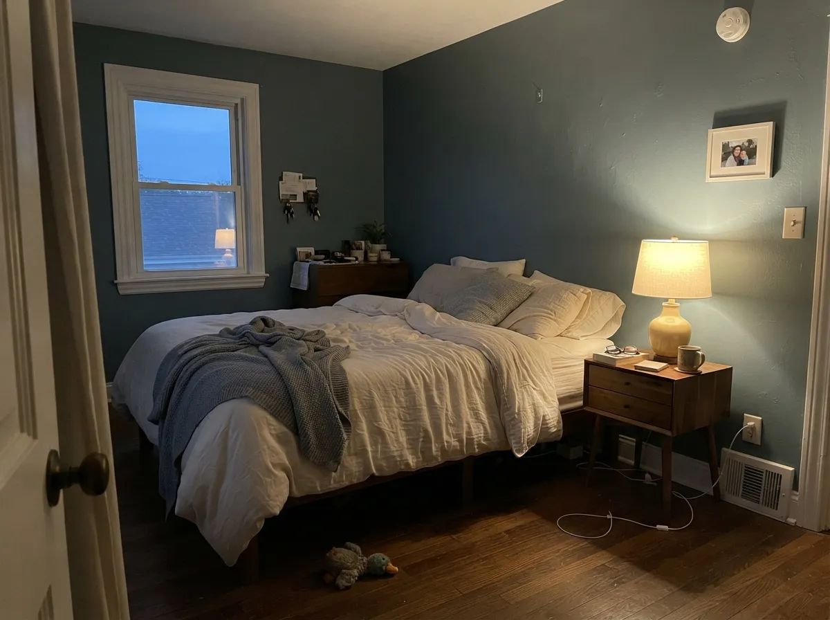
It earns its keep on scoped surfaces and in rooms with real daylight or a lamp turned on. South-facing daylight is where the blue commits hardest — the color's most photographed look — and evening lamplight is a close second, pulling the hidden green forward into something cozier. Give it a kitchen island, a front door, or a den with warm wood and brass, and it looks deliberate rather than dark for the sake of it.
Where It Fails
Almost every disappointed review of Blustery Sky comes down to one of three predictable mismatches. None of them are the paint's fault — but if your room matches one, sample big before you commit a whole wall.
This color does not hold one identity all day. South daylight and warm 2700K lamps pull the blue and the hidden green forward; north light, overcast skies, and cool LEDs flatten it toward plain gray. If you need a color that reads identically at 9am and 9pm, this is not it — but if you like a wall that changes with the day, this is exactly the point.
At LRV 22 it is genuinely dark, and without real daylight a small enclosed room can go cave-like fast. It is much safer as a scoped commitment — island, cabinets, front door, one accent wall with a window — than as the only color in a windowless powder room or a north-facing den.
Pair it with a stark, blue-leaning white trim in a dim or north-facing room and the wall reads muddy gray-green instead of the sophisticated blue-gray you saw on the chip. In strong light the crisp contrast works fine; in weak light, a warmer trim white or a soft off-white keeps the pairing honest.
Room by Room
Islands, lower cabinets, or a full run of cabinetry in Blustery Sky against white counters and upper cabinets is the pairing readers photograph the most. Brass or unlacquered-brass hardware brings out the warmth in the undertone. Satin cabinet enamel wipes clean and hides fingerprints better than a bright white would.
As a backdrop for walnut furniture and a light rug it goes calm and layered rather than dark. Works best as a full-room color when the room gets meaningful daylight; in a dim room, scope it to one wall instead.
Under warm lamplight it turns genuinely restful, the green whisper coming forward into something cozier than blue. Matte finish softens wall texture. Pair with cream linens rather than stark white bedding, which can read cold against it.
It reads cooler and sharper in a bathroom's typically harsher, more reflective light, and can feel draining without a window. Best on a vanity or half-wall rather than a full windowless powder room; with real daylight and warm brass fixtures it works beautifully.
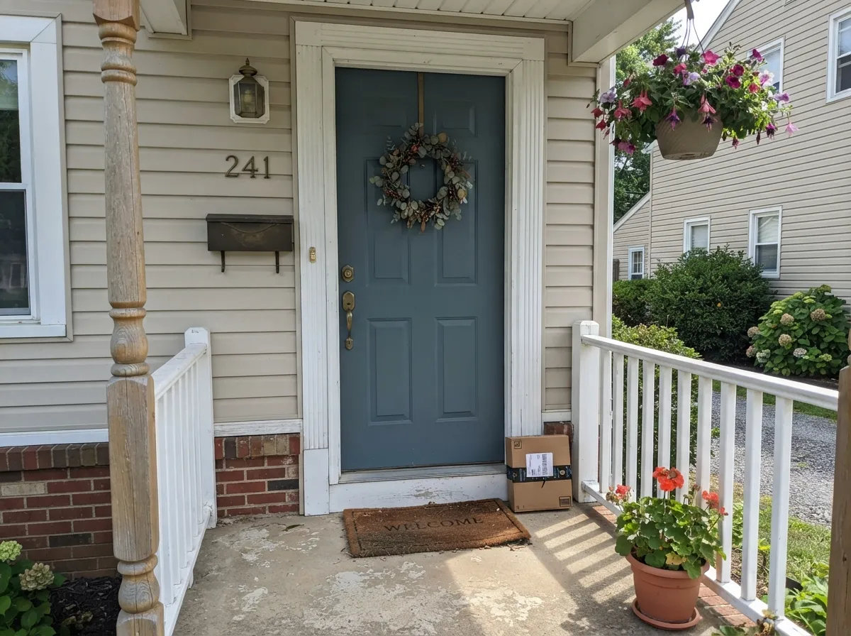
This is where the color gets genuinely confident: a Blustery Sky front door against a white or light-neutral house reads rich and stately rather than dark for its own sake. Full sun keeps the blue committed; use a bright, warm-leaning white for the trim and siding.
With walnut shelving, leather, and a lamp on, it makes an easy backdrop for video calls without going flat black on camera. Skip it if the room only gets north light and you work through overcast mornings without a lamp on.
Your Light Is the Risk
The blue comes forward hardest here — the color's most confident, most photographed look. Whole-room safe.
Cool gray daylight flattens the blue and exposes a muddy, slightly green-gray cast. Sample before committing four walls.
Grayer and cooler in the morning, bluer and warmer as afternoon sun swings around — most owners like the range.
2700K lamps pull the hidden green forward and the color turns cozy; cool LEDs keep it flat blue-gray. Pick your bulb on purpose.
Most complaints about Blustery Sky are a light mismatch. Upload a photo of your actual room and see it on your walls — then ask for the same wall in north light or evening lamps before you buy a single sample.
Need It From Another Brand?
Any paint counter can custom-tint Sherwin-Williams SW 9140 directly. If you would rather stay in one brand's own deck, these are the closest stock matches, measured as ΔE2000. Under 2 is a difference you will not see on the wall.
| Brand | Closest color | ΔE | LRV | |
|---|---|---|---|---|
| Behr | Rocky CreekPPF-37 · Behr | 1.0 | 22 | Color page → |
| Benjamin Moore | Smokestack Gray2131-40 · Benjamin Moore | 1.9 | 23 | Color page → |
| Valspar | Deep ThoughtsT694 · Valspar | 3.7 | 22.4 | Color page → |
| PPG / Glidden | Puddle JumperPPG1035-5 · PPG / Glidden | 2.1 | 21 | Color page → |
| Glidden | Puddle JumperPPG1035-5 · Glidden | 2.2 | 21 | Color page → |
| Dutch Boy | High Seas Blue337-5DB · Dutch Boy | 2.7 | 21 | Color page → |
Similar Sherwin-Williams Colors
The nearest shades to Blustery Sky within Sherwin-Williams's own range, ranked by perceptual color distance — useful when you want the same look a touch lighter, darker, or warmer.
WCAG 2.1: AA is 4.5 : 1 for normal text, 3 : 1 for large text, AAA is 7 : 1.
Blustery Sky vs the Colors You're Also Considering
Every Blustery Sky sample board has the same rivals on it. The numbers show the real lightness gap — then it comes down to which risk you would rather live with.
Pick this for the deeper, more committed version when Debonair feels like it's not quite showing up.
Sherwin-Williams SW 9139 · LRV 34DebonairPick this for the lighter, quieter version of the same blue-gray family — its numbering neighbor, one shade up.
Pick this for the green whisper that keeps a moody color from reading flat and cold.
Sherwin-Williams SW 6249 · LRV 24Storm CloudPick this for a purer gray-blue with almost no green — best saved for a door rather than a whole room.
Storm Cloud (SW 6249), hex #7A848D at LRV 23, is the closest neighbor in the line. It is marginally lighter and its red channel runs higher, so it reads a touch grayer and less green than Blustery Sky. Portsmouth (SW 9644), hex #768482 at LRV 22, holds more green and drifts toward a soft teal, while Software (SW 7074), hex #7F8486 at LRV 23, drops the hue almost entirely and behaves as a neutral gray.
Across brands, Behr's Rocky Creek (PPF-37) at LRV 22 sits 1.03 away and Benjamin Moore's Smokestack Gray (2131-40) at LRV 23 sits 1.94 away, both visually identical to Blustery Sky in normal room light. PPG and Glidden's Puddle Jumper (PPG1035-5) at LRV 21 is 2.07 away and Farrow and Ball's De Nimes (No. 299) at LRV 21 is 3.32 away, very close but worth sampling first. Valspar's Deep Thoughts (T694) at LRV 22.4 is 3.66 away, close but visibly different side by side.
Blustery Sky Coordinating Colors
The rule for coordinating with Blustery Sky: keep whites warm-leaning in dim rooms, crisp whites for strong light, and let its own family do the layering. It pairs cleanly with brushed brass, walnut, and matte black, and it looks most deliberate next to a genuinely warm white rather than a stark blue-white. These are the partners that keep showing up in rooms that work:
A Quiet 2021 Color That Never Chased Fame
Blustery Sky arrived in 2021 as part of a run of understated Sherwin-Williams neutrals and near-neutrals — its SKU sits immediately after SW 9139 Debonair, another quiet blue-gray from the same release. Neither color got a Color of the Year push or a viral design-blog moment; both simply went into the deck and stayed there, picked up steadily by people painting kitchen islands and front doors rather than chasing a trend.
That honest obscurity is arguably the point. It has none of the backlash risk of an over-hyped color — nobody is tired of it, because it was never everywhere — and it has years of real installs on real islands and doors behind it instead of a single magazine spread. If you want a dependable blue-gray without the trend-timestamp, this is a reasonable one to pick precisely because it never tried to be famous.
Blustery Sky With Wood Tones and Metals
Warm wood is this color's best partner. Walnut furniture and shelving deepen the mood without a fight, and honey or golden oak floors work too — blue-gray and orange-leaning wood sit close to opposite on the color wheel, and that contrast tends to read as deliberate rather than clashing, the same logic behind a classic navy-and-oak living room.
Metals are equally forgiving: unlacquered or brushed brass brings out the hidden warmth in the undertone, and matte black hardware or fixtures give the scheme a grounded, modern edge. Polished chrome is the one metal that leans cold against it and tends to fight rather than complement.
Three Ready Palettes Built on Blustery Sky
A color is never alone on the wall. These are complete combinations in the 60-30-10 pattern, with the reason each one holds together. Every one opens in the visualizer.
Alabaster keeps the room bright while the island carries all the color and depth; Iron Ore hardware and pendants give the scheme one black note so it reads finished, not just contrasted.
Try this palette in your roomPure White trim stays soft rather than stark, so the walls read deep and calm instead of harshly cut. Rainwashed carries the same blue-green lean into an attached bath at a lighter depth, so the two rooms feel like one palette, not two decisions.
Try this palette in your roomA soft warm siding with a sharp white trim is the classic crisp exterior; the door is the one deep, deliberate note, and full sun keeps Blustery Sky reading rich and blue rather than dark and flat.
Try this palette in your roomBlustery Sky FAQ
Is Blustery Sky blue or gray?
Both, depending on the light — genuinely. South daylight and warm lamps pull it toward blue with a hidden green whisper; north light, overcast days, and cool LEDs flatten it toward gray. It is never a pure teal or aqua, whatever the family label says.
Is it good for kitchen cabinets or an island?
Yes — this is its most photographed use. It works especially well on an island or lower cabinets against white uppers and counters, with brass or matte-black hardware. Use a satin cabinet-grade enamel, not a wall paint.
What trim white goes with Blustery Sky?
A crisp white like Extra White or Pure White works well in rooms with real daylight. In dim or north-facing rooms, step to a slightly warmer white — a stark cool white in weak light can make the walls read muddy instead of sophisticated.
Does it work on a front door or exterior?
Yes, and it is one of its strongest jobs. Full outdoor sun keeps the blue committed and reads as a rich, stately statement door rather than a dark one. Pair with a light, warm-leaning siding and white trim.
Will it feel too dark in a small room?
It can, if the room is small, dim, and painted floor to ceiling. At LRV 22 it needs real daylight or lamps to stay from feeling closed-in. Scope it to an island, an accent wall with a window, or a door rather than four walls in a windowless space.
Does it pair with warm wood floors like oak?
Yes — blue-gray and warm orange-leaning wood are near-opposite on the color wheel, and that contrast reads as intentional rather than clashing, the same logic behind classic navy-and-oak rooms. Walnut and honey oak both work; just keep the trim warm enough to bridge the two.
Have you painted with Blustery Sky?
Rate it — one tap helps the next reader decide.
Ask a Question