Elmira White
An obscure Historical Colors greige, reviewed honestly: the exact conditions that turn it pink, the rooms where it's genuinely calm, and the color a Houzz designer told one owner to switch to instead.

Jessica has spec'd whites and neutrals for more than 300 rooms and keeps a sample wall of painted drawdowns in her studio. Every color review is checked against real reader rooms in the comments and re-tested when a formula changes. About the testing process →
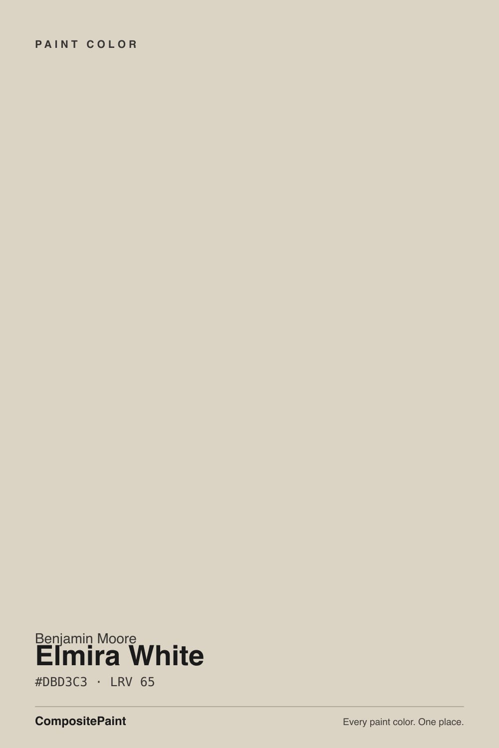
- 1Revere Pewter55
- 2Agreeable Gray60
- 3Elmira White65
- 4Shoji White74
- 5Dover White83
The Fast Verdict
Elmira White is one of Benjamin Moore's least-discussed Historical Colors neutrals — no Color of the Year run, almost no independent design-blog coverage, and a documented complaint that keeps showing up in real owner threads: the greige can flash pink or peach without warning. Give it a room with pale or gray-leaning floors and a warm-neutral trim partner and it settles into a calm, correct, old-house-appropriate off-white. Pair it carelessly and it will surprise you.
Traditional or colonial-style rooms · a whole-house neutral over pale or gray-washed floors · pairing with trim and cabinetry that share its warm temperature · buyers willing to sample big, in every room, before committing
Your floors are redwood, cherry, or another red-leaning wood · you're pairing it with a cooler, brighter warm white nearby · you want a color with a big online sample library to check against first · you need every room in the house to read identical
- A genuinely quiet greige-beige that stays out of the way in the right room
- LRV 65 keeps it a true light neutral — not chalky, not stark white
- Fits period trim and traditional woodwork without looking artificially bright
- No trend baggage — it predates the greige decade and isn't chasing a moment
- Reads calm and correct with pale or gray-toned wood floors
- Undertone can flash pink or peach unpredictably — documented by real owners, not just a theoretical risk
- Looks noticeably worse, not better, next to a cooler warm white like Swiss Coffee
- Almost no independent design-blog or forum coverage to compare your room against first
- Reflected light off red-toned wood floors is a specific, confirmed trigger for the pink flash
What Color Is Elmira White, Really?
Benjamin Moore files Elmira White in its Historical Colors collection, the HC-prefixed line drawn from early American architecture — a lineup built for quiet correctness on old trim and paneling, not for going viral. That obscurity is itself the honest headline: Elmira White has never had a Color of the Year moment, has barely any independent blog coverage, and shows up in searches mostly as a bare product listing. It is the kind of color a professional pulls off the historical rack for a restoration-adjacent project, not one a homeowner stumbles on through Pinterest.
At LRV 65 it sits in the same light-medium band as Pale Oak (LRV 67) and Natural Cream (LRV 65) — reflective enough to read as a pale neutral, not reflective enough to be white. On paper the undertone is a straightforward grey-beige. On the wall, real owner threads describe something less tidy: a warmth that can swing distinctly pink or peach, and not evenly across a house — one room reads true to the chip while another, under the same daylight, reads noticeably warmer.
Undertone in one line: warm greige with an inconsistent pink-leaning cast — never green, and the pink is not universal, but it is real and documented. If your sample looks correct in one room and peachy in another, that is the paint responding honestly to that room's floor and reflected light, not a bad batch or a mixing error.
Where It Shines
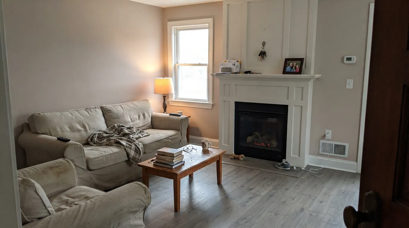
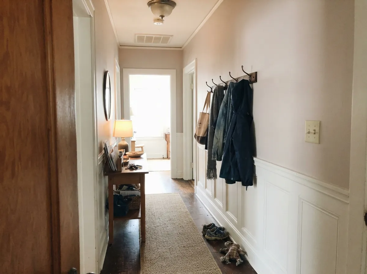
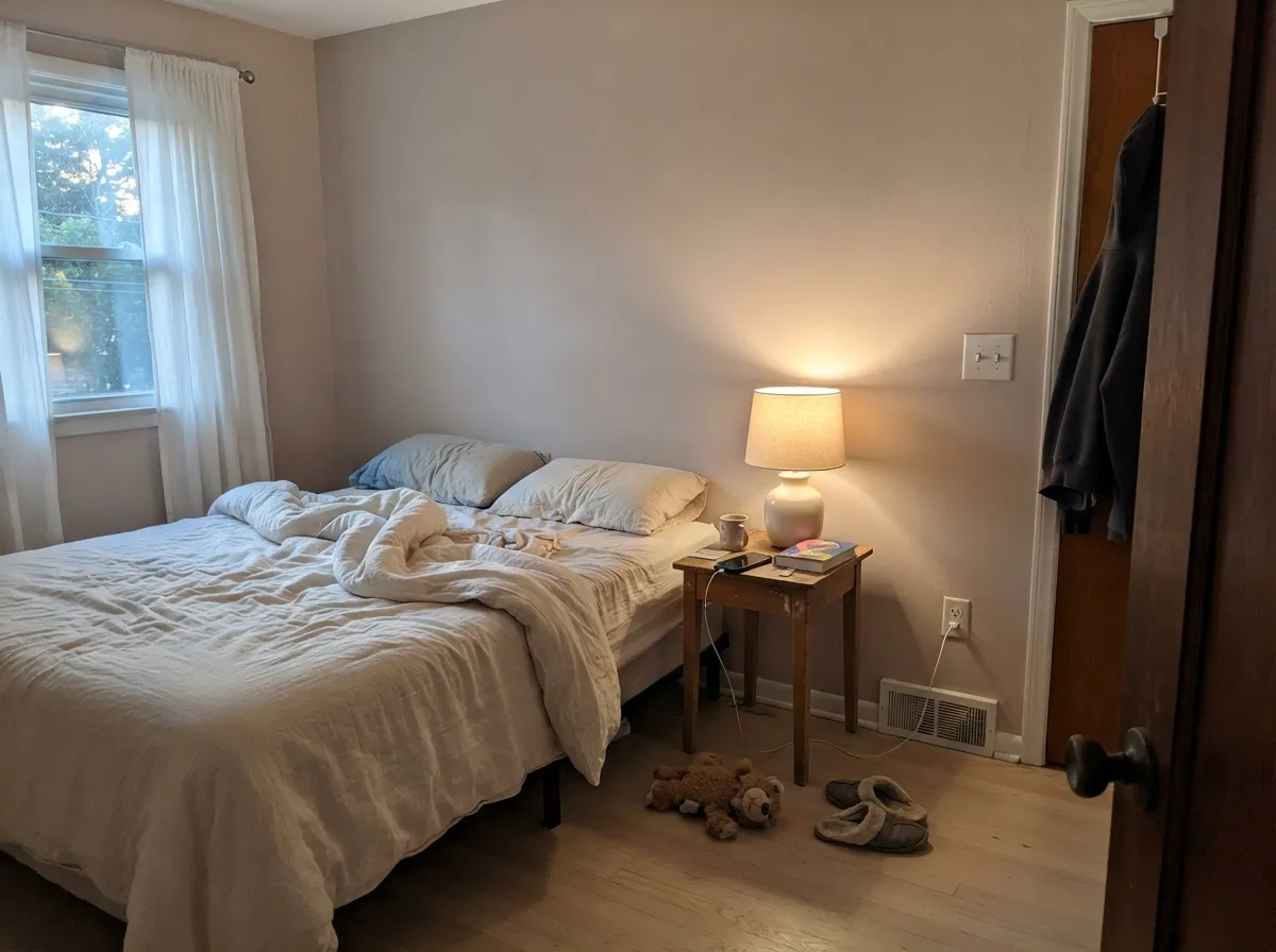
Give it a floor that isn't fighting it — pale oak, gray-washed wood, cool-toned tile — and a trim or cabinet partner in the same warm-neutral family, and Elmira White does exactly what a Historical Colors greige is supposed to do: it disappears into the architecture instead of announcing itself. In a traditional main floor with consistent trim, or a lamplit bedroom with cream linens, it reads as a calm, slightly warm, correctly quiet neutral — the kind of background color that lets older woodwork and furniture do the talking.
Where It Fails
Every documented complaint about Elmira White traces back to one of three real situations reported by actual owners — not vague online chatter. None of them are unfixable, but if your room matches one, sample generously before you commit a whole house to it.
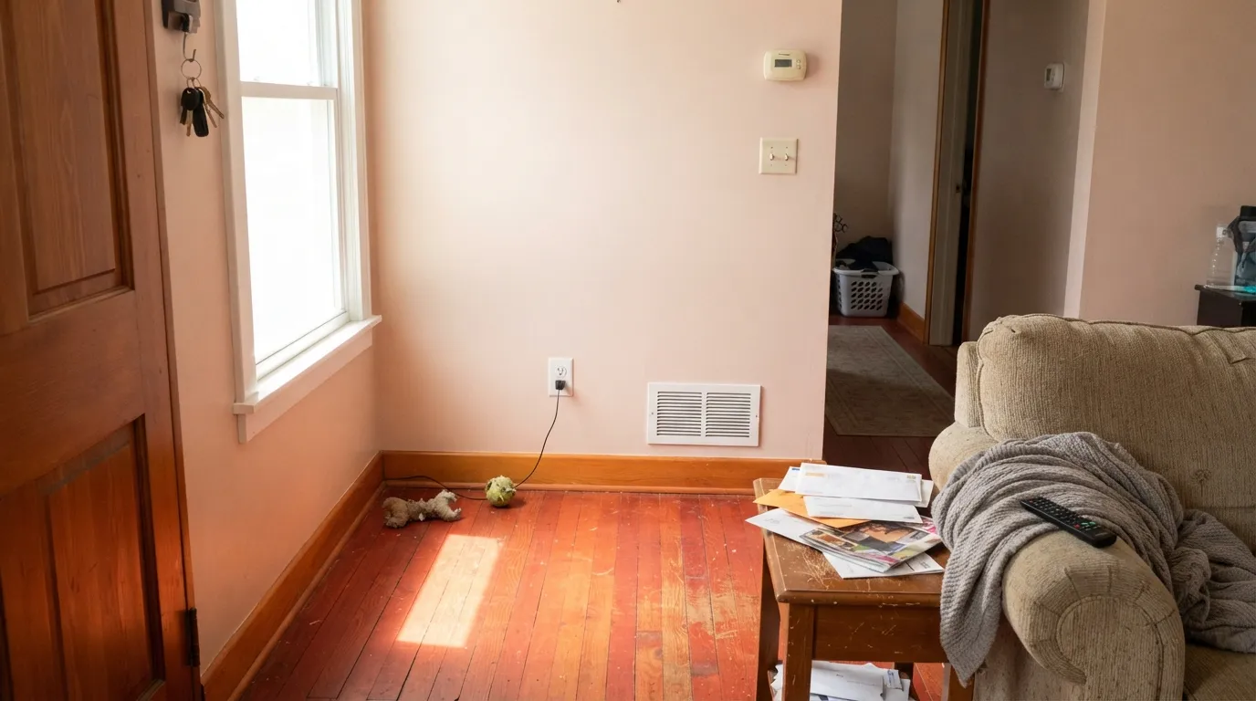
One owner painting an open-concept space in Elmira White reported the color matching the chip beautifully in some rooms and reading distinctly pink or peach in others — with a designer pointing to reflected light bouncing up off redwood-toned flooring as the likely cause. The fix that was actually recommended: repaint the affected rooms in Edgecomb Gray or Nature's Essentials, both described as 'very near but just a tad cooler.'
Another real report: after installing Swiss Coffee cabinets, the same owner said the surrounding Elmira White walls suddenly looked 'even worse — very pinky/peachy.' The paint hadn't changed; the comparison did. A brighter, cooler-leaning white right next to it will make Elmira White's warmth look like a mistake instead of a feature.
Because the pink flash depends on each room's specific floor tone and reflected light, not on the paint itself, a whole-house application without sampling every room individually is the single most common regret. Buy the sample size and test it on the actual wall in every space it will cover, not just the one with the best light.
Room by Room
Over pale oak, gray-washed wood, or neutral tile it reads as a calm, quiet warm-neutral background. Eggshell finish; keep trim in the same warm-white family rather than reaching for the brightest white in the fan deck.
The documented Houzz complaint about it clashing with Swiss Coffee cabinets is a real cautionary tale. If cabinets are a cooler or brighter white than the walls, test the pairing on the actual wall before painting either surface.
With 2700K bulbs and cream or white bedding it settles into a soft, restful neutral at night. If the floor is a red-leaning wood, sample the wall first — the same reflected-warmth risk applies here as anywhere else.
As a Historical Colors entry it was built to sit alongside period trim rather than a stark modern white. Pairing it with an equally warm trim white avoids the temperature clash that triggers the pink-flash complaints.
It can carry a house the way any quiet neutral does, but only if the floor tone stays consistent room to room. A house that mixes red-toned wood in one hallway and gray-washed boards in another will get two different versions of this color.
Historical Colors entries are commonly chosen for traditional and restoration-style exteriors, and Elmira White's muted greige fits that brief. Outdoor reflected light off red brick, red cedar shingle, or a red-toned roof can trigger the same pink flash documented indoors — sample on the actual siding before ordering gallons.
Your Light Is the Risk
Away from any reflected warm surface, this is when the greige reads calmest and most correct — soft, quiet, genuinely gray-beige.
Reflected warmth off red-leaning wood — redwood, cherry, some red oak stains — pushes it visibly pink or peach. This is the confirmed cause behind the real owner complaints.
Cooler and truer to the chip earlier in the day; noticeably warmer, occasionally peachier, as afternoon sun angles in.
2700K bulbs nudge it further toward peach. Cooler LEDs hold it closer to a flat gray-beige, which is safer if the pink flash is your concern.
Most complaints about Elmira White are a light mismatch. Upload a photo of your actual room and see it on your walls — then ask for the same wall in north light or evening lamps before you buy a single sample.
Need It From Another Brand?
Any paint counter can custom-tint Benjamin Moore HC-84 directly. If you would rather stay in one brand's own deck, these are the closest stock matches, measured as ΔE2000. Under 2 is a difference you will not see on the wall.
| Brand | Closest color | ΔE | LRV | |
|---|---|---|---|---|
| Sherwin-Williams | Natural TanSW 7567 · Sherwin-Williams | 1.2 | 65 | Color page → |
| Behr | Roman PlasterPPU7-10 · Behr | 1.9 | 65 | Color page → |
| Valspar | Warm Putty6006-1A · Valspar | 1.3 | 64.8 | Color page → |
| PPG / Glidden | Wheat SheafPPG14-21 · PPG / Glidden | 1.0 | 67 | Color page → |
| Glidden | Papyrus Paper50YY 65/071 · Glidden | 1.6 | 65 | Color page → |
| Dutch Boy | Existence420-1DB · Dutch Boy | 0.9 | 63 | Color page → |
Similar Benjamin Moore Colors
The nearest shades to Elmira White within Benjamin Moore's own range, ranked by perceptual color distance — useful when you want the same look a touch lighter, darker, or warmer.
WCAG 2.1: AA is 4.5 : 1 for normal text, 3 : 1 for large text, AAA is 7 : 1.
Elmira White vs the Colors You're Also Considering
Every Elmira White sample board has the same rivals on it. The numbers show the real lightness gap — then it comes down to which risk you would rather live with.
Pick this if your room already sampled true and you want the slightly warmer, softer read Elmira White offers.
Benjamin Moore HC-173 · LRV 63Edgecomb GrayPick this for the safer version of this exact idea — it's the cooler substitute a Houzz designer actually recommended once Elmira White went pink in a real home.
Pick this for the quieter, more gray-leaning neutral, once your floor and trim have passed the sample test.
Benjamin Moore OC-14 · LRV 65Natural CreamPick this for the same LRV in a warm cream instead of a greige — no gray base for a pink floor to argue with.
Pick this if Pale Oak's own known mood swing between good and bad light worries you more than an occasional pink flash does.
Benjamin Moore OC-20 · LRV 67Pale OakPick this for a far more documented, widely-used Benjamin Moore neutral, with the sample photos and reviews Elmira White simply doesn't have.
Edgecomb Gray HC-173 is the comparison people ask about most, and the two are closer than their reputations suggest. Edgecomb Gray sits at LRV 63 with a hex of #D9D3C4 against Elmira White's 65 and #DBD3C3. Elmira White is a hair lighter and leans slightly more red-orange, while Edgecomb Gray reads a touch greener and grayer. Baby Fawn OC-15 and Alaskan Skies 972 share that same hex and LRV 63, so they behave the same way.
Natural Cream OC-14 at LRV 65 and Nature's Essentials 1521 at LRV 67 are the softer, slightly creamier neighbors. Frosted Toffee 988 at LRV 64 pushes a little further toward pink.
Across brands, Diamond Vogel Midlothian Beige H103 at LRV 62 and deltaE 0.55 is the same color for practical purposes, as is Dutch Boy Existence 420-1DB at deltaE 0.91. Magnolia Home Stoneware Pieces JG-55 at LRV 63 and deltaE 3.92 is close but visibly different side by side, reading cooler and greener.
Elmira White Coordinating Colors
The safest rule for pairing with Elmira White: stay in its own warm-neutral temperature and avoid setting a noticeably cooler or brighter white directly beside it — that exact contrast is behind the most-repeated real complaint about this color. These are the partners that keep it stable rather than exposing its undertone risk:
The Quiet Corner of the Historical Colors Collection
Elmira White has none of the markers that make a paint color famous. No Color of the Year run, no viral renovation, almost no independent design-blog write-ups to browse before buying — search for it and you mostly find bare product listings, not owner galleries. It belongs to Benjamin Moore's Historical Colors collection, the HC-prefixed line built around early American architecture, which explains the character: this is a formula meant to sit quietly on old trim and paneling, not to announce itself on a moodboard.
That obscurity cuts both ways. It means there's little crowd-sourced evidence to check your specific room against before committing — which is exactly why the documented pink-flash reports matter more here than they would for a color with thousands of sample photos online. It also means Elmira White isn't competing for attention against a dozen trendier lookalikes; if it tests true in your space, you're getting a genuinely old-house-correct neutral with none of the current-moment baggage.
Elmira White With Wood Tones and Floors
This is where the real research on this color points, and it's worth taking seriously: a documented case of Elmira White reading correctly in some rooms and distinctly pink or peach in others, in the same open-concept house, was traced by a designer to reflected light bouncing up off redwood-toned flooring. Red-leaning woods — redwood, cherry, some red oak stains — are the confirmed risk.
Pale oak, gray-washed wood, and cool-toned tile are the safer floors; they don't feed extra warmth back into the paint film, so the greige stays closer to its intended gray-beige. If your floor is already a warm red-brown and you love this color, don't rule it out — but paint a large sample directly above the actual floor, in that actual room, before buying gallons.
Three Ready Palettes Built on Elmira White
A color is never alone on the wall. These are complete combinations in the 60-30-10 pattern, with the reason each one holds together. Every one opens in the visualizer.
White Dove trim stays in the same warm family, so there's no cooler-white clash to trigger the pink flash. Kendall Charcoal supplies the one dark note a Historical Colors house wants without introducing a competing undertone.
Try this palette in your roomEdgecomb Gray is the exact cooler greige a Houzz designer suggested once Elmira White read pink next to a brighter white — putting that cooler shade on the cabinets keeps the whole room in the same temperature instead of fighting it.
Try this palette in your roomUnder warm lamplight the greige leans gently toward its warm side without the daytime floor-reflection problem pushing it into peach. Wrought Iron adds one soft near-black note instead of a stark black that would only sharpen any undertone shift.
Try this palette in your roomElmira White FAQ
Is Elmira White warm or cool?
Warm-leaning, technically filed as a greige. The real story is that its warmth is inconsistent — real owners report it reading correctly gray-beige in one room and distinctly pink or peach in another, in the same house. Never green.
Why does Elmira White look pink in my house?
The most documented cause is reflected light bouncing off a warm or red-toned wood floor — redwood, cherry, some red oak stains. A designer diagnosing this exact problem on a real project pointed to floor reflectance, not the paint batch. Sample the wall in the specific room before committing.
What's a safer alternative if I'm worried about the pink flash?
Edgecomb Gray. It's the actual cooler substitute a Houzz designer recommended to an owner once Elmira White went pink in part of their home — close enough to keep the same mood, cool enough to avoid the same trap.
Does it work in a kitchen?
It can, but sample it against your specific cabinet color first. A real owner reported their Elmira White walls looking noticeably pinkier once brighter Swiss Coffee cabinets went in beside them — the contrast, not the paint alone, caused the complaint.
Is it good for an exterior or a historic-style home?
Plausible — Benjamin Moore's Historical Colors line is commonly used on traditional and restoration-style exteriors, and Elmira White's muted greige fits that look. The same reflected-warmth risk applies outdoors, so sample against your actual siding and any red brick or red-toned roofing nearby.
How does Elmira White compare to more famous Benjamin Moore neutrals like White Dove or Pale Oak?
It's far less documented. There's no large body of owner photos or design-blog reviews to check your room against before buying, which is itself the honest reason to sample generously rather than trust the chip alone.
Have you painted with Elmira White?
Rate it — one tap helps the next reader decide.
Ask a Question