Moonshine
The near-white gray everyone finds by accident, reviewed honestly: the wall it turns blue on, the lamp that turns it green, and where it lands next to Gray Owl and Classic Gray.

Jessica has spec'd whites and neutrals for more than 300 rooms and keeps a sample wall of painted drawdowns in her studio. Every color review is checked against real reader rooms in the comments and re-tested when a formula changes. About the testing process →
- 1Stardew43
- 2Palladian Blue60
- 3Moonshine67
- 4Spatial White72
- 5Spring Thaw83
The Fast Verdict
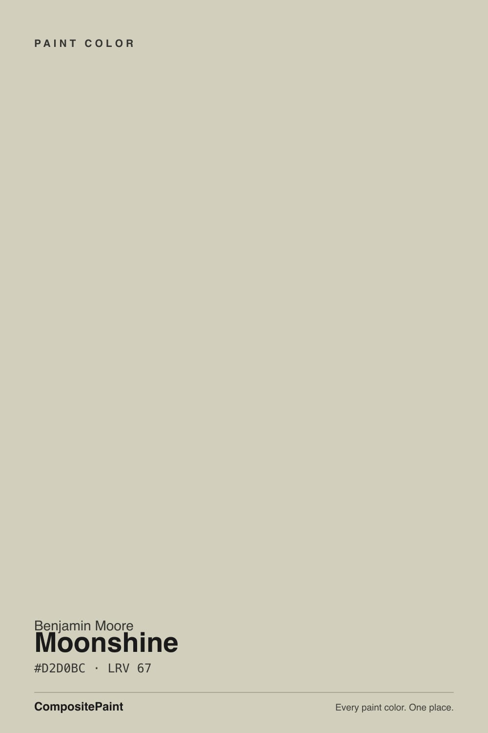
Moonshine is the quiet gray that never quite settles down. On the tiny fan-deck chip and on most screens it looks almost white; get it on a real wall and a soft blue-green undertone wakes up, shifting toward blue in cool daylight and toward green under a warm lamp. That instability is exactly why it has a following — it is never a flat, dead neutral — but buy it expecting a fixed color and you will be surprised by the third wall.
Kitchens and baths with nickel or chrome hardware · whole-house neutral in a room with real daylight · anyone who found Gray Owl too crisp or blue · bedrooms that should feel calm, not stark
You want one predictable color on every wall · your room stays dim and north-facing all day · your hardware and fixtures are brass or gold · you need a full-sun exterior body color
- Genuine chameleon — shifts blue to green through the day instead of sitting flat
- LRV 67 keeps rooms bright without the starkness of a true white
- Reads sophisticated and cool next to nickel, chrome and matte black hardware
- Softer and quieter than Gray Owl, without Classic Gray's pink risk
- Sold under two catalog numbers (OC-56 and 2140-60) so it's easy to find at any BM counter
- Undertone genuinely shifts — blue in north daylight, green under warm bulbs
- Near-invisible on the fan-deck chip; buyers are routinely surprised at wall scale
- Fights brass and gold-toned warm light harder than Gray Owl does
- Washes out in full-sun exterior coats — better indoors or as trim
What Color Is Moonshine, Really?
Moonshine sits in Benjamin Moore's Off-White Collection under the number OC-56 — the same formula also sells under the older Color Preview number 2140-60, so do not be thrown off if a sample chip or a contractor quotes the other code; it is one paint with two names. At LRV 67 it lands squarely on the line between "light gray" and "off-white," which is the root of most of the confusion around it: on a two-inch chip, and on almost every screen, it reads close to plain white. The color only shows up once it is rolled across a real wall.
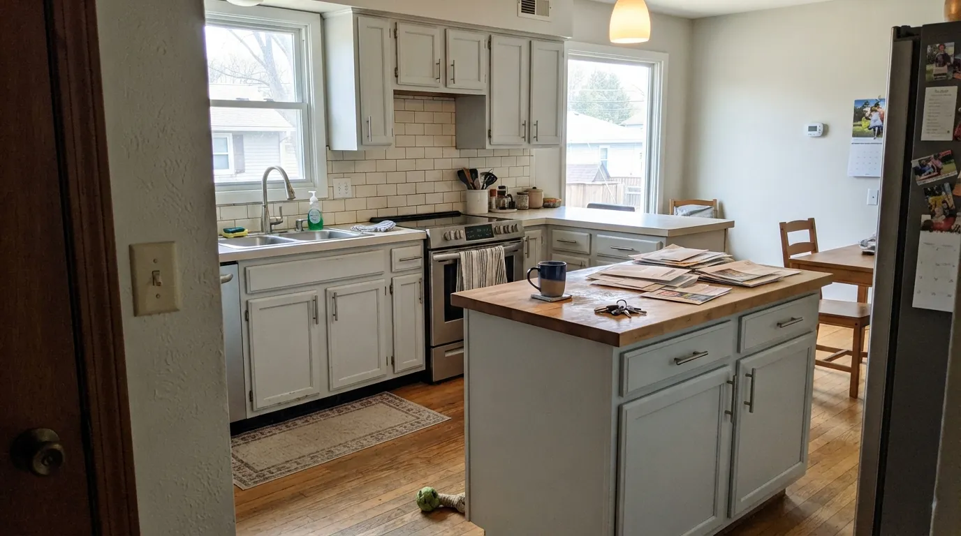
That color, once it appears, is a soft blue-green — and it does not stay put. Cool, north-facing daylight pulls the blue side forward and the wall reads like a quiet silvery gray, closer in mood to Benjamin Moore's Gray Owl. Warm lamplight, west sun, or a room full of plants pulls the green side forward instead, and the same wall reads faintly seafoam. Reviewers who bought it expecting a fixed gray are the ones who write it up as inconsistent; reviewers who bought it for exactly this shape-shifting are the ones who call it their favorite paint in the house.
Undertone in one line: cool blue-green chameleon, never warm, never pink. Line it up against its two most obvious BM siblings and the position is clear — Gray Owl (LRV 65) is crisper and more committed to blue-green, Classic Gray (LRV 74) is lighter, warmer, and carries a violet-pink whisper Moonshine never shows. Moonshine sits between them in depth and stays cooler than Classic Gray, softer and less certain of itself than Gray Owl.
Where It Shines
Give it real daylight and cool-toned metal and Moonshine is genuinely hard to tire of. It is a favorite for kitchens and baths built around nickel, chrome, or matte black hardware rather than brass, because its blue-green lean sits happily next to cool metal the way a warmer greige would not. In a well-lit whole-house scheme it reads as an easygoing, slightly silvery neutral that shifts gently through the day instead of sitting flat — the same quality that makes some readers uneasy is what makes fans call it never boring.
Where It Fails
Almost every disappointed review of Moonshine comes from one of three predictable situations. None of them are a defect in the paint — but if your room matches one, this is not your color, or at least not without a serious sample test first.
At LRV 67 the little paint chip and most monitors show something close to plain white. Roll two coats across a whole wall, especially in flat or north light, and the color shows up for real — buyers who skipped the large sample are the ones surprised it "isn't a true white."
Under 2700K lamps or a lot of afternoon west sun, the green side of the undertone comes forward and can read faintly seafoam, especially with houseplants nearby amplifying it. If you specifically want a gray that stays gray at night, this chameleon behavior will bother you — Gray Owl commits harder and drifts less.
Pale, low-chroma neutrals like Moonshine tend to wash out in strong, direct sun, and full-body exterior coats are where readers report it looking thin and washed instead of the soft interior gray they tested. It works far better as an interior color, or as trim and shutters outdoors rather than the whole facade.
Room by Room
In a room that gets honest daylight for most of the day, Moonshine is a calm, slightly silvery backdrop that never goes stark. Eggshell finish; keep trim white or a soft off-white rather than a stark white, which can make it look dingy by contrast.
On an island or full cabinet run, Moonshine pairs naturally with nickel, chrome, and matte black hardware. It is a harder sell next to warm brass and gold fixtures, where its cool lean fights instead of flatters. Satin cabinet enamel wipes clean.
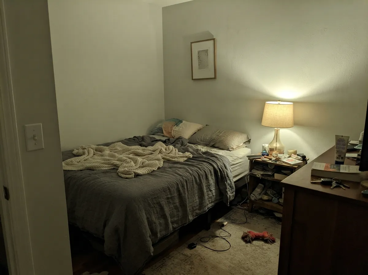
Under warm lamplight it softens toward a hushed green-gray that reads restful rather than clinical. If the room is north-facing and lamp-free, expect a cooler, flatter read during the day.
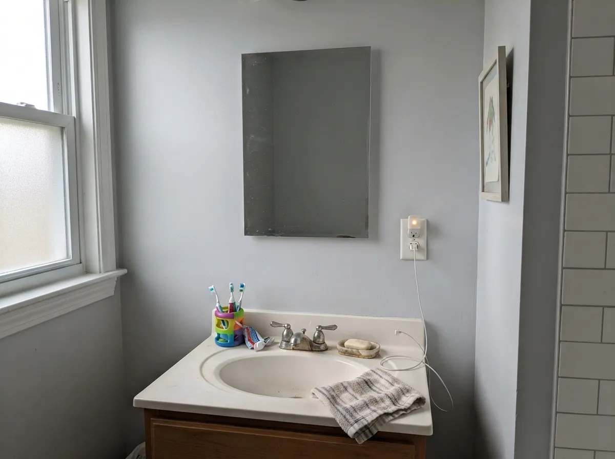
With chrome, white or cool-grey stone and cool-white tile, it is quietly excellent. With warm beige tile or brass fixtures it can look muddy or slightly green in a way readers describe as "off" — sample against your actual tile before committing.
Full sun washes pale neutrals like this one out rather than deepening them. It works as trim, shutters, or a shaded porch ceiling, but a full-body exterior coat in strong sun is where the complaints cluster. In cloudier, coastal-type light it holds up better.
Rooms that pass through several kinds of light during the day are exactly where the chameleon trait becomes a feature instead of a bug: the color quietly tracks the light instead of clashing with it as you move from a sunny end to a shaded one.
Your Light Is the Risk
In an average sunlit room, neither undertone wins outright — Moonshine reads as a clean, quiet silvery gray, the read most swatches promise.
Cool daylight pulls the blue side forward hard and the wall can go flatter and more overtly gray than the sample chip suggested. Test a large swatch before committing a whole room.
Low warm sun wakes the green undertone for an hour or two each afternoon — some readers describe a faint seafoam flash. Most love the shift; know it is coming before you sample at noon only.
2700K lamps push it toward a soft warm green-gray at night; cool LEDs hold it closer to blue-gray. Same paint, two different personalities depending on the bulb box.
Most complaints about Moonshine are a light mismatch. Upload a photo of your actual room and see it on your walls — then ask for the same wall in north light or evening lamps before you buy a single sample.
Need It From Another Brand?
Any paint counter can custom-tint Benjamin Moore 2140-60 directly. If you would rather stay in one brand's own deck, these are the closest stock matches, measured as ΔE2000. Under 2 is a difference you will not see on the wall.
| Brand | Closest color | ΔE | LRV | |
|---|---|---|---|---|
| Sherwin-Williams | Winter WalkSW 9628 · Sherwin-Williams | 2.5 | 66 | Color page → |
| Behr | MortarN380-1 · Behr | 0.7 | 67 | Color page → |
| Valspar | Stony Path5007-1B · Valspar | 1.0 | 68.2 | Color page → |
| PPG / Glidden | FogPPG1010-2 · PPG / Glidden | 1.4 | 67 | Color page → |
| Glidden | FogPPG1010-2 · Glidden | 2.0 | 68 | Color page → |
| Dutch Boy | Whistler428-1DB · Dutch Boy | 3.3 | 68 | Color page → |
Similar Benjamin Moore Colors
The nearest shades to Moonshine within Benjamin Moore's own range, ranked by perceptual color distance — useful when you want the same look a touch lighter, darker, or warmer.
WCAG 2.1: AA is 4.5 : 1 for normal text, 3 : 1 for large text, AAA is 7 : 1.
Moonshine vs the Colors You're Also Considering
Every Moonshine sample board has the same rivals on it. The numbers show the real lightness gap — then it comes down to which risk you would rather live with.
Pick this for the softer, quieter chameleon that warms slightly toward green under lamp light instead of staying fixed.
Benjamin Moore OC-52 · LRV 65Gray OwlPick this if you want the crisper, more committed blue-green gray — Gray Owl leans harder into cool and drifts less through the day.
Pick this for the cooler, more gray-forward off-white — Classic Gray can flash pink in some light, Moonshine never does.
Benjamin Moore OC-23 · LRV 74Classic GrayPick this for a warm, barely-there neutral with a violet-pink whisper instead of any hint of green.
Pick this for the lighter, cooler pick with more blue-green shimmer instead of a taupe cast.
Sherwin-Williams SW 7015 · LRV 58Repose GrayPick this if your painter works in Sherwin-Williams and you want a slightly deeper, warmer greige with the same easygoing reputation.
Pick this for the lighter, quieter version — Moonshine reads closer to white on the chip and only shows its color at wall scale.
Sherwin-Williams SW 7057 · LRV 59Silver StrandPick this for a deeper, more overtly silvery green-gray with the same cool DNA, if you want the color to commit rather than drift.
Within Benjamin Moore, Spring Thaw 1508 at #D2D1BF and LRV 62 is the closest in hue but noticeably deeper on a wall. Skipping Stone CSP-155 at #D5CFBF and LRV 63 leans warmer and less green. Clay Beige OC-11 and Temporal Spirit 965, both at #D9CFBB and LRV 62, are the tan versions, and Natural Linen CC-90 at #D7CDB7 and LRV 60 is the warmest and darkest of the group. If you want the same character with more weight, those are the steps down.
Across brands, PPG Fisherman's Net PPG14-25 at LRV 63 is 0.58 away in color difference, effectively the same color. Valspar Barest Celadon M244 at LRV 64 is 1.14 and Glidden With A Twist PPG1028-2 at LRV 63 is 1.27, both visually identical in normal room light.
Behr Sandstorm N310-3 at 2.05, Farrow and Ball Vichyssoise No. 9909 at 2.13, and Clare All The Sage at 2.88 are very close, so sample first. Sherwin-Williams Warm Oats SW 9511 at 3.29 and Rodda Celestial at 3.57 start to show a real difference side by side.
Moonshine Coordinating Colors
The rule for coordinating with Moonshine: stay cool. It flatters nickel, chrome, and matte black metal, cool white and soft gray trims, and deeper blue-greens that echo its own undertone rather than fighting it. These are the partners that keep showing up in rooms that work:
Two Numbers, One Paint: Moonshine's Quiet Reputation
Moonshine never had a Color of the Year moment or a viral HGTV reveal — it built its following the slow way, through designer blogs and word of mouth, as the answer to "I loved Gray Owl but wanted something a little softer." That it carries two catalog numbers, OC-56 in the Off-White Collection and 2140-60 in the older Color Preview line, is a small piece of Benjamin Moore's cataloging history rather than two different paints; ask for either number at the counter and you get the same can.
Its actual reputation is as a workhorse for cool-toned kitchens and baths — the neutral designers reach for when a client has nickel or chrome fixtures already picked out and wants a wall color that will not compete with them. It is a quieter, less decisive pick than Gray Owl, which is exactly the point: Moonshine is meant to track the room's light rather than dominate it.
Moonshine With Wood Tones and Floors
Cool-toned wood is the safe, flattering pairing: white oak, ash, driftwood-gray floors and cerused finishes all sit comfortably next to Moonshine's blue-green lean, and gray-washed or unstained wood lets the paint's coolness read as intentional rather than accidental.
Honey oak and other warm, orange-leaning floors are the harder combination. They do not clash as violently as they would with a saturated color, but the warmth in the floor and the coolness in the wall pull in opposite directions, and rooms with a lot of golden wood often read the paint as slightly muddier or greener than it does over a cooler floor. A large rug or a switch to nickel-and-cool-white trim narrows that gap; repainting the floor is not required, but sampling over the actual flooring is worth doing before committing a whole room.
Three Ready Palettes Built on Moonshine
A color is never alone on the wall. These are complete combinations in the 60-30-10 pattern, with the reason each one holds together. Every one opens in the visualizer.
Moonshine's cool blue-green undertone plays cleanly with nickel and chrome hardware in a way brass never quite manages. White Dove cabinets keep the warmth in check without going stark, and the charcoal island grounds the scheme with one deep, neutral anchor.
Try this palette in your roomThree depths of the same cool family stay calm together instead of arguing. Silver Satin trim is soft enough not to make Moonshine look dingy by contrast, and Boothbay Gray deepens the blue side on one wall for a restful, lamp-lit bedroom.
Try this palette in your roomStonington Gray and Moonshine share the same cool, low-drama family, so a den or office painted Moonshine off an open-plan Stonington Gray main floor reads like the same house getting quieter, not a color change. A cool white trim ties both back together without introducing warmth either color wants.
Try this palette in your roomMoonshine FAQ
Is Moonshine a gray or an off-white?
Both, depending on where you look. At LRV 67 Benjamin Moore files it in the Off-White Collection, and on the chip or a screen it reads close to plain white. On a real wall, especially at scale, the blue-green undertone shows up and most people call it a light gray. It genuinely sits on that line.
Is the undertone blue or green?
Both, and which one you see depends on the light. Cool, north-facing daylight pulls out the blue; warm lamplight, west sun, or houseplants pull out the green. It never turns pink or yellow — the shift stays inside the blue-green family.
Moonshine or Gray Owl — which is better?
Gray Owl is the more decisive choice: it commits harder to a cool blue-green and shifts less through the day. Moonshine is lighter, softer, and more of a chameleon. If you want one fixed color on the wall, pick Gray Owl. If you like a neutral that changes with the light, Moonshine is the more interesting pick.
How does it compare to Classic Gray?
Classic Gray runs warmer and lighter, with a violet-pink whisper Moonshine never shows, and it sits at LRV 74 versus Moonshine's 67. Pick Classic Gray for a barely-there warm neutral; pick Moonshine when you specifically want cool blue-green rather than any hint of pink.
Does Moonshine work on an exterior?
Not as the main body color in strong, direct sun — pale, low-chroma neutrals like this one tend to wash out rather than hold their gray. It works better as trim, shutters, or a shaded porch ceiling, or as a full body color in cloudier, coastal-type light where the sun is less aggressive.
What hardware and metal finishes go with Moonshine?
Nickel, chrome and matte black are its natural partners — the cool undertone sits happily next to cool metal. Brass and gold fixtures fight it more than they would a warmer greige; if your hardware is brass, sample carefully before committing whole rooms.
Have you painted with Moonshine?
Rate it — one tap helps the next reader decide.
Ask a Question