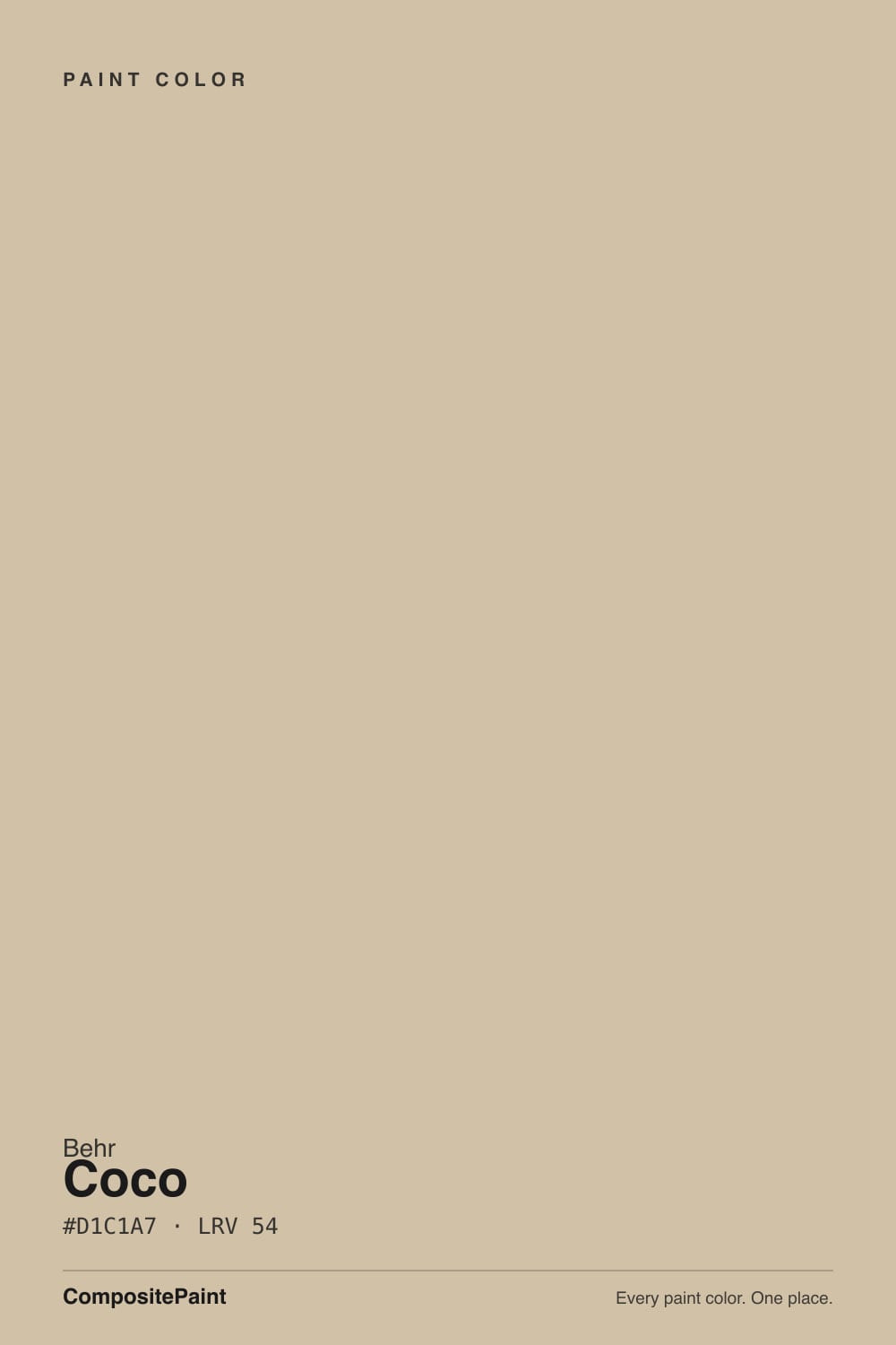
Coco
The quiet Behr taupe-beige nobody markets, reviewed honestly: where its brown-gray balance earns its keep, the light that flattens it, and what to pick instead.

Jessica has spec'd whites and neutrals for more than 300 rooms and keeps a sample wall of painted drawdowns in her studio. Every color review is checked against real reader rooms in the comments and re-tested when a formula changes. About the testing process →
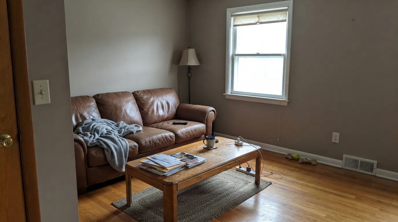
- 1Dorian Gray39
- 2Pashmina44
- 3Coco52
- 4Agreeable Gray60
- 5Pale Oak69
The Fast Verdict
Coco is Behr's quietest kind of good color: a beige with just enough gray leaning against it that it never tips into tan, and just enough brown that it never reads cold. It has no marketing page, no Color of the Year moment, no Reddit thread arguing about it — it is a formula-book number, N270-3, mixed to spec at any Behr counter. Judged on the swatch and the wall alone, it is a genuinely useful medium neutral that just happens to have zero reputation to trade on.
Living rooms and bedrooms with warm wood floors · builder-grade homes stepping up from yellow-tan beige · rooms with real daylight, not corner offices · anyone who wants a beige-taupe without chasing a trend name
Your room is small, dim, and north-facing · your trim is a cool, bright white you won't repaint · you want a color with a design pedigree to point to · you're set on a true warm tan, not a grayed one
- A genuine middle ground between beige and taupe — neither yellow nor pink
- Medium LRV 54 works as a real wall color, not a near-white
- Pairs cleanly with most warm wood tones without a fight
- Affordable and available at any Behr counter — no specialty order
- No trend baggage to date it later
- Goes flat and muddy in a small, cool north room
- Reads dingy next to a stark cool-white trim
- No design pedigree or online track record to check your judgment against
- Too muted for buyers who actually want a straightforward warm tan
What Color Is Coco, Really?
Soft brown first, a thread of cool gray second — that pairing is the whole personality. The gray is light enough that it never reads as a true greige, and the brown is muted enough that it never tips into builder-beige tan. Deck LRV lands it at 54, which puts it noticeably deeper than Behr's marketed almost-whites like Swiss Coffee (LRV 80) or Blank Canvas (LRV 79): Coco is a proper mid-depth wall color, not a near-white with a warm name.
Where Coco differs from most of the beiges on this site is not the formula — it is the résumé. Behr's named, campaigned colors (Blank Canvas, Creamy Mushroom, Even Better Beige) get their own landing pages and show up in paint-store blog posts and Houzz roundups. Coco carries only its N-series code. No Color of the Year nod, no viral room, no forum thread to quote. That is not a knock on the paint — the pigment load and the balance on the wall are exactly as good as its named cousins — it is just an honest note that nothing here is riding on reputation. Every claim in this review has to come from the chip and the wall, because there is no hype cycle to fact-check against.
Undertone in one line: brown first, a whisper of gray second — never yellow, never pink. If your sample looks flat and cool, that is the light, not a hidden undertone; if it looks warmer than the chip, that is late-day sun doing what late-day sun does to every medium neutral.
Where It Shines
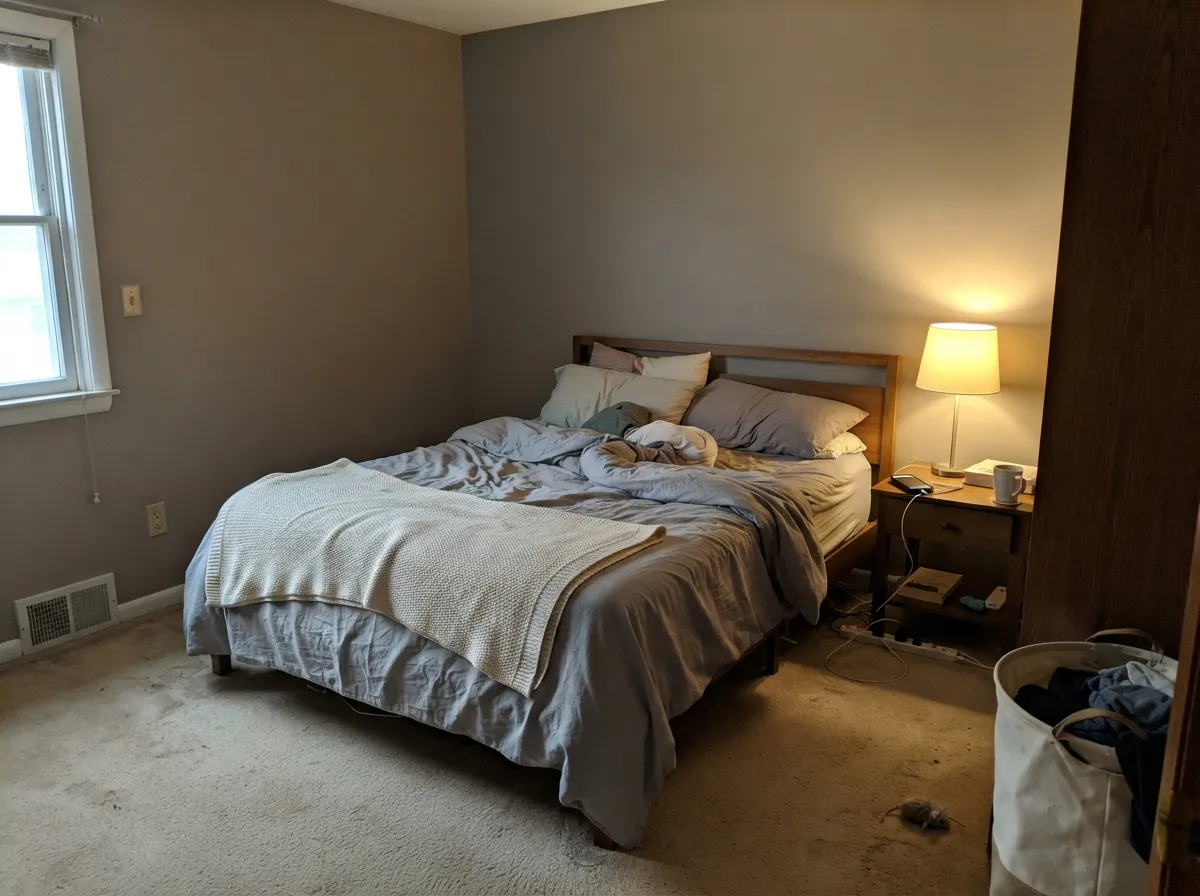
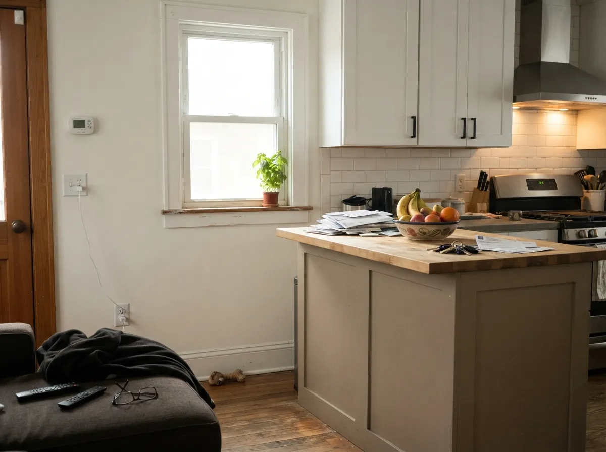
Give it real daylight and any warm wood — oak, walnut, butcher block — and Coco does exactly what a good medium neutral should: it sits back and lets the room's furniture and light do the talking. Its best use is the upgrade job: a builder-grade house painted in a flat yellow-tan out of the box, repainted in Coco, suddenly reads intentional instead of default. It is not a statement color and was never trying to be one.
Where It Fails
Coco doesn't have a track record of viral complaints to draw from — it simply doesn't get talked about online. What it does have is predictable color physics: a medium neutral with a real gray component behaves the same way whether or not anyone has written about it. These are the three situations that will disappoint you, worked out from the undertone and LRV rather than from a pile of one-star reviews.
Cool daylight has nothing warm to bounce off, so the gray component takes over and the brown drops out — readers of similar-LRV greiges describe this exact shift as "flat" or "muddy." The paint is not wrong; the room simply never gives it warm light to work with. Add warm lamps or size up to a warmer, higher-LRV Behr beige like Swiss Coffee.
Put Coco beside a stark cool white and the contrast reads as dirty rather than warm — the same trap that catches every warm mid-tone neutral next to builder-white trim. Keep the trim warm (Behr Swiss Coffee, BM White Dove) or accept the contrast on purpose with a genuinely dark trim instead.
Coco is not the straightforward honey-tan some buyers expect from a warm beige — the gray thread mutes it on purpose. If you want the fuller yellow warmth, a color without the gray lean (Behr Blank Canvas, SW Navajo White) will get you there faster; Coco will look slightly held-back by comparison.
Room by Room
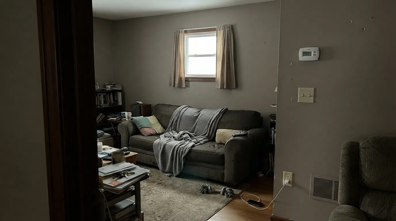
With real daylight and any warm wood furniture, Coco reads calm and settled rather than flat. Eggshell on the walls, satin on any built-ins.
A quiet, restful backdrop at 2700K lamplight. In a north-facing bedroom it can go a shade cool at night without warm bulbs — worth testing before committing.
On an island under white cabinets it reads as a deliberate warm note rather than a full commitment. A full kitchen of Coco cabinets needs strong task lighting to keep the gray from flattening it.
A walnut or oak table and brass fixtures pull the brown side forward. Keep the trim warm to avoid the dingy-next-to-white trap.
A quiet backdrop for a room you sit in during the day. If the desk sits away from the window, one warm task lamp keeps the color from reading cool by afternoon.
As siding it reads as a calm modern-neutral rather than a loud tan, and it takes a white or a dark trim equally well. Full sun will read it a step lighter and warmer than the interior chip suggests — sample outdoors before committing.
Your Light Is the Risk
Full, warm daylight keeps the brown and gray in balance all day — the color's most honest and most flattering read.
Cool, indirect daylight drains the brown out and leaves the gray exposed; small north rooms read flattest of all. Test before committing.
Warmer and browner at the sun hours, quieter and grayer the rest of the day. The swing is gentle, not dramatic.
2700K lamps bring the brown forward and the room feels cozier. Cool white LEDs push it back toward flat gray-beige — swap bulbs before you second-guess the paint.
Most complaints about Coco are a light mismatch. Upload a photo of your actual room and see it on your walls — then ask for the same wall in north light or evening lamps before you buy a single sample.
Need It From Another Brand?
Any paint counter can custom-tint Behr N270-3 directly. If you would rather stay in one brand's own deck, these are the closest stock matches, measured as ΔE2000. Under 2 is a difference you will not see on the wall.
| Brand | Closest color | ΔE | LRV | |
|---|---|---|---|---|
| Sherwin-Williams | Row House TanSW 7689 · Sherwin-Williams | 1.3 | 52 | Color page → |
| Benjamin Moore | Bar Harbor Beige1032 · Benjamin Moore | 1.2 | 51 | Color page → |
| Valspar | Country Charm3007-10B · Valspar | 2.2 | 53 | Color page → |
| PPG / Glidden | GaiaPPG14-18 · PPG / Glidden | 1.1 | 52 | Color page → |
| Glidden | GaiaPPG14-18 · Glidden | 1.4 | 52 | Color page → |
| Dutch Boy | Biscotti Beige415-3DB · Dutch Boy | 2.1 | 51 | Color page → |
Similar Behr Colors
The nearest shades to Coco within Behr's own range, ranked by perceptual color distance — useful when you want the same look a touch lighter, darker, or warmer.
WCAG 2.1: AA is 4.5 : 1 for normal text, 3 : 1 for large text, AAA is 7 : 1.
Coco vs the Colors You're Also Considering
Every Coco sample board has the same rivals on it. The numbers show the real lightness gap — then it comes down to which risk you would rather live with.
Pick this for the warmer, cocoa-toned version of the same balancing act — Coco keeps more brown in the mix.
Behr DC-010 · LRV 60Even Better BeigePick this if you want the gray pushed further and the brown pulled back — Even Better Beige is the more neutral, cooler-leaning sibling.
Pick this if you're already buying Behr and don't need to cross brands for an equivalent color.
Sherwin-Williams SW 7036 · LRV 58Accessible BeigePick this if your painter works in Sherwin-Williams — the same warm-neutral idea with the same cool-light risk.
Coco Coordinating Colors
The rule for coordinating with Coco is simple: keep whites and accents on the warm side, and save cool, stark whites for a deliberate contrast rather than a default trim choice. These are the partners that keep the brown-gray balance intact instead of fighting it:
Why Coco Flies Under the Radar
Behr's paint deck has two tiers of reputation: named, campaigned colors like Blank Canvas or Creamy Mushroom that get their own marketing pages, blog placements, and eventually a Houzz thread arguing about undertone — and numbered N-series colors like Coco, which exist purely as formulas in the fan deck. Nothing about the pigment load makes Coco a lesser color than its named cousins; it simply never got the marketing budget.
That has one practical upside for a buyer: there is no hype to discount. A famous color's reviews are half color and half brand story — this one is just the paint. If the swatch and a large sample on your actual wall look good, you're not fighting a reputation gap; you're seeing the whole picture.
Coco With Wood Tones and Floors
Warm wood is Coco's easiest partner. Oak — including the orange-leaning builder-grade kind — walnut, and butcher block all sit comfortably next to it because the brown base meets the wood halfway instead of arguing with it. Espresso and dark walnut furniture read even richer against the medium-depth wall.
The floors that need a real sample first are cool gray-washed LVP or gray-stained hardwood. Against a cool gray floor, Coco's brown side can look slightly out of step, and the room benefits from a warm rug or warm-toned furniture to bridge the two. It is not a hard clash — just a pairing worth testing at scale before committing to the whole room.
Three Ready Palettes Built on Coco
A color is never alone on the wall. These are complete combinations in the 60-30-10 pattern, with the reason each one holds together. Every one opens in the visualizer.
Swiss Coffee's warm cream keeps the wall-to-trim handoff soft instead of dingy, since both colors share the same brown-leaning base. Kendall Charcoal supplies one grounding dark note without adding any cool undertone for Coco to fight.
Try this palette in your roomWhite cabinets keep the kitchen bright while the Coco island carries the room's one warm note; Tricorn Black on the frames gives the pairing a crisp edge instead of letting the two neutrals blur together.
Try this palette in your roomTwo warm neutrals at nearly the same depth let the accent wall register as a shift in mood, not a jump in color; White Dove's soft warmth keeps the trim from cutting the room in half the way a stark white would.
Try this palette in your roomCoco FAQ
Is Behr Coco a beige or a taupe?
Both, honestly — that's the point of it. It sits in the narrow middle where a brown-based beige gets a real thread of gray mixed in, so it reads less yellow than a straightforward tan and less flat than a true greige. If you need a strict label, call it a taupe-leaning beige.
What is Coco's undertone?
Brown first, a whisper of cool gray second. It does not carry pink or true yellow the way some Behr beiges do — the gray is there specifically to keep it from tipping into either.
Will it look gray in a north-facing room?
Yes, more than it will in a south room. Cool daylight has no warmth to bounce off the wall, so the gray component takes over and the brown recedes. A small, dim north room is the one situation where this color disappoints — warm 2700K lamps largely fix it.
What white trim goes with Coco walls?
A warm white — Behr Swiss Coffee or Benjamin Moore White Dove both work. A cool, stark white trim will make the walls read dingy by contrast, the same trap every warm mid-tone neutral falls into next to builder-white.
Does it work with honey oak floors?
Generally yes — Coco's brown base has enough warmth to sit comfortably next to most oak, including the more orange builder-grade tone. It's a gentler pairing than a true gray would give you, though very saturated orange floors are worth sampling against first.
Is Behr Coco a popular or well-known color?
No, and that's worth saying plainly. It's an N-series numbered color, not one of Behr's named, campaigned shades — no Color of the Year nod, no design-blog fame, nothing to find debated on Reddit or Houzz. The formula itself is a solid, ordinary medium neutral; it just doesn't come with a reputation attached, so treat this review and your own sample as the only references you'll find.
Have you painted with Coco?
Rate it — one tap helps the next reader decide.
Ask a Question