Alabaster
Behr's own Alabaster, reviewed honestly: the warm quiet neutral it actually is, how it differs from the famous Sherwin-Williams color that shares its name, and where that name confusion costs buyers a return trip to the store.

Jessica has spec'd whites and neutrals for more than 300 rooms and keeps a sample wall of painted drawdowns in her studio. Every color review is checked against real reader rooms in the comments and re-tested when a formula changes. About the testing process →
- 1Sage Brush52
- 2Soft Fern57
- 3Alabaster82
- 4Frosty Lime89
- 5Mint Hint95
The Fast Verdict
Behr Alabaster is not the color half the people searching for it actually want — that's Sherwin-Williams SW 7008, a different paint at a different company. What Behr's BXC-62 actually is: a soft, low-drama warm off-white, quietly built into every major Behr product line from Premium Plus to Marquee to Pro. It doesn't have a design-blog fan club or a Color of the Year moment. It has consistency, and in a warm room that's worth more than buzz.
Living rooms and kitchens that want a soft warm neutral, not stark white · trim and cabinets on a Behr-only job · shoppers who already picked Behr and don't want to switch brands mid-project · a dependable off-white for someone who isn't chasing a specific viral look
You searched "Alabaster" because of a photo of Sherwin-Williams' version — that's a different color entirely · your room runs cool and gray already · you want a true bright white, not an off-white · you're color-matching against SW 7008 and expect an exact result
- A genuinely soft, warm off-white — not stark, not sterile
- Available across nearly every Behr product line and finish, indoors and out
- Convenient one-brand solution for a full Behr repaint — walls, trim, cabinets
- Reads brighter and cleaner outdoors than the interior swatch suggests
- Hides scuffs and handprints better than a brighter white would
- Constantly confused with the far more famous Sherwin-Williams Alabaster (SW 7008) — a different color entirely
- Warm room + warm wood + afternoon sun can push it toward tan rather than neutral
- Needs a tinted primer over bold or dark existing colors — bare coverage claims oversell it
- Little independent design-press coverage, so there's less real-room documentation to sample against than a bestseller color
What Color Is Alabaster, Really?
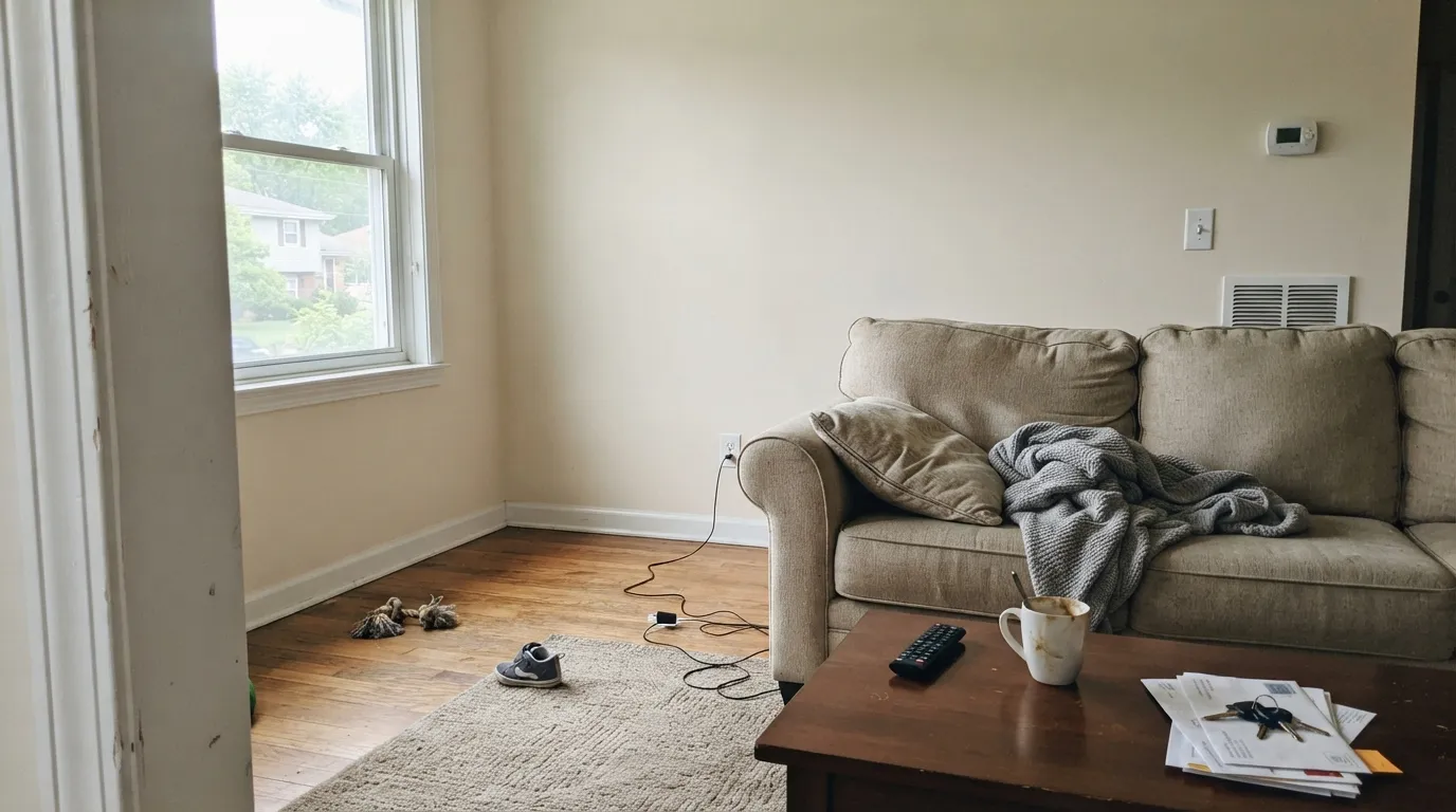
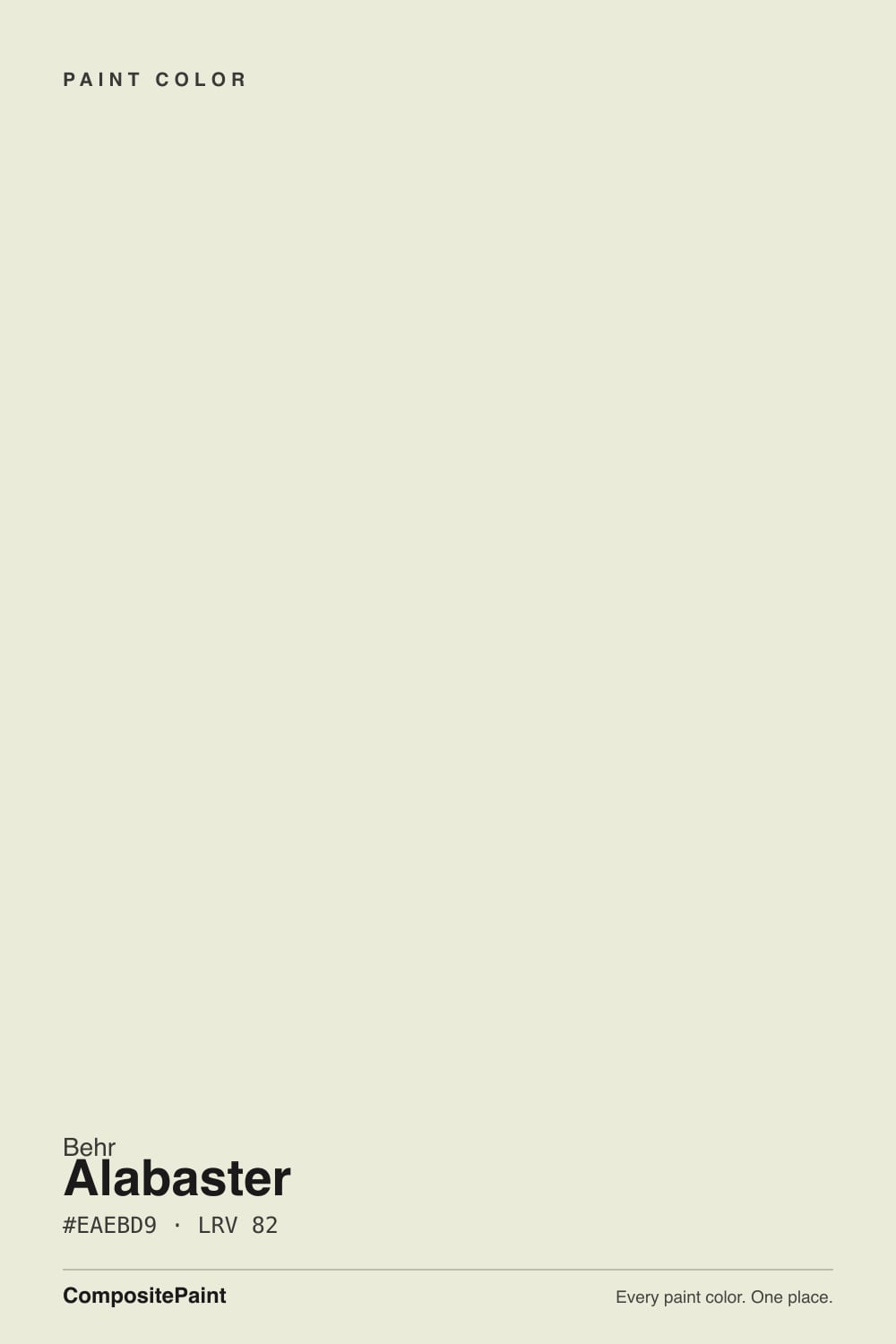
A pale, low-chroma warm neutral — beige pulled almost all the way to white, with the yellow muted rather than erased. At deck LRV 82 it sits close to true white on the reflectance scale, but it never reads stark: there's enough warmth in the base to keep a wall looking soft under daylight instead of clinical. The BXC prefix in the code marks it as one of Behr's core cross-collection colors — the kind Behr keeps consistent across every finish and formula rather than retiring it with a trend cycle.
That cross-collection presence is the real story here. Behr Alabaster ships under Premium Plus, Marquee, Ultra and the contractor-facing Behr Pro line, in finishes from dead-flat to semi-gloss, indoors and out. A color doesn't get that kind of shelf life by being flashy — it earns it by being the safe answer a painter reaches for on a dozen different jobs. It's the workhorse neutral in Behr's deck, not the marquee name.
Undertone in one line: warm beige-yellow, gently softened — never gray, never pink. If a swatch looks colder or more neutral than that, you're likely looking at Sherwin-Williams' Alabaster instead, which carries more gray in its base and reads a step cooler and creamier.
Where It Shines
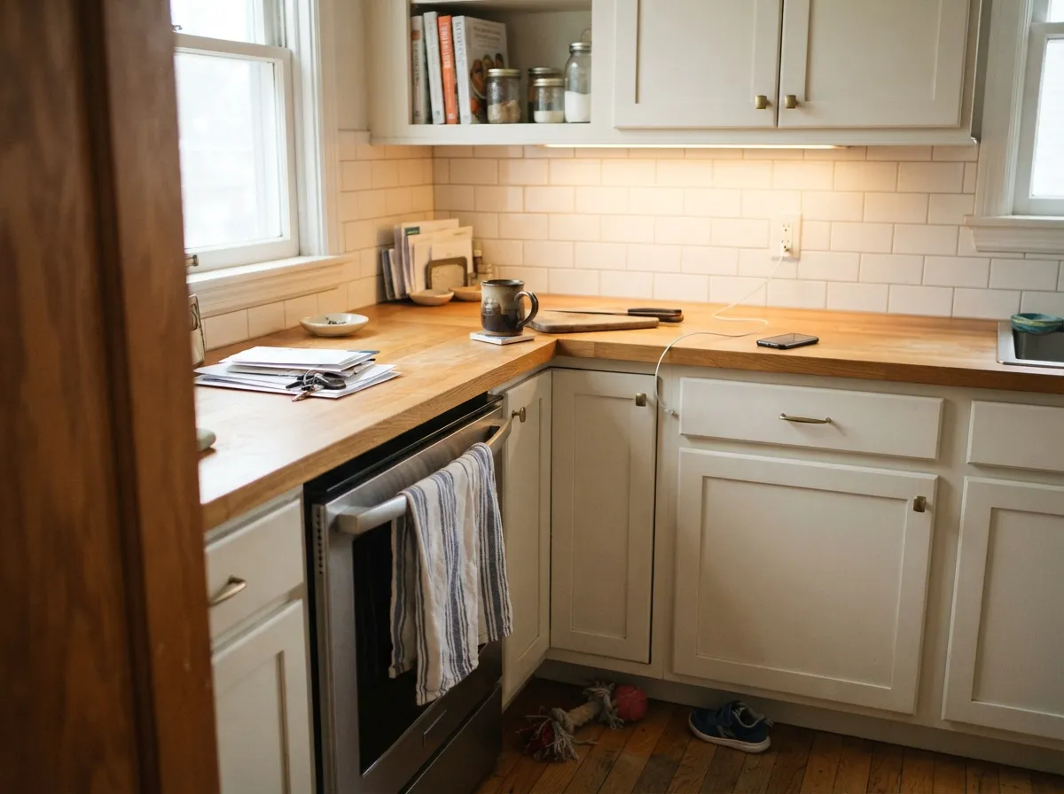
Give it a room with real daylight and it does exactly what a good background neutral should: it disappears into the walls and lets furniture, wood, and art carry the room. It's an easy trim white under mid-tone walls, and because it exists in every Behr finish, it's genuinely convenient for a whole-house repaint where one company needs to supply everything — walls, trim, cabinets, even the exterior.
Where It Fails
The single biggest problem with Behr Alabaster isn't the paint on the wall — it's the paint people think they're buying. Almost every real complaint traces back to one of these three situations.
Sherwin-Williams Alabaster (SW 7008) is the color behind thousands of Pinterest boards and "best white paint" round-ups. Behr's Alabaster is a completely separate formula that happens to share the name — beigier, with less gray in the base. If you're chasing the SW look with a Behr can, ask your Behr store to color-match SW 7008 by number; don't buy BXC-62 off the wall of chips and assume it's the same paint.
Because the beige is already muted rather than removed, pairing it with warm wood, brass, and afternoon sun stacks warmth on warmth. In that setup the wall can drift toward a soft tan rather than the airy off-white the chip promised. Cooler company — white oak, black hardware, north or east light — keeps it reading as the quiet neutral it's meant to be.
Like most pale off-whites, Alabaster's high LRV means it has almost no hiding power over red, navy, or dark accent walls. Reviewers who complain about coverage are almost always painting over saturated color without a gray-tinted primer first — the paint isn't thin, the job was set up to need three coats.
Room by Room
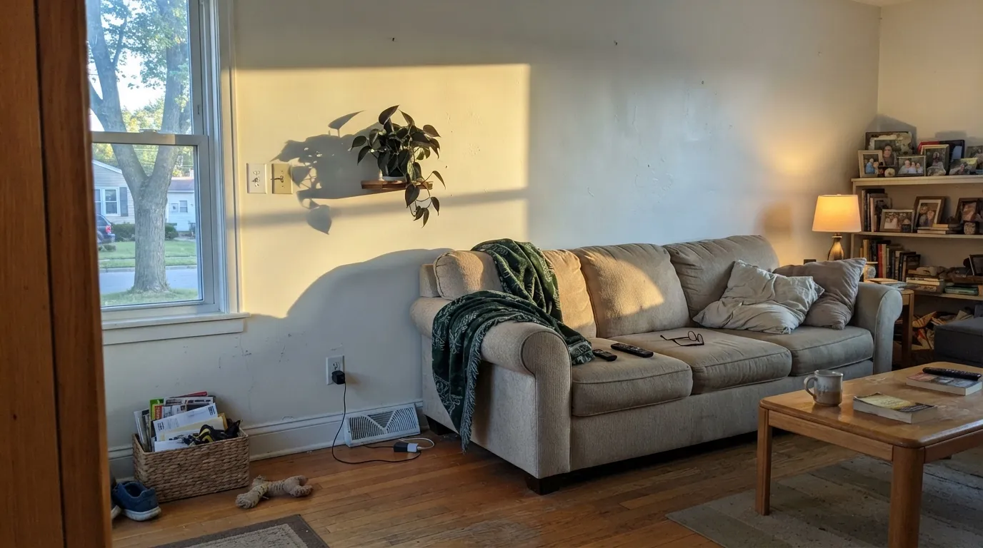
A calm, warm-leaning backdrop for wood furniture and neutral upholstery. Eggshell on the walls; same color in semi-gloss on trim keeps the room from feeling chopped up.
Works well on cabinets against warm counters and brass hardware. It won't out-glow a designer white like Chantilly Lace, but it's dependable, wipes clean in satin, and matches trim from the same can.
Under 2700K bulbs it turns gently cozy at night, the same way most warm off-whites do. A north-facing bedroom with no lamps will read flatter and less interesting.
Fine with warm-veined marble, wood vanities and brass. Against cool gray tile or chrome fixtures, the beige base starts to look slightly dated rather than soft.
Semi-gloss Alabaster trim under a mid-tone wall color does the job without drama. It's not the brightest trim white in any deck, but it's an honest, unfussy one — and it's available in the same brand as your wall paint.
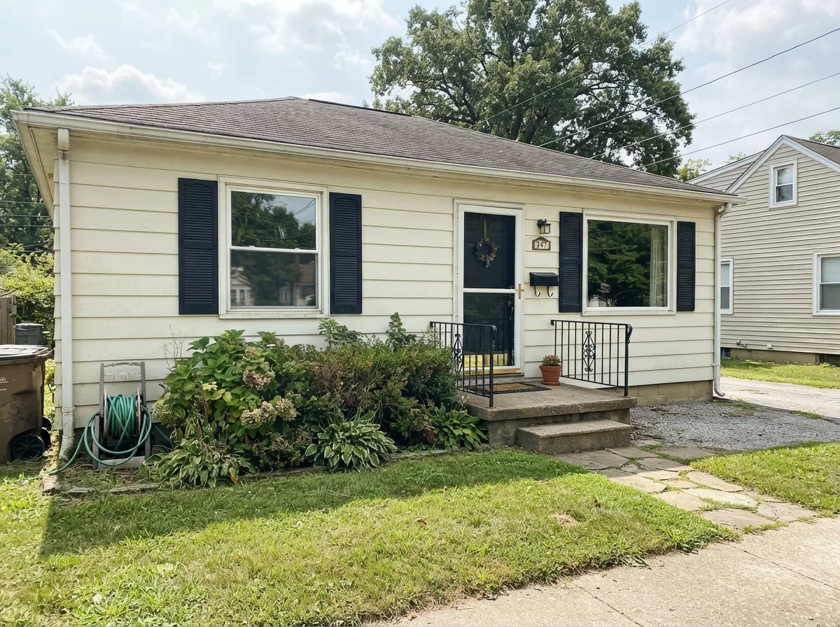
It's sold in Behr's exterior and Marquee lines for a reason: full sun reads it brighter and cleaner than it looks indoors, and it pairs comfortably with black or charcoal shutters and trim.
Your Light Is the Risk
East or south rooms with filtered light show the warm-but-quiet character at its most balanced — soft, not beige, not stark.
Late-day sun through a west window can push the yellow forward and read tan rather than off-white, especially on a large uninterrupted wall.
Cooler, flatter daylight mutes the warmth and brings it closer to a plain, slightly quiet white — less personality, but very safe.
2700K warm bulbs deepen the cream and make it feel cozier at night; cool white LEDs flatten it and can expose a faint gray cast.
Most complaints about Alabaster are a light mismatch. Upload a photo of your actual room and see it on your walls — then ask for the same wall in north light or evening lamps before you buy a single sample.
Need It From Another Brand?
Any paint counter can custom-tint Behr BXC-62 directly. If you would rather stay in one brand's own deck, these are the closest stock matches, measured as ΔE2000. Under 2 is a difference you will not see on the wall.
| Brand | Closest color | ΔE | LRV | |
|---|---|---|---|---|
| Sherwin-Williams | Barely PearSW 9666 · Sherwin-Williams | 1.7 | 83 | Color page → |
| Benjamin Moore | Meadow Mist936 · Benjamin Moore | 0.5 | 78 | Color page → |
| Valspar | Crème de Menthe8003-28A · Valspar | 1.4 | 83 | Color page → |
| PPG / Glidden | Magical StardustPPG1123-2 · PPG / Glidden | 1.0 | 81 | Color page → |
| Glidden | Really RainPPG1115-1 · Glidden | 1.3 | 82 | Color page → |
| Dutch Boy | Sun Hat220-1DB · Dutch Boy | 1.6 | 82 | Color page → |
Similar Behr Colors
The nearest shades to Alabaster within Behr's own range, ranked by perceptual color distance — useful when you want the same look a touch lighter, darker, or warmer.
WCAG 2.1: AA is 4.5 : 1 for normal text, 3 : 1 for large text, AAA is 7 : 1.
Alabaster vs the Colors You're Also Considering
Every Alabaster sample board has the same rivals on it. The numbers show the real lightness gap — then it comes down to which risk you would rather live with.
Pick this if you're already committed to Behr and want a matched warm off-white in every finish the brand sells.
Sherwin-Williams SW 7008 · LRV 82AlabasterPick this if this is the famous "Alabaster" you actually saw online — it's a different, cooler-gray-based formula from a different company.
Pick this for a slightly quieter, less obviously creamy version of the same warm-neutral idea.
Behr 12 · LRV 80Swiss CoffeePick this if you want the warmth turned up further — Swiss Coffee is Behr's warmest safe off-white and it shows.
The Behr neighbors are nearly all at LRV 82, so they separate by lean rather than brightness. Off White 73 at #E9EBD9 is effectively the same wall color, YL-W14 at #E9EBD7 is a shade more yellow, and Amazon Breeze GR-W03 at #EBEBD6 is the most yellow-green. Summer Jasmine PPU9-15 at #EEEAD8 is the creamiest, and Shark Tooth BWC-17 at LRV 81 is marginally deeper and greener.
Across brands the matches are unusually tight. Diamond Vogel Whitewash 0747 at LRV 82 differs by 0.44, Benjamin Moore Meadow Mist 936 by 0.48, and Dunn-Edwards Whispering Rain DE5533 by 0.52, so all three are true matches. PPG Magical Stardust PPG1123-2 at LRV 81 sits at 0.96, also a match. Valspar Creme de Menthe 8003-28A at LRV 83 and 1.38 and Sherwin-Williams Barely Pear SW 9666 at LRV 83 and 1.71 are visually identical in normal room light. Farrow and Ball White Tie No. 2002 at LRV 82 measures 3.39, very close but worth sampling first, since it trades green for a warmer cream.
Behr Alabaster vs. the Other Alabaster
This is the question that brings most people to this page, so it deserves a direct answer: Behr's Alabaster and Sherwin-Williams' Alabaster are not the same paint. They share a name because both companies independently chose a classic word for a pale off-white — the way "Ivory" or "Cream" get reused across brands. Sherwin-Williams' version (SW 7008) is the one with the design-blog following, a soft warm white with a hint of gray in the base. Behr's BXC-62 is beigier and warmer, with the gray mostly absent.
If you're renovating with a mix of brands, or you saw a room online and want to know which can to buy, check the SKU, not just the name. The safest move if you want the Sherwin-Williams look specifically is to have it color-matched at the Behr counter rather than buying Behr's own Alabaster off the wall of chips.
A Color Built to Show Up Everywhere
Behr Alabaster doesn't have a Color of the Year press release or a celebrity kitchen behind it. What it has is shelf presence: it's formulated across Behr Premium Plus, Behr Marquee, Behr Ultra and the contractor-facing Behr Pro line, in finishes running from dead-flat to semi-gloss, for both interior and exterior use. That's a deliberate choice by Behr to keep one dependable warm neutral consistent across the whole catalog rather than tying it to a single collection.
For a homeowner that translates into practical convenience: one color code gets you matching walls, trim, cabinets, and siding paint from a single brand, in whatever sheen each surface needs. It's the kind of color a painter reaches for because it works, not because a client asked for it by reputation.
Behr Alabaster With Wood Tones and Floors
Warm wood is the easy pairing: red oak, honey oak, and warm walnut all sit comfortably against Alabaster because both are working the same warm side of the color wheel. On a golden-toned floor it will read as a cohesive, unified warm room rather than a contrast.
The pairing that needs a sample first is cool gray or white-washed flooring. Because the paint's undertone is warm and the floor's is cool, the wall can start to look slightly dingy or dated next to it — the fix is usually cooler company elsewhere in the room (black hardware, gray textiles) rather than repainting.
Three Ready Palettes Built on Alabaster
A color is never alone on the wall. These are complete combinations in the 60-30-10 pattern, with the reason each one holds together. Every one opens in the visualizer.
Same-can walls and trim keep the room seamless while the sheen change adds depth; Even Better Beige gives one deeper Behr-family accent without introducing a second brand's undertone to argue with.
Try this palette in your roomSilver Drop's cooler greige keeps Alabaster's warmth from tipping tan on the cabinets, and Cracked Pepper on the island gives the kitchen its one dark anchor — all three sourced from a single Behr order.
Try this palette in your roomFull sun brightens Alabaster past its interior read, and the near-black trim gives the facade the crisp modern-farmhouse contrast this color needs to avoid looking merely beige. A brick-red door is the one loud note.
Try this palette in your roomAlabaster FAQ
Is Behr Alabaster the same as Sherwin-Williams Alabaster?
No — they're two different paints that happen to share a name. Sherwin-Williams SW 7008 is a soft, slightly gray-based white; Behr BXC-62 is warmer and beigier. If you saw "Alabaster" in a photo online, it's more likely to be the Sherwin-Williams color, since that one has the design-world reputation. Don't buy the Behr chip assuming it's an exact match.
Can I get Behr to match Sherwin-Williams Alabaster instead?
Yes — most Behr and Home Depot paint counters can color-match a competitor's formula by number if you bring in the SW 7008 code. That gets you the look you actually want in Behr's paint, rather than assuming BXC-62 is a stand-in.
What undertone does Behr Alabaster have?
Warm beige-yellow, muted rather than erased. It's not neutral gray and it's not pink — under strong afternoon sun the yellow can come forward, and under cool north light it settles into a quieter, plainer off-white.
Is it good for kitchen cabinets?
It's a solid, dependable cabinet color, especially if the rest of the kitchen is already Behr paint. It won't have the polished-magazine reputation of a color like Sherwin-Williams Alabaster or Benjamin Moore White Dove, but in satin cabinet enamel it wears well and pairs comfortably with warm wood and brass.
How many coats does it need?
Two coats over any light existing color. Over a bold or dark wall — deep red, navy, charcoal — prime with a gray-tinted primer first; skipping that step is the real cause behind most "needed three coats" complaints.
Does it work on exteriors?
Yes — it's sold across Behr's exterior and Marquee lines specifically for that use. Full sun reads it brighter and cleaner than it looks on an interior wall, and it pairs well with black or charcoal trim and shutters for contrast.
Have you painted with Alabaster?
Rate it — one tap helps the next reader decide.
Ask a Question