In The Moment
Behr's first Color of the Year, reviewed honestly: the rooms where this blue-green-gray settles, the light that turns it slate, and what to pick instead.

Jessica has spec'd whites and neutrals for more than 300 rooms and keeps a sample wall of painted drawdowns in her studio. Every color review is checked against real reader rooms in the comments and re-tested when a formula changes. About the testing process →
- 1Salamander6
- 2Hidden Gem14
- 3In The Moment30
- 4Peacock Blue35
- 5Wythe Blue48
The Fast Verdict
In The Moment is a mid-tone blue-green-gray — teal with the volume turned down, not a forest green and not a true gray. In south light the green comes forward and it reads like a quiet sage-teal; in a dim north room the gray wins and you are left with slate. It was Behr's first Color of the Year for a reason: it behaves. Just do not buy it for a dark open plan, and do not pair it with honey oak.
Bedrooms and spa baths · a daylight living room · kitchen islands and vanities · a front door on a light house
The room faces north and stays dim · honey oak or cherry floors are staying · you actually want gray, or a saturated teal · you need one color for the whole open plan
- Blue-green-gray that reads as quiet teal, not a theme color
- 2018 Color of the Year that the gray has kept from dating
- Deep enough (LRV 30) to hold color in bright rooms
- Bedrooms, baths, islands and a front door all take it well
- Chrome or brass — the blue and the green each have a metal
- Dim north light flattens it to shadowy slate
- Fights honey oak, cherry and orange-toned wood
- Too heavy for a whole open-plan main floor
- Not gray, not saturated teal — buyers expecting either are disappointed
What Color Is In The Moment, Really?
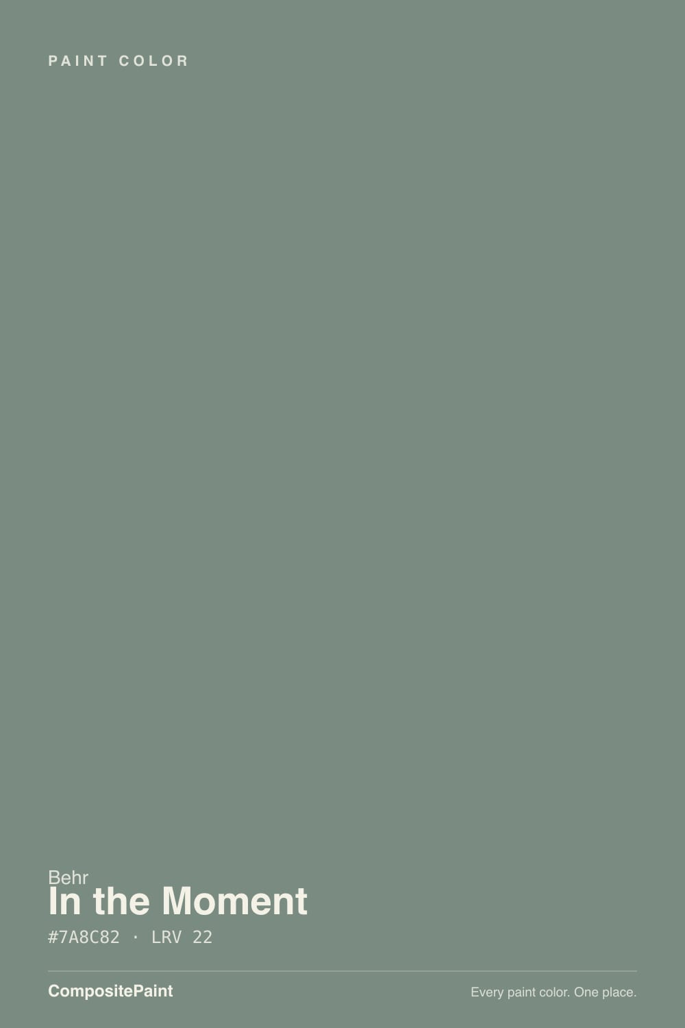
A balanced blue-green-gray — the kind of muted teal designers call earth-toned because a gray base keeps it from going tropical. Straight aquamarine on a wall looks like a hotel spa from 2009; the gray in T18-15 pulls it toward slate, so it lands as atmosphere rather than a theme. Behr made it the brand's first Color of the Year for 2018 (announced August 2017, with a pop-up in Grand Central Terminal), and the chip has sat in the green family ever since. Eight years later it still reads current, which is the gray doing the work.
At LRV 30 it is a genuine mid-tone, not a pale coastal wash. That depth is the useful part and the risk: it holds its color in a bright room instead of washing to mint, then sinks a step deeper and slatier after dark. Plan for the wall to read heavier than the chip — every color this deep does — and do not run it through living, dining, and kitchen as one continuous field. Designer Kylie M Interiors flagged that 30-ish range as a one-room commitment, and she is right.
Undertone in one line: blue-green first, gray second — never yellow, never forest. South and west sun pull the green so it can pass for a dusty sage-teal; north light and cool LEDs pull the blue-gray so it can pass for slate. If your sample looks like a dark pine green, that is not this paint — you have the wrong chip, or a reflection from trees outside.
Where It Shines
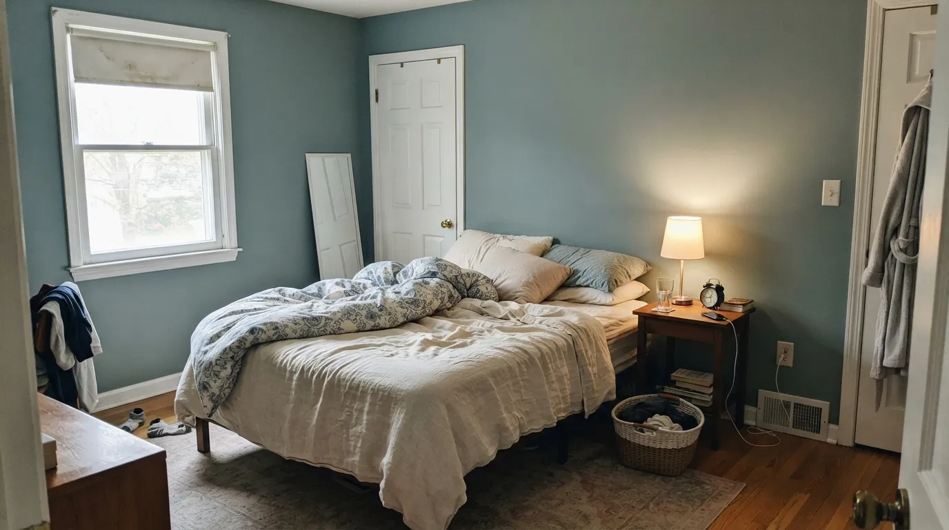
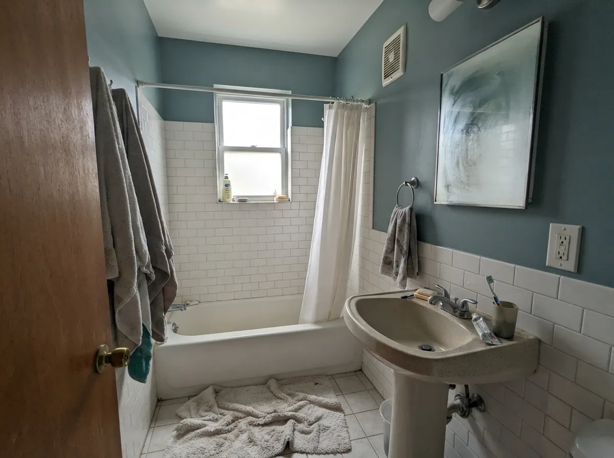
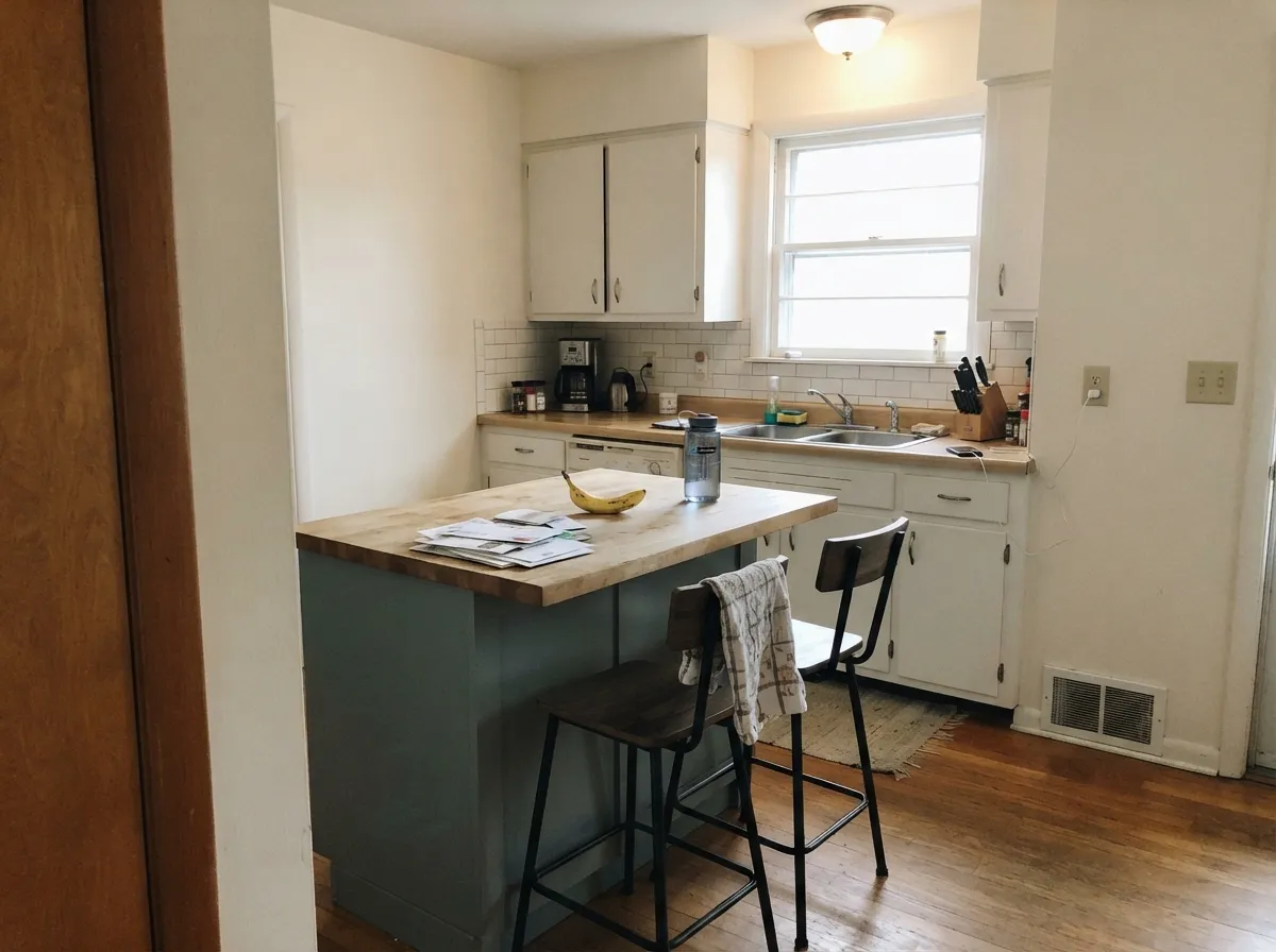
Give it real daylight and this color is almost easy. Bedrooms and bathrooms are its home: wrap all four walls and it feels like a quiet, expensive hotel without the aqua. Its second job is the contained commitment — a kitchen island, a vanity, a front door — where the teal reads custom and the rest of the house can stay light. Pair it with a clean Behr white, pale oak, linen, and either brass or chrome, and it looks like it was always there.
Where It Fails
Almost every regret story about In The Moment follows one of three scripts, and all three are visible before you buy the gallons. None of them are the paint's fault — but if your room matches one, this is not your color, and a bigger sample will only confirm it.
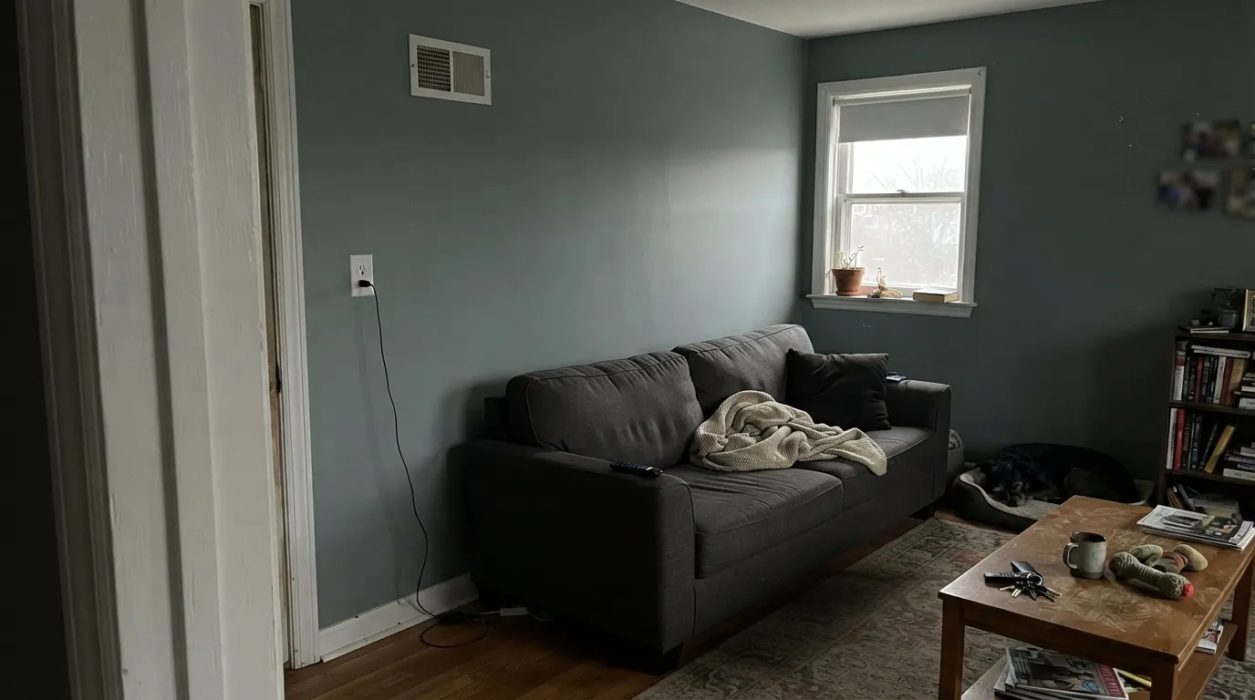
Cool gray daylight strips the green and leaves a flat, shadowy slate. Readers who fell for the teal on a south-facing chip board call the north version dingy. The color did not fail; the light did. If the room has one small window and you refuse lamps, pick a lighter green-gray (Sea Salt) or commit to 2700K bulbs before the first coat.
Blue-green sits opposite orange-red on the wheel, so golden builder oak, cherry floors and orange-stained trim all push this paint colder and bluer while the wood goes louder. Both sides lose. In The Moment wants pale white oak, walnut, or a large rug between it and anything honey. If the orange floor stays, this is the wrong teal.
On the chip it can pass for a moody gray-green. On four walls the blue-green is unmistakable. Buyers hunting a true gray are surprised by the teal; buyers hunting a saturated aqua are surprised by the gray. If you want gray, look elsewhere. If you want a deeper, more clearly teal workhorse, Aegean Teal is the next stop.
Room by Room
Calm in daylight, slatier and cozier at night. Eggshell (or matte if the walls are imperfect); Polar Bear trim keeps the edges clean without adding cream. Cream linen and warm 2700K lamps are the whole formula — this is the rare mid-tone that still reads restful instead of cave-like.
Above white tile it does the spa job without going mint. Chrome loves the blue; unlacquered brass pulls the green. Satin on a vanity under a pale stone top is a weekend project that looks like a design fee. Dim interior baths need warm bulbs or the walls go slate.
Beautiful in a south- or west-facing living room with oak, linen and one darker note. Risky in an open plan that also has to serve the kitchen and dining as the same color — at LRV 30 that is a lot of teal to live in. If the living room is closed, or you can stop the color at a doorway, it earns the wall.
Satin In The Moment on an island or the lower cabinets, with Polar Bear or another light wall, is the move. A full kitchen of this color is a bold bet, and a losing one over honey-oak floors. Two coats over a grey-tinted primer if you are covering builder beige.
Mid-tone gray-green is easy on the eyes for a work wall, and it hides the visual noise of screens and cables. Eggshell for wipeability; drench the built-ins in the same color if you want the room to feel finished rather than decorated. North offices still need a lamp.
Full sun washes every mid-tone lighter, and the gray in this one keeps the door from going neon teal from the street. Excellent on a front door or shutters against a light body; a whole house of LRV-30 teal is a much louder statement than the chip suggests. Satin or exterior semi-gloss on the door.
Your Light Is the Risk
Warm daylight pulls the green forward so it reads as a dusty sage-teal. This is the honest, livable version of the chip — sample here first.
Cool gray daylight kills the green and leaves flat slate. Fine if you half-wanted gray; disappointing if you bought it for the teal.
Cooler and bluer in morning east light; greener and softer through west afternoon and golden hour. It changes — most people who like teal like the shift.
2700K lamps warm the green-gray and the room goes cozy. Cool white LEDs sharpen the blue and slate — swap bulbs before you repaint.
Most complaints about In The Moment are a light mismatch. Upload a photo of your actual room and see it on your walls — then ask for the same wall in north light or evening lamps before you buy a single sample.
Need It From Another Brand?
Any paint counter can custom-tint Behr T18-15 directly. If you would rather stay in one brand's own deck, these are the closest stock matches, measured as ΔE2000. Under 2 is a difference you will not see on the wall.
| Brand | Closest color | ΔE | LRV | |
|---|---|---|---|---|
| Sherwin-Williams | Morning at SeaSW 9634 · Sherwin-Williams | 4.5 | 29 | Color page → |
| Benjamin Moore | Rushing River1574 · Benjamin Moore | 3.1 | 30 | Color page → |
| Valspar | Café Blue5001-4A · Valspar | 1.8 | 29.1 | Color page → |
| PPG / Glidden | Paradise FoundPPG1135-5 · PPG / Glidden | 3.3 | 30 | Color page → |
| Glidden | Calming Green Waters30GG 29/108 · Glidden | 2.8 | 29 | Color page → |
| Dutch Boy | Grayed Foundry426-6DB · Dutch Boy | 3.4 | 29 | Color page → |
Similar Behr Colors
The nearest shades to In The Moment within Behr's own range, ranked by perceptual color distance — useful when you want the same look a touch lighter, darker, or warmer.
WCAG 2.1: AA is 4.5 : 1 for normal text, 3 : 1 for large text, AAA is 7 : 1.
In The Moment vs the Colors You're Also Considering
Every In The Moment sample board has the same rivals on it. The numbers show the real lightness gap — then it comes down to which risk you would rather live with.
Pick this for the lighter, grayer, more restorative version of the same blue-green idea.
Benjamin Moore 2136-40 · LRV 25Aegean TealPick this if you want it deeper and more clearly teal — BM's workhorse COTY holds weight in strong sun without washing out.
Pick this when the blue-green is the point, not an olive-sage.
Sherwin-Williams SW 9130 · LRV 30Evergreen FogPick this if you want this depth without the blue — it is the better sage for cabinets, with less teal in the mix.
Behr Juniper Ash (PPU12-16, LRV 23) is the closest sibling. It shifts slightly toward blue-gray, so it reads a touch cooler and smokier where In the Moment reads greener. Pick Juniper Ash if your room already runs warm and you want the color to cool it down; pick In the Moment when you want the wall to feel like foliage rather than storm cloud.
Behr Woodcraft (N200-5, LRV 24) drops most of the blue and leans olive. It looks earthier and pairs better with tans and browns, while In the Moment pairs better with grays and blues.
Behr Dragonfly (PPU12-03, LRV 25) is a step lighter and noticeably bluer, closer to a true muted teal. In a north room Dragonfly can turn frankly blue; In the Moment holds its green longer. Choose Dragonfly for a coastal lean, In the Moment for a botanical one.
In The Moment Coordinating Colors
The rule for coordinating with In The Moment: clean or quietly warm whites, tonal blue-greens, and one darker navy or black — and keep yellow-orange wood at arm's length. It loves pale oak and brass or chrome; it argues with honey oak, peachy whites, and anything that wants to be a true gray. These are the partners that keep showing up in rooms that work:
Behr's First Color of the Year, Eight Years Later
Behr had never named a Color of the Year until August 9, 2017, when it put T18-15 on a pop-up home inside Grand Central Terminal and called it the 2018 color. The pitch was a grayed blue-green for people who were tired of beige and not ready for navy — a mid-tone you could live in, not a stunt. The T18 range around it (the 2018 trends palette) has mostly disappeared from conversation; In The Moment is the one that stuck on Pinterest boards and still gets searched by SKU.
Here is why the old COTY beats the louder teals it sat next to: the gray. At LRV 30 it has enough depth to feel like a decision, and enough mute to age the way a sage-gray does, not the way an aqua accent wall does. If you are buying it in 2026 because it was Color of the Year, that is the wrong reason. If you are buying it because you want a blue-green-gray that still looks like paint and not a trend, that is the right one.
In The Moment With Wood Tones and Floors
This decision gets made at the floor, not the paint chip. Pale white oak and walnut are the color's best friends — the first pulls the green into an earthy sage-teal, the second makes the blue-green look smoky and deliberate. Gray-washed oak and light LVP are safe. Cream carpet is fine.
The honest no is golden and red: honey oak, orange builder stain, cherry, terracotta tile. Blue-green sits opposite that temperature, so each side exaggerates the other — the floor reads more orange, the walls read more cold teal, and no amount of coats fixes geometry. If the golden floor is staying, put a large rug between it and this paint, or choose a warm sage (Evergreen Fog at the same LRV 30) and keep the mood without the fight.
Metals are the easy part: unlacquered brass and antique bronze pull the green; polished chrome and polished nickel pull the blue. Matte black works with either. The one to sample is a very peachy or yellow brass against a north-facing wall of this color — the wall may go slatier next to it.
Three Ready Palettes Built on In The Moment
A color is never alone on the wall. These are complete combinations in the 60-30-10 pattern, with the reason each one holds together. Every one opens in the visualizer.
Two depths of the same blue-green family keep the room from looking painted-in-one-swipe. Polar Bear is Behr's dependable everyday white, so the trim stays clean without the peach Blank Canvas can flash or the cream Swiss Coffee always shows.
Try this palette in your roomThe island carries the teal so the kitchen stays light; Accessible Beige next door is the safest warm neutral (until the light goes cool) and gives the blue-green somewhere earthy to land. Polar Bear trim ties both rooms together.
Try this palette in your roomComfort Gray is the quiet green-gray that already lives on a thousand farmhouse exteriors, so the teal door looks related rather than stuck on. Ultra Pure White is unbeatable on trim — the crisp edge that keeps LRV-30 teal from reading muddy from the street.
Try this palette in your roomIn The Moment FAQ
Is In the Moment green, blue, or gray?
All three, in that order on a good day. It is a blue-green with a gray backbone — teal when the sun is out, slate when it is not. On four walls nobody will call it a true gray, and nobody will call it a saturated aqua either. If you need it to pick a team, call it a grayed teal.
What trim white goes with In the Moment?
Polar Bear is the default in the Behr aisle — a dependable everyday white that does not fight the teal. Ultra Pure White if you want a crisper, brighter edge (it is excellent on trim, not on four walls). Swiss Coffee if you want cream, and it will show — that is a vintage pairing, not a quiet one. Skip Blank Canvas unless you have sampled it: it is Behr's best warm white, but it has a peach tell that can look odd next to blue-green.
Is it good for a bedroom?
It is the best interior room for it. Mid-tone, calm, and it deepens at night without going cave-dark the way a navy would. Use eggshell or matte, keep the bulbs at 2700K, and pair with cream or white bedding rather than beige, which can read yellow against it.
Does In the Moment work with oak floors?
Depends entirely on the oak. Pale unstained white oak and walnut are excellent — they pull the green and keep the temperature even. Golden honey oak and cherry are the clash: orange-red sits opposite this blue-green, so the floor goes louder and the walls go colder. A large rug helps; wall-to-wall honey tones need a different color.
Can I use it on kitchen cabinets?
Yes — best in a dose: an island, the lower cabinets, a bathroom vanity, in satin. A whole kitchen of mid-tone teal is a strong commitment, and a losing one over honey-oak floors. Use a urethane-fortified cabinet enamel and prime if you are covering a dark or orange stain.
Does a 2018 Color of the Year look dated now?
Bright trend teals from that era can. In The Moment was grayed from the start, which is why it still reads as a quiet blue-green-gray rather than a timestamp. It carries more repaint risk than a greige, less than almost any saturated teal, and it was Behr's first COTY — the gray is what kept it from becoming a punchline.
Have you painted with In The Moment?
Rate it — one tap helps the next reader decide.
Ask a Question