Winds Breath
Behr's quiet silvery green-white, reviewed honestly: the rooms where it stays calm, the Benjamin Moore namesake it is not, and the trim that makes it look dirty.

Jessica has spec'd whites and neutrals for more than 300 rooms and keeps a sample wall of painted drawdowns in her studio. Every color review is checked against real reader rooms in the comments and re-tested when a formula changes. About the testing process →
- 1Heirloom Shade63
- 2First Star69
- 3Winds Breath75
- 4Alabaster82
- 5Chantilly Lace91
The Fast Verdict
Winds Breath is a cool off-white with a silvery gray-green cast — light enough at LRV 75 to open a room, grayed enough that it never reads as primer. Behr files it as a cool white; the yellow-green in it keeps it from going icy. It is not Benjamin Moore Wind's Breath. That color is a warmer greige-cream at LRV 70. This one is lighter, cooler, and greener. Give it real daylight and a trim white that is not brighter than it, and it stays quiet. Pair it with Polar Bear or Ultra Pure White and it looks unwashed.
Living rooms and bedrooms with real daylight · hallways, offices, and laundry rooms that should stay quiet · one-color rooms (walls + trim, sheen change) · anyone who wanted a white with a little gray-green and none of the cream
You actually wanted Benjamin Moore Wind's Breath · trim stays Polar Bear or Ultra Pure White · the room faces north and runs on cool LEDs · floors are honey oak or beige carpet
- LRV 75 — bright enough to open rooms, body enough to look chosen
- Stays quiet in decent daylight — silvery, not cream, not clinic-white
- One-color rooms work: walls + trim + ceiling, sheen doing the edge
- Home Depot and a Saturday can — no special-order white
- Kind to pale oak, walnut, linen, and navy — the cool-neutral company it wants
- Not Benjamin Moore Wind's Breath — cooler, greener, easy to buy by mistake
- Polar Bear and Ultra Pure White trim make it look dingy gray-green
- North light and cool LEDs pull a pale sage / dirty-putty cast
- Honey oak, beige carpet, and cream neighbors flash the green
What Color Is Winds Breath, Really?
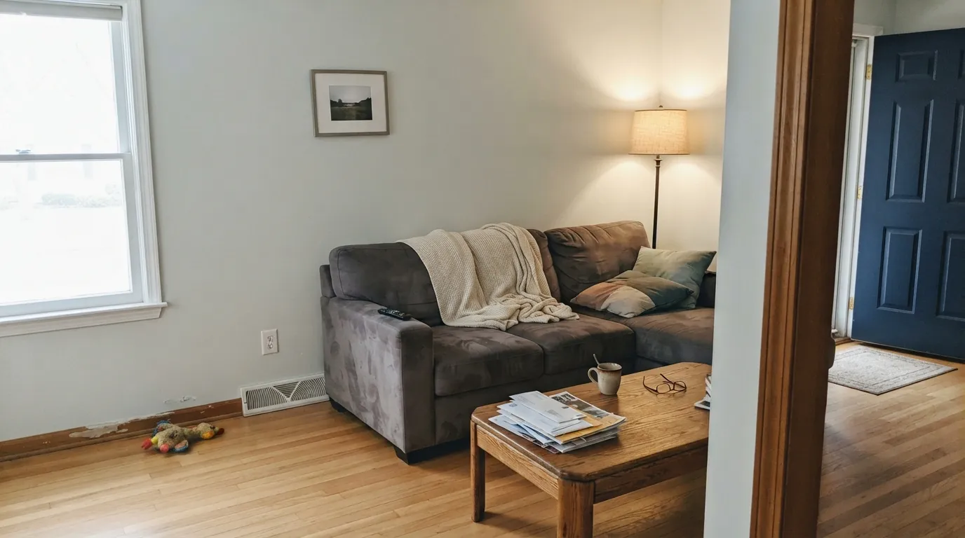
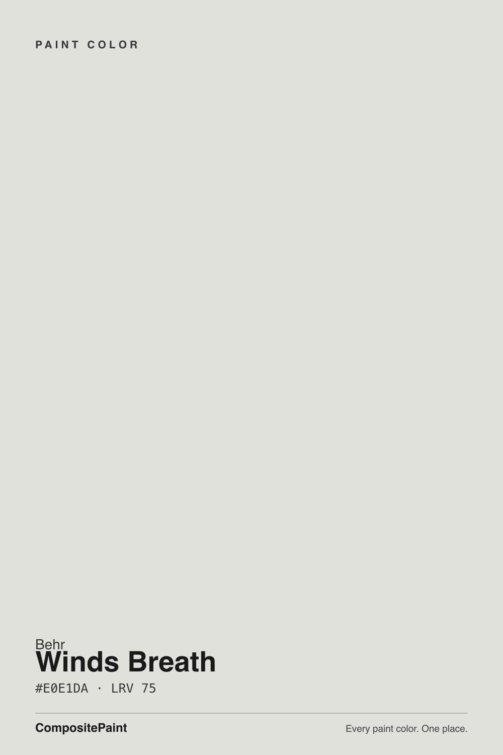
A cool off-white with a silvery gray-green cast — green, not cream, not blue. Behr files GR-W06 in the white family and describes it as a cool white with silvery green notes, which is the useful fact: this is not a greige and it is not the warm cream-taupe the same name means at Benjamin Moore. Saturation is very low, so four walls still read as a chosen white rather than a color. The green sits at the yellow-green handoff, the same place Horizon lives — a mineral, slightly weathered white, not mint and not sage. It has no Color of the Year, no famous room, and almost no designer write-ups of its own, because nearly every search for the name lands on the Benjamin Moore chip. Shop by GR-W06.
At LRV 75 it sits in the high off-white band: a clear step under White Dove (LRV 85), Alabaster (LRV 82), and Smoky White (LRV 83), and five points lighter than Benjamin Moore Wind's Breath (LRV 70). That gap is the whole review. On a wall it holds just enough body to soften shadows and look finished; next to Polar Bear (LRV 94) or Ultra Pure White (LRV 97) it suddenly shows as a gray-green. It is also a full twelve LRV points lighter than Sherwin-Williams Sea Salt (LRV 63), so it will not do the spa-green job people hire that name for. Plan for four walls to read a half-step greener and slightly more gray than the chip — every silvery white does this once it leaves the card.
Undertone in one line: silvery gray-green first, a thread of yellow second — never pink, never a true cream. If the sample looks like a quiet off-white, you have south or west daylight doing its job. If it looks like pale sage or dingy putty, the room is north, the bulbs are cool, or a cream neighbor is pulling the green forward. If it looks dirty next to the casing, the trim is too bright. All three versions are the same gallon being honest about the room.
Where It Shines
Give it real daylight, no brighter white nearby, and floors that are not golden, and Winds Breath does the rare thing a tinted white is supposed to do: look finished, stay airy, and skip both the cream and the clinic. Living rooms and bedrooms with a window are the job it actually has. Hallways, offices, and laundry rooms are the second home — LRV 75 bounces the one window or the one bulb you have without the glare of Polar Bear. The one-color room, walls and trim in GR-W06 with only a sheen change, is the version that works, because the color is interesting enough to carry the edge alone.
Where It Fails
Almost every unhappy story about this color is a shopping mistake or a neighbor-color mistake. None of them are a bad mix — but if your room matches one, a bigger sample will only confirm it.
Same three words, different paint. Benjamin Moore Wind's Breath (981, LRV 70) is a warm hybrid of cream, taupe, and gray — half off-white, half greige, and your light picks which. Behr GR-W06 is lighter, cooler, and silvery green. If a saved photo, a Kylie Minteriors review, or a Houzz thread is the Benjamin Moore color, do not hope the Home Depot can is a cheaper version. It is not. Sample Horizon if you wanted this cooler read in the BM deck; sample the Benjamin Moore chip if you wanted the warm one.
The most common Home Depot pairing is also the one that breaks it. Polar Bear (LRV 94) and Ultra Pure White (LRV 97) sit twenty-odd points brighter and much cleaner. The brighter white wins, and Winds Breath looks dingy and gray-green around the casings — the unwashed-wall effect every quiet off-white is famous for. Run GR-W06 on walls, trim, and ceiling and let eggshell / semi-gloss / flat separate the planes, or drop it and paint the whole room the brighter white.
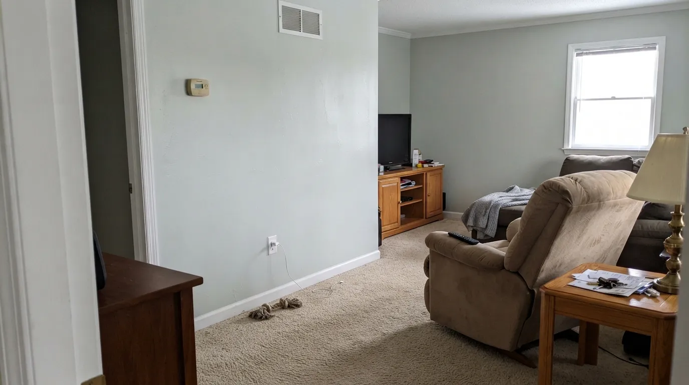
The green in GR-W06 is too weak to see on a white chip and too real to hide against a warm field. Builder oak, beige wall-to-wall, tan LVP, and Behr Swiss Coffee (W-B-700, LRV 87) on the next wall all shove the silvery green forward until people start saying sage or dirty. Pale white oak, walnut, and a true navy are fine. Golden wood and cream are not. Sample a big board over the actual floor before you commit the room.
Room by Room
With any real daylight it is the calm backdrop that makes wood furniture and art look deliberate without going cream. Eggshell on the walls; the same color on trim in semi-gloss. South and west rooms keep the green quiet. A north living room with Polar Bear casings is the miss.
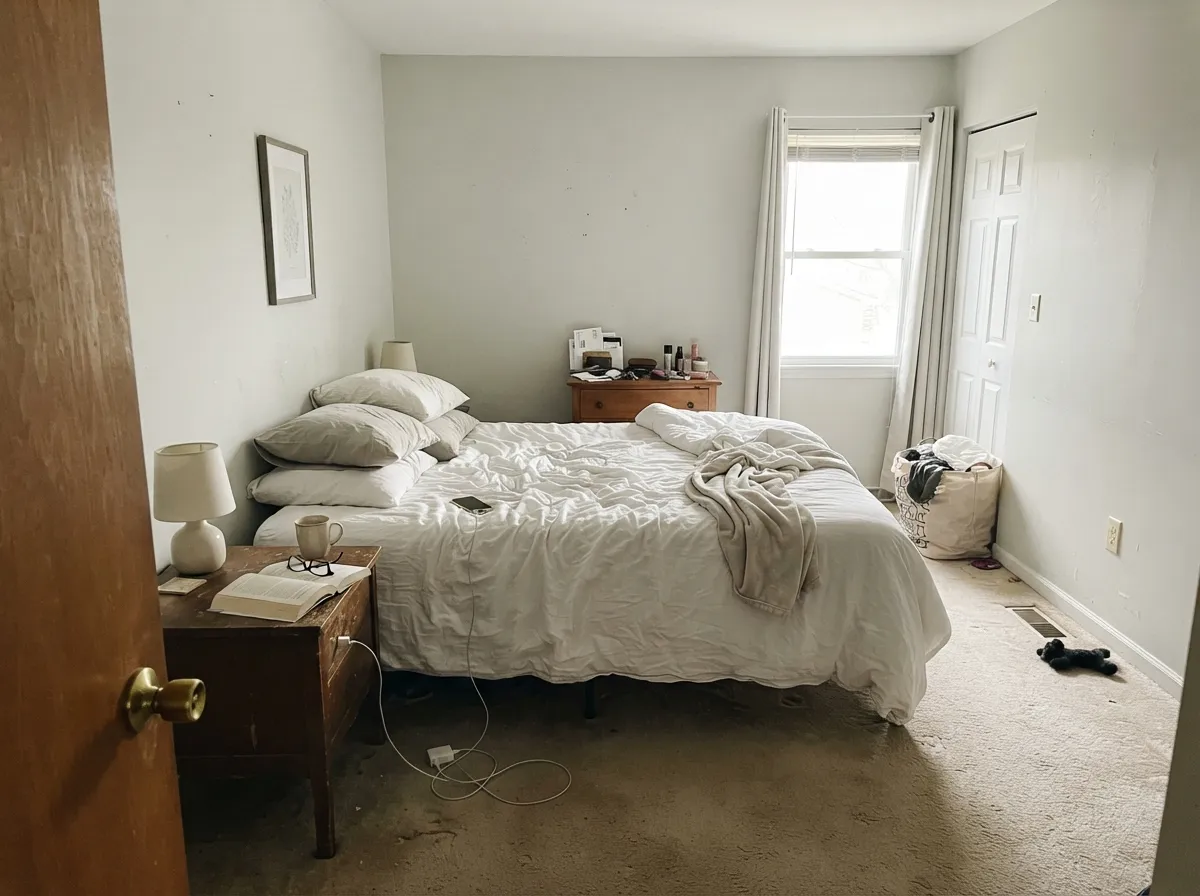
At LRV 75 it stays light enough to wake up to and quiet enough to settle at night. 2700K bulbs bury the green and nudge it toward a soft gray-beige; cool overheads do the opposite. White or washed-linen bedding, not beige. A Reddit owner put Dynasty eggshell on an office/guest room and kept it — that is the right kind of room.
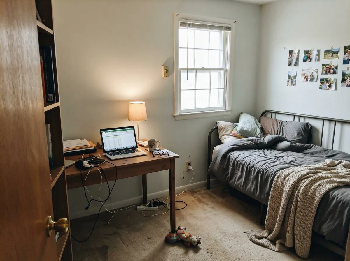
Interior halls, a small office, a laundry with one window: this is where LRV 75 earns its keep. It bounces what light you have and stays out of the way. Eggshell on walls, semi-gloss on the door. Keep the bulbs warm. A windowless hall on a 4000K LED will look a half-step greener and a step more gray — that is the light, not a bad batch.
Pale oak or walnut, white or lightly veined stone, nickel or unlacquered brass: the walls stay quiet. Honey-oak boxes you are not painting will pull the green; paint the wood or pick a creamier white. Satin if you put it on cabinets — it reads as a colored white, not a builder white, and hides knuckle marks better than Polar Bear. Do not park Ultra Pure White uppers next to these lowers.
White subway, chrome or brushed nickel, a window: the silvery cast reads rinsed rather than dingy. Satin in a wet room. Beige tile, almond fixtures, and warm cream stone are the argument — they make it go sage. Cool vanity bulbs will green it; swap them with the paint job.
Full sun washes a color this quiet toward pale gray, and the north wall of the house will read a full step greener than the south. It can work as a porch ceiling or a shaded body with near-black shutters, but it is not an exterior white you pick on purpose. Inside it has a job. Outside, use a committed white or a committed gray.
Your Light Is the Risk
Steady warm daylight buries the green and the wall reads as a quiet off-white with a silvery finish. This is the light the color was built for — whole-room safe.
Cool gray daylight wakes the silvery green and the wall goes pale sage or dingy putty. Fine if you half-wanted a gray-green; disappointing if you wanted white.
East rooms look cooler and slightly greener in the morning, quieter by afternoon. West rooms stay flat until golden hour, then warm toward gray-beige for an hour. Sample at both ends of the day.
2700K lamps bury the green and nudge it toward a soft gray-beige. Cool 4000K LEDs strip the yellow and leave the sage. Swap bulbs before you repaint.
Most complaints about Winds Breath are a light mismatch. Upload a photo of your actual room and see it on your walls — then ask for the same wall in north light or evening lamps before you buy a single sample.
Need It From Another Brand?
Any paint counter can custom-tint Behr GR-W06 directly. If you would rather stay in one brand's own deck, these are the closest stock matches, measured as ΔE2000. Under 2 is a difference you will not see on the wall.
| Brand | Closest color | ΔE | LRV | |
|---|---|---|---|---|
| Sherwin-Williams | Glacier BaySW 9626 · Sherwin-Williams | 0.8 | 75 | Color page → |
| Benjamin Moore | Horizon1478 · Benjamin Moore | 0.6 | 73 | Color page → |
| Valspar | Blizzard Fog7006-18 · Valspar | 0.8 | 73.5 | Color page → |
| PPG / Glidden | Tundra FrostPPG1009-1 · PPG / Glidden | 0.5 | 75 | Color page → |
| Glidden | Tundra FrostPPG1009-1 · Glidden | 0.8 | 75 | Color page → |
| Dutch Boy | Moon Pie406-1DB · Dutch Boy | 2.4 | 75 | Color page → |
Similar Behr Colors
The nearest shades to Winds Breath within Behr's own range, ranked by perceptual color distance — useful when you want the same look a touch lighter, darker, or warmer.
WCAG 2.1: AA is 4.5 : 1 for normal text, 3 : 1 for large text, AAA is 7 : 1.
Winds Breath vs the Colors You're Also Considering
Every Winds Breath sample board has the same rivals on it. The numbers show the real lightness gap — then it comes down to which risk you would rather live with.
Pick this for the lighter, cooler, silvery-green Home Depot version of a quiet off-white.
Benjamin Moore 981 · LRV 70Wind's BreathPick this if you wanted the warm greige-cream the name usually means — half off-white, half greige, and your light picks which.
Pick this when you are already at Home Depot and want the slightly lighter, slightly greener read of the same idea.
Benjamin Moore 1478 · LRV 73HorizonPick this if you want this exact cool, quiet gray-green in the Benjamin Moore deck — it is the closest twin, and the most light-dependent quiet gray BM makes.
Inside the Behr deck the gaps are small. Looking Glass MQ3-45 at LRV 73 and Salt Cellar PPU25-11 at LRV 74 are marginally darker and cooler, so they read grayer in the same room. Polished UL200-11 at LRV 76 is slightly brighter and cleaner. Taupe Tease N210-1 matches the LRV of 75 but leans beige instead of green.
Across brands, several colors land on top of it. Benjamin Moore Horizon 1478 at LRV 73 sits at a deltaE of 0.6, PPG Tundra Frost PPG1009-1 at LRV 75 is 0.49 away, and Sherwin-Williams Glacier Bay SW 9626 at LRV 75 is 0.76 away. For practical purposes those are the same color.
Farrow & Ball Strong White No. 2001 at LRV 76 comes in at 1.72, close enough to look identical in normal room light. Portola Paints Gem at 2.11 and Dutch Boy Moon Pie 406-1DB at 2.43 are very close but worth sampling first.
Winds Breath Coordinating Colors
The rule for coordinating with Winds Breath: stay on the cool-neutral side, or go dark. It loves gray-greens, navies, and near-blacks, and it argues with cream, beige, and any white that is a lot brighter than it is. Same-color trim is the pairing that actually works. These are the partners that keep the silvery green looking deliberate:
Not Benjamin Moore Wind's Breath
Almost every search, Houzz thread, and designer review attached to these three words is about Benjamin Moore Wind's Breath — OC-24 in some decks, 981 in ours — a warm greige-cream at LRV 70 that slides between off-white and taupe depending on the light. Behr GR-W06 borrowed the name and none of the personality. It is five LRV points lighter, cooler, and built on a silvery green instead of a warm gray-taupe.
That collision is why this color has almost no fame of its own. There is no Color of the Year, no viral kitchen, no Joanna-Gaines-adjacent living room. A Reddit owner used Dynasty eggshell in an office/guest room and liked the paint; Home Depot reviews for the SKU are about coverage and drag, not the color. Honest obscurity is the story. If you found this page after googling Wind's Breath, check the brand on the chip in your hand before you buy gallons.
Winds Breath With Wood Tones, Floors, and Trim
Pale white oak, walnut, and gray-washed wood sit comfortably against it because they share the cool-neutral temperature. Linen, unlacquered brass, brushed nickel, and matte black all work. The floor that needs a sample first is golden honey oak — yellow-orange pulls the green forward until the wall looks sage and the floor looks more orange. Beige carpet and tan LVP do the same job. A large rug is a patch, not a fix.
Trim is the other decision that gets made at the store, badly. Polar Bear (LRV 94) and Ultra Pure White (LRV 97) are the Home Depot defaults, and both make GR-W06 look dirty. Chantilly Lace (LRV 90) is the BM version of the same mistake: the cleanest white BM makes, and too crisp next to this wall. Paint the trim the same color in semi-gloss. If the ceiling has to be a separate white, Snowbound at LRV 83 is the smallest honest step up. Behr Swiss Coffee on an adjacent wall is cream, and cream is how this color goes green.
Three Ready Palettes Built on Winds Breath
A color is never alone on the wall. These are complete combinations in the 60-30-10 pattern, with the reason each one holds together. Every one opens in the visualizer.
One color at two sheens is the pairing that does not dingy the walls. The navy door supplies the single dark note the scheme needs, and it is the safest navy as long as the entry has light. No Polar Bear anywhere.
Try this palette in your roomEvergreen Fog is the cabinet sage that actually behaves, and it shares the gray-green family so the island reads like a deeper version of the wall, not a theme. Iron Ore grounds the metal. Pale oak or walnut floors only — honey oak fights both greens.
Try this palette in your roomSnowbound is only eight LRV points brighter, so the ceiling stays white without the Polar Bear glare that dirties this wall. Kendall Charcoal is the best-behaved dark gray in the BM deck and gives the quiet white something to push against. Warm 2700K lamps are part of the scheme.
Try this palette in your roomWinds Breath FAQ
Is Behr Winds Breath the same as Benjamin Moore Wind's Breath?
No. Benjamin Moore Wind's Breath (981, LRV 70) is a warm greige-cream — half off-white, half greige. Behr GR-W06 is a cool silvery green-white at LRV 75. Same three words, different paint, different temperature. If a photo or a blog review is the Benjamin Moore color, buy that formula. The closest BM twin of the Behr color is Horizon (1478, LRV 73).
Is Winds Breath warm or cool?
Cool — with a caveat. Behr files it as a cool white, and the silvery green is what you notice on a wall. A thread of yellow keeps it from going icy, so in south light it can pass for a quiet off-white rather than a gray. It is never a cream. In north light it is clearly a pale gray-green.
What trim white goes with Winds Breath?
Winds Breath itself, in semi-gloss. A brighter trim white — Polar Bear, Ultra Pure White, Chantilly Lace — makes the walls look dingy and gray-green. If you insist on a separate ceiling white, Snowbound (LRV 83) is close enough that the gap does not shout. Never go twenty LRV points brighter.
Does it look green?
It can. The hue sits where yellow turns toward green, so on a full wall the color often shows a faint sage cast that a small chip hides. Cool north light, 4000K bulbs, beige carpet, and honey oak all bring that green forward. Warm 2700K bulbs and south light push it back toward a silvery off-white.
Does Winds Breath work with oak floors?
Depends on the oak. Pale unstained white oak and walnut are excellent. Golden honey oak is the clash: the yellow-orange floor pulls the green out of the wall until both sides look louder. A large rug helps; painting the cabinets the same color as the walls does not. Test a big sample over the actual floor.
Is it good for a whole house?
In a house with decent daylight and no bright builder-white trim left in place, yes — the one-color plan (walls, trim, ceiling, sheen changes only) is how this color holds a floor. Skip the north bedrooms and any room that still has Polar Bear casings. It is not a whole-house exterior.
Have you painted with Winds Breath?
Rate it — one tap helps the next reader decide.
Ask a Question