Horizon
The palest, coolest gray in the Benjamin Moore Classic Collection, reviewed honestly: where it stays a true quiet gray, the light that turns it icy, and what to pick instead.

Jessica has spec'd whites and neutrals for more than 300 rooms and keeps a sample wall of painted drawdowns in her studio. Every color review is checked against real reader rooms in the comments and re-tested when a formula changes. About the testing process →
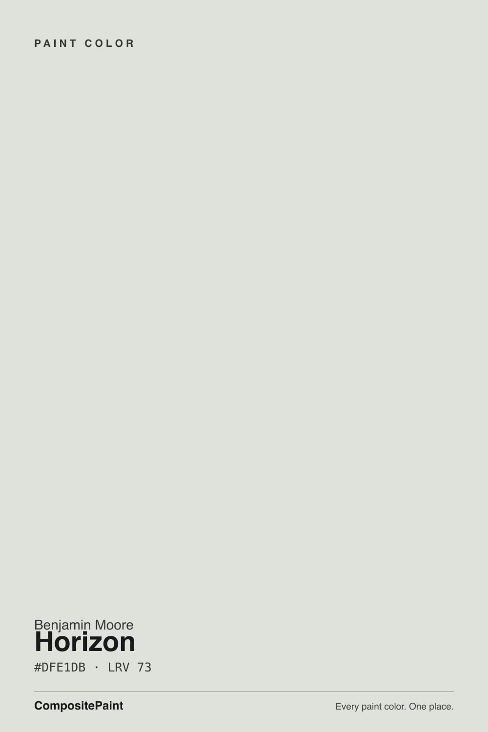
- 1Heirloom Shade63
- 2Titanium68
- 3Horizon73
- 4Alabaster82
- 5Chantilly Lace91
The Fast Verdict
Horizon is Benjamin Moore's palest cool gray — LRV 73, a blue lean that never tips warm, and no Color of the Year moment or viral room to its name. It has sat quietly in the Classic Collection for years, the color a painter suggests when someone says "just a light gray, nothing beige." In real south or east daylight it settles into a true, calm pale gray. In a dim north room it goes properly icy, and in strong sun it can wash out close to off-white — the same paleness that makes it useful is exactly what makes it swing.
Bright south- or east-facing rooms · bathrooms and kitchens with cool quartz or marble and black hardware · white oak or gray-washed floors · anyone who wants gray without much visible color
Your room is dim and north-facing with no warm light to balance it · your floors are red oak, cherry, or honey-toned · you want a gray you can actually see across the room · your trim is a warm creamy white
- Palest, coolest gray in the BM Classic Collection — reads clean without ever going warm
- High LRV (73) brightens a room without reading stark
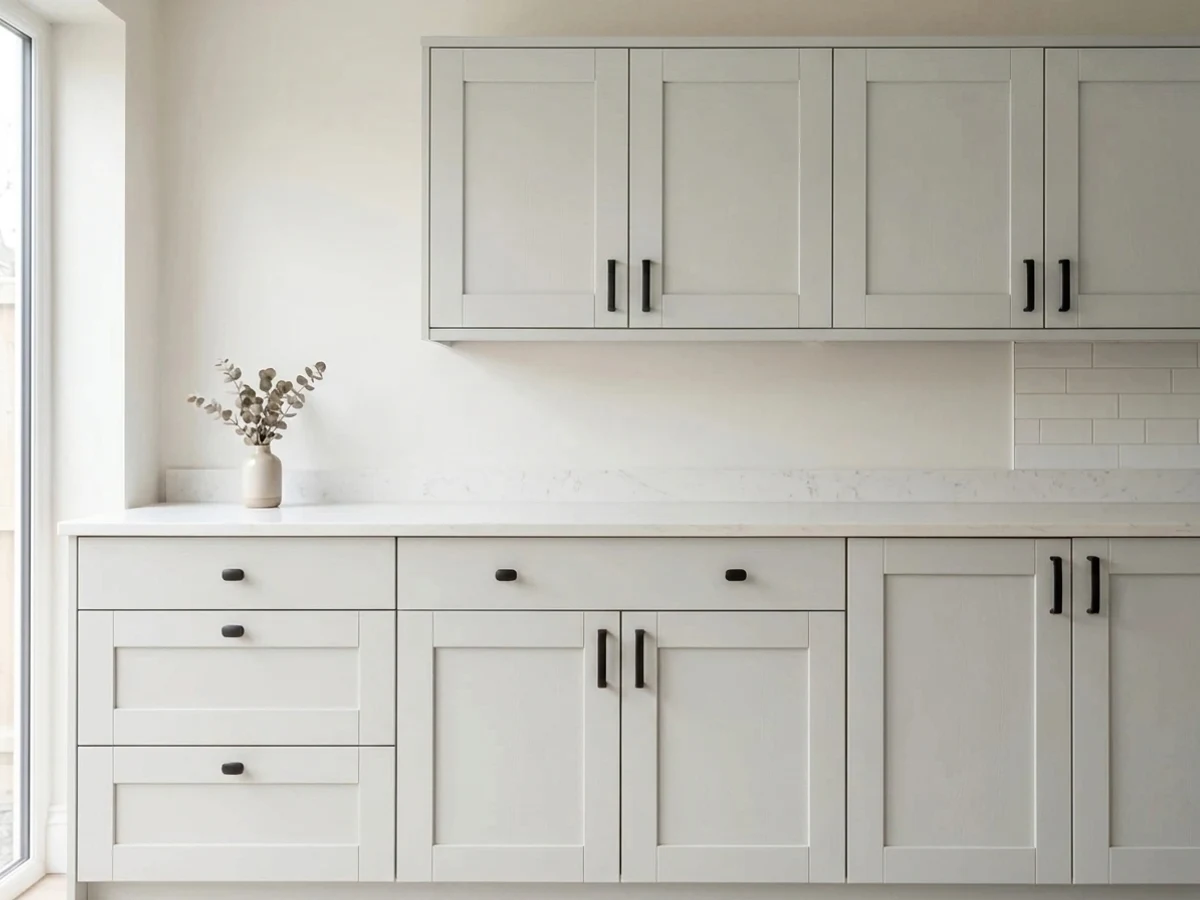
- Excellent with cool quartz, marble, and black or pewter hardware
- Flatters white oak and gray-washed floors
- Dependable and honestly unglamorous — no trend risk to worry about
- Goes properly icy in a dim, north-facing room
- Washes out close to off-white in strong south or east sun — too pale if you wanted visible gray
- Fights red oak, cherry, and other orange-toned wood
- Reads slightly dirty next to a very warm creamy trim white
What Color Is Horizon, Really?
Structurally, Horizon is built on a green-yellow base — but on the wall it reads as a cool, blue-leaning pale gray, and that mismatch between formula and appearance is the whole story of this color. It sits in Benjamin Moore's Classic Color Collection, the kind of steady, decades-old entry that never had a Color of the Year moment or a design-blog viral run. Nobody is chasing Horizon; it is the color a painter reaches for when a client says "just a light gray, nothing beige, nothing warm."
At LRV 73 it is genuinely pale — light enough that in strong south or east sun it can wash out close to off-white, the way a soft cream backs off in bright light. Put it next to a warmer near-white like Silver Satin (LRV 75) and Horizon's blue lean shows immediately; put it next to a deeper cool gray like Gray Owl (LRV 65) and Horizon reads as the airy, barely-there version of the same family. That range — near-white in the sun, properly icy in the shade — is the useful part and the risky part in the same breath.
Undertone in one line: blue first, cool throughout, never warm. If your sample reads greenish or beige on the wall, that is a warm bulb or a warm-toned floor doing the work, not the paint reverting to its green-yellow base.
Where It Shines
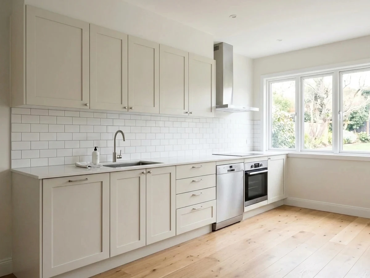
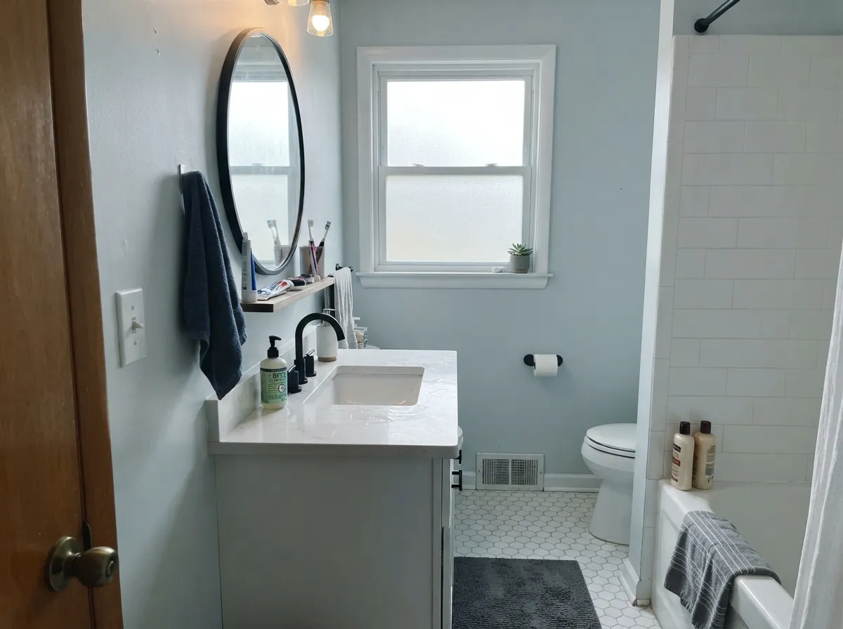
Give it real south or east daylight, cool countertops, and black or pewter hardware and it disappears into the background the way a good neutral should. Bathrooms and kitchens are its natural home — white subway tile, quartz, and Carrara-style marble all sit at the same cool temperature, so nothing has to negotiate. It is also one of the few pale grays that holds its own next to white oak floors instead of fighting them.
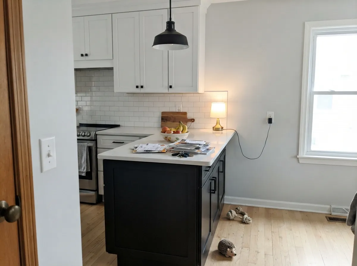
Where It Fails
Almost every regret story with Horizon comes from one of three predictable mismatches — the color, the light, or the wood it's sitting next to. None of them are a defect in the paint; they are a cool undertone doing exactly what a cool undertone does.
North light is cool and indirect — it amplifies the blue until the wall reads properly icy, not airy. Readers who love Horizon in a sunny room report a cold, almost gray-blue wall in a north one. The paint didn't change; the light did. Warm lamps help, or step to a warmer pale gray like Silver Satin.
Strong south or east daylight washes the color out toward near off-white — beautiful if that's the goal, a letdown if you picked Horizon expecting a gray you could see across the room. If you want the color to stay put regardless of exposure, go one step deeper: Gray Owl or Stonington Gray.
Cool blue-gray and orange-leaning wood sit at opposite ends of the wheel, and depth multiplies the clash: the floor reads more orange, the wall reads more blue. Both sides lose. Horizon wants white oak, gray-washed floors, or black walnut — not builder-grade red oak.
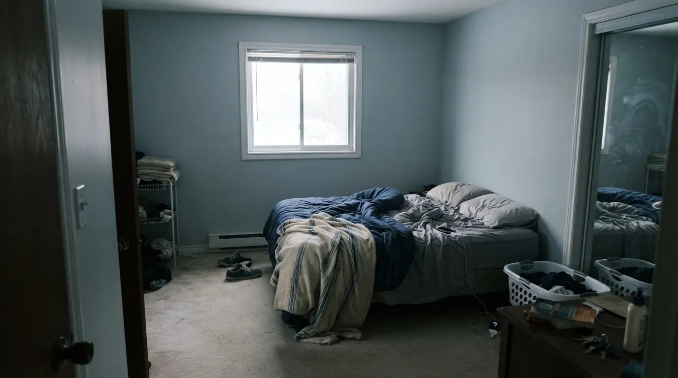
Room by Room
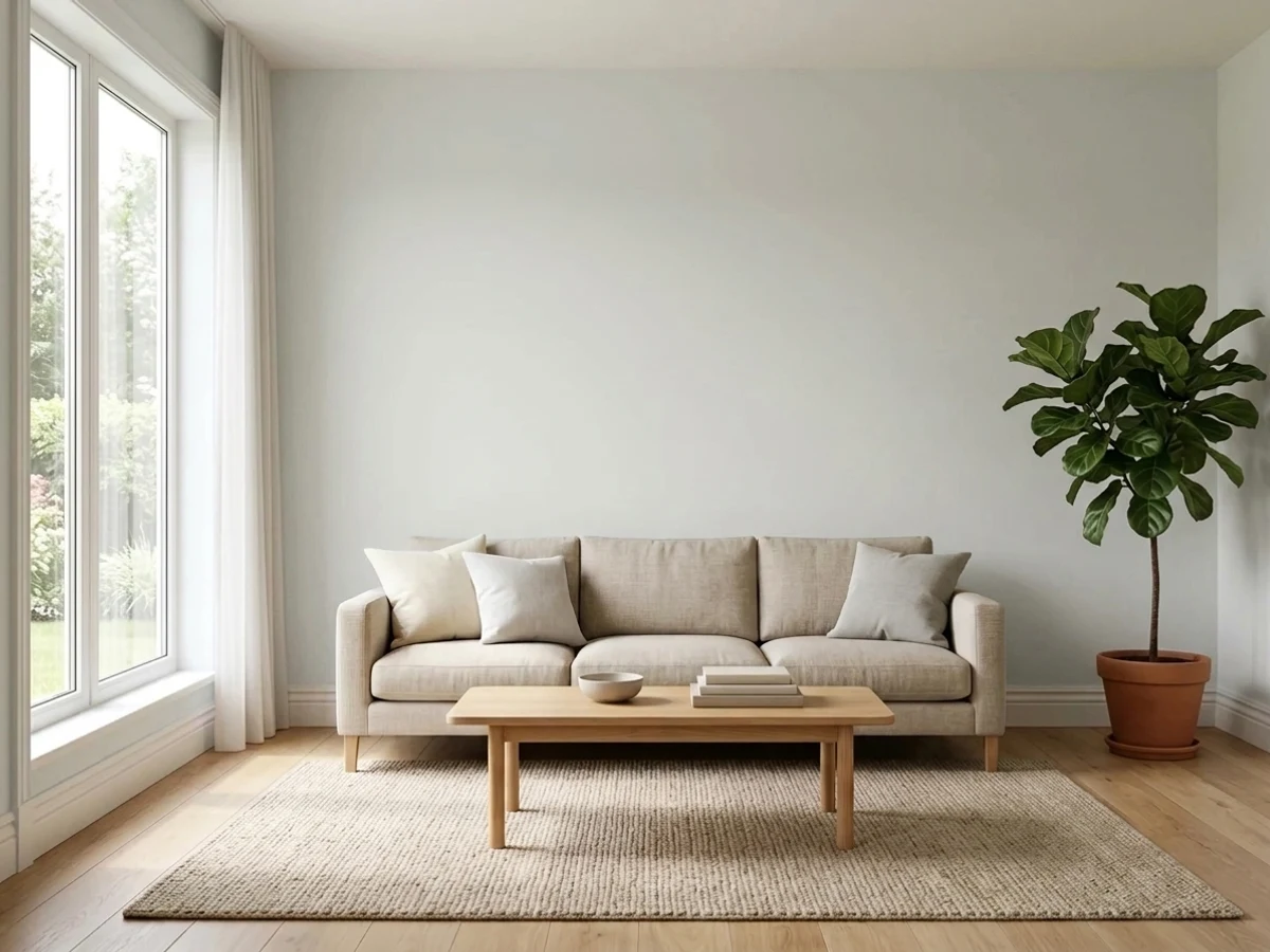
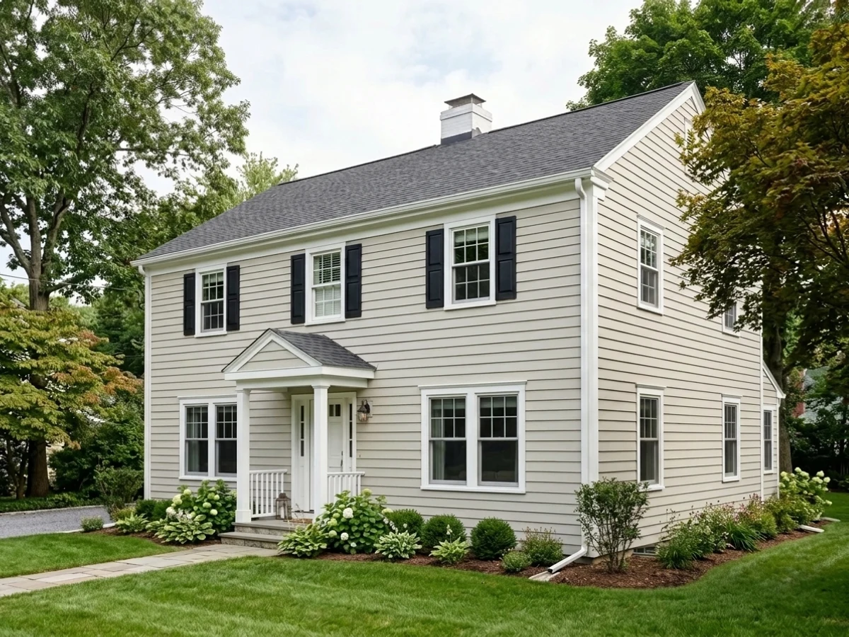
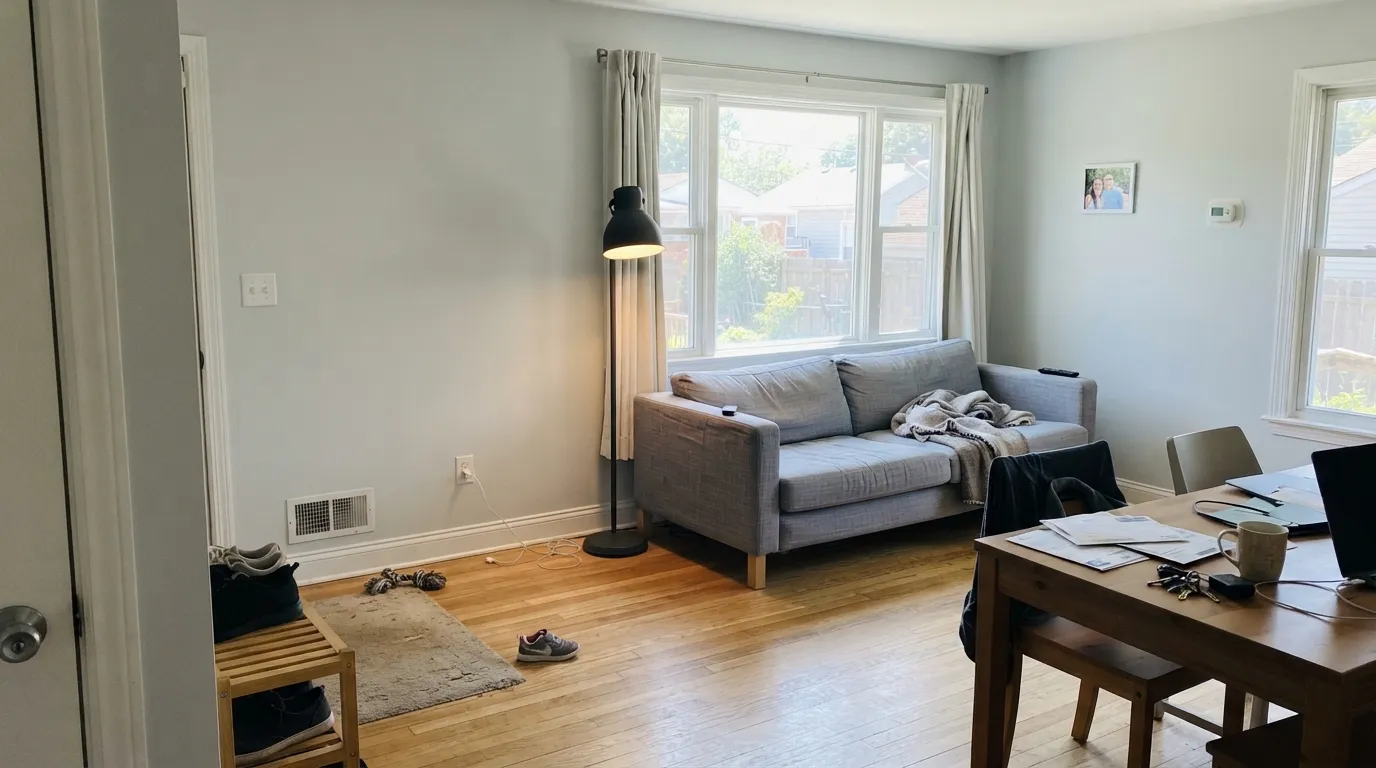
South or east sun settles it into a calm, barely-there gray that lets furniture and art carry the color. In a dim or north-facing living room, add warm lamps or pick a different gray.
With cool quartz or marble counters, white oak floors and black hardware, it reads clean and current without fighting anything. Skip it over warm honey-oak cabinetry or granite with gold flecks.
Restful under daylight, but the coziness at night comes from warm 2700K bulbs, not the paint — Horizon on its own stays cool. Pair with cream or white bedding, not beige.
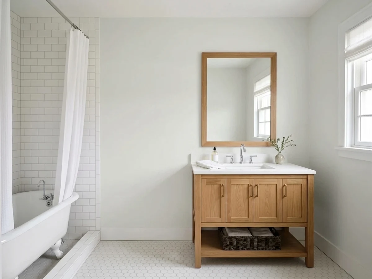
With white subway tile, chrome or matte black fixtures and stone counters, Horizon is one of the most dependable pale cool grays in the BM deck for a bath. Satin or eggshell for wipeability.
Semi-gloss Horizon on trim or cabinets under a deeper cool gray wall (Gray Owl, Stonington Gray) gives definition without the stark cut of a true white.
Full sun bleaches it toward white; the shaded side of the house shows more of the blue lean. Sample a board on the sunny and the shaded wall before committing the whole exterior.
Your Light Is the Risk
Warm southern sun pulls the hidden green-yellow forward and balances the blue — Horizon at its truest, calmest pale gray.
Cool, indirect light amplifies the blue until the wall reads properly icy, not airy. Sample before committing a whole north room.
Off-white in the morning or evening sun hours, cooler and grayer once direct light leaves the wall. The swing is real, not subtle.
Warm 2700K bulbs push it toward a soft greige at night; cool 4000K+ LEDs sharpen the blue for a crisper, more modern edge.
Most complaints about Horizon are a light mismatch. Upload a photo of your actual room and see it on your walls — then ask for the same wall in north light or evening lamps before you buy a single sample.
Need It From Another Brand?
Any paint counter can custom-tint Benjamin Moore 1478 directly. If you would rather stay in one brand's own deck, these are the closest stock matches, measured as ΔE2000. Under 2 is a difference you will not see on the wall.
| Brand | Closest color | ΔE | LRV | |
|---|---|---|---|---|
| Sherwin-Williams | Glacier BaySW 9626 · Sherwin-Williams | 1.0 | 75 | Color page → |
| Behr | Winds BreathGR-W06 · Behr | 0.6 | 75 | Color page → |
| Valspar | Silver Dust7004-19 · Valspar | 1.7 | 74.8 | Color page → |
| PPG / Glidden | Tundra FrostPPG1009-1 · PPG / Glidden | 1.0 | 75 | Color page → |
| Glidden | Tundra FrostPPG1009-1 · Glidden | 1.0 | 75 | Color page → |
| Dutch Boy | Moon Pie406-1DB · Dutch Boy | 3.0 | 75 | Color page → |
Similar Benjamin Moore Colors
The nearest shades to Horizon within Benjamin Moore's own range, ranked by perceptual color distance — useful when you want the same look a touch lighter, darker, or warmer.
WCAG 2.1: AA is 4.5 : 1 for normal text, 3 : 1 for large text, AAA is 7 : 1.
Horizon vs the Colors You're Also Considering
Every Horizon sample board has the same rivals on it. The numbers show the real lightness gap — then it comes down to which risk you would rather live with.
Pick this for the coolest, palest version of the two — Horizon holds its blue lean where Gray Owl drifts warmer.
Benjamin Moore OC-52 · LRV 65Gray OwlPick this for more visible color and a gray that shifts more as the room's light changes — Gray Owl reads richer where Horizon stays pale.
Pick this for a cleaner, more architectural cool gray with no guessing which way the undertone leans.
Benjamin Moore 856 · LRV 75Silver SatinPick this for a warmer, greige-leaning near-white that sits easier next to wood — the undertone reads friendlier, if harder to pin down.
Pick this for a quieter neutral that doesn't need perfect light to look intentional — Horizon stays calm even where Sea Salt goes flat.
Sherwin-Williams SW 6204 · LRV 63Sea SaltPick this if you want visible color — Sea Salt leans green-blue and reads like a soft pastel when its light agrees with it.
Paper White OC-55 at #E0E2DC and LRV 74 is one point lighter and almost the same mix. On a wall the two are hard to separate, so pick by whichever fan deck you have in hand. Pearl Gray 863 at #DDE1D8 and LRV 74 carries a touch more green in the middle channel and reads slightly more like a color. Sheep's Wool 857 and Intense White OC-51, both #E0DFD7 at LRV 73, trade the green for a small amount of warmth and land closer to a soft off-white.
Across brands, Behr Winds Breath GR-W06 at LRV 75 with a deltaE of 0.6 and Magnolia Home Chime Gray JG-119 at LRV 73 with a deltaE of 0.73 are true matches. Sherwin-Williams Glacier Bay SW 9626 and PPG Tundra Frost PPG1009-1, both LRV 75 and deltaE 0.98, match as well. Farrow and Ball Strong White No. 2001 at LRV 76 has a deltaE of 2.02, so it is very close but worth sampling first.
Horizon Coordinating Colors
The rule for coordinating with Horizon is temperature discipline: stay cool. It sits happily next to crisp whites, deeper true grays, near-blacks, and one muted green — and it argues with warm creamy whites and anything yellow-beige. These are the partners that keep showing up in rooms that work:
Horizon's Quiet Story: A Classic With No Hype
Horizon has never been a Color of the Year and it doesn't have a viral room attached to its name — the honest research trail for this color is mostly paint-store listings and long-standing BM catalog pages, not design-blog features. That is not a knock. It is a Classic Color Collection entry: the kind of color that has been quietly specified in bathrooms and hallways for years precisely because it doesn't ask for attention.
That quietness is also why it rewards a careful buyer more than a casual one. A famous color like Cinnamon Slate (Color of the Year 2025) gets tested constantly and its behavior is well documented online; Horizon's undertone shift from icy blue in the shade to near-white in the sun is real but under-discussed, which is exactly why the light section above matters more here than on a hyped color.
Horizon With Wood Tones and Floors
Cool undertone, cool preference: white oak, gray-washed wood, black walnut and ash all sit comfortably next to Horizon because neither side is fighting the other's temperature. Matte black or pewter hardware finishes the look without adding any warmth back in.
The wood that argues with it is anything orange- or red-leaning: red oak, cherry and honey-toned builder wood all sit at Horizon's exact complementary temperature, and depth multiplies the clash — the floor reads more orange, the wall reads more blue. If that wood is staying, a large rug or a warmer gray (Gray Owl, Silver Satin) will get along better than Horizon will.
Three Ready Palettes Built on Horizon
A color is never alone on the wall. These are complete combinations in the 60-30-10 pattern, with the reason each one holds together. Every one opens in the visualizer.
Horizon and Chantilly Lace share the same cool, blue-leaning family, so the wall-to-trim handoff stays crisp instead of muddy; the navy vanity supplies the single dark note the scheme needs, and black hardware ties all three together.
Try this palette in your roomGray Owl carries more visible color than Horizon at nearly the same cool-gray base, so trimming a Gray Owl room in Horizon reads like one family deepening toward the door rather than a mismatch. Wrought Iron supplies the single near-black note without going full black.
Try this palette in your roomCool white cabinets and a pale cool-gray wall keep the kitchen from ever tipping warm, and the near-black island is exactly the anchor this color's own light behavior keeps rewarding — black hardware, cool countertops, no honey wood in sight.
Try this palette in your roomHorizon FAQ
Is Horizon gray or a light blue?
Gray — a pale, cool one with a genuine blue lean, never a true blue paint. In strong daylight it can look nearly colorless; in a dim north room the blue becomes obvious enough that some readers call it icy.
What undertone does Horizon have?
Blue, structurally built on a green-yellow base that almost never shows on the wall. South and east light warm it just enough to look like a balanced pale gray; north light and cool LEDs push the blue forward.
Does Horizon work in a north-facing room?
Only with caution. North light amplifies the blue and the wall reads properly cool, even icy, without warm lamps or warm-toned furnishings to balance it. If the room stays dim, a warmer pale gray like Silver Satin will behave better.
What trim color goes with Horizon walls?
A cool crisp white — Chantilly Lace is the classic partner and keeps the wall-to-trim handoff in the same cool family. A warm creamy trim white can make the wall look slightly dirty by comparison.
Does Horizon work with wood floors?
With white oak, gray-washed wood, or black walnut, yes — the cool temperatures agree. With red oak, cherry, or honey-toned wood, the blue and the orange sit at opposite ends of the wheel and both look worse for it.
Is Horizon a trending or popular color?
Not in the Color-of-the-Year sense — it has no viral moment attached to it. It is a long-running Classic Collection color, the kind picked for bathrooms, hallways, and whole-house palettes because it is dependable, not because it is fashionable.
Have you painted with Horizon?
Rate it — one tap helps the next reader decide.
Ask a Question