Maritime White
A warm, quiet off-white that Benjamin Moore never bothered to market, reviewed honestly: what it actually looks like, where it disappoints, and why almost nobody's written about it.

Jessica has spec'd whites and neutrals for more than 300 rooms and keeps a sample wall of painted drawdowns in her studio. Every color review is checked against real reader rooms in the comments and re-tested when a formula changes. About the testing process →
- 1Agreeable Gray60
- 2Balboa Mist66
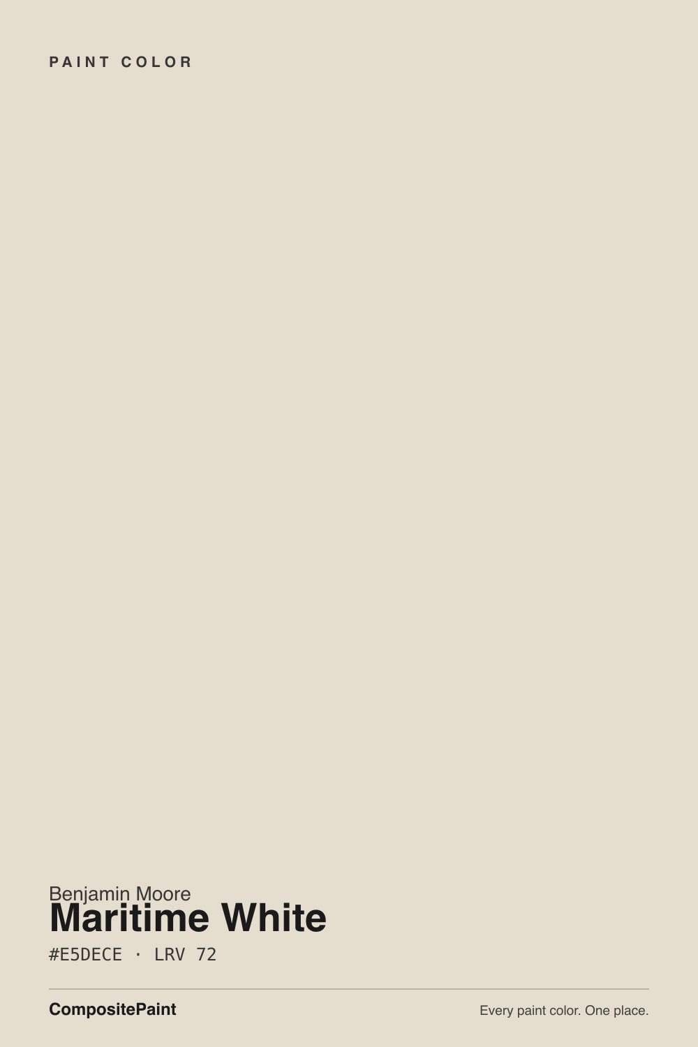
- 3Maritime White72
- 4Pearly White77
- 5Dover White83
The Fast Verdict
Maritime White is a warm, grayed-tan off-white sitting one real step deeper than Benjamin Moore's famous whites — quieter than White Dove, less bright than Swiss Coffee, never pink or blue despite the coastal name. It is not part of BM's curated, heavily marketed Off-White Collection, which is the entire reason you have probably never seen a photo of it: it lives in the full numbered fan deck instead, next to hundreds of colors nobody blogs about. Used with intention it is a genuinely dependable warm neutral. Used because a friend recommended it, you are flying blind — there is almost no real-world documentation to check yourself against.
Whole-house walls when White Dove feels too pale or too obvious · a warm, quiet cottage-style exterior · kitchens with wood cabinetry and brass · anyone who wants an off-white nobody else on the block already has
You want a name-brand color your painter already keeps a mixing formula for · your room is dim and north-facing · you plan to pair it with a brighter white trim · you need other people's photos before you commit
- A genuinely warm, deep off-white — more presence than a pale white, without going full greige
- Same paint quality and price as BM's marketed whites, just outside the curated collection
- Hides scuffs and shadow better than a paler off-white at this brand
- Flatters warm wood, brass, and butcher block the same way its famous siblings do
- A real, defensible exterior color — full sun reads it warm and clean, not chalky
- Almost no real-world photos or reviews exist online — you are testing largely blind
- Goes flat and dull in dim north light, same as every off-white this deep
- Looks dingy next to a brighter, cooler white trim — keep trim in the same family
- At LRV 72 it reads more like a wall color than a bright white — not a ceiling or trim substitute
What Color Is Maritime White, Really?
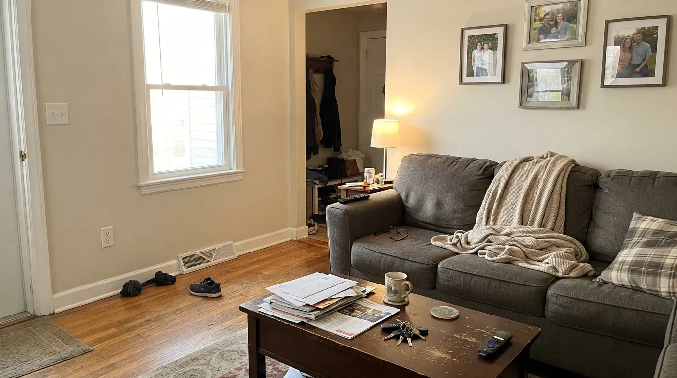
A warm, grayed-tan off-white — beige with the yellow muted down, not a bright white and not a true cream. Benjamin Moore's numeric code, 963, is the tell: colors with a plain number instead of an OC- prefix sit in the brand's full 3,500-plus color deck rather than the specifically curated, heavily marketed Off-White Collection that White Dove (OC-17), Swiss Coffee (OC-45), and Chantilly Lace (OC-65) belong to. Same mixing formula, same paint quality, same price at the counter — just none of the designer-blog attention. That is the honest story here, not a knock on the color.
At LRV 72 it sits noticeably deeper than the marketed whites — thirteen points below White Dove, twelve below Swiss Coffee — and almost exactly level with Ballet White and Sherwin-Williams's Oyster White. That depth is what gives it presence: on a wall in good light it reads as a genuine warm neutral, not a barely-tinted white, and it holds its color better in shadow than the paler off-whites do. It is closer to a light greige than a white, whatever the can says.
Undertone in one line: warm greige-cream — grayed tan, never pink, never blue, whatever the maritime name suggests. If your sample reads flat or dull, that is north light doing exactly what it does to every off-white in this LRV range, not the paint choosing a different undertone.
Where It Shines
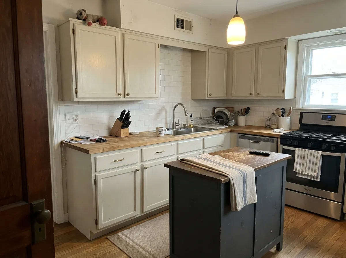
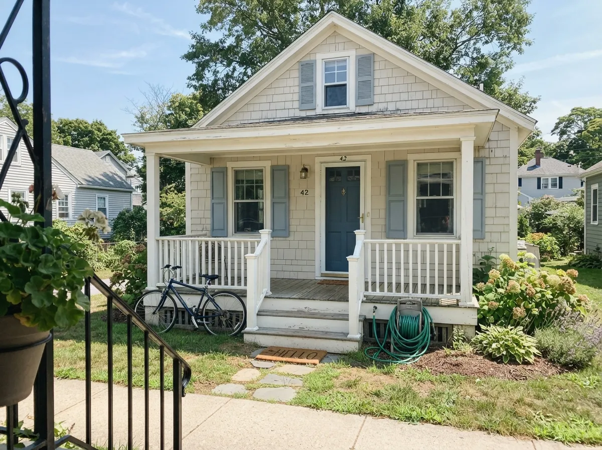
Give it real daylight and it does the job White Dove is famous for, just one register warmer and quieter — a whole-house neutral that never announces itself. Because it runs deeper than the marketed whites, it hides scuffs, shadows, and uneven drywall better than a paler off-white would, and it holds its own next to warm wood and brass without needing a bright-white partner to look finished. It is also, unusually for an off-white, a genuinely solid exterior choice: full sun reads it clean and warm rather than chalky, which is the one place its name actually gets to mean something.
Where It Fails
There is no scandal here, no famous complaint thread — Maritime White's failure modes are the ordinary ones every off-white in its depth class shares, plus one that is specific to how obscure it is. All three are predictable before the first coat.
North light is cool and flat, and it strips the warmth out of any grayed-tan color, leaving the grey base exposed and the wall reading dull or slightly concrete. The paint did not change; the light removed the one thing that was carrying it. Go warmer (Natural Cream) or plan on lamps.
Because it sits well below White Dove and Swiss Coffee in LRV, a stark bright trim white makes Maritime White walls look dingy by comparison — the same mistake that sinks every mid-depth off-white. Keep trim in the same family (Maritime White itself, or Ballet White) rather than reaching for a crisp white.
This is the honest, unglamorous fail: because it never made Benjamin Moore's marketed collection, there are almost no real rooms photographed in it anywhere online. You cannot scroll Houzz for reassurance the way you can with White Dove. Buy the largest sample size available and paint it on two walls in your actual light before committing to a whole house.
Room by Room
In south or west light it is a calm, warm backdrop that reads more grounded than a pale off-white without tipping into full greige. Eggshell on walls, the same color in semi-gloss on trim keeps the room from splitting into two competing whites.
Warm wood, brass, butcher block: all of it sits comfortably against this depth of warm off-white, and because it is deeper than the marketed whites it shows fingerprints and grease around handles less readily. Satin cabinet enamel.
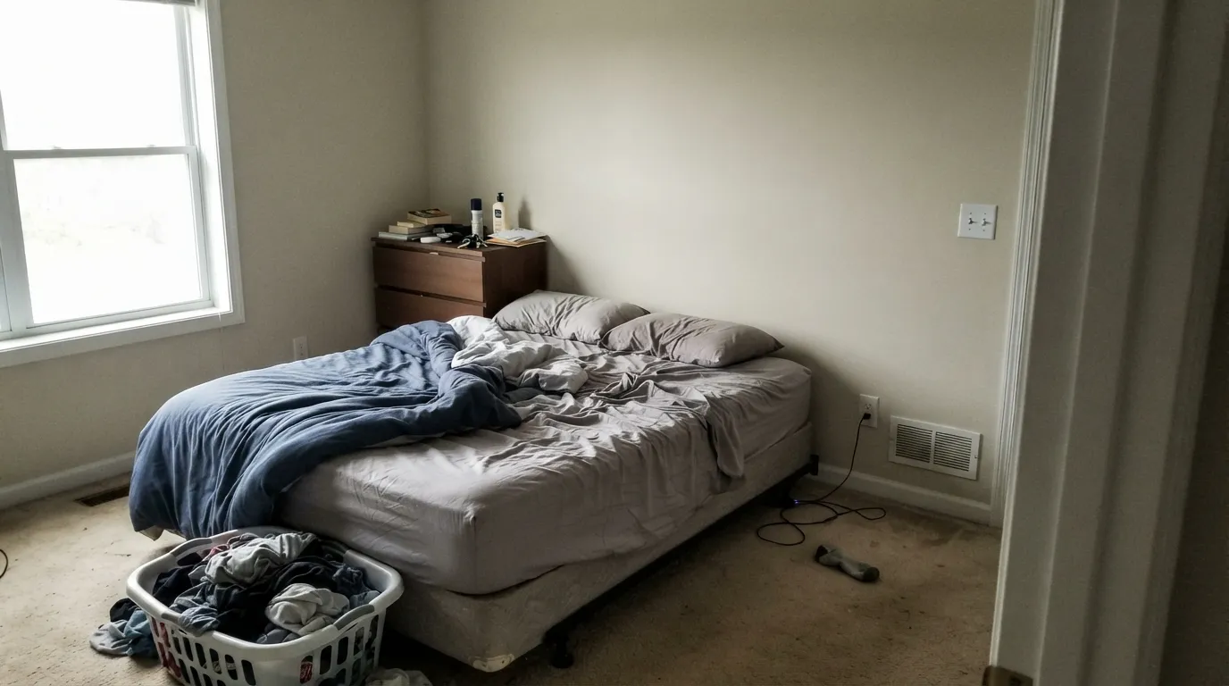
Under warm 2700K bulbs it turns genuinely cozy at night. A north-facing bedroom with no lamp plan will read flat and a little grey — the same trap every color in this LRV band falls into.
Warm stone, wood vanities, and brass fixtures all work. Cool grey or blue-veined marble will pull the warmth into relief and make the wall look slightly yellow by comparison — sample against the actual counter first.
The one-color approach (walls and trim, sheen change only) is the safest way to use it: no seam where a brighter trim white would expose how deep the wall color actually is. It reads as one calm, competent decision, not a color anyone will name.
Full sun reads it brighter and cleaner than any interior application, and its warmth avoids the slightly cold, chalky look cheap whites get on siding. Pairs well with a soft blue-gray accent and one near-black or charcoal door for a quiet cottage look — details below.
Your Light Is the Risk
Warm sun carries the cream forward without pushing it yellow. The most reliable light for this color, indoors or on siding.
Cool, flat daylight exposes the grey base and drains the warmth — the wall reads dull, almost concrete. Test first.
Warm and golden at the sun hours, quieter and more neutral through the middle of the day. A gentle shift, not a different color.
2700K lamps deepen it toward cream and cozy. Cool LEDs flatten it noticeably — this is a quiet color with little room to spare, so bulb choice matters more here than on a brighter white.
Most complaints about Maritime White are a light mismatch. Upload a photo of your actual room and see it on your walls — then ask for the same wall in north light or evening lamps before you buy a single sample.
Need It From Another Brand?
Any paint counter can custom-tint Benjamin Moore 963 directly. If you would rather stay in one brand's own deck, these are the closest stock matches, measured as ΔE2000. Under 2 is a difference you will not see on the wall.
| Brand | Closest color | ΔE | LRV | |
|---|---|---|---|---|
| Sherwin-Williams | ArrowrooteSW 9502 · Sherwin-Williams | 0.5 | 73 | Color page → |
| Behr | Confident WhiteGR-W12 · Behr | 1.2 | 74 | Color page → |
| Valspar | Cream in My Coffee3003-10C · Valspar | 1.5 | 72.3 | Color page → |
| PPG / Glidden | Southern BreezePPG1097-2 · PPG / Glidden | 1.2 | 73 | Color page → |
| Glidden | Southern BreezePPG1097-2 · Glidden | 1.1 | 74 | Color page → |
| Dutch Boy | Canvased015W · Dutch Boy | 1.1 | 73 | Color page → |
Similar Benjamin Moore Colors
The nearest shades to Maritime White within Benjamin Moore's own range, ranked by perceptual color distance — useful when you want the same look a touch lighter, darker, or warmer.
WCAG 2.1: AA is 4.5 : 1 for normal text, 3 : 1 for large text, AAA is 7 : 1.
Maritime White vs the Colors You're Also Considering
Every Maritime White sample board has the same rivals on it. The numbers show the real lightness gap — then it comes down to which risk you would rather live with.
Pick this for the plainer, more predictable undertone — Maritime White never drifts green, it just quietly never gets mentioned.
Benjamin Moore OC-9 · LRV 72Ballet WhitePick this if you want the version Benjamin Moore actually markets — the same depth, plus a green undertone worth testing for.
Pick this for more consistent warmth — Seapearl can swing either way with the light; Maritime White holds its temperature better.
Benjamin Moore 961 · LRV 76SeapearlPick this for a touch more brightness and a cooler, quieter grey base.
Inside the Benjamin Moore deck the differences are almost academic. Sail Cloth OC-142 at #E4DECE, LRV 72, is one digit off in hex, and Sail Cloth PM-21 lists at LRV 73. Fossil AF-65 at #E3DDCE, LRV 72, is a hair less golden. Hushed Hue 1520 at LRV 71 is a shade deeper. You will not tell these apart on a wall.
Across brands, Diamond Vogel Sedona 0334 at deltaE 0.48, Magnolia Home Castle Cream JG-153 at 0.50, and Sherwin-Williams Arrowroote SW 9502 at 0.52 are effective matches. Farrow and Ball School House White No. 291 at 1.06 and Behr Canvas Luggage N300-2 at 1.45 are visually identical in normal room light.
Backdrop Cookies and Cream BD-CC at deltaE 2.93 is very close but worth sampling first, since it carries more yellow. Benjamin Moore sells through independent dealers, so these near-matches are useful when a dealer is not nearby.
Maritime White Coordinating Colors
The rule for coordinating with Maritime White is the same one that works for any warm, grayed-tan neutral: stay warm, and let one color carry the contrast. It sits comfortably next to soft blue-grays, warm greiges, and near-blacks, and it avoids anything icy or high-chroma. These are the partners that show up in rooms that actually work:
Why You've Never Heard Of Maritime White
Benjamin Moore's most famous whites — White Dove, Swiss Coffee, Chantilly Lace, Simply White — all carry an OC- code and belong to a specific, curated Off-White Collection that the brand actively markets: showroom displays, campaign photography, the color cards designers reach for first. Maritime White carries a plain number, 963, which means it lives in BM's much larger full fan deck instead. It is not a lesser paint. It is the same acrylic formula, mixed to the same standard, sold at the same price per gallon. It is simply a color nobody put a marketing budget behind.
The practical effect is that this review is working with less to go on than a White Dove review would be — there is no long trail of Houzz photos, no design-blog consensus, no famous before-and-afters to fact-check against. That is an honest limitation, not a hidden flaw in the color, and it is exactly why the standard advice applies here more than usual: get the largest sample size sold, paint two full walls in your actual light, and judge it there rather than trusting anyone's swatch — including this one.
Maritime White With Wood Tones and Floors
Warm wood is the safe, easy pairing: oak, walnut, and butcher block all sit comfortably against this depth of warm off-white, and because Maritime White runs deeper than the marketed whites, it tends to ground a warm wood floor rather than fight it the way a paler, brighter white sometimes does.
Cool grey or grey-washed flooring is the pairing to sample first. Grey floors will pull the warmth into relief and can make the wall read faintly yellow by comparison — not a dealbreaker in most rooms, but worth testing a large board above the actual floor before committing to a whole house.
Three Ready Palettes Built on Maritime White
A color is never alone on the wall. These are complete combinations in the 60-30-10 pattern, with the reason each one holds together. Every one opens in the visualizer.
One color at two sheens lets the warmth read as a deliberate choice rather than a paler white gone wrong. The near-black door supplies the single sharp note the scheme needs, since nothing else in the room is competing for attention.
Try this palette in your roomThis is the one place the name actually gets to mean something: warm siding, a soft blue-gray accent, and one near-black door for definition. Full sun reads the siding brighter and cleaner than it ever will indoors.
Try this palette in your roomCabinets and trim share a warm base so the room hands off seamlessly; Boothbay Gray adds one grounding, blue-gray note that nods to the name without turning the kitchen into a theme.
Try this palette in your roomMaritime White FAQ
Is Maritime White warm or cool?
Warm — a grayed-tan off-white, never pink, never blue, whatever the coastal name suggests. In cool north light it drifts toward flat and dull rather than toward a different undertone; it stays warm at its core even when the light isn't helping it.
Why haven't I heard of Maritime White before?
Because it isn't part of Benjamin Moore's marketed Off-White Collection — the OC-prefixed lineup that includes White Dove, Swiss Coffee, and Chantilly Lace and gets styled in every showroom and design blog. Maritime White (963) lives in the brand's full numbered fan deck instead. Same paint, same price, none of the attention — which is also why real-world photos of it are hard to find.
Is it good for a whole house?
Yes, if the house has decent daylight. It carries a wall-to-trim, one-color scheme well and holds its warmth better than a paler off-white in shadowed corners. Skip it for a house that runs mostly north-facing and dim without a lamp plan.
What's the difference between Maritime White and White Dove?
Mainly depth: Maritime White sits at LRV 72, thirteen points below White Dove's 85, so it reads as a genuine light neutral rather than a near-white. White Dove is also the color your painter already has a mixing formula memorized for; Maritime White is the quieter, less-documented alternative with the same warm, grayed character.
Does it work on exteriors?
It behaves well there — full sun reads it warm and clean rather than chalky, and its depth avoids the slightly cold look a paler white can get on siding. There's no confirmed official exterior specialty designation for it, so treat that as an honest, untested-by-the-brand recommendation rather than a marketed claim, and sample a large board on the actual wall before committing.
What trim white goes with Maritime White walls?
Stay in the same family — Maritime White itself in semi-gloss, or a similarly deep off-white like Ballet White. A stark bright trim white (White Dove territory or brighter) makes the walls look dingy by contrast, which is the most common mistake with any off-white this deep.
Have you painted with Maritime White?
Rate it — one tap helps the next reader decide.
Ask a Question