Cream in My Coffee
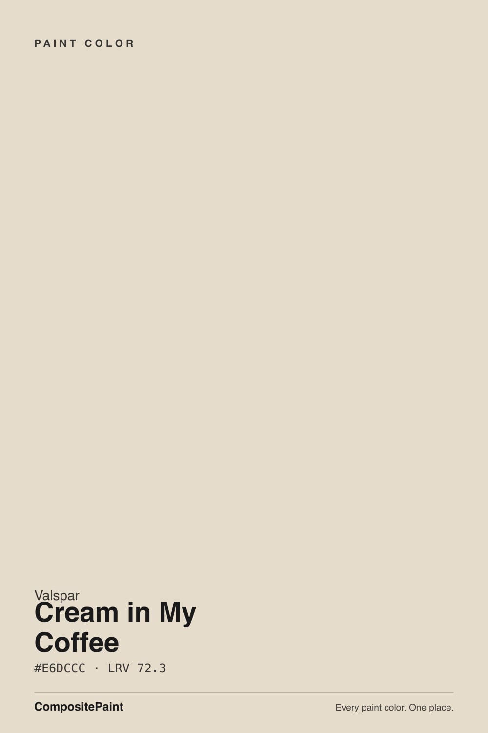
A light coffee-cream beige sold as a farmhouse white, reviewed honestly: where it stays soft, the window light that turns it yellow, and why LRV 72.3 is not a white.

Jessica has spec'd whites and neutrals for more than 300 rooms and keeps a sample wall of painted drawdowns in her studio. Every color review is checked against real reader rooms in the comments and re-tested when a formula changes. About the testing process →
- 1Agreeable Gray60
- 2Balboa Mist66
- 3Cream in My Coffee72.3
- 4Shoelace78
- 5Dover White83
The Fast Verdict
Cream in My Coffee is the pale swirl in the cup, not the coffee and not a white. At LRV 72.3 it is a light beige with warm beige-brown undertones — soft, common in bedrooms and living rooms, and easy to like when the light is warm. Shop it as a farmhouse white and you will be disappointed: it has too much body, and a bright south or west window can flash yellow. Shop it as a coffee-cream beige and it behaves.
Bedrooms and living rooms that want softness over drama · farmhouse interiors with oak, walnut and brass · Lowe's shoppers who actually need a light beige, not a white
You actually want a white · you hate yellow and have strong south or west sun · your floors or counters are cool gray · you want a crisp gallery look
- Genuine coffee-cream beige — warm without the usual gold
- LRV 72.3 is light enough for bedrooms, deep enough to hide scuffs
- Flatters oak, walnut and brass the way a true white cannot
- A Valspar go-to interior neutral, widely available at Lowe's
- Usually holds beige instead of yellow — if you sample the sun walls
- Not a white — buyers expecting farmhouse white see beige on four walls
- Strong south or west windows can flash distinctly yellow
- Looks dingy next to Ultra White, Chantilly Lace or any icy trim
- Cool gray floors and quartz push it toward dirty yellow
What Color Is Cream in My Coffee, Really?
People keep filing this as a farmhouse white. It is not. Valspar files Cream in My Coffee in Neutral with a warm undertone, and Lowe's product copy calls it a soft, natural, light beige with warm undertones. The name is the mood: the pale swirl of cream in a cup — not the coffee, not a white. Independent write-ups land in the same place: creamy, beige, popular as a white this year, and nowhere near a true white. Valspar itself lists it among its go-to interior neutrals for professionals, next to Ultra White, Swiss Coffee and Antique White — a workhorse beige, not a celebrity color.
At LRV 72.3 it sits a full step below the white band. Real whites in this deck start in the low 80s: White Dove at 85, Valspar Swiss Coffee at 86.2. Cream in My Coffee lives with Aesthetic White (LRV 73) and White Duck (LRV 74) — light enough to keep a bedroom airy, dark enough to read as color on four walls. That body is the useful part. It hides scuffs a brighter cream would broadcast, and it gives a room the softness people are shopping for when they say they want not stark and not gray.
Undertone in one line: warm beige with a faint yellow-brown — not gold, not green, not pink. It usually holds as coffee-cream rather than butter. The documented exception is strong window light: around a south or west window it can flash distinctly yellow, which is why anyone who hates yellow needs a sample on every wall, not just the chip. If a can reads green, that is a mix or a reflection — owners who lived with it in a bedroom reported no green at all.
Where It Shines
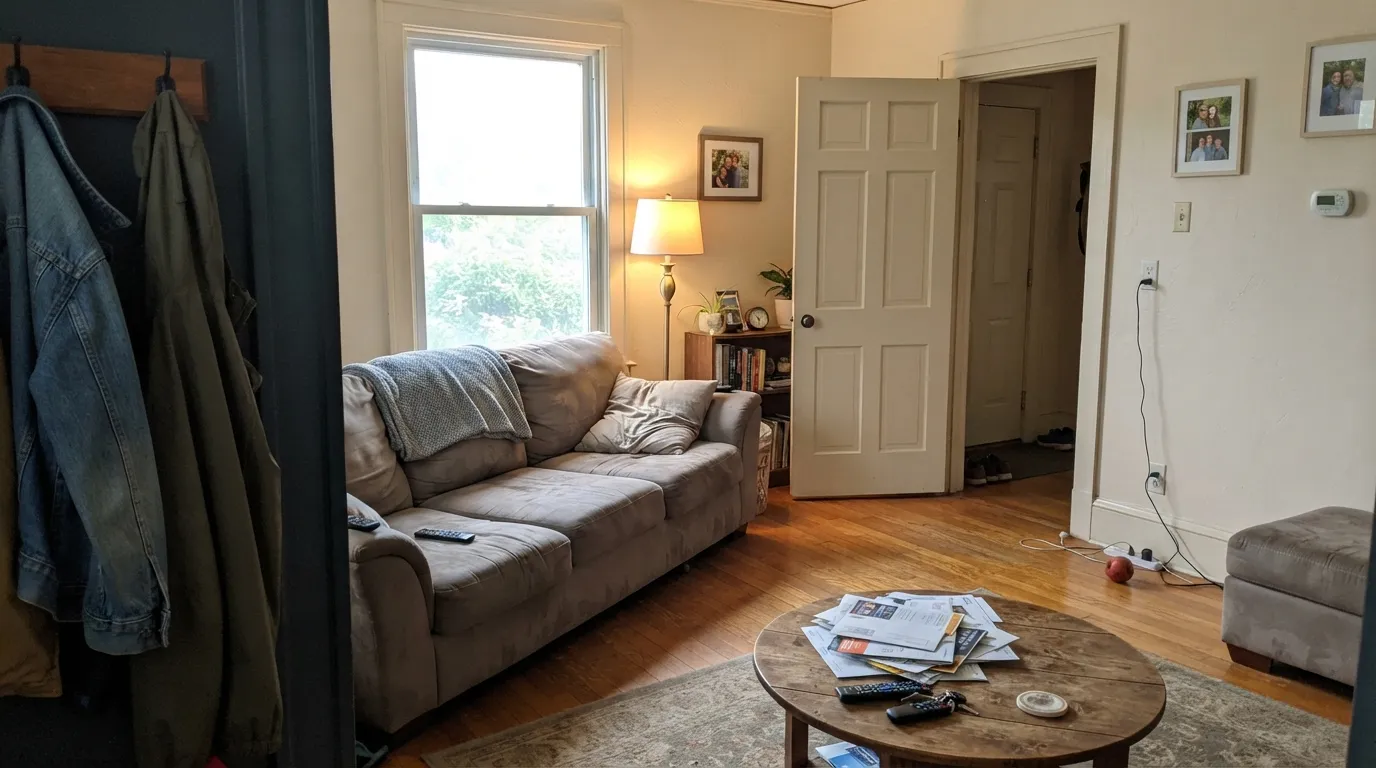
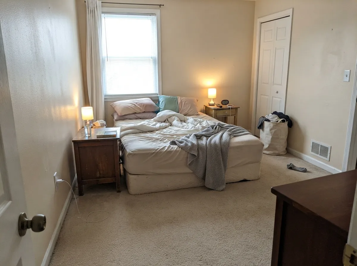
Give it real daylight, warm wood and a trim white that is actually cream, and it does what a light beige is supposed to do: soften the room without turning it yellow or gray. Bedrooms are its best room — morning light keeps it a beige-white, lamps at night make it coffee-cream. Living rooms and dining rooms with oak or walnut and brass are a close second. It is a Lowe's beige you can run hallway into living room without picking a fight, as long as you stop calling it a white.
Where It Fails
Almost every regret about Cream in My Coffee is predictable before the first coat. The paint is honest; the shopping language is not. If your room matches one of these three, sampling bigger will only confirm it.
This is the number-one mix-up. Blogs still file it as a creamy farmhouse white, and the name does not help. Whites in this deck live at LRV 82 and up. At 72.3, Cream in My Coffee is a light beige with real body — put it next to Valspar Dove White or Alabaster and the beige is obvious. If you wanted walls that still read white, pick Valspar Swiss Coffee or White Dove instead.
It does not often pull yellow — until it does. In real rooms it usually holds as beige, but the wall around a bright south or west window can go distinctly yellow, the exact shift owners who hate yellow complain about. Sample every corner, including the sun patch, before you commit a whole room.
Valspar chips Ultra White as a coordinating trim. Do not. Ultra White at LRV 93.6 is a 21-point leap into cool brightness, and it makes these walls look dingy and tan — the same trap that ruins Aesthetic White beside builder white. Cool gray LVP, cool quartz and Chantilly Lace trim do the same job from the other direction. Keep trim in the warm family: Dove White, Valspar Swiss Coffee, Alabaster.
Room by Room
Soft, restful, and the room this color was named for. Morning light keeps it a beige-white; 2700K lamps turn it coffee-cream at night. Eggshell on the walls, Dove White or Valspar Swiss Coffee on the trim. If the bedroom faces west and you hate yellow, sample the window wall before you buy gallons.
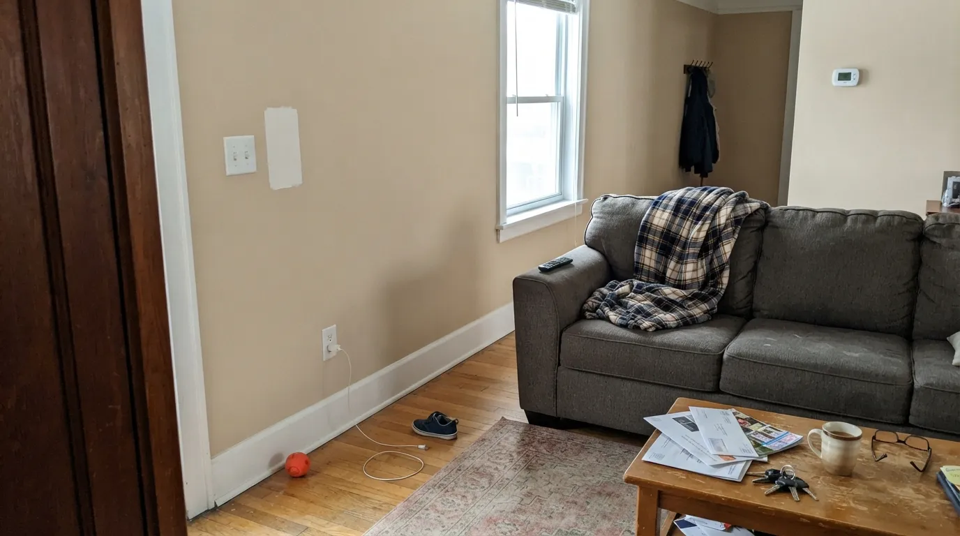
A calm backdrop for oak floors, a worn sectional and brass lamps. It has enough body to feel finished, not enough chroma to decorate the room for you. Eggshell on walls; same-family cream on trim. Open plans are fine as long as the kitchen counters are warm.
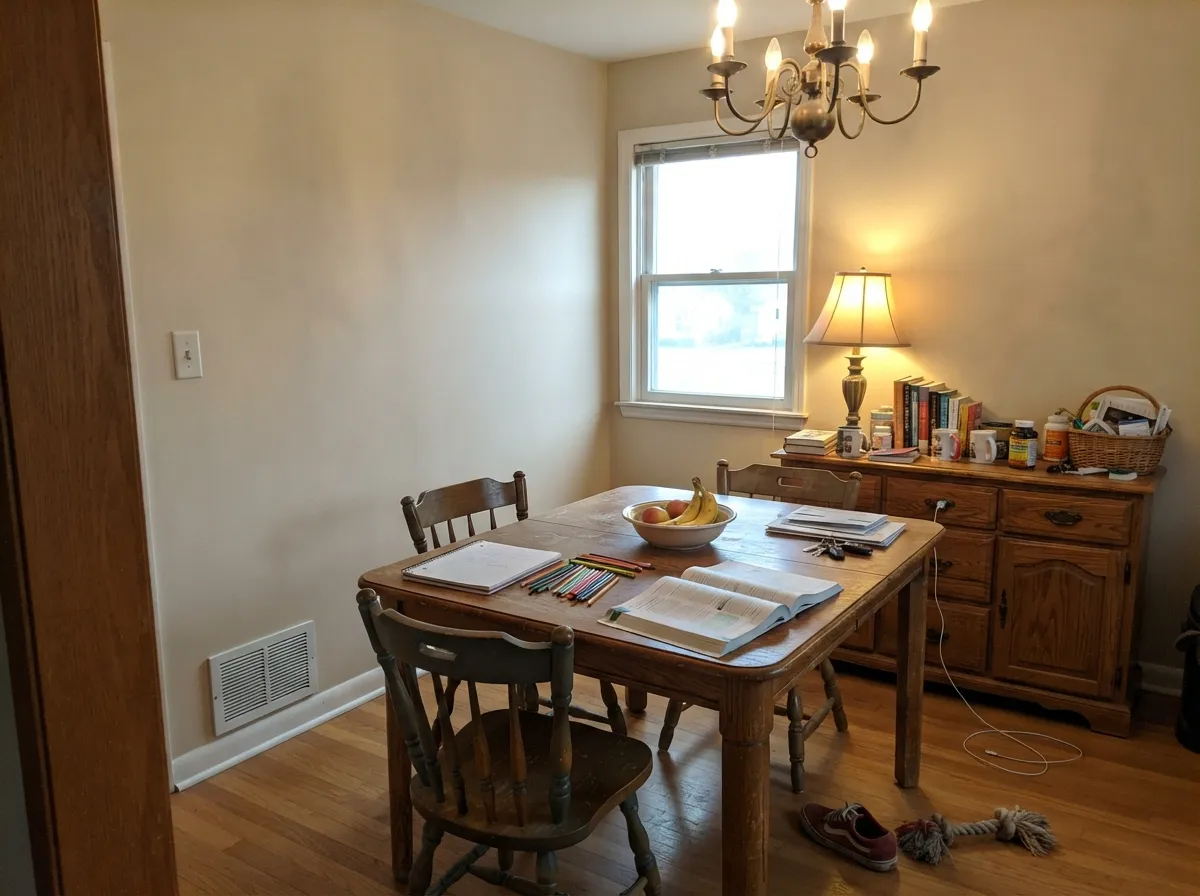
Valspar has used it here for a reason: cream walls, a wood table and a slightly deeper partner like Cappuccino Foam make a room you stay in. Warm bulbs matter. A cool chandelier LED will flatten it to leftover beige.
Butcher block, cream or painted wood cabinets, brass hardware: it sits well. Satin if you paint cabinets this color. Cool white quartz or gray LVP will push the walls yellow — sample the wall above the actual counter, not a chip on a clipboard.
Light enough to carry a windowless hall, warm enough not to go gray. This is the whole-house job Valspar hired it for on its interior-neutrals list. Commit to one cream trim everywhere so it does not look like a different beige in every doorway.
A powder room with warm tile and brass can work; a bath with cool gray porcelain will not. Exterior sun will bleach it toward a chalkier cream and the yellow can show from the street. Keep this color indoors.
Your Light Is the Risk
The cream glows as coffee-beige without tipping gold. This is the light that makes the color look expensive and finished.
Cool gray daylight strips the warmth and leaves a flat, slightly dingy beige. Fine if you wanted quiet; disappointing if you wanted cream.
Morning east light keeps it beige-white. West sun and the wall around a bright window can go clearly yellow for an hour or two — sample those corners.
2700K bulbs deepen the coffee-cream and make it cozy. Cool white LEDs flatten it toward leftover beige — swap the bulb before you swap the paint.
Most complaints about Cream in My Coffee are a light mismatch. Upload a photo of your actual room and see it on your walls — then ask for the same wall in north light or evening lamps before you buy a single sample.
Need It From Another Brand?
Any paint counter can custom-tint Valspar 3003-10C directly. If you would rather stay in one brand's own deck, these are the closest stock matches, measured as ΔE2000. Under 2 is a difference you will not see on the wall.
| Brand | Closest color | ΔE | LRV | |
|---|---|---|---|---|
| Sherwin-Williams | Divine WhiteSW 6105 · Sherwin-Williams | 0.4 | 72 | Color page → |
| Behr | White MochaOR-W11 · Behr | 0.5 | 73 | Color page → |
| Benjamin Moore | Ionic Column1016 · Benjamin Moore | 0.9 | 70 | Color page → |
| PPG / Glidden | Fossil StonePPG1102-2 · PPG / Glidden | 2.9 | 72 | Color page → |
| Glidden | Fossil StonePPG1102-2 · Glidden | 2.2 | 72 | Color page → |
| Dutch Boy | Dust Flats414-1DB · Dutch Boy | 0.4 | 72 | Color page → |
Similar Valspar Colors
The nearest shades to Cream in My Coffee within Valspar's own range, ranked by perceptual color distance — useful when you want the same look a touch lighter, darker, or warmer.
WCAG 2.1: AA is 4.5 : 1 for normal text, 3 : 1 for large text, AAA is 7 : 1.
Cream in My Coffee vs the Colors You're Also Considering
Every Cream in My Coffee sample board has the same rivals on it. The numbers show the real lightness gap — then it comes down to which risk you would rather live with.
Pick this if you are already at Lowe's and want the slightly cleaner coffee-cream version of the same LRV band.
Sherwin-Williams SW 7035 · LRV 73Aesthetic WhitePick this if you want the same depth from Sherwin-Williams — a sand-beige with a red-orange lean, equally unforgiving about bright trim.
Pick this when you want beige warmth with no green in it.
Sherwin-Williams SW 7010 · LRV 74White DuckPick this if you want a similar light off-white and can live with its honest green tell.
Cream in My Coffee Coordinating Colors
Stay on the warm side of the fence. Cream in My Coffee wants cream trim, not gallery white, and it likes oak, brass, and a slightly deeper latte beige more than it likes gray. Valspar chips Ultra White as a partner — ignore that chip. These are the partners that actually keep the room in one temperature:
Not a White: The Farmhouse Mix-up
Cream in My Coffee keeps getting sold as a white because the name sounds like Swiss Coffee and the farmhouse internet is hungry for creamy walls. Mod & Mood's review is the clearest public look: a creamy farmhouse white that is definitely cream, with warm beige undertones that usually hold — and a yellow flash around bright windows. Lowe's copy does not play along. It calls the color a light beige. Trust the product line, not the Pinterest title.
Valspar lists it as a go-to interior neutral for professionals, alongside Ultra White, Swiss Coffee and Antique White. That is the honest job: a Lowe's beige you can run through bedrooms and living rooms without drama. It is not a Color of the Year, and it does not have a famous TV-house moment. Volume is real; celebrity is not. If you need a documented designer white, go to White Dove or Alabaster. If you need this softness at Lowe's prices, stay here and stop asking it to be white.
Cream in My Coffee With Wood Tones and Floors
Warm wood loves it. Oak — red, white, or honey — walnut, butcher block and cedar all sit comfortably against the coffee-cream because the beige meets them halfway. Honey oak, which fights cool grays and violets, is one of the floors this color actually softens instead of amplifying.
The flooring that needs a large sample first is cool gray LVP, gray-washed wood, or blue-gray tile. Gray pulls the yellow-brown undertone into relief, and the wall can read slightly dirty-yellow against it. Warm rugs and brass help, but they do not rewrite the floor. Metals are easy: unlacquered brass, antique bronze and matte black all work; polished chrome is the one that leans cold.
Three Ready Palettes Built on Cream in My Coffee
A color is never alone on the wall. These are complete combinations in the 60-30-10 pattern, with the reason each one holds together. Every one opens in the visualizer.
Two depths of the same coffee-and-cream family, separated by a Lowe's White Dove twin. Dove White keeps the edges soft instead of icy; Cappuccino Foam is the latte foam just a hair deeper, so the room layers instead of looking painted one beige.
Try this palette in your roomValspar Swiss Coffee is the cleaner cream at the same Lowe's counter — bright enough to trim this beige without the dingy gap Ultra White would open. Hale Navy is the one dark note the scheme needs; it stays navy as long as the room has light.
Try this palette in your roomAlabaster is a superb cabinet white in this temperature range, and at LRV 82 it still reads as white against these walls. Evergreen Fog is the cabinet sage that earns the island without fighting the cream — keep the counters warm or the beige will go yellow.
Try this palette in your roomCream in My Coffee FAQ
Is Cream in My Coffee a white or a beige?
Beige. Designers and blogs still call it a creamy farmhouse white, but LRV 72.3 is well below the white band (real whites start around 82). On four walls it reads as a light coffee-cream beige. If you want walls that still look white, pick Valspar Swiss Coffee or White Dove.
Does it look yellow?
Usually no — that is its whole pitch, warm without going gold. The exception is strong south or west window light, where the wall around the glass can flash distinctly yellow. If yellow is your dealbreaker, sample every corner, including the sun patch, not just a chip in the middle of the room.
What trim white goes with Cream in My Coffee?
A warm cream, not a bright white. Valspar Dove White and Valspar Swiss Coffee are the Lowe's answers; Alabaster and White Dove work if you are mixing brands. Skip Ultra White and Chantilly Lace — both are too bright and too cool, and they make these walls look dingy and tan.
Is it good for a bedroom?
It is the best room for it. Morning light keeps it a beige-white; 2700K lamps turn it coffee-cream at night. Use eggshell, keep the trim in the same warm family, and sample a west-facing window wall if the room gets late sun.
Does it work with oak floors?
Yes — oak, walnut and butcher block are its natural company. The beige meets the wood halfway instead of going icy against it. The flooring that needs a sample first is cool gray LVP or gray-washed wood, which can push the walls toward yellow.
What is the closest Sherwin-Williams match?
Aesthetic White (SW 7035, LRV 73) is the nearest in depth and warmth, a sand-beige rather than coffee-cream. White Duck (SW 7010, LRV 74) is close in lightness but can flash green. Neutral Ground (SW 7568, LRV 70) is the whole-house beige a step deeper. Sample them on your wall; they are cousins, not copies.
Have you painted with Cream in My Coffee?
Rate it — one tap helps the next reader decide.
Ask a Question