Feather Down
A quiet off-white cousin of White Dove and Swiss Coffee, reviewed honestly: the light that keeps it golden, the light that turns it green, and the floors it fights.

Jessica has spec'd whites and neutrals for more than 300 rooms and keeps a sample wall of painted drawdowns in her studio. Every color review is checked against real reader rooms in the comments and re-tested when a formula changes. About the testing process →
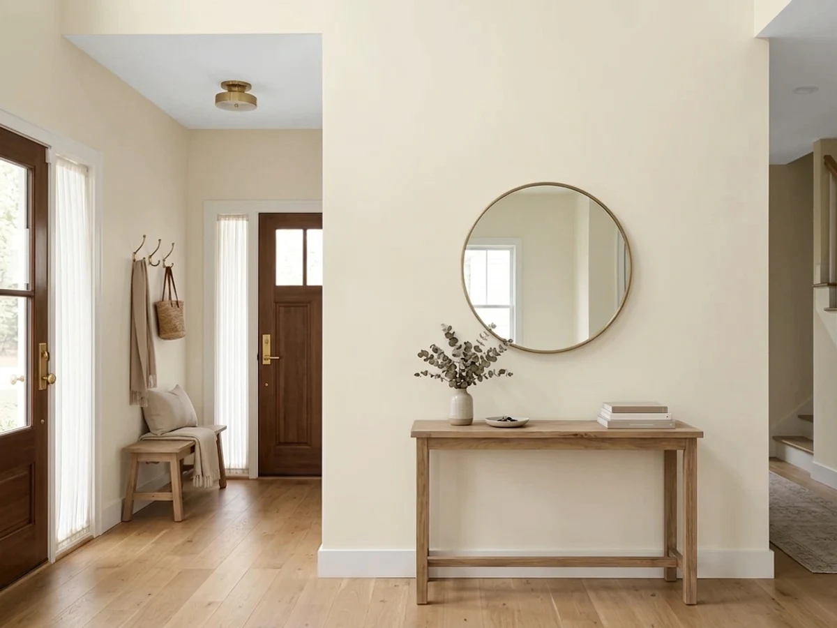
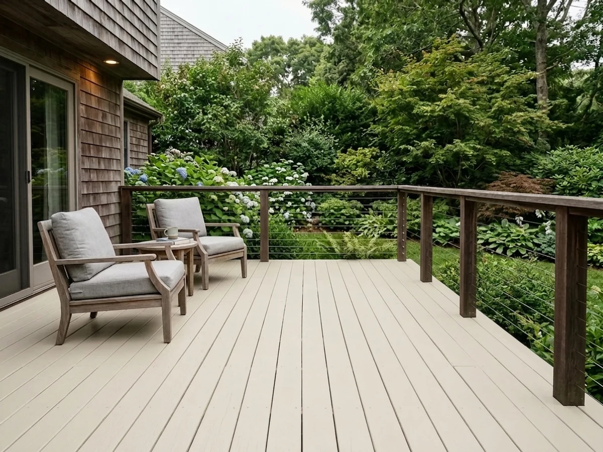
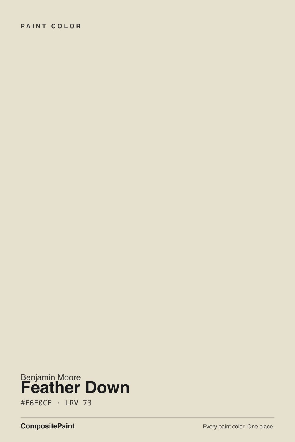
- 1Agreeable Gray60
- 2Balboa Mist66
- 3Feather Down73
- 4Shoelace78
- 5Dover White83
The Fast Verdict
Feather Down is not a famous color, and it does not need to be — it is one of a dozen quiet off-whites in Benjamin Moore's Off-White collection, and it does the job with none of the fanfare White Dove gets. In good warm light it is a soft, unfussy beige-cream.
The catch is that it is a genuine chameleon: the same wall can read gold near a lamp and faintly green under a cool overhead LED, and honey oak floors or cabinets pull it further yellow than most owners expect. Sample big, and sample in your own worst light before you commit.
Trim and doors against a deeper wall color · entryways and hallways · exteriors and decks with dark shutters · warm-daylight rooms wanting a soft, unfussy cream
Your floors or cabinets are honey oak · most of your lighting is cool white LED · you want one guaranteed undertone in every room of the house · you are copying a photo without testing your own walls first
- Soft, warm cream that avoids a stark or clinical look
- Its best-documented job — trim and doors against a deeper wall color — works reliably
- LRV 73 keeps rooms bright without reading cold
- Solid exterior and deck color, especially with dark shutters
- Quiet enough to not scream any particular trend or decade
- Genuine chameleon undertone — gold under warm light, faintly green under cool LEDs, occasional pink reported
- Amplifies honey oak floors and cabinets instead of taming them
- Can read as two different colors on two walls of the same room if the light isn't uniform
- Far less battle-tested than White Dove or Swiss Coffee — fewer real-room references to compare against before you commit
What Color Is Feather Down, Really?
A soft beige-cream carrying Benjamin Moore's OC-6 designation, filed in the same Off-White collection as White Dove and Swiss Coffee but without either color's reputation. It has sat in the deck for years as a dependable, un-hyped option — the color a painter suggests when a client wants "something soft, not stark, nothing too yellow" but isn't shopping for a famous name. That quiet positioning is honest: Feather Down does the same basic job as its more famous siblings, just with a wider undertone swing.
At LRV 73 it sits in the same brightness band as White Dove (85) and Swiss Coffee (84) but noticeably deeper — closer to a true cream than a near-white. That depth is where the chameleon behavior comes from: a lighter white has less pigment to shift, but Feather Down carries enough beige body that different light temperatures pull it in different directions on the same wall. Owners report it reading golden near a warm lamp and faintly cooler, even slightly green, a few feet away under daylight from a window.
Undertone in one line: warm beige at its base, with yellow-gold coming forward under warm light and a subtle green edge showing up under cool white LEDs. A few owners have also reported a fleeting pink cast in certain rooms — not a defect, just what a beige this soft does when the light itself is unusual (a colored blind, a stained-glass reflection, a rug throwing color back up). If your swatch looks different in two corners of the same room, that is the paint being honest, not inconsistent.
Where It Shines
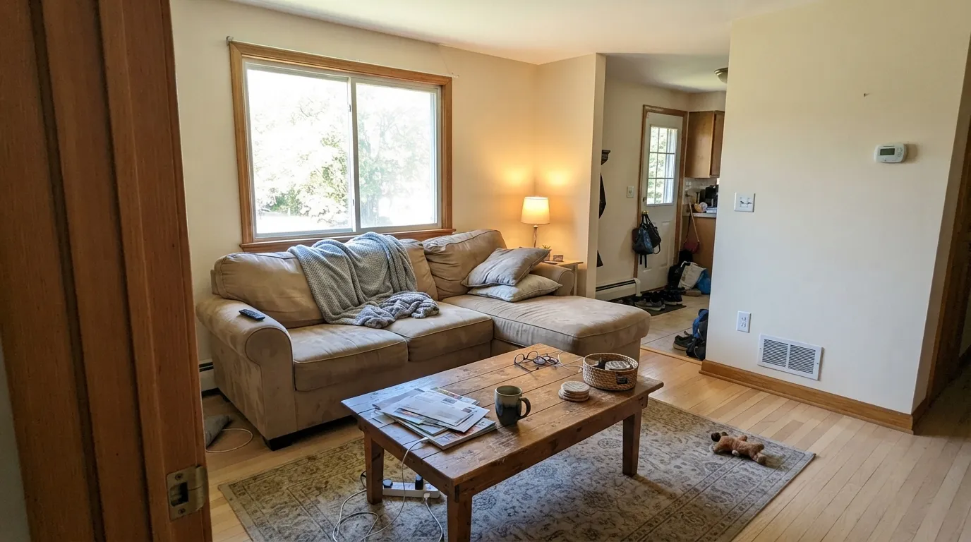
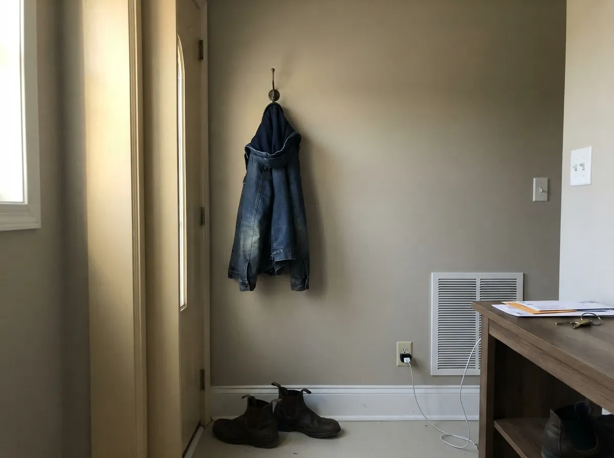
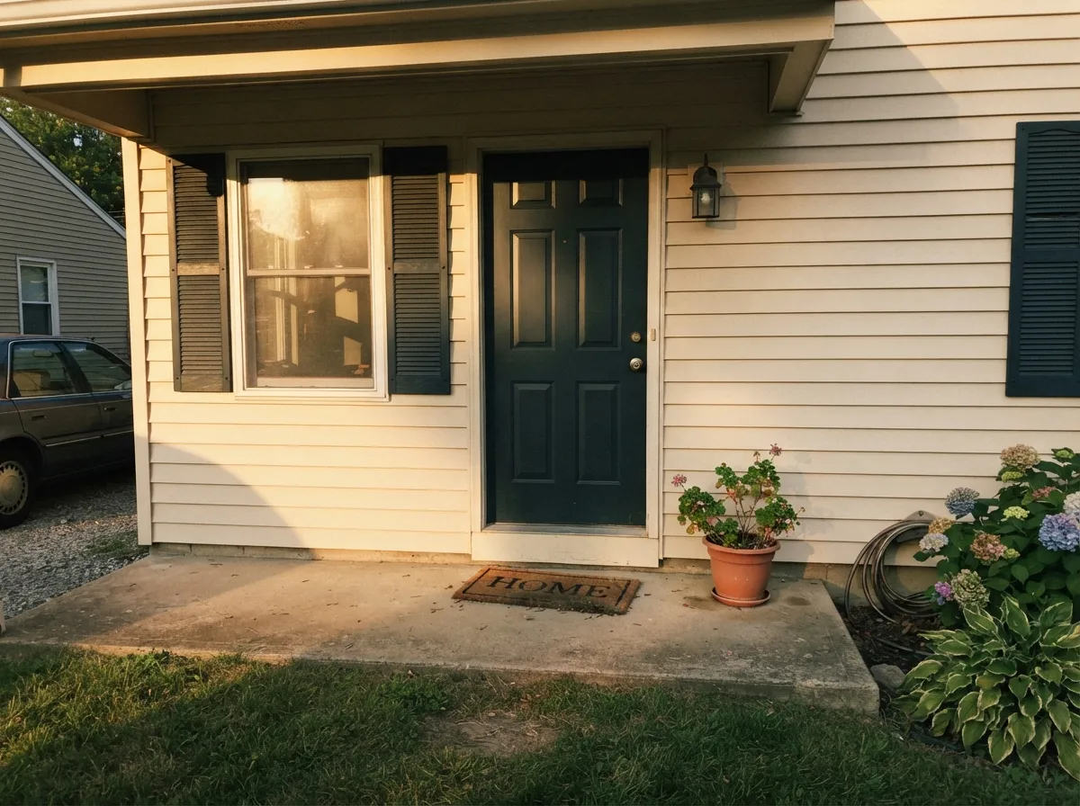
Give it real, warm daylight and it is a genuinely pleasant, low-drama cream — the kind of color nobody complains about because nobody notices it, which is the point. Its most reliable job is exactly what research on this color keeps turning up: trim and doors run against a deeper wall color, where Feather Down softens the transition instead of cutting a hard line. It also holds up well outdoors, reading brighter and more golden in full sun, which makes it a solid sibling to White Dove for exteriors and decks when paired with dark shutters.
Where It Fails
Almost every regret story about Feather Down comes from one of three predictable situations, and none of them are the paint's fault — they are the paint being a warm chameleon in a room that either amplifies the warmth or cancels it.
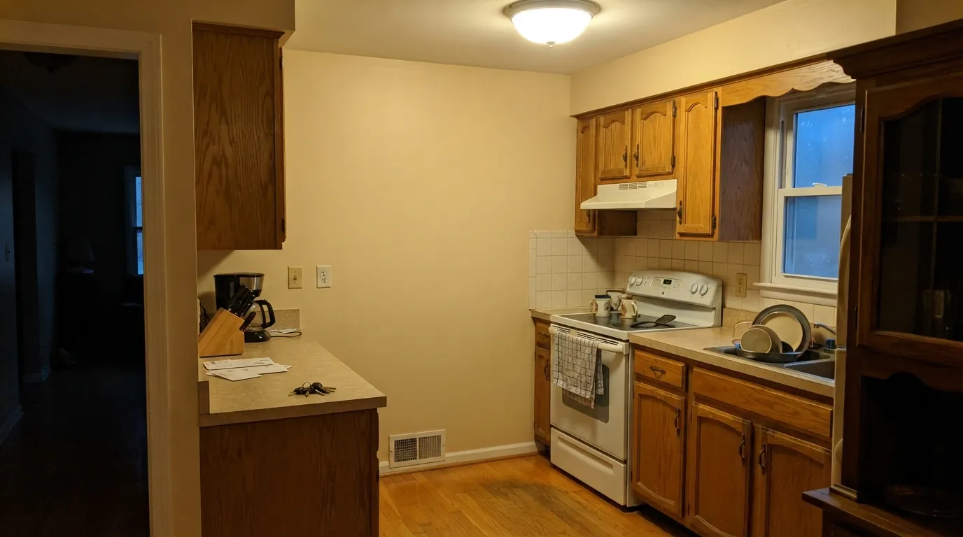
One documented case: a homeowner reported Feather Down looking "too yellow/golden" the moment it went up over dated oak cabinets and oak floor tile — the warm wood bounced its own gold back onto the wall and stacked on top of the paint's own warmth. Unlike a grayer white that can tame orange oak, Feather Down amplifies it. If your wood is honey-toned, sample big before committing, or pick a cooler-leaning off-white instead.
Warm 2700K light is where this color earns its keep. Swap in cool white or daylight-temperature LEDs and the beige loses its gold and shows a faint green undertone instead — readers describe it going flat and slightly murky at night. This is a bulb problem, not a paint problem, but it is the single easiest way to end up disappointed in a room you only saw in the store's fluorescent light.
Because the undertone genuinely shifts with light temperature and angle, a wall lit by a warm lamp and a wall lit by a north-facing window in the same room can look like they were painted from two different cans. One owner reported the color reading "too pinkish" most of the day in a room where it looked neutral on the swatch. It is the same paint; the light in that room is simply not uniform. Test a large sample on every wall you plan to paint, not just one.
Room by Room
In a room with genuine sun exposure it is a calm, warm backdrop that reads more cream than beige. Eggshell on the walls; keep any overhead bulbs at 2700K to match the lamps.
On walls with painted (not honey oak) cabinets it is soft and unobtrusive. On cabinets themselves, it works best over a neutral or cool-toned floor — over honey oak flooring, expect the golden cast documented above.
Warm 2700K lamp light turns it gently golden and restful. If the room's main light is a cool-white ceiling fixture, test it lit at night before you paint, not just in daylight.
With warm stone or cream tile it is quietly pretty. With cool gray or blue-gray tile, the paint's green undertone can come forward under the bathroom's typically cooler lighting — sample with the vanity lights on.
Run against a deeper wall color (a greige, a sage, a navy) it is the color's most reliable job: softer than a stark white trim, warmer than a plain off-white. Semi-gloss.
Full sun reads it brighter and more golden than indoors, and it pairs well with dark shutters or trim for contrast. A documented use case alongside living rooms, bathrooms, kitchens, and entryways.
Your Light Is the Risk
The beige-cream stays soft and gently golden all day without tipping heavy yellow. Its most dependable light.
The gold drains out and a faint green undertone shows up instead. Test here before painting the whole room.
Golden and soft in the morning, quieter and more neutral by afternoon, warm again at sunset. The swing is wider than most off-whites.
2700K lamps: golden and cozy. Cool white or daylight LEDs: flat, faintly green — swap the bulb before you blame the paint.
Most complaints about Feather Down are a light mismatch. Upload a photo of your actual room and see it on your walls — then ask for the same wall in north light or evening lamps before you buy a single sample.
Need It From Another Brand?
Any paint counter can custom-tint Benjamin Moore 953 directly. If you would rather stay in one brand's own deck, these are the closest stock matches, measured as ΔE2000. Under 2 is a difference you will not see on the wall.
| Brand | Closest color | ΔE | LRV | |
|---|---|---|---|---|
| Sherwin-Williams | Aged WhiteSW 9180 · Sherwin-Williams | 2.0 | 74 | Color page → |
| Behr | Hazelnut Cream750C-2 · Behr | 0.8 | 74 | Color page → |
| Valspar | Totten's Inlet7006-9 · Valspar | 2.3 | 75.2 | Color page → |
| PPG / Glidden | FocusPPG1008-1 · PPG / Glidden | 1.1 | 74 | Color page → |
| Glidden | Antarctic Ice70YY 73/083 · Glidden | 0.8 | 73 | Color page → |
| Dutch Boy | Worn Pages016W · Dutch Boy | 1.7 | 74 | Color page → |
Similar Benjamin Moore Colors
The nearest shades to Feather Down within Benjamin Moore's own range, ranked by perceptual color distance — useful when you want the same look a touch lighter, darker, or warmer.
WCAG 2.1: AA is 4.5 : 1 for normal text, 3 : 1 for large text, AAA is 7 : 1.
Feather Down vs the Colors You're Also Considering
Every Feather Down sample board has the same rivals on it. The numbers show the real lightness gap — then it comes down to which risk you would rather live with.
Pick this if you want the beige-gold lean instead of Ballet White's more neutral-to-green swing.
Benjamin Moore OC-9 · LRV 72Ballet WhitePick this if Feather Down already tested too warm — Ballet White sits at nearly the same LRV but carries its own green risk in the wrong light, so sample both before deciding.
Pick this if you specifically want a deeper, more cream-forward color and don't mind testing your own light first.
Benjamin Moore OC-17 · LRV 85White DovePick this for the proven, dependable default — brighter, better-documented, and far less prone to a same-room undertone swing.
Pick this if you want the color noticeably deeper and less sweet than Swiss Coffee's higher LRV.
Benjamin Moore OC-45 · LRV 84Swiss CoffeePick this for a cream that commits to warm instead of shifting — Swiss Coffee stays golden until the light goes truly cold, rather than flashing green.
Pick this to stay in the Benjamin Moore deck with the same off-white role.
Sherwin-Williams SW 7011 · LRV 73Natural ChoicePick this if your painter works in Sherwin-Williams — it sits at nearly the same LRV and depth, with its own trim-pairing caveat instead of a floor-amplification one.
Within the brand, Feather Down is one of a tight cluster. Plaster of Paris CSP-185 shares the LRV of 73 and a near-identical #E5E0D0, so the two are effectively the same wall. Ballet White OC-9, Muskoka Trail 974 and Maritime White 963 all sit at LRV 72 and only differ by a point or two of warmth. Cake Batter CSP-215 at LRV 75 is the lightest of the group.
Across brands the matches are unusually tight. Dunn-Edwards Pueblo White DET675 at deltaE 0.47, Behr Canvas Luggage N300-2 at 0.77 and Glidden Antarctic Ice 70YY 73/083 at 0.8 are all effectively the same color. Farrow & Ball Slipper Satin No. 2004 at 1.24 and PPG Focus PPG1008-1 at 1.06 are visually identical in normal room light.
Sherwin-Williams Aged White SW 9180 at deltaE 1.98 is still in that band, while Valspar Totten's Inlet 7006-9 at 2.27 and Backdrop Cookies & Cream at 2.72 are very close but worth sampling first.
Feather Down Coordinating Colors
The rule for coordinating with Feather Down: pair it with colors that can absorb some undertone drift, since the paint itself won't hold perfectly still. It works best as trim against a deeper warm-neutral wall, alongside a genuine warm white for cabinets, and with one confident dark note to anchor the room. These are the partners that show up again and again:
The Quiet Sibling of White Dove and Swiss Coffee
Feather Down has never had a Color of the Year moment, never gone viral on a renovation account, and doesn't show up in the same breath as White Dove or Swiss Coffee when people ask for "the safe warm white." That obscurity is not a knock — it is an honest description. It is one of roughly a dozen off-whites in Benjamin Moore's Off-White collection, close enough in family to its famous siblings that a painter can suggest it as a subtle variation, but different enough in undertone behavior that it hasn't earned the same blanket recommendation.
The practical upshot: you will find far fewer finished rooms, fewer detailed reviews, and fewer "I used this in my whole house" testimonials to check your own light against before committing. That is the real trade-off of picking a quieter color over a famous one — the paint itself is perfectly fine, but you are doing more of your own homework instead of borrowing someone else's thousand five-star reviews.
Feather Down With Wood Tones and Floors
Neutral or cool-toned floors — pale white oak, gray-washed wood, walnut, cool LVP — let Feather Down's own warmth do the work without a second source pushing it further gold. These pairings are where the color reads calm and deliberate rather than accidentally yellow.
Honey oak is the one flooring or cabinet tone to test carefully before committing to a full room. The documented complaint is specific: warm oak reflects its own gold back onto the wall, stacking on top of the paint's own beige-yellow lean, and the result reads noticeably more golden than the chip promised. A large sample taped up over the actual floor, viewed at different times of day, is the only reliable way to know before you buy the gallon.
Three Ready Palettes Built on Feather Down
A color is never alone on the wall. These are complete combinations in the 60-30-10 pattern, with the reason each one holds together. Every one opens in the visualizer.
Painted White Dove cabinets sidestep the honey-oak amplification problem entirely, and both whites share a warm-grayed base so the wall-to-cabinet handoff stays quiet. Wrought Iron on the island supplies the one dark anchor the room needs.
Try this palette in your roomThis is Feather Down's best-documented role: run as trim and doors against a deeper greige wall, it softens the transition instead of cutting a hard bright line. Hale Navy on the front door gives the entry one confident dark note.
Try this palette in your roomFull sun pushes Feather Down brighter and more golden, and dark charcoal shutters keep that warmth from reading washed-out from the street. Hale Navy on the door adds contrast without fighting the siding's warm base.
Try this palette in your roomFeather Down FAQ
Is Feather Down warm or cool?
Warm at its base — a beige-cream, not a gray-leaning white. But it is a genuine chameleon: warm 2700K light and warm wood push it further gold, while north daylight or cool white LEDs pull a faint green undertone forward. Expect more movement than a color like White Dove.
Is Feather Down the same as Ballet White?
No, though owners compare the two often because they sit close in LRV (73 vs 72). Ballet White leans more neutral with its own green risk; Feather Down leans more beige-gold. Sample both side by side rather than assuming one is simply a lighter version of the other.
Will it look too yellow with oak cabinets or floors?
Likely, if the oak is honey-toned. A documented case shows Feather Down reading "too yellow/golden" the moment it went up over dated oak cabinets and oak floor tile — the warm wood amplifies the paint's own warmth rather than canceling it. Test a large sample against your actual floor before committing.
What light bulbs should I use with it?
Warm 2700K, without exception. Cool white or daylight LEDs pull out a green undertone that reads flat and slightly murky at night — the fastest way to regret this color is to paint under warm store lighting, then live with cool bulbs at home.
Is it better for walls or trim?
Its most reliable, best-documented job is trim and doors run against a deeper wall color — a greige, a sage, a navy — where it softens the transition. As a wall color it can still work, but it needs consistent warm light across the whole room to avoid the corner-to-corner undertone shift.
Does it work on exteriors?
Yes — it is a documented exterior and deck color. Full sun reads it brighter and more golden than it does indoors, and it pairs well with dark shutters or trim like Kendall Charcoal for contrast.
Have you painted with Feather Down?
Rate it — one tap helps the next reader decide.
Ask a Question